ADX Histogram Indicator
- Indicators
- Thiago Pereira Pinho
- Version: 1.0
- Activations: 5
The ADX Histogram is a modern and visual upgrade of the classic Average Directional Index (ADX).
It transforms the standard ADX and DI+ / DI– values into a color-coded histogram, making trend analysis much clearer and faster.
✨ Key Features:
-
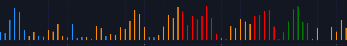
📊 Histogram with four states:
-
🔵 Blue = Normal Buy Trend
-
🟢 Green = Strong Buy Trend
-
🟠 Orange = Normal Sell Trend
-
🔴 Red = Strong Sell Trend
-
-
⚡ Automatic strength detection: uses the ADX line to separate “normal” vs. “strong” signals.
-
🔧 Fully customizable: ADX period and strength threshold can be adjusted to match your strategy.
-
📉 Works in a separate window for better visibility.
-
🔍 Compatible with Forex, Indices, Commodities, Stocks, and Crypto.
📊 How to Use:
-
Blue/Green histograms = bullish dominance (DI+ > DI–).
-
Green = strong buying pressure confirmed by ADX above threshold.
-
-
Orange/Red histograms = bearish dominance (DI– > DI+).
-
Red = strong selling pressure confirmed by ADX above threshold.
-
-
Combine with price action, support/resistance, or other indicators for best results.
🚀 Benefits for Traders:
-
Clear visualization of trend direction and strength.
-
Great for trend-following strategies and breakout trading.
-
Helps avoid false signals by filtering weak trends.
-
Easy to read at a glance – no need to analyze multiple lines.