TickFlow Zones
- Utilities
- Version: 1.0

See the market the way it actually moves - not the way the clock cuts it up
Every standard chart - M1, M5, H1 - slices the market into equal time segments, regardless of what actually happened during that time. A quiet minute and a chaotic minute end up looking the same size. TickFlow Zones takes a different approach: instead of grouping price action by time, it groups it by activity. Each bar on the TickFlow Zones chart represents a fixed number of ticks, so the chart speeds up automatically when the market is active and slows down when it is quiet. The result is a much finer, more honest picture of price action - the kind of detail you would normally expect from professional order flow tools, built natively inside MetaTrader 5.
Important: TickFlow Zones is a free utility, not an Expert Advisor. It does not place trades, manage positions, or access your account in any way. It creates a synthetic chart symbol and draws analysis on top of it - nothing more.
Developed and tested on XAUUSD (Gold). The tool is built around the tick behaviour and volatility profile of Gold. It may work on other instruments as well, but tick frequency and noise levels vary a lot between symbols, so there is no guarantee for that.
What TickFlow Zones actually does
As soon as you attach TickFlow Zones to an XAUUSD chart, here is what happens:
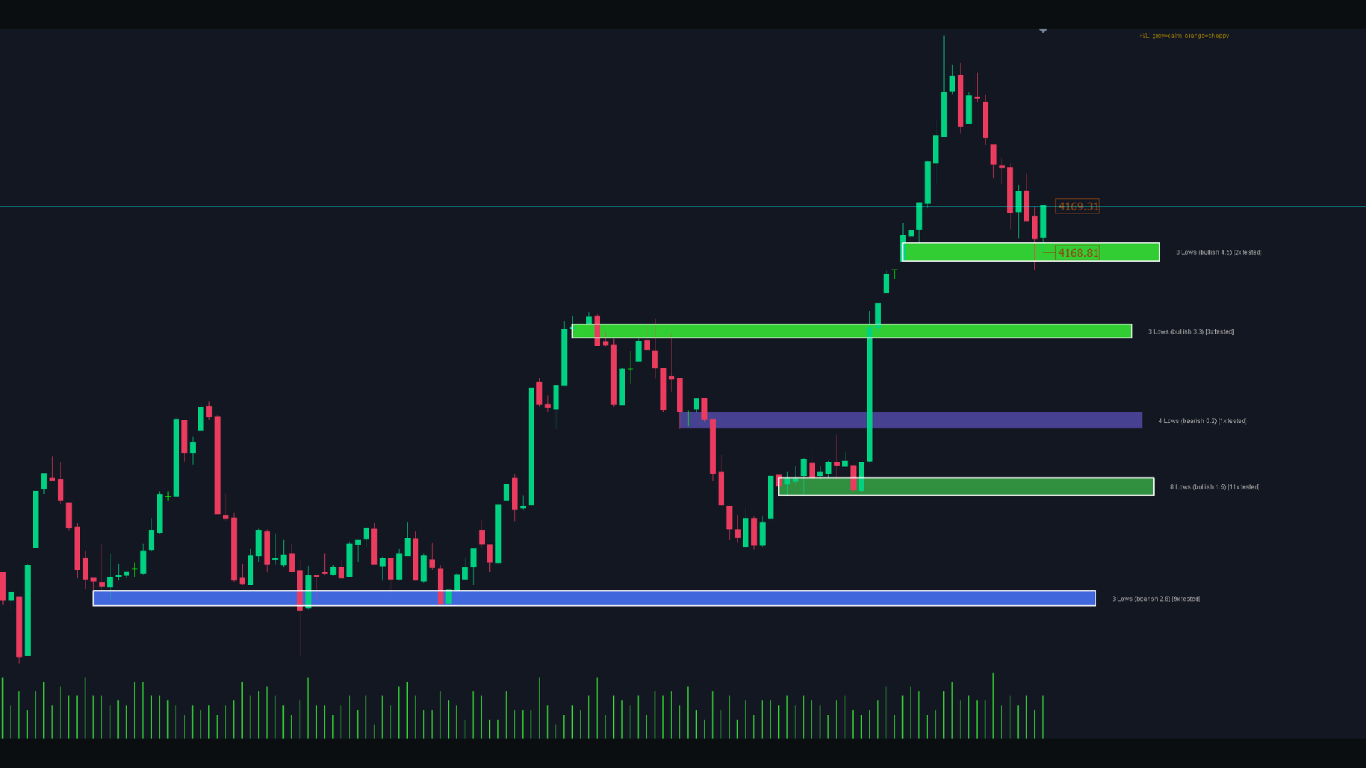
- It builds a synthetic tick-bar symbol (you choose how many ticks per bar) and opens its own chart window for it, pre-configured with a clean dark colour scheme.
- It backfills recent tick history, so you do not start with an empty chart.
- It continuously scans the tick bars for clusters of lows trading at a similar price level - these become zones.
- Each zone is coloured on a bullish/bearish heatmap based on how strong the move into it was, relative to current volatility - not a fixed point value, but a measure that adapts automatically between quiet and fast market phases.
- It counts how often price returns to a zone without breaking it, and highlights proven zones with a white border.
- It overlays the bigger-picture M1 structure for direct comparison - swing levels as dashed lines, plus a subtle zig-zag connecting confirmed M1 swing highs and lows.
- It marks bars with pronounced wick rejections - a sign that the market tested a level and got pushed back.
- It shows directly on the price axis how choppy the price movement is within the current bar: when price changes direction quickly and frequently instead of moving clearly in one direction, the High/Low markers shift from grey to orange, so this indecision catches your eye immediately. Note: since CFD brokers stream their own price quotes rather than real order-by-order transactions like on a futures exchange, this indicator measures the direction-change frequency of price quotes - not a real order tape in the classic order-flow sense.
None of this repaints in a misleading way - confirmed structure stays confirmed, only the most recent, still-forming points update live, exactly as you would expect from any structure tool.
Why this is useful
If you have ever felt like a clean support/resistance level should be there, but your M1 or M5 chart just shows noise around that area, that is often because the actual reaction happens inside a single candle - invisible at that timeframe. TickFlow Zones zooms into exactly that resolution. You start to see things like a level being tested and rejected three times within a single M1 candle, or a sharp wick rejection that a higher timeframe completely smooths over.
It is not a signal generator and will not tell you when to buy or sell. It is a way of seeing market microstructure clearly, so you can bring your own judgement to it - whether that is manual discretionary trading, refining entries for a system you already run, or simply understanding why a level held or failed.
Key Features
- Synthetic tick-bar chart with configurable ticks-per-bar and historical backfill
- Automatic low-cluster zone detection with volatility-normalised bullish/bearish heatmap colouring
- Touch tracking - zones that get retested without breaking are kept longer and highlighted visually
- Minimum zone spacing and a maximum active-zone limit, so the chart stays readable instead of cluttered
- M1 comparison lines (swing levels) that always extend to the current price and are removed automatically once broken
- Subtle M1 zig-zag overlay showing confirmed swing structure
- Wick rejection markers (sensitivity configurable, both relative and absolute thresholds)
- Live indication of price direction-change frequency directly on the price axis (shows how choppy or indecisive the current bar is)
- Clean, pre-configured dark chart theme applied automatically (grid off, chart shift on)
- Every visual element - colours, thresholds, zone count, line styles - is individually configurable
Recommended Setup
- Symbol: XAUUSD
- Works with any account type, no special server requirements
- Start with the default settings, then adjust InpTicksPerBar to taste - lower values show finer structure, higher values smooth things out a bit
What TickFlow Zones is not
- It does not place, modify, or close trades
- It does not predict price movements or generate buy/sell signals
- It is not guaranteed to behave identically on symbols other than XAUUSD
If you find this tool useful, I would appreciate a review - it really helps. And if you are looking for more than free utilities, my other products are linked on my profile.