DoEasy. Controls (Part 14): New algorithm for naming graphical elements. Continuing work on the TabControl WinForms object
 2 651
2 651
 0
0

Contents
- Concept
- Improving library classes
- TabHeader class — TabControl object tab header
- TabControl class — resuming the development
- Test
- What's next?
Concept
In the last article, when developing the TabControl WinForms object, we encountered a limitation on the length of the name of a graphical element, which prevented us from a full-fledged creation of the object. The name of each child graphical element, included in the parent, featured a reference to its parent element with the entire hierarchy of all related graphical controls. The name of each subsequent object in this chain was longer than the name of the previous object. As a result, I ran into a limitation on the length of a graphical resource name of 63 characters. Today I will implement a different algorithm for naming graphical elements to eliminate the drawback: each new object of the same type will contain in its name the name of the program, the name of the graphical element type and the number of already existing elements of this type created in the program when building GUI elements.
For example, when creating GUI elements for the test program of this article, we got the following list of graphical elements (only the first part of all constructed elements is visible, but this is enough to understand the accepted concept):
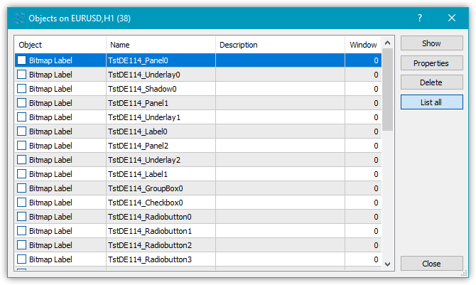
Thus, now we will not have any restrictions on the nesting of objects when creating controls. Instead of displaying a hierarchy in the name of a graphical element, we will simply use the element index with the program name and control type.
We are not able to understand the approximate location of a graphical element in the hierarchy of chains of related objects by its name. But we currently have no restriction on the length of the name. In order to be able to somehow understand what kind of object it is, we will add a new property to the string properties of graphical elements — graphical element description. This will clarify the question of understanding the purpose of the graphical element and how it can be accessed in your program. For example, after creating a graphical element of a toggle button, we enter something like "a button for switching the direction of trade" in its description. This description can be used to directly refer to this control element in the program, which is much better than referring by a "vague" name, like "MyProgram_Elm00_Elm01_Elm00" as it was before...
In addition to creating a new algorithm for naming graphical elements, I will also continue the development of the TabControl. Namely, I will create the TabHeader object describing a tab header. This object will have to be able to work in a group with other similar objects — the headers of other tab objects. When this element is selected, it should be able to grow slightly in size, and at the same time, it should take into account the location of the set of titles of all tabs on the TabControl - top, bottom, left or right, and depending on their location, draw a frame only in the right place of the object. For example, if the tab header object is located on top of the TabControl, then the frame that outlines the tab title should only be drawn on three sides — left, top, and right. The bottom side of the tab header will be in contact with the tab field, on which the objects of this tab should be placed. The place of contact should not have a drawn border — so that the tab title and the tab field form an integral whole without a visible separation.
Today I will implement the described handling of delineating the borders depending on the location of the tab headers only for the tab header objects. In the next article, I will deal with drawing the borders of the tab field and placing other controls.
Improving library classes
Some controls use existing controls for their work, for example, ListBox uses improved Button for drawing its collection (Items). To implement it, we need to create a new object derived from the Button element and add the required functionality. It would be better to put this and some other similar objects in a separate category of auxiliary objects to be placed in the root directory of the control categories rather than in their folders.
In \MQL5\Include\DoEasy\Defines.mqh, namely in the enumeration of graphical element types, add a new type of the TabControl container object, as well as add two auxiliary ListBoxItem and TabHeader controls in the new category:
//+------------------------------------------------------------------+
//| The list of graphical element types                              |
//+------------------------------------------------------------------+
enum ENUM_GRAPH_ELEMENT_TYPE
  {
   GRAPH_ELEMENT_TYPE_STANDARD,                       // Standard graphical object
   GRAPH_ELEMENT_TYPE_STANDARD_EXTENDED,              // Extended standard graphical object
   GRAPH_ELEMENT_TYPE_SHADOW_OBJ,                     // Shadow object
   GRAPH_ELEMENT_TYPE_ELEMENT,                        // Element
   GRAPH_ELEMENT_TYPE_FORM,                           // Form
   GRAPH_ELEMENT_TYPE_WINDOW,                         // Window
   //--- WinForms
   GRAPH_ELEMENT_TYPE_WF_UNDERLAY,                    // Panel object underlay
   GRAPH_ELEMENT_TYPE_WF_BASE,                        // Windows Forms Base
   //--- 'Container' object types are to be set below
   GRAPH_ELEMENT_TYPE_WF_CONTAINER,                   // Windows Forms container base object
   GRAPH_ELEMENT_TYPE_WF_PANEL,                       // Windows Forms Panel
   GRAPH_ELEMENT_TYPE_WF_GROUPBOX,                    // Windows Forms GroupBox
   GRAPH_ELEMENT_TYPE_WF_TAB_CONTROL,                 // Windows Forms TabControl
   //--- 'Standard control' object types are to be set below
   GRAPH_ELEMENT_TYPE_WF_COMMON_BASE,                 // Windows Forms base standard control
   GRAPH_ELEMENT_TYPE_WF_LABEL,                       // Windows Forms Label
   GRAPH_ELEMENT_TYPE_WF_BUTTON,                      // Windows Forms Button
   GRAPH_ELEMENT_TYPE_WF_CHECKBOX,                    // Windows Forms CheckBox
   GRAPH_ELEMENT_TYPE_WF_RADIOBUTTON,                 // Windows Forms RadioButton
   GRAPH_ELEMENT_TYPE_WF_ELEMENTS_LIST_BOX,           // Base list object of Windows Forms elements
   GRAPH_ELEMENT_TYPE_WF_LIST_BOX,                    // Windows Forms ListBox
   GRAPH_ELEMENT_TYPE_WF_CHECKED_LIST_BOX,            // Windows Forms CheckedListBox
   GRAPH_ELEMENT_TYPE_WF_BUTTON_LIST_BOX,             // Windows Forms ButtonListBox
   //--- Auxiliary elements of WinForms objects
   GRAPH_ELEMENT_TYPE_WF_LIST_BOX_ITEM,               // Windows Forms ListBoxItem
   GRAPH_ELEMENT_TYPE_WF_TAB_HEADER,                  // Windows Forms TabHeader
  };
//+------------------------------------------------------------------+
Add a new property to the enumeration of canvas-based graphical element string properties — description of a graphical element, and increase the total number of string properties from 3 to 4:
//+------------------------------------------------------------------+
//| String properties of the graphical element on the canvas         |
//+------------------------------------------------------------------+
enum ENUM_CANV_ELEMENT_PROP_STRING
  {
   CANV_ELEMENT_PROP_NAME_OBJ = (CANV_ELEMENT_PROP_INTEGER_TOTAL+CANV_ELEMENT_PROP_DOUBLE_TOTAL), // Graphical element object name
   CANV_ELEMENT_PROP_NAME_RES,                        // Graphical resource name
   CANV_ELEMENT_PROP_TEXT,                            // Graphical element text
   CANV_ELEMENT_PROP_DESCRIPTION,                     // Graphical element description
  };
#define CANV_ELEMENT_PROP_STRING_TOTAL  (4)           // Total number of string properties
//+------------------------------------------------------------------+
Add sorting by new property to the very end of the list of the possible criteria of sorting graphical elements on canvas:
//+------------------------------------------------------------------+
//| Possible sorting criteria of graphical elements on the canvas    |
//+------------------------------------------------------------------+
#define FIRST_CANV_ELEMENT_DBL_PROP  (CANV_ELEMENT_PROP_INTEGER_TOTAL-CANV_ELEMENT_PROP_INTEGER_SKIP)
#define FIRST_CANV_ELEMENT_STR_PROP  (CANV_ELEMENT_PROP_INTEGER_TOTAL-CANV_ELEMENT_PROP_INTEGER_SKIP+CANV_ELEMENT_PROP_DOUBLE_TOTAL-CANV_ELEMENT_PROP_DOUBLE_SKIP)
enum ENUM_SORT_CANV_ELEMENT_MODE
  {
//--- Sort by integer properties
   SORT_BY_CANV_ELEMENT_ID = 0,                       // Sort by element ID
   SORT_BY_CANV_ELEMENT_TYPE,                         // Sort by graphical element type
   //---...
   //---...
   SORT_BY_CANV_ELEMENT_TAB_ALIGNMENT,                // Sort by the location of tabs inside the control
   SORT_BY_CANV_ELEMENT_ALIGNMENT,                    // Sort by the location of the object inside the control
//--- Sort by real properties

//--- Sort by string properties
   SORT_BY_CANV_ELEMENT_NAME_OBJ = FIRST_CANV_ELEMENT_STR_PROP,// Sort by an element object name
   SORT_BY_CANV_ELEMENT_NAME_RES,                     // Sort by the graphical resource name
   SORT_BY_CANV_ELEMENT_TEXT,                         // Sort by graphical element text
   SORT_BY_CANV_ELEMENT_DESCRIPTION,                  // Sort by graphical element description
  };
//+------------------------------------------------------------------+
Now we will be able to select and sort graphical elements by a new property.
In \MQL5\Include\DoEasy\Data.mqh, add new message indices and remove the unnecessary message index:
//--- WinForms standard
   MSG_GRAPH_ELEMENT_TYPE_WF_COMMON_BASE,             // WinForms base standard control
   MSG_GRAPH_ELEMENT_TYPE_WF_LABEL,                   // Label control
   MSG_GRAPH_ELEMENT_TYPE_WF_CHECKBOX,                // CheckBox control
   MSG_GRAPH_ELEMENT_TYPE_WF_RADIOBUTTON,             // RadioButton control
   MSG_GRAPH_ELEMENT_TYPE_WF_BUTTON,                  // Button control
   MSG_GRAPH_ELEMENT_TYPE_WF_ELEMENTS_LIST_BOX,       // Base list object of Windows Forms elements
   MSG_GRAPH_ELEMENT_TYPE_WF_LIST_BOX,                // ListBox control
   MSG_GRAPH_ELEMENT_TYPE_WF_LIST_BOX_ITEM,           // ListBox control collection object
   MSG_GRAPH_ELEMENT_TYPE_WF_CHECKED_LIST_BOX,        // CheckedListBox control
   MSG_GRAPH_ELEMENT_TYPE_WF_BUTTON_LIST_BOX,         // ButtonListBox control
   MSG_GRAPH_ELEMENT_TYPE_WF_TAB_HEADER,              // Tab header
   MSG_GRAPH_ELEMENT_TYPE_WF_TAB_PAGE,                // TabPage control
   MSG_GRAPH_ELEMENT_TYPE_WF_TAB_CONTROL,             // TabControl
   MSG_GRAPH_OBJ_BELONG_PROGRAM,                      // Graphical object belongs to a program
   MSG_GRAPH_OBJ_BELONG_NO_PROGRAM,                   // Graphical object does not belong to a program
...
//--- String properties of graphical elements
   MSG_CANV_ELEMENT_PROP_NAME_OBJ,                    // Graphical element object name
   MSG_CANV_ELEMENT_PROP_NAME_RES,                    // Graphical resource name
   MSG_CANV_ELEMENT_PROP_TEXT,                        // Graphical element text
   MSG_CANV_ELEMENT_PROP_DESCRIPTION,                 // Graphical element description
  };
//+------------------------------------------------------------------+
and add new message texts corresponding to the newly added indices. Delete the removed index text as well:
//--- WinForms standard
   {"Базовый стандартный элемент управления WinForms","Basic Standard WinForms Control"},
   {"Элемент управления \"Label\"","Control element \"Label\""},
   {"Элемент управления \"CheckBox\"","Control element \"CheckBox\""},
   {"Элемент управления \"RadioButton\"","Control element \"RadioButton\""},
   {"Элемент управления \"Button\"","Control element \"Button\""},
   {"Базовый объект-список Windows Forms элементов","Basic Windows Forms List Object"},
   {"Элемент управления \"ListBox\"","Control element \"ListBox\""},
   {"Объект коллекции элемента управления ListBox","Collection object of the ListBox control"},
   {"Элемент управления \"CheckedListBox\"","Control element \"CheckedListBox\""},
   {"Элемент управления \"ButtonListBox\"","Control element \"ButtonListBox\""},
   {"Заголовок вкладки","Tab header"},

   {"Элемент управления \"TabControl\"","Control element \"TabControl\""},
   {"Графический объект принадлежит программе","The graphic object belongs to the program"},
   {"Графический объект не принадлежит программе","The graphic object does not belong to the program"},
...
//--- String properties of graphical elements
   {"Имя объекта-графического элемента","The name of the graphic element object"},
   {"Имя графического ресурса","Image resource name"},
   {"Текст графического элемента","Text of the graphic element"},
   {"Описание графического элемента","Description of the graphic element"},
  };
//+---------------------------------------------------------------------+
In the \MQL5\Include\DoEasy\Services\DELib.mqh file of service functions, implement the function for creating and returning the description of the graphical element type for its subsequent use in the library:
//+------------------------------------------------------------------+
//| Return the graphical object type as string                       |
//+------------------------------------------------------------------+
string TypeGraphElementAsString(const ENUM_GRAPH_ELEMENT_TYPE type)
  {
   ushort array[];
   int total=StringToShortArray(StringSubstr(::EnumToString(type),18),array);
   for(int i=0;i<total-1;i++)
     {
      if(array[i]==95)
        {
         i+=1;
         continue;
        }
      else
         array[i]+=0x20;
     }
   string txt=ShortArrayToString(array);
   StringReplace(txt,"_Wf_Base","WFBase");
   StringReplace(txt,"_Wf_","");
   StringReplace(txt,"_Obj","");
   StringReplace(txt,"_","");
   StringReplace(txt,"Groupbox","GroupBox");
   return txt;
  }
//+------------------------------------------------------------------+
The algorithm is as follows: pass the graphical element type, required for getting the description, to the function. Next, in the string
int total=StringToShortArray(StringSubstr(EnumToString(type),18),array);
get the number of substring characters extracted from the name of the type enumeration constant.
Let's take a look at this using the GRAPH_ELEMENT_TYPE_WF_CHECKED_LIST_BOX constant as an example.
Convert the enumeration constant into the "GRAPH_ELEMENT_TYPE_WF_CHECKED_LIST_BOX" text:
EnumToString(type) From the obtained text "GRAPH_ELEMENT_TYPE_WF_CHECKED_LIST_BOX", extract the line "_WF_CHECKED_LIST_BOX" starting with character 18:
StringSubstr(EnumToString(type),18)
The obtained string "_WF_CHECKED_LIST_BOX" is copied to the ushort array character by character while receiving the number of copied characters:
int total=StringToShortArray(StringSubstr(EnumToString(type),18),array);
As a result, array[] contains the codes of each "_WF_CHECKED_LIST_BOX" string symbol.
Now we need to leave an uppercase letter after each "_" sign, while all other characters are made lowercase.
Do this in the loop by the character array:
   for(int i=0;i<total-1;i++)
     {
      if(array[i]==95)
        {
         i+=1;
         continue;
        }
      else
         array[i]+=0x20;
     }
The first character of the string and of the array is "_". As soon as we find the character code (95) in the array, set the loop index to the next symbol following it.
In the string "_WF_CHECKED_LIST_BOX", these are color-coded characters.
After setting the loop index for the next character code in the array, move on to the next iteration, thus skipping the character to be left unchanged. At the else operator, add 32 to the character code in the array, which makes the character lowercase.
Thus, after the entire loop, the array will contain the character codes of the string "_Wf_Checked_List_Box", which we convert to the string:
string txt=ShortArrayToString(array);
Next, we simply replace the specified occurrences of strings into the ones we need in the obtained string and return the final row:
   StringReplace(txt,"_Wf_Base","WFBase");
   StringReplace(txt,"_Wf_","");
   StringReplace(txt,"_Obj","");
   StringReplace(txt,"_","");
   StringReplace(txt,"Groupbox","GroupBox");
   return txt;
We will use this new function to get the filename from the graphical element type.
In the \MQL5\Include\DoEasy\Objects\Graph\GBaseObj.mqh file of the base graphical object, namely in the method returning the description of the graphical element type, add a new type and remove the unnecessary one:
//+------------------------------------------------------------------+
//| Return the description of the graphical element type             |
//+------------------------------------------------------------------+
string CGBaseObj::TypeElementDescription(const ENUM_GRAPH_ELEMENT_TYPE type)
  {
   return
     (
      type==GRAPH_ELEMENT_TYPE_STANDARD               ? CMessage::Text(MSG_GRAPH_ELEMENT_TYPE_STANDARD)              :
      type==GRAPH_ELEMENT_TYPE_STANDARD_EXTENDED      ? CMessage::Text(MSG_GRAPH_ELEMENT_TYPE_STANDARD_EXTENDED)     :
      type==GRAPH_ELEMENT_TYPE_ELEMENT                ? CMessage::Text(MSG_GRAPH_ELEMENT_TYPE_ELEMENT)               :
      type==GRAPH_ELEMENT_TYPE_SHADOW_OBJ             ? CMessage::Text(MSG_GRAPH_ELEMENT_TYPE_SHADOW_OBJ)            :
      type==GRAPH_ELEMENT_TYPE_FORM                   ? CMessage::Text(MSG_GRAPH_ELEMENT_TYPE_FORM)                  :
      type==GRAPH_ELEMENT_TYPE_WINDOW                 ? CMessage::Text(MSG_GRAPH_ELEMENT_TYPE_WINDOW)                :
      //--- WinForms
      type==GRAPH_ELEMENT_TYPE_WF_UNDERLAY            ? CMessage::Text(MSG_GRAPH_ELEMENT_TYPE_WF_UNDERLAY)           :
      type==GRAPH_ELEMENT_TYPE_WF_BASE                ? CMessage::Text(MSG_GRAPH_ELEMENT_TYPE_WF_BASE)               :
      //--- Containers
      type==GRAPH_ELEMENT_TYPE_WF_CONTAINER           ? CMessage::Text(MSG_GRAPH_ELEMENT_TYPE_WF_CONTAINER)          :
      type==GRAPH_ELEMENT_TYPE_WF_GROUPBOX            ? CMessage::Text(MSG_GRAPH_ELEMENT_TYPE_WF_GROUPBOX)           :
      type==GRAPH_ELEMENT_TYPE_WF_PANEL               ? CMessage::Text(MSG_GRAPH_ELEMENT_TYPE_WF_PANEL)              :
      type==GRAPH_ELEMENT_TYPE_WF_TAB_HEADER          ? CMessage::Text(MSG_GRAPH_ELEMENT_TYPE_WF_TAB_HEADER)         :
      type==GRAPH_ELEMENT_TYPE_WF_TAB_PAGE            ? CMessage::Text(MSG_GRAPH_ELEMENT_TYPE_WF_TAB_PAGE)           :
      type==GRAPH_ELEMENT_TYPE_WF_TAB_CONTROL         ? CMessage::Text(MSG_GRAPH_ELEMENT_TYPE_WF_TAB_CONTROL)        :
      //--- Standard controls
      type==GRAPH_ELEMENT_TYPE_WF_COMMON_BASE         ? CMessage::Text(MSG_GRAPH_ELEMENT_TYPE_WF_COMMON_BASE)        :
      type==GRAPH_ELEMENT_TYPE_WF_LABEL               ? CMessage::Text(MSG_GRAPH_ELEMENT_TYPE_WF_LABEL)              :
      type==GRAPH_ELEMENT_TYPE_WF_CHECKBOX            ? CMessage::Text(MSG_GRAPH_ELEMENT_TYPE_WF_CHECKBOX)           :
      type==GRAPH_ELEMENT_TYPE_WF_RADIOBUTTON         ? CMessage::Text(MSG_GRAPH_ELEMENT_TYPE_WF_RADIOBUTTON)        :
      type==GRAPH_ELEMENT_TYPE_WF_BUTTON              ? CMessage::Text(MSG_GRAPH_ELEMENT_TYPE_WF_BUTTON)             :
      type==GRAPH_ELEMENT_TYPE_WF_ELEMENTS_LIST_BOX   ? CMessage::Text(MSG_GRAPH_ELEMENT_TYPE_WF_ELEMENTS_LIST_BOX)  :
      type==GRAPH_ELEMENT_TYPE_WF_LIST_BOX            ? CMessage::Text(MSG_GRAPH_ELEMENT_TYPE_WF_LIST_BOX)           :
      type==GRAPH_ELEMENT_TYPE_WF_LIST_BOX_ITEM       ? CMessage::Text(MSG_GRAPH_ELEMENT_TYPE_WF_LIST_BOX_ITEM)      :
      type==GRAPH_ELEMENT_TYPE_WF_CHECKED_LIST_BOX    ? CMessage::Text(MSG_GRAPH_ELEMENT_TYPE_WF_CHECKED_LIST_BOX)   :
      type==GRAPH_ELEMENT_TYPE_WF_BUTTON_LIST_BOX     ? CMessage::Text(MSG_GRAPH_ELEMENT_TYPE_WF_BUTTON_LIST_BOX)    :
      "Unknown"
     );
  }
//+------------------------------------------------------------------+
To get the name of the object, we need the above function, which will return the name of the created graphical element according to its type. But this is not enough to generate a full-fledged object name. We need to add the number of already existing graphical elements of the same type (present on a symbol chart and its subwindow) to the string received from the function.
In the \MQL5\Include\DoEasy\Objects\Graph\GCnvElement.mqh graphical element object class, namely in its protected section, declare two methods — the one returning the number of graphical elements by type and the one creating and returning the graphical element name by its type:
//--- Create (1) the object structure and (2) the object from the structure
   virtual bool      ObjectToStruct(void);
   virtual void      StructToObject(void);
//--- Copy the color array to the specified background color array
   void              CopyArraysColors(color &array_dst[],const color &array_src[],const string source);

//--- Return the number of graphical elements by type
   int               GetNumGraphElements(const ENUM_GRAPH_ELEMENT_TYPE type) const;
//--- Create and return the graphical element name by its type
   string            CreateNameGraphElement(const ENUM_GRAPH_ELEMENT_TYPE type);

private:
I will consider the implementation of methods a bit later.
In the private section, add new fields to the object structure:
private:
   int               m_shift_coord_x;                          // Offset of the X coordinate relative to the base object
   int               m_shift_coord_y;                          // Offset of the Y coordinate relative to the base object
   struct SData
     {
      //--- Object integer properties
      int            id;                                       // Element ID
      int            type;                                     // Graphical element type
      //---...
      //---...
      bool           button_toggle;                            // Toggle flag of the control featuring a button
      bool           button_state;                             // Status of the Toggle control featuring a button
      bool           button_group_flag;                        // Button group flag
      bool           multicolumn;                              // Horizontal display of columns in the ListBox control
      int            column_width;                             // Width of each ListBox control column
      bool           tab_multiline;                            // Several lines of tabs in TabControl
      int            tab_alignment;                            // Location of tabs inside the control
      int            alignment;                                // Location of the object inside the control
      //--- Object real properties

      //--- Object string properties
      uchar          name_obj[64];                             // Graphical element object name
      uchar          name_res[64];                             // Graphical resource name
      uchar          text[256];                                // Graphical element text
      uchar          descript[256];                            // Graphical element description
     };
   SData             m_struct_obj;                             // Object structure
   uchar             m_uchar_array[];                          // uchar array of the object structure
We will need them to correctly save the object to a file and read from it. These are the new properties of the graphical element I have added in the current article or earlier, but forgot to write here.
From the declaration of the method creating a new graphical element, remove the formal parameter, in which the name of the created object was passed to the method:
//--- Create the element
   bool              Create(const long chart_id,
                            const int wnd_num,
                            const string name,
                            const int x,
                            const int y,
                            const int w,
                            const int h,
                            const bool redraw=false);
Now the name of the object will not be passed to the method, but will be created in it based on its type.
The "name" variables have already been replaced with "descript" in all previously implemented graphical element object classes, namely in the formal parameters of all their constructors. For example, in the current file it is:
protected:
//--- Protected constructor
                     CGCnvElement(const ENUM_GRAPH_ELEMENT_TYPE element_type,
                                  const long    chart_id,
                                  const int     wnd_num,
                                  const string  descript,
                                  const int     x,
                                  const int     y,
                                  const int     w,
                                  const int     h);
public:
//--- (1) Set and (2) return the X coordinate shift relative to the base object
   void              SetCoordXRelative(const int value)                                { this.m_shift_coord_x=value;                }
   int               CoordXRelative(void)                                        const { return this.m_shift_coord_x;               }
//--- (1) Set and (2) return the Y coordinate shift relative to the base object
   void              SetCoordYRelative(const int value)                                { this.m_shift_coord_y=value;                }
   int               CoordYRelative(void)                                        const { return this.m_shift_coord_y;               }

//--- Event handler
   virtual void      OnChartEvent(const int id,const long& lparam,const double& dparam,const string& sparam);
//--- Parametric constructor
                     CGCnvElement(const ENUM_GRAPH_ELEMENT_TYPE element_type,
                                  const int     element_id,
                                  const int     element_num,
                                  const long    chart_id,
                                  const int     wnd_num,
                                  const string  descript,
                                  const int     x,
                                  const int     y,
                                  const int     w,
                                  const int     h,
                                  const color   colour,
                                  const uchar   opacity,
                                  const bool    movable=true,
                                  const bool    activity=true,
                                  const bool    redraw=false);
Now we do not pass the name of the created object to the class constructor. The library creates a new name for a new object based on its type. Therefore, instead of passing the name of the object to the constructor, we will pass its description we can assign ourselves in order to refer to the created object using this description. All such changes have already been made to all classes of all WinForms objects, and we will not consider them further here — they can be found in the files attached to the article.
Setting a graphical element type has been changed as well. Previously, I set the element type twice in each constructor of each WinForms object class. First, the type was set in the base object of library graphical elements (in its m_type_element variable):
void SetTypeElement(const ENUM_GRAPH_ELEMENT_TYPE type) { this.m_type_element=type; }
while the second string set the same type in the object properties.
Let's simplify this by creating the public method for setting (and returning) the object type into both values at once — to the variable and to the property:
//--- Set the shift of the (1) left, (2) top, (3) right, (4) bottom edge of the active area relative to the element,
//--- (5) all shifts of the active area edges relative to the element, (6) opacity
   void              SetActiveAreaLeftShift(const int value)   { this.SetProperty(CANV_ELEMENT_PROP_ACT_SHIFT_LEFT,fabs(value));       }
   void              SetActiveAreaRightShift(const int value)  { this.SetProperty(CANV_ELEMENT_PROP_ACT_SHIFT_RIGHT,fabs(value));      }
   void              SetActiveAreaTopShift(const int value)    { this.SetProperty(CANV_ELEMENT_PROP_ACT_SHIFT_TOP,fabs(value));        }
   void              SetActiveAreaBottomShift(const int value) { this.SetProperty(CANV_ELEMENT_PROP_ACT_SHIFT_BOTTOM,fabs(value));     }
   void              SetActiveAreaShift(const int left_shift,const int bottom_shift,const int right_shift,const int top_shift);
   void              SetOpacity(const uchar value,const bool redraw=false);

//--- (1) Set and (2) return the graphical element type
   void              SetTypeElement(const ENUM_GRAPH_ELEMENT_TYPE type)
                       {
                        CGBaseObj::SetTypeElement(type);
                        this.SetProperty(CANV_ELEMENT_PROP_TYPE,type);
                       }
   ENUM_GRAPH_ELEMENT_TYPE TypeGraphElement(void)  const { return (ENUM_GRAPH_ELEMENT_TYPE)this.GetProperty(CANV_ELEMENT_PROP_TYPE);   }

//--- Set the main background color
Now we set a single string calling the method for setting the property in each constructor of each WinForms object class. The method will set the property to both parent classes.
Add two methods for returning and setting the description of a graphical element to its properties:
//--- Graphical object group
   virtual int       Group(void)                         const { return (int)this.GetProperty(CANV_ELEMENT_PROP_GROUP);                }
   virtual void      SetGroup(const int value)
                       {
                        CGBaseObj::SetGroup(value);
                        this.SetProperty(CANV_ELEMENT_PROP_GROUP,value);
                       }
//--- Graphical element description
   string            Description(void)                   const { return this.GetProperty(CANV_ELEMENT_PROP_DESCRIPTION);               }
   void              SetDescription(const string descr)        { this.SetProperty(CANV_ELEMENT_PROP_DESCRIPTION,descr);                }

//+------------------------------------------------------------------+
//| The methods of receiving raster data                             |
//+------------------------------------------------------------------+
In both class constructors, add the method for setting the graphical element type, call the method for creating the element name by its type and add setting the new properties of a graphical element:
//+------------------------------------------------------------------+
//| Parametric constructor                                           |
//+------------------------------------------------------------------+
CGCnvElement::CGCnvElement(const ENUM_GRAPH_ELEMENT_TYPE element_type,
                           const int      element_id,
                           const int      element_num,
                           const long     chart_id,
                           const int      wnd_num,
                           const string   descript,
                           const int      x,
                           const int      y,
                           const int      w,
                           const int      h,
                           const color    colour,
                           const uchar    opacity,
                           const bool     movable=true,
                           const bool     activity=true,
                           const bool     redraw=false) : m_shadow(false)
  {
   this.SetTypeElement(element_type);
   this.m_type=OBJECT_DE_TYPE_GELEMENT;
   this.m_element_main=NULL;
   this.m_element_base=NULL;
   this.m_chart_color_bg=(color)::ChartGetInteger((chart_id==NULL ? ::ChartID() : chart_id),CHART_COLOR_BACKGROUND);
   this.m_name=this.CreateNameGraphElement(element_type);
   this.m_chart_id=(chart_id==NULL || chart_id==0 ? ::ChartID() : chart_id);
   this.m_subwindow=wnd_num;
   this.SetFont(DEF_FONT,DEF_FONT_SIZE);
   this.m_text_anchor=0;
   this.m_text_x=0;
   this.m_text_y=0;
   this.SetBackgroundColor(colour,true);
   this.SetOpacity(opacity);
   this.m_shift_coord_x=0;
   this.m_shift_coord_y=0;
   if(::ArrayResize(this.m_array_colors_bg,1)==1)
      this.m_array_colors_bg[0]=this.BackgroundColor();
   if(::ArrayResize(this.m_array_colors_bg_dwn,1)==1)
      this.m_array_colors_bg_dwn[0]=this.BackgroundColor();
   if(::ArrayResize(this.m_array_colors_bg_ovr,1)==1)
      this.m_array_colors_bg_ovr[0]=this.BackgroundColor();
   if(this.Create(chart_id,wnd_num,x,y,w,h,redraw))
     {
      this.SetProperty(CANV_ELEMENT_PROP_NAME_RES,this.m_canvas.ResourceName()); // Graphical resource name
      this.SetProperty(CANV_ELEMENT_PROP_CHART_ID,CGBaseObj::ChartID());         // Chart ID

      //---...
      //---...

      this.SetProperty(CANV_ELEMENT_PROP_CHECK_STATE,CANV_ELEMENT_CHEK_STATE_UNCHECKED);  // Status of a control having a checkbox
      this.SetProperty(CANV_ELEMENT_PROP_AUTOCHECK,true);                        // Auto change flag status when it is selected

      //---...
      //---...

      this.SetProperty(CANV_ELEMENT_PROP_BUTTON_TOGGLE,false);                                        // Toggle flag of the control featuring a button
      this.SetProperty(CANV_ELEMENT_PROP_BUTTON_STATE,false);                                         // Status of the Toggle control featuring a button
      this.SetProperty(CANV_ELEMENT_PROP_BUTTON_GROUP,false);                                         // Button group flag
      this.SetProperty(CANV_ELEMENT_PROP_LIST_BOX_MULTI_COLUMN,false);                                // Horizontal display of columns in the ListBox control
      this.SetProperty(CANV_ELEMENT_PROP_LIST_BOX_COLUMN_WIDTH,0);                                    // Width of each ListBox control column
      this.SetProperty(CANV_ELEMENT_PROP_TAB_MULTILINE,false);                                        // Several lines of tabs in TabControl
      this.SetProperty(CANV_ELEMENT_PROP_TAB_ALIGNMENT,CANV_ELEMENT_ALIGNMENT_TOP);                   // Location of tabs inside the control
      this.SetProperty(CANV_ELEMENT_PROP_ALIGNMENT,CANV_ELEMENT_ALIGNMENT_TOP);                       // Location of an object inside the control
      this.SetProperty(CANV_ELEMENT_PROP_TEXT,"");                                                    // Graphical element text
      this.SetProperty(CANV_ELEMENT_PROP_DESCRIPTION,descript);                                       // Graphical element description
     }
   else
     {
      ::Print(DFUN,CMessage::Text(MSG_LIB_SYS_FAILED_CREATE_ELM_OBJ),"\"",this.TypeElementDescription(element_type),"\" ",this.NameObj());
     }
  }
//+------------------------------------------------------------------+
In the method creating an object structure, add saving new properties into structure fields:
//+------------------------------------------------------------------+
//| Create the object structure                                      |
//+------------------------------------------------------------------+
bool CGCnvElement::ObjectToStruct(void)
  {
//--- Save integer properties
   this.m_struct_obj.id=(int)this.GetProperty(CANV_ELEMENT_PROP_ID);                               // Element ID
   this.m_struct_obj.type=(int)this.GetProperty(CANV_ELEMENT_PROP_TYPE);                           // Graphical element type

   //---...
   //---...

   this.m_struct_obj.button_toggle=(bool)this.GetProperty(CANV_ELEMENT_PROP_BUTTON_TOGGLE);                             // Toggle flag of the control featuring a button
   this.m_struct_obj.button_state=(bool)this.GetProperty(CANV_ELEMENT_PROP_BUTTON_STATE);                               // Status of the Toggle control featuring a button

   this.m_struct_obj.button_group_flag=(bool)this.GetProperty(CANV_ELEMENT_PROP_BUTTON_GROUP);                          // Button group flag
   this.m_struct_obj.multicolumn=(bool)this.GetProperty(CANV_ELEMENT_PROP_LIST_BOX_MULTI_COLUMN);                       // Horizontal display of columns in the ListBox control
   this.m_struct_obj.column_width=(int)this.GetProperty(CANV_ELEMENT_PROP_LIST_BOX_COLUMN_WIDTH);                       // Width of each ListBox control column
   this.m_struct_obj.tab_multiline=(bool)this.GetProperty(CANV_ELEMENT_PROP_TAB_MULTILINE);                             // Several lines of tabs in TabControl
   this.m_struct_obj.tab_alignment=(int)this.GetProperty(CANV_ELEMENT_PROP_TAB_ALIGNMENT);                              // Location of tabs inside the control
   this.m_struct_obj.alignment=(int)this.GetProperty(CANV_ELEMENT_PROP_ALIGNMENT);                                      // Location of an object inside the control
//--- Save real properties

//--- Save string properties
   ::StringToCharArray(this.GetProperty(CANV_ELEMENT_PROP_NAME_OBJ),this.m_struct_obj.name_obj);   // Graphical element object name
   ::StringToCharArray(this.GetProperty(CANV_ELEMENT_PROP_NAME_RES),this.m_struct_obj.name_res);   // Graphical resource name
   ::StringToCharArray(this.GetProperty(CANV_ELEMENT_PROP_TEXT),this.m_struct_obj.text);           // Graphical element text
   ::StringToCharArray(this.GetProperty(CANV_ELEMENT_PROP_DESCRIPTION),this.m_struct_obj.descript);// Graphical element description
   //--- Save the structure to the uchar array
   ::ResetLastError();
   if(!::StructToCharArray(this.m_struct_obj,this.m_uchar_array))
     {
      CMessage::ToLog(DFUN,MSG_LIB_SYS_FAILED_SAVE_OBJ_STRUCT_TO_UARRAY,true);
      return false;
     }
   return true;
  }
//+------------------------------------------------------------------+
In the method creating an object out of the structure, add values from the new structure fields to the new object properties:
//+------------------------------------------------------------------+
//| Create the object from the structure                             |
//+------------------------------------------------------------------+
void CGCnvElement::StructToObject(void)
  {
//--- Save integer properties
   this.SetProperty(CANV_ELEMENT_PROP_ID,this.m_struct_obj.id);                                    // Element ID
   this.SetProperty(CANV_ELEMENT_PROP_TYPE,this.m_struct_obj.type);                                // Graphical element type

   //---...
   //---...

   this.SetProperty(CANV_ELEMENT_PROP_BUTTON_TOGGLE,this.m_struct_obj.button_toggle);                             // Toggle flag of the control featuring a button
   this.SetProperty(CANV_ELEMENT_PROP_BUTTON_STATE,this.m_struct_obj.button_state);                               // Status of the Toggle control featuring a button

   this.SetProperty(CANV_ELEMENT_PROP_BUTTON_GROUP,this.m_struct_obj.button_group_flag);                          // Button group flag
   this.SetProperty(CANV_ELEMENT_PROP_LIST_BOX_MULTI_COLUMN,this.m_struct_obj.multicolumn);                       // Horizontal display of columns in the ListBox control
   this.SetProperty(CANV_ELEMENT_PROP_LIST_BOX_COLUMN_WIDTH,this.m_struct_obj.column_width);                      // Width of each ListBox control column
   this.SetProperty(CANV_ELEMENT_PROP_TAB_MULTILINE,this.m_struct_obj.tab_multiline);                             // Several lines of tabs in TabControl
   this.SetProperty(CANV_ELEMENT_PROP_TAB_ALIGNMENT,this.m_struct_obj.tab_alignment);                             // Location of tabs inside the control
   this.SetProperty(CANV_ELEMENT_PROP_ALIGNMENT,this.m_struct_obj.alignment);                                     // Location of an object inside the control
//--- Save real properties

//--- Save string properties
   this.SetProperty(CANV_ELEMENT_PROP_NAME_OBJ,::CharArrayToString(this.m_struct_obj.name_obj));   // Graphical element object name
   this.SetProperty(CANV_ELEMENT_PROP_NAME_RES,::CharArrayToString(this.m_struct_obj.name_res));   // Graphical resource name
   this.SetProperty(CANV_ELEMENT_PROP_TEXT,::CharArrayToString(this.m_struct_obj.text));           // Graphical element text
   this.SetProperty(CANV_ELEMENT_PROP_DESCRIPTION,::CharArrayToString(this.m_struct_obj.descript));// Graphical element description
  }
//+------------------------------------------------------------------+
Now we do not pass the name of a created object passed as a parameter to the method creating a graphical resource of the CCanvas class bound to the chart object. Instead, we pass the previously set object name:
//+------------------------------------------------------------------+
//| Create the graphical element object                              |
//+------------------------------------------------------------------+
bool CGCnvElement::Create(const long chart_id,     // Chart ID
                          const int wnd_num,       // Chart subwindow
                          const int x,             // X coordinate
                          const int y,             // Y coordinate
                          const int w,             // Width
                          const int h,             // Height
                          const bool redraw=false) // Flag indicating the need to redraw

  {
   ::ResetLastError();
   if(this.m_canvas.CreateBitmapLabel((chart_id==NULL ? ::ChartID() : chart_id),wnd_num,this.m_name,x,y,w,h,COLOR_FORMAT_ARGB_NORMALIZE))
     {
      this.Erase(CLR_CANV_NULL);
      this.m_canvas.Update(redraw);
      this.m_shift_y=(int)::ChartGetInteger((chart_id==NULL ? ::ChartID() : chart_id),CHART_WINDOW_YDISTANCE,wnd_num);
      return true;
     }
   CMessage::ToLog(DFUN_ERR_LINE,::GetLastError(),true);
   return false;
  }
//+------------------------------------------------------------------+
The method that returns the number of graphical elements by type:
//+------------------------------------------------------------------+
//| Return the number of graphical elements by type                  |
//+------------------------------------------------------------------+
int CGCnvElement::GetNumGraphElements(const ENUM_GRAPH_ELEMENT_TYPE type) const
  {
//--- Declare a variable with the number of graphical objects and
//--- get the total number of graphical objects on the chart and the subwindow where the graphical element is created
   int n=0, total=::ObjectsTotal(this.ChartID(),this.SubWindow());
//--- Create the name of a graphical object by its type
   string name=TypeGraphElementAsString(type);
//--- In the loop by all chart and subwindow objects,
   for(int i=0;i<total;i++)
     {
      //--- get the name of the next object
      string name_obj=::ObjectName(this.ChartID(),i,this.SubWindow());
      //--- if the object name does not contain the set prefix of the names of the library graphical objects, move on - this is not the object we are looking for
      if(::StringFind(name_obj,this.NamePrefix())==WRONG_VALUE)
         continue;
      //--- If the name of a graphical object selected in the loop has a substring with the created object name by its type,
      //--- then there is a graphical object of this type - increase the counter of objects of this type
      if(::StringFind(name_obj,name)>0)
         n++;
     }
//--- Return the number of found objects by their type
   return n;
  }
//+------------------------------------------------------------------+
Each method string is commented in detail, so, I believe, the method logic should be clear. In short, we need to find out how many graphical objects of the specified type are on the chart and subwindow where we need to create another element of this type. We can already create a name by type since the appropriate function has already been added. Create the name of the object by its type, and then in a loop through all graphical objects on the chart and its subwindow, look for an object whose name includes a substring with the created name of the graphical object according to its type. If such a name is found, then the object of this type already exists and we need to increase the counter. As a result, at the end of the loop, we have the number of objects found with the type we need. So, let's return it.
The method that creates and returns the name of a graphical element based on its type:
//+------------------------------------------------------------------+
//| Create and return the graphical element name by its type         |
//+------------------------------------------------------------------+
string CGCnvElement::CreateNameGraphElement(const ENUM_GRAPH_ELEMENT_TYPE type)
  {
   return this.NamePrefix()+TypeGraphElementAsString(type)+(string)this.GetNumGraphElements(type);
  }
//+------------------------------------------------------------------+
The method receives the object type the name should be created for.
Next, the prefix of the library graphical objects ("Program_name"+"_") receives the object name by its type and the number of objects of this type.
The result is returned from the method.
Both of these methods use a method call to get the name of the graphical object by its type. This means that they can be optimized by removing one call of the method, which is called twice. I will do this in the next article (mind the "simple-to-complex" principle).
In order for us to correctly indicate the type of a created object, we need to understand how this type "reaches" the CGCnvElement graphical element class, which is one of the parent classes for WinForms objects, and in which these objects are created. We need to "convey" the type of the created graphical element to this class. Now, in all constructors of classes inherited from it, the type the descendant class belongs to is explicitly specified. Thus, we will always create only the type that is specified in the class located in the inheritance hierarchy next after the CGCnvElement class. This is the form object class.
How can we send the type of the created object located in the inheritance hierarchy far from the CForm class? The answer is obvious: each such class should have one more constructor, which does not unambiguously indicate the type of the object being created (as is done now), but is passed to the parent class through the constructor variable in its initialization list. Such a constructor should be protected so that it can work only in inherited classes. Access to it from the outside is prohibited. Such constructors have already been created for each WinForms object. When inheriting from each other, the type of the child class is transferred to the parent class. This happens along the entire chain of the object hierarchy up to the CGCnvElement object, in which the required graphical element will be created with the type that "reached" its parent along the entire inheritance chain.
Do not forget that the "name" formal variables have already been renamed to "descript" in the constructors and methods for creating graphical elements in all files of all WinForms object classes. I am reminding of this again so as not to return to this issue anymore and avoid describing the same changes already made for each WinForms object.
In the \MQL5\Include\DoEasy\Objects\Graph\Form.mqh form object file, remove declaration of the unnecessary method returning the name of a dependent object (all names are now created automatically in the CGCnvElement class):
//--- Create a shadow object
   void              CreateShadowObj(const color colour,const uchar opacity);
//--- Return the name of the dependent object
   string            CreateNameDependentObject(const string base_name)  const
                       { return ::StringSubstr(this.NameObj(),::StringLen(::MQLInfoString(MQL_PROGRAM_NAME))+1)+"_"+base_name;   }
//--- Update coordinates of bound objects
   virtual bool      MoveDependentObj(const int x,const int y,const bool redraw=false);
Also remove the implementation code for this method from the class listing.
Declare the new protected constructor above all class constructors:
//--- Last mouse event handler
   virtual void      OnMouseEventPostProcessing(void);

protected:
//--- Protected constructor with object type, chart ID and subwindow
                     CForm(const ENUM_GRAPH_ELEMENT_TYPE type,
                           const long chart_id,
                           const int subwindow,
                           const string descript,
                           const int x,
                           const int y,
                           const int w,
                           const int h);
public:
//--- Constructors
Unlike other constructors, it has a formal parameter, through which the type of the created object is specified.
Let's write its implementation outside the class body:
//+------------------------------------------------------------------+
//| Protected constructor with an object type,                       |
//| chart ID and subwindow                                           |
//+------------------------------------------------------------------+
CForm::CForm(const ENUM_GRAPH_ELEMENT_TYPE type,
             const long chart_id,
             const int subwindow,
             const string descript,
             const int x,
             const int y,
             const int w,
             const int h) : CGCnvElement(type,chart_id,subwindow,descript,x,y,w,h)
  {
   this.m_type=OBJECT_DE_TYPE_GFORM;
   this.Initialize();
   this.SetCoordXInit(x);
   this.SetCoordYInit(y);
   this.SetWidthInit(w);
   this.SetHeightInit(h);
  }
//+------------------------------------------------------------------+
Unlike public constructors, the constructor initialization list, namely its parent class constructor, receives the type of a created object, which, in turn, is passed to the constructor from the inherited class.
Thus, by creating a similar protected constructor for each WinForms object, we create a chain, along which the type of any descendant class is passed to the CGCnvElement parent class, in which an object is created with a type obtained along the entire chain of the hierarchy of inherited objects.
From the method that creates a new graphical object, remove a string creating a dependent object name and pass the "descript" (description) parameter passed in the method formal parameters instead of the name when creating new objects:
//+------------------------------------------------------------------+
//| Create a new graphical object                                    |
//+------------------------------------------------------------------+
CGCnvElement *CForm::CreateNewGObject(const ENUM_GRAPH_ELEMENT_TYPE type,
                                      const int obj_num,
                                      const string descript,
                                      const int x,
                                      const int y,
                                      const int w,
                                      const int h,
                                      const color colour,
                                      const uchar opacity,
                                      const bool movable,
                                      const bool activity)
  {
   string name=this.CreateNameDependentObject(obj_name);
   CGCnvElement *element=NULL;
   //--- Depending on the created object type,
   switch(type)
     {
      //--- create a graphical element object
      case GRAPH_ELEMENT_TYPE_ELEMENT :
         element=new CGCnvElement(type,this.ID(),obj_num,this.ChartID(),this.SubWindow(),descript,x,y,w,h,colour,opacity,movable,activity);
        break;
      //--- create a form object
      case GRAPH_ELEMENT_TYPE_FORM :
         element=new CForm(type,this.ChartID(),this.SubWindow(),descript,x,y,w,h);
        break;
      default:
        break;
     }
   if(element==NULL)
      ::Print(DFUN,CMessage::Text(MSG_LIB_SYS_FAILED_CREATE_ELM_OBJ),this.TypeElementDescription(type));
   element.SetMovable(movable);
   element.SetCoordXRelative(element.CoordX()-this.CoordX());
   element.SetCoordYRelative(element.CoordY()-this.CoordY());
   return element;
  }
//+------------------------------------------------------------------+
Such changes have been made to all similar methods of other classes of WinForms objects. We will not consider them further here — everything can be found in the files attached to the article.
In the method that creates a new attached element and adds it to the list of attached objects, instead of the strings for creating the name of the graphical object,
//--- Create a graphical element name
   string ns=(::StringLen((string)num)<2 ? ::IntegerToString(num,2,'0') : (string)num);
   string name="Elm"+ns;
add creating the default object description text and pass it to the method of creating a new graphical object:
//+------------------------------------------------------------------+
//| Create a new attached element                                    |
//| and add it to the list of bound objects                          |
//+------------------------------------------------------------------+
CGCnvElement *CForm::CreateAndAddNewElement(const ENUM_GRAPH_ELEMENT_TYPE element_type,
                                            const int x,
                                            const int y,
                                            const int w,
                                            const int h,
                                            const color colour,
                                            const uchar opacity,
                                            const bool activity)
  {
//--- If the type of a created graphical element is less than the "element", inform of that and return 'false'
   if(element_type<GRAPH_ELEMENT_TYPE_ELEMENT)
     {
      ::Print(DFUN,CMessage::Text(MSG_FORM_OBJECT_ERR_NOT_INTENDED),::StringSubstr(::EnumToString(element_type),19));
      return NULL;
     }
//--- Specify the element index in the list
   int num=this.m_list_elements.Total();
//--- Create a description of the default graphical element
   string descript=TypeGraphElementAsString(element_type);
//--- Get the screen coordinates of the object relative to the coordinate system of the base object
   int elm_x=x;
   int elm_y=y;
   this.GetCoords(elm_x,elm_y);
//--- Create a new graphical element
   CGCnvElement *obj=this.CreateNewGObject(element_type,num,descript,elm_x,elm_y,w,h,colour,opacity,false,activity);
   if(obj==NULL)
      return NULL;
//--- and add it to the list of bound graphical elements

//---...
//---...
//---...

   return obj;
  }
//+------------------------------------------------------------------+
In the method creating a shadow object, add the object default description instead of its name:
//+------------------------------------------------------------------+
//| Create the shadow object                                         |
//+------------------------------------------------------------------+
void CForm::CreateShadowObj(const color colour,const uchar opacity)
  {
//--- If the shadow flag is disabled or the shadow object already exists, exit
   if(!this.m_shadow || this.m_shadow_obj!=NULL)
      return;

   //---...
   //---...
   //---...

//--- Create a new shadow object and set the pointer to it in the variable
   this.m_shadow_obj=new CShadowObj(this.ChartID(),this.SubWindow(),this.NameObj()+"Shadow",x,y,w,h);
   if(this.m_shadow_obj==NULL)
     {
      ::Print(DFUN,CMessage::Text(MSG_FORM_OBJECT_ERR_FAILED_CREATE_SHADOW_OBJ));
      return;
     }
   this.m_list_tmp.Add(this.m_shadow_obj);
//--- Set the properties for the created shadow object

   //---...
   //---...
   //---...

//--- Move the form object to the foreground
   this.BringToTop();
  }
//+------------------------------------------------------------------+
In all methods where we automatically create a default object description, we can always change this description from our program using the SetDescription() method.
In the \MQL5\Include\DoEasy\Objects\Graph\WForms\WinFormBase.mqh file of the WinForms object base class, declare the protected constructor and remove one of the public ones since it is not needed here:
protected:
//--- Protected constructor with object type, chart ID and subwindow
                     CWinFormBase(const ENUM_GRAPH_ELEMENT_TYPE type,
                                  const long chart_id,
                                  const int subwindow,
                                  const string descript,
                                  const int x,
                                  const int y,
                                  const int w,
                                  const int h);
public:
//--- Constructors
                     CWinFormBase(const long chart_id,
                                  const int subwindow,
                                  const string descript,
                                  const int x,
                                  const int y,
                                  const int w,
                                  const int h);
                     CWinFormBase(const string name) : CForm(::ChartID(),0,name,0,0,0,0)
                       {
                        this.m_type=OBJECT_DE_TYPE_GWF_BASE;
                       }

//--- (1) Set and (2) return the default text color of all panel objects
Implementation of the protected constructor almost completely repeats the implementation of the public parametric one:
//+------------------------------------------------------------------+
//| Protected constructor with an object type,                       |
//| chart ID and subwindow                                           |
//+------------------------------------------------------------------+
CWinFormBase::CWinFormBase(const ENUM_GRAPH_ELEMENT_TYPE type,
                           const long chart_id,
                           const int subwindow,
                           const string descript,
                           const int x,
                           const int y,
                           const int w,
                           const int h) : CForm(type,chart_id,subwindow,descript,x,y,w,h)
  {
//--- Set the specified graphical element type for the object and assign the library object type to the current object
   this.SetTypeElement(type);
   this.m_type=OBJECT_DE_TYPE_GWF_BASE;
//--- Initialize all variables
   this.SetText("");
   this.SetForeColor(CLR_DEF_FORE_COLOR,true);
   this.SetForeStateOnColor(this.ForeColor(),true);
   this.SetForeStateOnColorMouseDown(this.ForeColor());
   this.SetForeStateOnColorMouseOver(this.ForeColor());
   this.SetForeColorOpacity(CLR_DEF_FORE_COLOR_OPACITY);
   this.SetFontBoldType(FW_TYPE_NORMAL);
   this.SetMarginAll(0);
   this.SetPaddingAll(0);
   this.SetBorderSizeAll(0);
   this.SetDockMode(CANV_ELEMENT_DOCK_MODE_NONE,false);
   this.SetBorderStyle(FRAME_STYLE_NONE);
   this.SetAutoSize(false,false);
   CForm::SetCoordXInit(x);
   CForm::SetCoordYInit(y);
   CForm::SetWidthInit(w);
   CForm::SetHeightInit(h);
   this.m_shadow=false;
   this.m_gradient_v=true;
   this.m_gradient_c=false;
  }
//+------------------------------------------------------------------+
The only difference between them is that here we pass the type set in the constructor formal parameters to the parent class constructor. The string setting the object type in the properties is now done by calling the new method. The same string is now written in the public constructor:
//--- Set the specified graphical element type for the object and assign the library object type to the current object
   this.SetTypeElement(type);
   this.m_type=OBJECT_DE_TYPE_GWF_BASE;
//--- Initialize all variables
instead of the previous two, which had the same function:
//--- Set the graphical element and library object types as a base WinForms object
   CGBaseObj::SetTypeElement(GRAPH_ELEMENT_TYPE_WF_BASE);
   CGCnvElement::SetProperty(CANV_ELEMENT_PROP_TYPE,GRAPH_ELEMENT_TYPE_WF_BASE);
   this.m_type=OBJECT_DE_TYPE_GWF_BASE;
//--- Initialize all variables
Similar improvements have been made to all classes of all WinForms objects. They will not be considered further.
In the method that returns the description of the string property of the element, implement returning the description of the new property:
//+------------------------------------------------------------------+
//| Return the description of the control string property            |
//+------------------------------------------------------------------+
string CWinFormBase::GetPropertyDescription(ENUM_CANV_ELEMENT_PROP_STRING property,bool only_prop=false)
  {
   return
     (
      property==CANV_ELEMENT_PROP_NAME_OBJ      ?  CMessage::Text(MSG_CANV_ELEMENT_PROP_NAME_OBJ)+": \""+this.GetProperty(property)+"\""     :
      property==CANV_ELEMENT_PROP_NAME_RES      ?  CMessage::Text(MSG_CANV_ELEMENT_PROP_NAME_RES)+": \""+this.GetProperty(property)+"\""     :
      property==CANV_ELEMENT_PROP_TEXT          ?  CMessage::Text(MSG_CANV_ELEMENT_PROP_TEXT)+": \""+this.GetProperty(property)+"\""         :
      property==CANV_ELEMENT_PROP_DESCRIPTION   ?  CMessage::Text(MSG_CANV_ELEMENT_PROP_DESCRIPTION)+": \""+this.GetProperty(property)+"\""  :
      ""
     );
  }
//+------------------------------------------------------------------+
All the above improvements are made in the classes of WinForms objects in the files:
\MQL5\Include\DoEasy\Objects\Graph\WForms\Common Controls\CommonBase.mqh,
\MQL5\Include\DoEasy\Objects\Graph\WForms\Common Controls\Label.mqh,
\MQL5\Include\DoEasy\Objects\Graph\WForms\Common Controls\CheckBox.mqh,
\MQL5\Include\DoEasy\Objects\Graph\WForms\Common Controls\RadioButton.mqh,
\MQL5\Include\DoEasy\Objects\Graph\WForms\Common Controls\CheckedListBox.mqh,
\MQL5\Include\DoEasy\Objects\Graph\WForms\Common Controls\ButtonListBox.mqh,
Apart from the similar improvements common to all WinForms objects, in the \MQL5\Include\DoEasy\Objects\Graph\WForms\Common Controls\Button.mqh button object file, implement the method for making the status virtual, since we will need to redefine it in the derived classes:
   bool              Toggle(void)                        const { return (bool)this.GetProperty(CANV_ELEMENT_PROP_BUTTON_TOGGLE);                               }
//--- (1) Set and (2) return the Toggle control status
   virtual void      SetState(const bool flag)
                       {
                        this.SetProperty(CANV_ELEMENT_PROP_BUTTON_STATE,flag);
                        if(this.State())
                          {
                           this.SetBackgroundColor(this.BackgroundStateOnColor(),false);
                           this.SetForeColor(this.ForeStateOnColor(),false);
                           this.UnpressOtherAll();
                          }
                        else
                          {
                           this.SetBackgroundColor(this.BackgroundColorInit(),false);
                           this.SetForeColor(this.ForeColorInit(),false);
                           this.SetBorderColor(this.BorderColorInit(),false);
                          }
                       }
   bool              State(void)                         const { return (bool)this.GetProperty(CANV_ELEMENT_PROP_BUTTON_STATE);                                }
We use button objects to display strings in the ListBox object class. But in order to display the text on buttons with the condition that the text is always pressed to the left edge of the button when it is left-aligned, we need to introduce a parameter indicating the number of characters, by which the text to the right should be shifted.
The button object has no such property. Therefore, let's create the ListBoxItem auxiliary object.
In the \MQL5\Include\DoEasy\Objects\Graph\WForms\ library folder, create the new file ListBoxItem.mqh of the CListBoxItem class. The class should be derived from the button object class and its file should be included into the file of the created class:
//+------------------------------------------------------------------+
//|                                                  ListBoxItem.mqh |
//|                                  Copyright 2022, MetaQuotes Ltd. |
//|                             https://mql5.com/en/users/artmedia70 |
//+------------------------------------------------------------------+
#property copyright "Copyright 2022, MetaQuotes Ltd."
#property link      "https://mql5.com/en/users/artmedia70"
#property version   "1.00"
#property strict    // Necessary for mql4
//+------------------------------------------------------------------+
//| Include files                                                    |
//+------------------------------------------------------------------+
#include "Common Controls\Button.mqh"
//+------------------------------------------------------------------+
//| Label object class of WForms controls                            |
//+------------------------------------------------------------------+
class CListBoxItem : public CButton
  {
  }
In the private section of the class, declare the variable for storing the number of characters the text should be shifted by and the string variable the shift string is to be contained in. Let's declare a protected constructor in the protected section of the class, while the methods for working with class variables and the parametric constructor are declared in the public section:
//+------------------------------------------------------------------+
//| Label object class of WForms controls                            |
//+------------------------------------------------------------------+
class CListBoxItem : public CButton
  {
private:
   uchar             m_text_shift;                          // Element text shift to the right from the left edge in characters
   string            m_shift_space;                         // Shift string
protected:
//--- Protected constructor with object type, chart ID and subwindow
                     CListBoxItem(const ENUM_GRAPH_ELEMENT_TYPE type,
                                  const long chart_id,
                                  const int subwindow,
                                  const string descript,
                                  const int x,
                                  const int y,
                                  const int w,
                                  const int h);
public:
//--- Return the element text shift to the right from the left edge in characters
   uchar             TextShift(void)                        const { return this.m_text_shift;   }
//--- (1) Create and (2) return the string consisting of the number of shift characters
   void              SetTextShiftSpace(const uchar value);
   string            GetTextShiftSpace(void)                const { return this.m_shift_space;  }
//--- Set the element text
   virtual void      SetText(const string text);
//--- Constructor
                     CListBoxItem(const long chart_id,
                                  const int subwindow,
                                  const string descript,
                                  const int x,
                                  const int y,
                                  const int w,
                                  const int h);
  };
//+------------------------------------------------------------------+
Class constructors:
//+------------------------------------------------------------------+
//| Protected constructor with an object type,                       |
//| chart ID and subwindow                                           |
//+------------------------------------------------------------------+
CListBoxItem::CListBoxItem(const ENUM_GRAPH_ELEMENT_TYPE type,
                           const long chart_id,
                           const int subwindow,
                           const string descript,
                           const int x,
                           const int y,
                           const int w,
                           const int h) : CButton(type,chart_id,subwindow,descript,x,y,w,h)
  {
//--- Set the specified graphical element type for the object and assign the library object type to the current object
   this.SetTypeElement(type);
   this.m_type=OBJECT_DE_TYPE_GWF_COMMON;
   this.SetTextAlign(ANCHOR_LEFT);
   this.SetTextShiftSpace(1);
  }
//+------------------------------------------------------------------+
//| Constructor                                                      |
//+------------------------------------------------------------------+
CListBoxItem::CListBoxItem(const long chart_id,
                           const int subwindow,
                           const string descript,
                           const int x,
                           const int y,
                           const int w,
                           const int h) : CButton(GRAPH_ELEMENT_TYPE_WF_LIST_BOX_ITEM,chart_id,subwindow,descript,x,y,w,h)
  {
   this.SetTypeElement(GRAPH_ELEMENT_TYPE_WF_LIST_BOX_ITEM);
   this.m_type=OBJECT_DE_TYPE_GWF_COMMON;
   this.SetTextAlign(ANCHOR_LEFT);
   this.SetTextShiftSpace(1);
  }
//+------------------------------------------------------------------+
Both constructors are almost identical, except that the protected one has a formal parameter the object type is passed to and this type is passed to the parent class constructor, while in the parametric constructor, the object type is set exactly as ListBoxItem. Now we have all WinForms objects of the library arranged in this way. The text shift to the right by one character is set in each constructor.
The method creates a string consisting of the number of shift characters:
//+------------------------------------------------------------------+
//| Create a string consisting of the number of shift characters     |
//+------------------------------------------------------------------+
void CListBoxItem::SetTextShiftSpace(const uchar value)
  {
   this.m_text_shift=value;
   this.m_shift_space="";
   switch(this.TextAlign())
     {
      case ANCHOR_LEFT        :
      case ANCHOR_LEFT_LOWER  :
      case ANCHOR_LEFT_UPPER  :
        for(int i=0;i<(int)this.m_text_shift;i++)
           this.m_shift_space+=" ";
        break;
      default:
        break;
     }
  }
//+------------------------------------------------------------------+
The method receives the number of characters, by which the string should be shifted. The initial value of the shift string is set afterwards. Depending on the text alignment and provided that it starts from the left edge, add one space character to the offset line at each iteration of the loop. At the end of the loop, the string will contain the required number of space characters.
The method setting the element text:
//+------------------------------------------------------------------+
//| Set the element text                                             |
//+------------------------------------------------------------------+
void CListBoxItem::SetText(const string text)
  {
   this.SetProperty(CANV_ELEMENT_PROP_TEXT,this.GetTextShiftSpace()+text);
  }
//+------------------------------------------------------------------+
Here the object property receives the text of the object featuring the number of spaces set by the SetTextShiftSpace() method considered above.
In the ListBox object class of the \MQL5\Include\DoEasy\Objects\Graph\WForms\Common Controls\ListBox.mqh file, namely in its private section, add the variable storing the shift of the text of the element object collection (ListBoxItem object class considered above). In the public section, declare the methods for handling a new variable and declare the protected constructor in the protected section:
//+------------------------------------------------------------------+
//| ListBox object class of the WForms controls                      |
//+------------------------------------------------------------------+
class CListBox : public CElementsListBox
  {
private:
   uchar             m_text_shift;                       // ListBoxItem elements text shift to the right from the left edge in characters
//--- Create a new graphical object
   virtual CGCnvElement *CreateNewGObject(const ENUM_GRAPH_ELEMENT_TYPE type,
                                          const int element_num,
                                          const string descript,
                                          const int x,
                                          const int y,
                                          const int w,
                                          const int h,
                                          const color colour,
                                          const uchar opacity,
                                          const bool movable,
                                          const bool activity);
public:
//--- (1) Set and (2) return the element text shift to the right from the left edge in characters
   void              SetTextShift(const uchar value);
   uchar             TextShift(void)                  const { return this.m_text_shift;   }
//--- Create a list from the specified number of rows (Label objects)
   void              CreateList(const int line_count,const int new_column_width=0,const bool autosize=true);

protected:
//--- Protected constructor with object type, chart ID and subwindow
                     CListBox(const ENUM_GRAPH_ELEMENT_TYPE type,
                              const long chart_id,
                              const int subwindow,
                              const string descript,
                              const int x,
                              const int y,
                              const int w,
                              const int h);
public:
//--- Constructor
                     CListBox(const long chart_id,
                              const int subwindow,
                              const string descript,
                              const int x,
                              const int y,
                              const int w,
                              const int h);
  };
//+------------------------------------------------------------------+
The constructors are made and finalized identically to the already considered objects of other classes.
Let's refine the method that creates the list of the specified number of strings (ListBoxItem).
Now, instead of the CButton class object, I will work with the new class CListBoxItem and create the object of this new class. After creating the object, create its text shift right away and set the default text of the created collection element:
//+------------------------------------------------------------------+
//| Create the list from the specified number of rows (ListBoxItem)  |
//+------------------------------------------------------------------+
void CListBox::CreateList(const int count,const int new_column_width=0,const bool autosize=true)
  {
//--- Create the pointer to the CListBoxItem object
   CListBoxItem *obj=NULL;
//--- Calculate the width of the created object depending on the specified column width
   int width=(new_column_width>0 ? new_column_width : this.Width()-this.BorderSizeLeft()-this.BorderSizeRight());
//--- Create the specified number of ListBoxItem objects
   CElementsListBox::CreateElements(GRAPH_ELEMENT_TYPE_WF_LIST_BOX_ITEM,count,0,0,width,15,new_column_width,autosize);
//--- In the loop by the created number of objects
   for(int i=0;i<this.ElementsTotal();i++)
     {
      //--- Get the created object from the list by the loop index
      obj=this.GetElement(i);
      //--- If the object could not be obtained, send the appropriate message to the log and move on to the next one
      if(obj==NULL)
        {
         ::Print(DFUN,MSG_ELM_LIST_ERR_FAILED_GET_GRAPH_ELEMENT_OBJ,": ",this.TypeElementDescription(GRAPH_ELEMENT_TYPE_WF_LIST_BOX_ITEM));
         continue;
        }
      //--- Set left center text alignment
      obj.SetTextAlign(ANCHOR_LEFT);
      obj.SetTextShiftSpace(this.TextShift());
      //--- Set the object text
      obj.SetFontSize(8);
      obj.SetText(TypeGraphElementAsString(obj.TypeGraphElement())+string(i+1));
      //--- Set the background, text and frame color
      obj.SetBackgroundStateOnColor(clrDodgerBlue,true);
      obj.SetBackgroundStateOnColorMouseOver(obj.ChangeColorLightness(obj.BackgroundStateOnColor(),-5));
      obj.SetBackgroundStateOnColorMouseDown(obj.ChangeColorLightness(obj.BackgroundStateOnColor(),-10));
      obj.SetForeStateOnColor(this.BackgroundColor(),true);
      obj.SetForeStateOnColorMouseOver(obj.ChangeColorLightness(obj.ForeStateOnColor(),-5));
      obj.SetForeStateOnColorMouseDown(obj.ChangeColorLightness(obj.ForeStateOnColor(),-10));
      obj.SetBorderColor(obj.BackgroundColor(),true);
      obj.SetBorderColorMouseDown(obj.BackgroundColorMouseDown());
      obj.SetBorderColorMouseOver(obj.BackgroundColorMouseOver());
      //--- Set the flags of the toggle and group buttons
      obj.SetToggleFlag(true);
      obj.SetGroupButtonFlag(true);
     }
//--- If the flag of auto resizing the base object is passed to the method,
//--- set the auto resize mode to "increase and decrease"
   if(autosize)
      this.SetAutoSizeMode(CANV_ELEMENT_AUTO_SIZE_MODE_GROW_SHRINK,false);
  }
//+------------------------------------------------------------------+
The method setting the element text shift to the right from the left edge in characters:
//+------------------------------------------------------------------+
//| Set the element text shift                                       |
//| to the right from the left edge in characters                    |
//+------------------------------------------------------------------+
void CListBox::SetTextShift(const uchar value)
  {
   this.m_text_shift=value;
   for(int i=0;i<this.ElementsTotal();i++)
     {
      CListBoxItem *obj=this.GetElement(i);
      if(obj==NULL || obj.TextShift()==value)
         continue;
      obj.SetTextShiftSpace(value);
      obj.SetText(obj.Text());
      obj.Update(false);
     }
  }
//+------------------------------------------------------------------+
Here we set the number of shift characters, passed to the method, into a variable. Then in a loop through the list of bound objects, we get the next object and set the text with a shift for it using the SetText() object method considered above.
In the class of the base container object in MQL5\Include\DoEasy\Objects\Graph\WForms\Containers\Container.mqh, remove the redundant constructor:
                     CContainer(const string name) : CWinFormBase(::ChartID(),0,name,0,0,0,0)
                       {
                        CGBaseObj::SetTypeElement(GRAPH_ELEMENT_TYPE_WF_CONTAINER);
                        CGCnvElement::SetProperty(CANV_ELEMENT_PROP_TYPE,GRAPH_ELEMENT_TYPE_WF_CONTAINER);
                        this.m_type=OBJECT_DE_TYPE_GWF_CONTAINER;
                        this.SetForeColor(CLR_DEF_FORE_COLOR,true);
                        this.SetFontBoldType(FW_TYPE_NORMAL);
                        this.SetMarginAll(3);
                        this.SetPaddingAll(0);
                        this.SetDockMode(CANV_ELEMENT_DOCK_MODE_NONE,false);
                        this.SetBorderStyle(FRAME_STYLE_NONE);
                        this.SetAutoScroll(false,false);
                        this.SetAutoScrollMarginAll(0);
                        this.SetAutoSize(false,false);
                        this.SetAutoSizeMode(CANV_ELEMENT_AUTO_SIZE_MODE_GROW,false);
                        this.Initialize();
                       }
//--- Destructor
                    ~CContainer();
  };
//+------------------------------------------------------------------+
Declare a protected constructor in the protected section:
protected:
//--- Protected constructor with object type, chart ID and subwindow
                     CContainer(const ENUM_GRAPH_ELEMENT_TYPE type,
                                const long chart_id,
                                const int subwindow,
                                const string descript,
                                const int x,
                                const int y,
                                const int w,
                                const int h);
public:
//--- Constructor
                     CContainer(const long chart_id,
                                const int subwindow,
                                const string descript,
                                const int x,
                                const int y,
                                const int w,
                                const int h);
The implementation of the protected constructor is identical to all previously added protected constructors in other classes.
In the method setting the parameters to the attached object, add handling the ListBoxItem object similar to the one made for the Button and TabHeader objects:
      //--- For "Label", "CheckBox" and "RadioButton" WinForms objects
      case GRAPH_ELEMENT_TYPE_WF_LABEL             :
      case GRAPH_ELEMENT_TYPE_WF_CHECKBOX          :
      case GRAPH_ELEMENT_TYPE_WF_RADIOBUTTON       :
        //--- set the object text color depending on the one passed to the method:
        //--- either the container text color, or the one passed to the method.
        //--- The frame color is set equal to the text color
        //--- Set the background color to transparent
        obj.SetForeColor(colour==clrNONE ? this.ForeColor() : colour,true);
        obj.SetBorderColor(obj.ForeColor(),true);
        obj.SetBackgroundColor(CLR_CANV_NULL,true);
        obj.SetOpacity(0,false);
        break;
      //--- For the Button, TabHeader and ListBoxItem WinForms objects
      case GRAPH_ELEMENT_TYPE_WF_BUTTON            :
      case GRAPH_ELEMENT_TYPE_WF_TAB_HEADER        :
      case GRAPH_ELEMENT_TYPE_WF_LIST_BOX_ITEM     :
        //--- set the object text color as a container text color depending on the one passed to the method:
        //--- set the background color depending on the one passed to the method:
        //--- either the default standard control background color, or the one passed to the method.
        //--- The frame color is set equal to the text color
        obj.SetForeColor(this.ForeColor(),true);
        obj.SetBackgroundColor(colour==clrNONE ? CLR_DEF_CONTROL_STD_BACK_COLOR : colour,true);
        obj.SetBorderColor(obj.ForeColor(),true);
        obj.SetBorderStyle(FRAME_STYLE_SIMPLE);
        break;
      //--- For "ListBox", "CheckedListBox" and "ButtonListBox" WinForms object
      case GRAPH_ELEMENT_TYPE_WF_LIST_BOX          :
      case GRAPH_ELEMENT_TYPE_WF_CHECKED_LIST_BOX  :
      case GRAPH_ELEMENT_TYPE_WF_BUTTON_LIST_BOX   :
        //--- set the object text color as a container text color depending on the one passed to the method:
        //--- set the background color depending on the one passed to the method:
        //--- either the default standard control background color, or the one passed to the method.
        //--- The frame color is set equal to the text color
        obj.SetBackgroundColor(colour==clrNONE ? CLR_DEF_CONTROL_STD_BACK_COLOR : colour,true);
        obj.SetBorderColor(CLR_DEF_BORDER_COLOR,true);
        obj.SetForeColor(CLR_DEF_FORE_COLOR,true);
        break;
Remove the handling of the now missing TabPage object from the method:
        break;
      case GRAPH_ELEMENT_TYPE_WF_TAB_PAGE          :
        //--- set the object text color as a container text color depending on the one passed to the method:
        //--- set the background color depending on the one passed to the method:
        //--- either the default standard control background color, or the one passed to the method.
        //--- The frame color is set equal to the text color
        obj.SetBackgroundColor(colour==clrNONE ? CLR_DEF_CONTROL_TAB_PAGE_BACK_COLOR : colour,true);
        obj.SetBackgroundColorMouseDown(CLR_DEF_CONTROL_TAB_PAGE_MOUSE_DOWN);
        obj.SetBackgroundColorMouseOver(CLR_DEF_CONTROL_TAB_PAGE_MOUSE_OVER);
        obj.SetBorderColor(CLR_DEF_CONTROL_TAB_PAGE_BORDER_COLOR,true);
        obj.SetBorderColorMouseDown(CLR_DEF_CONTROL_TAB_PAGE_BORDER_MOUSE_DOWN);
        obj.SetBorderColorMouseOver(CLR_DEF_CONTROL_TAB_PAGE_BORDER_MOUSE_OVER);
        obj.SetForeColor(CLR_DEF_FORE_COLOR,true);
        obj.SetOpacity(CLR_DEF_CONTROL_TAB_PAGE_OPACITY);
        obj.SetBorderSizeAll(1);
        obj.SetBorderStyle(FRAME_STYLE_NONE);
        break;
      case GRAPH_ELEMENT_TYPE_WF_TAB_CONTROL       :
In the \MQL5\Include\DoEasy\Objects\Graph\WForms\Common Controls\ElementsListBox.mqh base control list object class, include the CListBoxItem class file:
//+------------------------------------------------------------------+
//| Include files                                                    |
//+------------------------------------------------------------------+
#include "..\Containers\Container.mqh"
#include "..\ListBoxItem.mqh"
//+------------------------------------------------------------------+
//| Class of the base object of the WForms control list              |
//+------------------------------------------------------------------+
Now the class of the control list collection will be available in other objects of the library.
Like in other objects, declare the protected constructor:
protected:
//--- Create the specified number of specified WinForms objects
   void              CreateElements(ENUM_GRAPH_ELEMENT_TYPE element_type,
                                    const int count,
                                    const int x,
                                    const int y,
                                    const int w,
                                    const int h,
                                    uint new_column_width=0,
                                    const bool autosize=true);

//--- Protected constructor with object type, chart ID and subwindow
                     CElementsListBox(const ENUM_GRAPH_ELEMENT_TYPE type,
                                      const long chart_id,
                                      const int subwindow,
                                      const string descript,
                                      const int x,
                                      const int y,
                                      const int w,
                                      const int h);
public:
//--- Constructor
The implementation of the protected constructor and the refinement of the parametric constructor are identical to other WinForms objects.
TabHeader class — TabControl object tab header
The title of the TabControl tab is made based on the button object. The tab title, like the toggle button, should be either enabled (the tab is selected) or disabled (another tab is selected). All titles should work in a group. Just like the group buttons, if one tab is selected, then the rest should be released. However, there should not be a situation when all tabs are released. One tab should also remain selected.
We can achieve this by using the buttons. However, the buttons cannot change their size depending on the state, while tab headers should do that. A selected tab has a slightly larger title than a released one. Tab titles can be placed in the control from four sides - top, bottom, left and right. Accordingly, the frame should not be drawn from the side that is in contact with the tab field. This means we need to make a new method for the button to redraw it. In this method, the frame will be drawn in accordance with the location of the title on the control. Besides, we need to implement the new method for handling a button pressing so that the button increases in size and shifts to new coordinates so that it always remains pressed to the tab field.
In the \MQL5\Include\DoEasy\Objects\Graph\WForms\ library folder, create a new file TabHeader.mqh of the TabHeader class. The class should be derived from the button object class, while its file should be included into the file of the created class:
//+------------------------------------------------------------------+
//|                                                    TabHeader.mqh |
//|                                  Copyright 2022, MetaQuotes Ltd. |
//|                             https://mql5.com/en/users/artmedia70 |
//+------------------------------------------------------------------+
#property copyright "Copyright 2022, MetaQuotes Ltd."
#property link      "https://mql5.com/en/users/artmedia70"
#property version   "1.00"
#property strict    // Necessary for mql4
//+------------------------------------------------------------------+
//| Include files                                                    |
//+------------------------------------------------------------------+
#include "Common Controls\Button.mqh"
//+------------------------------------------------------------------+
//| TabHeader object class of WForms TabControl                      |
//+------------------------------------------------------------------+
class CTabHeader : public CButton
  {
  }
Declare the variables and methods for the class operation in the private, protected and public class sections:
//+------------------------------------------------------------------+
//| TabHeader object class of WForms TabControl                      |
//+------------------------------------------------------------------+
class CTabHeader : public CButton
  {
private:
   int               m_width_off;                        // Object width in the released state
   int               m_height_off;                       // Object height in the released state
   int               m_width_on;                         // Object width in the selected state
   int               m_height_on;                        // Object height in the selected state
   int               m_col;                              // Header column index
   int               m_row;                              // Header row index
//--- Sets the width, height and shift of the element depending on the state
   void              SetWH(void);
//--- Adjust the size and location of the element depending on the state
   void              WHProcessStateOn(void);
   void              WHProcessStateOff(void);
//--- Draw the element frame depending on the location
   void              DrawFrame(void);

protected:
//--- 'The cursor is inside the active area, the left mouse button is clicked' event handler
   virtual void      MouseActiveAreaReleasedHandler(const int id,const long& lparam,const double& dparam,const string& sparam);

public:
//--- Set the control size in the (1) released and (2) selected state
   bool              SetSizeOff(void)  { return(CGCnvElement::SetWidth(this.m_width_off) && CGCnvElement::SetHeight(this.m_height_off) ? true : false);  }
   bool              SetSizeOn(void)   { return(CGCnvElement::SetWidth(this.m_width_on) && CGCnvElement::SetHeight(this.m_height_on)   ? true : false);  }
//--- Sets the size of the control element
   void              SetWidthOff(const int value)                                            { this.m_width_off=value;  }
   void              SetHeightOff(const int value)                                           { this.m_height_off=value; }
   void              SetWidthOn(const int value)                                             { this.m_width_on=value;   }
   void              SetHeightOn(const int value)                                            { this.m_height_on=value;  }
//--- Returns the control size
   int               WidthOff(void)                                                    const { return this.m_width_off; }
   int               HeightOff(void)                                                   const { return this.m_height_off;}
   int               WidthOn(void)                                                     const { return this.m_width_on;  }
   int               HeightOn(void)                                                    const { return this.m_height_on; }
//--- (1) Set and (2) return the index of the tab title row
   void              SetRow(const int value)                                                 { this.m_row=value;        }
   int               Row(void)                                                         const { return this.m_row;       }
//--- (1) Set and (2) return the index of the tab title column
   void              SetColumn(const int value)                                              { this.m_col=value;        }
   int               Column(void)                                                      const { return this.m_col;       }
//--- Set the tab location
   void              SetTabLocation(const int index,const int row,const int col)
                       {
                        this.SetRow(row);
                        this.SetColumn(col);
                       }
//--- (1) Sets and (2) return the location of the object on the control
   void              SetAlignment(const ENUM_CANV_ELEMENT_ALIGNMENT alignment)
                       {
                        this.SetProperty(CANV_ELEMENT_PROP_TAB_ALIGNMENT,alignment);
                        if(this.Alignment()==CANV_ELEMENT_ALIGNMENT_TOP)
                           this.SetBorderSize(1,1,1,0);
                        if(this.Alignment()==CANV_ELEMENT_ALIGNMENT_BOTTOM)
                           this.SetBorderSize(1,0,1,1);
                        if(this.Alignment()==CANV_ELEMENT_ALIGNMENT_LEFT)
                           this.SetBorderSize(1,1,0,1);
                        if(this.Alignment()==CANV_ELEMENT_ALIGNMENT_RIGHT)
                           this.SetBorderSize(0,1,1,1);
                       }
   ENUM_CANV_ELEMENT_ALIGNMENT Alignment(void)  const { return (ENUM_CANV_ELEMENT_ALIGNMENT)this.GetProperty(CANV_ELEMENT_PROP_TAB_ALIGNMENT);  }


//--- Sets the state of the control
   virtual void      SetState(const bool flag);

//--- Clear the element filling it with color and opacity
   virtual void      Erase(const color colour,const uchar opacity,const bool redraw=false);
//--- Clear the element with a gradient fill
   virtual void      Erase(color &colors[],const uchar opacity,const bool vgradient,const bool cycle,const bool redraw=false);

//--- Last mouse event handler
   virtual void      OnMouseEventPostProcessing(void);

protected:
//--- Protected constructor with object type, chart ID and subwindow
                     CTabHeader(const ENUM_GRAPH_ELEMENT_TYPE type,
                                const long chart_id,
                                const int subwindow,
                                const string descript,
                                const int x,
                                const int y,
                                const int w,
                                const int h);
public:
//--- Constructor
                     CTabHeader(const long chart_id,
                             const int subwindow,
                             const string descript,
                             const int x,
                             const int y,
                             const int w,
                             const int h);
  };
//+------------------------------------------------------------------+
The descriptions of variables and methods are pretty self-explanatory. Let's consider them in more detail.
Class constructors — protected and parametric. The implementation is almost identical, and the logic is exactly the same as for the rest of the library objects: the protected constructor passes the specified type to the parent class constructor, while the parametric constructor passes its object type to the parent one:
//+------------------------------------------------------------------+
//| Protected constructor with an object type,                       |
//| chart ID and subwindow                                           |
//+------------------------------------------------------------------+
CTabHeader::CTabHeader(const ENUM_GRAPH_ELEMENT_TYPE type,
                       const long chart_id,
                       const int subwindow,
                       const string descript,
                       const int x,
                       const int y,
                       const int w,
                       const int h) : CButton(type,chart_id,subwindow,descript,x,y,w,h)
  {
   this.SetTypeElement(GRAPH_ELEMENT_TYPE_WF_TAB_HEADER);
   this.m_type=OBJECT_DE_TYPE_GWF_COMMON;
   this.SetAlignment(CANV_ELEMENT_ALIGNMENT_TOP);
   this.SetToggleFlag(true);
   this.SetGroupButtonFlag(true);
   this.SetText(TypeGraphElementAsString(this.TypeGraphElement()));
   this.SetForeColor(CLR_DEF_FORE_COLOR,true);
   this.SetOpacity(CLR_DEF_CONTROL_TAB_HEAD_OPACITY,true);
   this.SetBackgroundColor(CLR_DEF_CONTROL_TAB_HEAD_BACK_COLOR,true);
   this.SetBackgroundColorMouseDown(CLR_DEF_CONTROL_TAB_HEAD_MOUSE_DOWN);
   this.SetBackgroundColorMouseOver(CLR_DEF_CONTROL_TAB_HEAD_MOUSE_OVER);
   this.SetBackgroundStateOnColor(CLR_DEF_CONTROL_TAB_HEAD_BACK_COLOR_ON,true);
   this.SetBackgroundStateOnColorMouseDown(CLR_DEF_CONTROL_TAB_HEAD_BACK_DOWN_ON);
   this.SetBackgroundStateOnColorMouseOver(CLR_DEF_CONTROL_TAB_HEAD_BACK_OVER_ON);
   this.SetBorderStyle(FRAME_STYLE_SIMPLE);
   this.SetBorderColor(CLR_DEF_CONTROL_TAB_HEAD_BORDER_COLOR,true);
   this.SetBorderColorMouseDown(CLR_DEF_CONTROL_TAB_HEAD_BORDER_MOUSE_DOWN);
   this.SetBorderColorMouseOver(CLR_DEF_CONTROL_TAB_HEAD_BORDER_MOUSE_OVER);
   this.SetWidthOff(this.Width());
   this.SetHeightOff(this.Height());
   this.SetWidthOn(this.Width()+4);
   this.SetHeightOn(this.Height()+2);
   this.SetState(false);
  }
//+------------------------------------------------------------------+
//| Constructor                                                      |
//+------------------------------------------------------------------+
CTabHeader::CTabHeader(const long chart_id,
                       const int subwindow,
                       const string descript,
                       const int x,
                       const int y,
                       const int w,
                       const int h) : CButton(GRAPH_ELEMENT_TYPE_WF_TAB_HEADER,chart_id,subwindow,descript,x,y,w,h)
  {
   this.SetTypeElement(GRAPH_ELEMENT_TYPE_WF_TAB_HEADER);
   this.m_type=OBJECT_DE_TYPE_GWF_COMMON;
   this.SetAlignment(CANV_ELEMENT_ALIGNMENT_TOP);
   this.SetToggleFlag(true);
   this.SetGroupButtonFlag(true);
   this.SetText(TypeGraphElementAsString(this.TypeGraphElement()));
   this.SetForeColor(CLR_DEF_FORE_COLOR,true);
   this.SetOpacity(CLR_DEF_CONTROL_TAB_HEAD_OPACITY,true);
   this.SetBackgroundColor(CLR_DEF_CONTROL_TAB_HEAD_BACK_COLOR,true);
   this.SetBackgroundColorMouseDown(CLR_DEF_CONTROL_TAB_HEAD_MOUSE_DOWN);
   this.SetBackgroundColorMouseOver(CLR_DEF_CONTROL_TAB_HEAD_MOUSE_OVER);
   this.SetBackgroundStateOnColor(CLR_DEF_CONTROL_TAB_HEAD_BACK_COLOR_ON,true);
   this.SetBackgroundStateOnColorMouseDown(CLR_DEF_CONTROL_TAB_HEAD_BACK_DOWN_ON);
   this.SetBackgroundStateOnColorMouseOver(CLR_DEF_CONTROL_TAB_HEAD_BACK_OVER_ON);
   this.SetBorderStyle(FRAME_STYLE_SIMPLE);
   this.SetBorderColor(CLR_DEF_CONTROL_TAB_HEAD_BORDER_COLOR,true);
   this.SetBorderColorMouseDown(CLR_DEF_CONTROL_TAB_HEAD_BORDER_MOUSE_DOWN);
   this.SetBorderColorMouseOver(CLR_DEF_CONTROL_TAB_HEAD_BORDER_MOUSE_OVER);
   this.SetWidthOff(this.Width());
   this.SetHeightOff(this.Height());
   this.SetWidthOn(this.Width()+4);
   this.SetHeightOn(this.Height()+2);
   this.SetState(false);
  }
//+------------------------------------------------------------------+
The body of the constructor sets default values for object colors in different states. The flags of the toggle button and the button working in the group are immediately set. For the pressed state, the size of the object is increased in each direction, except for the tab adjacent to the field, by two pixels.
The method that sets the state of the control:
//+------------------------------------------------------------------+
//| Set the state of the control                                     |
//+------------------------------------------------------------------+
void CTabHeader::SetState(const bool flag)
  {
   bool state=this.State();
   CButton::SetState(flag);
   if(state!=flag)
      this.SetWH();
  }
//+------------------------------------------------------------------+
First, save the current state, next call the parent class method for setting the state. If the previous state was different from the current one, call the method of changing the tab title size.
The method setting the element width, height and shift depending on its state:
//+------------------------------------------------------------------+
//| Set the element width, height and shift                          |
//| depending on its state                                           |
//+------------------------------------------------------------------+
void CTabHeader::SetWH(void)
  {
   if(this.State())
      this.WHProcessStateOn();
   else
      this.WHProcessStateOff();
  }
//+------------------------------------------------------------------+
If the state is "enabled", then call the method of changing the size and position for the "enabled" state, otherwise call the method of changing the size and position for the "disabled" state.
The method that adjusts the size and position of an element in the "selected" state depending on its position:
//+------------------------------------------------------------------+
//| Adjust the element size and location                             |
//| in the "selected" state depending on its location                |
//+------------------------------------------------------------------+
void CTabHeader::WHProcessStateOn(void)
  {
//--- If failed to get a new size, leave
   if(!this.SetSizeOn())
      return;
//--- Depending on the title location,
   switch(this.Alignment())
     {
      case CANV_ELEMENT_ALIGNMENT_TOP :
        //--- move it where necessary and set new relative coordinates
        if(this.Move(this.CoordX()-2,this.CoordY()-2))
          {
           this.SetCoordXRelative(this.CoordXRelative()-2);
           this.SetCoordYRelative(this.CoordYRelative()-2);
          }
        break;
      case CANV_ELEMENT_ALIGNMENT_BOTTOM :
        //--- move it where necessary and set new relative coordinates
        if(this.Move(this.CoordX()-2,this.CoordY()))
          {
           this.SetCoordXRelative(this.CoordXRelative()-2);
           this.SetCoordYRelative(this.CoordYRelative());
          }
        break;
      default:
        break;
     }
   this.Update(false);
  }
//+------------------------------------------------------------------+
The logic of the method is commented in the code. Depending on where the heading is located (so far only two positions are being processed - top and bottom), the heading is resized and shifted to new coordinates so that its edge, that is in contact with the tab field, remains in place. Visually, the object is expanded by two pixels in each direction, except for the side adjacent to the field.
The method that adjusts the size and position of an element in the "released" state depending on its position:
//+------------------------------------------------------------------+
//| Adjust the element size and location                             |
//| in the "released" state depending on its location                |
//+------------------------------------------------------------------+
void CTabHeader::WHProcessStateOff(void)
  {
//--- If failed to get a new size, leave
   if(!this.SetSizeOff())
      return;
//--- Depending on the title location,
   switch(this.Alignment())
     {
      case CANV_ELEMENT_ALIGNMENT_TOP :
        //--- move it where necessary and set new relative coordinates
        if(this.Move(this.CoordX()+2,this.CoordY()+2))
          {
           this.SetCoordXRelative(this.CoordXRelative()+2);
           this.SetCoordYRelative(this.CoordYRelative()+2);
          }
        break;
      case CANV_ELEMENT_ALIGNMENT_BOTTOM :
        //--- move it where necessary and set new relative coordinates
        if(this.Move(this.CoordX()+2,this.CoordY()))
          {
           this.SetCoordXRelative(this.CoordXRelative()+2);
           this.SetCoordYRelative(this.CoordYRelative());
          }
        break;
      default:
        break;
     }
   this.Update(false);
  }
//+------------------------------------------------------------------+
Depending on where the heading is located (so far only two positions are being processed - top and bottom), the heading is resized and shifted to new coordinates so that its edge, that is in contact with the tab field, remains in place. Visually, the object is reduced by two pixels in each direction, except for the side adjacent to the field.
The method drawing the element frame depending on the location:
//+------------------------------------------------------------------+
//| Draw the element frame depending on the location                 |
//+------------------------------------------------------------------+
void CTabHeader::DrawFrame(void)
  {
//--- Set initial coordinates
   int x1=0;
   int x2=this.Width()-1;
   int y1=0;
   int y2=this.Height()-1;
//--- Depending on the position of the header, draw a frame
//--- so that the edge of the drawn frame adjacent to the field goes beyond the object
//--- thus, visually the edge will not be drawn on the adjacent side
   switch(this.Alignment())
     {
      case CANV_ELEMENT_ALIGNMENT_TOP     :
        this.DrawRectangle(x1,y1,x2,y2+1,this.BorderColor(),this.Opacity());
        break;
      case CANV_ELEMENT_ALIGNMENT_BOTTOM  :
        this.DrawRectangle(x1,y1-1,x2,y2,this.BorderColor(),this.Opacity());
        break;
      case CANV_ELEMENT_ALIGNMENT_LEFT    :
        this.DrawRectangle(x1,y1,x2+1,y2,this.BorderColor(),this.Opacity());
        break;
      case CANV_ELEMENT_ALIGNMENT_RIGHT   :
        this.DrawRectangle(x1-1,y1,x2,y2,this.BorderColor(),this.Opacity());
        break;
      default:
        break;
     }
  }
//+------------------------------------------------------------------+
The logic of the method is commented in the code. If we draw a rectangle on an object so that the coordinates of one of the sides go beyond the object, then nothing will be drawn on this side. This is what we use here. In the location where the title should be adjacent to the tab field, we deliberately indicate the coordinates that go beyond the object, and the frame is not drawn on this side.
The method clearing the element filling it with color and opacity:
//+------------------------------------------------------------------+
//| Clear the element filling it with color and opacity              |
//+------------------------------------------------------------------+
void CTabHeader::Erase(const color colour,const uchar opacity,const bool redraw=false)
  {
//--- Fill the element having the specified color and the redrawing flag
   CGCnvElement::Erase(colour,opacity,redraw);
//--- If the object has a frame, draw it
   if(this.BorderStyle()!=FRAME_STYLE_NONE && redraw)
      this.DrawFrame();
//--- Update the element having the specified redrawing flag
   this.Update(redraw);
  }
//+------------------------------------------------------------------+
The virtual method overrides the method of the parent object, where a frame is drawn within the object. Here we call the above method to draw a frame on only three sides of the object.
The method that clears an element with a gradient fill:
//+------------------------------------------------------------------+
//| Clear the element with a gradient fill                           |
//+------------------------------------------------------------------+
void CTabHeader::Erase(color &colors[],const uchar opacity,const bool vgradient,const bool cycle,const bool redraw=false)
  {
//--- Fill the element having the specified color array and the redrawing flag
   CGCnvElement::Erase(colors,opacity,vgradient,cycle,redraw);
//--- If the object has a frame, draw it
   if(this.BorderStyle()!=FRAME_STYLE_NONE && redraw)
      this.DrawFrame();
//--- Update the element having the specified redrawing flag
   this.Update(redraw);
  }
//+------------------------------------------------------------------+
The method is identical to the one considered above, but fills the background with a gradient color from the array of colors passed to the method.
'The cursor is inside the active area, the left mouse button is clicked' event handler:
//+------------------------------------------------------------------+
//| 'The cursor is inside the active area,                           |
//| left mouse button released                                       |
//+------------------------------------------------------------------+
void CTabHeader::MouseActiveAreaReleasedHandler(const int id,const long& lparam,const double& dparam,const string& sparam)
  {
//--- The mouse button released outside the element means refusal to interact with the element
   if(lparam<this.CoordX() || lparam>this.RightEdge() || dparam<this.CoordY() || dparam>this.BottomEdge())
     {
      //--- If this is a simple button, set the initial background and text color
      if(!this.Toggle())
        {
         this.SetBackgroundColor(this.BackgroundColorInit(),false);
         this.SetForeColor(this.ForeColorInit(),false);
        }
      //--- If this is the toggle button, set the initial background and text color depending on whether the button is pressed or not
      else
        {
         this.SetBackgroundColor(!this.State() ? this.BackgroundColorInit() : this.BackgroundStateOnColorInit(),false);
         this.SetForeColor(!this.State() ? this.ForeColorInit() : this.ForeStateOnColorInit(),false);
        }
      //--- Set the initial frame color
      this.SetBorderColor(this.BorderColorInit(),false);
      //--- Send the test message to the journal
      Print(DFUN_ERR_LINE,TextByLanguage("Отмена","Cancel"));
     }
//--- The mouse button released within the element means a  click on the control
   else
     {
      //--- If this is a simple button, set the background and text color for "The cursor is over the active area" status
      if(!this.Toggle())
        {
         this.SetBackgroundColor(this.BackgroundColorMouseOver(),false);
         this.SetForeColor(this.ForeColorMouseOver(),false);
        }
      //--- If this is the toggle button,
      else
        {
         //--- if the button does not work in the group, set its state to the opposite,
         if(!this.GroupButtonFlag())
            this.SetState(!this.State());
         //--- if the button is not pressed yet, set it to the pressed state
         else if(!this.State())
            this.SetState(true);
         //--- set the background and text color for "The cursor is over the active area" status depending on whether the button is clicked or not
         this.SetBackgroundColor(this.State() ? this.BackgroundStateOnColorMouseOver() : this.BackgroundColorMouseOver(),false);
         this.SetForeColor(this.State() ? this.ForeStateOnColorMouseOver() : this.ForeColorMouseOver(),false);
        }
      //--- Send the test message to the journal
      Print(DFUN_ERR_LINE,TextByLanguage("Щелчок","Click"),", this.State()=",this.State(),", ID=",this.ID(),", Group=",this.Group());
      //--- Set the frame color for "The cursor is over the active area" status
      this.SetBorderColor(this.BorderColorMouseOver(),false);
     }
//--- Redraw the object
   this.Redraw(false);
  }
//+------------------------------------------------------------------+
The last mouse event handler:
//+------------------------------------------------------------------+
//| Last mouse event handler                                         |
//+------------------------------------------------------------------+
void CTabHeader::OnMouseEventPostProcessing(void)
  {
   ENUM_MOUSE_FORM_STATE state=GetMouseState();
   switch(state)
     {
      //--- The cursor is outside the form, the mouse buttons are not clicked
      //--- The cursor is outside the form, any mouse button is clicked
      //--- The cursor is outside the form, the mouse wheel is being scrolled
      case MOUSE_FORM_STATE_OUTSIDE_FORM_NOT_PRESSED :
      case MOUSE_FORM_STATE_OUTSIDE_FORM_PRESSED     :
      case MOUSE_FORM_STATE_OUTSIDE_FORM_WHEEL       :
        if(this.MouseEventLast()==MOUSE_EVENT_INSIDE_ACTIVE_AREA_NOT_PRESSED || this.MouseEventLast()==MOUSE_EVENT_INSIDE_FORM_NOT_PRESSED)
          {
           this.SetBackgroundColor(this.State() ? this.BackgroundStateOnColor() : this.BackgroundColorInit(),false);
           this.SetForeColor(this.State() ? this.ForeStateOnColor() : this.ForeColorInit(),false);
           this.SetBorderColor(this.BorderColorInit(),false);
           this.m_mouse_event_last=ENUM_MOUSE_EVENT(state+MOUSE_EVENT_NO_EVENT);
           this.Redraw(false);
          }
        break;

      //--- The cursor is inside the form, the mouse buttons are not clicked
      //--- The cursor is inside the form, any mouse button is clicked
      //--- The cursor is inside the form, the mouse wheel is being scrolled
      //--- The cursor is inside the active area, the mouse buttons are not clicked
      //--- The cursor is inside the active area, any mouse button is clicked
      //--- The cursor is inside the active area, the mouse wheel is being scrolled
      //--- The cursor is inside the active area, left mouse button is released
      //--- The cursor is within the window scrolling area, the mouse buttons are not clicked
      //--- The cursor is within the window scrolling area, any mouse button is clicked
      //--- The cursor is within the window scrolling area, the mouse wheel is being scrolled
      case MOUSE_FORM_STATE_INSIDE_FORM_NOT_PRESSED :
      case MOUSE_FORM_STATE_INSIDE_FORM_PRESSED :
      case MOUSE_FORM_STATE_INSIDE_FORM_WHEEL :
      case MOUSE_FORM_STATE_INSIDE_ACTIVE_AREA_NOT_PRESSED :
      case MOUSE_FORM_STATE_INSIDE_ACTIVE_AREA_PRESSED :
      case MOUSE_FORM_STATE_INSIDE_ACTIVE_AREA_WHEEL :
      case MOUSE_FORM_STATE_INSIDE_ACTIVE_AREA_RELEASED :
      case MOUSE_FORM_STATE_INSIDE_SCROLL_AREA_NOT_PRESSED :
      case MOUSE_FORM_STATE_INSIDE_SCROLL_AREA_PRESSED :
      case MOUSE_FORM_STATE_INSIDE_SCROLL_AREA_WHEEL :
        break;
      //--- MOUSE_EVENT_NO_EVENT
      default:
        break;
     }
  }
//+------------------------------------------------------------------+
Both methods are identical to the methods of the parent class.
They have been moved here for possible redefinition during further development of the TabControl object.
TabControl class — resuming the development
In the last article, we started developing TabControl but encountered a limitation in the length of the names of the created graphical objects. After having created the new algorithm for naming library graphical elements, let's continue our work in \MQL5\Include\DoEasy\Objects\Graph\WForms\Containers\TabControl.mqh.
Include the tab title object class file to the control file:
//+------------------------------------------------------------------+
//| Include files                                                    |
//+------------------------------------------------------------------+
#include "Container.mqh"
#include "GroupBox.mqh"
#include "..\TabHeader.mqh"
//+------------------------------------------------------------------+
In the private section of the class, declare two methods for setting the state of the tab specified by the index:
private:
   int                  m_item_width;                 // Fixed width of tab titles
   int                  m_item_height;                // Fixed height of tab titles
//--- Create a new graphical object
   virtual CGCnvElement *CreateNewGObject(const ENUM_GRAPH_ELEMENT_TYPE type,
                                          const int element_num,
                                          const string descript,
                                          const int x,
                                          const int y,
                                          const int w,
                                          const int h,
                                          const color colour,
                                          const uchar opacity,
                                          const bool movable,
                                          const bool activity);
//--- Set the tab as selected
   void              SetSelected(const int index);
//--- Set the tab as released
   void              SetUnselected(const int index);

public:
Rename the CreateTabPage() into CreateTabPages(), fit it out with the bool return type, change the set of formal parameters and add two methods returning the pointers to the header and the tab field by index:
public:
//--- Create the specified number of tabs
   bool              CreateTabPages(const int total,const int selected_page,const int tab_w=0,const int tab_h=0,const string header_text="");

//--- Return a pointer to the (1) title and (2) tab field
   CTabHeader       *GetHeader(const int index)          { return this.GetElementByType(GRAPH_ELEMENT_TYPE_WF_TAB_HEADER,index); }
   CContainer       *GetField(const int index)           { return this.GetElementByType(GRAPH_ELEMENT_TYPE_WF_CONTAINER,index);  }
Implement the SetAlignment() method so that it not only sets the value to the object property but also sets it for all tab titles created in the control:
//--- (1) Set and (2) return the location of tabs on the control
   void              SetAlignment(const ENUM_CANV_ELEMENT_ALIGNMENT alignment)
                       {
                        this.SetProperty(CANV_ELEMENT_PROP_TAB_ALIGNMENT,alignment);
                        CArrayObj *list=this.GetListElementsByType(GRAPH_ELEMENT_TYPE_WF_TAB_HEADER);
                        if(list==NULL)
                           return;
                        for(int i=0;i<list.Total();i++)
                          {
                           CTabHeader *header=list.At(i);
                           if(header==NULL)
                              continue;
                           header.SetAlignment(alignment);
                          }
                       }
First, set the value in the properties of the object, then we get a list of all the created tab titles. Set the same value in the loop through the resulting list for each object.
Declare three new public methods:
//--- Set a fixed tab size
   void              SetItemSize(const int w,const int h)
                       {
                        if(this.ItemWidth()!=w)
                           this.SetItemWidth(w);
                        if(this.ItemHeight()!=h)
                           this.SetItemHeight(h);
                       }
//--- Set the tab as selected/released
   void              Select(const int index,const bool flag);

//--- Set the title text (1) of the specified tab and (2) by index
   void              SetHeaderText(CTabHeader *header,const string text);
   void              SetHeaderText(const int index,const string text);

//--- Constructor
In the class constructor, set all colors to be transparent except the text color and make changes implemented to all WinForms objects:
//+------------------------------------------------------------------+
//| Constructor indicating the chart and subwindow ID                |
//+------------------------------------------------------------------+
CTabControl::CTabControl(const long chart_id,
                   const int subwindow,
                   const string descript,
                   const int x,
                   const int y,
                   const int w,
                   const int h) : CContainer(GRAPH_ELEMENT_TYPE_WF_TAB_CONTROL,chart_id,subwindow,descript,x,y,w,h)
  {
   this.SetTypeElement(GRAPH_ELEMENT_TYPE_WF_TAB_CONTROL);
   this.m_type=OBJECT_DE_TYPE_GWF_CONTAINER;
   this.SetBorderSizeAll(0);
   this.SetBorderStyle(FRAME_STYLE_NONE);
   this.SetOpacity(0,true);
   this.SetBackgroundColor(CLR_CANV_NULL,true);
   this.SetBackgroundColorMouseDown(CLR_CANV_NULL);
   this.SetBackgroundColorMouseOver(CLR_CANV_NULL);
   this.SetBorderColor(CLR_CANV_NULL,true);
   this.SetBorderColorMouseDown(CLR_CANV_NULL);
   this.SetBorderColorMouseOver(CLR_CANV_NULL);
   this.SetForeColor(CLR_DEF_FORE_COLOR,true);
   this.SetAlignment(CANV_ELEMENT_ALIGNMENT_TOP);
   this.SetItemSize(58,18);
  }
//+------------------------------------------------------------------+
This object should serve as a container for tabs created within it. Besides, it should manage those tabs. Therefore, it is completely transparent, but the ability to display text on it remains.
The method that creates the specified number of tabs:
//+------------------------------------------------------------------+
//| Create the specified number of tabs                              |
//+------------------------------------------------------------------+
bool CTabControl::CreateTabPages(const int total,const int selected_page,const int tab_w=0,const int tab_h=0,const string header_text="")
  {
//--- Calculate the size and initial coordinates of the tab title
   int w=(tab_w==0 ? this.ItemWidth()  : tab_w);
   int h=(tab_h==0 ? this.ItemHeight() : tab_h);

//--- In the loop by the number of tabs
   CTabHeader *header=NULL;
   for(int i=0;i<total;i++)
     {
      //--- Depending on the location of tab titles, set their initial coordinates
      int header_x=2;
      int header_y=0;
      if(this.Alignment()==CANV_ELEMENT_ALIGNMENT_TOP)
         header_y=0;
      if(this.Alignment()==CANV_ELEMENT_ALIGNMENT_BOTTOM)
         header_y=this.Height()-h;
      //--- Set the current X coordinate
      header_x=(header==NULL ? header_x : header.RightEdgeRelative());
      //--- Create the TabHeader object
      if(!this.CreateNewElement(GRAPH_ELEMENT_TYPE_WF_TAB_HEADER,header_x,header_y,w,h,clrNONE,255,this.Active(),false))
        {
         ::Print(DFUN,CMessage::Text(MSG_LIB_SYS_FAILED_CREATE_ELM_OBJ),this.TypeElementDescription(GRAPH_ELEMENT_TYPE_WF_TAB_HEADER),string(i+1));
         return false;
        }
      header=this.GetElementByType(GRAPH_ELEMENT_TYPE_WF_TAB_HEADER,i);
      if(header==NULL)
        {
         ::Print(DFUN,CMessage::Text(MSG_ELM_LIST_ERR_FAILED_GET_GRAPH_ELEMENT_OBJ),this.TypeElementDescription(GRAPH_ELEMENT_TYPE_WF_TAB_HEADER),string(i+1));
         return false;
        }
      header.SetBackgroundColor(CLR_DEF_CONTROL_TAB_HEAD_BACK_COLOR,true);
      header.SetBackgroundColorMouseDown(CLR_DEF_CONTROL_TAB_HEAD_MOUSE_DOWN);
      header.SetBackgroundColorMouseOver(CLR_DEF_CONTROL_TAB_HEAD_MOUSE_OVER);
      header.SetBackgroundStateOnColor(CLR_DEF_CONTROL_TAB_HEAD_BACK_COLOR_ON,true);
      header.SetBackgroundStateOnColorMouseDown(CLR_DEF_CONTROL_TAB_HEAD_BACK_DOWN_ON);
      header.SetBackgroundStateOnColorMouseOver(CLR_DEF_CONTROL_TAB_HEAD_BACK_OVER_ON);
      header.SetBorderStyle(FRAME_STYLE_SIMPLE);
      header.SetBorderColor(CLR_DEF_CONTROL_TAB_HEAD_BORDER_COLOR,true);
      header.SetBorderColorMouseDown(CLR_DEF_CONTROL_TAB_HEAD_BORDER_MOUSE_DOWN);
      header.SetBorderColorMouseOver(CLR_DEF_CONTROL_TAB_HEAD_BORDER_MOUSE_OVER);
      header.SetAlignment(this.Alignment());
      if(header_text!="" && header_text!=NULL)
         this.SetHeaderText(header,header_text+string(i+1));

      //--- Depending on the location of the tab headers, set the initial coordinates of the tab fields
      int field_x=0;
      int field_y=0;
      int field_h=this.Height()-header.Height();
      if(this.Alignment()==CANV_ELEMENT_ALIGNMENT_TOP)
         field_y=header.BottomEdgeRelative();
      if(this.Alignment()==CANV_ELEMENT_ALIGNMENT_BOTTOM)
         field_y=0;
      //--- Create the Container object (tab field)
      CContainer *field=NULL;
      if(!this.CreateNewElement(GRAPH_ELEMENT_TYPE_WF_CONTAINER,field_x,field_y,this.Width(),field_h,clrNONE,255,true,false))
        {
         ::Print(DFUN,CMessage::Text(MSG_LIB_SYS_FAILED_CREATE_ELM_OBJ),this.TypeElementDescription(GRAPH_ELEMENT_TYPE_WF_CONTAINER),string(i+1));
         return false;
        }
      field=this.GetElementByType(GRAPH_ELEMENT_TYPE_WF_CONTAINER,i);
      if(field==NULL)
        {
         ::Print(DFUN,CMessage::Text(MSG_ELM_LIST_ERR_FAILED_GET_GRAPH_ELEMENT_OBJ),this.TypeElementDescription(GRAPH_ELEMENT_TYPE_WF_CONTAINER),string(i+1));
         return false;
        }
      field.SetBorderSizeAll(1);
      field.SetBorderStyle(FRAME_STYLE_SIMPLE);
      field.SetOpacity(CLR_DEF_CONTROL_TAB_PAGE_OPACITY,true);
      field.SetBackgroundColor(CLR_DEF_CONTROL_TAB_PAGE_BACK_COLOR,true);
      field.SetBackgroundColorMouseDown(CLR_DEF_CONTROL_TAB_PAGE_MOUSE_DOWN);
      field.SetBackgroundColorMouseOver(CLR_DEF_CONTROL_TAB_PAGE_MOUSE_OVER);
      field.SetBorderColor(CLR_DEF_CONTROL_TAB_PAGE_BORDER_COLOR,true);
      field.SetBorderColorMouseDown(CLR_DEF_CONTROL_TAB_PAGE_BORDER_MOUSE_DOWN);
      field.SetBorderColorMouseOver(CLR_DEF_CONTROL_TAB_PAGE_BORDER_MOUSE_OVER);
      field.SetForeColor(CLR_DEF_FORE_COLOR,true);
      field.Hide();
   //---
     }
   this.Select(selected_page,true);
   return true;
  }
//+------------------------------------------------------------------+
The tabs consist of two objects — the tab title and the tab field. The title (button) is used to select the active tab, and the field is used to place other controls on it. Buttons should always be displayed, while tab fields should always stay hidden, except for the active one.
Here, in the loop, we first create buttons as tab titles and set them to their default values. On the same iteration of the loop after creating the button, create a container for the tab field and set its default values as well. The coordinates and size of the tab fields depend on the location of the headers in the control. Upon completion of the tab object creation loop, specify the tab set in the inputs as selected.
The method that sets the tab as selected:
//+------------------------------------------------------------------+
//| Set the tab as selected                                          |
//+------------------------------------------------------------------+
void CTabControl::SetSelected(const int index)
  {
   CTabHeader *header=this.GetElementByType(GRAPH_ELEMENT_TYPE_WF_TAB_HEADER,index);
   CContainer *field=this.GetElementByType(GRAPH_ELEMENT_TYPE_WF_CONTAINER,index);
   if(header==NULL || field==NULL)
      return;
   field.Show();
   field.BringToTop();
   header.SetState(true);
   header.BringToTop();
  }
//+------------------------------------------------------------------+
Get the pointers to the title and tab field by index.
Display the field and bring it to the foreground.
Set the selected title and bring it to the foreground.
The method setting the tab as released:
//+------------------------------------------------------------------+
//| Select the tab as released                                       |
//+------------------------------------------------------------------+
void CTabControl::SetUnselected(const int index)
  {
   CTabHeader *header=this.GetElementByType(GRAPH_ELEMENT_TYPE_WF_TAB_HEADER,index);
   CContainer *field=this.GetElementByType(GRAPH_ELEMENT_TYPE_WF_CONTAINER,index);
   if(header==NULL || field==NULL)
      return;
   field.Hide();
   header.SetState(false);
  }
//+------------------------------------------------------------------+
Get the pointers to the title and tab field by index.
Hide the field and set the header as released.
The method that sets tab as selected/released:
//+------------------------------------------------------------------+
//| Set the tab as selected/released                                 |
//+------------------------------------------------------------------+
void CTabControl::Select(const int index,const bool flag)
  {
   if(flag)
      this.SetSelected(index);
   else
      this.SetUnselected(index);
  }
//+------------------------------------------------------------------+
The tab index and the flag are passed to the method, and depending on the value of the flag, we call one of the two methods discussed above.
The method setting the title text of the specified tab:
//+------------------------------------------------------------------+
//| Set the title text of the specified tab                          |
//+------------------------------------------------------------------+
void CTabControl::SetHeaderText(CTabHeader *header,const string text)
  {
   if(header==NULL)
      return;
   header.SetText(text);
  }
//+------------------------------------------------------------------+
The method receives the pointer to the object, into which the text passed to the method is set.
The method that sets the tab title text by index:
//+------------------------------------------------------------------+
//| Set the tab title text by index                                  |
//+------------------------------------------------------------------+
void CTabControl::SetHeaderText(const int index,const string text)
  {
   CTabHeader *header=this.GetElementByType(GRAPH_ELEMENT_TYPE_WF_TAB_HEADER,index);
   this.SetHeaderText(header,text);
  }
//+------------------------------------------------------------------+
The method receives the index of the tab title the text should be set in.
By index, get the object with the tab title type and call the above method for setting the text to the specified object.
In the method creating a new graphical object, add creating the ListBoxItem object and remove the block of creating the now missing TabPage object:
//+------------------------------------------------------------------+
//| Create a new graphical object                                    |
//+------------------------------------------------------------------+
CGCnvElement *CTabControl::CreateNewGObject(const ENUM_GRAPH_ELEMENT_TYPE type,
                                         const int obj_num,
                                         const string descript,
                                         const int x,
                                         const int y,
                                         const int w,
                                         const int h,
                                         const color colour,
                                         const uchar opacity,
                                         const bool movable,
                                         const bool activity)
  {

   CGCnvElement *element=NULL;
   switch(type)
     {
      case GRAPH_ELEMENT_TYPE_ELEMENT              :
         element=new CGCnvElement(type,this.ID(),obj_num,this.ChartID(),this.SubWindow(),descript,x,y,w,h,colour,opacity,movable,activity);
        break;
      case GRAPH_ELEMENT_TYPE_FORM                 :
         element=new CForm(this.ChartID(),this.SubWindow(),descript,x,y,w,h);
        break;
      case GRAPH_ELEMENT_TYPE_WF_CONTAINER         :
         element=new CContainer(this.ChartID(),this.SubWindow(),descript,x,y,w,h);
        break;
      case GRAPH_ELEMENT_TYPE_WF_GROUPBOX          :
         element=new CGroupBox(this.ChartID(),this.SubWindow(),descript,x,y,w,h);
        break;
      case GRAPH_ELEMENT_TYPE_WF_PANEL             :
         element=new CPanel(this.ChartID(),this.SubWindow(),descript,x,y,w,h);
        break;
      case GRAPH_ELEMENT_TYPE_WF_LABEL             :
         element=new CLabel(this.ChartID(),this.SubWindow(),descript,x,y,w,h);
        break;
      case GRAPH_ELEMENT_TYPE_WF_CHECKBOX          :
         element=new CCheckBox(this.ChartID(),this.SubWindow(),descript,x,y,w,h);
        break;
      case GRAPH_ELEMENT_TYPE_WF_RADIOBUTTON       :
         element=new CRadioButton(this.ChartID(),this.SubWindow(),descript,x,y,w,h);
        break;
      case GRAPH_ELEMENT_TYPE_WF_BUTTON            :
         element=new CButton(this.ChartID(),this.SubWindow(),descript,x,y,w,h);
        break;
      case GRAPH_ELEMENT_TYPE_WF_LIST_BOX          :
         element=new CListBox(this.ChartID(),this.SubWindow(),descript,x,y,w,h);
        break;
      case GRAPH_ELEMENT_TYPE_WF_LIST_BOX_ITEM     :
         element=new CListBoxItem(this.ChartID(),this.SubWindow(),descript,x,y,w,h);
        break;
      case GRAPH_ELEMENT_TYPE_WF_CHECKED_LIST_BOX  :
         element=new CCheckedListBox(this.ChartID(),this.SubWindow(),descript,x,y,w,h);
        break;
      case GRAPH_ELEMENT_TYPE_WF_BUTTON_LIST_BOX   :
         element=new CButtonListBox(this.ChartID(),this.SubWindow(),descript,x,y,w,h);
        break;
      case GRAPH_ELEMENT_TYPE_WF_TAB_HEADER        :
         element=new CTabHeader(this.ChartID(),this.SubWindow(),descript,x,y,w,h);
        break;


      case GRAPH_ELEMENT_TYPE_WF_TAB_CONTROL       :
         element=new CTabControl(this.ChartID(),this.SubWindow(),descript,x,y,w,h);
        break;
      default:
        break;
     }
   if(element==NULL)
      ::Print(DFUN,CMessage::Text(MSG_LIB_SYS_FAILED_CREATE_ELM_OBJ),this.TypeElementDescription(type));
   return element;
  }
//+------------------------------------------------------------------+
Now we pass the object description (rather than its name) to the method in each object creation block.
The Panel object class in \MQL5\Include\DoEasy\Objects\Graph\WForms\Containers\Panel.mqh and the GroupBox object in \MQL5\Include\DoEasy\Objects\Graph\WForms\Containers\GroupBox.mqh feature the same improvements as we did for WinForms objects: added a new protected constructor, removed one unnecessary parametric constructor and improved the CreateNewGObject() virtual method the way I have just considered above.
These are all the improvements I have planned for the current article.
Test
To perform the test, let's use the EA from the previous article and save it to \MQL5\Experts\TestDoEasy\Part114\ as TstDE114.mq5.
To display the descriptions of enumeration constants in two languages in the EA settings, create an additional enumeration for the English compilation language and Russian. In the settings, add a new variable with the type of the enumeration, which specifies where — at the top or at the bottom (right-left is not implemented yet) — the tab titles are to be located:
//--- enumerations by compilation language
#ifdef COMPILE_EN
enum ENUM_AUTO_SIZE_MODE
  {
   AUTO_SIZE_MODE_GROW=CANV_ELEMENT_AUTO_SIZE_MODE_GROW,                // Grow
   AUTO_SIZE_MODE_GROW_SHRINK=CANV_ELEMENT_AUTO_SIZE_MODE_GROW_SHRINK   // Grow and Shrink
  };
enum ENUM_BORDER_STYLE
  {
   BORDER_STYLE_NONE=FRAME_STYLE_NONE,                                  // None
   BORDER_STYLE_SIMPLE=FRAME_STYLE_SIMPLE,                              // Simple
   BORDER_STYLE_FLAT=FRAME_STYLE_FLAT,                                  // Flat
   BORDER_STYLE_BEVEL=FRAME_STYLE_BEVEL,                                // Embossed (bevel)
   BORDER_STYLE_STAMP=FRAME_STYLE_STAMP,                                // Embossed (stamp)
  };
enum ENUM_CHEK_STATE
  {
   CHEK_STATE_UNCHECKED=CANV_ELEMENT_CHEK_STATE_UNCHECKED,              // Unchecked
   CHEK_STATE_CHECKED=CANV_ELEMENT_CHEK_STATE_CHECKED,                  // Checked
   CHEK_STATE_INDETERMINATE=CANV_ELEMENT_CHEK_STATE_INDETERMINATE,      // Indeterminate
  };
enum ENUM_ELEMENT_ALIGNMENT
  {
   ELEMENT_ALIGNMENT_TOP=CANV_ELEMENT_ALIGNMENT_TOP,                    // Top
   ELEMENT_ALIGNMENT_BOTTOM=CANV_ELEMENT_ALIGNMENT_BOTTOM,              // Bottom
   ELEMENT_ALIGNMENT_LEFT=CANV_ELEMENT_ALIGNMENT_LEFT,                  // Left
   ELEMENT_ALIGNMENT_RIGHT=CANV_ELEMENT_ALIGNMENT_RIGHT,                // Right
  };
#else
enum ENUM_AUTO_SIZE_MODE
  {
   AUTO_SIZE_MODE_GROW=CANV_ELEMENT_AUTO_SIZE_MODE_GROW,                // Increase only
   AUTO_SIZE_MODE_GROW_SHRINK=CANV_ELEMENT_AUTO_SIZE_MODE_GROW_SHRINK   // Increase and decrease
  };
enum ENUM_BORDER_STYLE
  {
   BORDER_STYLE_NONE=FRAME_STYLE_NONE,                                  // No frame
   BORDER_STYLE_SIMPLE=FRAME_STYLE_SIMPLE,                              // Simple frame
   BORDER_STYLE_FLAT=FRAME_STYLE_FLAT,                                  // Flat frame
   BORDER_STYLE_BEVEL=FRAME_STYLE_BEVEL,                                // Embossed (convex)
   BORDER_STYLE_STAMP=FRAME_STYLE_STAMP,                                // Embossed (concave)
  };
enum ENUM_CHEK_STATE
  {
   CHEK_STATE_UNCHECKED=CANV_ELEMENT_CHEK_STATE_UNCHECKED,              // Unchecked
   CHEK_STATE_CHECKED=CANV_ELEMENT_CHEK_STATE_CHECKED,                  // Checked
   CHEK_STATE_INDETERMINATE=CANV_ELEMENT_CHEK_STATE_INDETERMINATE,      // Undefined
  };
enum ENUM_ELEMENT_ALIGNMENT
  {
   ELEMENT_ALIGNMENT_TOP=CANV_ELEMENT_ALIGNMENT_TOP,                    // Top
   ELEMENT_ALIGNMENT_BOTTOM=CANV_ELEMENT_ALIGNMENT_BOTTOM,              // Bottom
   ELEMENT_ALIGNMENT_LEFT=CANV_ELEMENT_ALIGNMENT_LEFT,                  // Left
   ELEMENT_ALIGNMENT_RIGHT=CANV_ELEMENT_ALIGNMENT_RIGHT,                // Right
  };
#endif
//--- input parameters
sinput   bool                          InpMovable           =  true;                   // Panel Movable flag
sinput   ENUM_INPUT_YES_NO             InpAutoSize          =  INPUT_YES;              // Panel Autosize
sinput   ENUM_AUTO_SIZE_MODE           InpAutoSizeMode      =  AUTO_SIZE_MODE_GROW;    // Panel Autosize mode
sinput   ENUM_BORDER_STYLE             InpFrameStyle        =  BORDER_STYLE_SIMPLE;    // Label border style
sinput   ENUM_ANCHOR_POINT             InpTextAlign         =  ANCHOR_CENTER;          // Label text align
sinput   ENUM_INPUT_YES_NO             InpTextAutoSize      =  INPUT_NO;               // Label autosize
sinput   ENUM_ANCHOR_POINT             InpCheckAlign        =  ANCHOR_LEFT;            // Check flag align
sinput   ENUM_ANCHOR_POINT             InpCheckTextAlign    =  ANCHOR_LEFT;            // Check label text align
sinput   ENUM_CHEK_STATE               InpCheckState        =  CHEK_STATE_UNCHECKED;   // Check flag state
sinput   ENUM_INPUT_YES_NO             InpCheckAutoSize     =  INPUT_YES;              // CheckBox autosize
sinput   ENUM_BORDER_STYLE             InpCheckFrameStyle   =  BORDER_STYLE_NONE;      // CheckBox border style
sinput   ENUM_ANCHOR_POINT             InpButtonTextAlign   =  ANCHOR_CENTER;          // Button text align
sinput   ENUM_INPUT_YES_NO             InpButtonAutoSize    =  INPUT_YES;              // Button autosize
sinput   ENUM_AUTO_SIZE_MODE           InpButtonAutoSizeMode=  AUTO_SIZE_MODE_GROW;    // Button Autosize mode
sinput   ENUM_BORDER_STYLE             InpButtonFrameStyle  =  BORDER_STYLE_NONE;      // Button border style
sinput   bool                          InpButtonToggle      =  false;                  // Button toggle flag
//sinput   bool                          InpListBoxMColumn    =  false;                  // ListBox MultiColumn flag
sinput   bool                          InpButtListMSelect   =  false;                  // ButtonListBox Button MultiSelect flag
sinput   ENUM_ELEMENT_ALIGNMENT        InpHeaderAlignment   =  ELEMENT_ALIGNMENT_TOP;  // TabHeader Alignment
//--- global variables
CEngine        engine;
color          array_clr[];
//+------------------------------------------------------------------+
In the OnInit() handler, namely in the graphical object creation block, comment out the TabControl object creation block from the previous article (I will place it there later) and the ListBox object creation code (I will place it to the tabs of the future TabControl object). After the code block for creating the ButtonListBox object, place the code block for creating the TabControl object with three tabs, the first of which is to be selected initially:
      //--- If the attached GroupBox object is created
      if(pnl.CreateNewElement(GRAPH_ELEMENT_TYPE_WF_GROUPBOX,x,2,w,h,C'0x91,0xAA,0xAE',0,true,false))
        {
         //--- get the pointer to the GroupBox object by its index in the list of bound GroupBox type objects
         gbox2=pnl.GetElementByType(GRAPH_ELEMENT_TYPE_WF_GROUPBOX,1);
         if(gbox2!=NULL)
           {
            //--- set the "indented frame" type, the frame color matches the main panel background color,
            //--- while the text color is the background color of the last attached panel darkened by 1
            gbox2.SetBorderStyle(FRAME_STYLE_STAMP);
            gbox2.SetBorderColor(pnl.BackgroundColor(),true);
            gbox2.SetForeColor(gbox2.ChangeColorLightness(obj.BackgroundColor(),-1),true);
            gbox2.SetText("GroupBox2");

            //--- Create the TabControl object
//            gbox2.CreateNewElement(GRAPH_ELEMENT_TYPE_WF_TAB_CONTROL,4,12,gbox2.Width()-12,gbox2.Height()-20,clrNONE,255,true,false);
//            //--- get the pointer to the TabControl object by its index in the list of bound objects of the TabControl type
//            CTabControl *tctrl=gbox2.GetElementByType(GRAPH_ELEMENT_TYPE_WF_TAB_CONTROL,0);
//            if(tctrl!=NULL)
//              {
//               //--- get the pointer to the Container object by its index in the list of bound objects of the Container type
//               CContainer *page=tctrl.GetElementByType(GRAPH_ELEMENT_TYPE_WF_CONTAINER,0);
//               if(page!=NULL)
//                 {
//                  // Here we will create objects attached to the specified tab of the TabControl object
//                  // Unfortunately, in the current state of creating the names of graphical objects of the library,
//                  // their further creation is limited by the number of characters in the resource name in the CCanvas class
//                 }
//
//              }
            ///*
            //--- Create the CheckedListBox object
            gbox2.CreateNewElement(GRAPH_ELEMENT_TYPE_WF_CHECKED_LIST_BOX,4,12,160,20,clrNONE,255,true,false);
            //--- get the pointer to the CheckedListBox object by its index in the list of bound objects of the CheckBox type
            CCheckedListBox *clbox=gbox2.GetElementByType(GRAPH_ELEMENT_TYPE_WF_CHECKED_LIST_BOX,0);
            //--- If CheckedListBox is created and the pointer to it is received
            if(clbox!=NULL)
              {
               clbox.SetMultiColumn(true);
               clbox.SetColumnWidth(0);
               clbox.CreateCheckBox(4,66);
              }
            //--- Create the ButtonListBox object
            gbox2.CreateNewElement(GRAPH_ELEMENT_TYPE_WF_BUTTON_LIST_BOX,4,clbox.BottomEdgeRelative()+6,160,30,clrNONE,255,true,false);
            //--- get the pointer to the ButtonListBox object by its index in the list of attached objects of the Button type
            CButtonListBox *blbox=gbox2.GetElementByType(GRAPH_ELEMENT_TYPE_WF_BUTTON_LIST_BOX,0);
            //--- If ButtonListBox is created and the pointer to it is received
            if(blbox!=NULL)
              {
               blbox.SetMultiColumn(true);
               blbox.SetColumnWidth(0);
               blbox.CreateButton(4,66,16);
               blbox.SetMultiSelect(InpButtListMSelect);
               blbox.SetToggle(InpButtonToggle);
               for(int i=0;i<blbox.ElementsTotal();i++)
                 {
                  blbox.SetButtonGroup(i,(i % 2==0 ? blbox.Group()+1 : blbox.Group()+2));
                  blbox.SetButtonGroupFlag(i,(i % 2==0 ? true : false));
                 }
              }

            int lbx=6;
            int lby=blbox.BottomEdgeRelative()+6;
            int lbw=180;
            //--- Create the TabControl object
            gbox2.CreateNewElement(GRAPH_ELEMENT_TYPE_WF_TAB_CONTROL,lbx,lby,lbw,78,clrNONE,255,true,false);
            //--- get the pointer to the TabControl object by its index in the list of bound objects of the TabControl type
            CTabControl *tab_ctrl=gbox2.GetElementByType(GRAPH_ELEMENT_TYPE_WF_TAB_CONTROL,0);
            //--- If TabControl is created and the pointer to it is received
            if(tab_ctrl!=NULL)
              {
               //--- Set the location of the tab titles on the element and the tab text
               tab_ctrl.SetAlignment((ENUM_CANV_ELEMENT_ALIGNMENT)InpHeaderAlignment);
               tab_ctrl.CreateTabPages(3,0,56,16,TextByLanguage("Вкладка","TabPage"));
              }

            //--- Create the ListBox object
            //int lbx=4;
            //int lby=blbox.BottomEdgeRelative()+6;
            //int lbw=146;
            //if(!InpListBoxMColumn)
            //  {
            //   lbx=blbox.RightEdgeRelative()+6;
            //   lby=14;
            //   lbw=100;
            //  }
            //gbox2.CreateNewElement(GRAPH_ELEMENT_TYPE_WF_LIST_BOX,lbx,lby,lbw,60,clrNONE,255,true,false);
            ////--- get the pointer to the ListBox object by its index in the list of attached objects of ListBox type
            //CListBox *lbox=gbox2.GetElementByType(GRAPH_ELEMENT_TYPE_WF_LIST_BOX,0);
            ////--- If ListBox has been created and the pointer to it has been received
            //if(lbox!=NULL)
            //  {
            //   lbox.SetMultiColumn(true);
            //   lbox.CreateList(8,68);
            //  }
            //*/
           }
        }
Compile the EA and launch it on the chart:
Now the tabs have become more lively compared to the EA from the previous article. Tab titles can be located both above and below the container, but there are also noticeable flaws: if other elements behave well when interacting with the mouse, then the tab titles noticeably "blink". I will deal with this later. In the end, I hovered the cursor over the line between the title and the tab field. That line should not be there. I have already mentioned this in the article. In the next article, I will make so that the tab (the tab itself and its title) form a unified whole.
What's next?
In the next article, I will continue the development of TabControl.
*Previous articles within the series:
DoEasy. Controls (Part 1): First steps
DoEasy. Controls (Part 2): Working on the CPanel class
DoEasy. Controls (Part 3): Creating bound controls
DoEasy. Controls (Part 4): Panel control, Padding and Dock parameters
DoEasy. Controls (Part 5): Base WinForms object, Panel control, AutoSize parameter
DoEasy. Controls (Part 6): Panel control, auto resizing the container to fit inner content
DoEasy. Controls (Part 7): Text label control
DoEasy. Controls (Part 8): Base WinForms objects by categories, GroupBox and CheckBox controls
DoEasy. Controls (Part 9): Re-arranging WinForms object methods, RadioButton and Button controls
DoEasy. Controls (Part 10): WinForms objects — Animating the interface
DoEasy. Controls (Part 11): WinForms objects — groups, CheckedListBox WinForms object
DoEasy. Controls (Part 12): Base list object, ListBox and ButtonListBox WinForms objects
DoEasy. Controls (Part 13): Optimizing interaction of WinForms objects with the mouse, starting the development of the TabControl WinForms object
Translated from Russian by MetaQuotes Ltd.
Original article: https://www.mql5.com/ru/articles/11288
Warning: All rights to these materials are reserved by MetaQuotes Ltd. Copying or reprinting of these materials in whole or in part is prohibited.
This article was written by a user of the site and reflects their personal views. MetaQuotes Ltd is not responsible for the accuracy of the information presented, nor for any consequences resulting from the use of the solutions, strategies or recommendations described.

 Neural networks made easy (Part 23): Building a tool for Transfer Learning
 Learn how to design a trading system by Alligator
 Population optimization algorithms
 DoEasy. Controls (Part 13): Optimizing interaction of WinForms objects with the mouse, starting the development of the TabControl WinForms object
- Free trading apps
- Over 8,000 signals for copying
- Economic news for exploring financial markets
You agree to website policy and terms of use