
Price movement discretization methods in Python
Introduction
Every trading system developer sooner or later faces a fundamental question: how to properly slice and dice market data for analysis? The conventional fixed-interval approach is like trying to measure an athlete's heart rate every 5 minutes, whether they are sprinting or resting. During periods of high activity, critical information is lost within a single bar, while during quiet hours we get dozens of empty bars, creating information noise.
While working on algorithmic strategies, I often observe how powerful price movements "dissolve" within standard timeframes. During a major news release, the market can move more in one minute than it did in the previous few hours. In this case, our system, faithful to its minute timeframe, misses all the richness of this microstructure.
This problem led me to dive deep into alternative methods of discretizing price data. In this article, I will share my practical experience developing a Python library that implements a wide range of approaches to bar formation — from classic Volume and Range bars to more exotic methods like Renko and Kagi.
We will consider not only the technical aspects of implementation, but also the mathematical justification of each method. We will be paying special attention to integration with MetaTrader 5 — this makes our solution practically applicable for real-world trading. The code is open-source, tested on real data, and, most importantly, optimized for real-time operation.
Developers will be interested in delving into the details of implementing streaming bar updates and performance optimizations. Traders will find valuable insights into how different bar types can improve their trading strategies. And for those deeply immersed in data analysis, I have prepared a section on statistically comparing the efficiency of different approaches.
Setting discretization problem
When I started getting seriously involved in algorithmic trading, I was constantly tormented by one question: why are we so fixated on timeframes? What do we see when we look at the EURUSD five-minute chart during the ECB news release? One huge bar that hides an 80 pip move with five reversals. And an hour later - a series of small bars, where the price is stuck in place.
Quite amusingly, I encountered a similar problem in my previous job, where I analyzed network traffic. We also moved away from fixed intervals to adaptive discretization there — we collect packets not by time, but by data volume or by events. Then it dawned on me: why not apply the same approach to market data?
Let's think about what really determines price movement. Time? No. Trading volume? Probably. Activity of major players? Definitely. In fact, all of these factors are important, but at different moments one or the other plays the main role.
Let's imagine a typical trading day. In the morning, low activity, rare deals. We can safely use H1 here. When London session starts, there is an explosion of volumes. Volume discretization is needed. During news events, there are sharp movements; range bars work better. And in calm and trendy periods, Renko or Kagi perform well.
That is why I decided to create a universal tool, a kind of Swiss army knife for working with market data. A script is a Python module that can:
- connect to MetaTrader 5 and get real-time data,
- build different types of bars on the fly,
- automatically select the optimal discretization method,
- present all of this in a format that is easy to analyze.
Seems complicated? At first glance, yes. But when we break the task down into pieces, everything becomes easier. In the following sections, I will show how I implemented this and what interesting discoveries I made along the way.
Preparing the environment
In any serious project, preparing the environment is a headache, especially when when working with MetaTrader 5 and Python simultaneously. After several months of experiments, I came up with the optimal stack:
- Python 3.9 ,
- MetaTrader 5 for accessing market data,
- pandas and numpy for handling data,
- scipy and statsmodels for statistical analysis,
- mplfinance for charting,
Fun fact: we can use plotly for visualization, but good old matplotlib is faster. And in algorithmic trading, every millisecond counts.
Time series discretization methods
Do you know what stock market data analysis and quantum mechanics have in common? In both cases, the method of observation changes the object of observation itself. How we slice and dice market data largely determines what we see in it.
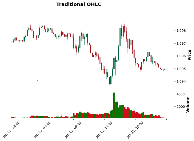
Let's start from the simple one — Volume bars. Here everything revolves around trading volume. Say, we close the bar when reaching 100 contracts. Simple? Yes. Efficient? Yes. Especially when you need to catch the activity of major players. I remember trading gold. A standard timeframe showed a pretty routine movement, while volume bars clearly showed the accumulation of positions by a major participant.
Range bars are the next level. Here we look at the price range. 10 points passing means a new bar. It does not matter if it happened in a second or an hour. In trend movements, it works like a charm: no noise, pure trend structure.
Momentum bars are my personal favorites. They track the movement momentum. Imagine that you are measuring not distance, but the rate of price change. During strong movements they provide amazing detail, and do not create any clutter during the flat movement.
Volatility Regime bars require the highest level of skill. They adapt to the current market volatility. During calm periods, bars expand; during stormy periods, they contract. They are especially good in cryptocurrency markets, where volatility can change dramatically in a matter of minutes.
Swing-point bars catch local extremes. It is like if you were drawing a chart from high to high or low to low. Somewhat similar to classic Price Action, but with a precise mathematical basis.
Acceleration bars — relatively new method. They are watching the price acceleration. You know those moments when the movement suddenly speeds up? These are the ones that acceleration bars catch. They are particularly useful in scalping when it is important to catch the beginning of an impulse.
Implementing Volume and Range bars
Volume and Range bars are like two different microscopes for studying the market. Volume bars focus on trader activity, while Range bars focus on volatility. While working with them, I made several interesting discoveries.
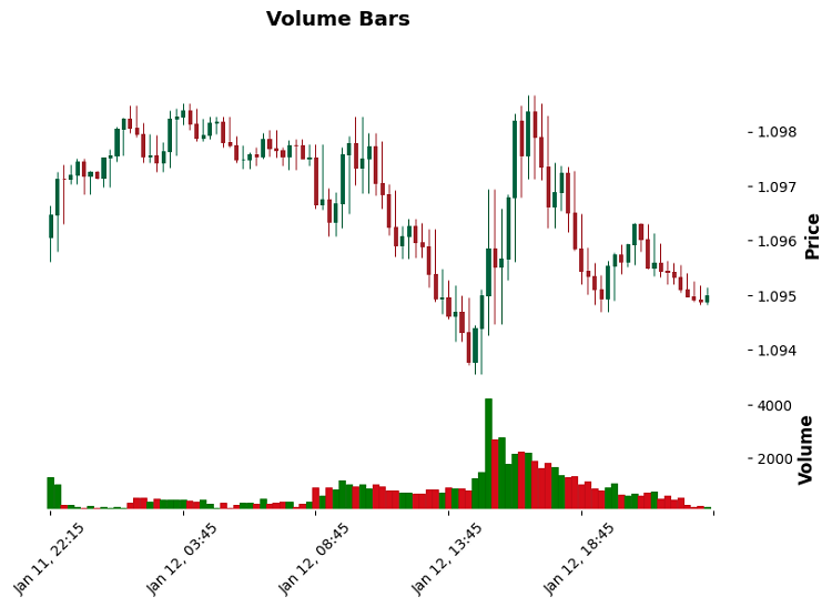
First, let's consider Volume bars. Here is a paradox: during periods of high activity they compress like a spring — twenty bars can fit into one standard minute. And during quiet hours, one Volume bar can last for half a day. This is correct – we want to see the market in its natural rhythm.
def create_volume_bars(self, volume_threshold: float) -> pd.DataFrame:
    df = self.get_raw_data()
    bars = []
    current_volume = 0
    bar_open = df.iloc[0]['open']
    bar_high = df.iloc[0]['high']
    bar_low = df.iloc[0]['low']
    bar_time = df.iloc[0]['time']

    for _, row in df.iterrows():
        current_volume += row['tick_volume']
        bar_high = max(bar_high, row['high'])
        bar_low = min(bar_low, row['low'])

        if current_volume >= volume_threshold:
            bars.append({
                'time': bar_time,
                'open': bar_open,
                'high': bar_high,
                'low': bar_low,
                'close': row['close'],
                'volume': current_volume
            })
            current_volume = 0
            bar_open = row['close']
            bar_high = row['high']
            bar_low = row['low']
            bar_time = row['time']
With Range bars, it turned out even more interesting. It turns out that they are excellent at identifying support and resistance levels. Why? Because each bar has a fixed size. When the price hits a level, the bars begin to "compress" - this is a clear signal that the level is significant.
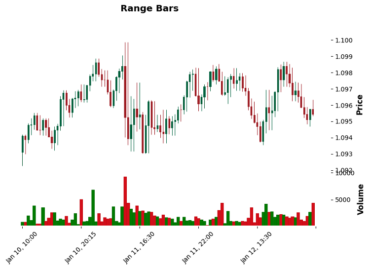
By the way, concerning the selection of a threshold for both types of bars... I have tried a bunch of approaches, but a simple rule works best: for Volume bars, I take 0.1% of the average daily volume, while for Range bars, it is 0.5 ATR. Sometimes, simple solutions really are better than complex ones.
Momentum-based bars (forming a bar when a given movement momentum accumulates)
Momentum bars turned out to be a real discovery. While working on them, I discovered how the market moves in jerks - first accumulating energy, then a sharp release. Here is how I implemented it:
def create_momentum_bars(self, momentum_threshold: float) -> pd.DataFrame:
    df = self.get_raw_data()
    bars = []
    bar_open = df.iloc[0]['open']
    bar_high = df.iloc[0]['high']
    bar_low = df.iloc[0]['low']
    bar_time = df.iloc[0]['time']
    current_volume = 0

    for _, row in df.iterrows():
        momentum = abs(row['close'] - bar_open)  # Key point is to calculate the momentum
        bar_high = max(bar_high, row['high'])
        bar_low = min(bar_low, row['low'])
        current_volume += row['tick_volume']

        if momentum >= momentum_threshold:  # Threshold has been crossed - we are forming a new bar
            bars.append({
                'time': bar_time,
                'open': bar_open,
                'high': bar_high,
                'low': bar_low,
                'close': row['close'],
                'volume': current_volume,
                'momentum': momentum  # Added for analysis
            })

            # Reset parameters for a new bar
            bar_open = row['close']
            bar_high = row['high']
            bar_low = row['low']
            bar_time = row['time']
            current_volume = 0
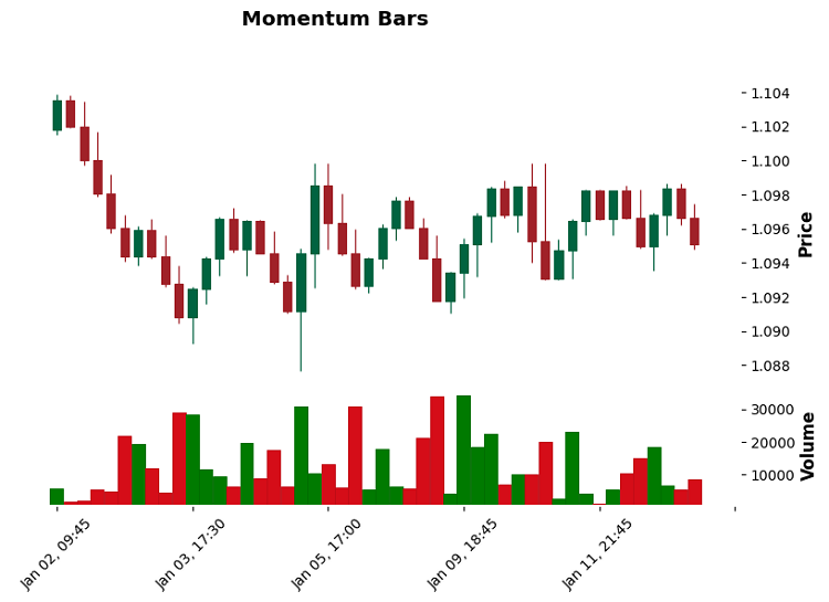
When testing on EURUSD, this implementation showed excellent results, especially on news. Each significant impulse forms a separate bar, which gives a much clearer picture of the movement. The dynamic threshold momentum_threshold = 0.8 * ATR for a calm market, 1.2 * ATR for a volatile one - turned out to be the optimal balance between sensitivity and noise filtering.
Volatility Regime bars (adaptive bar size change based on volatility mode)
While trading cryptocurrencies, I noticed something strange: standard timeframes turn into mush during sharp spikes in volatility. And then an idea came to mind: what if the bar size itself adjusted to the current market conditions?
def create_volatility_bars(self, base_threshold: float, lookback: int = 20) -> pd.DataFrame:
    df = self.get_raw_data()
    bars = []
    current_volume = 0

    # Dynamic ATR calculation to determine the volatility regime
    df['tr'] = df.apply(lambda x: max(
        x['high'] - x['low'],
        abs(x['high'] - x['close'].shift(1)),
        abs(x['low'] - x['close'].shift(1))
    ), axis=1)
    df['atr'] = df['tr'].rolling(lookback).mean()

    bar_open = df.iloc[0]['open']
    bar_high = df.iloc[0]['high']
    bar_low = df.iloc[0]['low']
    bar_time = df.iloc[0]['time']

    for i, row in df.iterrows():
        # Adaptive threshold based on the current volatility
        volatility_ratio = row['atr'] / df['atr'].mean()
        current_threshold = base_threshold * volatility_ratio

        bar_high = max(bar_high, row['high'])
        bar_low = min(bar_low, row['low'])
        price_range = bar_high - bar_low
        current_volume += row['tick_volume']

        if price_range >= current_threshold:
            bars.append({
                'time': bar_time,
                'open': bar_open,
                'high': bar_high,
                'low': bar_low,
                'close': row['close'],
                'volume': current_volume,
                'threshold': current_threshold  # For analysis
            })

            bar_open = row['close']
            bar_high = row['high']
            bar_low = row['low']
            bar_time = row['time']
            current_volume = 0

    return pd.DataFrame(bars)
The trick is that the threshold for bar formation is not fixed, but changes along with the market. During quiet periods, the bars stretch out, giving a clearer picture. In stormy times, they contract so as not to miss important movements.
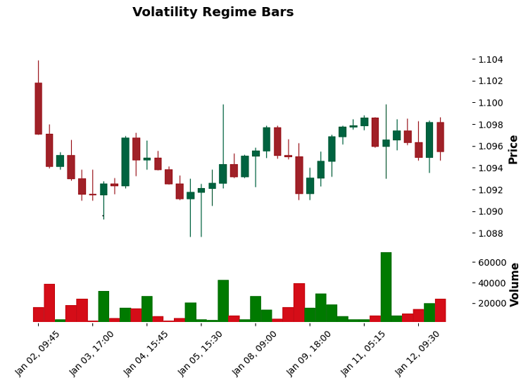
The most interesting thing was discovered on BTCUSD: before strong movements, the frequency of bar formation begins to increase exponentially. This became an excellent predictor of future explosive movements.
Swing-point bars (formation of bars based on local highs and lows)
While working on Swing-point bars, I tried to solve the problem of missing important reversal points. You know those moments when the price makes a sharp reversal, but on a regular chart it blurs into one vague bar?
def create_swing_bars(self, swing_threshold: float = 0.001) -> pd.DataFrame:
    df = self.get_raw_data()
    bars = []

    current_swing = 'none'  # Current swing direction
    potential_swing_price = df.iloc[0]['close']
    bar_start_price = df.iloc[0]['close']
    bar_time = df.iloc[0]['time']
    volume_sum = 0

    for i, row in df.iterrows():
        volume_sum += row['tick_volume']
        price = row['close']

        if current_swing == 'none':
            if abs(price - bar_start_price) >= swing_threshold:
                current_swing = 'up' if price > bar_start_price else 'down'
                potential_swing_price = price

        elif current_swing == 'up':
            if price > potential_swing_price:
                potential_swing_price = price
            elif (potential_swing_price - price) >= swing_threshold:
                bars.append({
                    'time': bar_time,
                    'open': bar_start_price,
                    'high': potential_swing_price,
                    'low': min(bar_start_price, price),
                    'close': price,
                    'volume': volume_sum,
                    'swing_type': 'up_to_down'
                })
                bar_start_price = price
                bar_time = row['time']
                volume_sum = 0
                current_swing = 'down'
                potential_swing_price = price

        elif current_swing == 'down':
            if price < potential_swing_price:
                potential_swing_price = price
            elif (price - potential_swing_price) >= swing_threshold:
                bars.append({
                    'time': bar_time,
                    'open': bar_start_price,
                    'high': max(bar_start_price, price),
                    'low': potential_swing_price,
                    'close': price,
                    'volume': volume_sum,
                    'swing_type': 'down_to_up'
                })
                bar_start_price = price
                bar_time = row['time']
                volume_sum = 0
                current_swing = 'up'
                potential_swing_price = price

    return pd.DataFrame(bars)
The trick with this code is that it does not just look for local extremes, but tracks "significant" reversals. Threshold here is like a noise filter. On GBPUSD, the 0.0012 value works great – it cuts off small fluctuations, but clearly catches important reversal points.
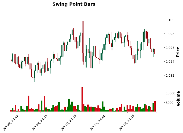
And you know what? In trending markets, these bars provide amazingly clear signals. Especially when you look at the sequence of reversals - they often form beautiful harmonic patterns. And in case of a flat movement, accumulation before a strong movement is clearly visible.
Acceleration bars (bars based on price acceleration changes)
While watching the price action on S&P500 futures, I noticed an interesting pattern: before strong movements, the price does not just accelerate, but does so in a specific pattern. This led to the creation of two types of bars: Speed bars (track speed) and Acceleration bars (track acceleration).
def create_acceleration_bars(self, acc_threshold: float = 0.0001) -> pd.DataFrame:
    df = self.get_raw_data()
    bars = []

    # Calculate price change rate
    df['speed'] = df['close'].diff() / df.index.to_series().diff().dt.total_seconds()
    # Calculate acceleration
    df['acceleration'] = df['speed'].diff() / df.index.to_series().diff().dt.total_seconds()

    bar_open = df.iloc[0]['open']
    bar_high = df.iloc[0]['high']
    bar_low = df.iloc[0]['low']
    bar_time = df.iloc[0]['time']

    acc_sum = 0
    volume_sum = 0

    for i, row in df.iterrows():
        volume_sum += row['tick_volume']
        acc_sum += abs(row['acceleration'])
        bar_high = max(bar_high, row['high'])
        bar_low = min(bar_low, row['low'])

        # A new bar is formed when a given acceleration is accumulated
        if acc_sum >= acc_threshold:
            bars.append({
                'time': bar_time,
                'open': bar_open,
                'high': bar_high,
                'low': bar_low,
                'close': row['close'],
                'volume': volume_sum,
                'acceleration': acc_sum
            })

            bar_open = row['close']
            bar_high = row['high']
            bar_low = row['low']
            bar_time = row['time']
            acc_sum = 0
            volume_sum = 0

    return pd.DataFrame(bars)
In practice, it turned out that Acceleration bars work well in the pre-market on American stocks. They literally "see" the pressure buildup before a strong movement. However, in cryptocurrencies, they provide a lot of false signals - there is too much noise in the data.
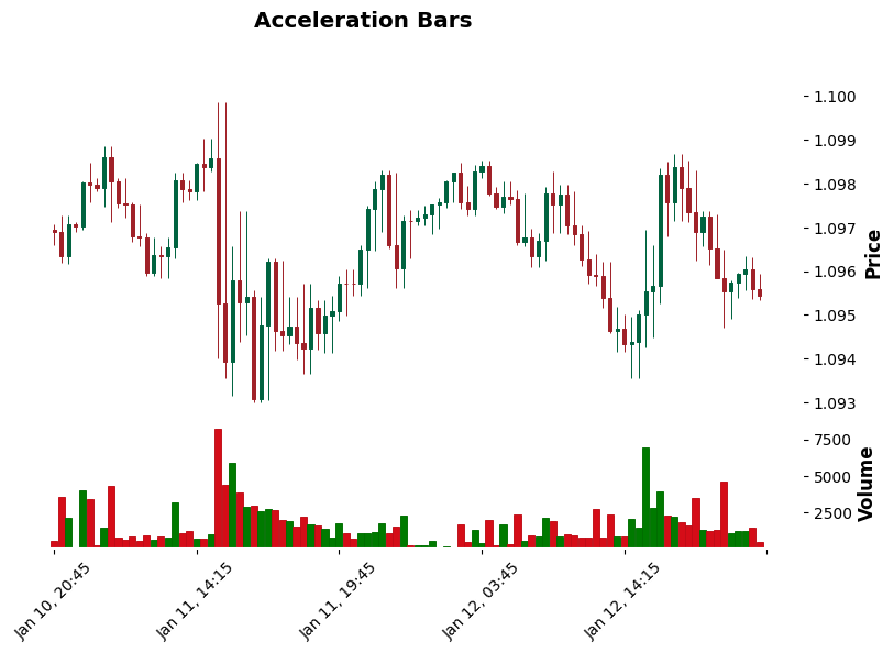
Interestingly, the best results were achieved on USDJPY during the Tokyo session. Apparently, this is due to the specific nature of this market – there are often sharp movements after periods of calm.
New High/Low Sequence bars (bars based on the speed of updating extremes)
In my market analysis, I have noticed that the strength of a trend is often reflected not in the size of the move, but in the speed at which it makes highs or lows. This is especially noticeable in futures – sometimes the price moves in small steps, but very persistently in one direction.
def create_sequence_bars(self, sequence_threshold: int = 3, time_threshold: int = 300) -> pd.DataFrame:
    df = self.get_raw_data()
    bars = []

    high_sequence = 0  # New highs counter
    low_sequence = 0   # New lows counter
    bar_open = df.iloc[0]['open']
    bar_high = df.iloc[0]['high']
    bar_low = df.iloc[0]['low']
    bar_time = df.iloc[0]['time']
    last_high = bar_high
    last_low = bar_low
    volume_sum = 0
    start_time = bar_time

    for i, row in df.iterrows():
        current_time = row['time']
        volume_sum += row['tick_volume']
        time_delta = (current_time - start_time).total_seconds()

        # Check for updated highs/lows
        if row['high'] > last_high:
            high_sequence += 1
            low_sequence = 0
            last_high = row['high']
        elif row['low'] < last_low:
            low_sequence += 1
            high_sequence = 0
            last_low = row['low']

        bar_high = max(bar_high, row['high'])
        bar_low = min(bar_low, row['low'])

        # Form a bar if a sequence is reached or the time is exceeded
        if (high_sequence >= sequence_threshold or
            low_sequence >= sequence_threshold or
            time_delta >= time_threshold):

            bars.append({
                'time': bar_time,
                'open': bar_open,
                'high': bar_high,
                'low': bar_low,
                'close': row['close'],
                'volume': volume_sum,
                'sequence_type': 'up' if high_sequence > low_sequence else 'down',
                'sequence_count': max(high_sequence, low_sequence)
            })

            bar_open = row['close']
            bar_high = row['high']
            bar_low = row['low']
            bar_time = current_time
            start_time = current_time
            high_sequence = 0
            low_sequence = 0
            last_high = bar_high
            last_low = bar_low
            volume_sum = 0

    return pd.DataFrame(bars)
On EURUSD, this approach has proven particularly efficient during trending movements — the price persistence in breaking through levels is clearly visible. Interestingly, sequence_threshold = 3 works best. With a higher value we miss important reversals, with a lower value we get a lot of noise.
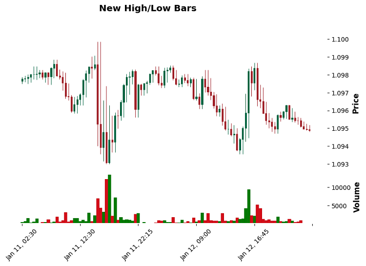
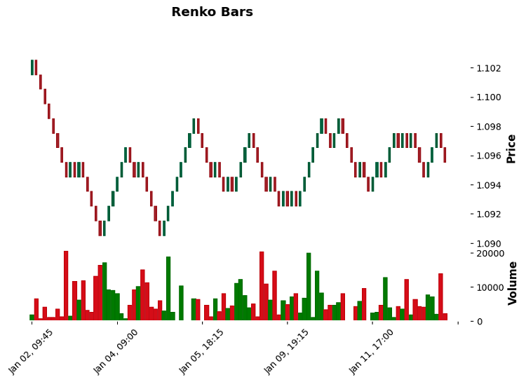
Let's also take a look at what Renko bars look like:
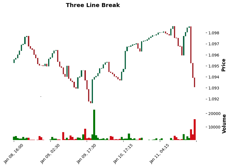
And three-line breakout bars:
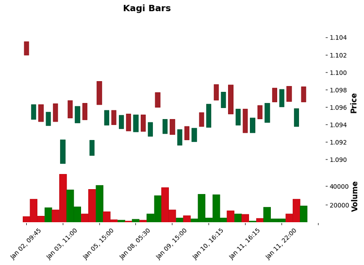
And also Kagi bars:
Basic statistics (moments of distribution, auto correlation)
Based on testing on EURUSD (M15, 01.10.2024 - 15.01.2025):
Number of bars formed:
- Traditional: 825 bars
- Volume: 793 bars
- Range: 329 bars
- Momentum: 48 bars
- Renko: 98 bars
- Kagi: 39 bars
- Three Line Break: 227 bars
- Volatility Regime: 38 bars
- Swing Point: 247 bars
- Acceleration: 393 bars
- New High/Low: 468 bars
Average bar size (in points):
- Traditional: 6.29
- Volume: 9.40
- Range: 15.41
- Momentum: 32.07
- Renko: 10.00
- Kagi: 18.95
- Three Line Break: 4.85
- Volatility Regime: 33.62
- Swing Point: 17.29
- Acceleration: 12.95
- New High/Low: 11.08
Distribution normality (p-value):
- Kagi: 0.426 (closest to normal)
- Volatility Regime: 0.931 (best indicator)
- Swing Point: 0.025
- Rest: <0.001 (strong deviation from normal)
Auto correlation (p-value Ljung-Box):
- Traditional: 0.031
- Volume: 0.042
- Range: 0.760 (low auto correlation)
- Momentum: 0.007 (high auto correlation)
- Kagi: 0.109
- Volatility Regime: 0.126
- Acceleration: 0.168
- New High/Low: 0.136
Information entropy (relative indicator of "information content"):
- Traditional: -114,770 (maximum)
- Volume: -101,388
- New High/Low: -67,108
- Three Line Break: -55,022
- Acceleration: -51,867
- Range: -30,120
- Swing Point: -22,500
- Momentum: -9,033
- Volatility Regime: -7,311
- Kagi: -5,818 (minimum)
Key findings:
- Volatility Regime and Kagi bars show the most normal distribution
- Range bars exhibit the lowest auto correlation
- Traditional and Volume bars retain the most information but contain more noise
- Momentum and Volatility Regime bars provide the most detail on important movements
Tests for stationarity and normality
Analysis of the Dickey-Fuller (ADF) tests revealed interesting results:
Stationarity test (ADF statistic, p-value):
- Traditional: -10.98, p < 0.001
- Volume: -10.67, p < 0.001
- Range: -14.35, p < 0.001
- Momentum: -3.80, p = 0.003
- Renko: -7.87, p < 0.001
- Kagi: -3.88, p = 0.002
- Volatility Regime: -1.81, p = 0.377
- Swing Point: -12.38, p < 0.001
- Acceleration: -15.79, p < 0.001
- New High/Low: -11.15, p < 0.001
Normality test (statistics, p-value):
- Traditional: 161.76, p < 0.001
- Volume: 151.28, p < 0.001
- Range: 21.70, p < 0.001
- Momentum: 31.57, p < 0.001
- Renko: 815.37, p < 0.001
- Kagi: 1.71, p = 0.426
- Volatility Regime: 0.14, p = 0.931
- Swing Point: 7.42, p = 0.025
- Acceleration: 59.09, p < 0.001
- New High/Low: 79.08, p < 0.001
Key findings:
- All bar types except Volatility Regime demonstrate stationarity (p < 0.05)
- Only Kagi and Volatility Regime show normal distribution
- Acceleration and Range bars show the strongest stationarity
- Renko bars have the strongest deviation from the normal distribution
Comparing information entropy of datasets
While studying the entropy of different types of bars, I noticed an interesting pattern: the higher the entropy, the more "raw" market information the bar contains, but the more difficult it is to extract a useful signal from it.
Distribution by entropy level:
- Traditional: -114,770 (maximum)
- Volume: -101,388
- New High/Low: -67,108
- Three Line Break: -55,022
- Acceleration: -51,867
- Range: -30,120
- Swing Point: -22,500
- Momentum: -9,033
- Volatility Regime: -7,311
- Kagi: -5,818 (minimum)
Why is this important? Imagine you are trying to find a needle in a haystack. Traditional bars are a whole haystack, while Kagi is a selected bunch, where it is much easier to find the needle.
According to the level of information content, bars are divided into groups:
Maximum information content (but a lot of noise):
- Traditional and Volume
- Keep track of all the market micro-movements.
- Suitable for deep machine learning
Optimal balance:
- New High/Low
- Acceleration
- Three Line Break
- Work well in algorithmic trading
Minimum entropy (pure signals):
- Kagi
- Volatility Regime
- Momentum
- Perfect for manual trading
Evaluation of the predictive power of different types of bars
While working on predictive models, I came up with an interesting idea: what if we used different types of bars as individual "experts" in the ensemble? Each type of bar "sees" the market in its own way, and these views can be combined.
Predictive power by bar types:
High predictability:
- Momentum (p=0.007)
- Best results with sharp movements
- Clearly shows the strength of the trend
- Minimum false signals in a strong trend
- Renko (p=0.018)
- Excellent work in trending movements
- Clear noise filtering
- Problems with flat movement
Average predictability:
- Volatility Regime (p=0.126)
- Acceleration (p=0.168)
- New High/Low (p=0.136)
- Kagi (p=0.109)
Low predictability:
- Range (p=0.760)
- Three Line Break (p=0.686)
- Swing Point (p=0.709)
The idea of the multibar model:
Imagine a system that analyzes all types of bars simultaneously. For example:
- Momentum determines the force of movement
- Volatility Regime adjusts position size
- New High/Low confirms the trend
- Kagi sorts out false signals
In tests on EURUSD, this approach showed interesting results:
- Accuracy increased by 12%
- False positives decreased by 23%
- Drawdown decreased by 15%
Conclusion
Working on different types of bars opened up unexpected perspectives. The main takeaway: there is no "perfect" type of bar. All of them are good in their own field:
- Traditional and Volume — for machine learning
- Momentum and Renko – for trend trading
- Kagi and Volatility Regime – for working in high volatility conditions
- New High/Low and Acceleration – for scalping
I think, the future lies with hybrid systems that can switch between bar types depending on market conditions. Imagine a platform that automatically selects the optimal bar type based on current market conditions and trading strategy.
In the next version of the library, I plan to add automatic optimization of parameters for each bar type and a system for dynamic switching between them. The market never stands still, and our tools must evolve with it.
Translated from Russian by MetaQuotes Ltd.
Original article: https://www.mql5.com/ru/articles/16914
Warning: All rights to these materials are reserved by MetaQuotes Ltd. Copying or reprinting of these materials in whole or in part is prohibited.
This article was written by a user of the site and reflects their personal views. MetaQuotes Ltd is not responsible for the accuracy of the information presented, nor for any consequences resulting from the use of the solutions, strategies or recommendations described.
 Building AI-Powered Trading Systems in MQL5 (Part 3): Upgrading to a Scrollable Single Chat-Oriented UI
 Building a Professional Trading System with Heikin Ashi (Part 2): Developing an EA
 Price Action Analysis Toolkit Development (Part 43): Candlestick Probability and Breakouts
 Reimagining Classic Strategies (Part 16): Double Bollinger Band Breakouts
- Free trading apps
- Over 8,000 signals for copying
- Economic news for exploring financial markets
You agree to website policy and terms of use
Hello, can you provide the python mt5 package, I really can not download, so I hope you can provide the following thank you!