
Quantitative Analysis of Trends: Collecting Statistics in Python

What quantitative trend analysis is in the forex market
Quantitative trend analysis is an approach that transforms chaotic market movements into an orderly system of numbers and patterns. In a world where most traders rely on intuition and visual assessment of charts, mathematical analysis of trend movements provides an undeniable advantage. Instead of subjective feelings, you receive precise data: the average trend duration in days, its typical value in points, and characteristic patterns of development and completion.
It is this objectivity that makes quantitative analysis the cornerstone of professional trading. William Eckhardt, a famous trader, rightly noted that trading is not a field of psychology, but a field of statistics. When you know that uptrends on the EURUSD pair statistically last longer than downtrends, or that 70% of trends on GBPUSD end before reaching 200 points, this is not just information, but a specific guide to action.
Why trend statistics are important
Imagine that you are driving a car in a fog. Without precision tools, you rely only on what you see in front of you. Quantitative analysis in trading is the very set of tools that make visible the things that are usually hidden from view. Knowing the average characteristics of movements, a trader can set profit goals more accurately, manage risk more efficiently, and determine the optimal time to hold positions.
But the main advantage of the quantitative approach is the ability to test hypotheses. Instead of making unfounded claims that "the trend is your friend" or "the market always returns to the average," you can mathematically prove or disprove these postulates for a specific currency pair over a specific time period.
Architecture of the analysis tool
Our quantitative trend analysis tool is implemented in Python and uses the MetaTrader 5 library to get data directly from the market. This allows you to work with up-to-date information and conduct research on various timeframes and currency pairs. Let's consider the key components of the program:
Initialization and data retrieval.
import MetaTrader5 as mt5
import pandas as pd
import numpy as np
import matplotlib
matplotlib.use('Agg')  # Non-interactive mode for saving charts
import matplotlib.pyplot as plt
from datetime import datetime, timedelta
import pytz
import os

def initialize_mt5():
    """Initializing connection to MetaTrader5"""
    if not mt5.initialize():
        print("Initialization error MT5")
        mt5.shutdown()
        return False
    return True

def get_eurusd_data(timeframe=mt5.TIMEFRAME_D1, bars_count=1000):
    """Downloading EURUSD historical data"""
    # Set time zone to UTC
    timezone = pytz.timezone("UTC")
    utc_now = datetime.now(timezone)

    # Get data
    eurusd_data = mt5.copy_rates_from_pos("EURUSD", timeframe, 0, bars_count)

    if eurusd_data is None or len(eurusd_data) == 0:
        print("Error retrieving EURUSD data")
        return None

    # Convert into pandas DataFrame
    df = pd.DataFrame(eurusd_data)

    # Convert time from timestamp to datetime
    df['time'] = pd.to_datetime(df['time'], unit='s')

    # Set time as index
    df.set_index('time', inplace=True)

    return df
This block of code initializes connection to the MetaTrader 5 terminal and downloads historical data. We use the pandas library to conveniently work with time series, which allows us to easily manipulate data and perform various calculations.
An important aspect is choosing the right timeframe. Daily charts (TIMEFRAME_D1) are suitable for long—term strategies, hourly charts (TIMEFRAME_H4 or TIMEFRAME_H1) are suitable for medium—term strategies, and minute charts (TIMEFRAME_M30 or TIMEFRAME_M15) are suitable for short-term strategies. Each timeframe will give a different picture of trends, and this variety of data can be used to build multi-level strategies.
Identifying trends
The heart of our analytical tool is the trend identification algorithm. It performs several key tasks: it finds local highs and lows, determines the sequence of these extremes, and generates trends based on them. Each trend is characterized by its type (Uptrend or Downtrend), start and end date, prices at these points, duration and magnitude.
def identify_trends(df, window_size=5):
    """
    Identification of local highs and lows to identify trends

    window_size: the size of a window for searching for local extremes
    """
    # Copy DataFrame so as not to change the original
    df_trends = df.copy()

    # Search for local highs and lows
    df_trends['local_max'] = df_trends['high'].rolling(window=window_size, center=True).apply(
        lambda x: x[window_size//2] == max(x), raw=True
    ).fillna(0).astype(bool)

    df_trends['local_min'] = df_trends['low'].rolling(window=window_size, center=True).apply(
        lambda x: x[window_size//2] == min(x), raw=True
    ).fillna(0).astype(bool)

    # Make structures for storing information about trends
    trends = []
    current_trend = {'start_idx': 0, 'start_price': 0, 'end_idx': 0, 'end_price': 0, 'type': None}

    local_max_idx = df_trends[df_trends['local_max']].index.tolist()
    local_min_idx = df_trends[df_trends['local_min']].index.tolist()

    # Combine and sort highs and lows by index
    all_extremes = [(idx, 'max', df_trends.loc[idx, 'high']) for idx in local_max_idx] + \
                  [(idx, 'min', df_trends.loc[idx, 'low']) for idx in local_min_idx]
    all_extremes.sort(key=lambda x: x[0])

    # Filter recurring local extremes
    filtered_extremes = []
    for i, extreme in enumerate(all_extremes):
        if i == 0:
            filtered_extremes.append(extreme)
            continue

        last_extreme = filtered_extremes[-1]
        if last_extreme[1] != extreme[1]:  # Different types (highs and lows)
            filtered_extremes.append(extreme)

    # Create trends based on sequence of extremes
    for i in range(1, len(filtered_extremes)):
        prev_extreme = filtered_extremes[i-1]
        curr_extreme = filtered_extremes[i]

        trend = {
            'start_date': prev_extreme[0],
            'start_price': prev_extreme[2],
            'end_date': curr_extreme[0],
            'end_price': curr_extreme[2],
            'duration': (curr_extreme[0] - prev_extreme[0]).days,
            'points': abs(curr_extreme[2] - prev_extreme[2]) * 10000,  # Convert to points
            'type': 'Uptrend' if curr_extreme[1] == 'max' else 'Downtrend'
        }

        # Add percentage change
        trend['percentage'] = (abs(trend['end_price'] - trend['start_price']) / trend['start_price']) * 100

        trends.append(trend)

    return pd.DataFrame(trends)
Special attention should be paid to the window_size parameter. It determines the size of the window for searching for local extremes and directly affects the quantity and characteristics of identified trends. With a small value, the program will find a lot of short trends, with a large one — fewer long-term movements. This allows you to adapt the analysis to specific trading strategies and time horizons.
Efficiency of the sliding window method
The sliding window method used in our algorithm has several advantages over other approaches to trend identification. Firstly, it is intuitive: a local high is a point where the price is higher than at neighboring points within a given window. Secondly, it is computationally efficient, which allows you to quickly process large amounts of data. Thirdly, by changing the window size, you can easily adjust the algorithm sensitivity.
However, there are limitations to this method. For example, it may skip some important price patterns that do not fit into the concept of local extremes. To eliminate these limitations, in future versions of the program it is planned to implement additional trend identification methods, such as wavelet analysis or time series segmentation.
Statistical analysis and visualization
Once trends have been identified, the real magic of quantitative analysis begins – statistical handling of retrieved data. The program calculates average values for the duration and magnitude of trends, analyzes their distribution, and visualizes the results in a form of various charts:
def analyze_trends(trend_df, output_dir):
    """Trend analysis and statistics printing with saving of results"""
    if trend_df.empty:
        print("No data available for trend analysis")
        return

    # Create file to save statistics
    stats_file = os.path.join(output_dir, 'trend_statistics.txt')
    with open(stats_file, 'w', encoding='utf-8') as f:
        # Basic statistics on all trends
        header = "=" * 50 + "\nOverall trend statistics:\n" + "=" * 50
        print(header)
        f.write(header + "\n")

        stats_text = f”Total number of trends: {len(trend_df)}\n"
        stats_text += f"Mean trend duration: {trend_df['duration'].mean():.2f} days\n"
        stats_text += f"Mean trend value: {trend_df['points'].mean():.2f} points\n"
        stats_text += f"Mean trend value: {trend_df['percentage'].mean():.2f}%\n"

        print(stats_text)
        f.write(stats_text)

        # Statistics on trend types
        up_trends = trend_df[trend_df['type'] == 'Uptrend']
        down_trends = trend_df[trend_df['type'] == 'Downtrend']

        up_stats = "Statistics on upward trends:\n"
        up_stats += f"Quantity: {len(up_trends)}\n"
        if not up_trends.empty:
            up_stats += f"Mean duration: {up_trends['duration'].mean():.2f} days\n"
            up_stats += f"Mean value: {up_trends['points'].mean():.2f} points\n"
            up_stats += f"Mean value: {up_trends['percentage'].mean():.2f}%\n"
            up_stats += f"Maximum value: {up_trends['points'].max():.2f} points\n"
            up_stats += f"Minimum value: {up_trends['points'].min():.2f} points\n"

        print(up_stats)
        f.write(up_stats)

        # Statistics on downtrends and other categories of trends...
Variety of visualizations for deep analysis
Visualization of the results is a key phase of the analysis. Charts make statistical data visual and allow you to quickly identify patterns. Our tool implements several types of visualizations:
def save_distribution_plots(trend_df, output_dir):
    """Creating and saving additional distribution charts"""
    # 1. Chart of trend distribution by magnitude
    plt.figure(figsize=(12, 8))
    up_trends = trend_df[trend_df['type'] == 'Uptrend']
    down_trends = trend_df[trend_df['type'] == 'Downtrend']

    plt.hist([up_trends['points'], down_trends['points']],
             bins=10, alpha=0.7, color=['green', 'red'],
             label=['Uptrends', 'Downtrends'])

    plt.title('Distribution of trend values (in points)')
    plt.xlabel('Trend value (points)')
    plt.ylabel('Number of trends')
    plt.grid(True, alpha=0.3)
    plt.legend()
    plt.tight_layout()
    plt.savefig(os.path.join(output_dir, 'trend_magnitude_distribution.png'))
    plt.close()

    # 2. Chart of trend distribution by duration
    plt.figure(figsize=(12, 8))
    plt.hist([up_trends['duration'], down_trends['duration']],
             bins=10, alpha=0.7, color=['green', 'red'],
             label=['Uptrends', 'Downtrends'])

    plt.title('Distribution of trend duration (in days)')
    plt.xlabel('Trend duration (days)')
    plt.ylabel('Number of trends')
    plt.grid(True, alpha=0.3)
    plt.legend()
    plt.tight_layout()
    plt.savefig(os.path.join(output_dir, 'trend_duration_distribution.png'))
    plt.close()

    # 3. Chart of the ratio of duration and magnitude of trends
    plt.figure(figsize=(12, 8))
    plt.scatter(up_trends['duration'], up_trends['points'],
                color='green', alpha=0.7, label='Uptrends')
    plt.scatter(down_trends['duration'], down_trends['points'],
                color='red', alpha=0.7, label='Downtrends')

    plt.title('Ratio of duration and magnitude of trends')
    plt.xlabel('Trend duration (days)')
    plt.ylabel('Trend magnitude (points)')
    plt.grid(True, alpha=0.3)
    plt.legend()
    plt.tight_layout()
    plt.savefig(os.path.join(output_dir, 'trend_correlation.png'))
    plt.close()
Each of these charts provides a unique insight into the characteristics of trends. The trend magnitude histogram shows how the trends are distributed by size in points. This allows you to determine which profit targets are realistic for a particular currency pair.
The trend duration histogram shows how many days trends usually last. This information is crucial for determining the optimal time to hold positions. The correlation chart of duration and magnitude allows you to understand whether there is a relationship between how long a trend lasts and how strong it eventually turns out to be.
Displaying trends on a price chart
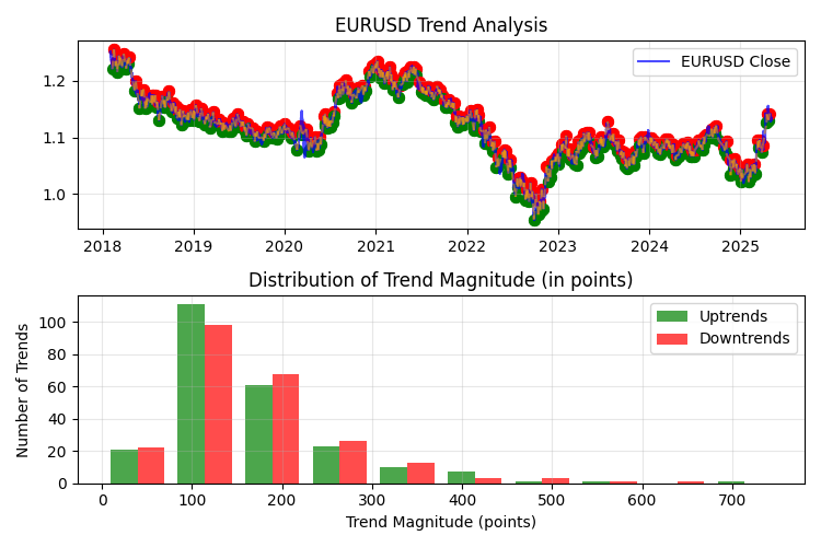
In addition to statistical charts, the program also creates a visualization of identified trends directly on the price chart. This allows you to clearly see what exactly the program considers to be a trend, and evaluate the quality of the algorithm:
def plot_trends(df, trend_df, output_dir):
    """Visualization of trends on a chart with saving"""
    plt.figure(figsize=(15, 10))

    # Main price chart
    plt.subplot(2, 1, 1)
    plt.plot(df.index, df['close'], label='EURUSD Close', color='blue', alpha=0.7)
    plt.title('EURUSD Trend Analysis')
    plt.grid(True, alpha=0.3)
    plt.legend()

    # Mark local highs and lows
    for _, trend in trend_df.iterrows():
        start_color = 'green' if trend['type'] == 'Uptrend' else 'red'
        end_color = 'red' if trend['type'] == 'Downtrend' else 'green'

        # Starting point of trend
        plt.scatter(trend['start_date'], trend['start_price'], color=start_color, s=50)

        # Endpoint of trend
        plt.scatter(trend['end_date'], trend['end_price'], color=end_color, s=50)

        # Trend line
        plt.plot([trend['start_date'], trend['end_date']],
                 [trend['start_price'], trend['end_price']],
                 color='orange', alpha=0.5, linestyle='--')

    # The second distribution chart
    # ...
Advanced statistical trend analysis
A simple analysis of averages and distributions is just the beginning. For a really deep understanding of characteristics of trends, it is necessary to use more sophisticated statistical methods. In future versions of the program, it is planned to implement trend seasonality analysis, Markov models for trend forecasting, and correlation analysis between currency pairs.
Many currency pairs exhibit seasonal patterns in trend behavior. For example, some studies show that during the summer months, the volatility and, consequently, the magnitude of trends on EURUSD decreases. The analysis of seasonality will allow us to identify such patterns and adapt trading strategies depending on a season.
Markov chains are a mathematical tool that can be used to model trend sequences. If the current trend is downtrend, what is the probability that the next one will be uptrend? Does the magnitude of the next trend depend on the magnitude of the previous one? Markov models will help answer these questions and build probabilistic forecasts of market development.
Different currency pairs often show correlation in trend movements. For example, if a strong uptrend begins on EURUSD, then a similar movement is often observed on GBPUSD. Analysis of cross-correlations of trends between currency pairs can provide valuable information for the development of multi-currency strategies.
Application of analysis results in trading
The collected statistics are not just a set of interesting numbers, but a direct guide to action for a trader. For example, if the analysis shows that on EURUSD, uptrends average 280 points and downtrends 220 points, this significantly affects the setting of profit targets and stop losses.
Optimization of indicator parameters
Many popular technical analysis indicators, such as moving averages or oscillators, require indicating a period to calculate. These periods are often chosen arbitrarily (14, 20, 50, etc.), without taking into account the specifics of a particular currency pair. Quantitative trend analysis allows you to select indicator periods based on the actual characteristics of the market.
For example, if the analysis shows that the average duration of the trend on EURUSD is 15 days, then using a 15-period moving average would be more reasonable than using the standard 20-period moving average. For a fast moving average, the optimal period is 8-10 days, and for a slow moving average, 16-20 days. The 14-day ADX period will enable us to effectively track current trends, and setting Parabolic SAR with parameters step=0.02 and maximum=0.2 will match the characteristics of identified trends. Such fine-tuning of indicators based on objective data significantly increases their performance.
Developing entry and exit strategies based on statistics
Trend distribution statistics can be used to develop a system for entering and exiting a market. Knowing the typical duration of trends, you can develop a strategy that automatically closes a position after a certain number of days, even if the target profit is not reached. This can prevent situations where a potential profit turns into a loss due to a trend reversal.
The most effective strategy may be to partially close positions at different profit levels. The first part of the position is closed when a relatively small but highly probable profit is achieved, the second — when the average trend value for a given currency pair is reached, and the remaining part is held with a trailing stop for the potential capture of a large trend.
Adaptive trading systems
A particularly valuable result of quantitative analysis is the ability to create adaptive trading systems that adjust their parameters depending on the current state of the market. For example, if the analysis shows that during periods of high volatility, the average trend value increases by 40%, the system can automatically adjust profit targets when such conditions are detected.
Another example of an adaptive strategy is altering parameters depending on the type of trend. If statistics show that uptrends last longer on average and are larger than downtrends, the system can apply different entry and exit rules for different types of trends.
The results of trend analysis on EURUSD
Methodology and data
The presented quantitative analysis of trends of the EURUSD currency pair is executed based on an hourly timeframe (H1) using historical data for the period from February 2018 to May 2025. For the study, 45,000 price bars were analyzed. This represents more than 7 years of trading history. A 100-bar window was used as a trend identification parameter, which enabled us to identify medium- and long-term trend movements, filtering out market noise and short-term price fluctuations.
General trend statistics
During the period considered, the algorithm identified 471 trend movements, almost evenly distributed along the direction: 236 uptrends and 235 downtrends. This balance suggests no long-term directional bias in EURUSD and confirms the pair’s structural neutrality.
The average duration of the trend was 5.11 days, which, with an hourly timeframe, corresponds to about 120 hours of continuous directional movement. This is an important metric for medium-term traders, as it determines the optimal time to hold a position.
The average trend value, which is 167.37 points (1.51% of the price), represents a significant movement, which, with proper capital management, allows you to make a significant profit. It is noteworthy that the downward trends turned out to be, on average, slightly stronger than the upward ones (170.09 versus 164.67 points), which may indicate some asymmetry in market psychology, where panic sales develop more intensively than upward movements.
Trend distribution by magnitude
An analysis of trend distribution by magnitude revealed that the majority of movements (51.59%) are in the range of 100-200 points. This is critical information for setting profit goals: it is in this range that the "golden mean" between the probability of achieving the goal and the magnitude of potential profit is located.
Trends of 50-100 points account for 19.11% of the total, and movements over 200 points account for 25.47%. Extremely strong trends (over 500 points) are especially rare, accounting for only 1.27% of all identified movements.
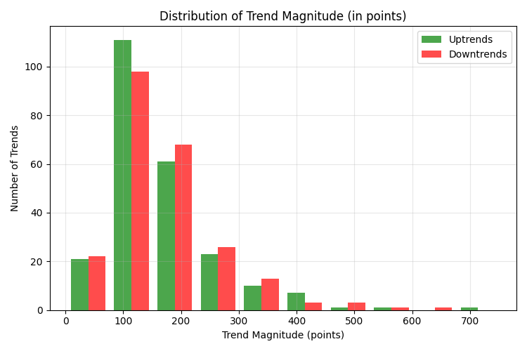
A small number of trends of less than 50 points (3.82%) is explained by a significant size of the identification window (100 bars), which filters out short-term price fluctuations.
Trend distribution by duration
More than half of all identified trends (56.69%) have a duration of up to 5 days. Another 28.87% of trends last from 5 to 10 days. Thus, the vast majority — 85.56% of trend movements — are completed within 10 days. Long-term trends lasting more than 10 days are much less common (8.92% for the range of 10-20 days and only 0.64% for the range of 20-30 days).
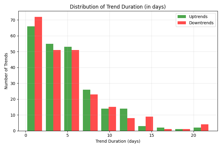
This data has a direct practical application: holding a position for more than 10 days significantly reduces the likelihood of capturing a full trend movement, since most trends are already coming to an end by this point. The optimal period for holding a position is 3-7 days.
Analysis of the strongest trends
The top 5 strongest trends demonstrate outstanding market movements that significantly exceed the average characteristics:
- An uptrend of November 2022, lasting 12 days and measuring 751.20 points (7.72%)
- A downward trend of June-July 2022, lasting 21 days and measuring 653.60 points (6.16%)
- A downward trend of April-May 2018, lasting 22 days and measuring 591.10 points (4.76%)
- An uptrend of February-March 2025, lasting 10 days and measuring 587.10 points (5.67%)
- An uptrend of May-June 2020, lasting 10 days and measuring 513.30 points (4.72%)
Note, that all five of the most powerful trends have a duration above the average (from 10 to 22 days) and occur during periods of significant economic events: the COVID-19 pandemic (2020), the inflationary crisis (2022) and the Trump tariff war in 2025.
Out of the five strongest trends, three are uptrends and two are downtrends, which indicates the possibility of extreme movements in both directions.
Practical conclusions for trading
Based on the analysis, we can formulate a number of practical recommendations for trading EURUSD:
- When developing a trading strategy, it makes sense to focus on the average trend value of 150-180 points as a target profit. More ambitious goals (over 200 points) are achievable in about 25% of cases.
- The optimal time to hold a position is 3-7 days. Whereas, it makes sense to use a trailing stop to potentially capture longer and stronger movements.
- When setting up technical analysis indicators for the EURUSD hourly chart, it is recommended to take into account the average trend duration. For moving averages, the optimal periods are 100-120 hours (corresponding to the average trend duration).
- Given the almost identical characteristics of uptrends and downtrends, symmetrical strategies can be used to trade in both directions.
- Special attention should be paid to periods of increased volatility and significant economic events, since they account for the strongest trend movements.
Trend distribution and the problem of grid strategies
The analysis revealed a characteristic feature of the distribution of trends on EURUSD — a pronounced "heavy tail" on the right side of the distribution. Although most trends (about 70-75%) have a value of up to 200 points, a significant statistical mass consists of rare but extremely strong movements reaching 500-750 points.

This distribution structure has fundamental implications for algorithmic trading, especially for grid strategies. Mathematical analysis shows that grid strategies based on averaging positions against the trend are critically vulnerable precisely because of the existence of this "heavy tail" of distribution.
The principle of the grid strategy is in opening additional positions as the price moves against the initial position. However, the mathematical problem is as follows: with a fixed account size and a limited number of possible additional positions, any grid strategy has a finite "grid depth". The strongest trends we have identified (500+ points) are highly likely to exceed this depth, which will lead to catastrophic losses.
The key factor is risk asymmetry. The consistent short-term profitability of grid strategies creates an illusion of reliability. However, a single extreme move can destroy all accumulated profits and result in a complete loss of capital. Mathematically, this is described by the formula of expected return, where the expected result E(R) is equal to the sum of the products of the probabilities of events and their results.
For grid strategies on EURUSD, in 75% of cases (trends up to 200 points), positive returns of 5-10% of capital are observed; in 24% of cases (trends of 200-500 points), near—zero or negative returns of 10-30%; and in 1% of cases (trends over 500 points), catastrophic losses of 50-100% of the capital. With such a distribution of results, even with a high probability of local profit, the mathematical expectation in the long run becomes negative, due to rare but devastating events.
Pyramiding along the trend: mathematical justification of effectiveness
Against the background of identified problems of grid strategies, quantitative analysis demonstrates mathematical validity of the opposite approach — pyramiding along trend. This strategy consists in sequential building up the position in the direction of a developing trend.
The mathematical advantage of pyramiding is based on exploiting exactly the "heavy tail" of distribution, which is detrimental to grid strategies. The key factor is the positive correlation between the duration and magnitude of the trend. The analysis showed that long-term trends are highly likely to be larger. This means that the longer a trend develops, the higher the mathematical probability of its further development to significant levels.
During pyramiding, each subsequent position opens in profit relative to the initial entry point. This creates the effect of compounding (compound interest), where profitability grows not linearly, but exponentially. Rare but extremely strong trends can generate disproportionately high profits during pyramiding. For example, a 700-point trend with three pyramiding points can yield returns equivalent to dozens of successful operations on conventional trends.
The mathematical formula for expected returns in pyramiding also changes its structure: the stronger the trend, the more points for pyramiding and the higher the final return; the risk for each subsequent position can decrease by moving the stop loss to breakeven as the trend develops; and with strict adherence to the rules of money management, the maximum loss is limited to a predetermined percentage from the deposit.
For the practical implementation of pyramiding in algorithmic trading, the optimal points to add positions are the movements of 80-100 points for the first addition, 150-170 points for the second one, and 200-250 points for the third one. Limiting the overall risk across the entire range of positions to 2-3% of capital allows you to effectively manage drawdowns even during a series of unsuccessful trades, while maintaining the potential to capture rare but extremely profitable price extremes.
Thus, a quantitative analysis of the EURUSD trend distribution demonstrates that pyramiding positions along the trend is a mathematically sound strategy with a positive long-term expectation, unlike grid approaches that are critically vulnerable to the "heavy tail" of trend distribution.
Conclusion
A quantitative analysis of EURUSD trends on an hourly timeframe revealed consistent patterns in the behavior of this currency pair. The medium-term nature of most trends, with a duration of about 5 days and a value of 150-180 points, presents significant opportunities for trading.
The obtained results create an objective foundation for developing trading strategies adapted to the real characteristics of the EURUSD market. Using this data, traders can set realistic profit targets, optimize position holding times, and adjust technical indicator parameters according to identified patterns.
Further development of this research may include analysis of trend seasonality, influence of economic events on the characteristics of trend movements, and the development of adaptive trading systems that adjust their parameters depending on the current market context.
Translated from Russian by MetaQuotes Ltd.
Original article: https://www.mql5.com/ru/articles/18035
Warning: All rights to these materials are reserved by MetaQuotes Ltd. Copying or reprinting of these materials in whole or in part is prohibited.
This article was written by a user of the site and reflects their personal views. MetaQuotes Ltd is not responsible for the accuracy of the information presented, nor for any consequences resulting from the use of the solutions, strategies or recommendations described.

- Free trading apps
- Over 8,000 signals for copying
- Economic news for exploring financial markets
You agree to website policy and terms of use
Very interesting work! But still, in my opinion, trading is both statistics and psychology - if only because financial markets are economic-behavioural systems. And today it is even more acute - markets react instantly to what Trump or Musk said, for example.