
Creación de barras 3D basadas en el tiempo, el precio y el volumen

Introducción
Han pasado seis meses desde que empecé este proyecto. Seis meses de una idea que me parecía tonta, y a la que no volví, limitándome a discutir la creación de este tipo de cotizaciones con mis compañeros de profesión.
Todo empezó con una simple pregunta: ¿por qué los tráders se empeñan en analizar un mercado tridimensional mirando gráficos bidimensionales? La acción del precio, el análisis técnico, la teoría de las ondas: todo funciona con la proyección del mercado en un plano. Pero, ¿y si intentamos ver la estructura real del precio, el volumen y el tiempo?
En mi trabajo sobre sistemas algorítmicos, he constatado de forma sistemática que los indicadores tradicionales pasan por alto las relaciones críticas entre precio y volumen.
La idea de las barras en 3D no nació inmediatamente. Primero experimenté con la visualización en 3D de la profundidad del mercado. Luego llegaron los primeros esbozos de clústeres volume-price. Y cuando añadí el componente temporal y construí la primera barra en 3D, se hizo evidente que resultaba una forma fundamentalmente nueva de ver el mercado.
Hoy quiero compartir con usted los resultados de este trabajo. Así, le mostraré cómo Python y MetaTrader 5 nos permiten construir barras volumétricas en tiempo real. Además, le hablaré de las matemáticas que hay detrás de los cálculos y de cómo utilizar esta información en la práctica del trading.
¿Qué tiene de diferente una barra 3D?
Observando el mercado a través del prisma de los gráficos bidimensionales, nos perdemos lo más importante: su estructura real. El análisis técnico tradicional funciona con proyecciones precio-tiempo y volumen-tiempo, pero nunca muestra la imagen completa de la interacción de dichos componentes.
El análisis 3D es fundamentalmente distinto, ya que permite ver el mercado en su conjunto. Cuando construimos una barra volumétrica, estamos creando literalmente un "molde" de las condiciones del mercado, donde cada dimensión porta información crítica:
- la altura de la barra muestra la amplitud del movimiento del precio
- la anchura refleja la escala temporal
- la profundidad visualiza la distribución del volumen
¿Por qué esto es tan importante? Imagine dos movimientos de precio idénticos en un gráfico. En la vista bidimensional, parecen idénticos. Pero al añadirle el componente del volumen, el panorama cambia radicalmente: un movimiento puede estar respaldado por un volumen masivo, formando una barra profunda y estable, mientras que el otro resulta ser un pico superficial con un apoyo mínimo para las transacciones reales.
El enfoque integral con barras 3D resuelve un problema clásico del análisis técnico: las señales rezagadas. La estructura volumétrica de la barra empieza a formarse desde los primeros ticks, lo cual permite ver el nacimiento de un movimiento fuerte mucho antes de su manifestación en un gráfico normal. En esencia, obtenemos una herramienta de análisis predictivo basada no en patrones históricos, sino en la dinámica real del trading actual.
El análisis multivariante de datos no solo supone una bonita visualización, sino una forma fundamentalmente nueva de entender la microestructura del mercado. Cada barra 3D contiene información sobre:
- la distribución del volumen dentro de la gama de precios
- la tasa de acumulación de posiciones
- los desequilibrios entre compradores y vendedores
- la volatilidad a nivel micro
- los impulsos de movimiento
Todos estos componentes funcionan como un mecanismo único que permite ver la verdadera naturaleza del movimiento de los precios. Allá donde el análisis técnico clásico solo ve una vela o una barra, el análisis 3D muestra la compleja estructura de las interacciones de la oferta y la demanda.
Fórmulas para calcular las métricas básicas. Principios básicos de la construcción de barras 7D. Lógica de combinación de diferentes dimensiones en un único sistema
El modelo matemático de barras tridimensionales surgió del análisis de la microestructura del mercado real. Y es que cada barra del sistema puede representarse como una cifra volumétrica, donde:
class Bar3D:
    def __init__(self):
        self.price_range = None  # Price range
        self.time_period = None  # Time interval
        self.volume_profile = {} # Volume profile by prices
        self.direction = None    # Movement direction
        self.momentum = None     # Impulse
        self.volatility = None   # Volatility
        self.spread = None       # Average spread
El punto clave supone el cálculo del perfil de volumen dentro de la barra. A diferencia de las barras clásicas, analizamos la distribución del volumen sobre los niveles de precios.
def calculate_volume_profile(self, ticks_data):
    volume_by_price = defaultdict(float)

    for tick in ticks_data:
        price_level = round(tick.price, 5)
        volume_by_price[price_level] += tick.volume

    # Normalize the profile
    total_volume = sum(volume_by_price.values())
    for price in volume_by_price:
        volume_by_price[price] /= total_volume

    return volume_by_price
El impulso se calcula como una combinación de la velocidad de variación del precio y el volumen:
def calculate_momentum(self):
    price_velocity = (self.close - self.open) / self.time_period
    volume_intensity = self.total_volume / self.time_period
    self.momentum = price_velocity * volume_intensity * self.direction
Se presta especial atención al análisis de la volatilidad dentro de la barra. Usamos una fórmula ATR modificada que considera la microestructura del movimiento:
def calculate_volatility(self, tick_data):
    tick_changes = np.diff([tick.price for tick in tick_data])
    weighted_std = np.std(tick_changes * [tick.volume for tick in tick_data[1:]])
    time_factor = np.sqrt(self.time_period)
    self.volatility = weighted_std * time_factor
La diferencia fundamental respecto a las barras clásicas es que todas las métricas se calculan en tiempo real, lo cual permite ver la formación de la estructura de la barra:
def update_bar(self, new_tick):
    self.update_price_range(new_tick.price)
    self.update_volume_profile(new_tick)
    self.recalculate_momentum()
    self.update_volatility(new_tick)

    # Recalculate the volumetric center of gravity
    self.volume_poc = self.calculate_poc()
Todas las mediciones se combinan usando un sistema de ponderación específico para cada instrumento:
def calculate_bar_strength(self):
    return (self.momentum_weight * self.normalized_momentum +
            self.volatility_weight * self.normalized_volatility +
            self.volume_weight * self.normalized_volume_concentration +
            self.spread_weight * self.normalized_spread_factor)
En el trading real, este modelo matemático permite ver aspectos del mercado como:
- los desequilibrios en la acumulación de volumen
- las anomalías en la velocidad de formación de precios
- las zonas de consolidación y ruptura
- la verdadera fuerza de la tendencia a través de las características del volumen
Cada barra tridimensional se convierte no solo en un punto del gráfico, sino en un indicador completo del estado del mercado en un momento determinado.
Análisis detallado del algoritmo de creación de barras tridimensionales. Características del trabajo con MetaTrader 5. Particularidades del procesamiento de datos
Tras depurar el algoritmo básico, por fin llegué a la parte más interesante: la implementación en tiempo real de barras multidimensionales. Lo admito, al principio parecía una tarea nada sencilla. MetaTrader 5 no se muestra particularmente amigable con los scripts externos, y la documentación cojea bastante en algunos lugares. Pero déjeme contarle cómo logré dar finalmente con la clave.
Empecé con una estructura básica para almacenar datos. Después de varias iteraciones, nació esta clase:
class Bar7D:
    def __init__(self):
        self.time = None
        self.open = None
        self.high = None
        self.low = None
        self.close = None
        self.tick_volume = 0
        self.volume_profile = {}
        self.direction = 0
        self.trend_count = 0
        self.volatility = 0
        self.momentum = 0
Lo más difícil fue averiguar cómo calcular correctamente el tamaño del bloque. Tras muchos experimentos, me decidí por esta fórmula:
def calculate_brick_size(symbol_info, multiplier=45):
    spread = symbol_info.spread
    point = symbol_info.point
    min_price_brick = spread * multiplier * point

    # Adaptive adjustment for volatility
    atr = calculate_atr(symbol_info.name)
    if atr > min_price_brick * 2:
        min_price_brick = atr / 2

    return min_price_brick
Con los volúmenes también lo pasé fatal. Al principio quería usar un tamaño volume_brick fijo, pero rápidamente me di cuenta de que eso no funcionaría. La solución llegó como algoritmo adaptativo:
def adaptive_volume_threshold(tick_volume, history_volumes):
    median_volume = np.median(history_volumes)
    std_volume = np.std(history_volumes)

    if tick_volume > median_volume + 2 * std_volume:
        return median_volume + std_volume
    return max(tick_volume, median_volume / 2)
Sin embargo, creo que me pasé un poco con el cálculo de las métricas estadísticas:
def calculate_stats(df):
    df['ma_5'] = df['close'].rolling(5).mean()
    df['ma_20'] = df['close'].rolling(20).mean()
    df['volume_ma_5'] = df['tick_volume'].rolling(5).mean()
    df['price_volatility'] = df['price_change'].rolling(10).std()
    df['volume_volatility'] = df['tick_volume'].rolling(10).std()
    df['trend_strength'] = df['trend_count'] * df['direction']

    # This is probably too much
    df['zscore_price'] = stats.zscore(df['close'], nan_policy='omit')
    df['zscore_volume'] = stats.zscore(df['tick_volume'], nan_policy='omit')
    return df
Es curioso, pero lo más difícil no fue escribir el código, sino depurarlo en condiciones reales.
Aquí está el resultado final de la función, donde también existe una normalización en el rango 3-9. ¿Por qué 3-9? Tanto Gunn como Tesla afirmaban que había algo mágico oculto en dichas cifras. También vi personalmente a un tráder de una conocida plataforma que supuestamente creó un exitoso script de detección de reversiones basado en estos números. No voy a sumergirme en teorías conspirativas y misticismo, simplemente lo intentaré:
def create_true_3d_renko(symbol, timeframe, min_spread_multiplier=45, volume_brick=500, lookback=20000):
    """
    Creates 3D Renko bars with extended analytics
    """
    rates = mt5.copy_rates_from_pos(symbol, timeframe, 0, lookback)
    if rates is None:
        print(f"Error getting data for {symbol}")
        return None, None

    df = pd.DataFrame(rates)
    df['time'] = pd.to_datetime(df['time'], unit='s')

    if df.isnull().any().any():
        print("Missing values detected, cleaning...")
        df = df.dropna()
        if len(df) == 0:
            print("No data for analysis after cleaning")
            return None, None

    symbol_info = mt5.symbol_info(symbol)
    if symbol_info is None:
        print(f"Failed to get symbol info for {symbol}")
        return None, None

    try:
        min_price_brick = symbol_info.spread * min_spread_multiplier * symbol_info.point
        if min_price_brick <= 0:
            print("Invalid block size")
            return None, None
    except AttributeError as e:
        print(f"Error getting symbol parameters: {e}")
        return None, None

    # Convert time to numeric and scale everything
    scaler = MinMaxScaler(feature_range=(3, 9))

    # Convert datetime to numeric (seconds from start)
    df['time_numeric'] = (df['time'] - df['time'].min()).dt.total_seconds()

    # Scale all numeric data together
    columns_to_scale = ['time_numeric', 'open', 'high', 'low', 'close', 'tick_volume']
    df[columns_to_scale] = scaler.fit_transform(df[columns_to_scale])

    renko_blocks = []
    current_price = float(df.iloc[0]['close'])
    current_tick_volume = 0
    current_time = df.iloc[0]['time']
    current_time_numeric = float(df.iloc[0]['time_numeric'])
    current_spread = float(symbol_info.spread)
    current_type = 0
    prev_direction = 0
    trend_count = 0

    try:
        for idx, row in df.iterrows():
            if pd.isna(row['tick_volume']) or pd.isna(row['close']):
                continue

            current_tick_volume += float(row['tick_volume'])
            volume_bricks = int(current_tick_volume / volume_brick)

            price_diff = float(row['close']) - current_price
            if pd.isna(price_diff) or pd.isna(min_price_brick):
                continue

            price_bricks = int(price_diff / min_price_brick)

            if volume_bricks > 0 or abs(price_bricks) > 0:
                direction = np.sign(price_bricks) if price_bricks != 0 else 1

                if direction == prev_direction:
                    trend_count += 1
                else:
                    trend_count = 1

                renko_block = {
                    'time': current_time,
                    'time_numeric': float(row['time_numeric']),
                    'open': float(row['open']),
                    'close': float(row['close']),
                    'high': float(row['high']),
                    'low': float(row['low']),
                    'tick_volume': float(row['tick_volume']),
                    'direction': float(direction),
                    'spread': float(current_spread),
                    'type': float(current_type),
                    'trend_count': trend_count,
                    'price_change': price_diff,
                    'volume_intensity': float(row['tick_volume']) / volume_brick,
                    'price_velocity': price_diff / (volume_bricks if volume_bricks > 0 else 1)
                }

                if volume_bricks > 0:
                    current_tick_volume = current_tick_volume % volume_brick
                if price_bricks != 0:
                    current_price += min_price_brick * price_bricks

                prev_direction = direction
                renko_blocks.append(renko_block)

    except Exception as e:
        print(f"Error processing data: {e}")
        if len(renko_blocks) == 0:
            return None, None

    if len(renko_blocks) == 0:
        print("Failed to create any blocks")
        return None, None

    result_df = pd.DataFrame(renko_blocks)

    # Scale derived metrics to same range
    derived_metrics = ['price_change', 'volume_intensity', 'price_velocity', 'spread']
    result_df[derived_metrics] = scaler.fit_transform(result_df[derived_metrics])

    # Add analytical metrics using scaled data
    result_df['ma_5'] = result_df['close'].rolling(5).mean()
    result_df['ma_20'] = result_df['close'].rolling(20).mean()
    result_df['volume_ma_5'] = result_df['tick_volume'].rolling(5).mean()
    result_df['price_volatility'] = result_df['price_change'].rolling(10).std()
    result_df['volume_volatility'] = result_df['tick_volume'].rolling(10).std()
    result_df['trend_strength'] = result_df['trend_count'] * result_df['direction']

    # Scale moving averages and volatility
    ma_columns = ['ma_5', 'ma_20', 'volume_ma_5', 'price_volatility', 'volume_volatility', 'trend_strength']
    result_df[ma_columns] = scaler.fit_transform(result_df[ma_columns])

    # Add statistical metrics and scale them
    result_df['zscore_price'] = stats.zscore(result_df['close'], nan_policy='omit')
    result_df['zscore_volume'] = stats.zscore(result_df['tick_volume'], nan_policy='omit')
    zscore_columns = ['zscore_price', 'zscore_volume']
    result_df[zscore_columns] = scaler.fit_transform(result_df[zscore_columns])

    return result_df, min_price_brick
Y así es como se ve la serie de barras obtenida en una escala unificada. No es muy estacionaria, ¿verdad?
Como entenderá, no quedé satisfecho con esa serie, ya que me proponía crear una serie más o menos estacionaria: una serie estacionaria de tiempo-volumen-precio. Y esto es lo que hice a continuación:
Introducimos la medida de volatilidad y hacemos magia
Durante la implementación de create_stationary_4d_features, tomé un camino fundamentalmente diferente. A diferencia de las barras 3D originales, en las que simplemente escalamos los datos en el intervalo 3-9, aquí me concentré en crear series realmente estacionarias.
La idea clave de esta función consiste en crear una representación cuatridimensional del mercado mediante características estacionarias. En lugar de realizarse un simple escalado, cada dimensión se transforma de un modo especial para lograr la estacionariedad:
- Dimensión temporal: aquí apliqué una transformación trigonométrica, convirtiendo las horas en sinusoides y cosinusoides. Las fórmulas sin(2π * hour/24) y cos(2π * hour/24) crean signos cíclicos, eliminando por completo el problema de la estacionalidad diaria.
- Medición de precios: en lugar de valores absolutos de los precios, se usan variaciones relativas de los mismos. En código, esto se implementa mediante el cálculo de un precio típico (high + low + close)/3 y el posterior cálculo de los rendimientos y sus aceleraciones. Este enfoque hace que las series sean estacionarias independientemente del nivel de los precios.
- Medición volumétrica: aquí hay un punto interesante; no solo tomamos los cambios en los volúmenes, sino también sus incrementos relativos. Esto resulta importante porque los volúmenes suelen tener una distribución muy desigual. En el código, esto se implementa usando la aplicación secuencial de pct_change() y diff() .
- Medición de la volatilidad: aquí aplicamos una transformación en dos pasos: primero calculamos la volatilidad móvil usando la desviación típica de los rendimientos y, a continuación, tomamos las variaciones relativas de dicha volatilidad. De hecho, obtenemos la "volatilidad de la volatilidad".
Cada bloque de datos se genera en una ventana móvil de 20 periodos. No es un número aleatorio: lo hemos elegido como compromiso entre la preservación de la estructura local de los datos y la conservación de la significación estadística de los cálculos.
Todos los signos calculados se escalan finalmente a un intervalo 3-9, pero se trata de una transformación secundaria aplicada a series ya estacionarias. De este modo se mantiene la compatibilidad con la aplicación original de la barra 3D, al tiempo que se usa un enfoque fundamentalmente distinto para el preprocesamiento de datos.
De especial importancia resulta la conservación de todas las métricas clave de la función original: medias móviles, volatilidad, puntuaciones z. Esto permite usar la nueva aplicación como sustituto directo de la función original, obteniendo al mismo tiempo datos mejores y estacionarios.
Como resultado, obtenemos un conjunto de características que no solo resulta estacionarios en un sentido estadístico, sino que también conservan toda la información importante sobre la estructura del mercado. Este enfoque hace que los datos se presten mucho más a las técnicas de aprendizaje automático y análisis estadístico, sin perder de vista el contexto de negociación original.
Esta es la función:
def create_true_3d_renko(symbol, timeframe, min_spread_multiplier=45, volume_brick=500, lookback=20000):
    """
    Creates 4D stationary features with same interface as 3D Renko
    """
    rates = mt5.copy_rates_from_pos(symbol, timeframe, 0, lookback)
    if rates is None:
        print(f"Error getting data for {symbol}")
        return None, None

    df = pd.DataFrame(rates)
    df['time'] = pd.to_datetime(df['time'], unit='s')

    if df.isnull().any().any():
        print("Missing values detected, cleaning...")
        df = df.dropna()
        if len(df) == 0:
            print("No data for analysis after cleaning")
            return None, None

    symbol_info = mt5.symbol_info(symbol)
    if symbol_info is None:
        print(f"Failed to get symbol info for {symbol}")
        return None, None

    try:
        min_price_brick = symbol_info.spread * min_spread_multiplier * symbol_info.point
        if min_price_brick <= 0:
            print("Invalid block size")
            return None, None
    except AttributeError as e:
        print(f"Error getting symbol parameters: {e}")
        return None, None

    scaler = MinMaxScaler(feature_range=(3, 9))
    df_blocks = []

    try:
        # Time dimension
        df['time_sin'] = np.sin(2 * np.pi * df['time'].dt.hour / 24)
        df['time_cos'] = np.cos(2 * np.pi * df['time'].dt.hour / 24)
        df['time_numeric'] = (df['time'] - df['time'].min()).dt.total_seconds()

        # Price dimension
        df['typical_price'] = (df['high'] + df['low'] + df['close']) / 3
        df['price_return'] = df['typical_price'].pct_change()
        df['price_acceleration'] = df['price_return'].diff()

        # Volume dimension
        df['volume_change'] = df['tick_volume'].pct_change()
        df['volume_acceleration'] = df['volume_change'].diff()

        # Volatility dimension
        df['volatility'] = df['price_return'].rolling(20).std()
        df['volatility_change'] = df['volatility'].pct_change()

        for idx in range(20, len(df)):
            window = df.iloc[idx-20:idx+1]

            block = {
                'time': df.iloc[idx]['time'],
                'time_numeric': scaler.fit_transform([[float(df.iloc[idx]['time_numeric'])]]).item(),
                'open': float(window['price_return'].iloc[-1]),
                'high': float(window['price_acceleration'].iloc[-1]),
                'low': float(window['volume_change'].iloc[-1]),
                'close': float(window['volatility_change'].iloc[-1]),
                'tick_volume': float(window['volume_acceleration'].iloc[-1]),
                'direction': np.sign(window['price_return'].iloc[-1]),
                'spread': float(df.iloc[idx]['time_sin']),
                'type': float(df.iloc[idx]['time_cos']),
                'trend_count': len(window),
                'price_change': float(window['price_return'].mean()),
                'volume_intensity': float(window['volume_change'].mean()),
                'price_velocity': float(window['price_acceleration'].mean())
            }
            df_blocks.append(block)

    except Exception as e:
        print(f"Error processing data: {e}")
        if len(df_blocks) == 0:
            return None, None

    if len(df_blocks) == 0:
        print("Failed to create any blocks")
        return None, None

    result_df = pd.DataFrame(df_blocks)

    # Scale all features
    features_to_scale = [col for col in result_df.columns if col != 'time' and col != 'direction']
    result_df[features_to_scale] = scaler.fit_transform(result_df[features_to_scale])

    # Add same analytical metrics as in original function
    result_df['ma_5'] = result_df['close'].rolling(5).mean()
    result_df['ma_20'] = result_df['close'].rolling(20).mean()
    result_df['volume_ma_5'] = result_df['tick_volume'].rolling(5).mean()
    result_df['price_volatility'] = result_df['price_change'].rolling(10).std()
    result_df['volume_volatility'] = result_df['tick_volume'].rolling(10).std()
    result_df['trend_strength'] = result_df['trend_count'] * result_df['direction']

    # Scale moving averages and volatility
    ma_columns = ['ma_5', 'ma_20', 'volume_ma_5', 'price_volatility', 'volume_volatility', 'trend_strength']
    result_df[ma_columns] = scaler.fit_transform(result_df[ma_columns])

    # Add statistical metrics and scale them
    result_df['zscore_price'] = stats.zscore(result_df['close'], nan_policy='omit')
    result_df['zscore_volume'] = stats.zscore(result_df['tick_volume'], nan_policy='omit')
    zscore_columns = ['zscore_price', 'zscore_volume']
    result_df[zscore_columns] = scaler.fit_transform(result_df[zscore_columns])

    return result_df, min_price_brick
Este es su aspecto en 2D:
A continuación, intentaremos crear un modelo 3D interactivo para precios 3D utilizando plotly. En las proximidades deberá observarse un gráfico bidimensional regular. Aquí está el código:
import plotly.graph_objects as go
from plotly.subplots import make_subplots


def create_interactive_3d(df, symbol, save_dir):
    """
    Creates interactive 3D visualization with smoothed data and original price chart
    """
    try:
        save_dir = Path(save_dir)

        # Smooth all series with MA(100)
        df_smooth = df.copy()
        smooth_columns = ['close', 'tick_volume', 'price_volatility', 'volume_volatility']

        for col in smooth_columns:
            df_smooth[f'{col}_smooth'] = df_smooth[col].rolling(window=100, min_periods=1).mean()

        # Create subplots: 3D view and original chart side by side
        fig = make_subplots(
            rows=1, cols=2,
            specs=[[{'type': 'scene'}, {'type': 'xy'}]],
            subplot_titles=(f'{symbol} 3D View (MA100)', f'{symbol} Original Price'),
            horizontal_spacing=0.05
        )

        # Add 3D scatter plot
        fig.add_trace(
            go.Scatter3d(
                x=np.arange(len(df_smooth)),
                y=df_smooth['tick_volume_smooth'],
                z=df_smooth['close_smooth'],
                mode='markers',
                marker=dict(
                    size=5,
                    color=df_smooth['price_volatility_smooth'],
                    colorscale='Viridis',
                    opacity=0.8,
                    showscale=True,
                    colorbar=dict(x=0.45)
                ),
                hovertemplate=
                "Time: %{x}<br>" +
                "Volume: %{y:.2f}<br>" +
                "Price: %{z:.5f}<br>" +
                "Volatility: %{marker.color:.5f}",
                name='3D View'
            ),
            row=1, col=1
        )

        # Add original price chart
        fig.add_trace(
            go.Candlestick(
                x=np.arange(len(df)),
                open=df['open'],
                high=df['high'],
                low=df['low'],
                close=df['close'],
                name='OHLC'
            ),
            row=1, col=2
        )

        # Add smoothed price line
        fig.add_trace(
            go.Scatter(
                x=np.arange(len(df_smooth)),
                y=df_smooth['close_smooth'],
                line=dict(color='blue', width=1),
                name='MA100'
            ),
            row=1, col=2
        )

        # Update 3D layout
        fig.update_scenes(
            xaxis_title='Time',
            yaxis_title='Volume',
            zaxis_title='Price',
            camera=dict(
                up=dict(x=0, y=0, z=1),
                center=dict(x=0, y=0, z=0),
                eye=dict(x=1.5, y=1.5, z=1.5)
            )
        )

        # Update 2D layout
        fig.update_xaxes(title_text="Time", row=1, col=2)
        fig.update_yaxes(title_text="Price", row=1, col=2)

        # Update overall layout
        fig.update_layout(
            width=1500,  # Double width to accommodate both plots
            height=750,
            showlegend=True,
            title_text=f"{symbol} Combined Analysis"
        )

        # Save interactive HTML
        fig.write_html(save_dir / f'{symbol}_combined_view.html')

        # Create additional plots with smoothed data (unchanged)
        fig2 = make_subplots(rows=2, cols=2,
                            subplot_titles=('Smoothed Price', 'Smoothed Volume',
                                          'Smoothed Price Volatility', 'Smoothed Volume Volatility'))

        fig2.add_trace(
            go.Scatter(x=np.arange(len(df_smooth)), y=df_smooth['close_smooth'],
                      name='Price MA100'),
            row=1, col=1
        )

        fig2.add_trace(
            go.Scatter(x=np.arange(len(df_smooth)), y=df_smooth['tick_volume_smooth'],
                      name='Volume MA100'),
            row=1, col=2
        )

        fig2.add_trace(
            go.Scatter(x=np.arange(len(df_smooth)), y=df_smooth['price_volatility_smooth'],
                      name='Price Vol MA100'),
            row=2, col=1
        )

        fig2.add_trace(
            go.Scatter(x=np.arange(len(df_smooth)), y=df_smooth['volume_volatility_smooth'],
                      name='Volume Vol MA100'),
            row=2, col=2
        )

        fig2.update_layout(
            height=750,
            width=750,
            showlegend=True,
            title_text=f"{symbol} Smoothed Data Analysis"
        )

        fig2.write_html(save_dir / f'{symbol}_smoothed_analysis.html')

        print(f"Interactive visualizations saved in {save_dir}")

    except Exception as e:
        print(f"Error creating interactive visualization: {e}")
        raise
Este es nuestro nuevo rango de precios:
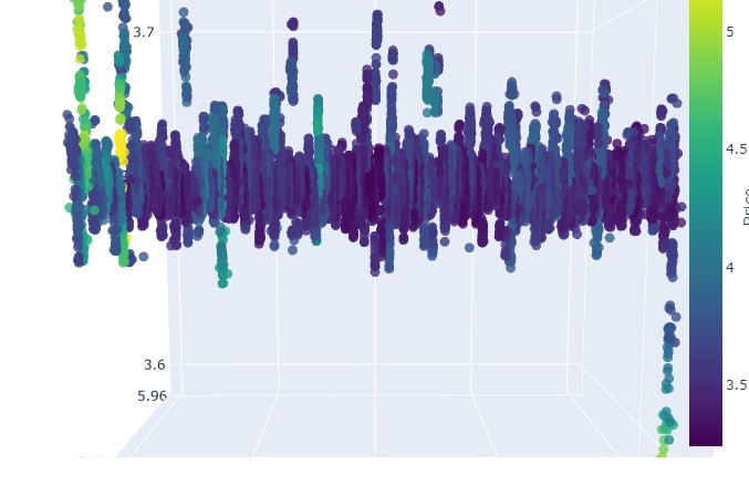
En general, parece muy interesante. Vemos ciertas secuencias de agrupación de precios por tiempo, así como valores atípicos de la agrupación de precios por volumen. Es decir, tenemos la sensación (y está directamente confirmada por la experiencia de los principales tráders) de que cuando el mercado está turbulento, cuando se agitan enormes volúmenes y la volatilidad es galopante, estamos ante un peligroso estallido que va más allá de las estadísticas, los famosos riesgos de cola. Por consiguiente, aquí podemos identificar inmediatamente una muestra de precios "más allá de los límites de la normalidad", en este tipo de coordenadas. Y solo por eso, quiero dar las gracias a la idea de los gráficos de precios multidimensionales.
Preste atención:
Procedemos al examen del paciente (gráficos 3D)
A continuación, le propongo visualizar. Pero no nuestro brillante futuro bajo una palmera junto al terminal, sino gráficos de precios en 3D. Vamos a dividir las situaciones en cuatro grupos: tendencia alcista, tendencia bajista, reversión de tendencia alcista a tendencia bajista y reversión de tendencia bajista a tendencia alcista. Para ello deberemos cambiar un poco el código: ya no necesitamos números de barras, sino que se cargarán datos en fechas concretas. En realidad, para esto solo tendremos que ir a mt5.copy_rates_range.
def create_true_3d_renko(symbol, timeframe, start_date, end_date, min_spread_multiplier=45, volume_brick=500):
    """
    Creates 4D stationary features with same interface as 3D Renko
    """
    rates = mt5.copy_rates_range(symbol, timeframe, start_date, end_date)
    if rates is None:
        print(f"Error getting data for {symbol}")
        return None, None

    df = pd.DataFrame(rates)
    df['time'] = pd.to_datetime(df['time'], unit='s')

    if df.isnull().any().any():
        print("Missing values detected, cleaning...")
        df = df.dropna()
        if len(df) == 0:
            print("No data for analysis after cleaning")
            return None, None

    symbol_info = mt5.symbol_info(symbol)
    if symbol_info is None:
        print(f"Failed to get symbol info for {symbol}")
        return None, None

    try:
        min_price_brick = symbol_info.spread * min_spread_multiplier * symbol_info.point
        if min_price_brick <= 0:
            print("Invalid block size")
            return None, None
    except AttributeError as e:
        print(f"Error getting symbol parameters: {e}")
        return None, None

    scaler = MinMaxScaler(feature_range=(3, 9))
    df_blocks = []

    try:
        # Time dimension
        df['time_sin'] = np.sin(2 * np.pi * df['time'].dt.hour / 24)
        df['time_cos'] = np.cos(2 * np.pi * df['time'].dt.hour / 24)
        df['time_numeric'] = (df['time'] - df['time'].min()).dt.total_seconds()

        # Price dimension
        df['typical_price'] = (df['high'] + df['low'] + df['close']) / 3
        df['price_return'] = df['typical_price'].pct_change()
        df['price_acceleration'] = df['price_return'].diff()

        # Volume dimension
        df['volume_change'] = df['tick_volume'].pct_change()
        df['volume_acceleration'] = df['volume_change'].diff()

        # Volatility dimension
        df['volatility'] = df['price_return'].rolling(20).std()
        df['volatility_change'] = df['volatility'].pct_change()

        for idx in range(20, len(df)):
            window = df.iloc[idx-20:idx+1]

            block = {
                'time': df.iloc[idx]['time'],
                'time_numeric': scaler.fit_transform([[float(df.iloc[idx]['time_numeric'])]]).item(),
                'open': float(window['price_return'].iloc[-1]),
                'high': float(window['price_acceleration'].iloc[-1]),
                'low': float(window['volume_change'].iloc[-1]),
                'close': float(window['volatility_change'].iloc[-1]),
                'tick_volume': float(window['volume_acceleration'].iloc[-1]),
                'direction': np.sign(window['price_return'].iloc[-1]),
                'spread': float(df.iloc[idx]['time_sin']),
                'type': float(df.iloc[idx]['time_cos']),
                'trend_count': len(window),
                'price_change': float(window['price_return'].mean()),
                'volume_intensity': float(window['volume_change'].mean()),
                'price_velocity': float(window['price_acceleration'].mean())
            }
            df_blocks.append(block)

    except Exception as e:
        print(f"Error processing data: {e}")
        if len(df_blocks) == 0:
            return None, None

    if len(df_blocks) == 0:
        print("Failed to create any blocks")
        return None, None

    result_df = pd.DataFrame(df_blocks)

    # Scale all features
    features_to_scale = [col for col in result_df.columns if col != 'time' and col != 'direction']
    result_df[features_to_scale] = scaler.fit_transform(result_df[features_to_scale])

    # Add same analytical metrics as in original function
    result_df['ma_5'] = result_df['close'].rolling(5).mean()
    result_df['ma_20'] = result_df['close'].rolling(20).mean()
    result_df['volume_ma_5'] = result_df['tick_volume'].rolling(5).mean()
    result_df['price_volatility'] = result_df['price_change'].rolling(10).std()
    result_df['volume_volatility'] = result_df['tick_volume'].rolling(10).std()
    result_df['trend_strength'] = result_df['trend_count'] * result_df['direction']

    # Scale moving averages and volatility
    ma_columns = ['ma_5', 'ma_20', 'volume_ma_5', 'price_volatility', 'volume_volatility', 'trend_strength']
    result_df[ma_columns] = scaler.fit_transform(result_df[ma_columns])

    # Add statistical metrics and scale them
    result_df['zscore_price'] = stats.zscore(result_df['close'], nan_policy='omit')
    result_df['zscore_volume'] = stats.zscore(result_df['tick_volume'], nan_policy='omit')
    zscore_columns = ['zscore_price', 'zscore_volume']
    result_df[zscore_columns] = scaler.fit_transform(result_df[zscore_columns])

    return result_df, min_price_brick
Aquí está nuestro código modificado:
def main():
    try:
        # Initialize MT5
        if not mt5.initialize():
            print("MetaTrader5 initialization error")
            return

        # Analysis parameters
        symbols = ["EURUSD", "GBPUSD"]
        timeframes = {
            "M15": mt5.TIMEFRAME_M15
        }

        # 7D analysis parameters
        params = {
            "min_spread_multiplier": 45,
            "volume_brick": 500
        }

        # Date range for data fetching
        start_date = datetime(2017, 1, 1)
        end_date = datetime(2018, 2, 1)

        # Analysis for each symbol and timeframe
        for symbol in symbols:
            print(f"\nAnalyzing symbol {symbol}")

            # Create symbol directory
            symbol_dir = Path('charts') / symbol
            symbol_dir.mkdir(parents=True, exist_ok=True)

            # Get symbol info
            symbol_info = mt5.symbol_info(symbol)
            if symbol_info is None:
                print(f"Failed to get symbol info for {symbol}")
                continue

            print(f"Spread: {symbol_info.spread} points")
            print(f"Tick: {symbol_info.point}")

            # Analysis for each timeframe
            for tf_name, tf in timeframes.items():
                print(f"\nAnalyzing timeframe {tf_name}")

                # Create timeframe directory
                tf_dir = symbol_dir / tf_name
                tf_dir.mkdir(exist_ok=True)

                # Get and analyze data
                print("Getting data...")
                df, brick_size = create_true_3d_renko(
                    symbol=symbol,
                    timeframe=tf,
                    start_date=start_date,
                    end_date=end_date,
                    min_spread_multiplier=params["min_spread_multiplier"],
                    volume_brick=params["volume_brick"]
                )

                if df is not None and brick_size is not None:
                    print(f"Created {len(df)} 7D bars")
                    print(f"Block size: {brick_size}")

                    # Basic statistics
                    print("\nBasic statistics:")
                    print(f"Average volume: {df['tick_volume'].mean():.2f}")
                    print(f"Average trend length: {df['trend_count'].mean():.2f}")
                    print(f"Max uptrend length: {df[df['direction'] > 0]['trend_count'].max()}")
                    print(f"Max downtrend length: {df[df['direction'] < 0]['trend_count'].max()}")

                    # Create visualizations
                    print("\nCreating visualizations...")
                    create_visualizations(df, symbol, tf_dir)

                    # Save data
                    csv_file = tf_dir / f"{symbol}_{tf_name}_7d_data.csv"
                    df.to_csv(csv_file)
                    print(f"Data saved to {csv_file}")

                    # Results analysis
                    trend_ratio = len(df[df['direction'] > 0]) / len(df[df['direction'] < 0])
                    print(f"\nUp/Down bars ratio: {trend_ratio:.2f}")

                    volume_corr = df['tick_volume'].corr(df['price_change'].abs())
                    print(f"Volume-Price change correlation: {volume_corr:.2f}")

                    # Print warnings if anomalies detected
                    if df['price_volatility'].max() > df['price_volatility'].mean() * 3:
                        print("\nWARNING: High volatility periods detected!")

                    if df['volume_volatility'].max() > df['volume_volatility'].mean() * 3:
                        print("WARNING: Abnormal volume spikes detected!")
                else:
                    print(f"Failed to create 3D bars for {symbol} on {tf_name}")

        print("\nAnalysis completed successfully!")

    except Exception as e:
        print(f"An error occurred: {e}")
        import traceback
        print(traceback.format_exc())
    finally:
        mt5.shutdown()
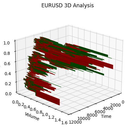
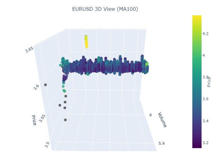
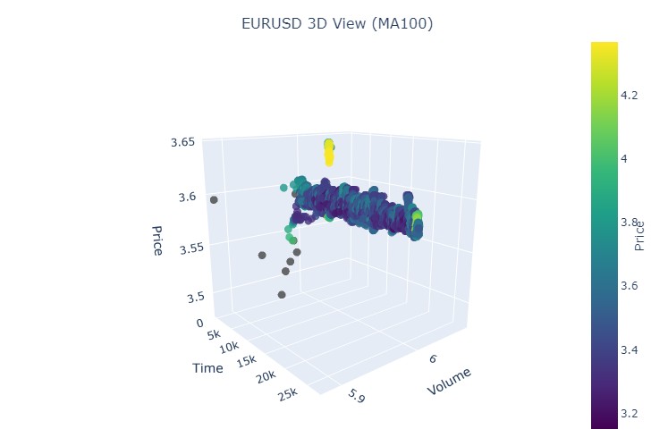
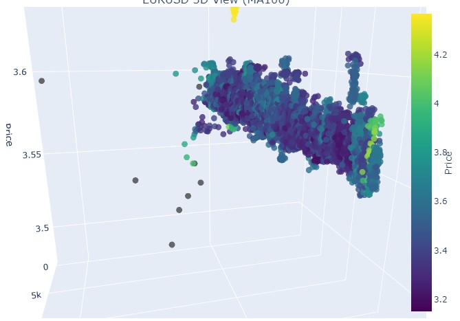
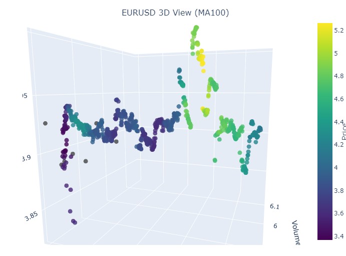
Tomaremos el primer dato, el euro-dólar, del 1 de enero de 2017 al 1 de febrero de 2018. En la práctica, una poderosa tendencia alcista. ¿Listo para ver cómo queda en barras 3D?
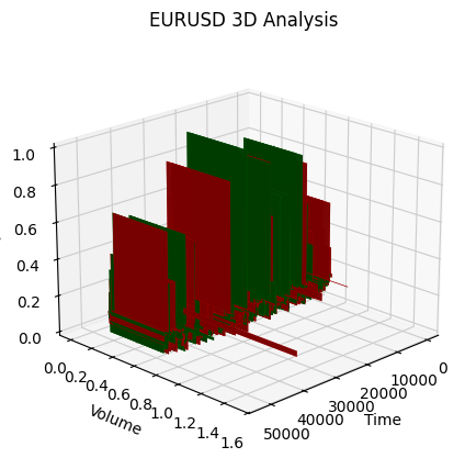
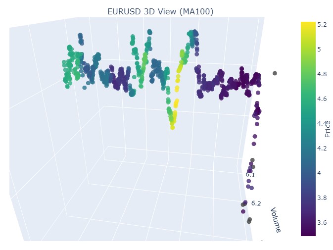
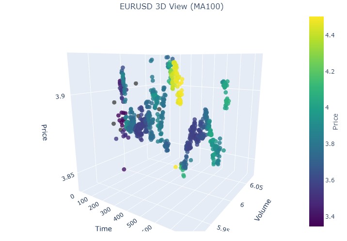
Este es otro ejemplo de visualización:
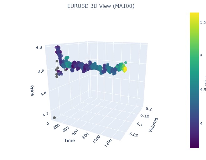
Prestemos atención al inicio de la tendencia alcista:
Y a su final:
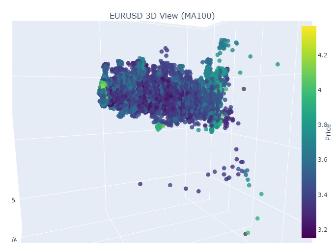
Consideremos ahora la tendencia bajista. Del 1 de febrero de 2018 al 20 de marzo de 2020:
Aquí tenemos el inicio de una tendencia bajista:
Y aquí tenemos el final:
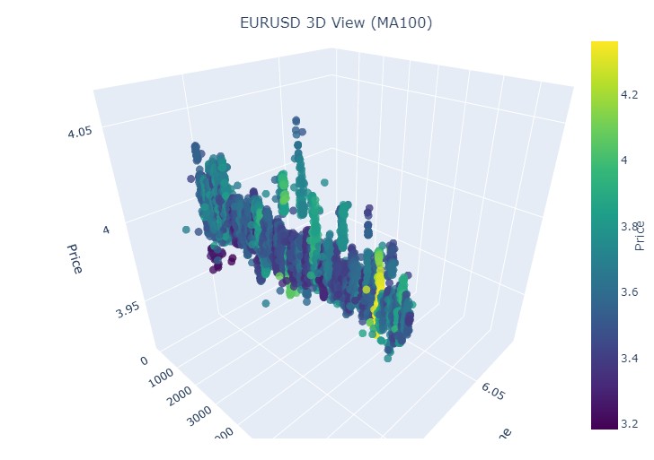
Bien, qué es lo que vemos: ambas tendencias (tanto bajistas como alcistas) en la representación 3D comenzaron como una región de puntos bajo la densidad de puntos 3D. Y el final de la tendencia en ambos casos estuvo marcado por un esquema de color amarillo intenso.
Para describir este fenómeno y el comportamiento de los precios de un par de divisas como el euro-dólar en tendencias alcistas y bajistas, puede utilizarse la siguiente fórmula universal:
P(t) = P_0 + \int_{t_0}^{t} A \cdot e^{k(t-u)} \cdot V(u) \, du + N(t)
donde:
- P(t) es el precio de la divisa en el momento .
- P_0 es el precio inicial en el momento.
- A es la amplitud de la tendencia que caracteriza la escala del cambio de precios.
- k es el coeficiente que determina la tasa de variación (se observa una tendencia alcista cuando k > 0, y una tendencia bajista cuando k < 0).
- V(u) es el volumen comercial en el momento, que afecta a la actividad del mercado y puede aumentar la importancia de las variaciones de precios.
- N(t) es el ruido aleatorio que refleja fluctuaciones impredecibles del mercado.
Explicación textual
Esta fórmula describe cómo varía el precio de una divisa a lo largo del tiempo según una serie de factores. El precio inicial es el punto de partida, tras el cual la integral tiene en cuenta la influencia de la amplitud de la tendencia y la tasa de variación, sometiendo al precio a una subida o bajada exponencial según la magnitud. El volumen comercial representado por la función añade otra dimensión, mostrando que la actividad del mercado también afecta a las variaciones de precios.
Así, este modelo permite visualizar los movimientos de los precios según las distintas tendencias mediante su representación en un espacio tridimensional, en el que el eje temporal, el precio y el volumen crean una rica imagen de la actividad del mercado. El brillo del esquema de colores en este modelo puede indicar la fuerza de la tendencia, donde los colores más brillantes se corresponden con los valores más grandes de la derivada del precio y del volumen comercial, lo cual señala movimientos potentes de volumen fluyendo en el mercado.
Cómo se muestra la reversión
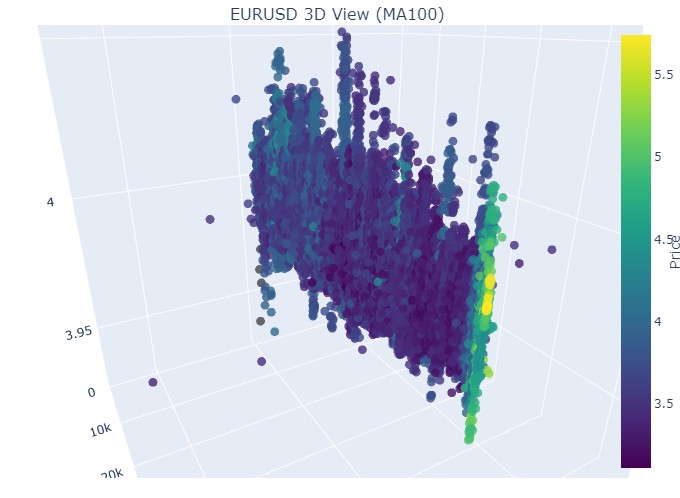
Se trata del periodo comprendido entre el 14 y el 28 de noviembre, aproximadamente en la mitad de este periodo de tiempo tendremos una reversión de las cotizaciones. ¿Qué aspecto tendrá en las coordenadas 3D? Este mismo:
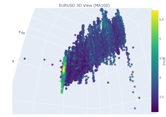
Vemos el conocido color amarillo en el momento de la reversión y el aumento de la coordenada normalizada del precio. Veamos ahora otra zona de precios con cambio de tendencia, del 13 de septiembre de 2024 al 10 de octubre del mismo año:
Nuevamente la misma imagen, solo que ahora tenemos el color amarillo y su acumulación en la parte inferior. ¿Es interesante? Mucho. ¿Continuamos?
Manos a la obra. 19 de agosto de 2024 - 30 de agosto de 2024, en la mitad de esta fecha se produce la reversión exacta de la tendencia. ¿Miramos nuestras coordenadas?
Tenemos exactamente la misma imagen otra vez. Vamos a analizar el periodo comprendido entre el 17 de julio de 2024 y el 8 de agosto de 2024. ¿Mostrará pronto el modelo signos de reversión?
¿Lo ha hecho o no? ¿Qué le parece?
El periodo final es del 21 de abril al 10 de agosto de 2023. Ahí terminó la tendencia alcista.
Una vez más vemos el ya conocido color amarillo.
Algunas palabras sobre los racimos amarillos
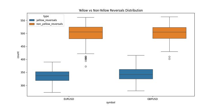
Mientras desarrollaba las barras 3D, me encontré con una característica muy interesante: los clústeres volumétricos volátiles amarillos. No voy a ocultarlo, ¡estaba literalmente fascinado por su comportamiento en el gráfico! Tras analizar una tonelada de datos históricos (más de 400.000 barras para 2022-2024 para ser exactos), me di cuenta de algo sorprendente.
Al principio no podía creer lo que veían mis ojos: de unas 100.000 barras amarillas, casi todas (¡el 97%!) estaban cerca de retrocesos de precios. Y funcionaba en el rango de más o menos tres barras. Curiosamente, si tomamos todas las reversiones, y había unas 169.000, y solo el 40% de ellas mostraban barras amarillas. Resulta que la barra amarilla prácticamente garantiza una reversión, aunque también se produzcan reversiones sin ellas.
Al profundizar en las tendencias, observé un patrón claro. Casi no hay barras amarillas al principio y en el curso de la tendencia, solo barras regulares en 3D en un grupo denso. Pero antes de la reversión, se dan racimos amarillos que brillan en el gráfico.
Esto resulta especialmente claro en las tendencias largas. Tomemos por ejemplo la subida del euro-dólar desde principios de 2017 hasta febrero de 2018, y luego la caída hasta marzo de 2020. En ambos casos, estos cúmulos amarillos aparecieron antes del cambio de tendencia, y su ubicación en 3D indicaba literalmente hacia dónde iría el precio.
También lo probé en periodos cortos: tomé algunos segmentos de 2-3 semanas en 2024. ¿Y sabe qué? Funciona como un reloj suizo. Cada vez, aparecían barras amarillas antes de la curva, como avisando: "¡Oye tío, la tendencia está a punto de revertirse!"
No se trata de un indicador cualquiera. Creo que hemos encontrado algo realmente importante en la propia estructura del mercado: cómo se distribuyen los volúmenes y cómo cambia la volatilidad antes de un cambio de tendencia. Ahora, cuando veo racimos amarillos en los gráficos 3D, lo sé: ¡es hora de prepararse para una reversión!
Conclusión
Tras concluir nuestra exploración de las barras tridimensionales, no puedo dejar de señalar hasta qué punto esta inmersión ha cambiado profundamente mi comprensión de la microestructura del mercado. Lo que empezó como un experimento de visualización se ha convertido en una forma totalmente nueva de ver y entender el mercado.
Mientras trabajaba en este proyecto, me enfrentaba constantemente a lo limitados que estamos por la tradicional representación bidimensional de los precios. El paso al análisis tridimensional ha abierto un nuevo horizonte de comprensión de las relaciones entre precio, volumen y tiempo. Me ha llamado especialmente la atención la claridad con que aparecen en el espacio tridimensional las pautas que preceden a los acontecimientos importantes del mercado.
El descubrimiento más significativo ha sido la posibilidad de detectar a tiempo posibles cambios de tendencia. La acumulación característica de volúmenes y los cambios de color en la vista tridimensional han resultado ser indicadores sorprendentemente fiables de cambios de tendencia inminentes. No se trata solo de una observación teórica, sino que la hemos confirmado con numerosos ejemplos históricos.
El modelo matemático que hemos desarrollado nos permite no solo visualizar, sino también cuantificar la dinámica del mercado. La integración de modernas tecnologías de visualización y herramientas informáticas ha permitido aplicar este método en el comercio real. Yo utilizo estas herramientas a diario y han cambiado significativamente mi enfoque del análisis de mercado.
Sin embargo, creo que solo estamos al principio del viaje. Este proyecto ha abierto la puerta al mundo del análisis multidimensional de la microestructura de los mercados, y estoy seguro de que nuevas investigaciones en esta dirección aportarán muchos más descubrimientos notables. Quizá el próximo paso sea integrar el aprendizaje automático para reconocer automáticamente patrones tridimensionales o desarrollar nuevas estrategias comerciales basadas en análisis multidimensionales.
En última instancia, el principal valor de esta investigación no reside en los bellos gráficos o las complejas fórmulas, sino en los nuevos conocimientos del mercado que ofrece. Como investigador, creo firmemente que el futuro del análisis técnico reside precisamente en un enfoque multivariante del análisis de los datos del mercado.
Traducción del ruso hecha por MetaQuotes Ltd.
Artículo original: https://www.mql5.com/ru/articles/16555
Advertencia: todos los derechos de estos materiales pertenecen a MetaQuotes Ltd. Queda totalmente prohibido el copiado total o parcial.
Este artículo ha sido escrito por un usuario del sitio web y refleja su punto de vista personal. MetaQuotes Ltd. no se responsabiliza de la exactitud de la información ofrecida, ni de las posibles consecuencias del uso de las soluciones, estrategias o recomendaciones descritas.

- Aplicaciones de trading gratuitas
- 8 000+ señales para copiar
- Noticias económicas para analizar los mercados financieros
Usted acepta la política del sitio web y las condiciones de uso
La pregunta que surge inmediatamente es: ¿por qué? ¿Un gráfico plano no es suficiente para un análisis preciso? Ahí es donde funciona la geometría normal de bachillerato.
Cualquier algoritmo explora esencialmente las dimensiones espaciales. Al crear algoritmos, intentamos resolver el problema fundamental de la explosión combinatoria mediante la búsqueda multidimensional. Es nuestra forma de navegar por un mar infinito de posibilidades.
(Disculpas si la traducción no es perfecta )
Cualquier algoritmo explora esencialmente dimensiones espaciales. Al crear algoritmos, intentamos resolver el problema fundamental de la explosión combinatoria mediante la búsqueda multidimensional. Es nuestra forma de navegar por un mar infinito de posibilidades.
(Disculpas si la traducción no es perfecta )
Entendido. Si no podemos resolver la previsión de tendencias mediante sencillas fórmulas geométricas escolares, ¡la gente empieza a inventar un Lysaped con sobrealimentación turbo, con control por smartphone, con caritas sonrientes y otros oropeles! Excepto que no hay ruedas, y no se espera que tengan ruedas. Y sin ruedas, no se puede ir muy lejos en un solo chasis.
Ya veo. Si es imposible resolver la previsión de tendencias mediante simples fórmulas geométricas escolares, ¡la gente se pone a inventar un lisaped con sobrealimentación turbo, con control por smartphone, con caritas sonrientes y demás oropeles! Excepto que no hay ruedas, y no se espera que tengan ruedas. Y sin ruedas, no se puede ir muy lejos en un solo chasis.