DoEasy. Elementos de control (Parte 13): Optimizando la interacción de los objetos WinForms con el ratón. Comenzamos el desarrollo del objeto WinForms TabControl
 614
614
 0
0

Contenido
- Concepto
- Mejorando las clases de la biblioteca
- Diseño del objeto WinForms TabControl
- Simulación
- ¿Qué es lo próximo?
Concepto
Los objetos gráficos de la biblioteca para crear los controles de la GUI actualmente tienen un inconveniente: cuando pasamos el cursor sobre algunos objetos, estos cambian su apariencia, pero al alejar el cursor del área del objeto, este no siempre recupera su estado original. Dicha situación sucede si dos objetos están cerca uno del otro y, por extraño que parezca, dependiendo de la dirección en la que se aleje el cursor del objeto. Si el movimiento es de abajo hacia arriba o de izquierda a derecha, los objetos responderán correctamente a la influencia del cursor sobre ellos. Si movemos el cursor en las direcciones opuestas, los objetos gráficos, tras cambiar su apariencia al pasar el cursor sobre ellos, no recuperarán su estado original cuando se eliminen del área de objetos. Sin embargo, merece la pena colocar los objetos a mayor distancia unos de otros, ya que comienzan a comportarse correctamente.
Este "mal funcionamiento" nos impedía crear algunos objetos, por lo que tuvimos que colocar sus componentes a una distancia considerable entre sí, mayor que la de los componentes de objetos similares del conjunto de control de MS Visual Studio. Tras analizar este comportamiento, llegué a la conclusión de que, para que un objeto cambie su apariencia a la original (con la condición de que el cursor se mueva en la dirección que causa errores), debe, antes de entrar en el área de un objeto cercano, ingresar en la zona del formulario en la que se encuentran estos objetos gráficos, lo cual los obligará a encontrarse separados por al menos 4 píxeles entre sí.
Ya hemos localizado el fallo que causa este comportamiento en los objetos gráficos, así que hoy corregiremos este error y, al mismo tiempo, optimizaremos el cambio de color de los objetos gráficos cuando interactúan con el ratón. Además, comenzaremos a desarrollar un objeto gráfico TabControl, que supone un conjunto de pestañas en las que podemos colocar varios objetos WinForms. Desafortunadamente, durante el desarrollo de este control, apareció un error igualmente importante en la planificación de la estructura de la biblioteca: la lógica para crear los nombres de los objetos gráficos. Nuestro nombre del objeto gráfico actualmente consta del nombre del programa con la adición del nombre del panel y las terminaciones "_Elm00", "_Elm01", "_Elm02", etc.
Por ejemplo, si el programa se llama "Program" y creamos tres objetos de panel vacíos en el gráfico, los nombres de estos tres paneles serán los siguientes: "Program_WFPanel1", "Program_WFPanel2" y "Program_WFPanel3". En este caso, los nombres de los objetos de panel los proporcionará el usuario de la biblioteca, quien creará el nombre del panel creado desde su programa: WFPanel1, WFPanel2, WFPanel3, en este caso. Si adjuntamos otro objeto al primer panel, la biblioteca creará automáticamente un nombre para él, y será así: Program_WFPanel1_Elm00.
Si creamos otro elemento adjunto a un elemento adjunto (dentro de este), el nombre se alargará de nuevo, y será así: Program_WFPanel1_Elm00_Elm00. Si creamos otro elemento en el primer elemento adjunto, entonces su nombre será así: WFPanel1_Elm00_Elm01. Otro más, se verá así: WFPanel1_Elm00_Elm02, etc. Por consiguiente, si creamos nuevos objetos adjuntos en cada objeto adjunto, el nombre se alargará, ya que en él se escribirá la jerarquía completa de todos los objetos adjuntos. Como consecuencia, esto no será cierto, ya que el nombre del recurso gráfico no deberá exceder los 63 caracteres. Y como en la clase CCanvas de la Biblioteca Estándar, al crear un elemento gráfico, se crea un recurso gráfico y su nombre consiste en el que nosotros mismos indicamos (generado por la biblioteca) más el valor del identificador del gráfico, más la cantidad de milisegundos transcurridos desde que se inició el sistema, más un número entero pseudoaleatorio en el rango de 0 a 32767 (en el método Create):
m_rcname="::"+name+(string)ChartID()+(string)(GetTickCount()+MathRand());
está claro que para el nombre del objeto indicado en el programa y generado por la biblioteca, quedará muy poco espacio de caracteres libres.
Por lo tanto, el concepto de construcción de los nombres de los elementos gráficos de la biblioteca que adoptamos antes se ha vuelto incorrecto. Ya me encontré con esto al desarrollar el elemento gráfico TabControl: ya no resulta posible adjuntar ningún otro elemento gráfico a sus pestañas: simplemente el nombre del recurso gráfico se vuelve demasiado largo y el método Create() de la clase CCanvas retornará false.
Partiendo de lo anterior, hoy prepararemos la base necesaria para crear el objeto WinForm TabControl; para ello, crearemos las plantillas de clase necesarias para su creación completa, pero no las seguiremos desarrollando hoy, sino que crearemos un diseño de este control usando "herramientas improvisadas", que nos permitirá comprobar la futura funcionalidad y la apariencia requerida para este objeto. Luego, en el próximo artículo, crearemos una nueva mecánica para crear los nombres de los elementos gráficos de la biblioteca y comenzaremos a crear el objeto WinForms TabControl completo usando las clases preparadas hoy para su creación, así como la experiencia obtenida del diseño.
Mejorando las clases de la biblioteca
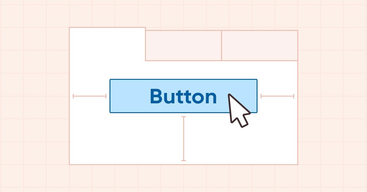
Al pasar el puntero del ratón sobre un objeto TabPage, o al clicar en el título de una pestaña, los elementos del objeto deberán comportarse de cierta manera. Algunos cambiarán de color y, por ejemplo, el título de la pestaña deberá aumentar ligeramente de tamaño, mostrando nuestra selección. Los marcos de los elementos del objeto se establecerán en sus propios colores, correspondientes al estado del objeto cuando lo seleccionamos o pasamos el cursor sobre él. Para todos estos estados posibles, definiremos macrosustituciones que almacenarán los valores de color de los diferentes modos de los componentes del objeto por defecto.
En el archivo \MQL5\Include\DoEasy\Defines.mqh, escribimos las siguientes macrosustituciones:
#define CLR_DEF_CONTROL_STD_BACK_COLOR_ON (C'0xC9,0xDE,0xD0')     // Background color of standard controls which are on
#define CLR_DEF_CONTROL_STD_BACK_DOWN_ON (C'0xA6,0xC8,0xB0')      // Color of standard control background when clicking on the control when it is on
#define CLR_DEF_CONTROL_STD_BACK_OVER_ON (C'0xB8,0xD3,0xC0')      // Color of standard control background when hovering the mouse over the control when it is on

#define CLR_DEF_CONTROL_TAB_BACK_COLOR (CLR_CANV_NULL)            // TabControl background color
#define CLR_DEF_CONTROL_TAB_MOUSE_DOWN (CLR_CANV_NULL)            // Color of TabControl background when clicking on the control
#define CLR_DEF_CONTROL_TAB_MOUSE_OVER (CLR_CANV_NULL)            // Color of TabControl background when hovering the mouse over the control
#define CLR_DEF_CONTROL_TAB_OPACITY    (0)                        // TabControl background opacity

#define CLR_DEF_CONTROL_TAB_BACK_COLOR_ON (CLR_CANV_NULL)         // Enabled TabControl background color
#define CLR_DEF_CONTROL_TAB_BACK_DOWN_ON (CLR_CANV_NULL)          // Color of enabled TabControl background when clicking on the control
#define CLR_DEF_CONTROL_TAB_BACK_OVER_ON (CLR_CANV_NULL)          // Color of enabled TabControl background when hovering the mouse over the control

#define CLR_DEF_CONTROL_TAB_BORDER_COLOR (CLR_CANV_NULL)          // TabControl frame color
#define CLR_DEF_CONTROL_TAB_BORDER_MOUSE_DOWN (CLR_CANV_NULL)     // Color of TabControl frame when clicking on the control
#define CLR_DEF_CONTROL_TAB_BORDER_MOUSE_OVER (CLR_CANV_NULL)     // Color of TabControl frame when hovering the mouse over the control

#define CLR_DEF_CONTROL_TAB_BORDER_COLOR_ON (CLR_CANV_NULL)       // Enabled TabControl frame color
#define CLR_DEF_CONTROL_TAB_BORDER_DOWN_ON (CLR_CANV_NULL)        // Color of enabled TabControl frame when clicking on the control
#define CLR_DEF_CONTROL_TAB_BORDER_OVER_ON (CLR_CANV_NULL)        // Color of enabled TabControl frame when hovering the mouse over the control

#define CLR_DEF_CONTROL_TAB_PAGE_BACK_COLOR (C'0xFF,0xFF,0xFF')   // TabPage control background color
#define CLR_DEF_CONTROL_TAB_PAGE_MOUSE_DOWN (C'0xFF,0xFF,0xFF')   // Color of TabPage control background when clicking on the control
#define CLR_DEF_CONTROL_TAB_PAGE_MOUSE_OVER (C'0xFF,0xFF,0xFF')   // Color of TabPage control background when hovering the mouse over the control
#define CLR_DEF_CONTROL_TAB_PAGE_OPACITY    (255)                 // TabPage background opacity

#define CLR_DEF_CONTROL_TAB_PAGE_BACK_COLOR_ON (C'0xFF,0xFF,0xFF')// Color of the enabled TabPage control background
#define CLR_DEF_CONTROL_TAB_PAGE_BACK_DOWN_ON (C'0xFF,0xFF,0xFF') // Color of the enabled TabPage control background when clicking on the control
#define CLR_DEF_CONTROL_TAB_PAGE_BACK_OVER_ON (C'0xFF,0xFF,0xFF') // Color of the enabled TabPage control background when hovering the mouse over the control

#define CLR_DEF_CONTROL_TAB_PAGE_BORDER_COLOR (C'0xDD,0xDD,0xDD') // TabPage control frame color
#define CLR_DEF_CONTROL_TAB_PAGE_BORDER_MOUSE_DOWN (C'0xDD,0xDD,0xDD') // Color of TabPage control background frame when clicking on the control
#define CLR_DEF_CONTROL_TAB_PAGE_BORDER_MOUSE_OVER (C'0xDD,0xDD,0xDD') // Color of TabPage control background frame when hovering the mouse over the control

#define CLR_DEF_CONTROL_TAB_PAGE_BORDER_COLOR_ON (C'0xDD,0xDD,0xDD')// Color of the enabled TabPage control frame
#define CLR_DEF_CONTROL_TAB_PAGE_BORDER_DOWN_ON (C'0xDD,0xDD,0xDD') // Color of the enabled TabPage control frame when clicking on the control
#define CLR_DEF_CONTROL_TAB_PAGE_BORDER_OVER_ON (C'0xDD,0xDD,0xDD') // Color of the enabled TabPage control frame when hovering the mouse over the control

#define CLR_DEF_CONTROL_TAB_HEAD_BACK_COLOR (C'0xF0,0xF0,0xF0')   // TabPage control header background color
#define CLR_DEF_CONTROL_TAB_HEAD_MOUSE_DOWN (C'0xF0,0xF0,0xF0')   // Color of TabPage control header background when clicking on the control
#define CLR_DEF_CONTROL_TAB_HEAD_MOUSE_OVER (C'0xF0,0xF0,0xF0')   // Color of TabPage control header background when hovering the mouse over the control
#define CLR_DEF_CONTROL_TAB_HEAD_OPACITY    (255)                 // TabPage header background opacity

#define CLR_DEF_CONTROL_TAB_HEAD_BACK_COLOR_ON (C'0xFF,0xFF,0xFF')// Color of the enabled TabPage control header background
#define CLR_DEF_CONTROL_TAB_HEAD_BACK_DOWN_ON (C'0xFF,0xFF,0xFF') // Color of the enabled TabPage control header background when clicking on the control
#define CLR_DEF_CONTROL_TAB_HEAD_BACK_OVER_ON (C'0xFF,0xFF,0xFF') // Color of the enabled TabPage control header background when clicking on the control

#define CLR_DEF_CONTROL_TAB_HEAD_BORDER_COLOR (C'0xD9,0xD9,0xD9')   // TabPage control header frame color
#define CLR_DEF_CONTROL_TAB_HEAD_BORDER_MOUSE_DOWN (C'0xD9,0xD9,0xD9') // Color of TabPage control header frame when clicking on the control
#define CLR_DEF_CONTROL_TAB_HEAD_BORDER_MOUSE_OVER (C'0xD9,0xD9,0xD9') // Color of TabPage control header frame when hovering the mouse over the control

#define CLR_DEF_CONTROL_TAB_HEAD_BORDER_COLOR_ON (C'0xDD,0xDD,0xDD')// Color of the enabled TabPage control header frame
#define CLR_DEF_CONTROL_TAB_HEAD_BORDER_DOWN_ON (C'0xDD,0xDD,0xDD') // Color of the enabled TabPage control header frame when clicking on the control
#define CLR_DEF_CONTROL_TAB_HEAD_BORDER_OVER_ON (C'0xDD,0xDD,0xDD') // Color of the enabled TabPage control header frame when hovering the mouse over the control

#define DEF_CONTROL_LIST_MARGIN_X      (1)                        // Gap between columns in ListBox controls
#define DEF_CONTROL_LIST_MARGIN_Y      (0)                        // Gap between rows in ListBox controls

#define DEF_FONT                       ("Calibri")                // Default font
#define DEF_FONT_SIZE                  (8)                        // Default font size
#define DEF_CHECK_SIZE                 (12)                       // Verification flag default size
#define OUTER_AREA_SIZE                (16)                       // Size of one side of the outer area around the form workspace
#define DEF_FRAME_WIDTH_SIZE           (3)                        // Default form/panel/window frame width
//--- Graphical object parameters
Aquí tenemos dos macrosustituciones más añadidas paradefinir el espacio entre filas en los controles ListBox. Antes, teníamos que utilizar 4 píxeles de altura y 6 píxeles de anchura, ahora que hemos corregido el error de cambio de apariencia de los elementos al interactuar con el ratón, podemos especificar los espacios mínimos entre filas en altura, y entre las hileras de columnas de filas en anchura, cosa que estableceremos aquí.
Vamos a añadirtres nuevos tiposa la enumeración de tipos de elementos gráficos:
//+------------------------------------------------------------------+
//| The list of graphical element types                              |
//+------------------------------------------------------------------+
enum ENUM_GRAPH_ELEMENT_TYPE
  {
   GRAPH_ELEMENT_TYPE_STANDARD,                       // Standard graphical object
   GRAPH_ELEMENT_TYPE_STANDARD_EXTENDED,              // Extended standard graphical object
   GRAPH_ELEMENT_TYPE_SHADOW_OBJ,                     // Shadow object
   GRAPH_ELEMENT_TYPE_ELEMENT,                        // Element
   GRAPH_ELEMENT_TYPE_FORM,                           // Form
   GRAPH_ELEMENT_TYPE_WINDOW,                         // Window
   //--- WinForms
   GRAPH_ELEMENT_TYPE_WF_UNDERLAY,                    // Panel object underlay
   GRAPH_ELEMENT_TYPE_WF_BASE,                        // Windows Forms Base
   //--- 'Container' object types are to be set below
   GRAPH_ELEMENT_TYPE_WF_CONTAINER,                   // Windows Forms container base object
   GRAPH_ELEMENT_TYPE_WF_PANEL,                       // Windows Forms Panel
   GRAPH_ELEMENT_TYPE_WF_GROUPBOX,                    // Windows Forms GroupBox
   //--- 'Standard control' object types are to be set below
   GRAPH_ELEMENT_TYPE_WF_COMMON_BASE,                 // Windows Forms base standard control
   GRAPH_ELEMENT_TYPE_WF_LABEL,                       // Windows Forms Label
   GRAPH_ELEMENT_TYPE_WF_BUTTON,                      // Windows Forms Button
   GRAPH_ELEMENT_TYPE_WF_CHECKBOX,                    // Windows Forms CheckBox
   GRAPH_ELEMENT_TYPE_WF_RADIOBUTTON,                 // Windows Forms RadioButton
   GRAPH_ELEMENT_TYPE_WF_ELEMENTS_LIST_BOX,           // Base list object of Windows Forms elements
   GRAPH_ELEMENT_TYPE_WF_LIST_BOX,                    // Windows Forms ListBox
   GRAPH_ELEMENT_TYPE_WF_CHECKED_LIST_BOX,            // Windows Forms CheckedListBox
   GRAPH_ELEMENT_TYPE_WF_BUTTON_LIST_BOX,             // Windows Forms ButtonListBox
   GRAPH_ELEMENT_TYPE_WF_TAB_HEADER,                  // Windows Forms TabHeader
   GRAPH_ELEMENT_TYPE_WF_TAB_PAGE,                    // Windows Forms TabPage
   GRAPH_ELEMENT_TYPE_WF_TAB_CONTROL,                 // Windows Forms TabControl
  };
//+------------------------------------------------------------------+
Necesitaremos estos nuevos tipos de elementos gráficos para indicar el tipo del propio objeto WinForms TabControl o sus componentes: el encabezado de la pestaña (TabHeader) o la pestaña (TabPage). Es decir, el objeto constará de un conjunto de pestañas, y las pestañas constarán de un panel donde se colocarán los objetos adjuntos, así como el encabezado del panel. Al clicar sobre este, se activará la pestaña correspondiente.
Podemos colocar el encabezado de la pestaña del elemento gráfico TabControl en cuatro posiciones: derecha, izquierda, arriba y abajo.
Para indicar su ubicación, crearemos la nueva enumeración:
//+------------------------------------------------------------------+
//| Control flag status                                              |
//+------------------------------------------------------------------+
enum ENUM_CANV_ELEMENT_CHEK_STATE
  {
   CANV_ELEMENT_CHEK_STATE_UNCHECKED,                 // Unchecked
   CANV_ELEMENT_CHEK_STATE_CHECKED,                   // Checked
   CANV_ELEMENT_CHEK_STATE_INDETERMINATE,             // Undefined
  };
//+------------------------------------------------------------------+
//| Location of an object inside a control                           |
//+------------------------------------------------------------------+
enum ENUM_CANV_ELEMENT_ALIGNMENT
  {
   CANV_ELEMENT_ALIGNMENT_TOP,                        // Top
   CANV_ELEMENT_ALIGNMENT_BOTTOM,                     // Bottom
   CANV_ELEMENT_ALIGNMENT_LEFT,                       // Left
   CANV_ELEMENT_ALIGNMENT_RIGHT,                      // Right
  };
//+------------------------------------------------------------------+
//| Integer properties of the graphical element on the canvas        |
//+------------------------------------------------------------------+
Al crear los nombres de las constantes, antes cometimos una pequeña imprecisión: nuestro botón puede ser un botón de activación (toggle-button), pero el estado del botón "presionado/soltado" no es un estado toggle. Será mejor cambiar el nombre del estado presionado a StateOn en los nombres de las constantes de enumeración.
Por ello, todas las enumeraciones que mencionan un color para el estado presionado, que anteriormente se denominaban "COLOR_TOGGLE", ahora se han renombrado como "COLOR_STATE_ON". Todas las correcciones en los nombres de las constantes de enumeración ya se han realizado en la biblioteca: aquí solo las mencionamos como información.
Daremos un ejemplo de cambio de nombre de algunas constantes en el archivo analizado en la enumeración de las propiedades enteras de un elemento gráfico en el lienzo:
   CANV_ELEMENT_PROP_FORE_COLOR_MOUSE_DOWN,           // Default control text color when clicking on the control
   CANV_ELEMENT_PROP_FORE_COLOR_MOUSE_OVER,           // Default control text color when hovering the mouse over the control
   CANV_ELEMENT_PROP_FORE_COLOR_STATE_ON,             // Text color of the control which is on
   CANV_ELEMENT_PROP_FORE_COLOR_STATE_ON_MOUSE_DOWN,  // Default control text color when clicking on the control which is on
   CANV_ELEMENT_PROP_FORE_COLOR_STATE_ON_MOUSE_OVER,  // Default control text color when hovering the mouse over the control which is on
   CANV_ELEMENT_PROP_BACKGROUND_COLOR,                // Control background color
   CANV_ELEMENT_PROP_BACKGROUND_COLOR_OPACITY,        // Opacity of control background color
   CANV_ELEMENT_PROP_BACKGROUND_COLOR_MOUSE_DOWN,     // Control background color when clicking on the control
   CANV_ELEMENT_PROP_BACKGROUND_COLOR_MOUSE_OVER,     // Control background color when hovering the mouse over the control
   CANV_ELEMENT_PROP_BACKGROUND_COLOR_STATE_ON,       // Background color of the control which is on
   CANV_ELEMENT_PROP_BACKGROUND_COLOR_STATE_ON_MOUSE_DOWN,// Control background color when clicking on the control which is on
   CANV_ELEMENT_PROP_BACKGROUND_COLOR_STATE_ON_MOUSE_OVER,// Control background color when hovering the mouse over control which is on
   CANV_ELEMENT_PROP_BOLD_TYPE,                       // Font width type
   CANV_ELEMENT_PROP_BORDER_STYLE,                    // Control frame style
Al final de la misma enumeración, añadiremos tres nuevas propiedades enteras y aumentaremos el número de propiedades enteras del objeto de 85 a 88:
   CANV_ELEMENT_PROP_LIST_BOX_MULTI_COLUMN,           // Horizontal display of columns in the ListBox control
   CANV_ELEMENT_PROP_LIST_BOX_COLUMN_WIDTH,           // Width of each ListBox control column
   CANV_ELEMENT_PROP_TAB_MULTILINE,                   // Several lines of tabs in TabControl
   CANV_ELEMENT_PROP_TAB_ALIGNMENT,                   // Location of tabs inside the control
   CANV_ELEMENT_PROP_ALIGNMENT,                       // Location of an object inside the control

  };
#define CANV_ELEMENT_PROP_INTEGER_TOTAL (88)          // Total number of integer properties
#define CANV_ELEMENT_PROP_INTEGER_SKIP  (0)           // Number of integer properties not used in sorting
//+------------------------------------------------------------------+
Vamos a añadir estas nuevas propiedades a la enumeración de posibles criterios de clasificación de los objetos gráficos en el lienzo:
   SORT_BY_CANV_ELEMENT_LIST_BOX_MULTI_COLUMN,        // Sort by horizontal column display flag in the ListBox control
   SORT_BY_CANV_ELEMENT_LIST_BOX_COLUMN_WIDTH,        // Sort by the width of each ListBox control column
   SORT_BY_CANV_ELEMENT_TAB_MULTILINE,                // Sort by the flag of several rows of tabs in TabControl
   SORT_BY_CANV_ELEMENT_TAB_ALIGNMENT,                // Sort by the location of tabs inside the control
   SORT_BY_CANV_ELEMENT_ALIGNMENT,                    // Sort by the location of the object inside the control
//--- Sort by real properties

//--- Sort by string properties
   SORT_BY_CANV_ELEMENT_NAME_OBJ = FIRST_CANV_ELEMENT_STR_PROP,// Sort by an element object name
   SORT_BY_CANV_ELEMENT_NAME_RES,                     // Sort by the graphical resource name
   SORT_BY_CANV_ELEMENT_TEXT,                         // Sort by graphical element text
  };
//+------------------------------------------------------------------+
Ahora podremos filtrar, clasificar y seleccionar todos los elementos gráficos según las nuevas propiedades.
En el archivo \MQL5\Include\DoEasy\Data.mqh, añadiremos los índices de los nuevos mensajes a la biblioteca:
   MSG_LIB_TEXT_BUTTON_STATE_PRESSED,                 // Pressed
   MSG_LIB_TEXT_BUTTON_STATE_DEPRESSED,               // Released

   MSG_LIB_TEXT_TOP,                                  // Top
   MSG_LIB_TEXT_BOTTOM,                               // Bottom
   MSG_LIB_TEXT_LEFT,                                 // Left
   MSG_LIB_TEXT_RIGHT,                                // Right

   MSG_LIB_TEXT_CORNER_LEFT_UPPER,                    // Center of coordinates at the upper left corner of the chart
   MSG_LIB_TEXT_CORNER_LEFT_LOWER,                    // Center of coordinates at the lower left corner of the chart
   MSG_LIB_TEXT_CORNER_RIGHT_LOWER,                   // Center of coordinates at the lower right corner of the chart
   MSG_LIB_TEXT_CORNER_RIGHT_UPPER,                   // Center of coordinates at the upper right corner of the chart
...
   MSG_GRAPH_ELEMENT_TYPE_WF_CHECKED_LIST_BOX,        // CheckedListBox control
   MSG_GRAPH_ELEMENT_TYPE_WF_BUTTON_LIST_BOX,         // ButtonListBox control
   MSG_GRAPH_ELEMENT_TYPE_WF_TAB_HEADER,              // Tab header
   MSG_GRAPH_ELEMENT_TYPE_WF_TAB_PAGE,                // TabPage control
   MSG_GRAPH_ELEMENT_TYPE_WF_TAB_CONTROL,             // TabControl
   MSG_GRAPH_OBJ_BELONG_PROGRAM,                      // Graphical object belongs to a program
   MSG_GRAPH_OBJ_BELONG_NO_PROGRAM,                   // Graphical object does not belong to a program
..
   MSG_CANV_ELEMENT_PROP_LIST_BOX_MULTI_COLUMN,       // Horizontal display of columns in the ListBox control
   MSG_CANV_ELEMENT_PROP_LIST_BOX_COLUMN_WIDTH,       // Width of each ListBox control column
   MSG_CANV_ELEMENT_PROP_TAB_MULTILINE,               // Several lines of tabs in the control
   MSG_CANV_ELEMENT_PROP_TAB_ALIGNMENT,               // Location of tabs inside the control
   MSG_CANV_ELEMENT_PROP_ALIGNMENT,                   // Location of an object inside the control
//--- Real properties of graphical elements

//--- String properties of graphical elements
   MSG_CANV_ELEMENT_PROP_NAME_OBJ,                    // Graphical element object name
   MSG_CANV_ELEMENT_PROP_NAME_RES,                    // Graphical resource name
   MSG_CANV_ELEMENT_PROP_TEXT,                        // Graphical element text

  };
//+------------------------------------------------------------------+
y los mensajes de texto correspondientes a los nuevos índices añadidos:
   {"Нажата","Pressed"},
   {"Отжата","Depressed"},

   {"Сверху","Top"},
   {"Снизу","Bottom"},
   {"Слева","Left"},
   {"Справа","Right"},

   {"Центр координат в левом верхнем углу графика","Center of coordinates is in the upper left corner of the chart"},
   {"Центр координат в левом нижнем углу графика","Center of coordinates is in the lower left corner of the chart"},
   {"Центр координат в правом нижнем углу графика","Center of coordinates is in the lower right corner of the chart"},
   {"Центр координат в правом верхнем углу графика","Center of coordinates is in the upper right corner of the chart"},
...
   {"Элемент управления \"CheckedListBox\"","Control element \"CheckedListBox\""},
   {"Элемент управления \"ButtonListBox\"","Control element \"ButtonListBox\""},
   {"Заголовок вкладки","Tab header"},
   {"Элемент управления \"TabPage\"","Control element \"TabPage\""},
   {"Элемент управления \"TabControl\"","Control element \"TabControl\""},

   {"Графический объект принадлежит программе","The graphic object belongs to the program"},
   {"Графический объект не принадлежит программе","The graphic object does not belong to the program"},
..
   {"Горизонтальное отображение столбцов в элементе управления ListBox","Display columns horizontally in a ListBox control"},
   {"Ширина каждого столбца элемента управления ListBox","The width of each column of the ListBox control"},
   {"Несколько рядов вкладок в элементе управления","Multiple rows of tabs in a control"},
   {"Местоположение вкладок внутри элемента управления","Location of tabs inside the control"},
   {"Местоположение объекта внутри элемента управления","Location of the object inside the control"},

//--- String properties of graphical elements
   {"Имя объекта-графического элемента","The name of the graphic element object"},
   {"Имя графического ресурса","Image resource name"},
   {"Текст графического элемента","Text of the graphic element"},

  };
//+---------------------------------------------------------------------+
Ahora que hemos añadido los nuevos tipos de elementos gráficos y también sus descripciones, podemos recurrir a los índices de los mensajes de texto en el método que retorna la descripción del tipo de elemento gráfico y la clase del objeto gráfico básico en el archivo \MQL5\Include\DoEasy\Objects\Graph\GBaseObj.mqh:
//+------------------------------------------------------------------+
//| Return the description of the graphical element type             |
//+------------------------------------------------------------------+
string CGBaseObj::TypeElementDescription(const ENUM_GRAPH_ELEMENT_TYPE type)
  {
   return
     (
      type==GRAPH_ELEMENT_TYPE_STANDARD               ? CMessage::Text(MSG_GRAPH_ELEMENT_TYPE_STANDARD)              :
      type==GRAPH_ELEMENT_TYPE_STANDARD_EXTENDED      ? CMessage::Text(MSG_GRAPH_ELEMENT_TYPE_STANDARD_EXTENDED)     :
      type==GRAPH_ELEMENT_TYPE_ELEMENT                ? CMessage::Text(MSG_GRAPH_ELEMENT_TYPE_ELEMENT)               :
      type==GRAPH_ELEMENT_TYPE_SHADOW_OBJ             ? CMessage::Text(MSG_GRAPH_ELEMENT_TYPE_SHADOW_OBJ)            :
      type==GRAPH_ELEMENT_TYPE_FORM                   ? CMessage::Text(MSG_GRAPH_ELEMENT_TYPE_FORM)                  :
      type==GRAPH_ELEMENT_TYPE_WINDOW                 ? CMessage::Text(MSG_GRAPH_ELEMENT_TYPE_WINDOW)                :
      //--- WinForms
      type==GRAPH_ELEMENT_TYPE_WF_UNDERLAY            ? CMessage::Text(MSG_GRAPH_ELEMENT_TYPE_WF_UNDERLAY)           :
      type==GRAPH_ELEMENT_TYPE_WF_BASE                ? CMessage::Text(MSG_GRAPH_ELEMENT_TYPE_WF_BASE)               :
      //--- Containers
      type==GRAPH_ELEMENT_TYPE_WF_CONTAINER           ? CMessage::Text(MSG_GRAPH_ELEMENT_TYPE_WF_CONTAINER)          :
      type==GRAPH_ELEMENT_TYPE_WF_GROUPBOX            ? CMessage::Text(MSG_GRAPH_ELEMENT_TYPE_WF_GROUPBOX)           :
      type==GRAPH_ELEMENT_TYPE_WF_PANEL               ? CMessage::Text(MSG_GRAPH_ELEMENT_TYPE_WF_PANEL)              :
      type==GRAPH_ELEMENT_TYPE_WF_TAB_HEADER          ? CMessage::Text(MSG_GRAPH_ELEMENT_TYPE_WF_TAB_HEADER)         :
      type==GRAPH_ELEMENT_TYPE_WF_TAB_PAGE            ? CMessage::Text(MSG_GRAPH_ELEMENT_TYPE_WF_TAB_PAGE)           :
      type==GRAPH_ELEMENT_TYPE_WF_TAB_CONTROL         ? CMessage::Text(MSG_GRAPH_ELEMENT_TYPE_WF_TAB_CONTROL)        :
      //--- Standard controls
      type==GRAPH_ELEMENT_TYPE_WF_COMMON_BASE         ? CMessage::Text(MSG_GRAPH_ELEMENT_TYPE_WF_COMMON_BASE)        :
      type==GRAPH_ELEMENT_TYPE_WF_LABEL               ? CMessage::Text(MSG_GRAPH_ELEMENT_TYPE_WF_LABEL)              :
      type==GRAPH_ELEMENT_TYPE_WF_CHECKBOX            ? CMessage::Text(MSG_GRAPH_ELEMENT_TYPE_WF_CHECKBOX)           :
      type==GRAPH_ELEMENT_TYPE_WF_RADIOBUTTON         ? CMessage::Text(MSG_GRAPH_ELEMENT_TYPE_WF_RADIOBUTTON)        :
      type==GRAPH_ELEMENT_TYPE_WF_BUTTON              ? CMessage::Text(MSG_GRAPH_ELEMENT_TYPE_WF_BUTTON)             :
      type==GRAPH_ELEMENT_TYPE_WF_ELEMENTS_LIST_BOX   ? CMessage::Text(MSG_GRAPH_ELEMENT_TYPE_WF_ELEMENTS_LIST_BOX)  :
      type==GRAPH_ELEMENT_TYPE_WF_LIST_BOX            ? CMessage::Text(MSG_GRAPH_ELEMENT_TYPE_WF_LIST_BOX)           :
      type==GRAPH_ELEMENT_TYPE_WF_CHECKED_LIST_BOX    ? CMessage::Text(MSG_GRAPH_ELEMENT_TYPE_WF_CHECKED_LIST_BOX)   :
      type==GRAPH_ELEMENT_TYPE_WF_BUTTON_LIST_BOX     ? CMessage::Text(MSG_GRAPH_ELEMENT_TYPE_WF_BUTTON_LIST_BOX)    :
      "Unknown"
     );
  }
//+------------------------------------------------------------------+
El encabezado de la pestaña del control TabControl se puede ubicar en los cuatro lados del objeto gráfico. Además, en el futuro, es posible que tengamos otros objetos para los que deberemos especificar su ubicación dentro de nuestro contenedor. Por ello, crearemos una función pública que retorne la descripción del lado de ubicación del elemento gráfico en el archivo \MQL5\Include\DoEasy\Services\DELib.mqh:
//+------------------------------------------------------------------+
//| Return the description                                           |
//| of the object location inside the control                        |
//+------------------------------------------------------------------+
string AlignmentDescription(const ENUM_CANV_ELEMENT_ALIGNMENT alignment)
  {
   switch(alignment)
     {
      case CANV_ELEMENT_ALIGNMENT_TOP     :  return CMessage::Text(MSG_LIB_TEXT_TOP);     break;
      case CANV_ELEMENT_ALIGNMENT_BOTTOM  :  return CMessage::Text(MSG_LIB_TEXT_BOTTOM);  break;
      case CANV_ELEMENT_ALIGNMENT_LEFT    :  return CMessage::Text(MSG_LIB_TEXT_LEFT);    break;
      case CANV_ELEMENT_ALIGNMENT_RIGHT   :  return CMessage::Text(MSG_LIB_TEXT_RIGHT);   break;
      default                             :  return "Unknown"; break;
     }
  }
//+------------------------------------------------------------------+
//| Return the flag of displaying the graphical                      |
//| object on a specified chart timeframe                            |
//+------------------------------------------------------------------+
Dependiendo del tipo de ubicación del objeto dentro del contenedor transmitido, se retornará el mensaje de texto correspondiente.
Ahora, hablemos un poco sobre la optimización.
Al mover el cursor del ratón sobre un objeto, este puede cambiar su color. Ahora hemos conseguido que el método de cambio de color cambie inmediatamente el color, sin importar que el color pueda ser ya aquel al que necesitamos cambiarlo. Como consecuencia, en este caso, al cambiar el color a exactamente el mismo, haremos trabajar al sistema en vano. Para evitar esto, deberemos comprobar el color antes de cambiar este, y si el color especificado del objeto es exactamente el mismo al que queremos cambiar, entonces no necesitaremos hacer nada, salvo salir del método.
En el archivo \MQL5\Include\DoEasy\Objects\Graph\GCnvElement.mqh, en los métodos que establecen el color, introducimos las mejoras anunciadas:
//--- Set the main background color
   void              SetBackgroundColor(const color colour,const bool set_init_color)
                       {
                        if(this.BackgroundColor()==colour)
                           return;
                        this.SetProperty(CANV_ELEMENT_PROP_BACKGROUND_COLOR,colour);
                        color arr[1];
                        arr[0]=colour;
                        this.SaveColorsBG(arr);
                        if(set_init_color)
                           this.SetBackgroundColorInit(this.BackgroundColor());
                       }
   void              SetBackgroundColors(color &colors[],const bool set_init_colors)
                       {
                        if(::ArrayCompare(colors,this.m_array_colors_bg)==0)
                           return;
                        this.SaveColorsBG(colors);
                        this.SetProperty(CANV_ELEMENT_PROP_BACKGROUND_COLOR,this.m_array_colors_bg[0]);
                        if(set_init_colors)
                           this.SetBackgroundColorsInit(colors);
                       }
//--- Set the background color when clicking on the control
   void              SetBackgroundColorMouseDown(const color colour)
                       {
                        if(this.BackgroundColorMouseDown()==colour)
                           return;
                        this.SetProperty(CANV_ELEMENT_PROP_BACKGROUND_COLOR_MOUSE_DOWN,colour);
                        color arr[1];
                        arr[0]=colour;
                        this.SaveColorsBGMouseDown(arr);
                       }
   void              SetBackgroundColorsMouseDown(color &colors[])
                       {
                        if(::ArrayCompare(colors,this.m_array_colors_bg_dwn)==0)
                           return;
                        this.SaveColorsBGMouseDown(colors);
                        this.SetProperty(CANV_ELEMENT_PROP_BACKGROUND_COLOR_MOUSE_DOWN,this.m_array_colors_bg_dwn[0]);
                       }
//--- Set the background color when hovering the mouse over control
   void              SetBackgroundColorMouseOver(const color colour)
                       {
                        if(this.BackgroundColorMouseOver()==colour)
                           return;
                        this.SetProperty(CANV_ELEMENT_PROP_BACKGROUND_COLOR_MOUSE_OVER,colour);
                        color arr[1];
                        arr[0]=colour;
                        this.SaveColorsBGMouseOver(arr);
                       }
   void              SetBackgroundColorsMouseOver(color &colors[])
                       {
                        if(::ArrayCompare(colors,this.m_array_colors_bg_ovr)==0)
                           return;
                        this.SaveColorsBGMouseOver(colors);
                        this.SetProperty(CANV_ELEMENT_PROP_BACKGROUND_COLOR_MOUSE_OVER,this.m_array_colors_bg_ovr[0]);
                       }
//--- Set the initial main background color
En aquellos métodos donde se usa un color, compararemos el color del objeto con el color transmitido al método. Y en aquellos métodos que usan un array de colores, necesitaremos comparar dos arrays para determinar si son iguales, lo cual haremos con la función ArrayCompare(), que retornará cero si los arrays comparados son iguales.
Al final del constructor protegido, añadiremos el nombre de la clase y el tipo del objeto creado en una línea que mostrará el error de su creación:
   else
     {
      ::Print(DFUN,CMessage::Text(MSG_LIB_SYS_FAILED_CREATE_ELM_OBJ),"\"",this.TypeElementDescription(element_type),"\" ",this.m_name);
     }
  }
//+------------------------------------------------------------------+
//| Destructor                                                       |
//+------------------------------------------------------------------+
Simplemente, al realizar la depuración (y si el objeto no había sido creado), antes se mostraba una entrada en el diario de registro indicando que el objeto no se había creado, así como su nombre. Esto no era suficiente, ya que no quedaba claro la clase del mensaje mostrado ni el tipo del objeto. Ahora resultará más fácil encontrar la clase correcta de la que proviene el mensaje de error,
pero, al mismo tiempo, el tipo de objeto no siempre se indicará correctamente, ya que casi todos los elementos gráficos tienen una jerarquía de herencia compleja, y su tipo cambia a medida que todos los constructores en su jerarquía se procesan con éxito, comenzando desde el más simple y terminando con el último, en el que precisamente se indicará el tipo correcto de objeto que se está creando. No obstante, aquí también hay un lado positivo: sabiendo qué tipo de objeto estamos creando y viendo en qué etapa se finalizó erróneamente su creación, ya podremos saber dónde (en qué clase) debemos buscar el error ya que ahora se mostrará el tipo en cuya clase el constructor ha finalizado erróneamente su funcionamiento.
Volvamos a la optimización. Tenemos los métodos para trabajar con el color de un elemento gráfico en diferentes clases de diferentes controles, lo cual está justificado: si el objeto no tiene propiedades cuyo color deba cambiarse, entonces no será necesario crear métodos para trabajar con la propiedad faltante, mientras que en su heredero, que ya posee esta propiedad y puede trabajar con ella, crearemos los métodos para trabajar con la propiedad soportada.
En el archivo de clase \MQL5\Include\DoEasy\Objects\Graph\Form.mqh del objeto de formulario, añadiremos los cambios analizados anteriormente a los métodos para trabajar con color:
//+------------------------------------------------------------------+
//| Methods of simplified access to object properties                |
//+------------------------------------------------------------------+
//--- (1) Set and (2) return the control frame color
   void              SetBorderColor(const color colour,const bool set_init_color)
                       {
                        if(this.BorderColor()==colour)
                           return;
                        this.SetProperty(CANV_ELEMENT_PROP_BORDER_COLOR,colour);
                        if(set_init_color)
                           this.SetBorderColorInit(colour);
                       }
   color             BorderColor(void)                            const { return (color)this.GetProperty(CANV_ELEMENT_PROP_BORDER_COLOR);             }
//--- (1) Set and (2) return the control frame color when clicking the control
   void              SetBorderColorMouseDown(const color colour)
                       {
                        if(this.BorderColorMouseDown()==colour)
                           return;
                        this.SetProperty(CANV_ELEMENT_PROP_BORDER_COLOR_MOUSE_DOWN,colour);
                       }
   color             BorderColorMouseDown(void)                   const { return (color)this.GetProperty(CANV_ELEMENT_PROP_BORDER_COLOR_MOUSE_DOWN);  }
//--- (1) Set and (2) return the control frame color when hovering the mouse over the control
   void              SetBorderColorMouseOver(const color colour)
                       {
                        if(this.BorderColorMouseOver()==colour)
                           return;
                        this.SetProperty(CANV_ELEMENT_PROP_BORDER_COLOR_MOUSE_OVER,colour);
                       }
   color             BorderColorMouseOver(void)                   const { return (color)this.GetProperty(CANV_ELEMENT_PROP_BORDER_COLOR_MOUSE_OVER);  }
En el método que dibuja el marco del formulario, previamente se dibujaba por defecto un marco simple, pero si transmitimos el estilo de marco FRAME_STYLE_NONE (no hay marco) al método, este seguirá dibujando un marco simple. En principio, en muchos objetos, antes de llamar a este método, se comprueba el tipo de marco y se llama al método solamente si el objeto tiene un marco. Pero aún así, para considerar posibles omisiones en el futuro, será mejor implementar el valor predeterminado sin marcoy dibujar un marco simple en el caso del operador de interruptor switch:
//+------------------------------------------------------------------+
//| Draw the form frame                                              |
//+------------------------------------------------------------------+
void CForm::DrawFormFrame(const int wd_top,              // Frame upper segment width
                          const int wd_bottom,           // Frame lower segment width
                          const int wd_left,             // Frame left segment width
                          const int wd_right,            // Frame right segment width
                          const color colour,            // Frame color
                          const uchar opacity,           // Frame opacity
                          const ENUM_FRAME_STYLE style)  // Frame style
  {
//--- Depending on the passed frame style
   switch(style)
     {
      //--- draw a dimensional (convex) frame
      case FRAME_STYLE_BEVEL  : this.DrawFrameBevel(0,0,this.Width(),this.Height(),wd_top,wd_bottom,wd_left,wd_right,colour,opacity);   break;
      //--- draw a dimensional (concave) frame
      case FRAME_STYLE_STAMP  : this.DrawFrameStamp(0,0,this.Width(),this.Height(),wd_top,wd_bottom,wd_left,wd_right,colour,opacity);   break;
      //--- draw a flat frame
      case FRAME_STYLE_FLAT   : this.DrawFrameFlat(0,0,this.Width(),this.Height(),wd_top,wd_bottom,wd_left,wd_right,colour,opacity);    break;
      //--- draw a simple frame
      case FRAME_STYLE_SIMPLE : this.DrawFrameSimple(0,0,this.Width(),this.Height(),wd_top,wd_bottom,wd_left,wd_right,colour,opacity);  break;
      //---FRAME_STYLE_NONE
      default                 : break;
     }
  }
//+------------------------------------------------------------------+
En el manejador del último evento del ratón, añadiremos la condición de que el último evento del ratón sea un estado indeterminado, y el estado actual sea que el botón fuera del formulario no haya sido presionado y un estado indefinido:
//+------------------------------------------------------------------+
//| Last mouse event handler                                         |
//+------------------------------------------------------------------+
void CForm::OnMouseEventPostProcessing(void)
  {
   ENUM_MOUSE_FORM_STATE state=this.GetMouseState();
   switch(state)
     {
      //--- The cursor is outside the form, the mouse buttons are not clicked
      //--- The cursor is outside the form, any mouse button is clicked
      //--- The cursor is outside the form, the mouse wheel is being scrolled
      case MOUSE_FORM_STATE_OUTSIDE_FORM_NOT_PRESSED        :
      case MOUSE_FORM_STATE_OUTSIDE_FORM_PRESSED            :
      case MOUSE_FORM_STATE_OUTSIDE_FORM_WHEEL              :
      case MOUSE_FORM_STATE_NONE                            :
        if(this.MouseEventLast()==MOUSE_EVENT_INSIDE_ACTIVE_AREA_NOT_PRESSED  ||
           this.MouseEventLast()==MOUSE_EVENT_INSIDE_FORM_NOT_PRESSED         ||
           this.MouseEventLast()==MOUSE_EVENT_OUTSIDE_FORM_NOT_PRESSED        ||
           this.MouseEventLast()==MOUSE_EVENT_NO_EVENT)
          {
           this.SetBackgroundColor(this.BackgroundColorInit(),false);
           this.SetBorderColor(this.BorderColorInit(),false);
           this.m_mouse_event_last=ENUM_MOUSE_EVENT(state+MOUSE_EVENT_NO_EVENT);
           //this.Redraw(false);
          }
        break;
      //--- The cursor is inside the form, the mouse buttons are not clicked
      //--- The cursor is inside the form, any mouse button is clicked
      //--- The cursor is inside the form, the mouse wheel is being scrolled
      //--- The cursor is inside the active area, the mouse buttons are not clicked
      //--- The cursor is inside the active area, any mouse button is clicked
      //--- The cursor is inside the active area, the mouse wheel is being scrolled
      //--- The cursor is inside the active area, left mouse button is released
      //--- The cursor is within the window scrolling area, the mouse buttons are not clicked
      //--- The cursor is within the window scrolling area, any mouse button is clicked
      //--- The cursor is within the window scrolling area, the mouse wheel is being scrolled
      case MOUSE_FORM_STATE_INSIDE_FORM_NOT_PRESSED         :
      case MOUSE_FORM_STATE_INSIDE_FORM_PRESSED             :
      case MOUSE_FORM_STATE_INSIDE_FORM_WHEEL               :
      case MOUSE_FORM_STATE_INSIDE_ACTIVE_AREA_NOT_PRESSED  :
      case MOUSE_FORM_STATE_INSIDE_ACTIVE_AREA_PRESSED      :
      case MOUSE_FORM_STATE_INSIDE_ACTIVE_AREA_WHEEL        :
      case MOUSE_FORM_STATE_INSIDE_ACTIVE_AREA_RELEASED     :
      case MOUSE_FORM_STATE_INSIDE_SCROLL_AREA_NOT_PRESSED  :
      case MOUSE_FORM_STATE_INSIDE_SCROLL_AREA_PRESSED      :
      case MOUSE_FORM_STATE_INSIDE_SCROLL_AREA_WHEEL        :
        break;
      //--- MOUSE_EVENT_NO_EVENT
      default:
        break;
     }
  }
//+------------------------------------------------------------------+
Estas situaciones también deberán procesarse para restablecer los colores del objeto a un estado normal. Pero resulta que lo más importante en este método para optimizar el trabajo con el ratón era que cada vez se redibujaba el objeto. Es decir, cuando el color cambiaba, se redibujaba por completo, no solo cambiaba el color, sino que el objeto se redibujaba con los nuevos colores. En consecuencia, todos los objetos adjuntos a él también se redibujaban, lo cual provocaba "parpadeos" visibles en la interfaz gráfica. Ahora hemos eliminado el redibujadoy los objetos simplemente cambian de color sin verse obligados a redibujarse por completo. En este caso, además, el color que ya es igual al color al que debe cambiarse permanecerá sin cambios, simplemente saldremos del método de cambio de color, pues ya hemos escrito estos cambios arriba.
Ahora la interacción de los elementos gráficos con el cursor del ratón funciona bastante bien. En el futuro, no excluimos mejoras adicionales para optimizar y corregir los errores identificados.
Como ya hemos mencionado, algunos métodos para trabajar con el color de los objetos se encuentran en las clases cuyos objetos admiten estas propiedades. Los métodos para trabajar con el color de los textos al interactuar con el cursor del ratón se encuentran en la clase de objeto básico de los objetos WinForms. Aquí mismo finalizaremos los métodos para trabajar con el texto de los objetos para la optimización.
En el archivo \MQL5\Include\DoEasy\Objects\Graph\WForms\WinFormBase.mqh de la clase de objeto WinForms básico, en su sección protegida, declararemos una variable para almacenar el color del texto inicial en el estado del objeto "activado":
//+------------------------------------------------------------------+
//| Form object class                                                |
//+------------------------------------------------------------------+
class CWinFormBase : public CForm
  {
protected:
   color             m_fore_color_init;                        // Initial color of the control text
   color             m_fore_state_on_color_init;               // Initial color of the control text when the control is "ON"
private:
Asimismo, al igual que antes, mejoraremos los métodos para optimizar el trabajo con el color:
//--- (1) Set and (2) return the default text color of all panel objects
   void              SetForeColor(const color clr,const bool set_init_color)
                       {
                        if(this.ForeColor()==clr)
                           return;
                        this.SetProperty(CANV_ELEMENT_PROP_FORE_COLOR,clr);
                        if(set_init_color)
                           this.SetForeColorInit(clr);
                       }
   color             ForeColor(void)                           const { return (color)this.GetProperty(CANV_ELEMENT_PROP_FORE_COLOR);                     }
//--- (1) Set and (2) return the initial default text color of all panel objects
   void              SetForeColorInit(const color clr)               { this.m_fore_color_init=clr;                                                       }
   color             ForeColorInit(void)                       const { return (color)this.m_fore_color_init;                                             }
//--- (1) Set and (2) return the default text color opacity of all panel objects
   void              SetForeColorOpacity(const uchar value)
                       {
                        if(this.ForeColorOpacity()==value)
                           return;
                        this.SetProperty(CANV_ELEMENT_PROP_FORE_COLOR_OPACITY,value);
                       }
   uchar             ForeColorOpacity(void)                    const { return (uchar)this.GetProperty(CANV_ELEMENT_PROP_FORE_COLOR_OPACITY);             }
//--- (1) Set and (2) return the control text color when clicking the control
   void              SetForeColorMouseDown(const color clr)
                       {
                        if(this.ForeColorMouseDown()==clr)
                           return;
                        this.SetProperty(CANV_ELEMENT_PROP_FORE_COLOR_MOUSE_DOWN,clr);
                       }
   color             ForeColorMouseDown(void)                  const { return (color)this.GetProperty(CANV_ELEMENT_PROP_FORE_COLOR_MOUSE_DOWN);          }
//--- (1) Set and (2) return the control text color when hovering the mouse over the control
   void              SetForeColorMouseOver(const color clr)
                       {
                        if(this.ForeColorMouseOver()==clr)
                           return;
                        this.SetProperty(CANV_ELEMENT_PROP_FORE_COLOR_MOUSE_OVER,clr);
                       }
   color             ForeColorMouseOver(void)                  const { return (color)this.GetProperty(CANV_ELEMENT_PROP_FORE_COLOR_MOUSE_OVER);          }
Luego añadiremos los métodos para cambiar el color del texto al interactuar con el cursor del ratón en el estado "activado" del objeto:
   color             ForeColorMouseOver(void)                  const { return (color)this.GetProperty(CANV_ELEMENT_PROP_FORE_COLOR_MOUSE_OVER);          }

//--- (1) Set and (2) return the initial enabled default text color of all panel objects
   void              SetForeStateOnColorInit(const color clr)        { this.m_fore_state_on_color_init=clr;                                              }
   color             ForeStateOnColorInit(void)                const { return (color)this.m_fore_state_on_color_init;                                    }
//--- (1) Set and (2) return the main text color for the "enabled" status
   void              SetForeStateOnColor(const color colour,const bool set_init_color)
                       {
                        if(this.ForeStateOnColor()==colour)
                           return;
                        this.SetProperty(CANV_ELEMENT_PROP_FORE_COLOR_STATE_ON,colour);
                        if(set_init_color)
                           this.SetForeStateOnColorInit(colour);
                       }
   color             ForeStateOnColor(void)                    const { return (color)this.GetProperty(CANV_ELEMENT_PROP_FORE_COLOR_STATE_ON);            }

//--- (1) Set and (2) return the text color when clicking on the control for the "enabled" status
   void              SetForeStateOnColorMouseDown(const color colour)
                       {
                        if(this.ForeStateOnColorMouseDown()==colour)
                           return;
                        this.SetProperty(CANV_ELEMENT_PROP_FORE_COLOR_STATE_ON_MOUSE_DOWN,colour);
                       }
   color             ForeStateOnColorMouseDown(void)           const { return (color)this.GetProperty(CANV_ELEMENT_PROP_FORE_COLOR_STATE_ON_MOUSE_DOWN); }

//--- (1) Set and (2) return the text color when hovering the mouse over the control for the "enabled" status
   void              SetForeStateOnColorMouseOver(const color colour)
                       {
                        if(this.ForeStateOnColorMouseOver()==colour)
                           return;
                        this.SetProperty(CANV_ELEMENT_PROP_FORE_COLOR_STATE_ON_MOUSE_OVER,colour);
                       }
   color             ForeStateOnColorMouseOver(void)           const { return (color)this.GetProperty(CANV_ELEMENT_PROP_FORE_COLOR_STATE_ON_MOUSE_OVER); }

//--- (1) Set and (2) return the element text
Ahora se puede cambiar el color del texto al interactuar con el ratón y en diferentes estados del objeto, así como cambiar sus otros colores: el de fondo y el del marco.
En el constructor de clases, añadiremos la configuración del color del texto del objeto en el estado "activado":
//+------------------------------------------------------------------+
//| Constructor                                                      |
//+------------------------------------------------------------------+
CWinFormBase::CWinFormBase(const long chart_id,
                           const int subwindow,
                           const string name,
                           const int x,
                           const int y,
                           const int w,
                           const int h) : CForm(chart_id,subwindow,name,x,y,w,h)
  {
//--- Set the graphical element and library object types as a base WinForms object
   CGBaseObj::SetTypeElement(GRAPH_ELEMENT_TYPE_WF_BASE);
   CGCnvElement::SetProperty(CANV_ELEMENT_PROP_TYPE,GRAPH_ELEMENT_TYPE_WF_BASE);
   this.m_type=OBJECT_DE_TYPE_GWF_BASE;
//--- Initialize all variables
   this.SetText("");
   this.SetForeColor(CLR_DEF_FORE_COLOR,true);
   this.SetForeStateOnColor(this.ForeColor(),true);
   this.SetForeStateOnColorMouseDown(this.ForeColor());
   this.SetForeStateOnColorMouseOver(this.ForeColor());
   this.SetForeColorOpacity(CLR_DEF_FORE_COLOR_OPACITY);
   this.SetFontBoldType(FW_TYPE_NORMAL);
   this.SetMarginAll(0);
   this.SetPaddingAll(0);
   this.SetBorderSizeAll(0);
   this.SetDockMode(CANV_ELEMENT_DOCK_MODE_NONE,false);
   this.SetBorderStyle(FRAME_STYLE_NONE);
   this.SetAutoSize(false,false);
   CForm::SetCoordXInit(x);
   CForm::SetCoordYInit(y);
   CForm::SetWidthInit(w);
   CForm::SetHeightInit(h);
   this.m_shadow=false;
   this.m_gradient_v=true;
   this.m_gradient_c=false;
  }
//+------------------------------------------------------------------+
Por defecto, los colores del texto en el estado "activado" no cambian cuando desplazamos el cursor y clicamos con el ratón en el objeto: estos son iguales al color del texto en el estado normal del objeto. En los objetos de las clases herederas, estos colores se podrán cambiar para mostrar visualmente la interacción del objeto con el ratón.
En el método que retorna la descripción de la propiedad entera de un elemento, al final del mismo, añadiremos los bloques de código necesarios para retornar la descripción de las nuevas propiedades del elemento gráfico:
      property==CANV_ELEMENT_PROP_CHECK_FLAG_COLOR_MOUSE_OVER  ?  CMessage::Text(MSG_CANV_ELEMENT_PROP_CHECK_FLAG_COLOR_MOUSE_OVER)+
         (only_prop ? "" : !this.SupportProperty(property)     ?  ": "+CMessage::Text(MSG_LIB_PROP_NOT_SUPPORTED) :
          ": "+::ColorToString((color)this.GetProperty(property),true)
         )  :
      property==CANV_ELEMENT_PROP_LIST_BOX_MULTI_COLUMN  ?  CMessage::Text(MSG_CANV_ELEMENT_PROP_LIST_BOX_MULTI_COLUMN)+
         (only_prop ? "" : !this.SupportProperty(property)     ?  ": "+CMessage::Text(MSG_LIB_PROP_NOT_SUPPORTED) :
          ": "+(string)this.GetProperty(property)
         )  :
      property==CANV_ELEMENT_PROP_LIST_BOX_COLUMN_WIDTH  ?  CMessage::Text(MSG_CANV_ELEMENT_PROP_LIST_BOX_COLUMN_WIDTH)+
         (only_prop ? "" : !this.SupportProperty(property)     ?  ": "+CMessage::Text(MSG_LIB_PROP_NOT_SUPPORTED) :
          ": "+(string)this.GetProperty(property)
         )  :
      property==CANV_ELEMENT_PROP_TAB_MULTILINE                ?  CMessage::Text(MSG_CANV_ELEMENT_PROP_TAB_MULTILINE)+
         (only_prop ? "" : !this.SupportProperty(property)     ?  ": "+CMessage::Text(MSG_LIB_PROP_NOT_SUPPORTED) :
          ": "+(string)this.GetProperty(property)
         )  :
      property==CANV_ELEMENT_PROP_TAB_ALIGNMENT                ?  CMessage::Text(MSG_CANV_ELEMENT_PROP_TAB_ALIGNMENT)+
         (only_prop ? "" : !this.SupportProperty(property)     ?  ": "+CMessage::Text(MSG_LIB_PROP_NOT_SUPPORTED) :
          ": "+AlignmentDescription((ENUM_CANV_ELEMENT_ALIGNMENT)this.GetProperty(property))
         )  :
      property==CANV_ELEMENT_PROP_ALIGNMENT                    ?  CMessage::Text(MSG_CANV_ELEMENT_PROP_ALIGNMENT)+
         (only_prop ? "" : !this.SupportProperty(property)     ?  ": "+CMessage::Text(MSG_LIB_PROP_NOT_SUPPORTED) :
          ": "+AlignmentDescription((ENUM_CANV_ELEMENT_ALIGNMENT)this.GetProperty(property))
         )  :
      ""
     );
  }
//+------------------------------------------------------------------+
Aquí, los dos primeros bloques deberían haberse incluido en el último artículo. Bueno, lo olvidamos, pero lo arreglaremos...
En el objeto WinForms CheckBox, hasta ahora hemos dibujado una casilla de verificación según coordenadas rigurosamente establecidas dentro de su campo. Esto no es correcto, porque al cambiar el tamaño del campo, la casilla de verificación se estirará o comprimirá según las coordenadas establecidas. Para representarla de forma correcta, no deberemos usar coordenadas con una separación en píxeles desde los bordes de la casilla de verificación, sino coordenadas relativas, es decir, un porcentaje del tamaño del campo. Corrijamos esto.
En el archivo \MQL5\Include\DoEasy\Objects\Graph\WForms\Common Controls\CheckBox.mqh, en el método que muestra la casilla de verificación para el estado especificado, calcularemos las coordenadas relativas de la casilla de verificación en los estados "marcado" e "indefinido". Realizaremos los cálculos en valores reales, para luego convertir las coordenadas a valores enteros y transmitir estas a los métodos de dibujado de primitivas de la clase CCanvas:
//+------------------------------------------------------------------+
//| Display the checkbox for the specified state                     |
//+------------------------------------------------------------------+
void CCheckBox::ShowControlFlag(const ENUM_CANV_ELEMENT_CHEK_STATE state)
  {
//--- Draw a filled rectangle of the selection checkbox area
   this.DrawRectangleFill(this.m_check_x,this.m_check_y,this.m_check_x+this.CheckWidth(),this.m_check_y+this.CheckHeight(),this.CheckBackgroundColor(),this.CheckBackgroundColorOpacity());
//--- Draw the rectangle of checkbox boundaries
   this.DrawRectangle(this.m_check_x,this.m_check_y,this.m_check_x+this.CheckWidth(),this.m_check_y+this.CheckHeight(),this.CheckBorderColor(),this.CheckBorderColorOpacity());
//--- Create X and Y coordinate arrays for drawing a polyline
   double x=(double)this.m_check_x;
   double y=(double)this.m_check_y;
   double w=(double)this.m_check_w;
   double h=(double)this.m_check_h;
//--- Calculate coordinates as double values and write them to arrays as integers
   int array_x[]={int(x+w*0.2), int(x+w*0.45), int(x+w*0.85), int(x+w*0.45)};
   int array_y[]={int(y+h*0.5), int(y+h*0.6),  int(y+h*0.3),  int(y+h*0.75)};
//--- Depending on the checkbox status passed to the method
   switch(state)
     {
      //--- Checked box
      case CANV_ELEMENT_CHEK_STATE_CHECKED :
        //--- First, draw a filled polygon inside the checkbox borders,
        //--- as well as a smoothed polygon in the form of a checkmark on top of it
        this.DrawPolygonFill(array_x,array_y,this.CheckFlagColor(),this.CheckFlagColorOpacity());
        this.DrawPolygonAA(array_x,array_y,this.CheckFlagColor(),this.CheckFlagColorOpacity());
        break;
      //--- Undefined state
      case CANV_ELEMENT_CHEK_STATE_INDETERMINATE :
        //--- Draw a filled rectangle inside the checkbox boundaries
        this.DrawRectangleFill(int(x+w*0.3),int(y+h*0.3),int(x+w*0.7),int(y+h*0.7),this.CheckFlagColor(),this.CheckFlagColorOpacity());
        break;
      //--- Unchecked checkbox
      default:
        break;
     }
  }
//+------------------------------------------------------------------+
Ahora la marca de la casilla de verificación se mostrará correctamente al cambiar el tamaño del campo de la casilla de verificación: proporcionalmente a su tamaño.
Vamos a introducir algunas mejoras en la clase de objeto RadioButton, en el archivo \MQL5\Include\DoEasy\Objects\Graph\WForms\Common Controls\RadioButton.mqh.
En la declaración del método que establece los colores para el estado "activado", añadiremos tres parámetros de color formales para el estado "activado":
//--- Set the colors for the 'enabled' status
   void              SetStateOnColors(const color back,
                                      const color back_down,
                                      const color back_over,
                                      const color fore,
                                      const color fore_down,
                                      const color fore_over,
                                      const bool set_init_color);
Fuera del cuerpo de la clase, en el código de implementación del método, añadiremos a las propiedades del objeto la configuración de los colores transmitidos:
//+------------------------------------------------------------------+
//| Set the colors for the toggle element 'enabled' status           |
//+------------------------------------------------------------------+
void CButton::SetStateOnColors(const color back,
                               const color back_down,
                               const color back_over,
                               const color fore,
                               const color fore_down,
                               const color fore_over,
                               const bool set_init_color)
  {
   this.SetBackgroundStateOnColor(back,set_init_color);
   this.SetBackgroundStateOnColorMouseDown(back_down);
   this.SetBackgroundStateOnColorMouseOver(back_over);
   this.SetForeStateOnColor(fore,set_init_color);
   this.SetForeStateOnColorMouseDown(fore_down);
   this.SetForeStateOnColorMouseOver(fore_over);
  }
//+------------------------------------------------------------------+
En el método que establece la bandera "Interruptor" del control, añadiremos la transmisión de los colores del texto para diferentes estados de interacción con el cursor del ratón del objeto en el estado "activado":
//--- (1) Set and (2) return the control Toggle flag
   void              SetToggleFlag(const bool flag)
                       {
                        this.SetProperty(CANV_ELEMENT_PROP_BUTTON_TOGGLE,flag);
                        if(this.Toggle())
                           this.SetStateOnColors
                             (
                              this.BackgroundStateOnColor(),this.BackgroundStateOnColorMouseDown(),this.BackgroundStateOnColorMouseOver(),
                              this.ForeStateOnColor(),this.ForeStateOnColorMouseDown(),this.ForeStateOnColorMouseOver(),true
                             );
                       }
En el método que establece el estado del control "Interruptor", añadiremos el establecimiento de colores a las propiedades del objeto según los estados del botón:
//--- (1) Set and (2) return the Toggle control status
   void              SetState(const bool flag)
                       {
                        this.SetProperty(CANV_ELEMENT_PROP_BUTTON_STATE,flag);
                        if(this.State())
                          {
                           this.SetBackgroundColor(this.BackgroundStateOnColor(),false);
                           this.SetForeColor(this.ForeStateOnColor(),false);
                           this.UnpressOtherAll();
                          }
                        else
                          {
                           this.SetBackgroundColor(this.BackgroundColorInit(),false);
                           this.SetForeColor(this.ForeColorInit(),false);
                           this.SetBorderColor(this.BorderColorInit(),false);
                          }
                       }
Todos los métodos que tengan la cadena "ColorToggleON" en su nombre, ahora serán renombrados a "StateOnColor" y todas las constantes de enumeración se han renombrado en consecuencia. Por ejemplo, el método que establece el color de fondo principal para el estado "activado":
   void              SetBackgroundStateOnColor(const color colour,const bool set_init_color)
                       {
                        this.SetProperty(CANV_ELEMENT_PROP_BACKGROUND_COLOR_STATE_ON,colour);
                        color arr[1];
                        arr[0]=colour;
                        this.CopyArraysColors(this.m_array_colors_bg_tgl,arr,DFUN);
                        if(set_init_color)
                           this.CopyArraysColors(this.m_array_colors_bg_tgl_init,arr,DFUN);
                       }
En el constructor de clases, añadiremos el establecimiento de colores para el botón en el estado "activado" para los tres estados de interacción del ratón:
//+------------------------------------------------------------------+
//| Constructor                                                      |
//+------------------------------------------------------------------+
CButton::CButton(const long chart_id,
                 const int subwindow,
                 const string name,
                 const int x,
                 const int y,
                 const int w,
                 const int h) : CLabel(chart_id,subwindow,name,x,y,w,h)
  {
   CGBaseObj::SetTypeElement(GRAPH_ELEMENT_TYPE_WF_BUTTON);
   CGCnvElement::SetProperty(CANV_ELEMENT_PROP_TYPE,GRAPH_ELEMENT_TYPE_WF_BUTTON);
   this.m_type=OBJECT_DE_TYPE_GWF_COMMON;
   this.SetCoordX(x);
   this.SetCoordY(y);
   this.SetWidth(w);
   this.SetHeight(h);
   this.Initialize();
   this.SetBackgroundColor(CLR_DEF_CONTROL_STD_BACK_COLOR,true);
   this.SetBackgroundColorMouseDown(CLR_DEF_CONTROL_STD_MOUSE_DOWN);
   this.SetBackgroundColorMouseOver(CLR_DEF_CONTROL_STD_MOUSE_OVER);
   this.SetBackgroundStateOnColor(CLR_DEF_CONTROL_STD_BACK_COLOR_ON,true);
   this.SetBackgroundStateOnColorMouseDown(CLR_DEF_CONTROL_STD_BACK_DOWN_ON);
   this.SetBackgroundStateOnColorMouseOver(CLR_DEF_CONTROL_STD_BACK_OVER_ON);
   this.SetOpacity(CLR_DEF_CONTROL_STD_OPACITY);
   this.SetTextAlign(ANCHOR_CENTER);
   this.SetMarginAll(3);
   this.SetWidthInit(this.Width());
   this.SetHeightInit(this.Height());
   this.SetCoordXInit(x);
   this.SetCoordYInit(y);
   this.SetToggleFlag(false);
   this.SetState(false);
   this.Redraw(false);
  }
//+------------------------------------------------------------------+
En los manejadores de eventos para el cursor del ratón en relación con el botón , añadiremos el establecimiento del color de texto según el estado de la interacción:
//+------------------------------------------------------------------+
//| 'The cursor is inside the active area,                           |
//| no mouse buttons are clicked' event handler                      |
//+------------------------------------------------------------------+
void CButton::MouseActiveAreaNotPressedHandler(const int id,const long& lparam,const double& dparam,const string& sparam)
  {
//--- If this is a simple button, set the background color for the "The cursor is over the active area, the mouse button is not clicked" status
   if(!this.Toggle())
     {
      this.SetBackgroundColor(this.BackgroundColorMouseOver(),false);
      this.SetForeColor(this.ForeColorMouseOver(),false);
     }
//--- If this is the toggle button, set the background color for the status depending on whether the button is pressed or not
   else
     {
      this.SetBackgroundColor(this.State() ? this.BackgroundStateOnColorMouseOver() : this.BackgroundColorMouseOver(),false);
      this.SetForeColor(this.State() ? this.ForeStateOnColorMouseOver() : this.ForeColorMouseOver(),false);
     }
//--- Set the frame color for the status
   this.SetBorderColor(this.BorderColorMouseOver(),false);
//--- Redraw the object
   this.Redraw(false);
  }
//+------------------------------------------------------------------+
//| 'The cursor is inside the active area,                           |
//| a mouse button is clicked (any)                                  |
//+------------------------------------------------------------------+
void CButton::MouseActiveAreaPressedHandler(const int id,const long& lparam,const double& dparam,const string& sparam)
  {
//--- If this is a simple button, set the background color for the "The cursor is over the active area, the mouse button is clicked" status
   if(!this.Toggle())
     {
      this.SetBackgroundColor(this.BackgroundColorMouseDown(),false);
      this.SetForeColor(this.ForeColorMouseDown(),false);
     }
//--- If this is the toggle button, set the background color for the status depending on whether the button is pressed or not
   else
     {
      this.SetBackgroundColor(this.State() ? this.BackgroundStateOnColorMouseDown() : this.BackgroundColorMouseDown(),false);
      this.SetForeColor(this.State() ? this.ForeStateOnColorMouseDown() : this.ForeColorMouseDown(),false);
     }
//--- Set the frame color for the status
   this.SetBorderColor(this.BorderColorMouseDown(),false);
//--- Redraw the object
   this.Redraw(false);
  }
//+------------------------------------------------------------------+
//| 'The cursor is inside the active area,                           |
//| left mouse button released                                       |
//+------------------------------------------------------------------+
void CButton::MouseActiveAreaReleasedHandler(const int id,const long& lparam,const double& dparam,const string& sparam)
  {
//--- The mouse button released outside the element means refusal to interact with the element
   if(lparam<this.CoordX() || lparam>this.RightEdge() || dparam<this.CoordY() || dparam>this.BottomEdge())
     {
      //--- If this is a simple button, set the initial background and text color
      if(!this.Toggle())
        {
         this.SetBackgroundColor(this.BackgroundColorInit(),false);
         this.SetForeColor(this.ForeColorInit(),false);
        }
      //--- If this is the toggle button, set the initial background and text color depending on whether the button is pressed or not
      else
        {
         this.SetBackgroundColor(!this.State() ? this.BackgroundColorInit() : this.BackgroundStateOnColorInit(),false);
         this.SetForeColor(!this.State() ? this.ForeColorInit() : this.ForeStateOnColorInit(),false);
        }
      //--- Set the initial frame color
      this.SetBorderColor(this.BorderColorInit(),false);
      //--- Send the test message to the journal
      Print(DFUN_ERR_LINE,TextByLanguage("Отмена","Cancel"));
     }
//--- The mouse button released within the element means a  click on the control
   else
     {
      //--- If this is a simple button, set the background and text color for "The cursor is over the active area" status
      if(!this.Toggle())
        {
         this.SetBackgroundColor(this.BackgroundColorMouseOver(),false);
         this.SetForeColor(this.ForeColorMouseOver(),false);
        }
      //--- If this is the toggle button,
      else
        {
         //--- if the button does not work in the group, set its state to the opposite,
         if(!this.GroupButtonFlag())
            this.SetState(!this.State());
         //--- if the button is not pressed yet, set it to the pressed state
         else if(!this.State())
            this.SetState(true);
         //--- set the background and text color for "The cursor is over the active area" status depending on whether the button is clicked or not
         this.SetBackgroundColor(this.State() ? this.BackgroundStateOnColorMouseOver() : this.BackgroundColorMouseOver(),false);
         this.SetForeColor(this.State() ? this.ForeStateOnColorMouseOver() : this.ForeColorMouseOver(),false);
        }
      //--- Send the test message to the journal
      Print(DFUN_ERR_LINE,TextByLanguage("Щелчок","Click"),", this.State()=",this.State(),", ID=",this.ID(),", Group=",this.Group());
      //--- Set the frame color for "The cursor is over the active area" status
      this.SetBorderColor(this.BorderColorMouseOver(),false);
     }
//--- Redraw the object
   this.Redraw(false);
  }
//+------------------------------------------------------------------+
En el controlador del último evento del ratón , añadiremos la restauración del color del texto del objeto según su estado (activado/desactivado):
//+------------------------------------------------------------------+
//| Last mouse event handler                                         |
//+------------------------------------------------------------------+
void CButton::OnMouseEventPostProcessing(void)
  {
   ENUM_MOUSE_FORM_STATE state=GetMouseState();
   switch(state)
     {
      //--- The cursor is outside the form, the mouse buttons are not clicked
      //--- The cursor is outside the form, any mouse button is clicked
      //--- The cursor is outside the form, the mouse wheel is being scrolled
      case MOUSE_FORM_STATE_OUTSIDE_FORM_NOT_PRESSED :
      case MOUSE_FORM_STATE_OUTSIDE_FORM_PRESSED     :
      case MOUSE_FORM_STATE_OUTSIDE_FORM_WHEEL       :
        if(this.MouseEventLast()==MOUSE_EVENT_INSIDE_ACTIVE_AREA_NOT_PRESSED || this.MouseEventLast()==MOUSE_EVENT_INSIDE_FORM_NOT_PRESSED)
          {
           this.SetBackgroundColor(this.State() ? this.BackgroundStateOnColor() : this.BackgroundColorInit(),false);
           this.SetForeColor(this.State() ? this.ForeStateOnColor() : this.ForeColorInit(),false);
           this.SetBorderColor(this.BorderColorInit(),false);
           this.m_mouse_event_last=ENUM_MOUSE_EVENT(state+MOUSE_EVENT_NO_EVENT);
           this.Redraw(false);
          }
        break;

      //--- The cursor is inside the form, the mouse buttons are not clicked
      //--- The cursor is inside the form, any mouse button is clicked
      //--- The cursor is inside the form, the mouse wheel is being scrolled
      //--- The cursor is inside the active area, the mouse buttons are not clicked
      //--- The cursor is inside the active area, any mouse button is clicked
      //--- The cursor is inside the active area, the mouse wheel is being scrolled
      //--- The cursor is inside the active area, left mouse button is released
      //--- The cursor is within the window scrolling area, the mouse buttons are not clicked
      //--- The cursor is within the window scrolling area, any mouse button is clicked
      //--- The cursor is within the window scrolling area, the mouse wheel is being scrolled
      case MOUSE_FORM_STATE_INSIDE_FORM_NOT_PRESSED :
      case MOUSE_FORM_STATE_INSIDE_FORM_PRESSED :
      case MOUSE_FORM_STATE_INSIDE_FORM_WHEEL :
      case MOUSE_FORM_STATE_INSIDE_ACTIVE_AREA_NOT_PRESSED :
      case MOUSE_FORM_STATE_INSIDE_ACTIVE_AREA_PRESSED :
      case MOUSE_FORM_STATE_INSIDE_ACTIVE_AREA_WHEEL :
      case MOUSE_FORM_STATE_INSIDE_ACTIVE_AREA_RELEASED :
      case MOUSE_FORM_STATE_INSIDE_SCROLL_AREA_NOT_PRESSED :
      case MOUSE_FORM_STATE_INSIDE_SCROLL_AREA_PRESSED :
      case MOUSE_FORM_STATE_INSIDE_SCROLL_AREA_WHEEL :
        break;
      //--- MOUSE_EVENT_NO_EVENT
      default:
        break;
     }
  }
//+------------------------------------------------------------------+
En el método que establece el estado del botón en "desactivado" para todos los botones del mismo grupo en el contenedor, añadiremos el establecimiento del color del texto y el color del borde en sus valores por defecto:
//+------------------------------------------------------------------+
//| Sets the state of the button to "released"                       |
//| for all Buttons of the same group in the container               |
//+------------------------------------------------------------------+
void CButton::UnpressOtherAll(void)
  {
//--- Get the pointer to the base object
   CWinFormBase *base=this.GetBase();
   if(base==NULL)
      return;
//--- Get the list of all objects of the Button type from the base object
   CArrayObj *list=base.GetListElementsByType(GRAPH_ELEMENT_TYPE_WF_BUTTON);
//--- Select all objects from the received list, except for the given one (the names of the selected objects are not equal to the name of this one)
   list=CSelect::ByGraphCanvElementProperty(list,CANV_ELEMENT_PROP_NAME_OBJ,this.Name(),NO_EQUAL);
//--- From the received list, select only those objects whose group index matches the group of the current one
   list=CSelect::ByGraphCanvElementProperty(list,CANV_ELEMENT_PROP_GROUP,this.Group(),EQUAL);
//--- If the list of objects is received,
   if(list!=NULL)
     {
      //--- in the loop through all objects in the list
      for(int i=0;i<list.Total();i++)
        {
         //--- get the next object,
         CButton *obj=list.At(i);
         if(obj==NULL)
            continue;
         //--- set the button status to "released",
         obj.SetState(false);
         //--- set the background color to the original one (the cursor is on another button outside this one)
         obj.SetBackgroundColor(obj.BackgroundColorInit(),false);
         obj.SetForeColor(obj.ForeColorInit(),false);
         obj.SetBorderColor(obj.BorderColorInit(),false);
         //--- Redraw the object to display the changes
         obj.Redraw(false);
        }
     }
  }
//+------------------------------------------------------------------+
Ahora los botones podrán cambiar el color del texto mostrado en ellos según el estado del botón (presionado/liberado) al interactuar con el cursor del ratón.
En la clase de objeto ElementsListBox, en el archivo \MQL5\Include\DoEasy\Objects\Graph\WForms\Common Controls\ElementsListBox.mqh, en el método que retorna las coordenadas del siguiente objeto colocado en la lista, ahora no podremos establecer la separación de los objetos entre sí en píxeles, sino que usaremos los valores por defecto registrados en las macrosustituciones que creamos anteriormente, donde se encuentran los valores mínimos: ahora los colores cambiarán correctamente, independientemente de lo cerca que los objetos se encuentren uno respecto al otro:
//+------------------------------------------------------------------+
//| Return the coordinates of the next object placed in the list     |
//+------------------------------------------------------------------+
void CElementsListBox::GetCoordsObj(CWinFormBase *obj,int &x,int &y)
  {
//--- Save the coordinates passed to the method in the variables
   int coord_x=x;
   int coord_y=y;
//--- If the flag of using multiple columns is not set,
   if(!this.MultiColumn())
     {
      //--- set the X coordinate the same as the one passed to the method,
      //--- set the Y coordinate for the first object in the list to be equal to the one passed to the method,
      //--- set the rest 4 pixels lower than the bottom edge of the previous object located above.
      //--- After setting the coordinates to the variables, leave the method
      x=coord_x;
      y=(obj==NULL ? coord_y : obj.BottomEdgeRelative()+DEF_CONTROL_LIST_MARGIN_Y);
      return;
     }
//--- If multiple columns can be used
//--- If this is the first object in the list,
   if(obj==NULL)
     {
      //--- set the coordinates the same as those passed to the method and leave
      x=coord_x;
      y=coord_y;
      return;
     }
//--- If this is not the first object in the list
//--- If (the bottom border of the previous object + 4 pixels) is below the bottom border of the ListBox panel (the next object will go beyond the borders),
   if(obj.BottomEdge()+DEF_CONTROL_LIST_MARGIN_Y>this.BottomEdge())
     {
      //--- If the columns width is zero, then the X coordinate of the created object will be the right border of the previous object + 6 pixels
      //--- Otherwise, if the width of the columns is greater than zero, then the X coordinate of the created object will be the X coordinate of the previous one + the column width
      //--- The Y coordinate will be the value passed to the method (start placing objects in a new column)
      x=(this.ColumnWidth()==0 ? obj.RightEdgeRelative()+DEF_CONTROL_LIST_MARGIN_X : int(obj.CoordXRelative()+this.ColumnWidth()));
      y=coord_y;
     }
//--- If the created object is placed within the ListBox panel,
   else
     {
      //--- the X coordinate of the created object will be the offset of the previous one from the panel edge minus the width of its frame,
      //--- the Y coordinate will be the lower border of the previous object located above plus 4 pixels
      x=obj.CoordXRelative()-this.BorderSizeLeft();
      y=obj.BottomEdgeRelative()+DEF_CONTROL_LIST_MARGIN_Y+(this.TypeGraphElement()==GRAPH_ELEMENT_TYPE_WF_BUTTON_LIST_BOX ? 2 : 0);
     }
  }
//+------------------------------------------------------------------+
En la clase del objeto WinForms ListBox, en el archivo \MQL5\Include\DoEasy\Objects\Graph\WForms\Common Controls\ListBox.mqh, añadiremos a la declaración del método que crea una lista con el número indicado de líneas, nuevos parámetros formales para especificar la anchura de las columnas y la bandera de cambio automático de tamaño del contenedor para que se ajuste a su contenido:
public:
//--- Create a list from the specified number of rows (Label objects)
   void              CreateList(const int line_count,const int new_column_width=0,const bool autosize=true);
//--- Constructor
En el código de implementación de este método, calcularemos la anchura de las filas creadas según el valor de anchura de columna transmitido al métodoy añadiremos la configuración del color para el estado "activado" del objeto creado:
//+--------------------------------------------------------------------+
//| Create the list from the specified number of rows (Button objects) |
//+--------------------------------------------------------------------+
void CListBox::CreateList(const int count,const int new_column_width=0,const bool autosize=true)
  {
//--- Create the pointer to the Button object
   CButton *obj=NULL;
//--- Calculate the width of the created object depending on the specified column width
   int width=(new_column_width>0 ? new_column_width : this.Width()-this.BorderSizeLeft()-this.BorderSizeRight());
//--- Create the specified number of Button objects
   CElementsListBox::CreateElements(GRAPH_ELEMENT_TYPE_WF_BUTTON,count,0,0,width,15,new_column_width,autosize);
//--- In the loop by the created number of objects
   for(int i=0;i<this.ElementsTotal();i++)
     {
      //--- Get the created object from the list by the loop index
      obj=this.GetElement(i);
      //--- If the object could not be obtained, send the appropriate message to the log and move on to the next one
      if(obj==NULL)
        {
         ::Print(DFUN,MSG_ELM_LIST_ERR_FAILED_GET_GRAPH_ELEMENT_OBJ,this.TypeElementDescription(GRAPH_ELEMENT_TYPE_WF_BUTTON));
         continue;
        }
      //--- Set left center text alignment
      obj.SetTextAlign(ANCHOR_LEFT);
      //--- Set the object text
      obj.SetFontSize(8);
      obj.SetText(" ListBoxItem"+string(i+1));
      //--- Set the background, text and frame color
      obj.SetBackgroundStateOnColor(clrDodgerBlue,true);
      obj.SetBackgroundStateOnColorMouseOver(obj.ChangeColorLightness(obj.BackgroundStateOnColor(),-5));
      obj.SetBackgroundStateOnColorMouseDown(obj.ChangeColorLightness(obj.BackgroundStateOnColor(),-10));
      obj.SetForeStateOnColor(this.BackgroundColor(),true);
      obj.SetForeStateOnColorMouseOver(obj.ChangeColorLightness(obj.ForeStateOnColor(),-5));
      obj.SetForeStateOnColorMouseDown(obj.ChangeColorLightness(obj.ForeStateOnColor(),-10));
      obj.SetBorderColor(obj.BackgroundColor(),true);
      obj.SetBorderColorMouseDown(obj.BackgroundColorMouseDown());
      obj.SetBorderColorMouseOver(obj.BackgroundColorMouseOver());
      //--- Set the flags of the toggle and group buttons
      obj.SetToggleFlag(true);
      obj.SetGroupButtonFlag(true);
     }
//--- If the flag of auto resizing the base object is passed to the method,
//--- set the auto resize mode to "increase and decrease"
   if(autosize)
      this.SetAutoSizeMode(CANV_ELEMENT_AUTO_SIZE_MODE_GROW_SHRINK,false);
  }
//+------------------------------------------------------------------+
El cambio automático de tamaño del contenedor ahora se realizará solo si la bandera está configurada en los parámetros de entrada del método.
Vamos a realizar mejoras similares en la clase de objeto CheckedListBox en el archivo \MQL5\Include\DoEasy\Objects\Graph\WForms\Common Controls\CheckedListBox.mqh.
En la declaración del método que crea el número especificado de objetos CheckBox, añadiremos un nuevo parámetro formal, la bandera de cambio tamaño automático del contenedor para que se ajuste a su contenido:
public:
//--- Create the specified number of CheckBox objects
   void              CreateCheckBox(const int count,const int width,const int new_column_width=0,const bool autosize=true);
//--- Constructor
En el código de implementación de este método, transmitiremos esta bandera al método para crear el número especificado de elementos, y al final añadiremos una verificación de la propia bandera para iniciar el proceso de cambio de tamaño automático del contenedor según el número de nuevos objetos creados en él:
//+------------------------------------------------------------------+
//| Create the specified number of CheckBox objects                  |
//+------------------------------------------------------------------+
void CCheckedListBox::CreateCheckBox(const int count,const int width,const int new_column_width=0,const bool autosize=true)
  {
//--- Create a pointer to the CheckBox object
   CCheckBox *obj=NULL;
//--- Create the specified number of CheckBox objects
   CElementsListBox::CreateElements(GRAPH_ELEMENT_TYPE_WF_CHECKBOX,count,2,2,width,DEF_CHECK_SIZE,new_column_width,autosize);
//--- In the loop by the created number of objects
   for(int i=0;i<this.ElementsTotal();i++)
     {
      //--- Get the created object from the list by the loop index
      obj=this.GetElement(i);
      //--- If the object could not be obtained, send the appropriate message to the log and move on to the next one
      if(obj==NULL)
        {
         ::Print(DFUN,MSG_ELM_LIST_ERR_FAILED_GET_GRAPH_ELEMENT_OBJ,this.TypeElementDescription(GRAPH_ELEMENT_TYPE_WF_CHECKBOX));
         continue;
        }
      //--- Set the left center alignment of the checkbox and the text
      obj.SetCheckAlign(ANCHOR_LEFT);
      obj.SetTextAlign(ANCHOR_LEFT);
      //--- Set the object text
      obj.SetText("CheckBox"+string(i+1));
     }
//--- If the flag of auto resizing the base object is passed to the method,
//--- set the auto resize mode to "increase and decrease"
   if(autosize)
      this.SetAutoSizeMode(CANV_ELEMENT_AUTO_SIZE_MODE_GROW_SHRINK,false);
  }
//+------------------------------------------------------------------+
En el método que crea un nuevo objeto gráfico, añadiremos tres píxeles a la altura del objeto creado transmitido al método, para que los objetos CheckBox sean ligeramente más grandes que el valor especificado. Esto se hace para que cuando pasemos el cursor sobre un objeto, el fondo del objeto en la lista se coloree cubriendo todo el objeto, y no estrictamente según su altura:
//+------------------------------------------------------------------+
//| Create a new graphical object                                    |
//+------------------------------------------------------------------+
CGCnvElement *CCheckedListBox::CreateNewGObject(const ENUM_GRAPH_ELEMENT_TYPE type,
                                                const int obj_num,
                                                const string obj_name,
                                                const int x,
                                                const int y,
                                                const int w,
                                                const int h,
                                                const color colour,
                                                const uchar opacity,
                                                const bool movable,
                                                const bool activity)
  {
   string name=this.CreateNameDependentObject(obj_name);
//--- create the CheckBox object
   CGCnvElement *element=new CCheckBox(this.ChartID(),this.SubWindow(),name,x,y,w,h+3);
   if(element==NULL)
      ::Print(DFUN,CMessage::Text(MSG_LIB_SYS_FAILED_CREATE_ELM_OBJ),": ",name);
//--- set the object relocation flag and relative coordinates
   element.SetMovable(movable);
   element.SetCoordXRelative(element.CoordX()-this.CoordX());
   element.SetCoordYRelative(element.CoordY()-this.CoordY());
   return element;
  }
//+------------------------------------------------------------------+
La clase de objeto ButtonListBox en el archivo \MQL5\Include\DoEasy\Objects\Graph\WForms\Common Controls\ButtonListBox.mqh se ha mejorado de manera similar.
También hemos añadido una bandera para adaptar automáticamente el tamaño del contenedor al contenido:
public:
//--- Create the specified number of CheckBox objects
   void              CreateButton(const int count,const int width,const int height,const int new_column_width=0,const bool autosize=true);
//--- Constructor
en el código de implementación de este método, esta marca se transmitirá al método de creación de objetos y luego se verificará para cambiar automáticamente el tamaño del contenedor y que se ajuste al contenido creado:
//+------------------------------------------------------------------+
//| Create the specified number of Button objects                    |
//+------------------------------------------------------------------+
void CButtonListBox::CreateButton(const int count,const int width,const int height,const int new_column_width=0,const bool autosize=true)
  {
//--- Create the pointer to the Button object
   CButton *obj=NULL;
//--- Create the specified number of Button objects
   CElementsListBox::CreateElements(GRAPH_ELEMENT_TYPE_WF_BUTTON,count,2,2,width,height,new_column_width,autosize);
//--- In the loop by the created number of objects
   for(int i=0;i<this.ElementsTotal();i++)
     {
      //--- Get the created object from the list by the loop index
      obj=this.GetElement(i);
      //--- If the object could not be obtained, send the appropriate message to the log and move on to the next one
      if(obj==NULL)
        {
         ::Print(DFUN,MSG_ELM_LIST_ERR_FAILED_GET_GRAPH_ELEMENT_OBJ,this.TypeElementDescription(GRAPH_ELEMENT_TYPE_WF_BUTTON));
         continue;
        }
      //--- Set left center text alignment
      obj.SetTextAlign(ANCHOR_CENTER);
      //--- Set the object text
      obj.SetText("Button"+string(i+1));
     }
//--- If the flag of auto resizing the base object is passed to the method,
//--- set the auto resize mode to "increase and decrease"
   if(autosize)
      this.SetAutoSizeMode(CANV_ELEMENT_AUTO_SIZE_MODE_GROW_SHRINK,false);
  }
//+------------------------------------------------------------------+
Diseño del objeto WinForms TabControl
A partir de ahora, visto que con el concepto de creación para los nombres de los elementos gráficos en la biblioteca (adoptado inicialmente) ya no podremos crear objetos gráficos compuestos complejos, así como adjuntar otros nuevos a objetos ya creados en la creciente jerarquía de su anidamiento (cosa que, por supuesto, arreglaremos), hoy solo implementaremos el diseño del control TabControl, para comprender cómo podemos hacerlo después de aplicar el nuevo concepto de creación de nombres para los elementos gráficos.
El objeto TabControl deberá constar de un panel que albergará las pestañas del control (objetos TabPage), el cual estará compuesto por un botón y un panel. Con el botón (encabezado de la pestaña TabHeader) activaremos la pestaña, y colocando en el panel aquellos objetos que deberían ubicarse en él. Al activarse una pestaña, se mostrará su panel, y el botón se volverá un poco más grande que los botones de las pestañas inactivas cuyos paneles están ocultos.
Como el encabezado de la pestaña (objeto TabHeader) deberá funcionar como un botón y, al mismo tiempo, podrá aumentar de tamaño, y su apariencia resulta ligeramente diferente del control Button, en consecuencia, este objeto deberá ser heredero del control «Botón» en el que implementarán las funcionalidades adicionales.
El objeto "Pestaña" (TabPage) debe ser un objeto de contenedor, ya que necesitará colocar un botón de encabezado y luego adjuntarle otros objetos. Lo más probable es que sea un objeto "Panel" al que se adjuntará el botón de encabezado, y los elementos adjuntos se podrán colocar en el propio panel.
El objeto TabControl deberá ser un objeto de panel al que se adjunten objetos de pestaña.
Pero todo esto es en teoría. En la práctica, ahora, como estamos limitados por la cantidad de objetos anidados y no podemos crear un objeto completo y luego adjuntarle otros, nos limitaremos a crear clases en blanco de los objetos TabHeader y TabPage, y el objeto en sí mismo, o más bien, su diseño prototipo, lo crearemos a partir de un objeto de contenedor y le adjuntaremos tres botones y tres contenedores para representar la apariencia del control TabControl.
El objeto estará vacío y estático, sin embargo, los botones responderán cuando cliquemos con del ratón y pasemos el este sobre ellos, lo cual resulta natural, pero la pestaña activa no aumentará de tamaño cuando presionemos el botón, y las inactivas no disminuirán, ya que los botones todavía no disponen de esa funcionalidad. Comenzaremos a implementar todo esto a partir del próximo artículo, después de crear un nuevo concepto para nombrar los elementos gráficos de la biblioteca.
En la carpeta de la biblioteca \MQL5\Include\DoEasy\Objects\Graph\WForms\Containers\, crearemos el nuevo archivo TabControl.mqh de la clase TabControl.
Justo después, incluiremos en el archivo los archivos de las clases necesarias para el funcionamiento:
//+------------------------------------------------------------------+
//|                                                   TabControl.mqh |
//|                                  Copyright 2022, MetaQuotes Ltd. |
//|                             https://mql5.com/en/users/artmedia70 |
//+------------------------------------------------------------------+
#property copyright "Copyright 2022, MetaQuotes Ltd."
#property link      "https://mql5.com/en/users/artmedia70"
#property version   "1.00"
#property strict    // Necessary for mql4
//+------------------------------------------------------------------+
//| Include files                                                    |
//+------------------------------------------------------------------+
#include "..\Containers\Container.mqh"
#include "..\Containers\GroupBox.mqh"
//+------------------------------------------------------------------+
y debajo escribiremos las clases vacías, es decir, las plantillas de las dos clases para crear el encabezado de la pestaña y la propia pestaña:
//+------------------------------------------------------------------+
//| Include files                                                    |
//+------------------------------------------------------------------+
#include "..\Containers\Container.mqh"
#include "..\Containers\GroupBox.mqh"
//+------------------------------------------------------------------+
//| TabHeader object class of WForms TabControl                      |
//+------------------------------------------------------------------+
class CTabHeader : public CButton
  {
private:

protected:

public:

//--- Constructor
                     CTabHeader(const long chart_id,
                             const int subwindow,
                             const string name,
                             const int x,
                             const int y,
                             const int w,
                             const int h);
  };
//+------------------------------------------------------------------+
//| CTabHeader::Constructor                                          |
//+------------------------------------------------------------------+
CTabHeader::CTabHeader(const long chart_id,
                       const int subwindow,
                       const string name,
                       const int x,
                       const int y,
                       const int w,
                       const int h) : CButton(chart_id,subwindow,name,x,y,w,h)
  {
   CGBaseObj::SetTypeElement(GRAPH_ELEMENT_TYPE_WF_TAB_HEADER);
   CGCnvElement::SetProperty(CANV_ELEMENT_PROP_TYPE,GRAPH_ELEMENT_TYPE_WF_TAB_HEADER);
   this.m_type=OBJECT_DE_TYPE_GWF_COMMON;
  }
//+------------------------------------------------------------------+
//+------------------------------------------------------------------+
//| TabPage object class of WForms TabControl                        |
//+------------------------------------------------------------------+
class CTabPage : public CContainer
  {
private:

public:

//--- Constructor
                     CTabPage(const long chart_id,
                              const int subwindow,
                              const string name,
                              const int x,
                              const int y,
                              const int w,
                              const int h);
  };
//+------------------------------------------------------------------+
//| CTabPage::Constructor indicating the chart and subwindow ID      |
//+------------------------------------------------------------------+
CTabPage::CTabPage(const long chart_id,
                   const int subwindow,
                   const string name,
                   const int x,
                   const int y,
                   const int w,
                   const int h) : CContainer(chart_id,subwindow,name,x,y,w,h)
  {
   CGBaseObj::SetTypeElement(GRAPH_ELEMENT_TYPE_WF_TAB_PAGE);
   CGCnvElement::SetProperty(CANV_ELEMENT_PROP_TYPE,GRAPH_ELEMENT_TYPE_WF_TAB_PAGE);
   this.m_type=OBJECT_DE_TYPE_GWF_CONTAINER;
  }
//+------------------------------------------------------------------+
Como las clases implementan solo los constructores paramétricos mínimamente necesarios, que simplemente indicarán el tipo de elemento gráfico y el tipo de objeto gráfico de la biblioteca, no habrá nada que analizar aquí; implementaremos las clases en el próximo artículo.
A continuación, declararemos la clase del objeto WinForms TabControl heredado de la clase del objeto de contenedory colocaremos en él las declaraciones de las variables y los métodos para trabajar con la clase:
//+------------------------------------------------------------------+
//| TabControl object class of WForms controls                       |
//+------------------------------------------------------------------+
class CTabControl : public CContainer
  {
private:
   int                  m_item_width;                 // Fixed width of tab titles
   int                  m_item_height;                // Fixed height of tab titles
//--- Create a new graphical object
   virtual CGCnvElement *CreateNewGObject(const ENUM_GRAPH_ELEMENT_TYPE type,
                                          const int element_num,
                                          const string name,
                                          const int x,
                                          const int y,
                                          const int w,
                                          const int h,
                                          const color colour,
                                          const uchar opacity,
                                          const bool movable,
                                          const bool activity);
public:
//--- Create the specified number of TabPage objects
   void              CreateTabPage(const int count,const int width,const int height,const int tab_state=1);

//--- (1) Set and (2) return the location of tab headers on the control
   void              SetAlignment(const ENUM_CANV_ELEMENT_ALIGNMENT alignment)   { this.SetProperty(CANV_ELEMENT_PROP_TAB_ALIGNMENT,alignment); }
   ENUM_CANV_ELEMENT_ALIGNMENT Alignment(void)  const { return (ENUM_CANV_ELEMENT_ALIGNMENT)this.GetProperty(CANV_ELEMENT_PROP_TAB_ALIGNMENT);  }
//--- (1) Set and (2) return the flag allowing multiple rows of tab headers on the control
   void              SetMultiline(const bool flag)    { this.SetProperty(CANV_ELEMENT_PROP_TAB_MULTILINE,flag);                                 }
   bool              Multiline(void)            const { return (bool)this.GetProperty(CANV_ELEMENT_PROP_TAB_MULTILINE);                         }
//--- (1) Set and (2) return the fixed width of tab headers
   void              SetItemWidth(const int value)    { this.m_item_width=value;    }
   int               ItemWidth(void)            const { return this.m_item_width;   }
//--- (1) Set and (2) return the fixed height of tab headers
   void              SetItemHeight(const int value)   { this.m_item_height=value;   }
   int               ItemHeight(void)           const { return this.m_item_height;  }
//--- Set the fixed size of tab headers
   void              SetItemSize(const int w,const int h)
                       {
                        if(this.ItemWidth()!=w)
                           this.SetItemWidth(w);
                        if(this.ItemHeight()!=h)
                           this.SetItemHeight(h);
                       }
//--- Constructor
                     CTabControl(const long chart_id,
                                 const int subwindow,
                                 const string name,
                                 const int x,
                                 const int y,
                                 const int w,
                                 const int h);
  };
//+------------------------------------------------------------------+
En el constructor de clases, especificaremos el tipo del elemento gráfico y el tipo del objeto de la biblioteca, y estableceremos los valores por defecto para las propiedades y los colores del objeto:
//+------------------------------------------------------------------+
//| Constructor indicating the chart and subwindow ID                |
//+------------------------------------------------------------------+
CTabControl::CTabControl(const long chart_id,
                         const int subwindow,
                         const string name,
                         const int x,
                         const int y,
                         const int w,
                         const int h) : CContainer(chart_id,subwindow,name,x,y,w,h)
  {
   CGBaseObj::SetTypeElement(GRAPH_ELEMENT_TYPE_WF_TAB_CONTROL);
   CGCnvElement::SetProperty(CANV_ELEMENT_PROP_TYPE,GRAPH_ELEMENT_TYPE_WF_TAB_CONTROL);
   this.SetID(this.GetMaxIDAll()+1);
   this.m_type=OBJECT_DE_TYPE_GWF_CONTAINER;
   this.SetBorderSizeAll(0);
   this.SetBorderStyle(FRAME_STYLE_NONE);
   this.SetOpacity(CLR_DEF_CONTROL_TAB_OPACITY,true);
   this.SetBackgroundColor(CLR_DEF_CONTROL_TAB_BACK_COLOR,true);
   this.SetBackgroundColorMouseDown(CLR_DEF_CONTROL_TAB_MOUSE_DOWN);
   this.SetBackgroundColorMouseOver(CLR_DEF_CONTROL_TAB_MOUSE_OVER);
   this.SetBorderColor(CLR_DEF_CONTROL_TAB_BORDER_COLOR,true);
   this.SetBorderColorMouseDown(CLR_DEF_CONTROL_TAB_BORDER_MOUSE_DOWN);
   this.SetBorderColorMouseOver(CLR_DEF_CONTROL_TAB_BORDER_MOUSE_OVER);
   this.SetForeColor(CLR_DEF_FORE_COLOR,true);
   this.SetMultiline(false);
   this.SetAlignment(CANV_ELEMENT_ALIGNMENT_TOP);
   this.SetItemSize(58,20);
   this.CreateTabPage(3,this.Width(),this.Height()-this.ItemHeight(),0);
  }
//+------------------------------------------------------------------+
Al final del código del constructor, llamaremos al método para crear tres pestañas.
Método virtual para crear un nuevo objeto gráfico:
//+------------------------------------------------------------------+
//| Create a new graphical object                                    |
//+------------------------------------------------------------------+
CGCnvElement *CTabControl::CreateNewGObject(const ENUM_GRAPH_ELEMENT_TYPE type,
                                            const int obj_num,
                                            const string obj_name,
                                            const int x,
                                            const int y,
                                            const int w,
                                            const int h,
                                            const color colour,
                                            const uchar opacity,
                                            const bool movable,
                                            const bool activity)
  {
   string name=this.CreateNameDependentObject(obj_name);
   CGCnvElement *element=NULL;
   switch(type)
     {
      case GRAPH_ELEMENT_TYPE_ELEMENT              :
         element=new CGCnvElement(type,this.ID(),obj_num,this.ChartID(),this.SubWindow(),name,x,y,w,h,colour,opacity,movable,activity);
        break;
      case GRAPH_ELEMENT_TYPE_FORM                 :
         element=new CForm(this.ChartID(),this.SubWindow(),name,x,y,w,h);
        break;
      case GRAPH_ELEMENT_TYPE_WF_CONTAINER         :
         element=new CContainer(this.ChartID(),this.SubWindow(),name,x,y,w,h);
        break;
      case GRAPH_ELEMENT_TYPE_WF_GROUPBOX          :
         element=new CGroupBox(this.ChartID(),this.SubWindow(),name,x,y,w,h);
        break;
      case GRAPH_ELEMENT_TYPE_WF_PANEL             :
         element=new CPanel(this.ChartID(),this.SubWindow(),name,x,y,w,h);
        break;
      case GRAPH_ELEMENT_TYPE_WF_LABEL             :
         element=new CLabel(this.ChartID(),this.SubWindow(),name,x,y,w,h);
        break;
      case GRAPH_ELEMENT_TYPE_WF_CHECKBOX          :
         element=new CCheckBox(this.ChartID(),this.SubWindow(),name,x,y,w,h);
        break;
      case GRAPH_ELEMENT_TYPE_WF_RADIOBUTTON       :
         element=new CRadioButton(this.ChartID(),this.SubWindow(),name,x,y,w,h);
        break;
      case GRAPH_ELEMENT_TYPE_WF_BUTTON            :
         element=new CButton(this.ChartID(),this.SubWindow(),name,x,y,w,h);
        break;
      case GRAPH_ELEMENT_TYPE_WF_LIST_BOX  :
         element=new CListBox(this.ChartID(),this.SubWindow(),name,x,y,w,h);
        break;
      case GRAPH_ELEMENT_TYPE_WF_CHECKED_LIST_BOX  :
         element=new CCheckedListBox(this.ChartID(),this.SubWindow(),name,x,y,w,h);
        break;
      case GRAPH_ELEMENT_TYPE_WF_BUTTON_LIST_BOX   :
         element=new CButtonListBox(this.ChartID(),this.SubWindow(),name,x,y,w,h);
        break;
      case GRAPH_ELEMENT_TYPE_WF_TAB_HEADER       :
         element=new CTabHeader(this.ChartID(),this.SubWindow(),name,x,y,w,h);
        break;
      case GRAPH_ELEMENT_TYPE_WF_TAB_PAGE       :
         element=new CTabPage(this.ChartID(),this.SubWindow(),name,x,y,w,h);
        break;
      case GRAPH_ELEMENT_TYPE_WF_TAB_CONTROL       :
         element=new CTabControl(this.ChartID(),this.SubWindow(),name,x,y,w,h);
        break;
      default:
        break;
     }
   if(element==NULL)
      ::Print(DFUN,CMessage::Text(MSG_LIB_SYS_FAILED_CREATE_ELM_OBJ),": ",name);
   return element;
  }
//+------------------------------------------------------------------+
El método es idéntico a los mismos métodos de creación de elementos gráficos en otras clases de objetos de contenedor, y simplemente creará nuevos elementos gráficos según el tipo transmitido al método.
Método que crea el número indicado de objetos TabPage:
//+------------------------------------------------------------------+
//| Create the specified number of TabPage objects                   |
//+------------------------------------------------------------------+
void CTabControl::CreateTabPage(const int count,const int width,const int height,const int tab_state=1)
  {
//--- Create the pointer to the Button and Container objects
   CButton *header=NULL;
   CContainer *tab=NULL;
//--- Create the specified number of TabPage objects
   for(int i=0;i<count;i++)
     {
      //--- Set the initial tab coordinates
      int x=this.BorderSizeLeft()+2;
      int y=this.BorderSizeTop()+2;
      //--- Create the button object as a tab header
      if(!CContainer::CreateNewElement(GRAPH_ELEMENT_TYPE_WF_BUTTON,x+(this.ItemWidth()-4)*i,y,this.ItemWidth()-4,this.ItemHeight()-2,clrNONE,255,true,false))
        {
         ::Print(DFUN,CMessage::Text(MSG_LIB_SYS_FAILED_CREATE_ELM_OBJ),this.TypeElementDescription(GRAPH_ELEMENT_TYPE_WF_BUTTON));
         continue;
        }
      //--- Get the created button from the list of created objects
      header=this.GetElementByType(GRAPH_ELEMENT_TYPE_WF_BUTTON,i);
      if(header==NULL)
        {
         ::Print(DFUN,CMessage::Text(MSG_ELM_LIST_ERR_FAILED_GET_GRAPH_ELEMENT_OBJ),this.TypeElementDescription(GRAPH_ELEMENT_TYPE_WF_BUTTON));
         continue;
        }
      //--- Set the header default property values
      header.SetID(this.GetMaxIDAll()+1);
      header.SetToggleFlag(true);
      header.SetGroupButtonFlag(true);
      header.SetText("TabPage"+string(i+1));
      header.SetTextAlign(ANCHOR_CENTER);
      header.SetOpacity(CLR_DEF_CONTROL_TAB_HEAD_OPACITY,true);
      header.SetBackgroundColor(CLR_DEF_CONTROL_TAB_HEAD_BACK_COLOR,true);
      header.SetBackgroundColorMouseDown(CLR_DEF_CONTROL_TAB_HEAD_MOUSE_DOWN);
      header.SetBackgroundColorMouseOver(CLR_DEF_CONTROL_TAB_HEAD_MOUSE_OVER);
      header.SetBackgroundStateOnColor(CLR_DEF_CONTROL_TAB_HEAD_BACK_COLOR_ON,true);
      header.SetBackgroundStateOnColorMouseDown(CLR_DEF_CONTROL_TAB_HEAD_BACK_DOWN_ON);
      header.SetBackgroundStateOnColorMouseOver(CLR_DEF_CONTROL_TAB_HEAD_BACK_OVER_ON);
      header.SetBorderColor(CLR_DEF_CONTROL_TAB_HEAD_BORDER_COLOR,true);
      header.SetBorderColorMouseDown(CLR_DEF_CONTROL_TAB_HEAD_BORDER_MOUSE_DOWN);
      header.SetBorderColorMouseOver(CLR_DEF_CONTROL_TAB_HEAD_BORDER_MOUSE_OVER);
      header.SetForeColor(CLR_DEF_FORE_COLOR,true);
      if(this.Alignment()==CANV_ELEMENT_ALIGNMENT_TOP)
         header.SetBorderSize(1,1,1,0);
      if(this.Alignment()==CANV_ELEMENT_ALIGNMENT_BOTTOM)
         header.SetBorderSize(1,0,1,1);
      if(this.Alignment()==CANV_ELEMENT_ALIGNMENT_LEFT)
         header.SetBorderSize(1,1,0,1);
      if(this.Alignment()==CANV_ELEMENT_ALIGNMENT_RIGHT)
         header.SetBorderSize(0,1,1,1);

      //--- Create a container object as a tab field attached objects are to be located on
      if(!CContainer::CreateNewElement(GRAPH_ELEMENT_TYPE_WF_CONTAINER,x-2,header.BottomEdgeRelative(),width,height,clrNONE,255,true,false))
        {
         ::Print(DFUN,CMessage::Text(MSG_LIB_SYS_FAILED_CREATE_ELM_OBJ),this.TypeElementDescription(GRAPH_ELEMENT_TYPE_WF_CONTAINER));
         continue;
        }
      //--- Get the tab from the list of created objects
      tab=this.GetElementByType(GRAPH_ELEMENT_TYPE_WF_CONTAINER,i);
      if(tab==NULL)
        {
         ::Print(DFUN,CMessage::Text(MSG_ELM_LIST_ERR_FAILED_GET_GRAPH_ELEMENT_OBJ),this.TypeElementDescription(GRAPH_ELEMENT_TYPE_WF_CONTAINER));
         continue;
        }
      //--- Set the default property values for the created tab
      tab.SetID(this.GetMaxIDAll()+1);
      tab.SetBorderSizeAll(1);
      tab.SetOpacity(CLR_DEF_CONTROL_TAB_PAGE_OPACITY,true);
      tab.SetBackgroundColor(CLR_DEF_CONTROL_TAB_PAGE_BACK_COLOR,true);
      tab.SetBackgroundColorMouseDown(CLR_DEF_CONTROL_TAB_PAGE_MOUSE_DOWN);
      tab.SetBackgroundColorMouseOver(CLR_DEF_CONTROL_TAB_PAGE_MOUSE_OVER);
      tab.SetBorderColor(CLR_DEF_CONTROL_TAB_PAGE_BORDER_COLOR,true);
      tab.SetBorderColorMouseDown(CLR_DEF_CONTROL_TAB_PAGE_BORDER_MOUSE_DOWN);
      tab.SetBorderColorMouseOver(CLR_DEF_CONTROL_TAB_PAGE_BORDER_MOUSE_OVER);
      tab.SetForeColor(CLR_DEF_FORE_COLOR,true);
      tab.Hide();
     }
   //--- Get the title and tab from the list by the index of the active tab
   header=this.GetElementByType(GRAPH_ELEMENT_TYPE_WF_BUTTON,tab_state);
   tab=this.GetElementByType(GRAPH_ELEMENT_TYPE_WF_CONTAINER,tab_state);
   //--- If the pointers to objects have been received
   if(header!=NULL && tab!=NULL)
     {
      //--- Display the tab
      tab.Show();
      //--- Move the title to the front and set new sizes for it
      header.BringToTop();
      header.SetState(true);
      header.SetWidth(this.ItemWidth());
      header.SetHeight(this.ItemHeight());
      //--- Shift the title to new coordinates, since the size has become slightly larger,
      //--- and set new relative coordinates for the header
      header.Move(header.CoordX()-2,header.CoordY()-2);
      header.SetCoordXRelative(header.CoordXRelative()-2);
      header.SetCoordYRelative(header.CoordYRelative()-2);
      header.Update(true);
     }
  }
//+------------------------------------------------------------------+
Como este es un método temporal que solo sirve para probar el concepto de creación de pestañas, no lo estudiaremos en profundidad; aún sufrirá cambios importantes en el próximo artículo. Pero, resumiendo, podemos decir que aquí se crea en un ciclo el número especificado de objetos de botón, cuyo tamaño será menor al necesario para el encabezado de la pestaña activa. A continuación, se creará un objeto de contenedor como campo de la pestaña para contener los objetos adjuntos a la pestaña, y el objeto se ocultará inmediatamente. Ambos objetos creados, después de su creación, recibirán valores predeterminados para sus propiedades, y el encabezado de la pestaña activa, cuyo número se indicará en los parámetros de entrada del método, será activado: el botón recibirá el estado presionado, su tamaño aumentará al especificado en las propiedades, se pondrá en primer plano y se mostrará el campo de la pestaña.
Esto es todo lo que necesitamos para mostrar el diseño de TabControl por ahora.
Para que podamos crear controles TabControl en objetos de contenedor, haremos cambios en las clases de objetos de contenedor.
En el archivo \MQL5\Include\DoEasy\Objects\Graph\WForms\Containers\Container.mqh de la clase del objeto de contenedor básico, en el método que establece los parámetros del objeto adjunto, añadiremos la configuración de los valores de propiedad para los objetos TabHeader, TabPage y TabControlcreados:
//+------------------------------------------------------------------+
//| Set parameters for the attached object                           |
//+------------------------------------------------------------------+
void CContainer::SetObjParams(CWinFormBase *obj,const color colour)
  {
//--- Set the text color of the object to be the same as that of the base container
   obj.SetForeColor(this.ForeColor(),true);
//--- If the created object is not a container, set the same group for it as the one for its base object
   if(obj.TypeGraphElement()<GRAPH_ELEMENT_TYPE_WF_CONTAINER || obj.TypeGraphElement()>GRAPH_ELEMENT_TYPE_WF_GROUPBOX)
      obj.SetGroup(this.Group());
//--- Depending on the object type
   switch(obj.TypeGraphElement())
     {
      //--- For the Container, Panel and GroupBox WinForms objects
      case GRAPH_ELEMENT_TYPE_WF_CONTAINER         :
      case GRAPH_ELEMENT_TYPE_WF_PANEL             :
      case GRAPH_ELEMENT_TYPE_WF_GROUPBOX          :
        //--- set the frame color equal to the background color
        obj.SetBorderColor(obj.BackgroundColor(),true);
        break;
      //--- For "Label", "CheckBox" and "RadioButton" WinForms objects
      case GRAPH_ELEMENT_TYPE_WF_LABEL             :
      case GRAPH_ELEMENT_TYPE_WF_CHECKBOX          :
      case GRAPH_ELEMENT_TYPE_WF_RADIOBUTTON       :
        //--- set the object text color depending on the one passed to the method:
        //--- either the container text color, or the one passed to the method.
        //--- The frame color is set equal to the text color
        //--- Set the background color to transparent
        obj.SetForeColor(colour==clrNONE ? this.ForeColor() : colour,true);
        obj.SetBorderColor(obj.ForeColor(),true);
        obj.SetBackgroundColor(CLR_CANV_NULL,true);
        obj.SetOpacity(0,false);
        break;
      //--- For the Button WinForms object
      case GRAPH_ELEMENT_TYPE_WF_BUTTON            :
      case GRAPH_ELEMENT_TYPE_WF_TAB_HEADER        :
        //--- set the object text color as a container text color depending on the one passed to the method:
        //--- set the background color depending on the one passed to the method:
        //--- either the default standard control background color, or the one passed to the method.
        //--- The frame color is set equal to the text color
        obj.SetForeColor(this.ForeColor(),true);
        obj.SetBackgroundColor(colour==clrNONE ? CLR_DEF_CONTROL_STD_BACK_COLOR : colour,true);
        obj.SetBorderColor(obj.ForeColor(),true);
        obj.SetBorderStyle(FRAME_STYLE_SIMPLE);
        break;
      //--- For "ListBox", "CheckedListBox" and "ButtonListBox" WinForms object
      case GRAPH_ELEMENT_TYPE_WF_LIST_BOX          :
      case GRAPH_ELEMENT_TYPE_WF_CHECKED_LIST_BOX  :
      case GRAPH_ELEMENT_TYPE_WF_BUTTON_LIST_BOX   :
        //--- set the object text color as a container text color depending on the one passed to the method:
        //--- set the background color depending on the one passed to the method:
        //--- either the default standard control background color, or the one passed to the method.
        //--- The frame color is set equal to the text color
        obj.SetBackgroundColor(colour==clrNONE ? CLR_DEF_CONTROL_STD_BACK_COLOR : colour,true);
        obj.SetBorderColor(CLR_DEF_BORDER_COLOR,true);
        obj.SetForeColor(CLR_DEF_FORE_COLOR,true);
        break;
      case GRAPH_ELEMENT_TYPE_WF_TAB_PAGE          :
        //--- set the object text color as a container text color depending on the one passed to the method:
        //--- set the background color depending on the one passed to the method:
        //--- either the default standard control background color, or the one passed to the method.
        //--- The frame color is set equal to the text color
        obj.SetBackgroundColor(colour==clrNONE ? CLR_DEF_CONTROL_TAB_PAGE_BACK_COLOR : colour,true);
        obj.SetBackgroundColorMouseDown(CLR_DEF_CONTROL_TAB_PAGE_MOUSE_DOWN);
        obj.SetBackgroundColorMouseOver(CLR_DEF_CONTROL_TAB_PAGE_MOUSE_OVER);
        obj.SetBorderColor(CLR_DEF_CONTROL_TAB_PAGE_BORDER_COLOR,true);
        obj.SetBorderColorMouseDown(CLR_DEF_CONTROL_TAB_PAGE_BORDER_MOUSE_DOWN);
        obj.SetBorderColorMouseOver(CLR_DEF_CONTROL_TAB_PAGE_BORDER_MOUSE_OVER);
        obj.SetForeColor(CLR_DEF_FORE_COLOR,true);
        obj.SetOpacity(CLR_DEF_CONTROL_TAB_PAGE_OPACITY);
        obj.SetBorderSizeAll(1);
        obj.SetBorderStyle(FRAME_STYLE_NONE);
        break;
      case GRAPH_ELEMENT_TYPE_WF_TAB_CONTROL       :
        //--- set the object text color as a container text color depending on the one passed to the method:
        //--- set the background color depending on the one passed to the method:
        //--- either the default standard control background color, or the one passed to the method.
        //--- The frame color is set equal to the text color
        obj.SetBackgroundColor(colour==clrNONE ? CLR_DEF_CONTROL_TAB_BACK_COLOR : colour,true);
        obj.SetBorderColor(CLR_DEF_CONTROL_TAB_BORDER_COLOR,true);
        obj.SetForeColor(CLR_DEF_FORE_COLOR,true);
        obj.SetOpacity(CLR_DEF_CONTROL_TAB_OPACITY);
        break;
      default:
        break;
     }
  }
//+------------------------------------------------------------------+
Añadiremos al archivo \MQL5\Include\DoEasy\Objects\Graph\WForms\Containers\Panel.mqh de la clase de objeto de panel el archivo del objeto TabControl:
//+------------------------------------------------------------------+
//| Include files                                                    |
//+------------------------------------------------------------------+
#include "Container.mqh"
#include "GroupBox.mqh"
#include "TabControl.mqh"
#include "..\..\WForms\Common Controls\ListBox.mqh"
#include "..\..\WForms\Common Controls\CheckedListBox.mqh"
#include "..\..\WForms\Common Controls\ButtonListBox.mqh"
//+------------------------------------------------------------------+
Esta clase ahora resultará visible para todas las clases de objetos de contenedor.
En el método que crea un nuevo objeto gráfico, añadiremos la creación de objetos de la clase TabControl:
//+------------------------------------------------------------------+
//| Create a new graphical object                                    |
//+------------------------------------------------------------------+
CGCnvElement *CPanel::CreateNewGObject(const ENUM_GRAPH_ELEMENT_TYPE type,
                                       const int obj_num,
                                       const string obj_name,
                                       const int x,
                                       const int y,
                                       const int w,
                                       const int h,
                                       const color colour,
                                       const uchar opacity,
                                       const bool movable,
                                       const bool activity)
  {
   string name=this.CreateNameDependentObject(obj_name);
   CGCnvElement *element=NULL;
   switch(type)
     {
      case GRAPH_ELEMENT_TYPE_ELEMENT :
         element=new CGCnvElement(type,this.ID(),obj_num,this.ChartID(),this.SubWindow(),name,x,y,w,h,colour,opacity,movable,activity);
        break;
      case GRAPH_ELEMENT_TYPE_FORM :
         element=new CForm(this.ChartID(),this.SubWindow(),name,x,y,w,h);
        break;
      case GRAPH_ELEMENT_TYPE_WF_CONTAINER         :
         element=new CContainer(this.ChartID(),this.SubWindow(),name,x,y,w,h);
        break;
      case GRAPH_ELEMENT_TYPE_WF_GROUPBOX          :
         element=new CGroupBox(this.ChartID(),this.SubWindow(),name,x,y,w,h);
        break;
      case GRAPH_ELEMENT_TYPE_WF_PANEL             :
         element=new CPanel(this.ChartID(),this.SubWindow(),name,x,y,w,h);
        break;
      case GRAPH_ELEMENT_TYPE_WF_LABEL             :
         element=new CLabel(this.ChartID(),this.SubWindow(),name,x,y,w,h);
        break;
      case GRAPH_ELEMENT_TYPE_WF_CHECKBOX          :
         element=new CCheckBox(this.ChartID(),this.SubWindow(),name,x,y,w,h);
        break;
      case GRAPH_ELEMENT_TYPE_WF_RADIOBUTTON       :
         element=new CRadioButton(this.ChartID(),this.SubWindow(),name,x,y,w,h);
        break;
      case GRAPH_ELEMENT_TYPE_WF_BUTTON            :
         element=new CButton(this.ChartID(),this.SubWindow(),name,x,y,w,h);
        break;
      case GRAPH_ELEMENT_TYPE_WF_LIST_BOX          :
         element=new CListBox(this.ChartID(),this.SubWindow(),name,x,y,w,h);
        break;
      case GRAPH_ELEMENT_TYPE_WF_CHECKED_LIST_BOX  :
         element=new CCheckedListBox(this.ChartID(),this.SubWindow(),name,x,y,w,h);
        break;
      case GRAPH_ELEMENT_TYPE_WF_BUTTON_LIST_BOX   :
         element=new CButtonListBox(this.ChartID(),this.SubWindow(),name,x,y,w,h);
        break;
      case GRAPH_ELEMENT_TYPE_WF_TAB_HEADER        :
         element=new CTabHeader(this.ChartID(),this.SubWindow(),name,x,y,w,h);
        break;
      case GRAPH_ELEMENT_TYPE_WF_TAB_PAGE          :
         element=new CTabPage(this.ChartID(),this.SubWindow(),name,x,y,w,h);
        break;
      case GRAPH_ELEMENT_TYPE_WF_TAB_CONTROL       :
         element=new CTabControl(this.ChartID(),this.SubWindow(),name,x,y,w,h);
        break;
      default:
        break;
     }
   if(element==NULL)
      ::Print(DFUN,CMessage::Text(MSG_LIB_SYS_FAILED_CREATE_ELM_OBJ),": ",name);
   return element;
  }
//+------------------------------------------------------------------+
Aquí vemos que todo es bastante estándar para tales métodos: según el tipo transmitido al método, se crea el objeto correspondiente.
En el archivo \MQL5\Include\DoEasy\Objects\Graph\WForms\Containers\GroupBox.mqh de la clase de objeto GroupBox, en el método para crear un nuevo objeto gráfico, añadiremos la creación de objetos de la clase CheckedListBox:
//+------------------------------------------------------------------+
//| Create a new graphical object                                    |
//+------------------------------------------------------------------+
CGCnvElement *CGroupBox::CreateNewGObject(const ENUM_GRAPH_ELEMENT_TYPE type,
                                          const int obj_num,
                                          const string obj_name,
                                          const int x,
                                          const int y,
                                          const int w,
                                          const int h,
                                          const color colour,
                                          const uchar opacity,
                                          const bool movable,
                                          const bool activity)
  {
   string name=this.CreateNameDependentObject(obj_name);
   CGCnvElement *element=NULL;
   switch(type)
     {
      case GRAPH_ELEMENT_TYPE_ELEMENT              :
         element=new CGCnvElement(type,this.ID(),obj_num,this.ChartID(),this.SubWindow(),name,x,y,w,h,colour,opacity,movable,activity);
        break;
      case GRAPH_ELEMENT_TYPE_FORM                 :
         element=new CForm(this.ChartID(),this.SubWindow(),name,x,y,w,h);
        break;
      case GRAPH_ELEMENT_TYPE_WF_CONTAINER         :
         element=new CContainer(this.ChartID(),this.SubWindow(),name,x,y,w,h);
        break;
      case GRAPH_ELEMENT_TYPE_WF_GROUPBOX          :
         element=new CGroupBox(this.ChartID(),this.SubWindow(),name,x,y,w,h);
        break;
      case GRAPH_ELEMENT_TYPE_WF_PANEL             :
         element=new CPanel(this.ChartID(),this.SubWindow(),name,x,y,w,h);
        break;
      case GRAPH_ELEMENT_TYPE_WF_LABEL             :
         element=new CLabel(this.ChartID(),this.SubWindow(),name,x,y,w,h);
        break;
      case GRAPH_ELEMENT_TYPE_WF_CHECKBOX          :
         element=new CCheckBox(this.ChartID(),this.SubWindow(),name,x,y,w,h);
        break;
      case GRAPH_ELEMENT_TYPE_WF_RADIOBUTTON       :
         element=new CRadioButton(this.ChartID(),this.SubWindow(),name,x,y,w,h);
        break;
      case GRAPH_ELEMENT_TYPE_WF_BUTTON            :
         element=new CButton(this.ChartID(),this.SubWindow(),name,x,y,w,h);
        break;
      case GRAPH_ELEMENT_TYPE_WF_LIST_BOX  :
         element=new CListBox(this.ChartID(),this.SubWindow(),name,x,y,w,h);
        break;
      case GRAPH_ELEMENT_TYPE_WF_CHECKED_LIST_BOX  :
         element=new CCheckedListBox(this.ChartID(),this.SubWindow(),name,x,y,w,h);
        break;
      case GRAPH_ELEMENT_TYPE_WF_BUTTON_LIST_BOX   :
         element=new CButtonListBox(this.ChartID(),this.SubWindow(),name,x,y,w,h);
        break;
      case GRAPH_ELEMENT_TYPE_WF_TAB_HEADER        :
         element=new CTabHeader(this.ChartID(),this.SubWindow(),name,x,y,w,h);
        break;
      case GRAPH_ELEMENT_TYPE_WF_TAB_PAGE          :
         element=new CTabPage(this.ChartID(),this.SubWindow(),name,x,y,w,h);
        break;
      case GRAPH_ELEMENT_TYPE_WF_TAB_CONTROL       :
         element=new CTabControl(this.ChartID(),this.SubWindow(),name,x,y,w,h);
        break;
      default:
        break;
     }
   if(element==NULL)
      ::Print(DFUN,CMessage::Text(MSG_LIB_SYS_FAILED_CREATE_ELM_OBJ),": ",name);
   return element;
  }
//+------------------------------------------------------------------+
En el archivo \MQL5\Include\DoEasy\Collections\GraphElementsCollection.mqh de la clase de colección de elementos gráficos, en el método de procesamiento posterior de antiguos formularios activos bajo el cursor,añadiremos como un nuevo parámetro formal la transmisión al método del puntero al formulario actual sobre el que se encuentra el cursor y los parámetros del manejador de eventos:
//--- Reset all interaction flags for all forms except the specified one
   void              ResetAllInteractionExeptOne(CGCnvElement *form);
//--- Post-processing of the former active form under the cursor
   void              FormPostProcessing(CForm *form,const int id, const long &lparam, const double &dparam, const string &sparam);
//--- Add the element to the collection list
En el método en sí, obtendremos del formulario el objeto principal al que se adjunta el formulario, y desde él, una lista de todos los objetos adjuntos a este formulario. Luego, en un ciclo por la lista recibida, obtendremos cada objeto adjunto siguiente y nos aseguraremos de solicitar el método para determinar la ubicación del cursor del ratón en relación con este objeto. Esta es la razón principal por la que los objetos no cambiaban de color después de mover el cursor fuera de ellos; en algunos casos, este estado no se escribía en el objeto y no se podía procesar:
//+------------------------------------------------------------------+
//| Post-processing of the former active form under the cursor       |
//+------------------------------------------------------------------+
void CGraphElementsCollection::FormPostProcessing(CForm *form,const int id, const long &lparam, const double &dparam, const string &sparam)
  {
//--- Get the main object the form is attached to
   CForm *main=form.GetMain();
   if(main==NULL)
      main=form;
//--- Get all the elements attached to the form
   CArrayObj *list=main.GetListElements();
   if(list==NULL)
      return;
   //--- In the loop by the list of received elements
   int total=list.Total();
   for(int i=0;i<total;i++)
     {
      //--- get the pointer to the object
      CForm *obj=list.At(i);
      //--- if failed to get the pointer, move on to the next one in the list
      if(obj==NULL)
         continue;
      obj.OnMouseEventPostProcessing();
      //--- Create the list of interaction objects and get their number
      int count=obj.CreateListInteractObj();
      //--- In the loop by the obtained list
      for(int j=0;j<count;j++)
        {
         //--- get the next object
         CWinFormBase *elm=obj.GetInteractForm(j);
         if(elm==NULL)
            continue;
         //--- determine the location of the cursor relative to the object
         //--- and call the mouse event handling method for the object
         elm.MouseFormState(id,lparam,dparam,sparam);
         elm.OnMouseEventPostProcessing();
        }
     }
   ::ChartRedraw(main.ChartID());
  }
//+------------------------------------------------------------------+
Al final del ciclo, actualizaremos el gráfico del objeto. Después de realizar esta mejora, la interacción del objeto con el ratón debería funcionar correctamente.
En el manejador de eventos, ahora transmitiremos a este método el puntero al formulario actual, así como los valores de los parámetros del manejador:
            else
              {
               //--- The undefined mouse status in mouse_state means releasing the left button
               //--- Assign the new mouse status to the variable
               if(mouse_state==MOUSE_FORM_STATE_NONE)
                  mouse_state=MOUSE_FORM_STATE_INSIDE_ACTIVE_AREA_RELEASED;
               //--- Handle moving the cursor mouse away from the graphical element
               this.FormPostProcessing(form,id,lparam,dparam,sparam);
              }
Ya estamos preparados para las pruebas.
Simulación
Para la prueba, tomaremos el asesor experto del artículo anterior y lo guardaremos en la nueva carpeta \MQL5\Experts\TestDoEasy\Part113\ con el nuevo nombre TstDE113.mq5.
En lugar de crear los objetos CheckedListBox, ButtonListBox y ListBox en el segundo control GroupBox, crearemos el objeto TabControl:
      //--- If the attached GroupBox object is created
      if(pnl.CreateNewElement(GRAPH_ELEMENT_TYPE_WF_GROUPBOX,x,2,w,h,C'0x91,0xAA,0xAE',0,true,false))
        {
         //--- get the pointer to the GroupBox object by its index in the list of bound GroupBox type objects
         gbox2=pnl.GetElementByType(GRAPH_ELEMENT_TYPE_WF_GROUPBOX,1);
         if(gbox2!=NULL)
           {
            //--- set the "indented frame" type, the frame color matches the main panel background color,
            //--- while the text color is the background color of the last attached panel darkened by 1
            gbox2.SetBorderStyle(FRAME_STYLE_STAMP);
            gbox2.SetBorderColor(pnl.BackgroundColor(),true);
            gbox2.SetForeColor(gbox2.ChangeColorLightness(obj.BackgroundColor(),-1),true);
            gbox2.SetText("GroupBox2");

            //--- Create the TabControl object
            gbox2.CreateNewElement(GRAPH_ELEMENT_TYPE_WF_TAB_CONTROL,4,12,gbox2.Width()-12,gbox2.Height()-20,clrNONE,255,true,false);
            //--- get the pointer to the TabControl object by its index in the list of bound objects of the TabControl type
            CTabControl *tctrl=gbox2.GetElementByType(GRAPH_ELEMENT_TYPE_WF_TAB_CONTROL,0);
            if(tctrl!=NULL)
              {
               //--- get the pointer to the Container object by its index in the list of bound objects of the Container type
               CContainer *page=tctrl.GetElementByType(GRAPH_ELEMENT_TYPE_WF_CONTAINER,0);
               if(page!=NULL)
                 {
                  // Here we will create objects attached to the specified tab of the TabControl object
                  // Unfortunately, in the current state of creating the names of graphical objects of the library,
                  // their further creation is limited by the number of characters in the resource name in the CCanvas class
                 }

              }
            /*
            //--- Create the CheckedListBox object
            //---...
            //---...
           }
Aquí simplemente crearemos un objeto de la clase CTabControl. Y listo: entonces no podremos hacer nada con él, porque cuando intentemos adjuntarle cualquier otro objeto, la biblioteca mostrará un error de exceso de longitud del nombre del recurso gráfico. No obstante, lo arreglaremos en el próximo artículo.
Vamos a compilar el asesor y ejecutarlo en el gráfico:
Entonces, en la parte izquierda del panel creado, veremos el procesamiento correcto de la interacción de los objetos con el ratón. Y a la derecha estará el diseño del futuro control TabControl. Este muestra que la primera pestaña está activa y el tamaño del encabezado es ligeramente mayor que el tamaño de los encabezados de las pestañas inactivas. Las pestañas responden a la interacción del ratón, más concretamente, a la presencia del cursor en el área del encabezado y a la pulsación de los botones. No hay otra funcionalidad, y esta ni siquiera es necesaria aquí ahora; lo importante para nosotros era crear un prototipo del control, cuyo contenido trataremos en los siguientes artículos.
¿Qué es lo próximo?
En el próximo artículo, crearemos un nuevo algoritmo para nombrar los objetos gráficos de biblioteca y continuaremos desarrollando el objeto WinForms TabControl.
*Artículos de esta serie:
DoEasy. Controles (Parte 1): Primeros pasos
DoEasy. Elementos de control (Parte 2): Continuamos trabajando con la clase CPanel
DoEasy. Elementos de control (Parte 3): Creando controles vinculados
DoEasy. Elementos de control (Parte 4): Elemento de control "Panel", parámetros Padding y Dock
DoEasy. Elementos de control (Parte 5): Objeto básico WinForms, control «Panel», parámetro AutoSize
DoEasy. Elementos de control (Parte 6): Control «Panel», cambio automático del tamaño del contenedor según el contenido interno
DoEasy. Elementos de control (Parte 7): Elemento de control «etiqueta de texto»
DoEasy. Elementos de control (Parte 8): Objetos básicos WinForms por categorías, controles "GroupBox" y "CheckBox
DoEasy. Elementos de control (Parte 9): Reorganizando los métodos de los objetos WinForms, los controles "RadioButton" y "Button"
DoEasy. Elementos de control (Parte 10): Objetos WinForms: dando vida a la interfaz
DoEasy. Elementos de control (Parte 11): Objetos WinForms: grupos, el objeto WinForms CheckedListBox
DoEasy. Elementos de control (Parte 12): Objeto de lista básico, objetos WinForms ListBox y ButtonListBox
Traducción del ruso hecha por MetaQuotes Ltd.
Artículo original: https://www.mql5.com/ru/articles/11260
Advertencia: todos los derechos de estos materiales pertenecen a MetaQuotes Ltd. Queda totalmente prohibido el copiado total o parcial.
Este artículo ha sido escrito por un usuario del sitio web y refleja su punto de vista personal. MetaQuotes Ltd. no se responsabiliza de la exactitud de la información ofrecida, ni de las posibles consecuencias del uso de las soluciones, estrategias o recomendaciones descritas.

 Creación simple de indicadores complejos usando objetos
 Indicador CCI. Tres pasos para la transformación
 Redes neuronales: así de sencillo (Parte 23): Creamos una herramienta para el Transfer Learning
 DoEasy. Elementos de control (Parte 12): Objeto de lista básico, objetos WinForms ListBox y ButtonListBox
- Aplicaciones de trading gratuitas
- 8 000+ señales para copiar
- Noticias económicas para analizar los mercados financieros
Usted acepta la política del sitio web y las condiciones de uso