
Analyzing Price Time Gaps in MQL5 (Part II): Creating a Heat Map of Liquidity Distribution Over Time

In the first part, we examined the concept of time gaps and their connection with institutional trading activity. However, detecting these gaps is only half the task. To trade effectively, a trader needs to see the full picture: where the price spends a lot of time, where it spends little time, and how these zones interact with each other.
This is where our indicator comes in – a tool that turns invisible time patterns into a visual heat map. While in the first part we were looking for anomalies (gaps), now we are constructing a complete map of normal price behavior.
The basic idea is simple: represent the entire price range as a set of micro-zones and, for each zone, calculate how long the price was in it. The longer the time, the "hotter" the zone, the more important it is for the market. The result is visualized through a color scheme from cool red to hot blue.
Mathematical foundation: From chaos to order
Any market can be viewed as a continuous struggle between supply and demand. Where this struggle is most intense, price tends to remain longer. Mathematically, this is expressed through the time density function:
T(p) = Σt_i, where the price is in the range [p-δ, p+δ]
Here p is the price level under study, δ is the size of the analysis zone, while t_i is the duration of each period the price is in this zone.
But the raw data tells little. We need normalization which will convert absolute time values into relative percentages. We use the formula:
P(p) = ((T(p) - T_min) / (T_max - T_min)) × 99% + 1%
This formula ensures that the "coldest" zones are assigned a 1% presence value, while the "hottest" ones reach 100%. All other zones will be distributed between these extremes in proportion to their importance.
Solution architecture: Modularity as the basis for reliability
Creating such an indicator requires a well-thought-out architecture. At the core is the PriceLevel structure, which encapsulates all information about each price level:
struct PriceLevel
{
    double      price;             // Central price level
    double      price_high;        // Zone upper boundary
    double      price_low;         // Zone lower boundary
    long        time_spent;        // Accumulated time in bars
    double      presence_percent;  // Presence percentage
    color       level_color;       // Dynamic color
    string      object_name;       // Unique ID
};
Each level has its own life: it accumulates time, recalculates percentages, and changes color. It is not just a data structure - it is the living essence of the market.
The key innovation was the use of a sliding analysis window. Instead of processing the entire available history (which could take seconds), we analyze only the latest MaxHistory bars through a window the size of AnalysisPeriod. This ensures that the results are relevant and the performance is acceptable.
Algorithm: Math meets reality
The process begins with determining the price range for analysis. The algorithm automatically finds the maximum and minimum for the studied period, which allows it to adapt to the volatility of any instrument.
This range is then divided into equal zones. The number of zones is calculated dynamically: if the tick size is specified, it is used; if not, the minimum Point of the instrument is taken. At the same time, the system balances between detail (at least 50 levels) and performance (no more than 1000 levels).
The most resource-intensive part is counting the time at each level. A naive approach would require checking each bar against each level (O(n²) complexity). We optimized this to O(n×k), where k is the average number of levels affected by one bar.
// Optimization: find only relevant levels for each bar
int startLevel = MathMax(0, (int)((lowPrice - minPrice) / realTickSize));
int endLevel = MathMin(totalPriceLevels - 1, (int)((highPrice - minPrice) / realTickSize) + 1);

for(int levelIdx = startLevel; levelIdx <= endLevel; levelIdx++)
{
    if(DoesBarTouchLevel(highPrice, lowPrice, levels[levelIdx]))
    {
        levels[levelIdx].time_spent++;
    }
}
The DoesBarTouchLevel function checks the intersection of the High-Low range of the bar with the boundaries of the price level. The logic is simple: if the maximum of the bar is above the lower boundary of the level and the minimum of the bar is below the upper boundary, there is an overlap.
Color alchemy: Transforming numbers into images
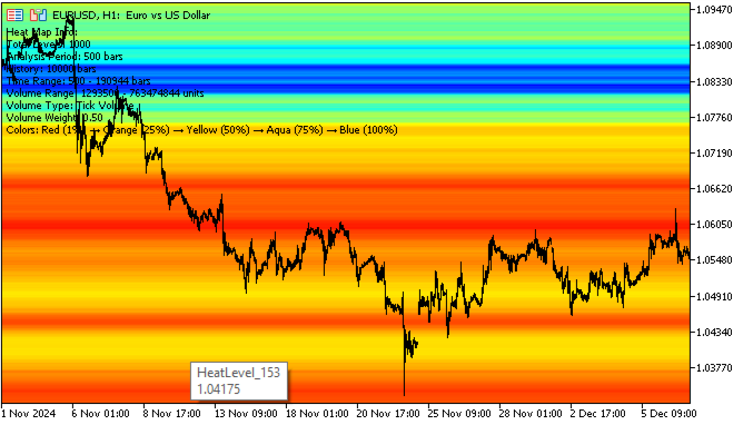
After the time is calculated, the most creative part begins: converting the raw data into a color scheme. We use a five-step system: red (1%), orange (25%), yellow (50%), light-blue (75%), blue (100%).
Smooth interpolation occurs between key points. For example, a level with 37% presence will receive a color between orange and yellow. Interpolation works in RGB space:
color InterpolateColor(color color1, color color2, double factor)
{
    // Decomposition into RGB components
    int r1 = (color1 >> 16) & 0xFF;
    int g1 = (color1 >> 8) & 0xFF;
    int b1 = color1 & 0xFF;

    // Linear interpolation of each channel
    int r = (int)(r1 + (r2 - r1) * factor);
    int g = (int)(g1 + (g2 - g1) * factor);
    int b = (int)(b1 + (b2 - b1) * factor);

    return (r << 16) | (g << 8) | b;
}
The result is smooth color transitions that create a natural heat map of the market.
Visualization: From algorithm to chart
Each price level is displayed as a rectangle on the chart. Creating thousands of graphical objects is a technically challenging task that requires optimization.
Rectangles are placed from the start time of the analysis to the current moment, covering the entire area of interest. Each object is configured to work in the background: it does not interfere with chart analysis, is not highlighted when clicked, and is automatically redrawn when the zoom level changes.
The object management system includes a mechanism for clearing previous results before rendering new ones. This prevents the accumulation of "garbage" on the chart and ensures correct updating of the visualization.
In real time, performance is critical. The indicator uses several levels of optimization:
- The first level is lazy calculations. Recalculation occurs only when a new bar appears. The system tracks the time of the last update and starts calculations only when a change occurs.
- The second level is memory optimization. Data arrays are allocated once and reused. Data structures are designed for minimal memory consumption: longs are used instead of doubles for counters, and unnecessary string variables are avoided.
- The third level is algorithmic optimization. The sliding analysis window limits the amount of data processed. The adaptive level grid prevents the creation of an excessive number of zones.
Interpreting the results: What the colors mean
Red zones (1-25% presence) indicate areas that price passes through quickly. These are the potential time gap zones described in the previous article. Red zones often experience rebounds and false breakouts, so they require a cautious approach.
Orange and yellow zones (25-75%) represent areas of moderate activity. Here the price lingers periodically, but without obvious dominance. These are transition zones that can become support or resistance, depending on the market context. These are the zones where trend-following trades often work best.
The blue and light blue zones (75-100%) are the main focus of our analysis. This is where the price spends most of its time, indicating high trading activity. These levels have a strong magnetic force: the price regularly returns to them, using them as a support for movement or a barrier to overcome.
The most effective strategy is trading bounces from blue zones. When the price approaches the area of maximum presence, the probability of a reversal is significantly higher than average. This works especially well in sideways markets, where the blue zones clearly define the channel boundaries.
Breakouts through yellow zones often signal continued movement. If the price easily passes through the medium presence area on good volume, it indicates that there is no serious resistance ahead.
Reversal setups are often most effective in red zones.
Combination with volume analysis greatly enhances the signals. When the blue zone coincides in time with high volume in the volume profile, a zone of maximum significance is created.
Customization for different markets: Versatility through adaptation
Forex with its high liquidity requires large AnalysisPeriod (300-500 bars) and MaxHistory (5000-8000 bars) values. The movements here are smoother, so a greater depth of analysis is needed to identify significant areas.
For stocks, moderate settings tend to work well: AnalysisPeriod 200-300 bars, MaxHistory 3000-5000 bars. The session structure creates natural pauses that are reflected well in the heat map.
Tick size (TickSize) is critical for proper operation. Setting this value too low will result in excessive detail without any practical benefit. Too high a value will result in missing important nuances. The value of 0 (automatic mode) is usually optimal - the system will automatically select the size based on the instrument's characteristics.
Transparency affects not only visual perception, but also performance. High values (70-90%) create a semi-transparent map that does not interfere with candlestick analysis, but requires more resources to render.
The 1000 level limit was introduced for a reason. MetaTrader 5 has limitations on the number of graphical objects, and exceeding reasonable limits leads to a slowdown in the interface without significantly improving the quality of analysis.
Integration with other tools: Synergy of methods
The heat map indicator works especially well alongside the volume profile. The coincidence of blue time zones with volume peaks creates areas of exceptional importance. Such zones often become key for long-term price movement.
Combination with Fibonacci levels gives interesting results. When important Fibonacci levels fall into the blue zones of the heat map, their importance increases many times over. This is natural: mathematical levels are supported by real price behavior.
Volatility indicators (such as Bollinger Bands) work well in conjunction with a heat map. Widening of the bands in the red zones often precedes strong moves, while narrowing in the blue zones indicates the accumulation of energy for a future breakout.
The next version of the indicator is planned to include machine learning to automatically optimize parameters for a specific instrument. The algorithm will analyze level performance statistics and adjust settings for maximum efficiency.
Integration with alert systems will allow you to receive notifications when prices approach key zones. This is especially useful for swing traders who cannot constantly monitor charts.
Exporting data to external systems will open up opportunities for creating trading robots based on heat maps. Robots will be able to use the strength of levels as an additional filter for entering a position.
Method philosophy: Time as a market currency
The indicator is based on a profound idea: time is the currency of the market. Traders spend their time as consciously as they spend their money. The more time spent at a given level, the more emotions, decisions and capital are associated with it.
This emotional attachment creates market memory. Even when the price moves away from a significant level, the memory of it remains in the subconscious of the participants. When returning to this level, old memories awaken: for some, about profits, for others, about losses. These memories influence new trading decisions.
The heat map of time makes this invisible memory visible. It turns market psychology into math, emotions into algorithms, and intuition into data.
Conclusion: A new look at old truths
The indicator does not reveal new principles, it makes old ones clearer. Support and resistance levels have always existed, but now they can be measured and ranked by importance. The heat map shows where the market spends time, and therefore where the real strength lies.Combined with the time gap indicator, this provides a comprehensive picture of the behavior of major participants: where they act quickly and where they linger. Together, these tools allow us to better understand market structure and make decisions based on logic rather than intuition.
In the next part, we will discuss how to combine all of this into a single trading system.
Translated from Russian by MetaQuotes Ltd.
Original article: https://www.mql5.com/ru/articles/18661
Warning: All rights to these materials are reserved by MetaQuotes Ltd. Copying or reprinting of these materials in whole or in part is prohibited.
This article was written by a user of the site and reflects their personal views. MetaQuotes Ltd is not responsible for the accuracy of the information presented, nor for any consequences resulting from the use of the solutions, strategies or recommendations described.

- Free trading apps
- Over 8,000 signals for copying
- Economic news for exploring financial markets
You agree to website policy and terms of use
It reminds me: I used to do this a long time ago,
In my opinion, you have just a little bit incomplete - it is left to reveal the regular structure (or show that it does not exist).
This is not a heat-map, of course - just the extrema of the regular part of a similar temperature map.
By the way, the map is calculated using the most labour-intensive and error-prone method.
Everything is simpler - for each candle 2 pairs {price,weight} : { price=high, weight=-1; } { price=low,weight=+1;} The collection is sorted by price, the sum with accumulation by weight is the heat map. Then it is quantised as you like.