
Mastering Model Interpretation: Gaining Deeper Insight From Your Machine Learning Models
Introduction
In the realm of machine learning, more often than not we think in terms of trade offs. While optimising one metric of performance, we often compromise another performance metric. With the growing evolutionary trend of increasingly larger and more intricate models, understanding, explaining and debugging them become formidable tasks. The intricacies beneath the model's surface, deciphering 'why' our models are making the decisions they are making is vital. Without this clarity how can we confidently believe we can supervise this model to our desired ends? We can't risk the model functioning in unintended ways,rendering our efforts futile! This article delves into these complexities and aims to illuminate the following topics:
-
Identifying Crucial Features: Which features did your model think were important
-
Decoding Single Feature Impact: Understanding how each feature affects your model's performance
-
Grasping Collective Feature Influence: Exploring the broader impact of features on the model's predictions
Our journey navigates the core of machine learning intricacies, empowering you to better understand and modify your model's behaviour. Embrace this knowledge, and harness the true potential of your machine learning endeavours.
Why Is It Important?
Debugging:

Fig 1: The Art of Debugging
'To err is humane, to Forgive, Divine' ~ Alexander Pope
At first glance, debugging may seem mundane, but its significance transcends domains. Picture elusive bugs, the kind that stealthily evade runtime errors, slipping by unnoticed. Yet, armed with the knowledge woven within these pages, you become equipped to decipher the intricate patterns your models weave. You’ll discern if these patterns harmonize with your understanding of the real world. In the labyrinth of real-life projects, you’ll adeptly track down and conquer your own bugs, for they are the stepping stones to mastery.
Better Feature Engineering:

Fig 2: Feature Engineering
'Continuous improvement is better than delayed perfection' ~ Mark Twain
Now, let's venture into the enchanting realm of feature engineering. Imagine a circle. Draw a red line along its diameter; a simple act, yet pregnant with meaning. Now, consider this: how many times could your diameter gracefully curve around the circle's circumference? The answer reveals itself – about 3.145, a constant known to all as pi.
This thought experiment serves as our guide, highlighting the impact of presentation on our ability to learn. Just as the curvature of our circle affects its fit, so do feature transformations enhance our dataset's harmony. By sculpting new columns, we transcend the ordinary, elevating our forecasting accuracy to extraordinary heights. Here, intuition becomes our compass, steering us through uncharted waters. But what happens when intuition falters? Fear not; this odyssey unveils strategies to navigate even the most bewildering terrains. But we don't stop there,we will then go on to empircally measure the effectiveness of these new engineered features we've introduced
Directing Future data collection:

Fig 3: Improved Data Collection
'If you want to know the future, look to the past' ~ Albert Einstein
As we traverse the landscape of data, an age-old wisdom echoes – the key to the future lies in the annals of the past. Exhausted are our feature engineering exploits? Fear not, for in the world of data, the past is our beacon. New data types beckon, promising to breathe life into our models. Insights, our faithful companions, serve as proxies, guiding us toward the gems amidst the data troves. With every insight gleaned, our path to new features becomes clearer, painting the future in hues of endless possibilities.
Improved Decision Making:

Fig 4: Improved decision making
'A little learning is a dangerous thing' ~ Alexander Pope
In the symphony of machine learning, you drive the wheel. The model dances to your tune, a testament to the decisions that breathe life into its predictions. Machine learning transcends mere forecasts; it delves into the depths of insight, where the true treasures lie buried. Your understanding, your mastery, forms the bedrock upon which your ambitions stand. Each insight, a precious nugget, influences your endeavors.
So, fellow explorer, as we unravel the mysteries of machine learning, let these words guide you.
Theoretical Foundation
In this article, our objective is to employ a gradient boosted tree model, readily available in the CatBoost Python library, to conduct price regression analysis. However, a noteworthy challenge emerges at the outset, necessitating a closer examination of the model and the identification of influential features. Before delving into the application of black-box explanation techniques for our model, it is imperative to comprehend the limitations inherent in our black-box model and the rationale behind employing black-box explainers in this context.
Gradient Boosted Trees exhibit commendable performance in classification tasks; nevertheless, they manifest distinct limitations when applied to specific time series regression problems. These trees, belonging to the family of machine learning models, categorize inputs into groups based on the target value. Subsequently, the algorithm computes the average target value within each group and utilizes these group averages for prediction. Notably, these group averages, established during training, remain fixed unless further training is conducted. A critical drawback emerges from this fixed nature, as Gradient Boosted Trees typically struggle to extrapolate trends effectively. When confronted with input values outside its training scope, the model is prone to repetitive predictions, relying on averages derived from known groups that may not accurately capture the underlying trend beyond the observed training range.
Moreover, the model presupposes that similar feature values will yield similar target values, a assumption inconsistent with our collective experience in trading financial instruments. In financial markets, price patterns may exhibit similarity while concluding at disparate points. This divergence challenges the model's assumption that the generative process produces data falling into homogeneous groups. Consequently, the violation of these assumptions introduces bias into our model.
To substantiate these observations, we will conduct a demonstration for readers who may not have independently observed this phenomenon. Our commitment is to ensure a comprehensive understanding for all readers.
We start by loading the necessary dependencies
#pip install pandas if you haven't installed it allready
#We'll use pandas to store and retrieve data
import pandas as pd

#pip install pandas-ta if you haven't installed it allready
#We'll use pandas_ta to calculate technical indicators
import pandas_ta as ta

#pip install numpy if you haven't installed it allready
#We'll use numpy to perform optmized vector calculations
import numpy as np

import matplotlib.pyplot as plt

#pip install numpy if you haven't installed it allready
#We'll use MetaTrader 5 connect to and control our MetaTrader 5 Terminal
import MetaTrader5 as MT5

#Standard python library
import time
Then we enter our login credentials
login = enter_your_login
password =  enter_your_password
server = enter_your_broker_server
Now we initialize our MetaTrader 5 Terminal and login
if(MT5.initialize(login=login, password= password, server=server)):
    print("Logged in succesfully")
else:
    print("Failed to initialize the terminal and login")
data = pd.DataFrame(MT5.copy_rates_from_pos("Volatility 75 Index",MT5.TIMEFRAME_M1,0,100000))
data
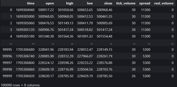
Fig 5: Our Market Data From The MetaTrader 5 Terminal
Let's calculate technical indicators that may help us forecast price
#20 period exponential moving average
data["ema_20"] = data.ta.ema(length=20)
#40 period exponential moving average
data["ema_40"] = data.ta.ema(length=40)
#100 period exponential moving average
data["ema_100"] = data.ta.ema(length=100)
#20 period relative strength indicator
data.ta.rsi(length=20,append=True)
#20 period bollinger bands with 3 standard deviations
data.ta.bbands(length=20,sd=3,append=True)
#14 period average true range
data.ta.atr(length=14,append=True)
#Awesome oscilator with default settings
data.ta.ao(append=True)
#Moving average convergence divergence (MACD)
data.ta.macd(append=True)
#Chaikins commidity index
data.ta.cci(append=True)
#Know sure thing oscilator
data.ta.kst(append=True)
#True strength index
data.ta.tsi(append=True)
#Rate of change
data.ta.roc(append=True)
#Slope between 2 points
data.ta.slope(append=True)
#Directional movement
data.ta.dm(append=True)
Setting up the target
data["target"] = data["close"].shift(-30)
Let's setup our black-box model
from catboost import CatBoostRegressor
Preparing our training and testing splits
train_start = 100
train_end   = 10000

test_start = train_end + 100
test_end = test_start + 30000

predictors = [
    "open",
    "high",
    "low",
    "close",
    "KSTs_9",
    "KST_10_15_20_30_10_10_10_15",
    "CCI_14_0.015",
    "AO_5_34",
    "ATRr_14",
    "BBM_20_2.0",
    "BBP_20_2.0",
    "BBB_20_2.0",
    "BBU_20_2.0",
    "BBL_20_2.0",
    "RSI_20",
    "ema_20",
    "ema_40",
    "ema_100",
    "SLOPE_1",
    "ROC_10",
    "TSIs_13_25_13",
    "TSI_13_25_13",
    "MACD_12_26_9",
    "MACDh_12_26_9",
    "MACDs_12_26_9",
    "DMP_14",
    "DMN_14"
]
target = "target"
Decision trees are sensitive to scale so we will normalise input values therefore we will store the first readings from each feature in this array called "first_values".
first_values = {} #Iterating over the columns in the dataset for col in data.columns: #Which of those columns are part of the model inputs? if col in predictors: #What was the first value in that column? first_values[col] = data[col][train_start] data[col] = data[col]/first_values[col]
Performing The Train test split
train_x = data.loc[train_start:train_end,predictors]
train_y = data.loc[train_start:train_end,target]

test_x = data.loc[test_start:test_end,predictors]
test_y = data.loc[test_start:test_end,target]
Fitting our black-box model
cat_full = CatBoostRegressor()
cat_full.fit(train_x,train_y)
Obtaining predictions from our black-box model
cat_full_predictions = pd.DataFrame(index=test_x.index)
cat_full_predictions["predictions"] = cat_full.predict(test_x)
cat_full_predictions.plot(label=True)
test_y.plot() 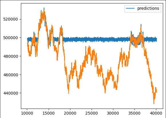
Fig 6: Our Black-box Forecast
Upon initial observation, it becomes apparent that the predictive model exhibits atypical flat periods. Given our comprehensive overview of the typical implementation of gradient boosted algorithms, such patterns should not be unexpected. Our interest lies in discerning which features contribute positively to our model's performance and which may serve as potential sources of noise. This necessitates a thorough examination of feature engineering opportunities.
To unravel these nuances, we propose employing a suite of black-box explainers. However, before blindly applying these explainers, it is imperative to grasp the underlying mechanisms of the black-box explainer algorithm. This involves a critical evaluation of the assumptions it operates under, allowing us to ascertain whether these assumptions are adhered to or potentially violated.
Approaching the application of black-box explanation techniques with this foundational understanding enables us to interpret each explanation judiciously. By scrutinizing the explanation techniques and weighing their relevance, we can attribute appropriate levels of confidence to the insights derived. This methodical approach enhances our ability to extract meaningful information and make informed decisions based on the outcomes of the black-box explanation process.
Black-box Explanation Algorithms
Drop Column Importance:
The Drop Column Importance technique is a method employed to evaluate a model's accuracy by initially considering all predictors and subsequently iteratively removing a single column, observing the resulting impact on accuracy. This approach yields valuable insights into the specific contribution of each column to the overall model performance.
What distinguishes Drop Column Importance is its practicality and reasonability. The assumption underlying this technique aligns with real-world scenarios where data inconsistencies frequently arise. Whether caused by interruptions to internet connections, power outages, adverse weather conditions, or other unforeseen events, the methodology emulates a robust model that mirrors occurrences in the actual operational environment. This realism enhances the technique's applicability and effectiveness in addressing scenarios that may be encountered in practical, day-to-day situations.
Strengths:
- Improved Model Performance: Dropping irrelevant or redundant columns can enhance the performance of machine learning models by reducing noise and improving the signal-to-noise ratio.
- Simplified Model: Removing unnecessary columns can lead to simpler and more interpretable models, making it easier to understand and explain to stakeholders.
Weaknesses:
- Loss of Information: Deleting a column may result in the loss of valuable information, potentially leading to an oversimplified model that fails to capture important patterns in the data.
- Impact on Downstream Processes: If the column is used in subsequent analyses or is necessary for certain business processes, dropping it may disrupt those workflows.
Opportunities:
- Feature Engineering: The removal of a column may present an opportunity for feature engineering, allowing you to create new features based on the existing data or modify the remaining features for better model performance.
- Resource Optimization: Removing unnecessary columns can lead to resource savings in terms of memory, storage, and processing time, especially in large datasets.
Threats:
- Model Bias: If the dropped column contains information crucial for unbiased predictions, its removal may introduce bias into the model, leading to inaccurate or unfair results.
- Data Integrity Concerns: Dropping columns without a thorough understanding of the data may introduce data integrity issues, affecting the overall quality of the dataset and subsequent analyses.
Permutation Importance:
Permutation Importance offers an alternative method for assessing feature importance by randomly permuting the values of a specific column and assessing the resulting impact on the model's error metrics. The core idea is based on the premise that if a column plays a substantial role in influencing the model, disrupting its original values should result in an increase in error metrics and a decline in overall accuracy. Conversely, if the column's impact is minimal, observable changes will be limited, and in certain instances, there may even be an improvement in performance.
This technique provides a nuanced perspective on feature importance, allowing for a dynamic evaluation of each feature's contribution to the model's predictive capacity. The permutation process introduces a level of randomness that helps uncover the sensitivity of the model to individual features, enabling a more comprehensive understanding of their significance in the predictive framework.
Strengths:
- Model-Agnostic: Permutation importance is model-agnostic, meaning it can be applied to any supervised learning model without assumptions about the underlying algorithm. This makes it a versatile and widely applicable technique.
- Intuitive Interpretation: The concept of permutation importance is relatively easy to understand. It measures the change in model performance when the values of a specific feature are randomly permuted, providing a clear interpretation of feature importance.
Weaknesses:
- Computational Intensity: The calculation of permutation importance involves re-evaluating the model's performance for each feature permutation, making it computationally intensive and potentially time-consuming, especially for large datasets.
- Sensitivity to Sample Size: Permutation importance can be sensitive to the size of the dataset. In small datasets, the impact of permuting a feature might be exaggerated, leading to less reliable importance estimates.
Opportunities:
- Feature Selection Guidance: Permutation importance results can guide feature selection by identifying which features contribute most to the model's performance. This information can be valuable for simplifying models and reducing dimensionality.
- Identification of Non-linear Relationships: Unlike linear models, permutation importance can capture non-linear relationships between features and the target variable, providing insights into complex patterns in the data.
Threats:
- Influence of Correlated Features: Permutation importance may not handle well situations where features are highly correlated. If two features are correlated, permuting one may not significantly impact the model's performance if the other feature is still providing similar information.
- Potential for Overfitting: In certain cases, there is a risk of overfitting when using permutation importance, especially if the model is overly complex or if the dataset is small. The importance scores might not generalize well to new data.
Partial Dependence Plots (PDP) and Individual Conditional Expectation (ICE) Plots:
To gain a more nuanced understanding of the model's behavior, we employ Partial Dependence Plots (PDP) and Individual Conditional Expectation (ICE) Plots. Partial Dependence Plots illustrate how the predicted outcome evolves as a single predictor varies, keeping all other predictors constant. Meanwhile, ICE Plots provide a detailed perspective on feature importance by presenting individual curves for each instance, facilitating a comprehensive analysis of the impact of each feature.
Together, PDPs and ICE Plots offer a robust visual representation that goes beyond aggregate trends. PDPs provide an overarching view of the relationship between a specific predictor and the model's predictions, while ICE Plots delve into the nuances by presenting a set of curves, each representing the individualized impact of that predictor across different instances. This combined approach enhances our ability to discern intricate patterns and variations in the model's response to different predictor values, fostering a more thorough comprehension of feature importance within the overall predictive framework.
Strengths:
- Interpretability: PDPs provide an intuitive and visual representation of the relationship between a feature and the predicted outcome, making it easier for non-experts to interpret and understand the impact of a specific feature on the model's predictions.
- Identification of Patterns: PDPs can help identify patterns and trends in the relationship between a feature and the predicted outcome, allowing for a deeper understanding of how changes in a feature influence the model's predictions.
Weaknesses:
- Assumption of Independence: PDPs assume that the feature of interest is independent of other features. In complex models with correlated features, the interpretation of PDPs might be challenging, and the plots may not accurately reflect the true relationships.
- Limited to Marginal Effects: PDPs show the marginal effect of a single feature while keeping other features fixed. They may not capture complex interactions between multiple features, limiting their ability to reveal the full complexity of the model.
Opportunities:
- Model Validation: PDPs can be used as a tool for model validation. By comparing the insights gained from PDPs with domain knowledge or expectations, practitioners can assess whether the model aligns with the anticipated behavior of features.
- Feature Importance Ranking: PDPs can aid in feature importance ranking by visually highlighting the features that have the most significant impact on model predictions. This information can guide feature selection and model simplification.
Threats:
- Potential for Misinterpretation: Without a proper understanding of statistical concepts, there is a risk of misinterpretation. Users might mistakenly attribute causality to observed associations, especially if they are not aware of potential confounding variables or underlying model complexities.
- Complexity for High-Dimensional Data: PDPs become challenging to interpret in high-dimensional spaces due to the combinatorial explosion of possible feature combinations. Visualizing interactions among multiple features becomes increasingly complex.
Shapley Additive Explanations (SHAP Values):

Fig 7: In Loving Memory of Lloyd Shapley Who Passed Away March 12, 2016, Tucson, Arizona. His Ideas Live On Forever.
Named after their pioneer, Lloyd Shapley, SHAP values are used for explaining the output of a model by attributing the contribution of each feature to the prediction.
SHAP values can be computed by evaluating the model's output for all possible combinations of features. In simpler terms, it involves shuffling the values of a specific feature while keeping the others constant and observing the impact on the model's predictions.
Just like a player in a game, if a feature consistently doesn't change the model's output when its value is shuffled (like a player not impacting the team's performance when they are not involved), the SHAP value for that feature tends to be lower. In contrast, if changing the feature significantly affects the model's output, the SHAP value will be higher, indicating a more substantial contribution.
SHAP values provide a quantitative measure of the contribution of each feature. By comparing the SHAP values across different features, you can infer which features have a more substantial impact on the model's predictions.
So, if a feature is repeatedly left out (its values are shuffled or varied), and the model's performance doesn't change significantly, it suggests that the contribution of that feature to the model's predictions might be relatively small.
Strengths:
- Model-Agnostic: SHAP values are model-agnostic, meaning they can be applied to any machine learning model, including complex models such as ensemble methods, neural networks, and support vector machines.
- Global and Local Interpretability: SHAP values provide both global and local interpretability. They can explain the impact of individual features on a specific prediction (local interpretability) and the overall contribution of each feature across the entire dataset (global interpretability).
Weaknesses:
- Computationally Intensive: Calculating SHAP values can be computationally intensive, especially for large datasets or complex models. This may pose challenges in real-time applications or situations where computational resources are limited.
- Interpretability Challenges for High-Dimensional Data: Interpreting SHAP values for models with a high number of features can be challenging. Visualizing and understanding the contributions of numerous features becomes more complex in high-dimensional spaces.
Opportunities:
- Feature Importance Ranking: SHAP values can be used to rank features based on their impact on model predictions. This information is valuable for feature selection and identifying the most influential variables in a model.
- Explanatory Visualizations: SHAP values enable the creation of insightful visualizations, such as SHAP summary plots or individual force plots, aiding in the communication of model predictions and feature contributions to stakeholders.
Threats:
- Assumption of Consistency: SHAP values assume consistency, meaning that the impact of a feature on a prediction is consistent across different instances. In some cases, this assumption might not hold, leading to potential misinterpretations.
- Complexity of Interpretation: While SHAP values provide valuable insights, interpreting them correctly requires a solid understanding of the underlying concepts. Users may misinterpret the significance of certain values or fail to grasp the nuances of feature contributions.
Mutual Information:
Mutual Information (MI) is a measure of the amount of information that the presence or absence of one variable provides about another variable. It quantifies the degree of dependence or association between two variables.
Strengths:
- Model-Agnostic: Mutual Information is a model-agnostic metric, meaning it does not rely on a specific machine learning model. It can be applied to any type of relationship between variables, including both linear and non-linear dependencies.
- Captures Non-Linear Relationships: Unlike correlation, which is more suitable for linear relationships, Mutual Information can capture non-linear dependencies between variables, making it versatile for various types of data.
Weaknesses:
- Sensitivity to Sample Size: Mutual Information might be sensitive to the size of the dataset. In small datasets, the estimation of MI can be less stable, and small variations in data may have a more significant impact on the results.
- Difficulty in Interpreting Magnitude: While MI provides a measure of the strength of association, its absolute values might be challenging to interpret directly. The interpretation of "high" or "low" mutual information depends on the context and scale of the variables.
Opportunities:
- Feature Selection: Mutual Information can be used for feature selection by ranking features based on their relevance to the target variable. Features with higher MI values are considered more informative for predicting the target.
- Variable Importance in Ensemble Models: In ensemble learning, Mutual Information can be employed to assess the importance of variables, aiding in the construction of more accurate and interpretable ensemble models.
Threats:
- Assumption of Independence: Mutual Information assumes that variables are independent when their MI is zero. In practice, it might not capture complex dependencies or relationships affected by latent factors or confounding variables.
- Computationally Intensive for High Dimensions: Estimating Mutual Information for high-dimensional data can be computationally intensive. This may pose challenges in terms of time and resource requirements.
Thankfully, specialized Python libraries streamline this process, sparing us the need to build most of the code from scratch.
It's important to note that this article won't delve into the intricacies of training and fitting models. Instead, it will focus on the post-training phase, exploring how to assess and interpret a model's performance. The provided code example builds a basic model purely for illustrative purposes, emphasizing the steps taken after designing and training your model.
Let's Start
Drop Column Importance
We will use the Recursive Feature Elimination algorithm from the sklearn library to serve as an implementation of Drop Column Importance
from sklearn.feature_selection import RFE
from sklearn.linear_model import LinearRegression
from sklearn.svm import SVR
The Recursive Feature Elimination algorithm expects us to pass supervised learning model which it can fit and assess.
The model should provide information about feature importance either through it's coefficients or a dedicted function.
The model doesn't have to be the same as the model we are using in our problem.
The model doesn't have to be from the sklearn library, but it should at least have an sklearn wrapper
We'll use a linear model and assess it's accuracy as we randomly drop features.
lm = LinearRegression()
rfe = RFE(lm,step=1) The step argument denotes how many features to drop with each iteration.
Then we fit the Recursive Feature Elimination algorithm
rfe = rfe.fit(train_x,train_y)Let's inspect which features our RFE algorithm found informative
rfe.support_
rfe.ranking_
The sklearn implementation furnishes us with a mask we can apply to the columns in our train_x dataframe, to see the names of the columns RFE found important.
train_x.columns[rfe.support_]
1)Open 2)High 3)Low 4)Close 6)KSTs_9 7)KST_10_15_20_30_10_10_10_15 7)All 3 exponential moving averages 8)4 Bollinger Band Components: 'BBM_20_2.0' 'BBB_20_2.0' 'BBU_20_2.0' 'BBL_20_2.0' 9)MACD: 'MACDs_12_26_9' 10)Directional movement negative The other indicators may have been contributing noise, but remember these are only estimations and serve as guides!
We cannot conclude that this is precisely the truth of the matter, however it's still a reasonable assertion for us to make.
Next we move on to assessing Permutation Importance
We will use a Python library called Explain Like I'm 5 (ELI5) to implement the algorithm
#pip install eli5 if you don't allready have it installed
import eli5
from eli5.sklearn import PermutationImportance
from sklearn.ensemble import GradientBoostingRegressor
gbr = GradientBoostingRegressor().fit(train_x,train_y)

permutation = PermutationImportance(gbr).fit(test_x,test_y)
Now we will assess the weights the algorithm has assigned to each of our features
eli5.show_weights(permutation,feature_names = test_x.columns.to_list())
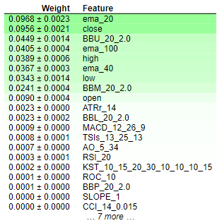
Fig 8: Permutation Importance Weights
Interpreting the results of permutation importance is straightforward. The features are ranked in descending order of importance, with the most crucial ones positioned at the top and the less significant ones towards the bottom. The weight value, such as "0.0986 +- 0.0256," signifies the change in the model's error metrics. For readers seeking concise information, it's worth reiterating that Permutation Importance involves randomly shuffling the values of a feature. If the feature significantly influences the model, this randomization should lead to an increase in the model's error metrics. Due to the stochastic nature of the algorithm, this increase is presented as a range rather than a specific value.
Conversely, for features that lack importance, there will be either no change or, in some instances, a decrease in the model's error metrics when the values are randomly shuffled. This dual nature of the outcomes—either an increase or decrease in error metrics—provides a clear indication of the relative importance of each feature, contributing to a concise and comprehensible interpretation of the permutation importance results. Therefore we can conclude that drop column importance and permutation importance both share similar sentiments regarding feature importance in our model.
Partial Dependence Plots and Individual Conditional Expectation (ICE) Plots:
#Import partial dependence display from sklearn
from sklearn.inspection import PartialDependenceDisplay
for feature_name in predictors:
    PartialDependenceDisplay.from_estimator(cat_full,test_x,[feature_name])
    plt.grid()
plt.show() 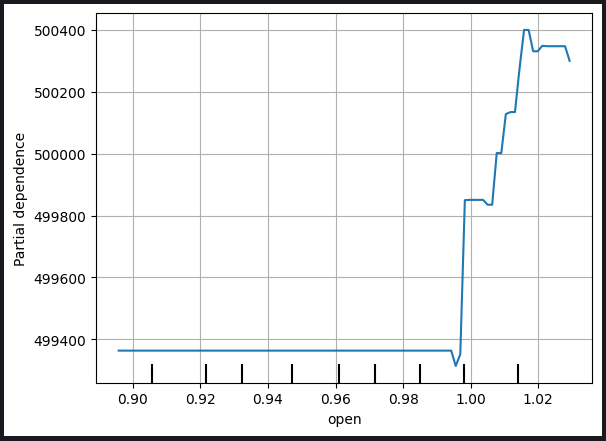
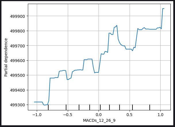
Fig 9: Partial Depedency Plot of Opening Price and The MACD Signal Line
The partial dependence plot serves as a valuable tool for understanding how a change in a specific variable influences our model's predictions. Analyzing the partial dependence plot of the MACD Signal Line, we can reasonably infer that, in general, an increase in the MACD Signal Line is associated with a rise in our model's forecasted closing price.
However, it's important to note that the interpretation of partial dependence plots can be more intricate, as exemplified by the MACD Height plot below.
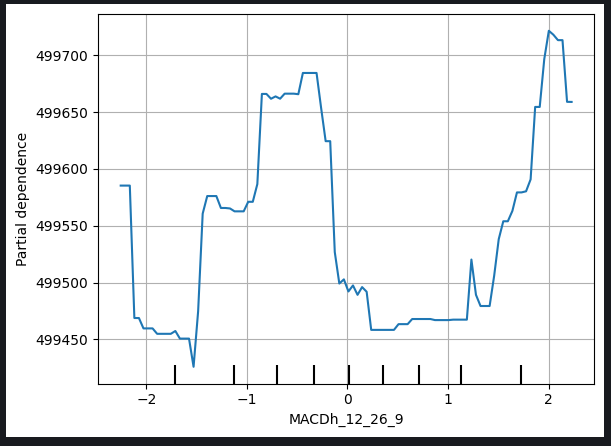
Fig 10: Partial Depedence Plot of The MACD Height
The complexities in interpreting such plots may arise from non-linear relationships or interactions with other variables that require more nuanced analysis. In the case of the MACD Height plot, additional considerations and exploration may be necessary to uncover the precise nature of the relationship between MACD Height and the model's forecasted closing price.
This acknowledgment emphasizes the need for a comprehensive examination of partial dependence plots, considering the unique characteristics of each variable, and, when faced with challenges in interpretation, seeking further insights through additional analyses or expert consultation.
Individual Conditional Expectation (ICE) plots are generated to provide a granular view of how individual instances respond to changes in a specific predictor variable. Here's a step-by-step explanation of how ICE plots are made and used:
1. Individual Prediction Variations:
- Begin with a dataset containing the predictor variable of interest and other relevant features.
- Select a specific instance from the dataset.
2. Vary the Predictor Variable:
- For the chosen instance, systematically vary the values of the predictor variable while keeping the other features constant.
- Create a set of predictions corresponding to each varied value of the predictor variable.
3. Create Individual Curves:
- Repeat steps 1-2 for multiple instances in the dataset, generating a set of individual curves (one for each instance) that illustrate the relationship between the predictor variable and the model's predictions.
4. Plotting:
- Plot each individual curve on the same graph. The x-axis represents the values of the predictor variable, and the y-axis represents the model's predictions.
5. Interpretation:
- Analyze the ICE plot to observe how the model's predictions change for each instance as the predictor variable varies.
- Identify patterns, trends, or variations in the curves to gain insights into the impact of the predictor variable on individual predictions.
6. Comparative Analysis:
- Compare multiple ICE plots, especially when dealing with different instances, to understand the heterogeneity in the variable's effect across the dataset.
Usage:
- Granular Insight: ICE plots offer a detailed, instance-specific view of how a predictor variable influences predictions, allowing for a more nuanced understanding.
- Model Understanding: They help users explore non-linear relationships, interactions, and potential anomalies that might not be evident in aggregate views.
- Feature Importance: ICE plots can contribute to assessing the importance of a specific feature by illustrating its impact on individual predictions.
- Decision Support: Insights from ICE plots can inform decision-making, especially when it's crucial to understand how predictions vary for specific instances in response to changes in a particular variable.
As a matter of fact, the PDP plot is simply the average of the ICE plots made. The PDP line is shown in orange below.
for feature in predictors:
    PartialDependenceDisplay.from_estimator(cat_full,test_x,[feature],kind='both')
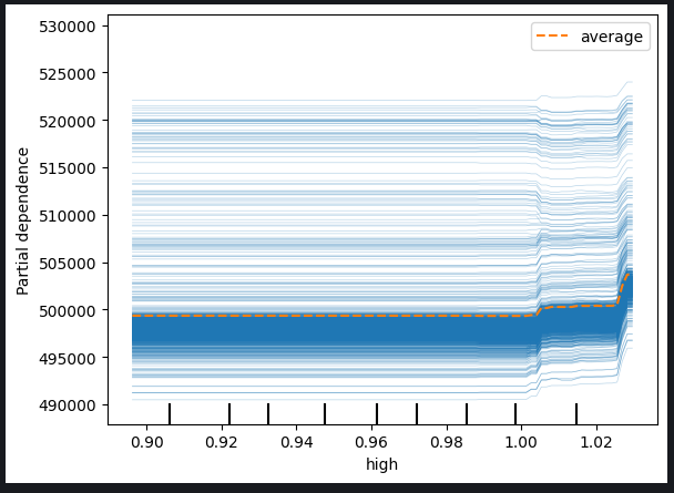
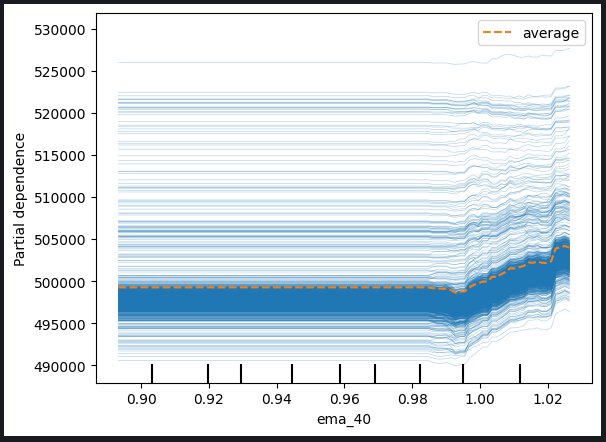
Fig 11: ICE Plot of The High Price And The 40 Period EMA
Based on the observed plots, it is evident that an increase in either the high price or the exponential moving average does not result in an immediate impact on our model's predictions. Instead, it appears that these variables would need to experience significant increases before any notable change in the model's predictions is expected. This observation suggests that the model is not very sensitive to incremental changes in these particular features.
Key insights derived from the plots include:
-
Threshold Sensitivity: The model appears to exhibit a threshold sensitivity, meaning that it requires a substantial or threshold level of change in the high price or exponential moving average before it adjusts its predictions significantly.
-
Gradual Response: Incremental or moderate changes in the mentioned features do not seem to trigger immediate adjustments in the model's predictions. This characteristic suggests a gradual or subdued response to such variations.
-
Low Sensitivity: The conclusion that the model is not very sensitive to changes in these features implies that minor fluctuations in the high price or exponential moving average are unlikely to have a discernible impact on the model's output.
Understanding the sensitivity of the model to different features is crucial for effective model interpretation and decision-making. These insights can guide further analysis, model refinement, or inform stakeholders about the nature of the relationships between specific predictors and the model's predictions.
We can also inspect 2-Dimensional Partial Depedence Plots to see the joint effect of 2 features
#Setting up the plot
fig , ax = plt.subplots(figsize=(10,5))
column_names = [('ROC_10','ATRr_14')]

#Plotting 2D PDP
disp_4 = PartialDependenceDisplay.from_estimator(cat_full, test_x[0:1000],column_names, ax=ax)
plt.show() 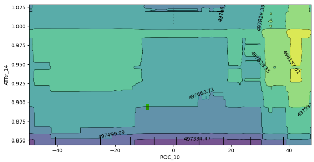
Fig 12: 2D Partial Depedence Plot of the Rate of Change (ROC) and Average True Range (ATR) indicator.
The analysis of the 2D partial dependence plot reveals that, in general, an increase in both the ROC (Rate of Change) and ATR (Average True Range) indicators corresponds to an increase in the expected prediction from our model. This positive correlation aligns with the anticipated behavior of the model in response to changes in these indicators.
However, the plot also provides insights into the interaction between these two indicators. Notably, the lack of well-defined boundaries in the plot suggests that the relationship is not consistently stable. Instead, there are areas of mixed strength and weakness, indicating that the influence of the ROC and ATR indicators on the model's predictions may vary across different regions of the plot.
The presence of random enclaves of weak expectations within boundaries of strong expectations further emphasizes the dynamic nature of the interaction. It's important to note that the observed behavior might be influenced by the sampling approach, particularly if a subset of the dataframe was used for computational efficiency reasons.
A few considerations and potential implications include:
-
Sampling Limitations: The observed inconsistencies could be partially attributed to the use of a smaller sample for computational efficiency. A broader sampling approach might provide a more comprehensive view of the interaction.
-
Non-Linearity or Interactions: The lack of well-defined boundaries and the presence of mixed spots suggest potential non-linearities or interactions between the ROC and ATR indicators. Further exploration, possibly with larger samples, could unveil more nuanced patterns.
-
Model Robustness: Understanding the variability in the interaction helps assess the robustness of the model and its sensitivity to different combinations of input features.
In conclusion, the interpretation of the 2D partial dependence plot offers valuable insights into the model's response to changes in the ROC and ATR indicators. Acknowledging the potential influence of sample size on the observed patterns, further investigation and, if feasible, a more extensive sampling strategy may enhance the precision of these findings.
Shapely Additive Explanations (SHAP) Values
#pip install shap if you don't have it installed
#Import SHAP
import shap

#Initialise the shap package
shap.initjs()
A few things to consider :
-
SHAP values assume features are independent/uncorrelated
-
SHAP values are computationally expensive to calculate accurately, this problem is exacerbated by increasing dimensionality of the dataset.
-
SHAP values are model agnostic, meaning they may not help us capture certain model specific behaviours, this is ironically a strength and a weakness.
-
SHAP values are sensitive to input order!
Our dataset has strong correlation terms and that’s a major problem when calculating SHAP values, it violates the assumption that the features are independent, fortunately there are many ways to treat this problem for example:
-
Dropping correlated features, this is the simplest solution but should only be considered last in most cases.
-
Consider using feature reduction techniques such as Principal components analysis or other feature selection methods you may also be familiar with
-
Feature discretization into bins can help mitigate the adverse effects of correlation in your SHAP value calculations
-
Using SHAP algorithms designed to handle correlated data
-
Using uncorrelated features, for example in our case Volume and High Low Spread have very little correlation.
For this exercise we’ll use a 4th solution, using specific SHAP algorithms that are designed to handle correlated data. Tree based SHAP algorithms can handle correlation well.
#Initialise shap value calculator
tree_explainer = shap.TreeExplainer(cat_full)

#Store SHAP values
shap_values = tree_explainer.shap_values(test_x)

#Plot SHAP values
shap.summary_plot(shap_values,test_x)
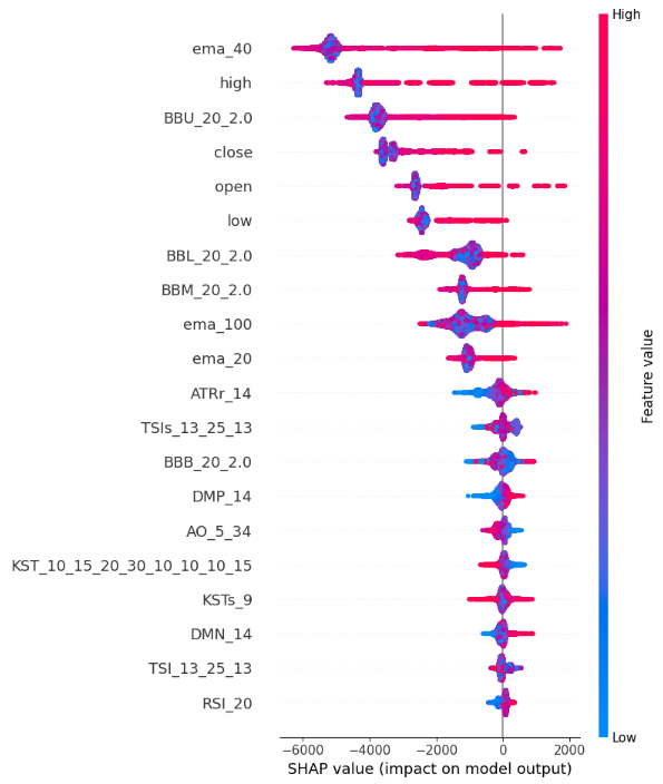
Fig 13: SHAP Value Plots
Here's how we interpret the SHAP summary plot:
-
Feature Importance: Features listed at the top of the y-axis have a stronger influence on increasing the close price, while features towards the bottom of the y-axis have a stronger influence on decreasing close price.
-
Direction of impact: Each feature has colour coded points along the x-axis. Blue points symbolise lower feature values and red points symbolise higher feature values. The horizontal positioning of these points tells us the impact of the feature’s value on close price. So our SHAP value calculations are telling that our High_Low_Sread isn’t very indicative of closing price.
-
Magnitude of location: the horizontal location of each point along the x-axis represents the magnitude of the impact, therefore extreme high and low values have relatively stronger effects on the closing price as compared to the Volume, Open and High_Low_Spread features in this demonstration example.
Mutual Information
from sklearn.feature_selection import mutual_info_regression
mi_scores = mutual_info_regression(train_x, train_y)
mi_scores = pd.Series(mi_scores, name="MI Scores", index=train_x.columns)
mi_scores = mi_scores.sort_values(ascending=False)
mi_scores
ema_100 1.965130
ema_40 1.960548
ema_20 1.933651
BBM_20_2.0 1.902066
BBL_20_2.0 1.895867
BBU_20_2.0 1.881435
high 1.795941
low 1.786879
close 1.783567
open 1.777118
TSIs_13_25_13 0.232247
ATRr_14 0.215980
MACDs_12_26_9 0.214559
KST_10_15_20_30_10_10_10_15 0.208868
KSTs_9 0.205177
MACD_12_26_9 0.174518
TSI_13_25_13 0.168086
AO_5_34 0.128653
BBB_20_2.0 0.104481
RSI_20 0.095368
MACDh_12_26_9 0.076360
DMP_14 0.060191
DMN_14 0.048856
ROC_10 0.042115
BBP_20_2.0 0.028558
CCI_14_0.015 0.022320
SLOPE_1 0.004144
def plot_mi_scores(scores):
    scores = scores.sort_values(ascending=True)
    width = np.arange(len(scores))
    ticks = list(scores.index)
    plt.barh(width, scores)
    plt.yticks(width, ticks)
plt.title("Mutual Information Scores") plt.figure(dpi=100, figsize=(8, 5)) plt.grid() plot_mi_scores(mi_scores)
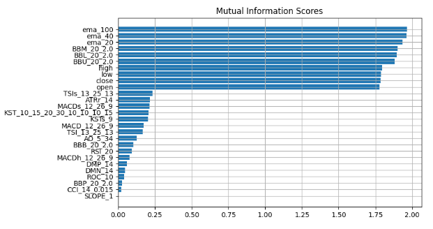
Fig 14: Mutual Information Scores
We observe a consistent consensus across all our black-box explanation techniques, suggesting that features consistently highlighted in these explanations likely contain substantial information that we can effectively leverage. The Exponential Moving Average, The Bollinger Bands and the Open High Low and Close prices consistently rank towards the top, therefore by taking measures of central tendency we can logically arrive at the conclusion that these features may be very informative and therefore we can drop everything else.
Let's validate our findings.
We'll use 2 models, a simple linear regression and our powerfull black-box. We will handpick features using the insight we've gained from our black-box explanation techniques.
First we'll import the dependencies we need.
from sklearn.linear_model import LinearRegression
from catboost import CatBoostRegressor
from sklearn.metrics import mean_squared_error
Then we will fit the simpler model first
#First we fit the simpler model
lm = LinearRegression()

lm.fit(train_x.loc[:,["open","high","low","close"]],train_y)
We will then assess how well the simpler model fits the training data.
lm_predictions = pd.DataFrame(lm.predict(train_x.loc[:,["open","high","low","close"]]), index = train_y.index)
lm_fit = lm.predict(train_x.loc[:,["open","high","low","close"]])
residuals = pd.DataFrame(train_y - lm_fit)
We will now bring in our more powerfull black-box model to learn the residuals of our simpler model, we will give our black-box model the features we believe are most informative
#Now we bring in our more powerfull black-box model
cat = CatBoostRegressor()
cat.fit(
    train_x.loc[:,["BBM_20_2.0","BBL_20_2.0","BBU_20_2.0","ema_40","ema_20","ema_100"]],
    residuals)
We will conduct a comparison of error levels on the test data by evaluating the performance of our initial black-box model, which utilized all available features, against the accuracy of a refined model. The refined model incorporates the assistance of a simpler linear regression and strategically employs a subset of carefully selected features.
lm_test_predictions = pd.DataFrame(lm.predict(test_x.loc[:,["open","high","low","close"]]),index=test_y.index)
cat_full_test_predictions = cat_full.predict(test_x[predictors])

cat_residuals_predictions = pd.DataFrame(cat.predict(test_x.loc[:,["BBM_20_2.0","BBL_20_2.0","BBU_20_2.0","ema_40","ema_20","ema_100"]]),index=test_y.index)
We will assess the error level of our initial black-box
full_error = mean_squared_error(test_y,cat_full_test_predictions)
And compare it to the error level of our new black-box hybrid.
hybrid_predictions = lm_test_predictions.iloc[:,0] + cat_residuals_predictions.iloc[:,0]
hybrid_error = mean_squared_error(test_y, hybrid_predictions)
delta_error = full_error - hybrid_error
(delta_error / full_error) * 100
94.428
Our new black-box hybrid has error metrics that have improved by 94%.
hybrid_predictions.plot()
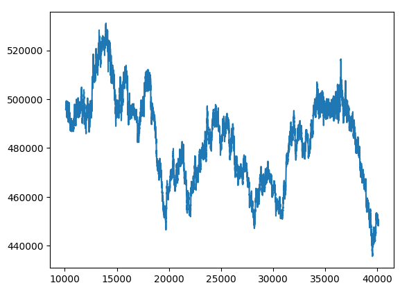
Fig 15: New Black-box Forecast
Bringing It All Together
We are poised to integrate all components into a comprehensive trading strategy.
MARKET_SYMBOL = "Volatility 75 Index"
DEVIATION = 100
VOLUME = 0
symbol_info = MT5.symbol_info(MARKET_SYMBOL)
VOLUME = symbol_info.volume_min * 1
def preprocess(df):
    #20 period exponential moving average
    df["ema_20"] = df.ta.ema(length=20)
    #40 period exponential moving average
    df["ema_40"] = df.ta.ema(length=40)
    #100 period exponential moving average
    df["ema_100"] = df.ta.ema(length=100)
    #20 period bollinger bands with 3 standard deviations
    df.ta.bbands(length=20,sd=2,append=True)
    df = df.loc[100:,:]
def fetch_prices():
    current_prices = pd.DataFrame()
    current_prices = pd.DataFrame(MT5.copy_rates_from_pos(MARKET_SYMBOL,MT5.TIMEFRAME_M1,0,200))
    preprocess(current_prices)
    return(current_prices)
def normalise_prices(raw_data):
    for col in raw_data.columns:
        if col in first_values:
            raw_data[col] = raw_data[col] / first_values[col]
model_forecast = 0 def hybrid_forecast(model_1,model_2): market_data = fetch_prices() normalise_prices(market_data) forecast_1 = model_1.predict(market_data.loc[199:200,["open","high","low","close"]]) forecast_2 = model_2.predict(market_data.loc[199:200,["BBM_20_2.0","BBL_20_2.0","BBU_20_2.0","ema_40","ema_20","ema_100"]]) out = forecast_1 + forecast_2 return(out)
INITIAL_BALANCE = MT5.account_info().balance
CURRENT_BALANCE = 0
if __name__ == "__main__": while True: #Account standing info = MT5.account_info() CURRENT_BALANCE = info.balance profit = CURRENT_BALANCE - INITIAL_BALANCE model_forecast = hybrid_forecast(lm,cat) print("Current forecast: ",model_forecast) #We have no open positions if(MT5.positions_total() == 0): print("No open positions") #Buy if(model_forecast > MT5.symbol_info(MARKET_SYMBOL).ask): print("Following model forecast buy") MT5.Buy(MARKET_SYMBOL,VOLUME) last_trade = 1 #Sell elif(model_forecast < MT5.symbol_info(MARKET_SYMBOL).ask): print("Following model forecast sell") MT5.Sell(MARKET_SYMBOL,VOLUME) last_trade = 0 elif(MT5.positions_total() > 0): print("Checking model forecast") if((model_forecast > MT5.symbol_info(MARKET_SYMBOL).ask) & (last_trade == 0)): print("Model is forecasting a move that hurts our exposure. Closing positions") MT5.Close() elif((model_forecast < MT5.symbol_info(MARKET_SYMBOL).ask) & (last_trade == 1)): print("Model is forecasting a move that hurts our exposure. Closing positions") MT5.Close() print("Total Profit/Loss: ",profit) time.sleep(60)
Current forecast: [239100.04622681] No open positions Following model forecast buy Total Profit/Loss: 0.0
Conclusion
As we advance on to train larger and more sophisticated models, they become challenging to understand, explain and debug. Without being able to fully understand what exactly our machine learning models are doing under the hood and why they are reaching the decisions they are reaching we cannot be sure that the model is functioning the way we intended it to. Failure to understand and troubleshoot models doesn’t warrant the additional complexity brought on by employing these techniques. The value we can consistently leverage from a tool is limited to the extent that we understand said tool. So it was towards this end that this article was written, to empore you to have more confidence in your models and extract deeper insights into the turning cogs that are within the infamous black box of machine learning models.Warning: All rights to these materials are reserved by MetaQuotes Ltd. Copying or reprinting of these materials in whole or in part is prohibited.
This article was written by a user of the site and reflects their personal views. MetaQuotes Ltd is not responsible for the accuracy of the information presented, nor for any consequences resulting from the use of the solutions, strategies or recommendations described.
 Modified Grid-Hedge EA in MQL5 (Part II): Making a Simple Grid EA
 Data label for time series mining (Part 6):Apply and Test in EA Using ONNX
 Algorithmic Trading With MetaTrader 5 And R For Beginners
- Free trading apps
- Over 8,000 signals for copying
- Economic news for exploring financial markets
You agree to website policy and terms of use