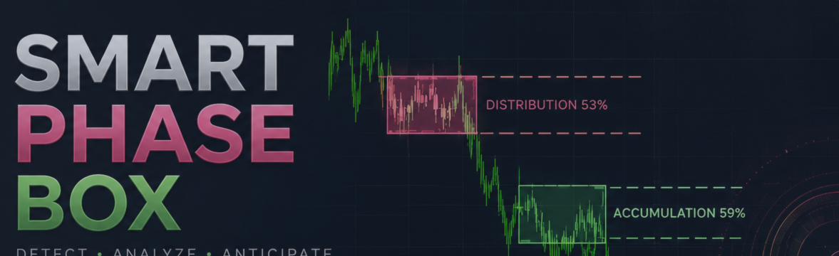

Markets don't move in straight lines — they breathe
Every chart is full of quiet stretches. Price stalls, coils into a tight range, and just sits there for a while before eventually breaking out in one direction. Most traders scroll right past these zones, waiting for "something to happen." But if you look closely — really closely, at the candle-by-candle texture rather than the overall shape — those quiet stretches are rarely as empty as they look. Something is usually happening. It's just happening below the surface.
That's the starting point for Smart Phase Box.
Indicator for
MT5: https://www.mql5.com/en/market/product/186516
MT4: https://www.mql5.com/en/market/product/186530
A century-old idea, still underappreciated
In the 1930s, Richard Wyckoff described markets as driven by a "Composite Operator" — a stand-in for the collective behavior of large, well-capitalized participants. His observation was simple but powerful: big size can't be bought or sold in one shot without moving the price against itself. So large players build and unload positions gradually, inside ranges, absorbing the opposite side's orders as they go. He called the building phase accumulation and the unloading phase distribution.
The idea has survived remarkably well because it isn't really about any specific player — it's about a structural fact of markets: size needs time and liquidity, and time and liquidity leave marks. Long wicks that get bought up. Down candles that go nowhere despite heavy volume. A tendency for price to keep closing in the upper or lower half of a range. None of these are proof of anything on their own. But taken together, over enough candles, they start to describe a bias.
The "Smart Money" framing that grew out of this tradition is really just a modern restatement: somewhere out there, better-informed or better-funded participants are positioning during the boring parts of the chart, and the breakout that follows is often just the visible tip of work that was already done quietly inside the range.
Why the usual tools fall short
Two common approaches try to formalize this kind of reading, and both fall short in a specific way.
Volume Profile shows you where volume traded, but it doesn't interpret why. A big volume node inside a range could mean patient accumulation — or it could mean two large players fighting to a standstill with no net edge either way. The profile alone can't tell them apart. It leaves the actual judgment call entirely to the trader's eye.
Generic flat/range detectors solve a different, narrower problem: they find compression. They're good at telling you that something quiet is happening, but not what. Every range gets flagged the same way, regardless of whether it's a calm balance, a stealth accumulation, or a distribution top in disguise.
Smart Phase Box tries to sit between these two gaps: find the compression and read what's happening inside it, using the same clues a Wyckoff-style reader would look for by eye — just applied consistently, candle by candle, without fatigue or bias creeping in over a long session.
The three questions the indicator keeps asking
Once a range is detected, the indicator doesn't stop at "there's a flat here." It re-asks three simple questions on every new candle inside the zone, and keeps a running tally of the answers.
1. Is a wick being defended? A long lower wick on its own means nothing — plenty of candles have wicks. But a long lower wick paired with a spike in volume is a different story: it suggests that as price dipped, a wave of orders showed up and pushed it back before the candle closed. That's the signature of a resting buyer (or seller, on the upper side) absorbing flow at a specific level, rather than random noise.
2. Is there effort without result? This is the more subtle of the two, and arguably the more interesting one. Picture a red candle — sellers clearly pushed — but the candle's body is narrow and volume was unusually high. A lot of selling happened, and yet price barely moved. Somebody was buying into that selling, in size, without it showing up as a green candle. The visible direction and the underlying pressure have quietly diverged. The same logic runs in reverse for green candles that go nowhere on heavy volume.
3. Where does price keep closing? Over the life of the range, does price gravitate toward closing in the upper half of the zone or the lower half? It's a simple positional tell, but consistently closing strong (or weak) relative to the range's center adds a small, steady vote in one direction — the kind of detail that's easy to miss by eye over dozens of candles, but easy for code to track exactly.
None of these three signals is meant to be decisive alone. The indicator's verdict — "leaning accumulation" or "leaning distribution," with a percentage — is the running balance of all three, recalculated candle by candle, which is why the label and color can (and often do) shift while a zone is still forming. That's intentional: the read is a live hypothesis, not a one-time prediction stamped at the start of the range.
The lifecycle of a box
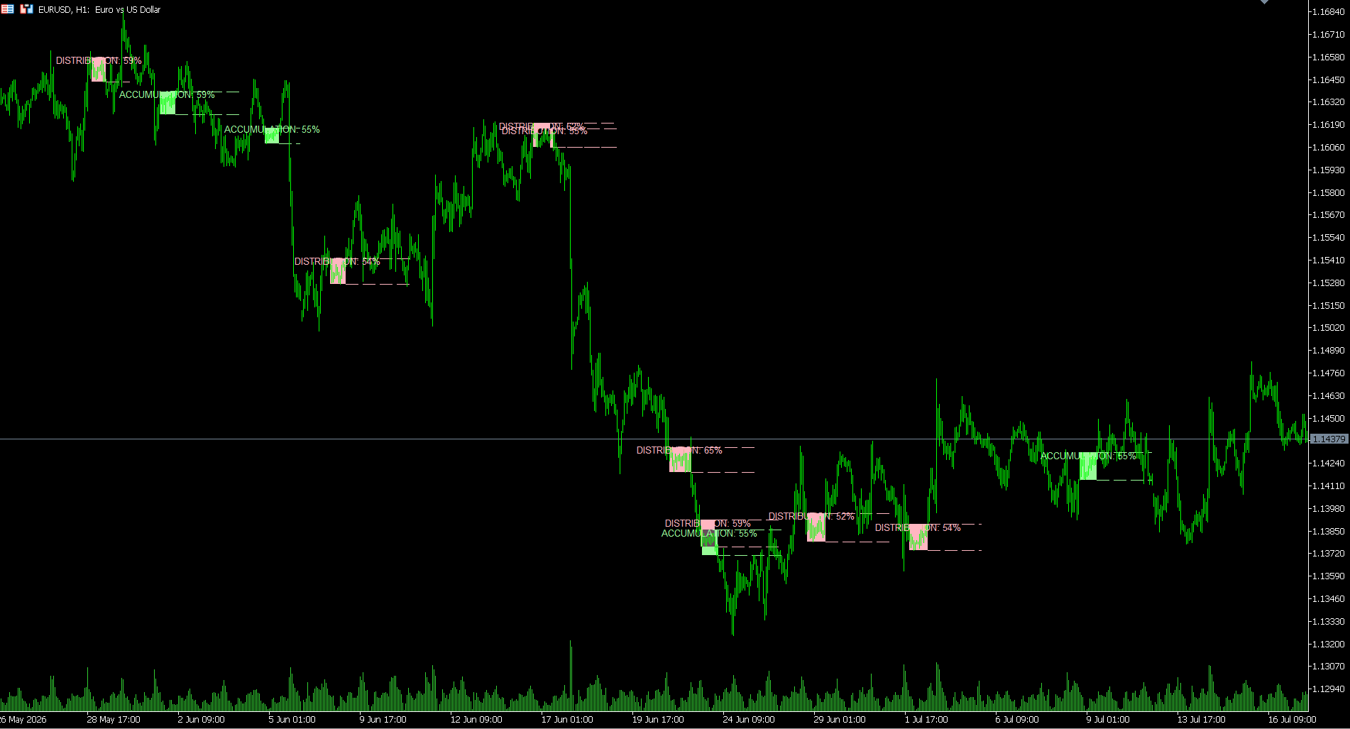
A zone starts gray and unlabeled — there simply isn't enough evidence yet. As candles accumulate inside it, the scoring tips one way or the other and the box turns green ("accumulation") or red ("distribution"), with a confidence percentage attached. If price keeps compressing, the zone keeps growing and the read keeps updating. Once price finally breaks out of the range, the zone closes, and its upper and lower edges are projected forward as simple reference lines — old range boundaries very often continue to matter after the fact, acting as support-turned-resistance or resistance-turned-support.
Nothing about this lifecycle claims to know the future. It's simply making explicit, consistent, and visible a kind of reading experienced discretionary traders have always tried to do by eye — and doing it the same way every single time, without getting tired, bored, or emotionally attached to a particular outcome halfway through the range.
How to actually use it
Treat the label as a lean, not an instruction. A zone marked "accumulation" is a statement about what the microstructure looked like while price was compressed — it is not a countdown to a guaranteed rally. The most natural way to use it is as a filter or a context layer: it tells you which side of a breakout to be more interested in, or which direction a retest of the range is more likely to hold, so you can apply your own entry logic — a break-and-hold, a retest, a structure shift on a lower timeframe — with a bit more conviction and a clearer invalidation level (the opposite edge of the box).
It's also worth remembering what the indicator is actually measuring: candle shape and relative volume. It has no way of knowing why volume spiked, who was behind it, or what happens next. It's a lens on market microstructure, built on a century-old way of reading price — not a crystal ball, and not a replacement for your own read of the wider context.
The philosophy, in one sentence
Markets rarely announce their intentions loudly — they tend to whisper it first, in the texture of quiet candles nobody's watching closely. Smart Phase Box is an attempt to listen to that whisper a little more systematically than the eye alone usually manages.