
Graphical Interfaces IV: Informational Interface Elements (Chapter 1)
 11 354
 22
22

Contents
- Introduction
- The Status Bar Element
- Test of the Status Bar
- The Tooltip Element
- Test of Tooltips
- Private Array for Tooltips
- Conclusion
Introduction
The first article Graphical Interfaces I: Preparation of the Library Structure (Chapter 1) considers in detail what this library is for. A full list of the links to the articles is at the end of each chapter of the series. There, you can also find and download a complete version of the library at the current stage of development. The files must be located in the same directories as in the archive.
At the current stage of development, the library for creating graphical interfaces contains a form and several controls that can be attached to it. It was mentioned before that one of the future articles would be dedicated to the multi-window mode. Now, we have everything ready for that and we will deal with it in the following chapter. In this chapter, we will write classes for creating the status bar and tooltip informational interface elements.
The Status Bar Element
A status bar is one of the informational elements of the graphical interface. This element is used for a quick entry of important data, details, values, etc. The MetaTrader terminals also have a status bar. This consists of several sections (items). The first one presents the information about what part of the terminal the mouse cursor is located in or the names of the program commands. There are also items reflecting dates and prices when the cursor is moving over the area of the price chart. Some items contain a context menu, which can be brought up by the left mouse click. The MetaEditor code editor has a status bar too. Its items also reflect the program commands, the cursor location (row/column) and the text entry mode (INS/OVR). More detailed information about the status bars of the terminals and the code editor can be found in their Help (F1).
In this article, we are going to create a simple status bar without an option of attaching context menus to its items. Similar to other interface elements, a status bar will be composed of several primitive objects:
- Background.
- Items.
- Separation lines.

Fig. 1. Compound parts of the status bar element.
Create the StatusBar.mqh file and include it in the WndContainer.mqh file so it is available for use in the whole library. The code below shows the CStatusBar class with the standard virtual methods that are used in all the classes of controls.
//+------------------------------------------------------------------+
//|                                                    StatusBar.mqh |
//|                        Copyright 2015, MetaQuotes Software Corp. |
//|                                              http://www.mql5.com |
//+------------------------------------------------------------------+
#include "Element.mqh"
#include "Window.mqh"
//+------------------------------------------------------------------+
//| Class for creating the status bar                                |
//+------------------------------------------------------------------+
class CStatusBar : public CElement
  {
private:
   //--- Pointer to the form to which the element is attached
   CWindow          *m_wnd;
   //---
public:
                     CStatusBar(void);
                    ~CStatusBar(void);
   //--- Stores the form pointer
   void              WindowPointer(CWindow &object)                   { m_wnd=::GetPointer(object);   }
   //---
public:
   //--- Chart event handler
   virtual void      OnEvent(const int id,const long &lparam,const double &dparam,const string &sparam) {}
   //--- Timer
   virtual void      OnEventTimer(void) {}
//--- Moving the element
   virtual void      Moving(const int x,const int y);
   //--- (1) Show, (2) hide, (3) reset, (4) delete
   virtual void      Show(void);
   virtual void      Hide(void);
   virtual void      Reset(void);
   virtual void      Delete(void);
   //--- (1) Setting, (2) resetting priorities of the left mouse click
   virtual void      SetZorders(void);
   virtual void      ResetZorders(void);
  };
//+------------------------------------------------------------------+
//| Constructor                                                      |
//+------------------------------------------------------------------+
CStatusBar::CStatusBar(void)
  {
  }
//+------------------------------------------------------------------+
//| Destructor                                                       |
//+------------------------------------------------------------------+
CStatusBar::~CStatusBar(void)
  {
  }
//+------------------------------------------------------------------+
The OnEvent() and OnEventTimer() methods for event handling are not used in this version and are left for consistency with other control classes.
Now, we are going to consider properties of the status bar. As objects arrays are to be used, there will be common and unique properties for them. The unique ones will comprise only the width of the items. The list of common properties is longer and is presented below.
Common properties:
- Color of the background and background frame.
- Text color.
- Colors for the separation line.
- Priority of the left mouse click.
Initialize the property fields by default values in the constructor. At the moment of creating the element, the user can redefine them using public methods of the class.
class CStatusBar : public CElement
  {
private:
   //--- Properties:
   //    Arrays for unique properties
   int               m_width[];
   //--- (1) Color of the background and (2) background frame
   color             m_area_color;
   color             m_area_border_color;
   //--- Text color
   color             m_label_color;
   //--- Priority of the left mouse button click
   int               m_zorder;
   //--- Colors for separation lines
   color             m_sepline_dark_color;
   color             m_sepline_light_color;
   //---
public:
   //--- Color of (1) the background, (2) the background frame and (3) the text
   void              AreaColor(const color clr)                       { m_area_color=clr;             }
   void              AreaBorderColor(const color clr)                 { m_area_border_color=clr;      }
   void              LabelColor(const color clr)                      { m_label_color=clr;            }
   //--- Colors of the separation lines
   void              SeparateLineDarkColor(const color clr)           { m_sepline_dark_color=clr;     }
   void              SeparateLineLightColor(const color clr)          { m_sepline_light_color=clr;    }
  };
//+------------------------------------------------------------------+
//| Constructor                                                      |
//+------------------------------------------------------------------+
CStatusBar::CStatusBar(void) : m_area_color(C'240,240,240'),
                               m_area_border_color(clrSilver),
                               m_label_color(clrBlack),
                               m_sepline_dark_color(C'160,160,160'),
                               m_sepline_light_color(clrWhite)
  {
//--- Store the name of the element class in the base class
   CElement::ClassName(CLASS_NAME);
//--- Set priorities of the left mouse button click
   m_zorder=2;
  }
Let us consider the methods for creating the status bar. To create the background, we will use a primitive object of the CRectLabel type. A dynamic array of primitive objects of the CEdit type has to be declared for creating items. The CSeparateLine class was written earlier for creating separation lines. This class can be used as an independent interface element. In this case, it will be used as a compound part of the status bar and we will need an array of such elements.
Items must be added using the CStatusBar::AddItem() method before creating the status bar, otherwise the creation of the graphical interface will be terminated. The number of items can be obtained by calling the CStatusBar::ItemsTotal() method.
//+------------------------------------------------------------------+
//|                                                    StatusBar.mqh |
//|                        Copyright 2015, MetaQuotes Software Corp. |
//|                                              http://www.mql5.com |
//+------------------------------------------------------------------+
#include "Element.mqh"
#include "Window.mqh"
#include "SeparateLine.mqh"
//+------------------------------------------------------------------+
//| Class for creating the status bar                                |
//+------------------------------------------------------------------+
class CStatusBar : public CElement
  {
private:
   //--- Object for creating a button
   CRectLabel        m_area;
   CEdit             m_items[];
   CSeparateLine     m_sep_line[];
   //---
public:
   //--- Methods for creating the status bar
   bool              CreateStatusBar(const long chart_id,const int subwin,const int x,const int y);
   //---
private:
   bool              CreateArea(void);
   bool              CreateItems(void);
   bool              CreateSeparateLine(const int line_number,const int x,const int y);
   //---
public:
   //--- Number of items
   int               ItemsTotal(void)                           const { return(::ArraySize(m_items)); }

   //--- Adds the item with specified properties before creating the status bar
   void              AddItem(const int width);
  };
We are going to discuss in detail only the CStatusBar::CreateItems() method for creating items of the status bar. Other methods do not have anything fundamentally different that has not been considered in the classes of other controls.
Items are set inside the background area in the way that they do not obscure its frame. This is why one pixel margins are added to coordinates at the very beginning. Then a check for the number of items is carried out. If no items have been set, a message will be printed in the journal and the creation of the graphical interface will be terminated.
We are going to arrange that if the width of the first item is not defines, it will be calculated automatically. The width of the status bar is supposed to be just under the width of the form to which it is attached (two pixels less to stay inside the form area). To get the width for the first item, the size (width) of other items is to be added in a loop and this value is to be deducted from the value of the width of the form.
Then, follows the loop where items of the status bar are created and then the loop for creating separation lines. Coordinates for separation lines are calculated in relation to the coordinates of each item. A separation line is not created for the first item. This way, the number of separation lines is always one less than the number of items.
//+------------------------------------------------------------------+
//| Creates a list of status bar items                               |
//+------------------------------------------------------------------+
bool CStatusBar::CreateItems(void)
  {
   int l_w=0;
   int l_x=m_x+1;
   int l_y=m_y+1;
//--- Get the number of items
   int items_total=ItemsTotal();
//--- If there are no items in the group, report and leave
   if(items_total<1)
     {
      ::Print(__FUNCTION__," > This method is to be called, "
              "if a group contains at least one item! Use the CStatusBar::AddItem() method");
      return(false);
     }
//--- If the width of the first item is not set, then...
   if(m_width[0]<1)
     {
      //--- ...calculate it in relation to the common width of other items
      for(int i=1; i<items_total; i++)
         l_w+=m_width[i];
      //---
      m_width[0]=m_wnd.XSize()-l_w-(items_total+2);
     }
//--- Create specified number of items
   for(int i=0; i<items_total; i++)
     {
      //--- Forming the object name
      string name=CElement::ProgramName()+"_statusbar_edit_"+string(i)+"__"+(string)CElement::Id();
      //--- X coordinate
      l_x=(i>0)? l_x+m_width[i-1] : l_x;
      //--- Creating an object
      if(!m_items[i].Create(m_chart_id,name,m_subwin,l_x,l_y,m_width[i],m_y_size-2))
         return(false);
      //--- Setting properties
      m_items[i].Description("");
      m_items[i].TextAlign(ALIGN_LEFT);
      m_items[i].Font(FONT);
      m_items[i].FontSize(FONT_SIZE);
      m_items[i].Color(m_label_color);
      m_items[i].BorderColor(m_area_color);
      m_items[i].BackColor(m_area_color);
      m_items[i].Corner(m_corner);
      m_items[i].Anchor(m_anchor);
      m_items[i].Selectable(false);
      m_items[i].Z_Order(m_zorder);
      m_items[i].ReadOnly(true);
      m_items[i].Tooltip("\n");
      //--- Margins from the edge of the panel
      m_items[i].XGap(l_x-m_wnd.X());
      m_items[i].YGap(l_y-m_wnd.Y());
      //--- Coordinates
      m_items[i].X(l_x);
      m_items[i].Y(l_y);
      //--- Size
      m_items[i].XSize(m_width[i]);
      m_items[i].YSize(m_y_size-2);
      //--- Store the object pointer
      CElement::AddToArray(m_items[i]);
     }
//--- Creating separation lines
   for(int i=1; i<items_total; i++)
     {
      //--- X coordinate
      l_x=m_items[i].X();
      //--- Creating a line
      CreateSeparateLine(i,l_x,l_y+2);
     }
//---
   return(true);
  }
We will also need a public method for changing text in every item. Let us create such a method and call it CStatusBar::ValueToItem(). It will receive as parameters the number of the item index and the line that has to be reflected in it.
class CStatusBar : public CElement
  {
public:
   //--- Setting the value by the specified index
   void              ValueToItem(const int index,const string value);
  };
//+------------------------------------------------------------------+
//| Setting the value by the specified index                         |
//+------------------------------------------------------------------+
void CStatusBar::ValueToItem(const int index,const string value)
  {
//--- Checking for exceeding the array range
   int array_size=::ArraySize(m_items);
   if(array_size<1 || index<0 || index>=array_size)
      return;
//--- Setting the passed text
   m_items[index].Description(value);
  }
Test of the Status Bar
We have everything ready for testing the status bar element. We will use the first EA from the previous part of the series for test (the third part). Keep the main menu and five buttons of the CIconButton type and delete all other controls. The StatusBar.mqh file is already included in the library and its instance and method for creating the status bar can be created in the CProgram custom class.
Create the status bar consisting of two items. We will not define the width of the first item and it will be calculated automatically. After creating the status bar, set the text «For Help, press F1» in the first item as an example.
//+------------------------------------------------------------------+
//| Class for creating the application                               |
//+------------------------------------------------------------------+
class CProgram : public CWndEvents
  {
private:
   //--- Status bar
   CStatusBar        m_status_bar;
   //---
private:
   //--- Status bar
#define STATUSBAR1_GAP_X         (1)
#define STATUSBAR1_GAP_Y         (175)
   bool              CreateStatusBar(void);
  };
//+------------------------------------------------------------------+
//| Creates the trading panel                                        |
//+------------------------------------------------------------------+
bool CProgram::CreateTradePanel(void)
  {
//--- Creating form 1 for controls
//--- Creating controls:
//    Main menu
//--- Context menus
//--- Creating the status bar
   if(!CreateStatusBar())
      return(false);
//--- Redrawing of the chart
   m_chart.Redraw();
   return(true);
  }
//+------------------------------------------------------------------+
//| Creates the status bar                                           |
//+------------------------------------------------------------------+
bool CProgram::CreateStatusBar(void)
  {
#define STATUS_LABELS_TOTAL 2
//--- Pass the panel object
   m_status_bar.WindowPointer(m_window1);
//--- Coordinates
   int x=m_window1.X()+STATUSBAR1_GAP_X;
   int y=m_window1.Y()+STATUSBAR1_GAP_Y;
//--- Width
   int width[]={0,110};
//--- Set properties before creation
   m_status_bar.YSize(24);
//--- Specify the number of parts and set their properties
   for(int i=0; i<STATUS_LABELS_TOTAL; i++)
      m_status_bar.AddItem(width[i]);
//--- Create a control
   if(!m_status_bar.CreateStatusBar(m_chart_id,m_subwin,x,y))
      return(false);
//--- Set text in the first item of the status bar
   m_status_bar.ValueToItem(0,"For Help, press F1");
//--- Add object to the common array of object groups
   CWndContainer::AddToElementsArray(0,m_status_bar);
   return(true);
  }
The second item of the status bar will show local time. For that, add code to the application timer as shown in the code below. This means that the item will be updated every 500 milliseconds.
//+------------------------------------------------------------------+
//| Timer                                                            |
//+------------------------------------------------------------------+
void CProgram::OnTimerEvent(void)
  {
   CWndEvents::OnTimerEvent();

//--- Updating the second item of the status bar every 500 milliseconds
   static int count=0;
   if(count<500)
     {
      count+=TIMER_STEP_MSC;
      return;
     }
//---
   count=0;
   m_status_bar.ValueToItem(1,TimeToString(TimeLocal(),TIME_DATE|TIME_SECONDS));
   m_chart.Redraw();
  }
If everything was done correctly, you should get the result as shown in the screenshot below:

Fig. 2. Test of the status bar element.
We have completed developing the class for creating the status bar element. The complete version of the class can be found in the files attached to this article.
The Tooltip Element
Now, we are going to develop the class for creating tooltips. In the fourth chapter of the first part of the series, when considering functions for the form buttons, it was explained in detail why this element required a separate class. In short, tooltips are required without limiting the number of symbols and with the option of highlighting some words. To implement this, we will use a class for drawing elements. An example of how interface elements can be drawn has been shown earlier. The CSeparateLine class for creating the separation line element was written in the second chapter of the second part of this series. Now, following the same principle, we will develop a class for tooltips.

Fig. 3. Example of a tooltip in Word.
Create the Tooltip.mqh file and include it in the WndContainer.mqh file to which all interface elements are included. Then, in this new file create a class with already familiar methods standard for all interface elements. In this class besides the form pointer, we will need the pointer to the element to which the tooltip will be attached and a method for storing this pointer.
//+------------------------------------------------------------------+
//|                                                      Tooltip.mqh |
//|                        Copyright 2015, MetaQuotes Software Corp. |
//|                                              http://www.mql5.com |
//+------------------------------------------------------------------+
#include "Element.mqh"
#include "Window.mqh"
//+------------------------------------------------------------------+
//| Class for creating the tooltip                                   |
//+------------------------------------------------------------------+
class CTooltip : public CElement
  {
private:
   //--- Pointer to the form to which the element is attached
   CWindow          *m_wnd;
   //--- Pointer to the element to which the tooltip is attached
   CElement         *m_element;
   //---
public:
   //--- (1) Stores the form pointer, (2) stores the element pointer
   void              WindowPointer(CWindow &object)   { m_wnd=::GetPointer(object);     }
   void              ElementPointer(CElement &object) { m_element=::GetPointer(object); }
   //---
public:
   //--- Chart event handler
   virtual void      OnEvent(const int id,const long &lparam,const double &dparam,const string &sparam);
   //--- Moving the element
   virtual void      Moving(const int x,const int y);
   //--- (1) Show, (2) hide, (3) reset, (4) delete
   virtual void      Show(void);
   virtual void      Hide(void);
   virtual void      Reset(void);
   virtual void      Delete(void);
  };
//+------------------------------------------------------------------+
//| Constructor                                                      |
//+------------------------------------------------------------------+
CTooltip::CTooltip(void)
  {
  }
//+------------------------------------------------------------------+
//| Destructor                                                       |
//+------------------------------------------------------------------+
CTooltip::~CTooltip(void)
  {
  }
Properties that the user can set before creating the tooltip:
- Header.
- Array of lines.
Other properties will have default values. They are:
- Gradient colors of the tooltip background.
- Color of the background frame.
- Header color.
- Text color.
- Alpha channel. For managing the transparency of the tooltip.
The line array can be added line by line before creating the tooltip using the CTooltip::AddString() method.
class CTooltip : public CElement
  {
private:
   //--- Properties:
   //    Header
   string            m_header;
   //--- Array of lines of the tooltip text
   string            m_tooltip_lines[];
   //--- Value of the alpha channel (transparency of the tooltip)
   uchar             m_alpha;
   //--- Colors of (1) text, (2) the header and (3) the background frame
   color             m_text_color;
   color             m_header_color;
   color             m_border_color;
   //--- Array of background gradient
   color             m_array_color[];
   //---
public:
   //--- Tooltip header
   void              Header(const string text)        { m_header=text;                  }
   //--- Adds the line for the tooltip
   void              AddString(const string text);
  };
//+------------------------------------------------------------------+
//| Constructor                                                      |
//+------------------------------------------------------------------+
CTooltip::CTooltip(void) : m_header(""),
                           m_alpha(0),
                           m_text_color(clrDimGray),
                           m_header_color(C'50,50,50'),
                           m_border_color(C'118,118,118'),
                           m_gradient_top_color(clrWhite),
                           m_gradient_bottom_color(C'208,208,235')
  {
//--- Store the name of the element class in the base class
   CElement::ClassName(CLASS_NAME);
  }
//+------------------------------------------------------------------+
//| Adds a line                                                      |
//+------------------------------------------------------------------+
void CTooltip::AddString(const string text)
  {
//--- Increase the array size by one element
   int array_size=::ArraySize(m_tooltip_lines);
   ::ArrayResize(m_tooltip_lines,array_size+1);
//--- Store the value of passed parameters
   m_tooltip_lines[array_size]=text;
  }
Similar to the class of the separation line element, we will use the CRectCanvas class and two methods (public and private) for creating the tooltip.
class CTooltip : public CElement
  {
private:
   //--- Object for creating the tooltip
   CRectCanvas       m_canvas;
   //---
public:
   //--- Method for creating the tooltip
   bool              CreateTooltip (const long chart_id,const int subwin);
   //---
private:
   //--- Creates the canvas for the tooltip
   bool              CreateCanvas(void);
  };
In addition to the check for the pointer to the form to which the element will be attached, the CTooltip::CreateTooltip() public method also contains a check for the pointer to the element for which this tooltip is designated. If the element pointer is present, the coordinates for the tooltip are calculated in relation to the coordinates of this element. In our case this is one pixel below the lower boundary of the element.
//+------------------------------------------------------------------+
//| Creates the Tooltip object                                       |
//+------------------------------------------------------------------+
bool CTooltip::CreateTooltip(const long chart_id,const int subwin)
  {
//--- Leave, if there is no form pointer
   if(::CheckPointer(m_wnd)==POINTER_INVALID)
     {
      ::Print(__FUNCTION__," > Before creating the tooltip, the class must be passed "
              "the form pointer: CTooltip::WindowPointer(CWindow &object).");
      return(false);
     }
//--- Leave, if there is no element pointer
   if(::CheckPointer(m_element)==POINTER_INVALID)
     {
      ::Print(__FUNCTION__," > Before creating the tooltip, the class must be passed "
              "the element pointer: CTooltip::ElementPointer(CElement &object).");
      return(false);
     }
//--- Initialization of pointers
   m_id       =m_wnd.LastId()+1;
   m_chart_id =chart_id;
   m_subwin   =subwin;
   m_x        =m_element.X();
   m_y        =m_element.Y2()+1;
//--- Margins from the edge
   CElement::XGap(m_x-m_wnd.X());
   CElement::YGap(m_y-m_wnd.Y());
//--- Creates the tooltip
   if(!CreateTooltip())
      return(false);
//---
   return(true);
  }
Unlike the similar method in the CSeparateLine class, in the CTooltip::CreateCanvas() private method for creating the drawing canvas, the following actions are carried out instead of drawing after creating an object and setting properties.
- Setting the size of the gradient array for the tooltip background. Array size is equal to the number of pixels in the height of the object (the Y axis size).
- Initialization of the gradient array.
- Clearing the canvas. Set the transparency at 100%. The value of the alpha channel is zero.
At the end of the method, the object is added to the common array of element objects. The code of this method is shown below.
//+------------------------------------------------------------------+
//| Creates the canvas for drawing                                   |
//+------------------------------------------------------------------+
bool CTooltip::CreateCanvas(void)
  {
//--- Forming the object name
   string name=CElement::ProgramName()+"_help_tooltip_"+(string)CElement::Id();
//--- Create canvas
   if(!m_canvas.CreateBitmapLabel(m_chart_id,m_subwin,name,m_x,m_y,m_x_size,m_y_size,COLOR_FORMAT_ARGB_NORMALIZE))
      return(false);
//--- Attach to the chart
   if(!m_canvas.Attach(m_chart_id,name,m_subwin,1))
      return(false);
//--- Set properties
   m_canvas.Background(false);
//--- Margins from the edge
   m_canvas.XGap(m_x-m_wnd.X());
   m_canvas.YGap(m_y-m_wnd.Y());
//--- Setting the array size of the tooltip background gradient
   CElement::GradientColorsTotal(m_y_size);
   ::ArrayResize(m_array_color,m_y_size);
//--- Initializing gradient array
   CElement::InitColorArray(m_gradient_top_color,m_gradient_bottom_color,m_array_color);
//--- Clearing the canvas
   m_canvas.Erase(::ColorToARGB(clrNONE,0));
   m_canvas.Update();
   m_alpha=0;
//--- Store the object pointer
   CElement::AddToArray(m_canvas);
   return(true);
  }
Let us consider methods for drawing the vertical gradient and the frame. For the gradient, there is already an array initialized with required values at the moment of creating the canvas. This is why, we simply need to draw line after line with the color specified from the array in a loop with the number of iterations equal to the height of the canvas. To draw the frame, at the beginning of the method arrays with coordinates for each side of the canvas are declared and initialized. After the frame is drawn, round the corners by one pixel and then add four more pixels in four corners inside the canvas.
Both methods have only one parameter - the alpha channel. This means that the degree of transparency of the gradient and frame can be specified when calling those methods.
//+------------------------------------------------------------------+
//| Vertical gradient                                                |
//+------------------------------------------------------------------+
void CTooltip::VerticalGradient(const uchar alpha)
  {
//--- X coordinates
   int x1=0;
   int x2=m_x_size;
//--- Draw the gradient
   for(int y=0; y<m_y_size; y++)
      m_canvas.Line(x1,y,x2,y,::ColorToARGB(m_array_color[y],alpha));
  }
//+------------------------------------------------------------------+
//| Frame                                                            |
//+------------------------------------------------------------------+
void CTooltip::Border(const uchar alpha)
  {
//--- Frame color
   color clr=m_border_color;
//--- Boundaries
   int x_size =m_canvas.X_Size()-1;
   int y_size =m_canvas.Y_Size()-1;
//--- Coordinates: top/right/bottom/left
   int x1[4]; x1[0]=0;      x1[1]=x_size; x1[2]=0;      x1[3]=0;
   int y1[4]; y1[0]=0;      y1[1]=0;      y1[2]=y_size; y1[3]=0;
   int x2[4]; x2[0]=x_size; x2[1]=x_size; x2[2]=x_size; x2[3]=0;
   int y2[4]; y2[0]=0;      y2[1]=y_size; y2[2]=y_size; y2[3]=y_size;
//--- Draw the frame by specified coordinates
   for(int i=0; i<4; i++)
      m_canvas.Line(x1[i],y1[i],x2[i],y2[i],::ColorToARGB(clr,alpha));
//--- Round the corners by one pixel
   clr=clrBlack;
   m_canvas.PixelSet(0,0,::ColorToARGB(clr,0));
   m_canvas.PixelSet(0,m_y_size-1,::ColorToARGB(clr,0));
   m_canvas.PixelSet(m_x_size-1,0,::ColorToARGB(clr,0));
   m_canvas.PixelSet(m_x_size-1,m_y_size-1,::ColorToARGB(clr,0));
//--- Adding pixels by specified coordinates
   clr=C'180,180,180';
   m_canvas.PixelSet(1,1,::ColorToARGB(clr,alpha));
   m_canvas.PixelSet(1,m_y_size-2,::ColorToARGB(clr,alpha));
   m_canvas.PixelSet(m_x_size-2,1,::ColorToARGB(clr,alpha));
   m_canvas.PixelSet(m_x_size-2,m_y_size-2,::ColorToARGB(clr,alpha));
  }
Let us arrange that when the mouse cursor is hovering over the element, a tooltip will emerge immediately and when the cursor leaves the element area, the tooltip will be fading gradually.
Let us create the CTooltip::ShowTooltip() method for displaying the tooltip. At the beginning of this method, there will be a check for the value of the m_alpha field (alpha channel). If the value of the alpha channel is equal or greater than 255, it means that the program has already been here and the tooltip is 100% visible so there is no need to carry on. Otherwise, the next step is setting the coordinates and margin for the tooltip header and drawing the gradient and frame. In case the user has not specified the text for the header, the header will not be drawn. If the text for header is present, then font parameters are set and the header is drawn.
After that, coordinates for the main text of the tooltip are set considering the presence of the header. Then, parameters for the main text are set. Unlike the bold font of the header text(FW_BLACK), the font of the main font will be less prominent (FW_THIN). Then, the tooltip text is entered on the canvas in a loop from the array initialized by the user. The Y coordinate for each line is adjusted for the specified value in every iteration. At the very end, the canvas is updated for displaying the changes and the indication of a completely visible tooltip is set. The code of this method is shown below.
//+------------------------------------------------------------------+
//| Shows the tooltip                                                |
//+------------------------------------------------------------------+
void CTooltip::ShowTooltip(void)
  {
//--- Leave, if the tooltip is 100% visible
   if(m_alpha>=255)
      return;
//--- Coordinates and margins for the header
   int  x        =5;
   int  y        =5;
   int  y_offset =15;
//--- Draw the gradient
   VerticalGradient(255);
//--- Draw the frame
   Border(255);
//--- Draw the header (if specified)
   if(m_header!="")
     {
      //--- Set font parameters
      m_canvas.FontSet(FONT,-80,FW_BLACK);
      //--- Draw the header text
      m_canvas.TextOut(x,y,m_header,::ColorToARGB(m_header_color),TA_LEFT|TA_TOP);
     }
//--- Coordinates for the main text of the tooltip (considering the presence of the header)
   x=(m_header!="")? 15 : 5;
   y=(m_header!="")? 25 : 5;
//--- Set font parameters
   m_canvas.FontSet(FONT,-80,FW_THIN);
//--- Draw the main text of the tooltip
   int lines_total=::ArraySize(m_tooltip_lines);
   for(int i=0; i<lines_total; i++)
     {
      m_canvas.TextOut(x,y,m_tooltip_lines[i],::ColorToARGB(m_text_color),TA_LEFT|TA_TOP);
      y=y+y_offset;
     }
//--- Update the canvas
   m_canvas.Update();
//--- Indication of a completely visible tooltip
   m_alpha=255;
  }
Let us write a method for gradual fading of the tooltip and name it CTooltip::FadeOutTooltip(). At the beginning of this method, a reverse check for the value of the alpha channel is carried out. This means that if complete transparency has been achieved, there is no need to carry on. If this is not the case, the canvas is redrawn in a loop with a specified step for fading until complete transparency is achieved. A complete version of this method is show in the code below.
//+------------------------------------------------------------------+
//| Gradual fading of the tooltip                                    |
//+------------------------------------------------------------------+
void CTooltip::FadeOutTooltip(void)
  {
//--- Leave, if the tooltip is 100% hidden
   if(m_alpha<1)
      return;
//--- Margin for the header
   int y_offset=15;
//--- Transparency step
   uchar fadeout_step=7;
//--- Gradual fading of the tooltip
   for(uchar a=m_alpha; a>=0; a-=fadeout_step)
     {
      //--- If the next step makes it negative, stop the loop
      if(a-fadeout_step<0)
        {
         a=0;
         m_canvas.Erase(::ColorToARGB(clrNONE,0));
         m_canvas.Update();
         m_alpha=0;
         break;
        }
      //--- Coordinates for the header
      int x =5;
      int y =5;
      //--- Draw the gradient and the frame
      VerticalGradient(a);
      Border(a);
      //--- Draw the header (if specified)
      if(m_header!="")
        {
         //--- Set font parameters
         m_canvas.FontSet(FONT,-80,FW_BLACK);
         //--- Draw the header text
         m_canvas.TextOut(x,y,m_header,::ColorToARGB(m_header_color,a),TA_LEFT|TA_TOP);
        }
      //--- Coordinates for the main text of the tooltip (considering the presence of the header)
      x=(m_header!="")? 15 : 5;
      y=(m_header!="")? 25 : 5;
      //--- Set font parameters
      m_canvas.FontSet(FONT,-80,FW_THIN);
      //--- Draw the main text of the tooltip
      int lines_total=::ArraySize(m_tooltip_lines);
      for(int i=0; i<lines_total; i++)
        {
         m_canvas.TextOut(x,y,m_tooltip_lines[i],::ColorToARGB(m_text_color,a),TA_LEFT|TA_TOP);
         y=y+y_offset;
        }
      //--- Update the canvas
      m_canvas.Update();
     }
  }
Now, we have all required methods for creating and drawing the tooltip. They are to be called in the element event handler. To find out if the button for displaying tooltips is pressed on the form, create the >CWindow::TooltipBmpState() method in the CWindow class.
class CWindow : public CElement
  {
public:
   //--- Check of the tooltip display mode
   bool              TooltipBmpState(void)                             const { return(m_button_tooltip.State());   }
  };
Now, if the focus is on the element, the tooltip will be displayed provided that the tooltip display mode is enabled. If the mouse cursor is outside of the element area or the form is blocked, then the tooltip will be hidden.
//+------------------------------------------------------------------+
//| Chart event handler                                              |
//+------------------------------------------------------------------+
void CTooltip::OnEvent(const int id,const long &lparam,const double &dparam,const string &sparam)
  {
//--- Handling the cursor movement event
   if(id==CHARTEVENT_MOUSE_MOVE)
     {
      //--- Leave, if the element is hidden
      if(!CElement::IsVisible())
         return;
      //--- Leave, if the tooltip button on the form is disabled
      if(!m_wnd.TooltipBmpState())
         return;
      //--- If the form is blocked
      if(m_wnd.IsLocked())
        {
         //--- Hide the tooltip
         FadeOutTooltip();
         return;
        }
      //--- If the focus is on the element
      if(m_element.MouseFocus())
         //--- Show the tooltip
         ShowTooltip();
      //--- If there is no focus
      else
      //--- Hide the tooltip
         FadeOutTooltip();
      //---
      return;
     }
  }
Test of Tooltips
Now, we can test how it all works. There are currently five buttons on the form of the test EA. Let us create a tooltip for every button. Declare five instances of the class of the CTooltip type and five methods. We will show the implementation for only one of them as an example.
class CProgram : public CWndEvents
  {
private:
   CTooltip          m_tooltip1;
   CTooltip          m_tooltip2;
   CTooltip          m_tooltip3;
   CTooltip          m_tooltip4;
   CTooltip          m_tooltip5;
   //---
private:
   bool              CreateTooltip1(void);
   bool              CreateTooltip2(void);
   bool              CreateTooltip3(void);
   bool              CreateTooltip4(void);
   bool              CreateTooltip5(void);
  };
//+------------------------------------------------------------------+
//| Creates tooltip 5                                                |
//+------------------------------------------------------------------+
bool CProgram::CreateTooltip5(void)
  {
#define TOOLTIP5_LINES_TOTAL 3
//--- Store the window pointer
   m_tooltip5.WindowPointer(m_window1);
//--- Store the element pointer
   m_tooltip5.ElementPointer(m_icon_button5);
//--- Array with the tooltip text
   string text[]=
     {
      "Control \"Icon button\" (5).",
      "This is the second line of the tooltip.",
      "This is the third line of the tooltip."
     };
//--- Set properties before creation
   m_tooltip5.Header("Icon Button 5");
   m_tooltip5.XSize(250);
   m_tooltip5.YSize(80);
//--- Add text line-by-line
   for(int i=0; i<TOOLTIP5_LINES_TOTAL; i++)
      m_tooltip5.AddString(text[i]);
//--- Create a control
   if(!m_tooltip5.CreateTooltip(m_chart_id,m_subwin))
      return(false);
//--- Add object to the common array of object groups
   CWndContainer::AddToElementsArray(0,m_tooltip5);
   return(true);
  }
The creation of tooltips must be conducted last in the method of creating the graphical interface so that they are at the very end of the element array in the base. This way tooltips will always be above other objects on the chart.
//+------------------------------------------------------------------+
//| Creates the trading panel                                        |
//+------------------------------------------------------------------+
bool CProgram::CreateTradePanel(void)
  {
//--- Creating form 1 for controls
//--- Creating controls:
//    Main menu
//--- Context menus
//--- Creating the status bar
//--- Icon buttons

//--- Tooltips
   if(!CreateTooltip1())
      return(false);
   if(!CreateTooltip2())
      return(false);
   if(!CreateTooltip3())
      return(false);
   if(!CreateTooltip4())
      return(false);
   if(!CreateTooltip5())
      return(false);
//--- Redrawing of the chart
   m_chart.Redraw();
   return(true);
  }
To display the tooltip button on the form, at the moment of its creation use the CWindow::UseTooltipsButton() method.
//+------------------------------------------------------------------+
//| Creates form 1 for controls                                      |
//+------------------------------------------------------------------+
bool CProgram::CreateWindow1(const string caption_text)
  {
//--- Add the window pointer to the window array
   CWndContainer::AddWindow(m_window1);
//--- Coordinates
   int x=1;
   int y=20;
//--- Properties
   m_window1.Movable(true);
   m_window1.XSize(251);
   m_window1.YSize(200);
   m_window1.UseTooltipsButton();
   m_window1.CaptionBgColor(clrCornflowerBlue);
   m_window1.CaptionBgColorHover(C'150,190,240');
//--- Create the form
   if(!m_window1.CreateWindow(m_chart_id,m_subwin,caption_text,x,y))
      return(false);
//---
   return(true);
  }
You should get the result as shown in the screenshot below:

Fig. 4. Tooltip test.
It looks and works well! Now, this element requires a private array in the pointer base. When we are developing the multi-window mode, it will be illustrated what cases we may need such an array.
Private Array for Tooltips
So, move to the CWndContainer class and enrich it with new members. A private array for tooltips is to be added to the WindowElements structure. We will also create (1) the CWndContainer::TooltipsTotal() method for obtaining the number of tooltips and (2) the CWndContainer::AddTooltipElements() method for adding the tooltip pointer to the private array.
class CWndContainer
  {
protected:
   //--- Structure of the element arrays
   struct WindowElements
     {
      //--- Tooltips
      CTooltip         *m_tooltips[];
     };
   //--- Array of arrays of elements for each window
   WindowElements    m_wnd[];
   //---
public:
   //--- Number of tooltips
   int               TooltipsTotal(const int window_index);
   //---
private:
   //--- Stores the pointers to tooltips elements in the base
   bool              AddTooltipElements(const int window_index,CElement &object);
  };
//+------------------------------------------------------------------+
//| Returns the number of tooltips by the specified window index     |
//+------------------------------------------------------------------+
int CWndContainer::TooltipsTotal(const int window_index)
  {
   if(window_index>=::ArraySize(m_wnd))
     {
      ::Print(PREVENTING_OUT_OF_RANGE);
      return(WRONG_VALUE);
     }
//---
   return(::ArraySize(m_wnd[window_index].m_tooltips));
  }
//+------------------------------------------------------------------+
//| Stores the tooltip pointer in the private array                  |
//+------------------------------------------------------------------+
bool CWndContainer::AddTooltipElements(const int window_index,CElement &object)
  {
//--- Leave, if this is not a tooltip
   if(object.ClassName()!="CTooltip")
      return(false);
//--- Get the tooltip pointer
   CTooltip *t=::GetPointer(object);
//--- Add the pointer to the private array
   AddToRefArray(t,m_wnd[window_index].m_tooltips);
   return(true);
  }
The CWndContainer::AddTooltipElements() method is to be called in the CWndContainer::AddToElementsArray() public method, which will be used in the custom class when adding the element to the base. Its shortened version is presented in the code below.
//+------------------------------------------------------------------+
//| Adds the pointer to the element array                            |
//+------------------------------------------------------------------+
void CWndContainer::AddToElementsArray(const int window_index,CElement &object)
  {
//--- If the base does not contain forms for controls
//--- If the request is for a non-existent form
//--- Add to the common array of elements
//--- Add element objects to the common array of objects
//--- Store the id of the last element in all forms
//--- Increase the counter of element identifiers

//--- Stores pointers to the context menu objects in the base
//--- Stores pointers to the main menu objects in the base
//--- Stores pointers to the split button objects in the base

//--- Stores pointers to the tooltip objects in the base
   if(AddTooltipElements(window_index,object))
      return;
  }
The development of the class for creating tooltips is now finished. Its complete version can be downloaded from the files attached to this article.
Conclusion
In this article, we have considered the development of the status bar and tooltip informational interface elements. In the next chapter, we will implement the possibility to create multi-window graphical interfaces and discuss the management system of priorities of the left mouse button click.
You can find and download the material of the first part or the series in the attached files so you can test how it works. If you have questions on using the material presented in those files, you can refer to the detailed description of the library development in one of the articles from the list below or ask your question in the comments of this article.
List of articles (chapters) of the fourth part:
- Graphical Interfaces IV: Informational Interface Elements (Chapter 1)
- Graphical Interfaces IV: the Multi-Window Mode and the System of Priorities (Chapter 2)
Translated from Russian by MetaQuotes Ltd.
Original article: https://www.mql5.com/ru/articles/2307
Warning: All rights to these materials are reserved by MetaQuotes Ltd. Copying or reprinting of these materials in whole or in part is prohibited.
This article was written by a user of the site and reflects their personal views. MetaQuotes Ltd is not responsible for the accuracy of the information presented, nor for any consequences resulting from the use of the solutions, strategies or recommendations described.

 Graphical Interfaces IV: the Multi-Window Mode and System of Priorities (Chapter 2)
 Enhancing the StrategyTester to Optimize Indicators Solely on the Example of Flat and Trend Markets
 Deep neural network with Stacked RBM. Self-training, self-control
 MQL5 Cookbook - Programming moving channels
- Free trading apps
- Over 8,000 signals for copying
- Economic news for exploring financial markets
You agree to website policy and terms of use
No required methods
The latest version of the library in this article: GUIs X: Text Selection in a Multiline Input Box (build 13)
The latest version of the library is in this article: GUI X: Text Selection in a Multiline Input Box (build 13)
thanks
I have the same problem, I can't generate it, I don't understand it.
Oh, just change the minor issues.
this code is such a web site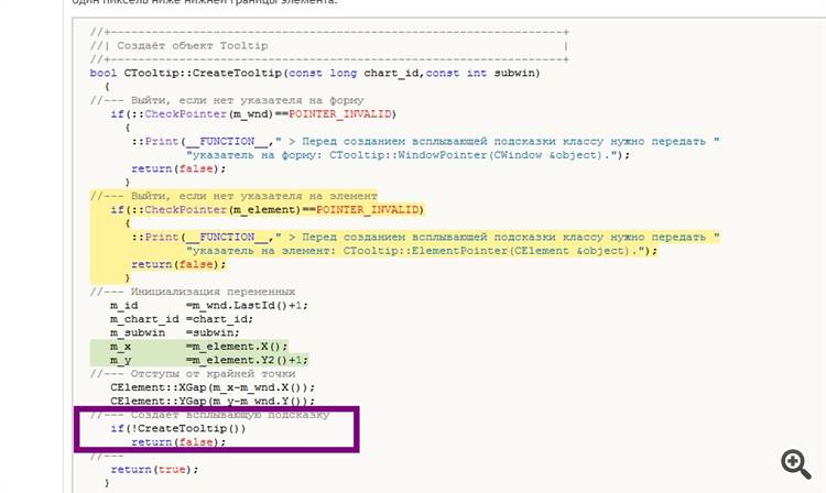
But it's to download the source code