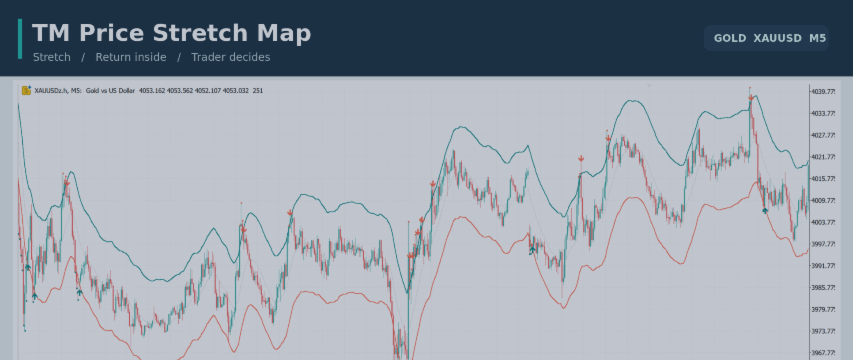
TM Price Stretch Map: From a Price Extreme to a Return Inside the Bands

The indicator draws solid upper and lower bands around price. These bands use a causal calculation: each historical value is based on prices available at that candle. A small red dot marks a completed candle closing above the upper band, while a teal dot marks a completed candle closing below the lower band.
If the next completed candle closes back between both bands, an arrow marks that return. A downward arrow follows an upper stretch; an upward arrow follows a lower stretch. The arrow describes what happened on the chart. It is not an instruction to open a position.
How I Read a Stretch
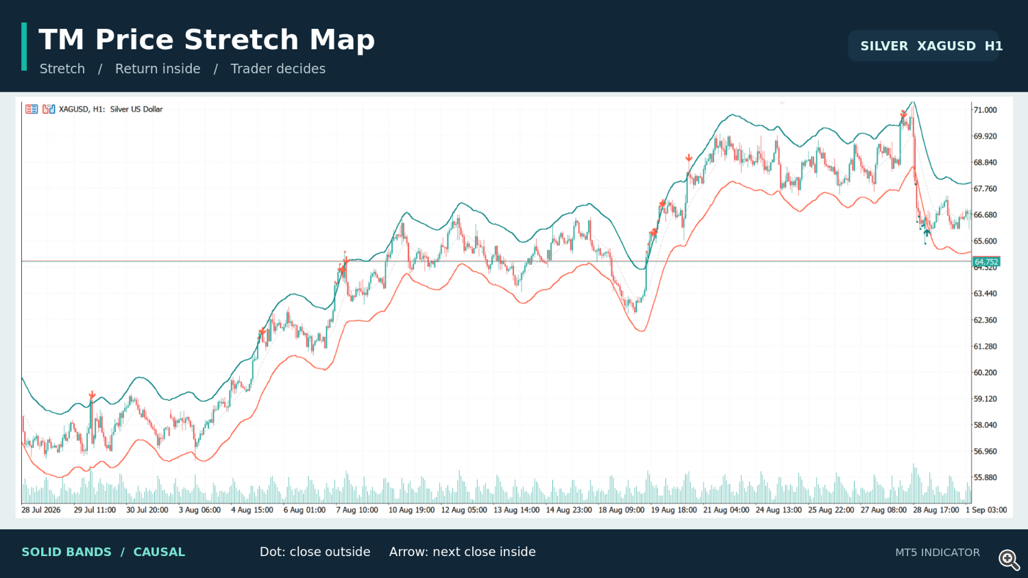
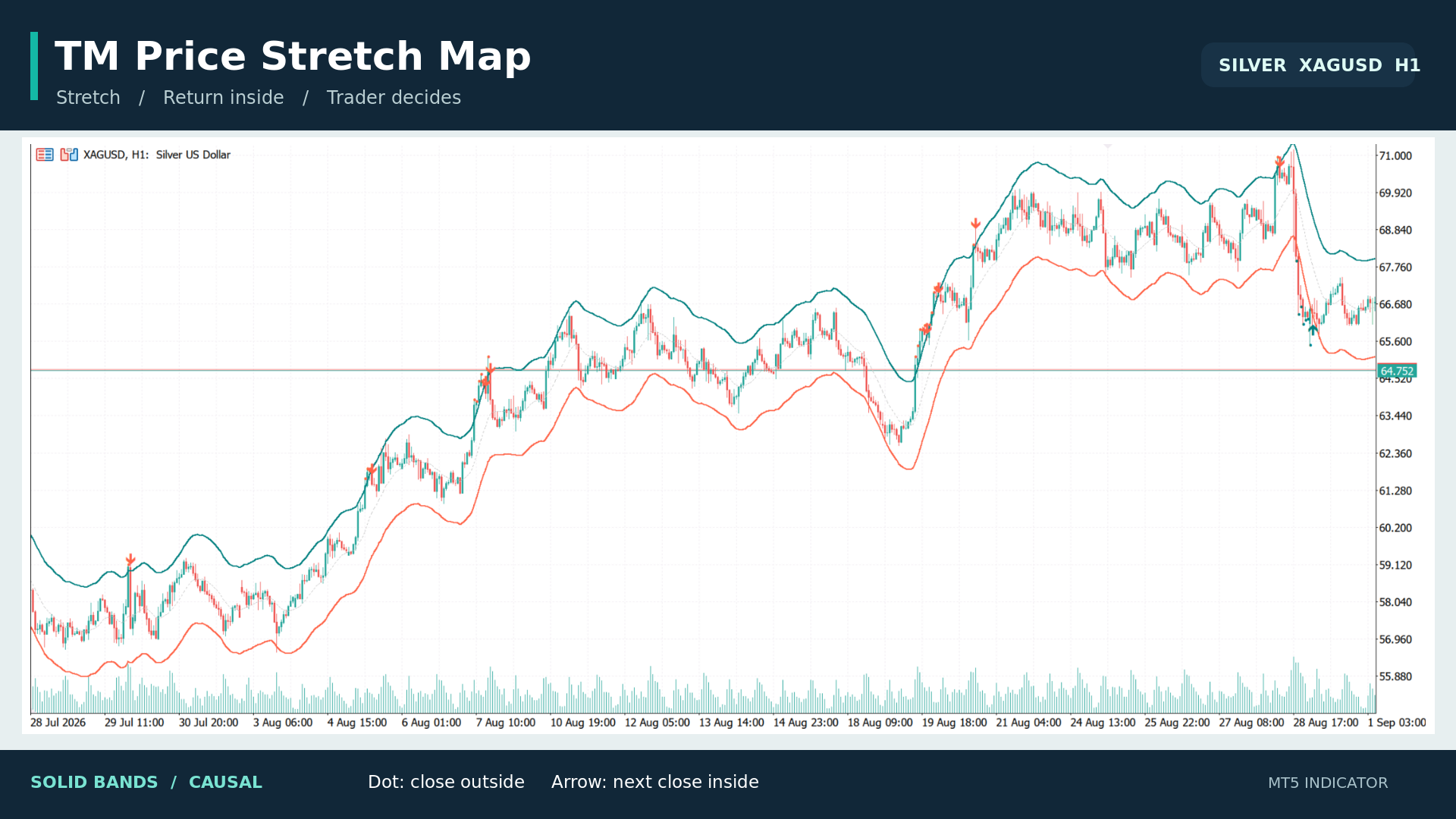
I first look at the market around the dot. Is price approaching a previous swing level? Is the move accelerating through a strong trend, or losing momentum near resistance or support? A close outside the band can occur in either situation.
The return arrow tells me that the following candle closed back inside the envelope. From there, I can examine candle structure, the broader trend and the distance to nearby levels. Sometimes that produces an interesting reversal idea. Sometimes the better decision is to leave it alone.
This is why the indicator shows the two stages separately. The dot identifies the stretch. The arrow identifies the return. The trader makes the final decision.
Solid Bands and the Optional Dashed Overlay
The solid bands generate the dots and arrows. Their calculation uses current and older prices, and the markers are placed on completed candles.
An optional dashed envelope provides a smoother retrospective view. Because it recalculates historical curves as new candles arrive, the dashed overlay can repaint. It is for visual analysis only and does not generate the dots or arrows. The indicator labels this mode clearly on the chart.
Adjusting the Chart
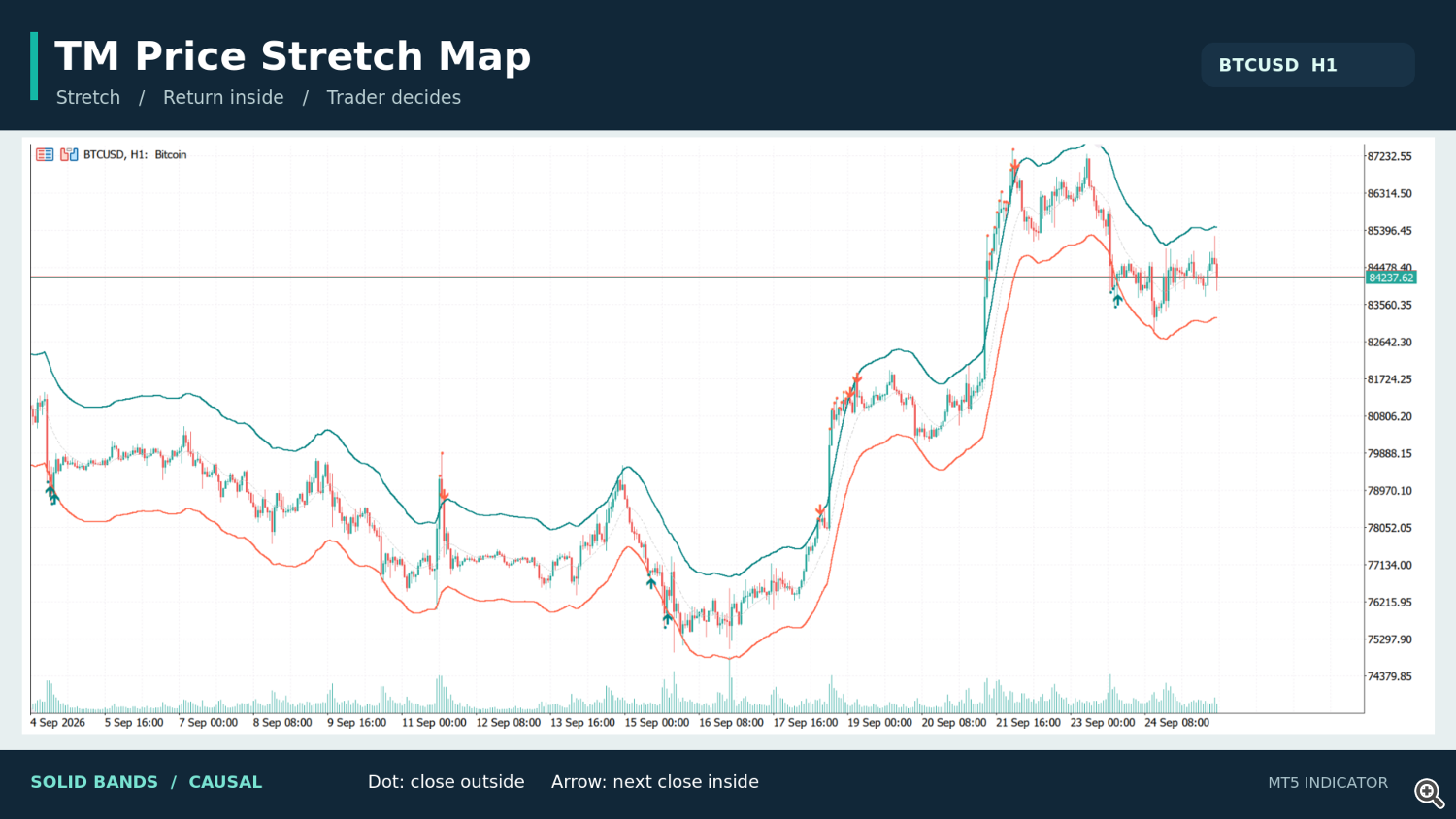
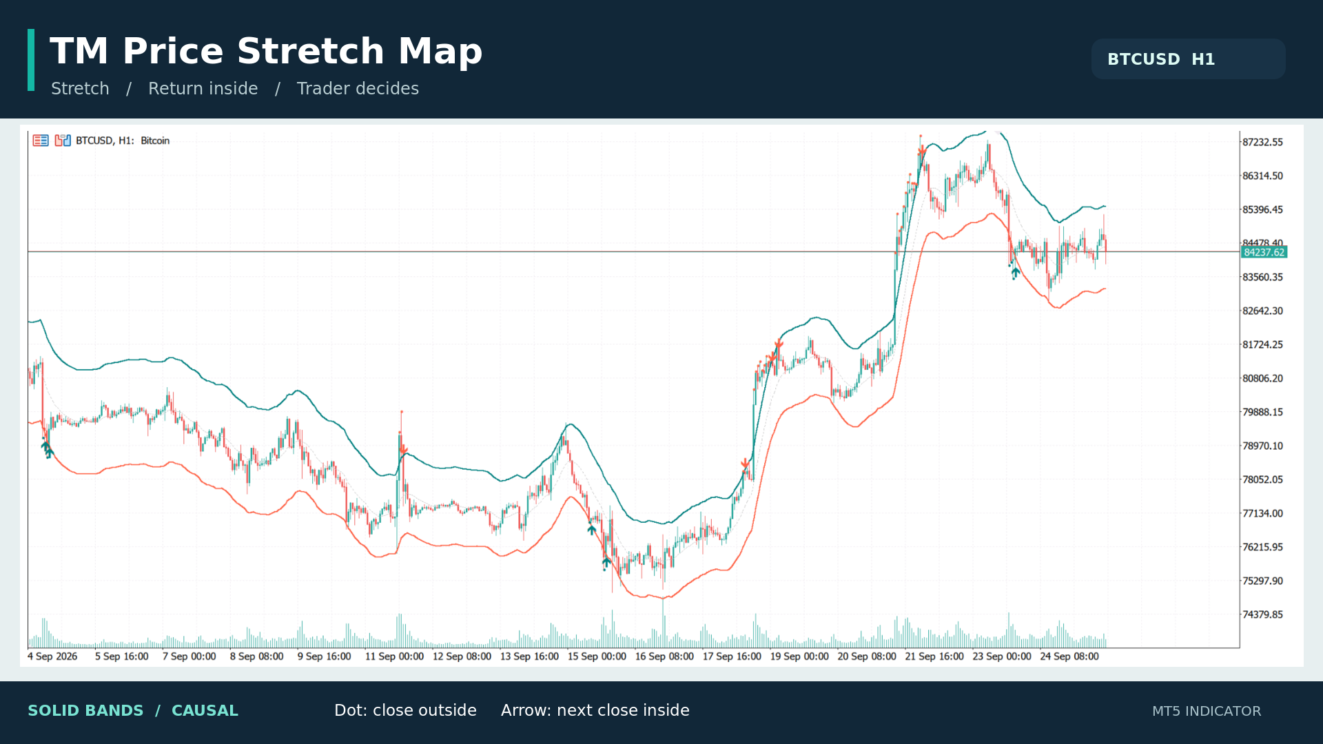
You can change the kernel bandwidth, envelope width, price source, displayed history, colors, centerline and marker visibility. Wider or narrower settings change how often price reaches a band. I suggest judging any setting across different market conditions rather than choosing one because a few historical arrows look appealing.
The indicator can be used to inspect charts such as gold, silver, Bitcoin and EURUSD on different timeframes. The examples shown here demonstrate its display and logic; they are not a performance test.
TM Price Stretch Map does not place trades or manage risk. It gives you a structured way to notice a price extreme and its immediate return, while leaving market context and execution in your hands.
Product : https://www.mql5.com/en/market/product/197922
TM Price Stretch Map is available free for MetaTrader 5 in my MQL5 Market products.