
Market Diagnostics by Pulse

Introduction
FOREX is a market that works 24 hours a day. However, we are all clearly aware of that the "intensity" of its work is not always the same. There are periods of "revolving door", prices jump up and down just like a scalded cat, but there are periods when you have time to have a cup of tea waiting until the next tick arrives. When we say that "FOREX is a market that works 24 hours a day", we somehow forget about that not the market itself works – these are people who work on this market. Like all people, traders need some sleep or a pause for lunch. In the morning, at the beginning of working day, one is usually full of pith and solicitous of working. But what about evenings? "I'd better have been shot up", and no trading at all.
In the article, an attempt is made to visualize the intensity of specific markets and of their time segments, to detect their regularities and behavior patterns.
Waves of Market Activity
Market, in spite of its apparently chaotic character, is a rather regular structure. You can quite easily extract some single repeated time lines in chaotic price movements – they usually analyze daily and weekly cycles where the periodicity inherent in traders' work time is most pronounced. Since we see some repeated patterns on historical data, it would be logical to suppose them to appear in future, according to the same rules.
For example, the first wave of market activity for any symbol coincides with the time starting the corresponding trading session. It is natural, because in the evening or even at night, the previous trading day has been analyzed and new trading attitudes have been developed for the next day. As soon as a new day starts, traders hurry to realize their home ideas, and active trading begins.
The second wave appears a bit later. These are traders having their home-prepared ideas. However, their strategies depend on in what direction the price will move. They wait for the results from the first wave that must confirm their expectations. After such a confirmation has been obtained, they start trading as actively as the traders of the first wave did before.
The third wave starts within the period of closing day-trading orders placed in a "wrong" direction. Either stop orders trigger or positions are closed manually in order to minimize the growing losses. The period of traders trading on setbacks starts.
Of course, these are the very broad outlines that don't consider fundamental and operational short-term events (news) taking place on the market, and many other things. Nevertheless, they reflect the regular structure of the market and, in the conditions of quiet market, can be successfully used in forecasting future behavior of prices. Just one small thing is lacking: to represent this regularity visually and "pick in" its future.
Visual Comprehension of Information
Many lances were broken in discussions about what is more convenient - a graphical interface or a command line. Both can replace each other and, if you have a choice between working in "windows" and in "command line", this usually becomes the matter of personal preferences. The situation is very much the same with MetaTrader 4: All operations in analyzing the market can be performed by analyzing numeric tabular data or visually, using charts. However, in most cases, analyzing of numeric data results in building charts. It is natural because, as the scientists argue, a man learns 80% of all information through his vision. It is this reason, for which, as I think, it would be better to represent all analytical research graphically.
One more driver for graphical interface is human intuition. Nobody knows exactly how it works, but everybody can remember his or her feelings when looking into monitor: the events will move in this direction, not in any other.
Which is most important, a chart, like no other tool allows a trader to see whether that supposed regularity can be found in price behavior or not. An example of ideal regularity is a sine curve. The closer to sinusoid is the price chart, the more foreseeable and predictable is the market. A rather smooth chart with clearly appearing bursts of activity is a good forecasting tool, as well. If even the bursts themselves are not very regular, the regularity of their appearance as related to the time periods allows us to use it for our trading.
No result is a result, too. If you have not detected any market regularities, it is a good signal not to trade. It will allow you to avoid inadvertent loss, since you won't open any positions in the absence of clear signals. This is surely better for keeping your deposit safe than just playing a "shell game".
How to Feel the Market Pulse?
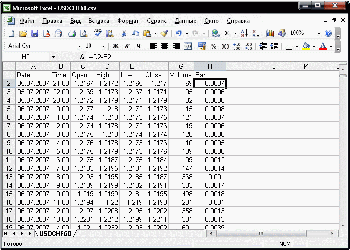
To analyze the available data, let's use the good old tool, MS Excel.First of all, let's export the currency pair timeframe we are interested in to the file that can be opened in MS Excel. Let's select the Tools/History Center (F2) menu item in the terminal and then select the desired currency and timeframe, press "Export" and save the file in CSV format. Then open it with MS Excel and perform some preparatory manipulations.
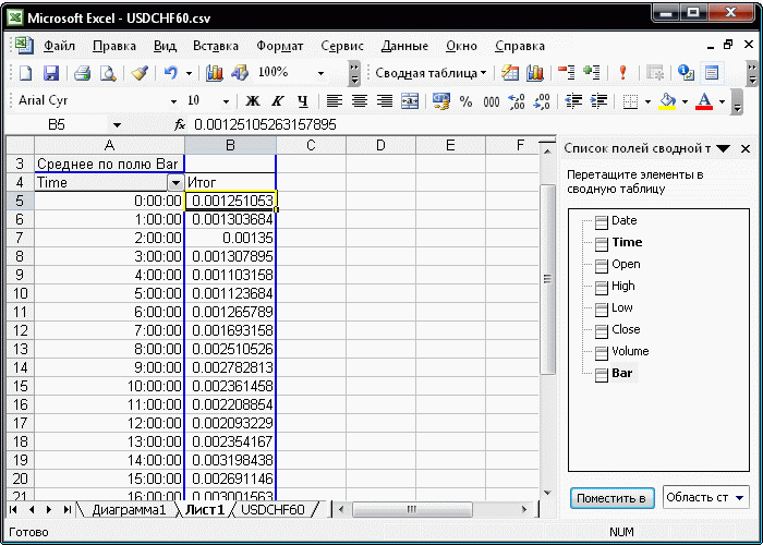
First of all, let's add one line above data and fill out the cells with the column names: Date, Time, Open, High, Low, Close, Volume. Introduce the formulas for bar height calculation in column H: in cell H2 enter formula =D2-E2. Then select a range of cells starting from cell H2 to the line where the export data end. Select the Edit/Fill/Down (Ctrl+D) menu item. Bar heights appear to the right of the exported data - let's analyze it using a Pivot Chart.
Select columns A:H and select the Data/Pivot Table menu item. Select the appearance of the report to be created - Pivot Chart (with a pivot table).
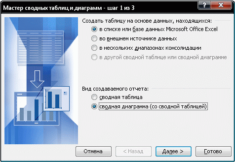
Then press "Next" and "Done" in the two following windows of the wizard. This results in obtaining a pattern for creation of a pivot table:
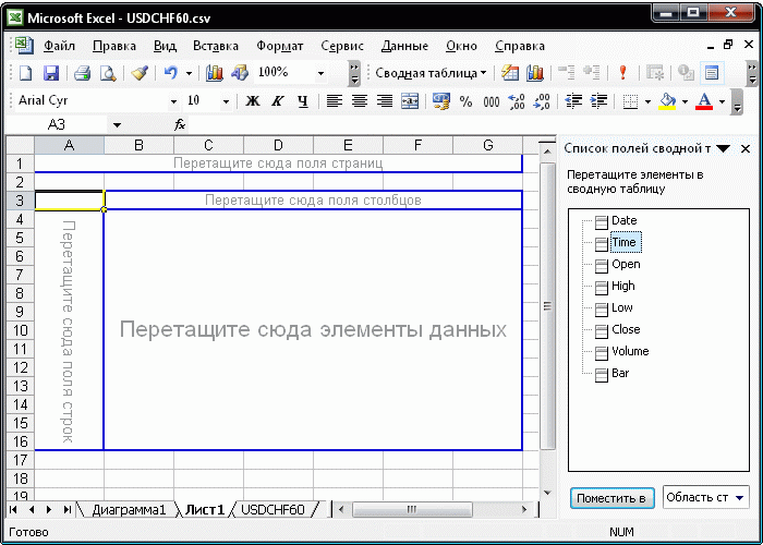
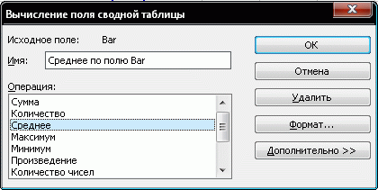
Now drag the cells from the list of cells and drop them in the pivot table pattern: Time - in the line field, Bar - in data items. Replace the formula calculating the amount of data with that calculation the average value. Select cell B5, click with the right button of your mouse and select "Format cells" item. Then select "Average" in the "Operation" field and press OK.
As a result, we've obtained the average value of bar height for each hour (in my example).
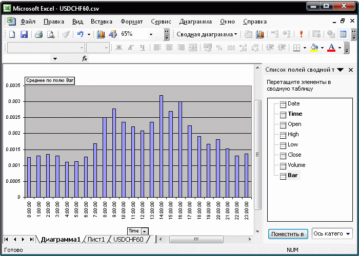
Now switch to the Chart tab and see the desired "Market Pulse":
Well, now we have a practically universal tool at hand. If you use the price difference formula for Open and Close (=F2-C2), you will obtain a chart of bar cores, i.e., the direction of price movements:
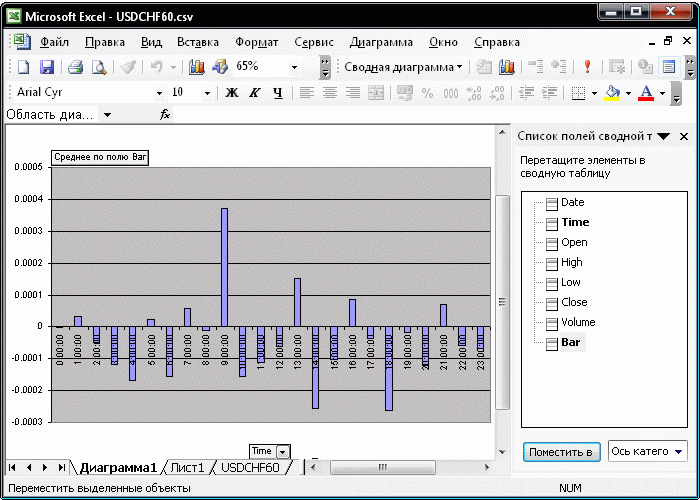
Chart Analysis
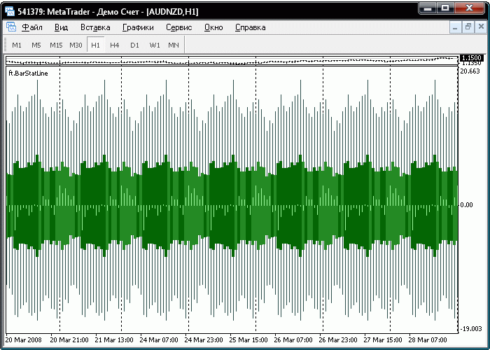
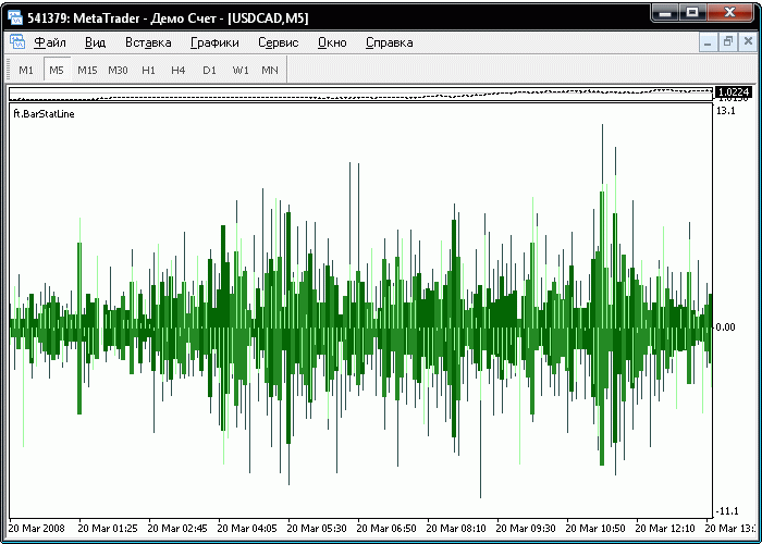
So, what do we have in our diagnostics? On the first chart, these are two market volatility waves: from 8 to 9 a.m. and from 2 to 4 p.m. At 9 o'clock, the price usually moves up and at 2 p.m. it moves rapidly down and becomes silent by 4 p.m. It is not a trading system yet, but, still, its essential part. You can successfully use the data as confirmation signals.
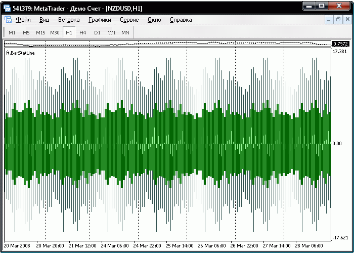
Unfortunately, all these manipulations with MS Excel take quite a lot of time, so I wrote for myself indicator ft.BarStatLine that performs these actions directly in the chart analyzing the following parameters:
- candlestick body size
- candlestick shadow size
- candlestick type - bull or bear
- shift of the candlestick mid-body when transferring from one bar to another
All parameters for the given period are accumulated and averaged. For example, the color of a candlestick is found as follows: the amount of black and white candlesticks of the same time (for example, of 9:00) is counted and, if there are more white candlesticks than black ones, the resulting candlestick to be drawn in the chart at 9:00 every day will be white. Vice versa, if there are more black ones, it will be black.
The size of the candlestick body and shadow is calculated in a similar manner: the sizes of all candlesticks of the same time (for example, of 9:15) are summed, the obtained value is divided by the amount of summed candlesticks, and this resulting averaged candlestick is drawn with its body and shadow at the corresponding time (9:00).
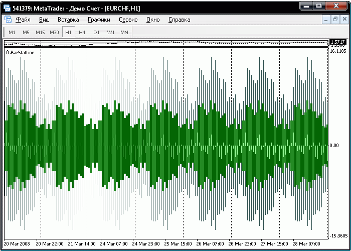
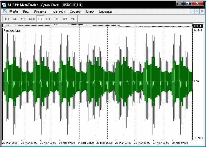
Various alternatives may be combined endlessly, so the most indicative alternatives only are selected for this article.
The market is a mine area. No visible structure is observed, it is practically a "white noise". It would be better not to trade on this market.
A stable and quiet market. It is without specific upsets, but with a clear "working schedule": black and white candlesticks form continuous blocks within which you can trade in the direction they determine.
A fluctuating market. You can clearly see in the chart the periodicity of price activity, but, unlike the preceding one, the color of candlesticks changes in a rather chaotic manner. You can forecast the activity periods in it, but not the directions which are the lottery.
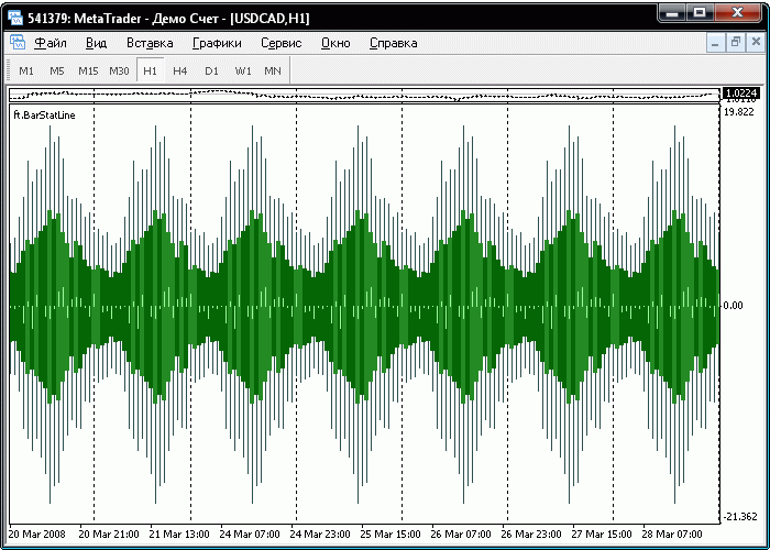
A stable aggressive market. Activity waves and blocks of the same candlestick color allow you detect both the trading time and the trading direction.
Two-wave market. You can see in the chart above two points of the activity bursts: the first peak falls onto 9 a.m., the second one falls onto the period from 2 to 4 p.m.
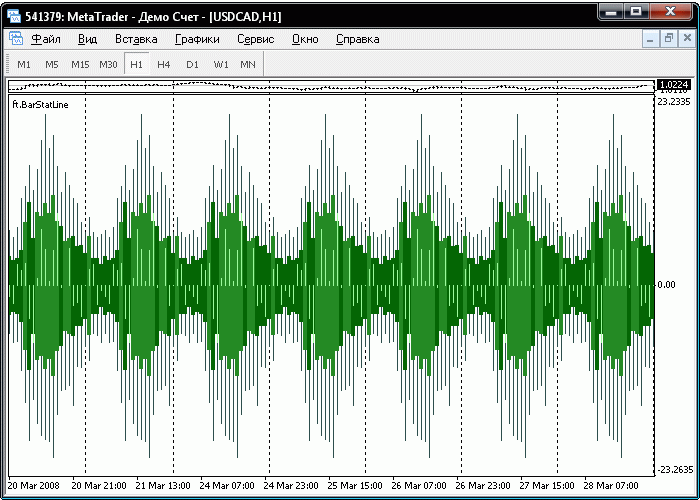
Selecting a Period, or When Do Regularities Appear and Disappear?
Market trends are especially clear at certain periods of time. Such a period must not be too short for the trend to have time to become completely formed and stand out of the general noise of price movements, but it must not be very long for opposite trends not to have time to neutralize each other.
Nothing is clear. Trends cannot be seen.
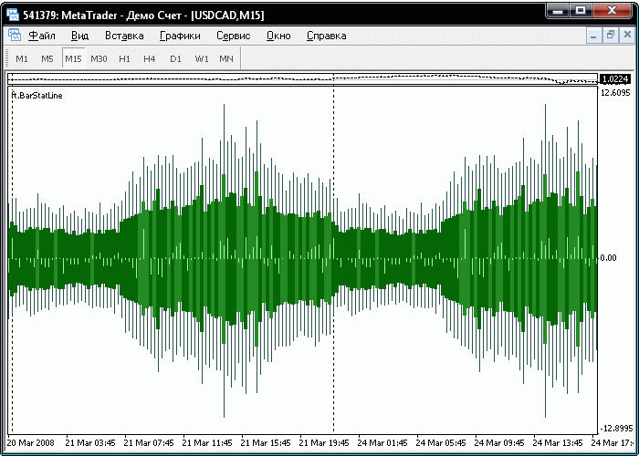
The beginning of some regularity, but still too much noise.
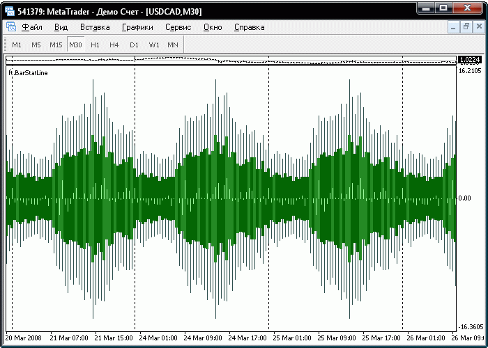
The regularity of activity can be seen clearly, you can start using it for some forecasting.
Selecting a Period to Analyze Statistics
In market activity analysis, much depends on how the initial data has been selected. Market trends can be of short-term nature. For example, in the first month of year the price may predominantly grow, and then a small correction or a setback. Or, vice versa, the trend will not be very strong to be detected within a month and will clearly appear within three months.
Trends of one month (March 2008) can be clearly seen.
A three-month market (January through March 2008) becomes regular, but neutrally noisy. This may mean that the trends of first months start being replaced with the opposite ones - the market is reversing.
Conclusion
The charts given above and their analysis should be rather considered as recommendations for analysis, not for trading. Unfortunately, trading is not my primary occupation. If I worked in the analysis division of a bank or a dealing center and could devote my all working day to analysis, this work might well be a table evaluating the current state of markets, currency pair ratings, and optimal times to work on them. Moreover, such a complete analysis would take more than one day, since the time is eaten not by charts themselves, but by their analysis and detection of interrelations between markets and prices.
In any case, the above statistical market analysis is not just charts. It seems to me that you can use them for validation of analysis methods similar to Japanese candlesticks. They must be simpler and more reliable on statistical charts, since they use the data having been previously processed. It means that this method has some not-yet-unlocked potential.
Translated from Russian by MetaQuotes Ltd.
Original article: https://www.mql5.com/ru/articles/1522
Warning: All rights to these materials are reserved by MetaQuotes Ltd. Copying or reprinting of these materials in whole or in part is prohibited.
This article was written by a user of the site and reflects their personal views. MetaQuotes Ltd is not responsible for the accuracy of the information presented, nor for any consequences resulting from the use of the solutions, strategies or recommendations described.

 The Statistic Analysis of Market Movements and Their Prognoses
 Automated Trading Championship: The Reverse of the Medal
 Layman's Notes: ZigZag…
 Two-Stage Modification of Opened Positions
- Free trading apps
- Over 8,000 signals for copying
- Economic news for exploring financial markets
You agree to website policy and terms of use
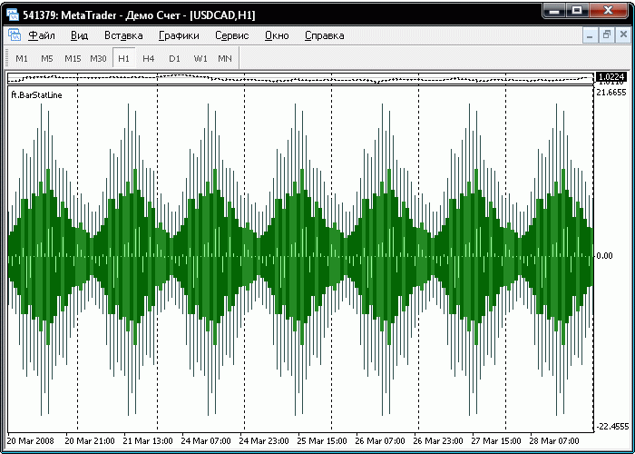
I read this article with much interest. After downloading the indicator i am concerned because i dont get the indicator to work like in the article. Any one with the same problem? Here is the chart how the indicator looks like. I can not see the different colors for bear or bull candles.
Thanks
Thanks for posting your work, it's very interesting, and it looks like yoo're onto something there.
this link leads to a *.zip and an *.exe file, but I can't read the instructions. Could you post in English how
to apply this indicator? Thanks
Ok, if you open the *.zip file and drill down, the mq4 file is there, but when loaded only gives me the following. Does this work for anyone else?