Revisiting Murray system

Introduction
In modern trading, building trading systems is usually based on one of three approaches:
- Graphical analysis. Trading decisions are made based on images on the monitor screen.
- Computing systems. All sorts of EAS based on indicators, neural algorithms, etc.
- News systems. Analysis of global trends, news, "insider" information, etc.
Naturally, all these types of obtaining market data can be combined. However, as a rule, traders tend to choose one of them as the main direction, using the rest as auxiliary ones.
I belong to the first type of traders - those who prefer to make trading decisions based on what they see on the chart. In my opinion, this allows for more accurate market entries and exits since it is easier to place pending orders.
Any graphical system assumes some kind of visual reference points - price or time levels.
In the article, I want to highlight some ways to build such reference levels.
Level types
First of all, I will only talk about regular charts that include price and time.
In other words, any vertical line on such a chart means time, while a horizontal line stands for price. (It seems obvious, but personally I did not realize this right away... For a while I just "drew stripes" before having this Eureka moment).
I also assume that any diagonal line (be it a moving average slope, connected trend vertices or an arbitrarily drawn line) means price change over time, i.e. price movement speed. Of course, not all of them are equally useful for a particular situation...
Thus, we can have horizontal, vertical and diagonal levels. Curves drawn by indicators (for example, a Moving Average) or any shapes (like circles) can also most often be classified as "diagonal", although they change faster.
Why does it work? Probably because people sometimes buy and sometimes sell, while their desire is to make a profit from their transactions ... We can also recall that any periodic (oscillatory) system always has a certain oscillation amplitude, which cannot be infinite in real systems.
Besides, people (including myself) like making plans. And it is better to build plans based on already known data.
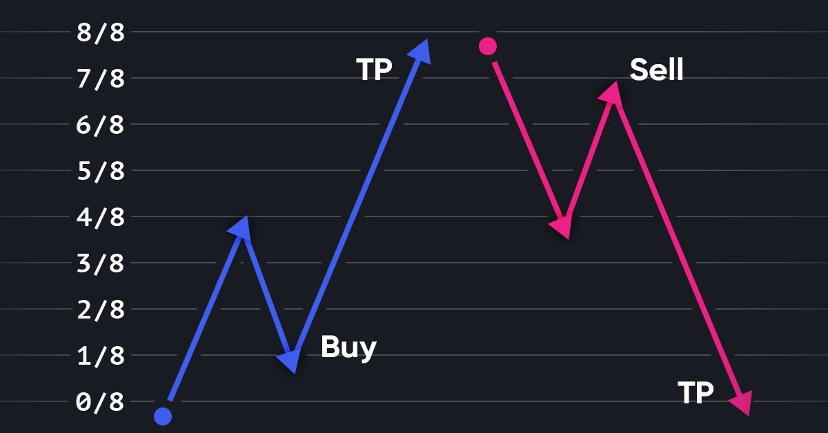
For example, one of the "primitive" (but very effective) trading systems might look like this:
- Buy an asset.
- Hold it until its price doubles.
- Sell the asset.
Here we have a "natural" price level of 100%.
Traders may think: "By purchasing this asset, I do not want to lose all the money I have. If suddenly the asset price, starts to fall contrary to my expectations, I want to keep at least half of my money”.
Or traders may draw some stripes on the charts (for example, mark the beginning and end of a trend) and argue that the price may not completely reverse, but it will still reach half of the marked distance, since it is already moving in that direction.
Both groups of traders put their orders in the middle of the path already traveled because for some reason they need to minimize the risks. "It is better to take half of the possible profit than not to receive it at all due to a sharp reversal", they think, and... They create a level of 50% with their orders...
Each new or obvious idea stemming from "common sense" creates prerequisites for the accumulation of orders in certain zones, especially if this idea is confirmed by statistics and published. In most cases, these zones can be detected.
Level building tools
I have favorite tools that were created a long time ago and proved to be stable in their efficiency.
- The standard Fibo Levels tool is configured in such a way that any interval is divided in half. In addition, each interval is repeated up and down 2 times (200%).

- The standard Fibo Time Zones tool allows measuring six equal intervals.

- Besides, each chart features my Shortcuts indicator, which makes it very easy to draw levels with a single keystroke.

- If I need colored levels, I can use my level indicator.

- In order to build some specific lines, I can use indicators developed by someone else or develop them myself. For example, to build Murray levels, we can use any of the indicators presented at the appropriate Forum topic page. There are a lot of good indicators there and they are gathered in one place.
Horizontal Murray levels
One of the efficient level-based trading systems was developed by Thomas Henning Murray. In turn, the system is based on the works by William Gann. The essence of the markup is simple: the chart space is divided into several fragments using vertical and horizontal levels, and, observing the price behavior in each fragment, the trader makes a decision to buy or sell.
Murray levels do not require knowledge of current prices in order to draw them. They need only the current trading range.
Horizontal levels are obtained by dividing the trading range into 8 parts.
The range is considered to form from zero. For example, if the maximum asset price for the period is within (0..250] (the left end is excluded from consideration, the right one is included), then the "base" for the levels of this asset will be 100, and each level will be obtained by adding or subtracting from this number a certain "module" equal to 100/8 = 12.5.
The set of eight levels is called octave. The major octave for this hypothetical asset will consist of the following levels: 0; 12.5; 25; 37.5; 50; 62.5; 75; 87.5; 100. It is called "major" because, most often, it stands for global periods of time - years and even decades. Base levels are designated in Murray's works as MMML (Major Murray Math Level).
If we want to make transactions more often, we need to somehow determine the range of "corresponding" levels. All is simple. Find out, between which "base" levels the price is located on "our" time period and divide this distance between the base levels by 8. Murray calls this deeper octave "minor". This is already the level of days, or maybe a 4-6 hour period. These levels are called mMML (minor Murray Math Level).
An even deeper layer is obtained in a similar way - by dividing the distance between the levels of the major octave into 8 parts. The resulting octave is called "baby". These levels are called bMML (baby Murray Math Level).
If the distances between the levels of the "baby" octave are still too large, they can also be divided... Theoretically, we can divide them infinitely, but in practice up to four octaves are usually sufficient. The levels of "smaller" octaves do not have proper names in Murray's works.
If the asset is traded exactly within the range (0..100], then these values will be used to calculate all other levels. Otherwise, we can shift the octave up, usually by 4/8 or 8/8. For example, the maximum value of USDJPY from 1987 to the present time is 160.40, while the minimum value is 75.83. This means we can take the base range as [50..150] or [100..200]. Both will be correct.

In any case, it is immediately clear that the price at the maximum closest to the right edge bounced off the red line (strong level), broke through the next level and is moving towards the pale green line (the second strongest support line). The current markup is unable to predict whether the line will be reached. It is necessary to zoom in or analyze further using some other markup tools, which I will talk about a little later. However, at first glance, the probability of reaching the light green level is quite high.
In any case, for comfortable work, we need to go "deeper", for example, to the daily interval, and divide the distance between 125 and 137.5 into eight parts.
But there is another nuance here. Over the past year, the price has gone too far (breaking three zones sharply in a row), and it went "too fast" (compared with the movement from 2016 to 2020). Therefore, most likely, it will be necessary to use several base periods in a row - say, 100-150 or 125-150 and divide this interval into eight parts.
The laws of movement between the levels of the "younger" octaves are the same as for the "older" ones, only the time and range of these movements will differ.
Table 1 shows the height of the "base octave" (SR) depending on the price high on the given period.
| Traded range | Major octave height |
|---|---|
| (25000..250000] | 100000 |
| (2500..25000] | 10,000 |
| (250..2500] | 1000 |
| (25..250] | 100 |
| (12.5..25] | 12.5 |
| (6.25..12.5] | 12.5 |
| (3.125..6.25] | 6.25 |
| (1.5625..3.125] | 3.125 |
| (0.390625..1.5625] | 1.5625 |
| (0..0.390625] | 0.390625 |
Table 1. Dependence of the major octave height on the maximum price for the given period
By the way, if we take the JPY trading range forthe whole available period, we will see that additional levels can be added to this picture from an octave with a base distance of 1000:

In this representation, the probability of approaching 125.00 is close to 100%, rebound is about 11/17, immediate target is 137.50, most likely target is 175.00 or higher, 187.50 seems like a perfect reversal candidate...
Although this plan is for a very, very distant future (at least until the end of the year or even for a couple more years), due to the absence of too sharp jumps, this scale allows us to understand the principles of analysis in the best way, therefore, further constructions will be carried out here.
The principle remains the same for smaller scales: any interval the price is currently located in can be divided into the required number of parts. Then we analyze the resulting small interval in an absolutely similar way.
Vertical markup
Following Gann, Murray repeats: time is a very important parameter. It allows you to enter trades with very small stops and win most of the time.
In general, the markets are very cyclical, so we can use any meaningful interval. For example, you we measure the distance between the tops of two opposing trends (say, two bottom or two top zigzag vertices). Alternatively, we can use multidirectional peaks of one major movement.
Thomas Murray offers the same formal approach as with price levels. He suggests choosing a point on the chart (usually the beginning of a new trading year, in October, when most options expire) and drawing 4, 8, 16, 32, 64, 128, 256 intervals from it. Murray mainly applies daily candles. However, if the same principle is applied on the scale that I used when while considering JPY, a year and an hour will also do. The "deeper" we go, the larger the recommended interval. For example, the period of 16 days works very well on most instruments on the daily time interval. In case of JPY (months, the maximum "compression" of the chart), a period of 4 years works very clearly, while on H1 it is quite possible to try 128 or 256 hours, although smaller intervals often work as well.
Since the interval I am considering is super-global, it would be logical to start with some year that is exactly divisible by 4, for example, since the beginning of the millennium (the year of 2000)...
")
It is still amazing and joyful for me to see how each vertical bar provides trading opportunities. In the vicinity of almost every global interval, the price tried to reverse and after the reversal passed at least two horizontal levels (and in most cases - all four)! Most amazingly, the inside levels often show the same behavior. The price often turns in the middle, and not on the level itself... The same principle of dividing the interval into 8 parts works again ...
However, the reversal from the middle of the interval looks rather weak compared to the reversal from its border. Only once after such a reversal did the price pass three levels in a row. In most cases, it was a distance from half to a whole interval.
Accordingly, such a reversal (from the middle of the four-year interval) is a good reason to think about adding to the main deal, but a reversal in the area of the "main" level is a reason to reverse the position.
In the next figure, I added "weak" levels and highlighted them in blue for clarity.
")
If we select eight intervals horizontally and eight vertically in this figure (highlighted in orange), then we get a figure that is very close to a square. Prices tend to stay in this square moving up to its borders, and when they go beyond it, they tend to turn around. The "expanded" square (+2 intervals into the future and along the main trend) is highlighted in magenta. It describes the state of the highest readiness to reverse (the so-called "overbought" or "oversold" state). However, the shorter the time interval, the more unreliable this “readiness”, since there are much more funds moving at the “older” intervals, although on most instruments, the probability of a reversal in these zones remains around 70%.

In this case, we can see that a reversal has occurred. In other words, the price has risen from the oversold zone (from the level -2/8) to the level 2/8 (and the global level 1/8 MMML of the highest octave), turning around at the time level 3/8 of the current period. After doing that, in the area of the "extended square" border (+2/8 in time), it left the zone of these squares and went to the next zone (where you need to draw squares of the next interval).
Speed lines
Given vertical and horizontal borders, we can draw diagonals within these borders, denoting what speed of movement we can expect within this square.
Murray considered the most important lines to be the 45° lines, that is, the lines drawn through the start point (0) and the 8/8 levels (horizontal and vertical). If the price moves above such an upward level, we see a moderately strong uptrend. If it is below the same level directed downwards, there is a moderately strong downtrend. Such trends can last quite a long time.
All other levels are obtained by dividing the intervals on the sides of the square in half. Depending on the slope, these lines can determine:
- either much stronger up and down trends - usually they are shorter-term ones, but have greater amplitude, as if they move the price to a new range, in which it may hang around for a long time,
- or much weaker trends indicating that we are observing a correction. Therefore, upon breaking this line, the price will most likely reverse and go below the lowest low in the interval.
The figure below shows the most commonly used up and down lines as an example, followed by an up fan containing all diagonals starting from 0 for an uptrend and 8 for a downtrend.


It is often useful to draw diagonals not from the left side of the square, but from the right, as in the figures below.


Here are some examples. Not all possible diagonals have been drawn since any gap can be divided in half, and we get one more diagonal that works in certain situations no worse than the ones already drawn.
In addition, you might have noticed that I drew the diagonals from the upper corner for the "main" square, while the diagonals for the "extended" square are drawn from the lower corner. In this case, it is just a demonstration of the possibilities. In reality, we need to draw the lines that more accurately reflect the movement exactly on our instrument, specifically in our conditions.
By the way, this is the true Gann fan - each line starts in one of the corners and ends somewhere on the side of the square, at one of the intersection points of the square and the level. It does not matter if the level is horizontal or vertical. The angles of these lines, of course, can be accurately measured, but only if the chart scale is fixed rigidly and never changes. I know people who trade this way, but for me it is very inconvenient.
Here is another picture. This one is for those who like symmetry. You just need to get used to it...

I think, I do not need to explain how it is formed. Diagonals go from each corner to the opposite corner, as well as to the midpoints of the opposite sides. Similarly, we could draw a star with a shift of 4/8 (in this case - downwards), or place it not in an expanded square, but in the main one. Now that you understand the principle, you can do it yourself.
As long as the price is above the upward sloping diagonal, we have an upward trend. If it breaks and fixes below, a downward trend begins, and you need to look for (or draw) the nearest downward diagonal, below which the price goes. As soon as such a line is broken, look for signs of an upward move (and draw the corresponding diagonal)...
William Gann used angles to indicate which diagonal he was referring to. But we should keep in mind that he drew his charts on paper. MetaTrader also allows you to fix the scale... Personally I find this inconvenient, although I know many people who consider this method of analysis perfect.
I can also name these angles "45°","33.75°", etc. However, as I have already mentioned, it is more convenient for me to see the entire chart on the screen, to look either from a distant perspective (as in my examples above), or zooming in so as to see each candle, and even switch time intervals in order to see each movement more accurately. Therefore, it is worth recalling that the 45° line means only that it is parallel to the line going from the intersection of levels (0;0) to the intersection of levels (8;8), and the line 33.75° is parallel to the one going from the point (0; 0) to the intersection of levels 2/8 vertically and 3/8 horizontally (2;3).
For myself, I often designate lines this way - by level numbers: (0; 0) (2; 3) or even just 2: 3, assuming that the main line always comes from zero.
In one of the books available to me, the author gives the following picture:

In this case, it is clear that the line Q'A will be parallel to the line R'B and its slope is equal to the slope of the main diagonal or 8:8 (or 1:1, or 2:2...). The same is true for the rest.
There is no standardized designation (and probably cannot be), but it seems to me that the two-digit designation option (8:8 or 1:2) seems to be the most convenient. I put time first, and price second. Other sources may use other designations.
Generally speaking, by drawing a line on a particular chart and waiting for its breakout or rebound, we can get much more benefit than reading various reference books stating that "most often the strong resistance is the 45° line" ... In my perception, the lines starting on the right side of the square most often represent "corrections" - some obstacles in the price path, while on the left side there are usually lines of "strong trends" ("strong" for a given time interval, of course).
The figure below represents one of the options for how you can draw "your" lines.

All lines here are obtained by means of a parallel transfer of the "main" diagonals, however, they are located closer to the scene. We can say that they simply take into account a smaller time interval.
According to statistics, the price bounces off lines parallel to 8:8, 3:2, and 4:1 more often than off any other.
The figure below is an example containing speed lines for JPY on a chart that has been enlarged compared to the previous ones.

Any of the sets (blue, green or yellow) could be used here. Usually, it makes no sense to use all this together in the current form.
Specifically in this area, I would most likely end up just drawing a part of the "star". It would make it look better for me...

The red and blue dots and circles seen in the last two images are explained below.
Finally, below are four ways to use speed lines on a single chart...

The basic vertical interval (between the dotted lines) is 16 days, so the square contains 64 days.
The lines are signed only in the leftmost square. I believe, the remaining constructions are obvious from the previous description.
Attentive readers will probably notice that the verticals (rhythm lines) can be shifted relative to the "correct" Murray construction on the last chart. However, this rhythm is very obvious, the price follows it, so why would I need something more artificial? I simply draw what I find useful and gather my stats... The main thing is that I can draw all these pictures (including the last channel) long before the price reaches the border of the square.
Conflict circles
At the points of intersection of levels 2/8, 4/8, 6/8 vertically and horizontally, such a phenomenon as "conflict circles" or "contradiction circles" is manifested. In MetaTrader, such circles can be drawn using the Fibo Arcs tool (below are screenshots of the tool settings for drawing circles of the required configuration).

The scale of the circle (the "Parameters" tab) is selected so that the edges of the circle (second from the center) touch the adjacent vertical levels (for example, if the circle axis is at level 2/8, then with a properly selected scale, the left edge of the unit circle will touch level 1/8, while the right one will touch 3/8.

Such circles are placed within the main square: one is strictly in the center, at the intersection of 4/8 horizontal and vertical, and four - at the intersections of 2/8 and 6/8 in all combinations.

This set of objects has at least one very interesting feature: if the price moves in a flat, it will not enter the small, innermost circle, let alone touching its center. If the price is in an active trending movement, the inner circle is likely to be broken, and the price will touch its center. Perhaps after that the price will turn into a long trend in the opposite direction, as it was in 2011, or go further, as in 2007-2008. However, if the price approaches the border of this circle, this information is very significant at all intervals.
Unfortunately or fortunately, the scale of circles is not recalculated when changing the timeframe in MetaTrader. This means that for each time interval the circles should be different. On the Display tab, we need toswitch off circle displayfor all time rangesexcept for the current one.
Trade rules
The level breakthrough is a situation when the price crossed the level and fixed there.
For example, when the price closes below the level on the first candle, above the level - on the second and third, we can assume that the level has been broken.
Or when the price closed above the level, then returned and closed below it, and then, no more than eight candles later, closed again above that level. Usually in this case, the extremum formed after the first breakout and directed against the trend does not reach the previous level.

Here, the finger icon denotes a "signal" candle of a horizontal level breakthrough, while the red square stands for a "breakthrough" candle, upon closing of which (respectively, upon opening of the next one), we can open a position.
A rebound from a level is a situation when the price approached the level but turned around closing in front of it.
For example, a rebound is when the price reaches the level of ±1/8 of a smaller octave but closes before the main level, and the next candle does not break through the level.

One of the opportunities for entry during the rebound is at the extremum of the next candle after the rebound.
- If the price has broken through a horizontal or diagonal level, then it is likely to move towards the next level.
- If the price has rebounded from the level, then it will most likely move towards the previous level.
- If the price approaches the level from above or below, then it is likely to reverse. Moreover, the further it goes without a turn, the more likely it is to turn when approaching the level.
Table 2. The probability of a reversal depending on the distance traveled by the price from the previous reversalIf the price moves the distance Reversal
probability(1 x mMML) + (4 x bMML) 50% (2 x mMML) 75% (3 x mMML) 85% (4 x mMML) 90% (5 x mMML) 95%
Murray believes that large price movements are quite rare and do not last long. So traders should take the profit and move on to the next trade.
- Find the "main" trend and trade only in its direction. To determine it, we can, for example, find out how the price is located in relation to the main diagonals of the "parent" octave for a given time period. If it is above the main diagonal directed upwards, the trend is bullish. If it is below the main diagonal directed downwards, the trend is bearish.
- Mark the vertical intervals. For daily charts, the most typical interval is 16 days. During this period, it often turns out that the price moves between mMML levels, and bMML levels may be sufficient. However, sometimes the price moves too steeply or too flat. Then it is better to use intervals of 32 or even 64 days.
Murray recommends 16 days for stocks and options, 32 days for currencies and commodities and 64 days for mutual funds.
Table 3. Recommended time periods for different assetsSymbol Period shares and options 16 days currencies and commodities 32 days mutual funds 64 days
However, as I said many times, it all depends on your specific situation. It is best if the markup starts from the "upper" time interval (in case of MetaTrader, this is months). he "older" the level, the greater its "strength". I think, you will want to know if there are strong resistances or supports in the price path.
- Estimate the volume of the previous candle. If the candle number [0] is currently active, and the volume of the candle number [1] has changed dramatically (by 25% or more) in any direction compared to the candle [2], we are likely to expect important events in the near future...
For such an assessment, I propose using a simple indicator that draws a red dot above the candles, if the volume has grown, and a blue dot under the candles, if its volume has fallen (the file for MetaTrader 5 is attached below).

- Draw the nearest speed line. Bounces and breakdowns of this line can provide important information for a trade.
- Assess the position of the price in relation to the circles of conflict. Do the candles touch the inner circle? Do they penetrate it?
- Assess the position of the asset in relation to the boundaries of the trading range (main and extended squares). The closer to the borders, the higher the probability of a reversal.
- Where exactly did the price of the asset enter the current trading range? If it is closer to the upper or lower edge, the probability of a big move is greater than if it is closer to the middle.
- Most of the time, prices tend to move around the center, that is, between the 3/8 and 5/8 levels. Murray calls this range "the country of happiness" and does not recommend trading, because the market here is too unpredictable.
Even-numbered levels are considered stronger support/resistance levels than odd-numbered ones. In other words, odd-numbered levels are broken more easily. However, according to my observations, the 1/8 level (7/8 for an uptrend) is triggered too often to be written off, while 6/8 is passed much easier... So I watch breakthroughs and rebounds of each level, regardless of its number. The volumes (p. 7) are much more useful for me in this sense.
- Vertical levels have different strengths. The strongest reversal level is 6/8. For the rest, the strength is different for even and odd ones (even ones are stronger). When the price approaches these levels, it is necessary to pay more attention.
- If a reversal occurs, make sure the price is above the middle of the previous candle before buying and sell below the middle of the previous candle.
Conclusion
The Murray system provides the trader with a very rich toolkit for assessing the current price position and making the right trading decisions. It is not necessary to use the entire arsenal presented here, but limiting yourself to only horizontal levels seems completely wrong to me. Speed lines (diagonals), time lines (verticals), conflict circles are powerful predictive tools and using them, traders can greatly increase the accuracy of their transactions, and therefore increase profits and reduce losses.
It is easy to formalize these constructions (perhaps, except for drawing arcs - you will have to look for a way to calculate the scale there), and once the levels are built, they will work for a very long time, giving accurate entry signals over and over again.
This article is written in the hope that it will help you trade better, however no guarantees are given. I recommend using these materials as an occasion for additional research of your own, and I hope that it helped someone to look at the market a little differently...
Translated from Russian by MetaQuotes Ltd.
Original article: https://www.mql5.com/ru/articles/11998
Warning: All rights to these materials are reserved by MetaQuotes Ltd. Copying or reprinting of these materials in whole or in part is prohibited.
This article was written by a user of the site and reflects their personal views. MetaQuotes Ltd is not responsible for the accuracy of the information presented, nor for any consequences resulting from the use of the solutions, strategies or recommendations described.

- Free trading apps
- Over 8,000 signals for copying
- Economic news for exploring financial markets
You agree to website policy and terms of use
How will you use Murray levels to calculate the reversal time? In the box both price and time and angles (just the backlash allows you to catch it).
how can you understand this shit, it's all in the corners.
Look at the right corners, ignore the rest.
Author, you have mixed Murray levels and Gann's pattern (box) in a heap. You can just work with a box, and it is clearer and more accurate.
In my perception Murray has a system that includes far more than just levels. And yes, he never once hid that he learnt from Gunn.
And, in order not to be completely unsubstantiated, I will cite a screenshot from the original presentation of the software implemented by Murray:
In my perception, Murray has a system that includes far more than just levels. And yes, he never once hid that he studied under Gunn.
And, in order not to be completely unsubstantiated, I will cite a screenshot from the original presentation of the software implemented by Murray:
Only here a paradox arises. If Murray had understood Gunn to the end, he would not have invented his own system.
There's a paradox. If Murray had understood Gunn to the end, he wouldn't have invented his system.
For me, every system has to be convenient for its creator.
If Gunn's system is inconvenient to someone, despite its accuracy, why not adapt it to suit them? If, say, the square nine seems mystical to someone, who prevents them from using geometry alone? Who prevents us from dividing not the maximum-minimum ranges, but from using more "stationary" levels? If it is inconvenient for me to enter at 8 in New York, but OK at 12 in Kiev, will I adjust to the Americans? Well, and so on...
And in the end, I end up with my own system, regardless of how I understand someone else's system...
Convenience decides,