Alan Andrews and his methods of time series analysis
Introduction
I believe, all modern chart analysis applications include Andrews Pitchfork. In advanced systems, some additional lines are added to the three main lines (for example, "side" levels are added in MetaTrader 5 for more convenience). Some developers include "Schiff pitchfork", "modified Schiff pitchfork" or even "inward pitchfork" in their programs.
The simplicity of these lines encourages developers to be creative.
However, those who have not read Alan Andrews' original course often ask "Why do we need so many different pitchforks? How to use them in trading? What additional indicators should I add to make my trading better, more precise and more pleasant?"
The original course answers all these questions. Ii is even available for free. However, its style might seem too heavy and incomprehensible to some readers.
That is why I decided to write this article. I think it is time to reveal the truth to those who did not know it. :-)
Marechal chart
Andrews starts by trying to convince his readers that the market is predictable. To do this, he cites a chart of Marechal, who predicted the movement of the Dow Jones index twenty years ahead. Here is that chart:
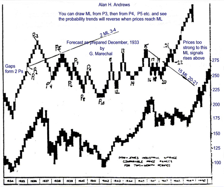
The image says that this prediction was made in 1933, long before personal computers and, even more so, long before the concept of neural networks. Nevertheless, it exists, and this gives us all the opportunity to believe that our methods of analysis can also bring us closer to such forecast accuracy if we have enough imagination or good teachers.
The most interesting part begins afterwards.
Median line and parallels
So the market is predictable. What laws can it follow? Many analysts believe that physical laws are applicable to any oscillatory processes. For example, Alan Andrews believed that Newton's third law is applicable to financial flows: "When two bodies interact, the forces of action and reaction are equal in absolute value and opposite in direction." He called this "Action" and "Reaction" actively promoting the possibilities offered by this method throughout the course. I think, the method is working.
This is understandable: if the resources are limited and someone needs these resources (goods, money, shares, whatever) and there is no monopoly, then as a result, supply and demand will be in dynamic equilibrium for a long time, and the prices of these resources will fluctuate around a certain average line.
Andrews put this principle at the heart of his course. Action equals reaction.
This principle can be modeled, for example, using the median line. It is quite simple: three consecutive reversal points are taken (for example, peak[0]-trough[1]-peak[2]), and a straight line is drawn from the leftmost point [0] through the middle of the [1]-[2] distance.
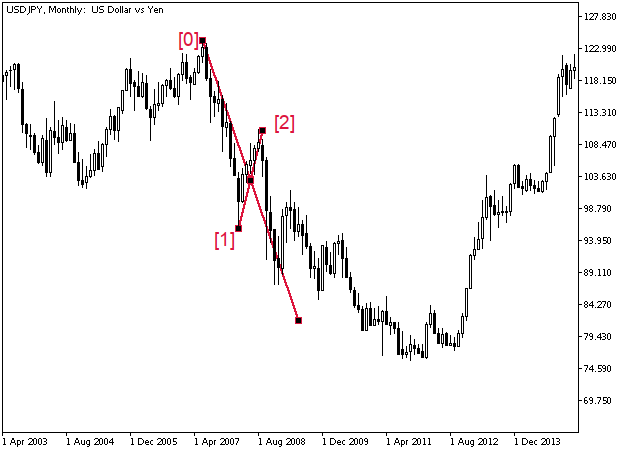
The first parameter this line has is the slope. If the line is sloping down, then the local trend is down, and vice versa, if the line is sloping up, the local trend is up.
Andrews claims that when approaching this line, the price is likely to bounce or break through it, forming a gap. In "calm" markets, this is mostly true, and the 80% figure that Andrews specifies counting the rebounds is probably justified. On Forex, the price, having quickly reached the line, often begins to "slide" along it, as in the figure above.
However, the price prefers to stay in a channel formed by the lines parallel to the median line (in Andrews' charts, they are labeled MLH ("H" here stands for "parallel", like the letter itself). LMLH is the lower parallel line, while UMLH is the upper one. If the price reverses from the median line of the pitchfork (ML), then most likely it will go in the direction of the "nearest" MLH, and again it will either break it or bounce. If ML breaks through, then, most likely, the nearest target is near the opposite MLH further along the trend.
The three lines form the "three-toothed fork" used by most traders.
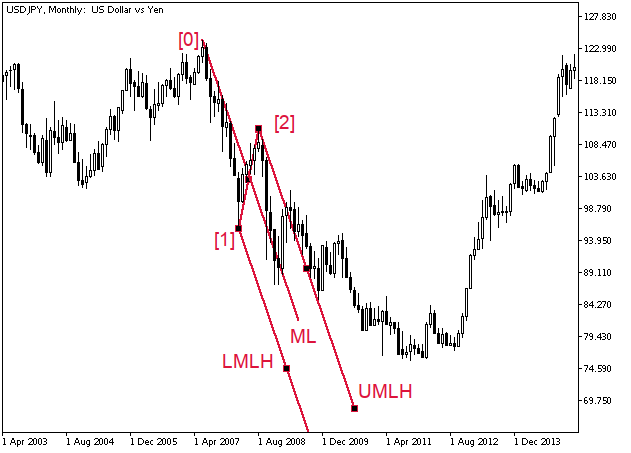
The best-known use of this tool is, of course, trading inside the channel. As long as the price is between the MLH lines, the trend continues and the work goes only in the direction of the trend. When the price approaches the channel borders or the median line, we expect a reversal. If the price went beyond the borders and fixed there, we expect a global reversal. For example, if in the image above the second candle after the breakthrough (April 2009) had been directed upwards, there would have been a reason to think about placing buy orders.
The third way to control movement is the so-called "sliding parallels" (SH). If the price breaks through MLH, but continues to slide along it in the direction of the "main" trend, then you can draw a line parallel to ML, tangential to the movement, so that only one candle touches this line, and all the rest would be between it and MLH.
Andrews himself recommends drawing a line at some important price of the previous candle (usually at extreme point - maximum or minimum). Then the breakdown of this line can also indicate a local reversal or a change in trend.
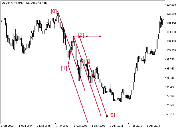
There are at least two more ways to use this construction. Andrews does not directly mention this, but if you remember that any diagonal line on the chart is a line of the rate of price change over time, then you can try to predict the boundaries of the movement - both in terms of the level and the approximate time of a reversal. To do this, draw a couple of lines - vertical and horizontal.
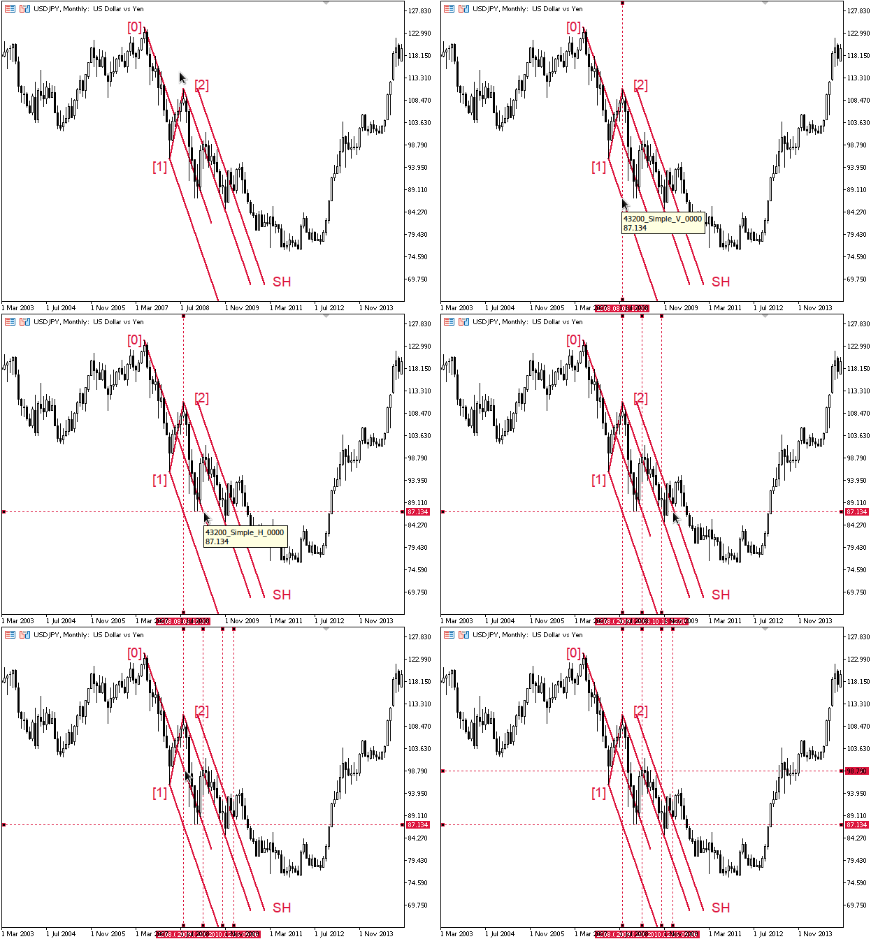
Verticals and horizontals answer the trader's main question: "If the price continues to move at the same speed, where will it end up? And when exactly can it turn around?" The points of intersection of these lines with the lines of speed (any inclined ones) give quite reliable future reversal levels. However, do not forget about stop levels.
Any critical point on the chart determines where other critical points will be - either in time or in purpose - as long as the chart obeys the laws used to build its left side (the one in history). In this article, we will consider pivot points as "critical points", although there may be other options.
On price charts, this may happen because these points are seen by everyone: both crowds of beginners and large investors - and everyone is trying to interpret them in approximately the same way. However, this does not explain why the same patterns also appear on the solar activity or bird migration charts. It looks like magic.
I tried to trace the price path using only the median lines drawing them after each significant reversal. All ML lines here are thin and one-pixel thick. Each pair of ML and the line it rests on is highlighted with its own color, for example, 4ML 5-6 is dark green and 4ML 5-8 is yellow.
Since the action is equal to the reaction, the right end of the ML itself is also indicated by a certain level (and, of course, indicates some time). The distance from the starting vertex to the cross line is equal to the distance from the cross line to the level. No further calculations were made.
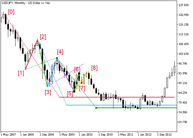
If two or more consecutive median lines point in the same direction, the trend is very strong and prices will continue to move very quickly.
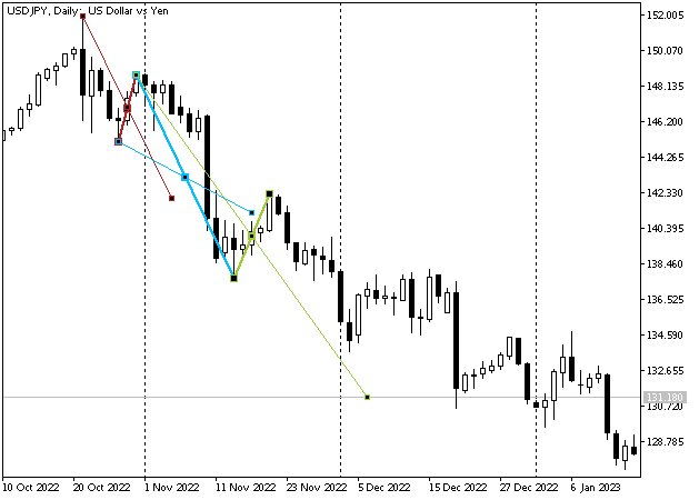
If the price sharply rebounds from the median line forming long shadows, or exactly touches the line MLand the candle closes before ML, a global reversal is very likely in the near future. A reversal can be confirmed, for example, by the formation of ML in the opposite direction and a price rebound from the MLH line.
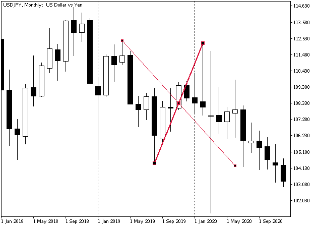
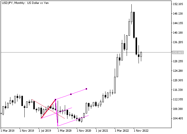
It is clear that we can build ML both at the nearest pivot points and at more distant ones - prices often reverse when approaching both of these lines. For example, the blue line is from the beginning of 2019. Perhaps its signals for someone could be even more significant than the signals of the magenta model.
Hagopian rule
If the price has not reached the median line and has broken through MLH in the direction opposite to the slope of ML, it makes sense to draw a trend line based on the extrema of the area that "tried but did not reach its destination".
Andrews recommends entering as soon as this trend line is broken.
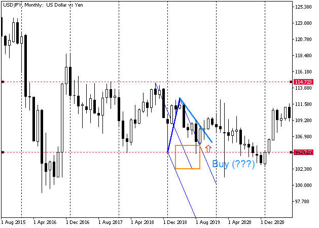
HoweverI repeat once again that in my opinion this situation simply means that the price is in a flat zone (or in a correction if we use Elliott's terminology). The price often makes a global reversal in such places, so you can, of course, enter with a very short stop, since most often with such a markup it is not clear whether the flat has ended or not. Alternatively, you can make the stop level longer - approximately by the width of the flat corridor or more.
However, if the price really reverses here (after the flat), then the movement is likely to be very powerful, and there may not be a return to the breakdown point for a very long time (see the last figure of the previous section). The main thing is to determine in time that the flat is over.
Here is another situation of "not reaching the destination". If we take into account that this is a screenshot of a monthly chart, then the situation both here and in the previous figure is quite profitable. But if I has traded heredirectly, I would most likely have waited for a more specific situation, for example, for selling - a breakdown of the 2016 low or the "correct" pitchfork configuration, when the breakdownfor me would have been persuasive.
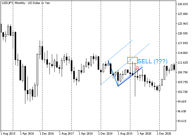
Conversely, in the next fragment, there is an almost unambiguous entry: the price confidently broke through MLH, before that it almost exactly touched the median line and formed a very long spire before that. Moreover, it walked at the top of the pitchfork without going beyond the middle one for a long time. Very interesting situation!
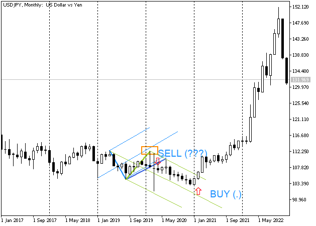
Right after the end of the first candle (following the breakout), move the stop level to the breakeven and go to the stadium (or embark on a trip around the world - it depends on the scale of the time interval). The only thing is that you still need to track how the price passes through some significant levels, but this is no longer difficult considering the trend power, while you have such tools as the Andrews pitchfork at your disposal.
Small pitchfork
In order to determine a good entry point, a "small" pitchfork can be used instead of a trend line.
Usually the pitchfork captures a fairly large area - 5-7 candles on each side of the triangle that lies at their base, and often more.
"Small" pitchfork can contain 2-3 candles in the part that is divided by the median line, and, for example, one candle as a "base". In fact, this is just a trend on a smaller time interval, and, most often, it is more convenient to mark it there. But no one prevents you from implementing the following markup:
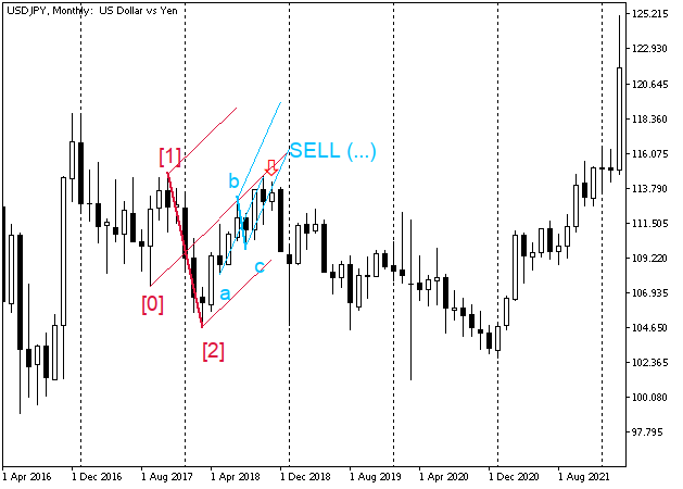
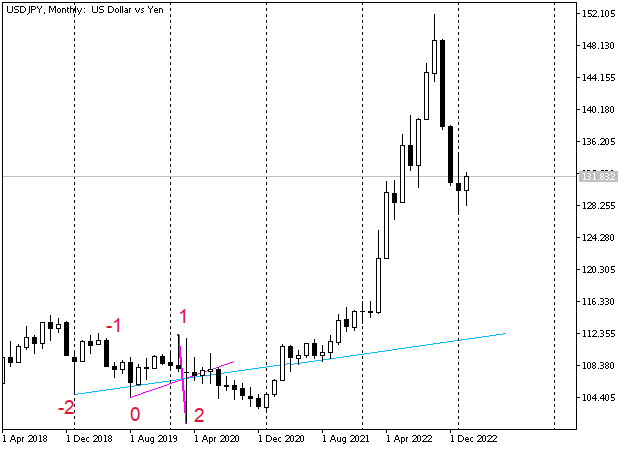
Several factors converged on the candle marked with a red arrow:
- it closed below the MLH parallel,
- the price touched the median line before it,
- the touch point of the previous candle matches the intersection pointof thr large and small averages - a very strongreversal level, like any other intersection point,
- touch point - 100% level of the blue median line,
- point level [1] is above the touch point,
- the candle is an "inside bar". The inside bar very often works as a trigger for transactions, since the price, breaking through its boundaries, can abruptly go in one direction (in this example, there is a high probability of a sharp downward movement).
The drawdowns of this "composition" include:
- price within the range of 2016,
- the previous two years it was in a downward flat,
- therefore, there is a high probability of a global reversal upwards. However, the markup does not reveal when this reversal will take place.
However, locally, the marking looks like a downward movement is quite probable.
Conclusion: you can sell, but you need to clearly understand the goals. You can search for them in the "lower" time intervals or build the next pitchfork ([1]ML[2]-[3]. Here the point [3] is not clearly marked, but it has already formed - the high of the October bar (the black candle next to the arrow on the left).
To make a deal, you can sell, for example, on the breakdown of the low of the November bar (indicated by the arrow). Alternatively, you can enter the deal at the opening of the next (December) candle or look for entry points at lower time intervals. A stop level is placed somewhere above the high of the October candle. You can exit, for example, at the crossing of the median line not shown here (2 ML 3-Arrow) or by trailing stop.
Do NOT count on a great (for a given period) downtrend at the moment of the arrow. Considering that this is a monthly chart, two black candles gave a total of 1000 points of profit (10,000 points on a three-digit chart). If we manage to take at least 90% of this movement (this is quite possible when entering at the opening of a new month), then the result can be called satisfactory.
Schiff pitchfork
Sometimes the median line does not describe movement accurately enough. For example, when the price moves along the upper MLH line and cannot touch the median line in any way, or even goes beyond the constructed channel but continues to move in the direction indicated by ML. It is clearly seen that this trend is "weak" for this time interval, however, it is not possible to measure it with the existing construction of straight lines, and there are no grounds for building new pitchforks yet, the top has not formed yet.
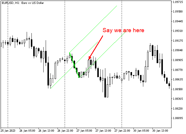
One way to solve this problem is to find lines that describe the given movement more accurately than ML. For example, we can reduce the slope of the median line by moving the first point to the middle of the [0]-[1] interval vertically.
In this case, the movement looks already more controlled, and we can try to predict it, given that we are dealing with the flat movement.
Such a construction is called Schiff pitchfork.
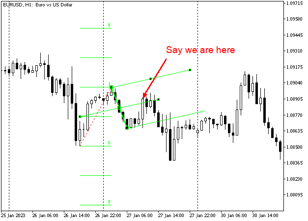
Of course, too steep movements can be measured the same way, for example:
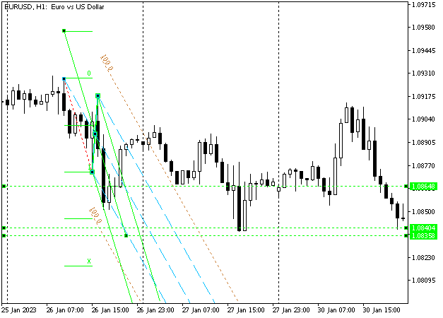
In this case, shifting the first point may allow you to find an earlier entry, as it gives more accurate indications of the bounce points.
Modified Schiff pitchfork
If we shift the beginning of the pitchfork to the middle of the [0]-[1] interval horizontally as well, we get "modified" Schiff pitchfork. They are often more accurate in depicting movement during flat. Besides, they provide clearer bounce points.
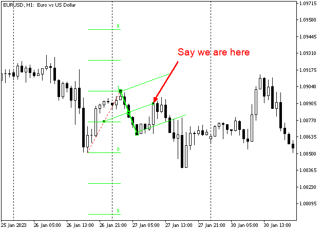
Such pitchforks are often useful when the number of bars in the [0]-[1] area is much larger than in [1]-[2].
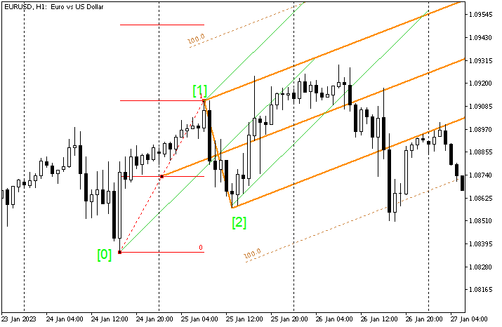
It is clear that both options will work - both "standard" and "modified", but it seems to me that in the given case, it is more convenient to look at targets on orange stripes.
Warning lines
In the figure from the previous section, we can see dotted lines with labels 100.0. Andrews calls them "warning lines". They are a reflection of the same action-reaction principle: "Action and reaction are equal and opposite". After having traveled a certain distance, prices will tend to turn around and go to the "median line". If the price bounced off the median line and broke through MLH, then, trying to go the same distance that it has already passed, it will have to reach this "warning" line. Then, turning around, it will go back to MLH using it as "median". It turns out that the main pitchfork seems to have "shifted" down. For the nearest time (for the given time period, of course), the movement will take place in this "shifted" channel.
I really like that MetaTrader 5 now features this ability. In MetaTrader 4, such a line could only be made manually. This was inconvenient and time-consuming.
In the figure below, I continued to plot the same EUR chart as in the previous section for the next period after the modified Schiff Pitchfork from the previous section was drawn. The conventional pitchfork was added.
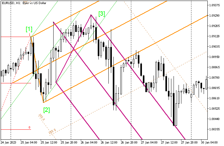
On January 27, EUR went beyond the boundaries of the lilac pitchfork but failed to break through the orange resistance line and continued to move down again.
Generally, the price can bounce off the warning lines several times, and move along the trend much further than any extremum inside the pitchfork. Therefore, if I see a trend on higher time intervals, I will try not to change the direction of the position if the price has not broken through the warning line on the lower interval. Conversely, a breakthrough of a warning line may indicate a good move, so if the breakout is convincing to me, I will likely enter on the candle following the breakout candle, or on a rollback to the breakthrough point if I think it might work. Most likely, it will be more beneficial.
Reverse (or "inward") pitchfork
After a sudden impulse movement, prices consolidate before a new breakthrough. To describe such a consolidation, we can use a "reversal (inward) pitchfork". To build them, we need to select three points of the triangle, as well as to build a regular median line, but we need to divide the [0]-[1] in half, rather than [1]-[2]. The trend line will pass through the middle [0]-[1] and the point [2].
Most often, in this case, the movement remains within the corridor created by this line and parallel to it, passing through the point [1], so usually additional warning lines are marked inside the channel. The Fibo Channel tool may come in handy here. I like to divide the inner interval of such a channel into 4 parts: levels 0.25, 0.5 and 0.75. External levels are 0.5 of the channel width.
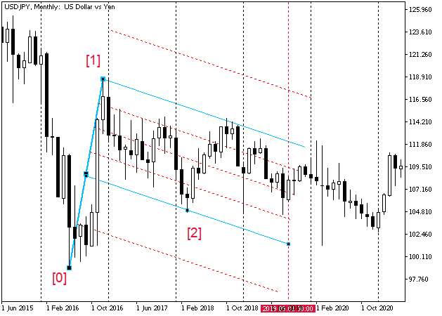
While the "classic" pitchfork is an attempt to describe an impulse movement, the "inward" one is an attempt to describe a corrective movement including all sorts of flags, pennants, etc.
Action-reaction lines
Lines parallel to any meaningful straight line can serve as action-reaction lines. This means that by drawing, say, the middle line [0] ML [1][2], we can set aside the distance from it to the point [-1], to the right, and this line will most likely serve as a reversal line when it approaches price, and if the direction of the line is down, we should expect a downward reversal, and vice versa.
Such "basic" lines can be built not only with the help of MLs but also many other lines. For example, Andrews recommends using the following options:
- 0-3;
- 0-4;
- reverse ML (from the previous section);
- multi-pivot line - a line passing through 3 or more historical pivot points;
- Gap-2;
- Moving averages and channel lines formed by them;
- High-Low and Low-High of any clearly visible trend;
- etc.
Let's look at this in more detail.
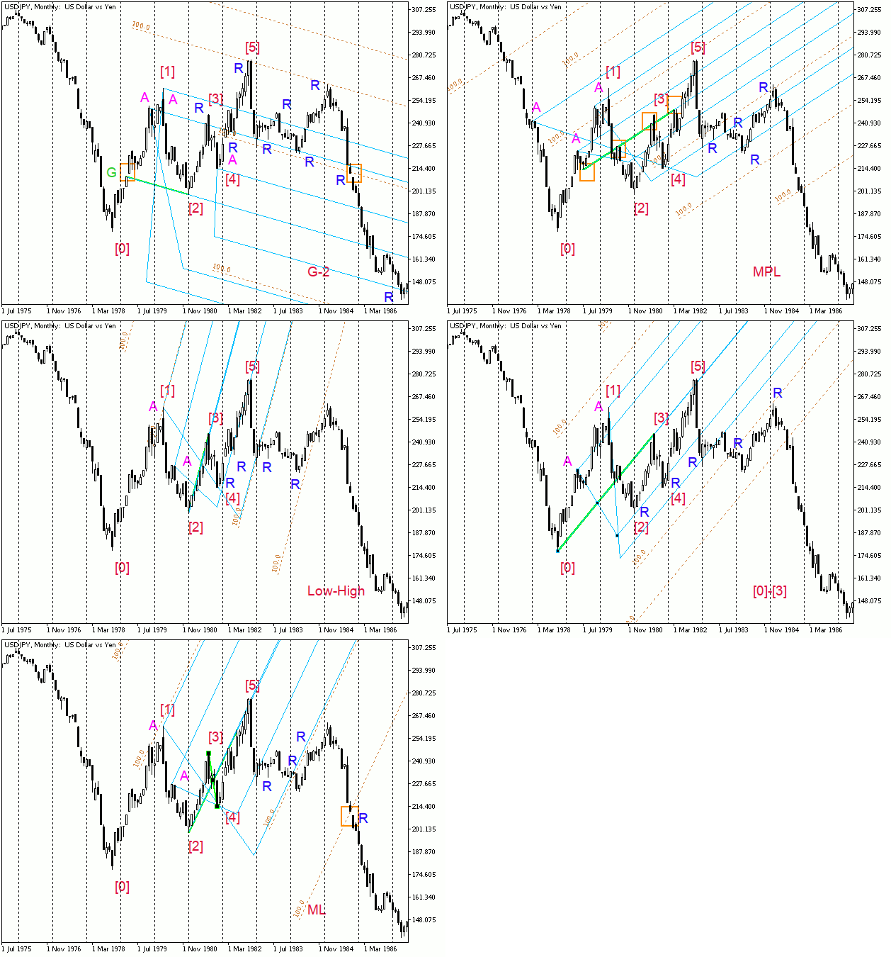
You can check the rest of the lines.
I can only add that I am not fond of using moving averages as "base" lines.
Let me once again describe the algorithm for constructing action-reaction lines:
- Select and draw a "base" line (see the list above).
- Select a reversal point on history (marked as А on the animation).
- Place the first point of the standard Andrews Pitchfork tool on the starting point of the baseline.
- Put the second point on the selected historical extremum. For lines directed upward, it is usually better to choose the upper extremum.
- The third point of the pitchfork is set so that the median line of the pitchfork matches the base line.
- When approaching the boundaries of the pitchfork constructed in this way, the price is likely to reverse or form a gap.
Horn of plenty trading method
If we draw a fan of lines that are 10° apart, from 10° to 80°, then the price will "notice" these lines, and if we see this happening, we can get a powerful basis for trading.
It seems that this rule only works on paper, but, oddly enough, it works on electronic charts, too. However, when the scale changes, the angle of the line, along which the price moves, also changes, but, nevertheless, prices continue to move along the fan just as steadily.
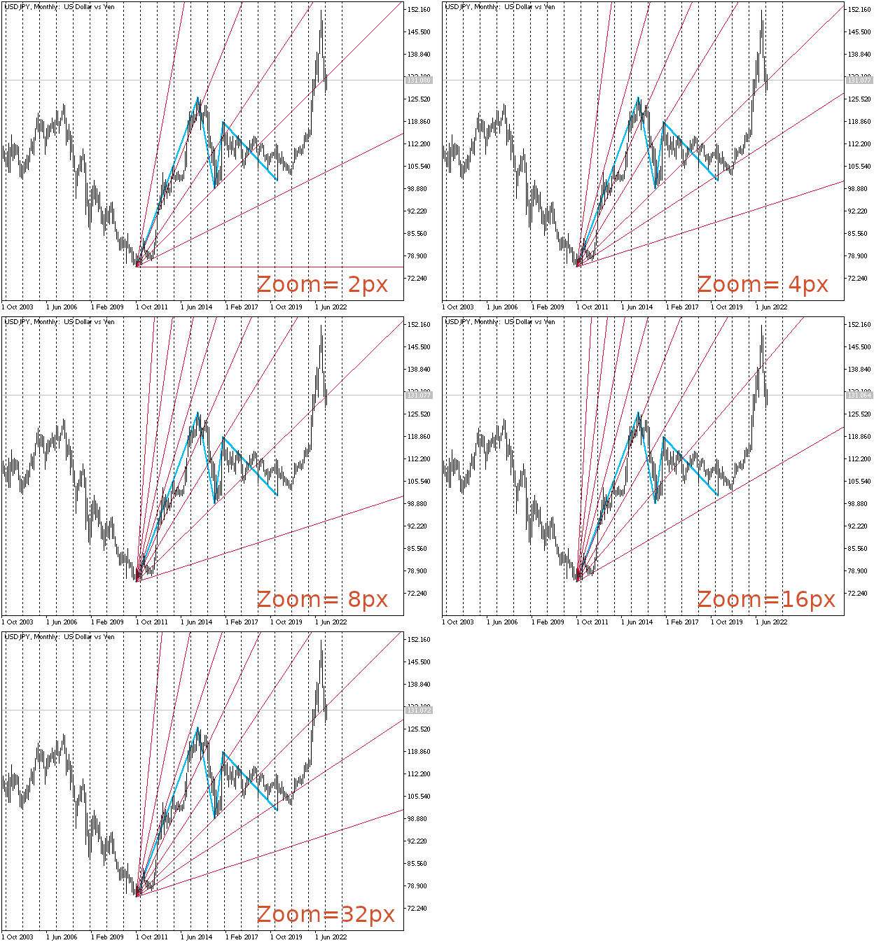
In the animation, we can see that the best results are obtained at 4px and 32px scales, but the other scales also give quite adequate results.
The main point of these stripes is that the price prefers to stay within a certain range, and if it closes behind some line that previously interfered with it, then there is probably a chance of going in the direction of the next line or further.
Andrews describes it this way:
If we notice a sharp rise or fall in prices, then this is a signal that a series of 10-degree lines can be drawn.
As long as the price is within the first two (the steepest) lines, a trader may not worry about his position, since it will grow.
When the price crosses the 20° line, it often goes to the 30° line, giving the opportunity to add to the position. Most likely, the price will move further along the trend as long as it remains within the 40° line.
If the price crosses the 40° line, a sharp trend reversal is likely to be expected. This becomes especially probable if there was another sharp surge before this intersection.
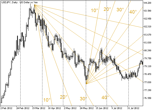
Naturally, it is better to collect your own statistics - by pairs, scales, time intervals, etc. In my case, this method of assessing the situation with the price movement works on all intervals.
The script that allows you to draw the lines of the fan is attached below. Simply drop it on the chart close to the desired top or bottom. If it is thrown from the top of the chart, the fan goes down, if it is thrown from the bottom, the fan goes up.
The rule of five reversals, or waves as interpreted by Andrews
Almost at the end of the course, Andrews describes counting pivot points. He was aware of Elliott's work, but he believed that Elliott had not defined the rules with enough precision. In fact, they should look like this:
After breaking the 0-4 line, you will usually be able to count at least 5 pivot points before any action needs to be taken.
This does not sound very clear. Let's have look at the charts.
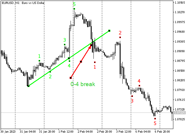
So, the 0-4 line of the previous trend has been broken, which means that there is a good chance for a big downward move. Now we can start counting the pivots. We should be interested only in those pivots that correspond to the desired profit size, that is, the size of each pivot should be approximately proportional to the movements that created the points of the previous trend.
Let's have a look at how the situation develops:
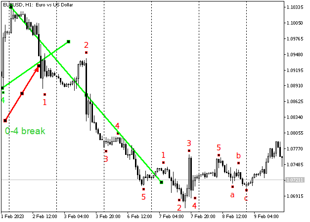
Despite the broken 0-4 line, the price continued to move down (probably hitting our stop level).
No big deal...
We can enter again - from point 2 (if 4 ML 5-1 is built - it will almost coincide with 04, and, therefore, point 2 of the new trend should rebound from it). Naturally, no one can stop us from building a small pitchfork at the top of 1 new (small) trend.
However, the situation when the price did not turn around after the breakdown of the 0-4 line, indicates that, most likely, a flat is starting on the market now. Therefore, if you are focused on long-term trends, you can start counting pivots. This "wave" is smaller than the "main" waves both in time and in amplitude. Then we just need to wait for a new point 5. The price could turn around from it and go down sharply, but in reality, the price simply completed the flat movement. We may add "a", "b" and "c" peaks and enter at the breakthrough of the 3-b line. Perhaps, in this case, this approach would be more reliable and would save traders from some additional losses.
Extended pivot
If the price forms such a formation, when a reversal appears at point 1 after a long or very fast trend, then point 2 appears below 1, followed by point 3 higher than point 1, then 4 below 2, and finally 5 higher than 3, then, following Andrews, we will call this formation Extended Pivot (EP). The reversal is usually goes from the "three peaks" towards the "two peaks" and most often it is very swift and far. In such cases, I usually try to draw a small pitchfork on the last trend, and enter immediately after they are broken in the direction opposite to the movement to point 5.
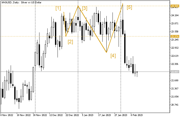
In this picture, there is another pivot between 3 and 5, but it turned out to be lower than 3, but then 5 met all expectations. This is why I have drawn these lines this way...
By the way, if you use the 0-4 breakthrough rule, then the same magic ratio appears again when counting (5 or 8 pivots, which can be repeated several times), so we can say that the entry on silver was almost mandatory on February 3 (more precisely, after opening on February 4). Or, even better, we might calculate the vertex (fortunately, Pitchfork gives a lot of opportunities for this) and put a "sleeping" order with a short stop level there. If it had been triggered, we would already have a decent profit by February 3.
So, if you are able to recognize this pattern, the probability of profits in your trading will greatly increase.
Conclusion
All methods of chart analysis described in this article are equal in their efficiency. Any of them can help a trader understand how the price will behave at any given time if we look closely at the path that it has taken before. Besides, any of them can roughly tell where the price will be at the appropriate moment in time. However, their combination gives better results. In my opinion, they are all worth a try so that you can define the ones that are more to your liking.
Andrews himself recommends that traders at first learn to trade on paper with the help of median lines only.
When this trading is mastered and the profit from "paper" trading with two contracts exceeds 100% (probably per year), traders can switch to trading using the Action-Reaction method.
After this method is mastered as well, traders can turn to Andrews for a new portion of knowledge (about the fan, counting, etc.).
As it turns out, no additional indicators are needed. The system is quite self-sufficient, and gives a very clear schedule, as well as very accurate entries and exits. If someone is used to Moving Averages or RSI, it is also quite possible to seamlessly combine them with the pitchfork. Just make sure this is a well thought-out decision.
In the age of the Internet with free working trading strategies, smart programs, high volatility, the possibility of huge leverage for margin trading and the ability to virtually test any complex strategy, the reality of profit becomes even more tangible on condition that traders complete their "homework" in full, collect statistics and strictly follow the system they have chosen.
We have a tester to build our own system based on the material presented here. There are several Expert Advisors that trade by graphical patterns drawn using straight lines. In addition, we have ample abilities to communicate with each other.
If we have our own system that suits us perfectly and provides accurate entries and exits, the world will probably change.
Andrews Pitchfork can become such a system, as it accurately determines the trend, entry-exit levels and trading time.
As always, trade wisely and have profits.
Translated from Russian by MetaQuotes Ltd.
Original article: https://www.mql5.com/ru/articles/12140
Warning: All rights to these materials are reserved by MetaQuotes Ltd. Copying or reprinting of these materials in whole or in part is prohibited.
This article was written by a user of the site and reflects their personal views. MetaQuotes Ltd is not responsible for the accuracy of the information presented, nor for any consequences resulting from the use of the solutions, strategies or recommendations described.
- Free trading apps
- Over 8,000 signals for copying
- Economic news for exploring financial markets
You agree to website policy and terms of use
Yay, someone to cross swords with this weekend!!!! Not for the sake of argument, just to pose. ))
No swords :-) Just another interpretation of a classic by the Jew.... True, it's not drawn in MT, but I hope I'll be forgiven....
No swords :-) Just another interpretation of a classic by the Jew.... True, it's not drawn in MT, but I hope I'll be forgiven....
Well, and pound let it be on the main topic :-)
Well, and pound let it be on the main topic :-)
I also like the pound the most.
P.S. - I mainly watch and trade M5, an hour purely for medium-term analysis.
P.S. And his system is, yes, very accurate. I'm not sure it's "the most", I know a couple of other things comparable (for me) in accuracy.... But I personally respect Gunn's work very much, yes.
I'll write a little bit at night, why there is still nothing more accurate than Gunn! :)
1 - first of all, the mathematics of the models. The past movement already gives the level of the first reaction, where you can stand with a minimum stop for correction. The error is +-3-4 pips, often it works in pips to pips.
2 - secondly, visualisation of patterns. Even if you did not have time to get into the beginning of the movement, you always catch the very end of the correction with the pattern and get into the third one with a minimum stop. Plus you always see if the pattern is over or not, i.e. if it is a reversal or if it will be a doboy on the trend.
3 - full algorithmisation. I.e. the same clear algorithm of actions for decision making. Mainly for catching the end of correction.
P.S. - The trading technique "Horn of Plenty" strongly chikannya Gunn! ;) Fan (there are angles), but there is no price and time binding. Therefore, it is not clear whether the trend is still in force or is already running out of steam.
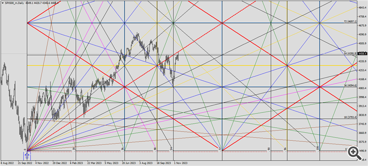
SiPi-500 in the Gann fan with price and time cut-offs.
