
Exploring Seasonal Patterns of Financial Time Series with Boxplot
Attempt to disprove the efficient-market hypothesis and to prove the existence of market cycles
In 2013, Eugene Fama, who developed efficient market hypothesis, won the Nobel Prize in Economics. According to his hypothesis, asset prices fully reflect all substantial information. This means that none of the market participants has advantages over others.
However, the hypothesis itself has some reservations, while the efficiency can have the following three degrees:
- weak if the market asset price fully reflects the past information regarding this asset
- average when the price reflects not only the past, but also the current public information
- strong, when it additionally reflects non-public insider information
Depending on the efficiency degree, markets have different degrees of predictability. For a technical analyst, this means that there can exist different cyclical seasonal components in the market.
For example, the market activity can vary from year to year, from month to month, from session to session, from hour to hour and so on. Furthermore, these cycles can represent some predictable sequences, inside and between which the trader can find his alpha. Cycles can also overlap and create different compositional patterns which can be further explored.
Search for seasonal patterns in price increments
We can study regular cycles along with composite ones. Let us view the example of studying monthly fluctuations of a financial instrument. For this purpose, we will use the combination of the IPython language and the MetaTrader 5 terminal.
To enable the easier import of quotes straight from the terminal, we will use the following code:
from MetaTrader5 import *
from datetime import datetime
import numpy as np
import pandas as pd
import matplotlib.pyplot as plt
%matplotlib inline
import seaborn; seaborn.set()
# Initializing MT5 connection
MT5Initialize("C:\\Program Files\\MetaTrader 5\\terminal64.exe")
MT5WaitForTerminal()

print(MT5TerminalInfo())
print(MT5Version())
Specify path to your terminal, which can differ from mine.
Add a few more lines to start analysis:
rates = pd.DataFrame(MT5CopyRatesRange("EURUSD", MT5_TIMEFRAME_D1, datetime(2010, 1, 1), datetime(2020, 1, 1)),
                     columns=['time', 'open', 'low', 'high', 'close', 'tick_volume', 'spread', 'real_volume'])
# leave only 'time' and 'close' columns
rates.drop(['open', 'low', 'high', 'tick_volume', 'spread', 'real_volume'], axis=1)

# get percent change (price returns)
returns = pd.DataFrame(rates['close'].pct_change(1))
returns = returns.set_index(rates['time'])
returns = returns[1:]
returns.head(5)

Monthly_Returns = returns.groupby([returns.index.year.rename('year'), returns.index.month.rename('month')]).mean()
Monthly_Returns.boxplot(column='close', by='month', figsize=(15, 8))
The rates variable receives the pandas dataframe with prices over the specified time interval (for example, 10 years in this example). Suppose we are only interested in close prices (to simplify further interpretation). Let us delete the unnecessary data columns using the rates.drop() method.
Prices have a shift in the average value over time and form trends, therefore the statistical analysis is not applicable to such raw series. Percentage price changes (price increments) are usually used in econometrics to ensure they all lie in the same value range. The percentage changes can be received using the pd.DataFrame(rates['close'].pct_change(1)) method.
We need average monthly price ranges. Let us arrange the table so as to receive the average values of monthly increments by years and display them on the boxplot diagram.
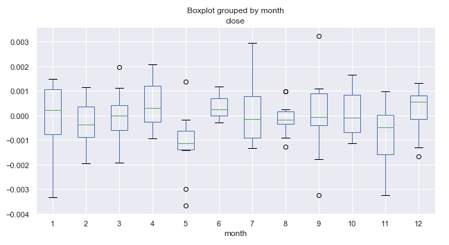
Fig. 1. Average price increment ranges by month, over 10 years.
What are boxplots and how to interpret them?
We need to access data on the volatility or distribution of price data for a selected period. Each separate boxplot (or box-and-whiskey diagram) provides a good visualization of how values are distributed along the dataset. Boxplots should not be confused with the candlestick charts, although they can be visually similar. Unlike candlesticks, boxplots provide a standardized way to display the distribution of data based on five readings.
- Median, Q2 or the 50th percentile shows the average value of the data set. The value appears as green horizontal lines inside the boxes on the diagram.
- The first quartile, Q1 (or the 25th percentile) represents the median between Q2 and the smallest value within the sample, which falls within the 99% confidence interval. It is shown as the lower edge of the box "body" on the diagram.
- The third quartile, Q3 (or the 75th percentile) is the median between Q2 and the maximum value, shown as the upper edge of the box "body".
- The body of the box forms an interquartile range (between the 25th and the 75th percentiles), also called IQR.
- Box whiskers complement the distribution. They cover 99% of the entire sample variance, and the dots above and below indicate values beyond the 99% value range.
This data is enough to evaluate the range of fluctuations and the dispersion of values within the internal range.
Further analysis of seasonal patterns
Let us consider figure 1 in more detail. We can see that the median of increments for the fifth month (May) is shifted down relative to zero and has a visible outlier above zero. In general, as we can see from the 10-year statistics, the market in May was declining relative to March. There was only one year, when the market grew in May. This is an interesting idea, which well complies with the trader adage "Sell in May and go away!".
Let us have a look at the 6th month (June), which follows May. Almost always (with the exception of one year) the market was growing in June relative to May, is shows to be a pattern that repeats from year to year. The range of June fluctuations is quite small, without any outliers (unlike May), which indicates good seasonal stability.
Pay attention to the 11th month (November). The probability of the market to decline during this period is high. After that, in December, the market usually was up again. January (the 1st month) was marked by high volatility and a decline relative to December.
The obtained data may provide a useful overview of underlying conditions for making trading decisions. Also, probabilities can be integrated into a trading system. For example, it can perform more buys or sells in certain months.
The monthly cycle data is very interesting, but it is possible to look even deeper into shorter daily cycles.
Let us view the distribution of price increments for each separate day of the week, using the same 10-year period:
Daily_Returns = returns.groupby([returns.index.week.rename('week'), returns.index.dayofweek.rename('day')]).mean()
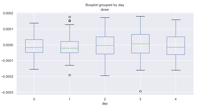
Fig. 2. Average price increment ranges by trading days, over 10 years.
Here zero corresponds to Monday and four to Friday. According to the price range, the volatility by days remains almost constant. It cannot be concluded that trading is more intensive on some particular day of the week. On average, the market is more inclined to go down than up on Mondays and Fridays. Perhaps, in some separate months, the distribution by day has a different look. Let's perform additional analysis.
# leave only one month "returns.index[~returns.index.month.isin([1])"
returns = returns.drop(returns.index[~returns.index.month.isin([1])])
In the above code 1 is used for January. By changing this value, we can obtain statistics for any month, in our case for 10 years.
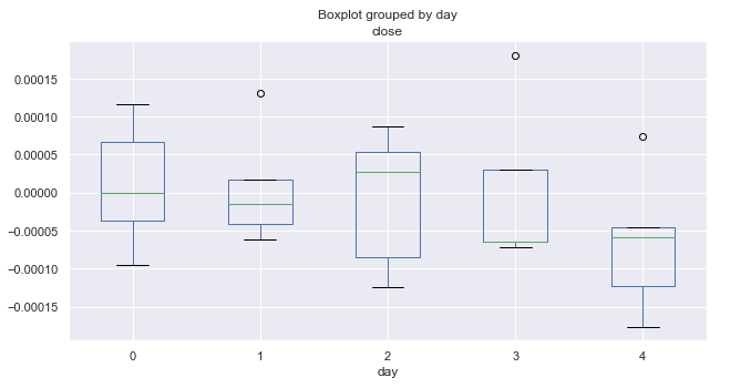
Fig. 3. Average price increment ranges by trading days, over 10 years (January).
The above diagram shows distribution of increments by days for January. The diagram now provides more useful details as compared to the summary statistics for all months. It clearly shows that market tends to decrease on Fridays. Only once the EURUSD pair did not go down (shown by an outlier above zero).
Here are similar statistics for March:
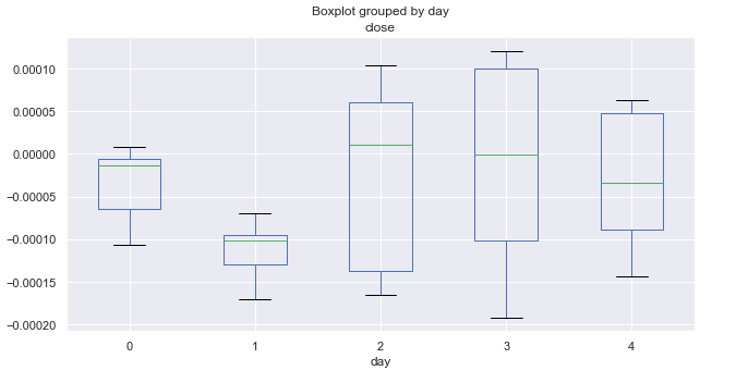
Fig. 4. Average price increment ranges by trading days, over 10 years (March).
March statistics is completely different from that of January. Monday and Tuesday (especially Tuesday) show bearish trend. All Tuesdays closed with a significant decrease, while the remaining days fluctuate around zero (on average).
Let's have a look at October:
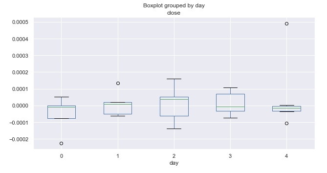
Fig. 5. Average price increment ranges by trading days, over 10 years (October).
The analysis of increment distribution by day of the week did not reveal any prominent patterns. We can only single out Wednesday, which has the highest range and potential for price movement. All other days show equal probability for upward and downward movements and have some outliers.
Analysis of seasonal intraday patterns
Very often it is necessary to take into account intraday distributions when creating a trading system, for example to use hourly data in addition to daily and monthly distributions. This can be easily done.
Consider the distribution of price increments for each hour:
rates = pd.DataFrame(MT5CopyRatesRange("EURUSD", MT5_TIMEFRAME_M15, datetime(2010, 1, 1), datetime(2019, 11, 25)),
                     columns=['time', 'open', 'low', 'high', 'close', 'tick_volume', 'spread', 'real_volume'])
# leave only 'time' and 'close' columns
rates.drop(['open', 'low', 'high', 'tick_volume', 'spread', 'real_volume'], axis=1)

# get percent change (price returns)
returns = pd.DataFrame(rates['close'].pct_change(1))
returns = returns.set_index(rates['time'])
returns = returns[1:]

Hourly_Returns = returns.groupby([returns.index.day.rename('day'), returns.index.hour.rename('hour')]).median()
Hourly_Returns.boxplot(column='close', by='hour', figsize=(10, 5))
These are the 15-minute timeframe quotes for 10 years. Another difference is that the data is grouped by days and hours to obtain the median hourly statistics for all days in the subsample.
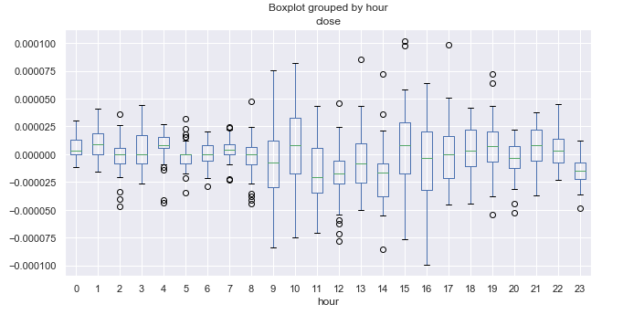
Fig. 6. Average price increment ranges by hours, over 10 years.
Here it is necessary to know the time zone of the terminal. In my case it is + 2. For reference, let us write the opening and closing times of the main FOREX trading sessions in UTC+2.
| Session | Open | Close |
|---|---|---|
| Pacific | 21.00 | 08.00 |
| Asian | 01.00 | 11.00 |
| European | 08.00 | 18.00 |
| American | 14.00 | 00.00 |
Trading during the Pacific session is usually quiet. If you look at the size of the boxes, you can easily notice that the range is minimal between 21.00-08.00, which corresponds to quiet trading. The range increases after the opening of the European and American sessions and then starts gradually decreasing. It seems there are no obvious cyclic patterns, which were clear on the daily timeframe. The average increment fluctuates around zero, without clear upward or clear downward hours.
An interesting period is 23.00 (closing of the American session), during which prices are usually reduced relative to 22.00. This can be an indication of a correction at the end of the trading session. At 00.00 prices grow relative to 23.00, so this can be treated as a regularity. It is difficult to detect more pronounced cycles, but we have a complete picture of the price range and know what to expect at this time.
Detrend in increments with a single lag can hide some patterns. So, it would be reasonable to look at data detrended by a moving average with an arbitrary period.
Search for seasonal patterns as detrended by an MA
Proper determining of the trend component is very tricky. Sometimes the time series can be smoothed too much. In this case there will be few trading signals. If the smoothing period is reduced, then the high frequency of deals may fail to cover spread and commission. Let's edit the code to make the detrend using a moving average:
rates = pd.DataFrame(MT5CopyRatesRange("EURUSD", MT5_TIMEFRAME_M15, datetime(2010, 1, 1), datetime(2019, 11, 25)),
                     columns=['time', 'open', 'low', 'high', 'close', 'tick_volume', 'spread', 'real_volume'])
# leave only 'time' and 'close' columns
rates = rates.drop(['open', 'low', 'high', 'tick_volume', 'spread', 'real_volume'], axis=1)
rates = rates.set_index('time')
# set the moving average period
window = 25
# detrend tome series by MA
ratesM = rates.rolling(window).mean()
ratesD = rates[window:] - ratesM[window:]

plt.figure(figsize=(10, 5))
plt.plot(rates)
plt.plot(ratesM)
The moving average period is set to 25. This parameter, as well as the period for which close prices are requested, can be changed. I use the 15-minute timeframe. As a result, we get the average deviation of close prices from the 15-minute moving average for each hour. Here is the resulting time series:
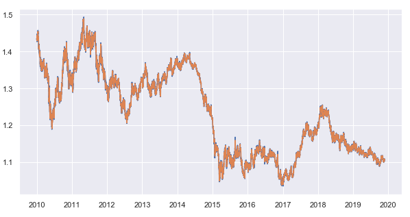
Fig. 7. 15-minute timeframe close prices and the 25-period moving average
Subtract the moving average from the close prices and get a detrended time series (remainder):
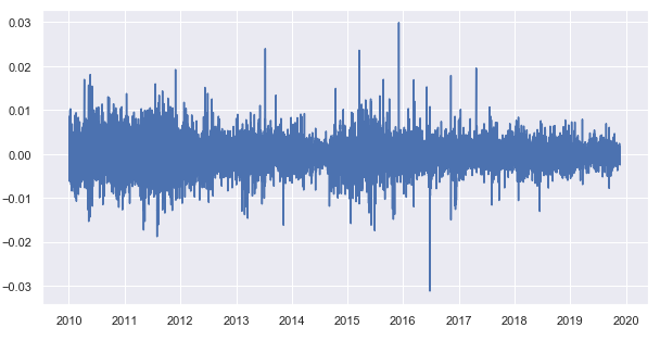
Fig. 8. Remainders from the subtraction of the moving average from close prices
Now let's obtain the hourly statistics of the distribution of remainders for each trading hour:
Hourly_Returns = ratesD.groupby([ratesD.index.day.rename('day'), ratesD.index.hour.rename('hour')]).median()
Hourly_Returns.boxplot(column='close', by='hour', figsize=(15, 8))
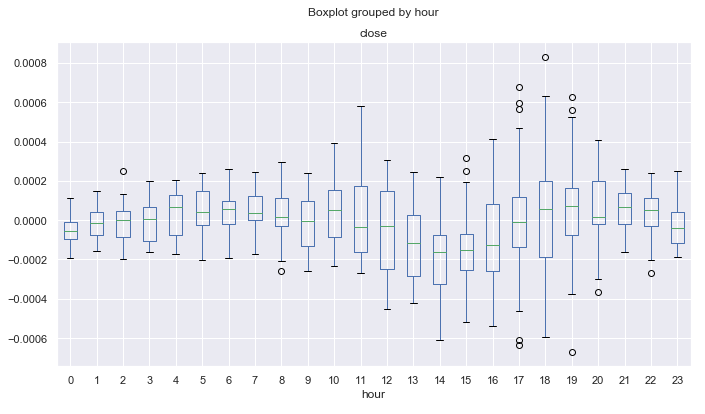
Fig. 9. Average price increment ranges by hours, over 10 years, detrended by the 25-period MA.
Unlike the diagram in figure 6, which was created for price increments with a single lag, this diagram shows less outliers and reveals more cyclic patterns. For example, you can see that from 0.00 to 08.00 (Pacific session) prices normally are rising smoothly relative to the moving average. A downward trend can be defined from 12.00 to 14.00. After that, during the US session, prices are rising on the average. After the beginning of the Pacific session, prices are declining for 4 hours, starting from 21.00.
The next logical step is to scrutinize the distribution moments in order to obtained more accurate statistical estimates. For example, calculate the standard deviation for the resulting detrended series as a boxplot diagram:
Hourly_std = ratesD.groupby([ratesD.index.day.rename('day'), ratesD.index.hour.rename('hour')]).std()
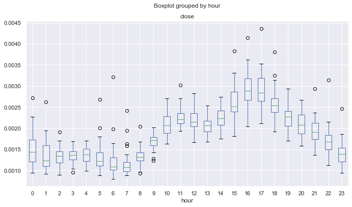
Fig. 10. Average standard deviations of price increments by hours, over 10 years, detrended by the 25-period MA.
Fig. 10 shows the hours having the most stable price behavior in terms of its standard deviation from the math expectations. For example, hours 4, 13, 14, 19 have a stable dispersion on all days and can be attractive for mean reversion strategies. Other hours may have outliers and long mustache, which indicates a more variable volatility in different days.
Another interesting point is the asymmetry coefficient. Let's calculate it:
Hourly_skew = ratesD.groupby([ratesD.index.day.rename('day'), ratesD.index.hour.rename('hour')]).skew()
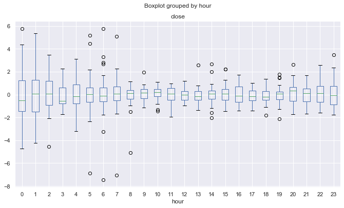
Fig. 11. Average asymmetry coefficients of price increments by hours, over 10 years, detrended by the 25-period MA.
Proximity to zero and a small dispersion indicate a more "standard" distribution of increments. The diagram form here becomes concave. For example, though fluctuations in the European and American session have larger dispersion (fig. 9), their hourly distributions are more stable and less biased, unlike the Pacific and Asian sessions. This may stem from large fluctuations in the activity during the last two sessions, when almost zero trading activity is replaced by sudden movements, which contribute much to the distribution bias.
Excess statistics shows similar results:
Hourly_std = ratesD.groupby([ratesD.index.day.rename('day'), ratesD.index.hour.rename('hour')]).apply(pd.DataFrame.kurt)
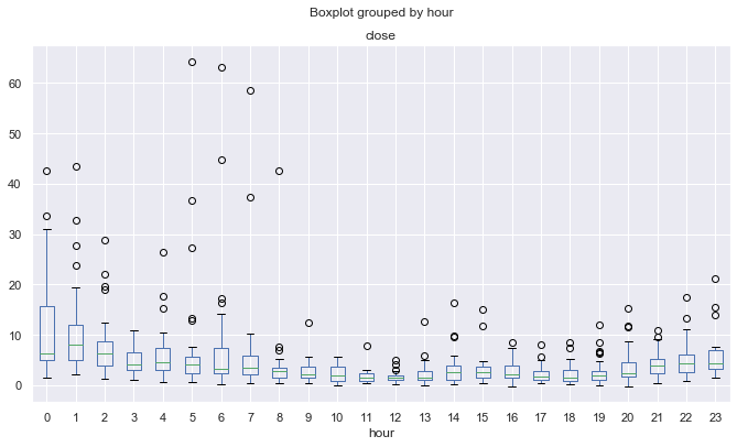
Fig. 12. Average excesses coefficients of price increments by hours, over 10 years, detrended by the 25-period MA.
Due to the aforementioned possible effect, distributions are less peaked and more "regular" for more volatile trading sessions, while they are "irregular" for quiet trading sessions. This is kind of a paradox.
Search for seasonal patterns, detrended by MA, for a specific month or day of the week
We can view the detrended hourly price distribution for each month separately, as well as for each day of the week. The entire code is available in the attachments below. Here I will only provide the comparison between March and November.
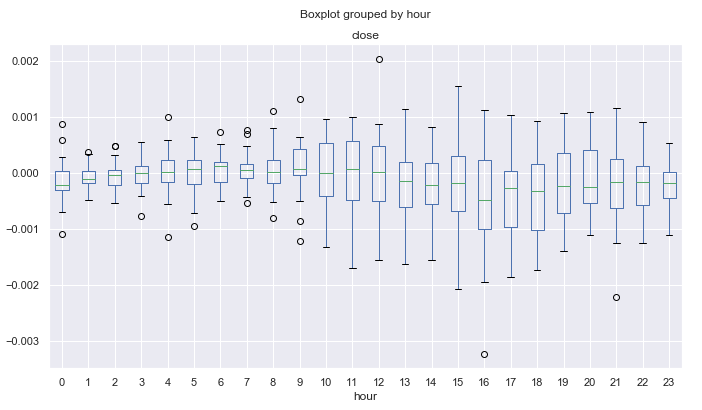
Fig. 13. Average price increment ranges by hours, over 10 years, detrended by the 25-period MA, for March.
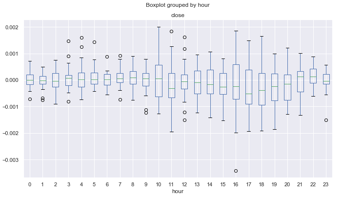
Fig. 14. Average price increment ranges by hours, over 10 years, detrended by the 25-period MA, for November.
It is possible to search for even smaller intraday cycles, including tick data, but here we only deal with the basic seasonal patterns, which may exist in financial time series according to traders' opinion. You may use this data for developing your own trading systems, taking into account the seasonal features of the financial instrument.
Checking patterns using trading logic
Let's create a simple trading Expert Advisor, which will utilize the found patterns shown in fig. 9. It shows that from 0.00 to 04.00 (GMT+2), EURUSD prices rise relative to its average during the four hours.
//+------------------------------------------------------------------+
//|                                              Seasonal trader.mq5 |
//|                                  Copyright 2020, Max Dmitrievsky |
//|                        https://www.mql5.com/en/users/dmitrievsky |
//+------------------------------------------------------------------+
#property copyright "Copyright 2020, Max Dmitrievsky"
#property link      "https://www.mql5.com/en/users/dmitrievsky"
#property version   "1.00"

#include <MT4Orders.mqh>
#include <Trade\AccountInfo.mqh>
#include <Math\Stat\Math.mqh>

input int OrderMagic = 666;
input double   MaximumRisk=0.01;
input double   CustomLot=0;

int hnd = iMA(NULL, 0, 25, 0, MODE_SMA, PRICE_CLOSE);
MqlDateTime hours;
double maArr[], prArr[];

void OnTick()
  {
//---
      CopyBuffer(hnd, 0, 0, 1, maArr);
      CopyClose(NULL, 0, 0, 1, prArr);
      double pr = prArr[0] - maArr[0];

      TimeToStruct(TimeCurrent(), hours);
      if(hours.hour >=0 && hours.hour <=4)
         if(countOrders(0)==0 && countOrders(1)==0)
            if(pr < -0.0002) OrderSend(Symbol(),OP_BUY,0.01,SymbolInfoDouble(_Symbol,SYMBOL_ASK),0,0,0,NULL,OrderMagic,INT_MIN);

      if(countOrders(0)!=0 && pr >=0)
         for(int b=OrdersTotal()-1; b>=0; b--)
            if(OrderSelect(b,SELECT_BY_POS)==true && OrderMagicNumber() == OrderMagic) {
               if(OrderClose(OrderTicket(),OrderLots(),OrderClosePrice(),0,Red)) {};
            }

  }
//+------------------------------------------------------------------+
//|                                                                  |
//+------------------------------------------------------------------+
int countOrders(int a) {
   int result=0;
   for(int k=0; k<OrdersTotal(); k++) {
      if(OrderSelect(k,SELECT_BY_POS,MODE_TRADES)==true)
         if(OrderType()==a && OrderMagicNumber()==OrderMagic && OrderSymbol() == _Symbol) result++;
   }
   return(result);
}
The Moving Average used is the same as for the statistical estimate. It has a period of 25. Subtract the average value from the last known price and check whether the current trading time is in the range from 0:00 to 4:00 inclusive. As can be seen from the diagram in fig. 9, the maximum difference between the close price and the moving average over this period is equal to -0.0002, while the MA is above zero. Accordingly, our trading logic is to open a buy deal when this difference is reached, and to close the position when it collapses to zero. The test robot does not have any stop orders or other checks and is only intended for testing the found patterns. Run a test from 2015 to 2019 on the 15-minute timeframe (the MA was also built on this period in our study), every tick mode:
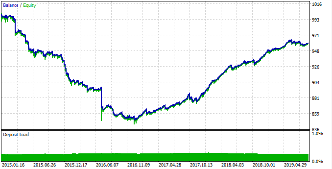
Fig. 15. Testing the found pattern.
The pattern worked poorly from 2015 to 2017, and the chart was down. Then, a stable growth is shown from 2017 to 2019. Why did this happen? To understand it, let's view statistics for each of the time interval separately.
First, here is the profitable trading interval:
rates = pd.DataFrame(MT5CopyRatesRange("EURUSD", MT5_TIMEFRAME_M15, datetime(2017, 1, 1), datetime(2019, 11, 25)),
                     columns=['time', 'open', 'low', 'high', 'close', 'tick_volume', 'spread', 'real_volume'])
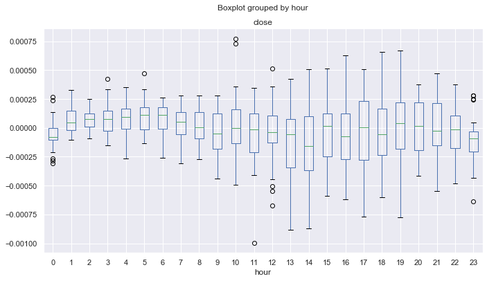
Fig. 16. Statistics for 2017-2019.
As can be seen, the median for all hours (except zero) are above zero, relative to the Moving Average. Statistically alpha is on our trading system side and the system remains in profit on the average. Now, here is the distribution for 2015-2017.
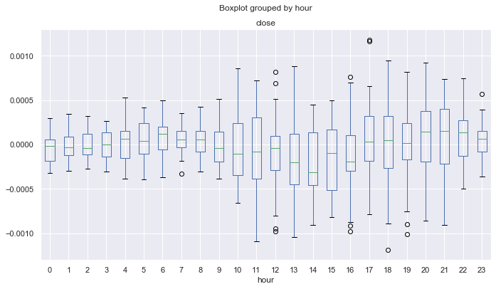
Fig. 17. Statistics for 2015-2017.
Here, the median of the distributions is below or equal to null for all hours except the fourth, which means a smaller probability of obtaining the profit. In addition, boxes have a significantly larger average range compared to another time interval for which the minimum value is not lower than -0.00025. Here it is almost -0.0005. Another drawback is the estimation of distributions only at close prices, and thus price spikes are not taken into account. This can be fixed by analyzing the tick data, which is beyond the scope of this article. The difference is clear, and so you can try to fine-tune the system to even out the results for all years.
Let's allow deal opening only at hours 0-1. Thus, we assume that in the next few hours the deal will be closed with profit, because mean deviation tends to move to a positive direction. Also, increase the deal closing threshold from 0.0 to 0.0003, and thus the robot can take more potential profit. Changes are shown in the below code:
TimeToStruct(TimeCurrent(), hours);
      if(hours.hour >=0 && hours.hour <=1)
         if(countOrders(0)==0 && countOrders(1)==0)
            if(pr < -0.0004) OrderSend(Symbol(),OP_BUY,LotsOptimized(), SymbolInfoDouble(_Symbol,SYMBOL_ASK),0,0,0,NULL,OrderMagic,INT_MIN);

      if(countOrders(0)!=0 && pr >= 0.0003)
         for(int b=OrdersTotal()-1; b>=0; b--)
            if(OrderSelect(b,SELECT_BY_POS)==true && OrderMagicNumber() == OrderMagic) {
               if(OrderClose(OrderTicket(),OrderLots(),OrderClosePrice(),0,Red)) {};
            }
Let's test the robot to draw the final conclusion:
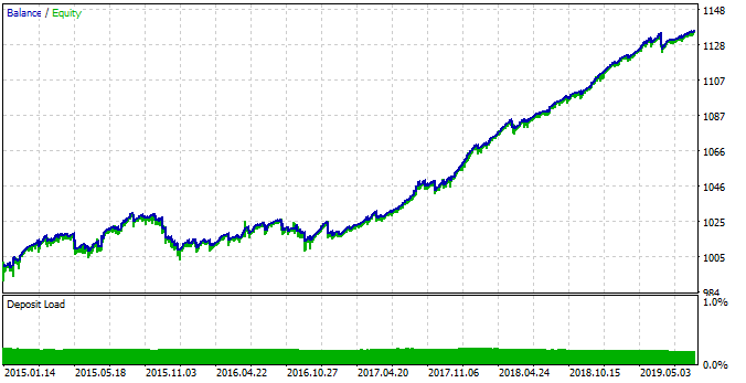
Fig. 18. Testing the detected pattern with changed EA parameters.
This time the system is more stable in the time interval between 2015 and 2017. However, this period was not as efficient as a period between 2017 and 2019, because of the changed seasonal patterns. This behavior is related to fundamental changes in the market, which can be easily described using boxplot diagrams.
Of course, there are still many unexplored patterns, but this basic example provides an understanding of new interesting possibilities that open up when using such a technique.
Conclusion
This article features a description of the proposed statistical method for detecting seasonal patterns in financial time series. The market may have monthly season cycles, as well as intraday cycles depending on the month. The hourly analysis has shown that with a certain smoothing period (for example, a moving average), you can find certain cycles both inside sessions and when moving from one trading session to another.
One of the advantages of the approach is the possibility to work with specific market patterns and the absence of over optimization (parameter overfitting), and thus the trading system can be highly stable.
As for the disadvantages, the seasonal pattern mining process is not easy and involves operations with various combinations and cycles.
The analysis was performed for the EURUSD currency pair, with the 10-year time interval. Python source codes are attached at the end of the article in .ipynb format (Jupyter notebook). You can perform the same study for any desired financial instrument, using the attached library, and apply the obtained results to create your own trading system or to improve an existing one.
Translated from Russian by MetaQuotes Ltd.
Original article: https://www.mql5.com/ru/articles/7038
Warning: All rights to these materials are reserved by MetaQuotes Ltd. Copying or reprinting of these materials in whole or in part is prohibited.
This article was written by a user of the site and reflects their personal views. MetaQuotes Ltd is not responsible for the accuracy of the information presented, nor for any consequences resulting from the use of the solutions, strategies or recommendations described.
- Free trading apps
- Over 8,000 signals for copying
- Economic news for exploring financial markets
You agree to website policy and terms of use
Hi Maxim,
I run code:
rates = pd.DataFrame(mt5.copy_rates_range("EURUSD", mt5.TIMEFRAME_D1, datetime(2010, 1, 1), datetime(2020, 1, 1)),
columns=['time', 'open', 'low', 'high', 'close', 'tick_volume', 'spread', 'real_volume'])
and the time I get is sth like '1262563200' which does not make sense, How can this be fixed plz?
Thx!
Hi, try this
" For example, hours 4, 13, 14, 19 have stable variance from day to day and may be more attractive for mean reversion strategies."
Why isn't hour 20 included? Based on the variance chart, it seems to be stable too.
" For example, 4, 13, 14, 19 hours have consistent variance from day to day and may be more attractive for mean reversion strategies"
Why isn't hour 20 included? Based on the variance chart, it seems to be stable too.
I don't remember, it was just an example, I think. Of course, you can test other hours as well. But I developed it with the MO.
It shows that the 20th hour is really good.
"Exploratory analysis for each trading hour" section.
Very good!
Thank you.