
Graphical Interfaces X: Text Edit box, Picture Slider and simple controls (build 5)
 15 429
 44
44

Contents
- Introduction
- The Text Edit box control
- Class for creating the Text Edit box control
- The Picture Slider Control
- Class for creating the Picture Slider control
- The Text Label and Picture controls
- CFonts class for working with fonts
- List of additional library updates
- Application for testing the controls
- Conclusion
Introduction
In order to get a better understanding of this library's purpose, please read the first article: Graphical interfaces I: Preparation of the library structure (Chapter 1). You will find a list of articles with links at the end of each chapter. There, you can also download a complete version of the library at the current stage of development. The files must be located in the same directories as in the archive.
This article will consider new controls: Text Edit box, Picture Slider, as well as additional simple controls: Text label and Picture, which can also be useful in various cases. The library continues to grow, and in addition to introduction of new controls, the previously created ones are also being improved. Since the library is currently utilized by a number of users, multiple comments and suggestions are received from them. Many of those requests have been implemented in the new version of the library. Plus, certain algorithms have been optimized. This reduced the CPU load even more. More details about this are further in the article.
The Text Edit box control
So far, the developed library already contains an Edit box control (the CSpinEdit class), but it is designed for entering numerical values only. The library will now be supplemented with another control, which would allow any text to be entered into the field. The Text Edit box control may be needed in different situations. For example, it is possible to create a string search in the files of the terminal "sandbox". Another option is to provide the end user of the MQL application with the ability to enter an array of symbols to trade. In short, this can be any text data required for working.
Let us enumerate all components of the Text Edit box control:
- Background
- Icon
- Description
- Edit box
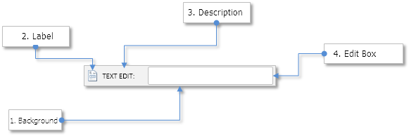
Fig. 1. Components of the Text Edit box control.
Let us take a closer look at the class of this control.
Class for creating the Text Edit box control
Create the TextEdit.mqh file with the CTextEdit class which has methods standard for all controls and include it in the library engine (the WndContainer.mqh file). Below are the control properties that are available to user for customization:
- Color of the control background
- Control icons for the active and blocked states
- Margins for icon along the two axes (x, y)
- Description text of the control
- Margins for the text label along the two axes (x, y)
- Color of the text in different states of the control
- Size of the Edit box
- Margins for the Edit box along the two axes (x, y)
- Colors of the Edit box and text of the Edit box in different states
- Alignment of text in the Edit box (left/right/center)
- Display mode of the text selection cursor
- Mode of resetting the value in the Edit box
//| Class for creating the text edit box |
//+------------------------------------------------------------------+
class CTextEdit : public CElement
{
private:
//--- Color of the control background
color m_area_color;
//--- Control icons in the active and blocked states
string m_icon_file_on;
string m_icon_file_off;
//--- Icon margins
int m_icon_x_gap;
int m_icon_y_gap;
//--- Text of the Edit box description
string m_label_text;
//--- Text label margins
int m_label_x_gap;
int m_label_y_gap;
//--- Color of the text in different states
color m_label_color;
color m_label_color_hover;
color m_label_color_locked;
color m_label_color_array[];
//--- Current value of the Edit box
string m_edit_value;
//--- Size of the Edit box
int m_edit_x_size;
int m_edit_y_size;
//--- Margins for the Edit box
int m_edit_x_gap;
int m_edit_y_gap;
//--- Colors of the Edit box and text of the Edit box in different states
color m_edit_color;
color m_edit_color_locked;
color m_edit_text_color;
color m_edit_text_color_locked;
color m_edit_text_color_highlight;
//--- Colors of the Edit box frame in different states
color m_edit_border_color;
color m_edit_border_color_hover;
color m_edit_border_color_locked;
color m_edit_border_color_array[];
//--- Mode of resetting the value (empty string)
bool m_reset_mode;
//--- Display mode of the text selection pointer
bool m_show_text_pointer_mode;
//--- Mode of text alignment
ENUM_ALIGN_MODE m_align_mode;
//---
public:
//--- Icon margins
void IconXGap(const int x_gap) { m_icon_x_gap=x_gap; }
void IconYGap(const int y_gap) { m_icon_y_gap=y_gap; }
//--- (1) Background color, (2) text of Edit box description, (3) margins of the text label
void AreaColor(const color clr) { m_area_color=clr; }
string LabelText(void) const { return(m_label.Description()); }
void LabelText(const string text) { m_label.Description(text); }
void LabelXGap(const int x_gap) { m_label_x_gap=x_gap; }
void LabelYGap(const int y_gap) { m_label_y_gap=y_gap; }
//--- Colors of the text label in different states
void LabelColor(const color clr) { m_label_color=clr; }
void LabelColorHover(const color clr) { m_label_color_hover=clr; }
void LabelColorLocked(const color clr) { m_label_color_locked=clr; }
//--- (1) Edit box size, (2) margin for Edit box from the right side
void EditXSize(const int x_size) { m_edit_x_size=x_size; }
void EditYSize(const int y_size) { m_edit_y_size=y_size; }
//--- Margins for the Edit box
void EditXGap(const int x_gap) { m_edit_x_gap=x_gap; }
void EditYGap(const int y_gap) { m_edit_y_gap=y_gap; }
//--- Colors of the Edit box in different states
void EditColor(const color clr) { m_edit_color=clr; }
void EditColorLocked(const color clr) { m_edit_color_locked=clr; }
//--- Colors of the Edit box text in different states
void EditTextColor(const color clr) { m_edit_text_color=clr; }
void EditTextColorLocked(const color clr) { m_edit_text_color_locked=clr; }
void EditTextColorHighlight(const color clr) { m_edit_text_color_highlight=clr; }
//--- Colors of the Edit box frame in different states
void EditBorderColor(const color clr) { m_edit_border_color=clr; }
void EditBorderColorHover(const color clr) { m_edit_border_color_hover=clr; }
void EditBorderColorLocked(const color clr) { m_edit_border_color_locked=clr; }
//--- (1) Reset mode when pressing the text label, (2) display mode of the text selection pointer
bool ResetMode(void) { return(m_reset_mode); }
void ResetMode(const bool mode) { m_reset_mode=mode; }
void ShowTextPointerMode(const bool mode) { m_show_text_pointer_mode=mode; }
//--- Mode of text alignment
void AlignMode(ENUM_ALIGN_MODE mode) { m_align_mode=mode; }
//--- Setting icons for the button in the active and blocked states
void IconFileOn(const string file_path);
void IconFileOff(const string file_path);
};
Display mode of the text selection pointer means that the mouse cursor will be complemented by an additional icon when it hovers over the Edit box, indicating that text can be entered there. For this to work, one more identifier (MP_TEXT_SELECT) has been added to the ENUM_MOUSE_POINTER enumeration.
//| Enumeration of the pointer types |
//+------------------------------------------------------------------+
enum ENUM_MOUSE_POINTER
{
MP_CUSTOM =0,
MP_X_RESIZE =1,
MP_Y_RESIZE =2,
MP_XY1_RESIZE =3,
MP_XY2_RESIZE =4,
MP_X_SCROLL =5,
MP_Y_SCROLL =6,
MP_TEXT_SELECT =7
};
The corresponding addition was made in the class CPointer as well (see the code below). The image for the cursor icon of text selection is available in the archive at the end of the article.
//| Pointer.mqh |
//| Copyright 2015, MetaQuotes Software Corp. |
//| http://www.mql5.com |
//+------------------------------------------------------------------+
#include "Element.mqh"
//--- Resources
...
#resource "\\Images\\EasyAndFastGUI\\Controls\\pointer_text_select.bmp"
//+------------------------------------------------------------------+
//| Set the cursor icons based on cursor type |
//+------------------------------------------------------------------+
void CPointer::SetPointerBmp(void)
{
switch(m_type)
{
case MP_X_RESIZE :
m_file_on ="Images\\EasyAndFastGUI\\Controls\\pointer_x_rs_blue.bmp";
m_file_off ="Images\\EasyAndFastGUI\\Controls\\pointer_x_rs.bmp";
break;
case MP_Y_RESIZE :
m_file_on ="Images\\EasyAndFastGUI\\Controls\\pointer_y_rs_blue.bmp";
m_file_off ="Images\\EasyAndFastGUI\\Controls\\pointer_y_rs.bmp";
break;
case MP_XY1_RESIZE :
m_file_on ="Images\\EasyAndFastGUI\\Controls\\pointer_xy1_rs_blue.bmp";
m_file_off ="Images\\EasyAndFastGUI\\Controls\\pointer_xy1_rs.bmp";
break;
case MP_XY2_RESIZE :
m_file_on ="Images\\EasyAndFastGUI\\Controls\\pointer_xy2_rs_blue.bmp";
m_file_off ="Images\\EasyAndFastGUI\\Controls\\pointer_xy2_rs.bmp";
break;
case MP_X_SCROLL :
m_file_on ="Images\\EasyAndFastGUI\\Controls\\pointer_x_scroll_blue.bmp";
m_file_off ="Images\\EasyAndFastGUI\\Controls\\pointer_x_scroll.bmp";
break;
case MP_Y_SCROLL :
m_file_on ="Images\\EasyAndFastGUI\\Controls\\pointer_y_scroll_blue.bmp";
m_file_off ="Images\\EasyAndFastGUI\\Controls\\pointer_y_scroll.bmp";
break;
case MP_TEXT_SELECT :
m_file_on ="Images\\EasyAndFastGUI\\Controls\\pointer_text_select.bmp";
m_file_off ="Images\\EasyAndFastGUI\\Controls\\pointer_text_select.bmp";
break;
}
//--- If custom type (MP_CUSTOM) is specified
if(m_file_on=="" || m_file_off=="")
::Print(__FUNCTION__," > Both icons must be set for the cursor!");
}
To create the Text Edit box control, five private and one public methods will be needed:
{
private:
//--- Objects for creating the Edit box
CRectLabel m_area;
CBmpLabel m_icon;
CLabel m_label;
CEdit m_edit;
CPointer m_text_select;
//---
public:
//--- Methods for creating the Text Edit box
bool CreateTextEdit(const long chart_id,const int subwin,const string label_text,const int x,const int y);
//---
private:
bool CreateArea(void);
bool CreateIcon(void);
bool CreateLabel(void);
bool CreateEdit(void);
bool CreateTextSelectPointer(void);
};
The rest of the CTextEdit class does not contain anything that has not been studied in the previous articles of this series. Therefore, you can examine its capabilities yourselves. The current version of the Text Edit box has a limit of 63 characters.
The Picture Slider Control
The Picture Slider belongs to informational controls of the graphical interface. It is useful to create a quick reference guide, where the illustrations show certain situations on the price chart or brief explanation about the purpose of a particular control of the graphical interface in the used MQL application.
Let us enumerate all components of the Picture Slider control:
- Background
- Slider arrow buttons
- Group of radio buttons
- Group of images associated with the group of radio buttons
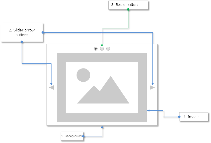
Fig. 2. Components of the Picture Slider control.
Class for creating the Picture Slider control
Create the PicturesSlider.mqh file with the standard methods present in other classes and include it in the WndContainer.mqh file. Below are properties of the control that can be customized by the library users.
- Color of the control background
- Control background frame color
- Margin for the pictures along the Y axis
- Margins for the slider arrow buttons along the two axes (x, y)
- Margins for the radio buttons along the two axes (x, y)
- Margin between the radio buttons
//| Class for creating the Picture Slider |
//+------------------------------------------------------------------+
class CPicturesSlider : public CElement
{
private:
//--- Control background and frame color
color m_area_color;
color m_area_border_color;
//--- Margin for the pictures along the Y axis
int m_pictures_y_gap;
//--- Margins for buttons
int m_arrows_x_gap;
int m_arrows_y_gap;
//--- Margins for radio buttons
int m_radio_buttons_x_gap;
int m_radio_buttons_y_gap;
int m_radio_buttons_x_offset;
//---
public:
//--- (1) Color of the background and (2) background frame
void AreaColor(const color clr) { m_area_color=clr; }
void AreaBorderColor(const color clr) { m_area_border_color=clr; }
//--- Margins for arrow buttons
void ArrowsXGap(const int x_gap) { m_arrows_x_gap=x_gap; }
void ArrowsYGap(const int y_gap) { m_arrows_y_gap=y_gap; }
//--- Margin for the pictures along the Y axis
void PictureYGap(const int y_gap) { m_pictures_y_gap=y_gap; }
//--- (1) Margins of the radio buttons, (2) distance between the radio buttons
void RadioButtonsXGap(const int x_gap) { m_radio_buttons_x_gap=x_gap; }
void RadioButtonsYGap(const int y_gap) { m_radio_buttons_y_gap=y_gap; }
void RadioButtonsXOffset(const int x_offset) { m_radio_buttons_x_offset=x_offset; }
};
To create the Picture Slider control, five private and one public methods will be needed:
{
private:
//--- Objects for creating the control
CRectLabel m_area;
CBmpLabel m_pictures[];
CRadioButtons m_radio_buttons;
CIconButton m_left_arrow;
CIconButton m_right_arrow;
//---
public:
//--- Methods for creating the Picture Slider
bool CreatePicturesSlider(const long chart_id,const int subwin,const int x,const int y);
//---
private:
bool CreateArea(void);
bool CreatePictures(void);
bool CreateRadioButtons(void);
bool CreateLeftArrow(void);
bool CreateRightArrow(void);
};
The width of the control will be calculated automatically, based on the user-defined parameters. These parameters include the margins for group of radio buttons from the left edge of the control, with respect to which the coordinate for the right arrow button of the Picture Slider is also calculated. Height of the control also depends on the size of the pictures. It is assumed that the picture sizes will be the same, so the calculations use the size of the first picture of the group.
Before calling the main method for creating the control, it is necessary to add the pictures to an array using the CPicturesSlider::AddPicture() method. If the path to the picture is not set as the only argument of this method, the default path will be applied.
//| PicturesSlider.mqh |
//| Copyright 2016, MetaQuotes Software Corp. |
//| http://www.mql5.com |
//+------------------------------------------------------------------+
...
//--- Default picture
#resource "\\Images\\EasyAndFastGUI\\Icons\\bmp64\\no_image.bmp"
//+------------------------------------------------------------------+
//| Class for creating the Picture Slider |
//+------------------------------------------------------------------+
class CPicturesSlider : public CElement
{
private:
//--- Array of pictures (path to pictures)
string m_file_path[];
//--- Default path to the picture
string m_default_path;
//---
public:
//--- Add picture
void AddPicture(const string file_path="");
};
//+------------------------------------------------------------------+
//| Constructor |
//+------------------------------------------------------------------+
CPicturesSlider::CPicturesSlider(void) : m_default_path("Images\\EasyAndFastGUI\\Icons\\bmp64\\no_image.bmp"),
m_area_color(clrNONE),
m_area_border_color(clrNONE),
m_arrows_x_gap(2),
m_arrows_y_gap(2),
m_radio_button_width(12),
m_radio_buttons_x_gap(25),
m_radio_buttons_y_gap(1),
m_radio_buttons_x_offset(20),
m_pictures_y_gap(25)
{
//--- Store the name of the control class in the base class
CElement::ClassName(CLASS_NAME);
//--- Set priorities of the left mouse button click
m_zorder=0;
}
//+------------------------------------------------------------------+
//| Add picture |
//+------------------------------------------------------------------+
void CPicturesSlider::AddPicture(const string file_path="")
{
//--- Increase the array size by one element
int array_size=::ArraySize(m_pictures);
int new_size=array_size+1;
::ArrayResize(m_pictures,new_size);
::ArrayResize(m_file_path,new_size);
//--- Store the values of passed parameters
m_file_path[array_size]=(file_path=="")? m_default_path : file_path;
}
To display a picture from the group, use the CPicturesSlider::SelectPicture() method. This method will be called when pressing the arrow buttons and radio buttons in the handler of the CPicturesSlider class.
{
public:
//--- Switches the picture at the specified index
void SelectPicture(const uint index);
};
//+------------------------------------------------------------------+
//| Specifies the picture to be displayed |
//+------------------------------------------------------------------+
void CPicturesSlider::SelectPicture(const uint index)
{
//--- Get the number of pictures
uint pictures_total=PicturesTotal();
//--- If there is no picture in the group, report
if(pictures_total<1)
{
::Print(__FUNCTION__," > This method is to be called, "
"if a group contains at least one picture! Use the CPicturesSlider::AddPicture() method");
return;
}
//--- Adjust the index value if the array range is exceeded
uint correct_index=(index>=pictures_total)? pictures_total-1 : index;
//--- Select the radio button at this index
m_radio_buttons.SelectRadioButton(correct_index);
//--- Switch to picture
for(uint i=0; i<pictures_total; i++)
{
if(i==correct_index)
m_pictures[i].Timeframes(OBJ_ALL_PERIODS);
else
m_pictures[i].Timeframes(OBJ_NO_PERIODS);
}
}
When pressing the arrow buttons, the event handler of the control calls the CPicturesSlider::OnClickLeftArrow() and CPicturesSlider::OnClickRightArrow() methods. The listing below shows the code if the method for the left mouse button. Events of clicking the picture slider buttons can be traced in the custom class of the MQL application, if necessary.
{
public:
private:
//--- Handling the clicking of left button
bool OnClickLeftArrow(const string clicked_object);
//--- Handling the clicking of right button
bool OnClickRightArrow(const string clicked_object);
};
//+------------------------------------------------------------------+
//| Clicking the left mouse button |
//+------------------------------------------------------------------+
bool CPicturesSlider::OnClickLeftArrow(const string clicked_object)
{
//--- Leave, if clicking was not on the button
if(::StringFind(clicked_object,CElement::ProgramName()+"_icon_button_",0)<0)
return(false);
//--- Get the identifier of the control from the object name
int id=CElement::IdFromObjectName(clicked_object);
//--- Get the index of the control from the object name
int index=CElement::IndexFromObjectName(clicked_object);
//--- Leave, if control identifiers do not match
if(id!=CElement::Id())
return(false);
//--- Leave, if control indexes do not match
if(index!=0)
return(false);
//--- Get the current index of the selected radio button
int selected_radio_button=m_radio_buttons.SelectedButtonIndex();
//--- Switch the picture
SelectPicture(--selected_radio_button);
//--- Send a message about it
::EventChartCustom(m_chart_id,ON_CLICK_BUTTON,CElement::Id(),CElement::Index(),"");
return(true);
}
The listing below shows the shortened code of the event handler for the Picture Slider. It is evident that events of clicking the radio buttons of the slider are tracked here as well. It is possible to understand that a radio button in a local group was clicked using the control identifier, which is equal to the identifier of the Picture Slider.
//| Event handler |
//+------------------------------------------------------------------+
void CPicturesSlider::OnEvent(const int id,const long &lparam,const double &dparam,const string &sparam)
{
//--- Handling of the cursor movement event
...
//--- Handling the event of clicking the radio button
if(id==CHARTEVENT_CUSTOM+ON_CLICK_LABEL)
{
//--- If this is a radio button of the slider, switch the picture
if(lparam==CElement::Id())
SelectPicture(m_radio_buttons.SelectedButtonIndex());
//---
return;
}
//--- Handling the left mouse button click on the object
if(id==CHARTEVENT_OBJECT_CLICK)
{
//--- If an arrow button of the slider was clicked, switch the picture
if(OnClickLeftArrow(sparam))
return;
if(OnClickRightArrow(sparam))
return;
//---
return;
}
}
The Text Label and Picture controls
As a supplement, the library now includes two new CTextLabel and CPicture classes for creating simple Text Label and Picture controls. They can be used as separate objects, without binding them to any other control. Their content is very simple. In the CPicture class, users can change only one property - the path to the picture. The CPicture::Path() method has been implemented for that purpose. Unless a custom path is not specified, the default picture will be used. The picture can be changed programmatically at any time even after creating the graphical interface of the MQL application.
//| Picture.mqh |
//| Copyright 2016, MetaQuotes Software Corp. |
//| http://www.mql5.com |
//+------------------------------------------------------------------+
#include "Element.mqh"
#include "Window.mqh"
//--- Resources
#resource "\\Images\\EasyAndFastGUI\\Icons\\bmp64\\no_image.bmp"
//+------------------------------------------------------------------+
//| Class for creating picture |
//+------------------------------------------------------------------+
class CPicture : public CElement
{
private:
//--- Path to the picture
string m_path;
//---
public:
//--- Gets/sets the path to the picture
string Path(void) const { return(m_path); }
void Path(const string path);
};
//+------------------------------------------------------------------+
//| Constructor |
//+------------------------------------------------------------------+
CPicture::CPicture(void) : m_path("Images\\EasyAndFastGUI\\Icons\\bmp64\\no_image.bmp")
{
//--- Store the name of the control class in the base class
CElement::ClassName(CLASS_NAME);
//--- Set priorities of the left mouse button click
m_zorder=0;
}
//+------------------------------------------------------------------+
//| Set the picture |
//+------------------------------------------------------------------+
void CPicture::Path(const string path)
{
m_path=path;
m_picture.BmpFileOn("::"+path);
m_picture.BmpFileOff("::"+path);
}
As for the Text label control, everything is quite simple and only four properties can be defined by user:
- Text of the label
- Text color
- Font
- Font size
//| Class for creating a text label |
//+------------------------------------------------------------------+
class CTextLabel : public CElement
{
public:
//--- Gets/sets the text of the label
string LabelText(void) const { return(m_label.Description()); }
void LabelText(const string text) { m_label.Description(text); }
//--- Setting the (1) color, (2) font and (3) font size of the Text label
void LabelColor(const color clr) { m_label.Color(clr); }
void LabelFont(const string font) { m_label.Font(font); }
void LabelFontSize(const int size) { m_label.FontSize(size); }
};
CFonts class for working with fonts
To facilitate font selection, an additional CFonts class has been implemented. It contains 187 fonts. Those are the system fonts of the terminal, which you have probably seen listed in the settings of certain graphical objects.

Fig. 3. System fonts of the terminal.
The file with the fonts (Fonts.mqh) is located in the "MetaTrader 5\MQL5\Include\EasyAndFastGUI\Fonts.mqh" directory. It has been included in the Objects.mqh file to allow full access throughout the entire scheme of the library:
//| Objects.mqh |
//| Copyright 2015, MetaQuotes Software Corp. |
//| http://www.mql5.com |
//+------------------------------------------------------------------+
#include "Enums.mqh"
#include "Defines.mqh"
#include "..\Fonts.mqh"
#include "..\Canvas\Charts\LineChart.mqh"
#include <ChartObjects\ChartObjectSubChart.mqh>
#include <ChartObjects\ChartObjectsBmpControls.mqh>
#include <ChartObjects\ChartObjectsTxtControls.mqh>
The CFonts class contains only two public methods for getting the size of the fonts array and getting the font name by index. The array of fonts is initialized in the class constructor.
//| Fonts.mqh |
//| Copyright 2016, MetaQuotes Software Corp. |
//| http://www.mql5.com |
//+------------------------------------------------------------------+
//+------------------------------------------------------------------+
//| Class for working with font |
//+------------------------------------------------------------------+
class CFonts
{
private:
//--- Array of fonts
string m_fonts[];
//---
public:
CFonts(void);
~CFonts(void);
//--- Returns the number of fonts
int FontsTotal(void) const { return(::ArraySize(m_fonts)); }
//--- Returns font by index
string FontsByIndex(const uint index);
//---
private:
//--- Initialize the array of fonts
void InitializeFontsArray(void);
};
//+------------------------------------------------------------------+
//| Constructor |
//+------------------------------------------------------------------+
CFonts::CFonts(void)
{
//--- Initialize the array of fonts
InitializeFontsArray();
}
//+------------------------------------------------------------------+
//| Destructor |
//+------------------------------------------------------------------+
CFonts::~CFonts(void)
{
::ArrayFree(m_fonts);
}
Calling the CFonts::FontsByIndex() method invokes the adjustment that prevents exceeding the array range:
//| Returns font by index |
//+------------------------------------------------------------------+
string CFonts::FontsByIndex(const uint index)
{
//--- Array size
uint array_size=FontsTotal();
//--- Adjustment in case the range has been exceeded
uint i=(index>=array_size)? array_size-1 : index;
//--- Return the font
return(m_fonts[i]);
}
List of additional library updates
1. Fixed the incorrect display of the tooltips in the dialog boxes. Now, the pressed state of the tooltips button in the main window applies to all windows of the graphical interface. Pressing the button generates a message with the new ON_WINDOW_TOOLTIPS event identifier (see the Defines.mqh file).
//| Defines.mqh |
//| Copyright 2015, MetaQuotes Software Corp. |
//| http://www.mql5.com |
//+------------------------------------------------------------------+
...
#define ON_WINDOW_TOOLTIPS (29) // Clicking on the Tooltips button
Accordingly, the OnClickTooltipsButton() method has been added to the CWindow class for handling the tooltips button:
//| Class for creating a form for controls |
//+------------------------------------------------------------------+
class CWindow : public CElement
{
private:
//--- Handling the event of clicking on the Tooltips button
bool OnClickTooltipsButton(const string clicked_object);
};
//+------------------------------------------------------------------+
//| Chart event handler |
//+------------------------------------------------------------------+
void CWindow::OnEvent(const int id,const long &lparam,const double &dparam,const string &sparam)
{
//--- Handling event of clicking on an object
if(id==CHARTEVENT_OBJECT_CLICK)
{
//--- If the Tooltips button was clicked
if(OnClickTooltipsButton(sparam))
return;
}
}
//+------------------------------------------------------------------+
//| Handling the event of clicking on the Tooltips button |
//+------------------------------------------------------------------+
bool CWindow::OnClickTooltipsButton(const string clicked_object)
{
//--- This button is not required, if the window is a dialog box
if(m_window_type==W_DIALOG)
return(false);
//--- Leave, if clicking was not on the radio button
if(::StringFind(clicked_object,CElement::ProgramName()+"_window_tooltip_",0)<0)
return(false);
//--- Get the identifier of the control from the object name
int id=CElement::IdFromObjectName(clicked_object);
//--- Leave, if control identifiers do not match
if(id!=CElement::Id())
return(false);
//--- Store the state in the class field
m_tooltips_button_state=m_button_tooltip.State();
//--- Send a message about it
::EventChartCustom(m_chart_id,ON_WINDOW_TOOLTIPS,CElement::Id(),CElement::Index(),"");
return(true);
}
For all this to work in the library engine (CWndEvents class), the OnWindowTooltips() method for handling event with the ON_WINDOW_TOOLTIPS identifier has been added:
{
private:
//--- Enable/disable tooltips
bool OnWindowTooltips(void);
};
//+------------------------------------------------------------------+
//| CHARTEVENT_CUSTOM event |
//+------------------------------------------------------------------+
void CWndEvents::ChartEventCustom(void)
{
//--- If the signal is for minimizing the form
//--- If the signal is for maximizing the form
//--- If the signal is to resize the controls along the X axis
//--- If the signal is to resize the controls along the Y axis
//--- If the signal is to enable/disable tooltips
if(OnWindowTooltips())
return;
//--- If the signal is for hiding context menus below the initiating item
//--- If the signal is to hide all context menus
//--- If the signal is to open a dialog window
//--- If the signal is to close a dialog window
//--- If the signal is to zero the colors of all elements on the specified form
//--- If the signal is to reset the priorities of the left mouse button click
//--- If the signal is to restore the priorities of the left mouse button click
}
//+------------------------------------------------------------------+
//| ON_WINDOW_TOOLTIPS event |
//+------------------------------------------------------------------+
bool CWndEvents::OnWindowTooltips(void)
{
//--- If the signal is to "Enable/disable tooltips"
if(m_id!=CHARTEVENT_CUSTOM+ON_WINDOW_TOOLTIPS)
return(false);
//--- If the window identifiers match
if(m_lparam!=m_windows[0].Id())
return(true);
//--- Synchronize the tooltips mode across all windows
int windows_total=WindowsTotal();
for(int w=0; w<windows_total; w++)
{
if(w>0)
m_windows[w].TooltipButtonState(m_windows[0].TooltipButtonState());
}
//---
return(true);
}
2. Added ability to change the text in the description of the following controls after they had been created:
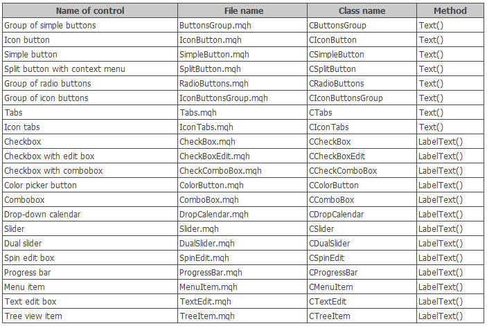
Fig. 4. List of controls with the ability to change the text after they had been created.
3. Icon can now be set in all controls, where it might be necessary (see the table below). In addition, added the ability to change the control icons after they had been created:
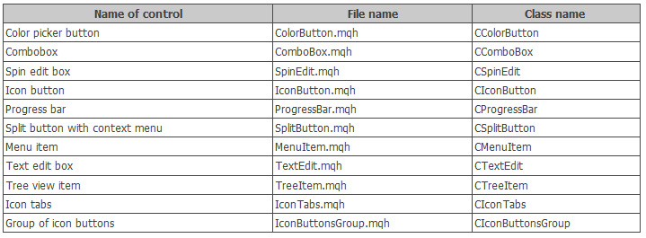
Fig. 5. List of controls with the ability to change the icon after they had been created.
To replace the icon in all controls listed in the table above, the IconFileOn() and IconFileOff() methods exist.
4. Added the ability to programmatically manage the state of all types of buttons and tabs (pressed/released) after they had been created. The table below shows the controls which include this addition:
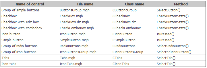
Fig. 6. List of controls with the ability to change the state (pressed/released) after they had been created.
5. Optimized the algorithm of highlighting the items when the cursor is hovering over them in the following controls:
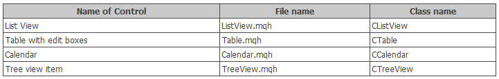
Fig. 7. Controls with the optimization of algorithm for highlighting the control items.
Previously, the program iterated over all items in the lists of the above controls, checking the location of the mouse cursor above them. Thus, the item under the cursor was highlighted in a different color, while the default color was set to rest of the items. But this method is very resource intensive, so there was a need to optimize. Now, instead of iterating over the entire array of items, only two items participate in changing the color. Search in the cycle only takes place when there was a transition to another item, that is the focus has changed.
Further, as an example, consider how this was implemented in the CListView class. Implementing the above requires adding (1) m_prev_item_index_focus class field to store the index of the last focused item, (2) CListView::CheckItemFocus() method to check the focus over the item and (3) changing the algorithm in the CListView::ChangeItemsColor() method.
//| Class for creating a list view |
//+------------------------------------------------------------------+
class CListView : public CElement
{
private:
//--- To determine the moment of mouse cursor transition from one item to another
int m_prev_item_index_focus;
//---
private:
//--- Changing the color of list view items when the cursor is hovering over them
void ChangeItemsColor(void);
//--- Checking the focus of list view items when the cursor is hovering
void CheckItemFocus(void);
};
The CListView::CheckItemFocus() method is called only when the mouse cursor enters the area of the control (in this case – CListView), and also when the mouse cursor moves from one item to another (see the code below). Once the item with the mouse hovering it is found, its index is stored.
//| Check the focus of list view items when the cursor is hovering |
//+------------------------------------------------------------------+
void CListView::CheckItemFocus(void)
{
//--- Get the current position of the scrollbar slider
int v=m_scrollv.CurrentPos();
//--- Identify over which item the cursor is over and highlight it
for(int i=0; i<m_visible_items_total; i++)
{
//--- Increase the counter if the list view range has not been exceeded
if(v>=0 && v<m_items_total)
v++;
//--- Skip the selected item
if(m_selected_item_index==v-1)
{
m_items[i].BackColor(m_item_color_selected);
m_items[i].Color(m_item_text_color_selected);
continue;
}
//--- If the cursor is over this item, highlight it
if(m_mouse.X()>m_items[i].X() && m_mouse.X()<m_items[i].X2() &&
m_mouse.Y()>m_items[i].Y() && m_mouse.Y()<m_items[i].Y2())
{
m_items[i].BackColor(m_item_color_hover);
m_items[i].Color(m_item_text_color_hover);
//--- Remember the item
m_prev_item_index_focus=i;
break;
}
}
}
The CListView::CheckItemFocus() method is called from within the CListView::ChangeItemsColor() method in the cases described in the previous paragraph (see the code listing below):
//| Changing color of the list view item when the cursor is hovering |
//+------------------------------------------------------------------+
void CListView::ChangeItemsColor(void)
{
//--- Leave, if the highlighting of the item when the cursor is hovering over it is disabled or the scrollbar is active
if(!m_lights_hover || m_scrollv.ScrollState())
return;
//--- Leave, if it is not a drop-down element and the form is blocked
if(!CElement::IsDropdown() && m_wnd.IsLocked())
return;
//--- If entered the list view again
if(m_prev_item_index_focus==WRONG_VALUE)
{
//--- Check the focus on the current item
CheckItemFocus();
}
else
{
//--- Check the focus on the current row
int i=m_prev_item_index_focus;
bool condition=m_mouse.X()>m_items[i].X() && m_mouse.X()<m_items[i].X2() &&
m_mouse.Y()>m_items[i].Y() && m_mouse.Y()<m_items[i].Y2();
//--- If moved to another item
if(!condition)
{
//--- Reset the color of the previous item
m_items[i].BackColor(m_item_color);
m_items[i].Color(m_item_text_color);
m_prev_item_index_focus=WRONG_VALUE;
//--- Check the focus on the current item
CheckItemFocus();
}
}
}
In the CListView::OnEvent() event handler, the CListView::ChangeItemsColor() method is called only when the mouse cursor is located within the area of the control. As soon as the cursor leaves the control area, the default colors are set, and value of the item index is reset. The shortened version of the event handler is shown below.
//| Event handler |
//+------------------------------------------------------------------+
void CListView::OnEvent(const int id,const long &lparam,const double &dparam,const string &sparam)
{
//--- Handling of the cursor movement event
if(id==CHARTEVENT_MOUSE_MOVE)
{
//--- Leave, if the element is hidden
//--- Leave, if numbers of subwindows do not match
//--- Checking the focus over elements
//--- If this is a drop-down list and the mouse button is pressed
//--- Move the list if the management of the slider is enabled
//--- Reset color of the element, if not in focus
if(!CElement::MouseFocus())
{
//--- If the item already is in focus
if(m_prev_item_index_focus!=WRONG_VALUE)
{
//--- Reset the color of the list view
ResetColors();
m_prev_item_index_focus=WRONG_VALUE;
}
return;
}
//--- Changes the color of the list view items when the cursor is hovering over it
ChangeItemsColor();
return;
}
}
The same principle has been implemented in the CTable, CCalendar and CTreeView classes, but with certain differences that take into account the peculiarities of each control.
6. Pressing a button of the CIconButton type in two-state mode (when the button is not released after clicking) shows a different icon, if it is set. The icon for the pressed button can be set using the CIconButton::IconFilePressedOn() and CIconButton::IconFilePressedOff() methods.
//| Class for Creating an Icon Button |
//+------------------------------------------------------------------+
class CIconButton : public CElement
{
private:
//--- Icons for the button in active, blocked and pressed states
string m_icon_file_on;
string m_icon_file_off;
string m_icon_file_pressed_on;
string m_icon_file_pressed_off;
//---
public:
//--- Setting icons for the button in the pressed, active and blocked states
void IconFileOn(const string file_path);
void IconFileOff(const string file_path);
void IconFilePressedOn(const string file_path);
void IconFilePressedOff(const string file_path);
};
//+------------------------------------------------------------------+
//| Set icon for the pressed "ON" state |
//+------------------------------------------------------------------+
void CIconButton::IconFilePressedOn(const string file_path)
{
//--- Leave, if the two-state mode is disabled for the button
if(!m_two_state)
return;
//--- Store the path to the picture
m_icon_file_pressed_on=file_path;
//--- Immediately determine if the button is pressed
if(m_button.State())
m_icon.BmpFileOn("::"+file_path);
}
//+------------------------------------------------------------------+
//| Set icon for the pressed "OFF" state |
//+------------------------------------------------------------------+
void CIconButton::IconFilePressedOff(const string file_path)
{
//--- Leave, if the two-state mode is disabled for the button
if(!m_two_state)
return;
//--- Store the path to the picture
m_icon_file_pressed_off=file_path;
//--- Immediately determine if the button is pressed
if(m_button.State())
m_icon.BmpFileOff("::"+file_path);
}
7. Added ability to programmatically select a row in the table (CTable). To do this, use the CTable::SelectRow() method. Specifying index of an already selected row deselects it.
//| Class for creating an edit box table |
//+------------------------------------------------------------------+
class CTable : public CElement
{
public:
//--- Select the specified row of the table
void SelectRow(const uint row_index);
};
//+------------------------------------------------------------------+
//| Select the specified row of the table |
//+------------------------------------------------------------------+
void CTable::SelectRow(const uint row_index)
{
//--- Adjustment in case the range has been exceeded
uint index=(row_index>=(uint)m_rows_total)? m_rows_total-1 : row_index;
//--- If this row is selected already, deselect
bool is_selected=(index==m_selected_item);
//--- Store the row index
m_selected_item=(is_selected)? WRONG_VALUE : (int)index;
//--- Store the cell row
m_selected_item_text=(is_selected)? "" : m_vcolumns[0].m_vrows[index];
//--- Generate a string with the cell parameters
string cell_params=string(0)+"_"+string(index)+"_"+m_vcolumns[0].m_vrows[index];
//--- Reset the focus
m_prev_item_index_focus=WRONG_VALUE;
//--- Update the table
UpdateTable();
//--- Highlight the selected row
HighlightSelectedItem();
}
8. Fixed an issue with the display of the elements in a selected tab of a CIconTabs control. The problem occurred when opening and maximizing a form with this type of tabs.
Application for testing the controls
Let us write a test application, where you can test all new controls and practice on your own, evaluating their different modes. In the graphical interface of the application, create a Tabs control (CTabs class), which will contain four tabs with the following content:
1. The first tab:
- Progress bar (CProgressBar).
- Text edit Box (CTextEdit).
- Combobox with a drop-down list(CCombobox).
- Spin edit box for numerical values (CSpinEdit).
- Button to call the color picker (CColorButton).
- Text label (CTextLabel).
Set an icon for all controls, except the text label. Descriptions of the Progress bar and Text edit box controls will be changed at regular time intervals in order to demonstrate that such feature is now available. Place named of all fonts from the CFonts class to the combobox list. The event model of the MQL test application will be constructed in such a way that selecting a font from the combobox is reflected in the text label. Similarly, the text label will be bound to numerical edit box for changing the font size and selection of a color in the picker.
The event handler for managing the parameters of the Text label control will look as follows:
//| Chart event handler |
//+------------------------------------------------------------------+
void CProgram::OnEvent(const int id,const long &lparam,const double &dparam,const string &sparam)
{
//--- Event of selection from the combobox list
if(id==CHARTEVENT_CUSTOM+ON_CLICK_COMBOBOX_ITEM)
{
//--- If control identifiers match
if(lparam==m_combobox1.Id())
{
//--- Change the font
m_text_label1.LabelFont(m_combobox1.ButtonText());
}
//---
return;
}
//--- Event of clicking the spin edit box buttons
if(id==CHARTEVENT_CUSTOM+ON_CLICK_INC ||
id==CHARTEVENT_CUSTOM+ON_CLICK_DEC)
{
//--- If control identifiers match
if(lparam==m_spin_edit1.Id())
{
//--- Change the font size
m_text_label1.LabelFontSize(int(m_spin_edit1.GetValue()));
}
//---
return;
}
//--- Event of changing color using the color picker
if(id==CHARTEVENT_CUSTOM+ON_END_EDIT)
{
//--- If control identifiers match
if(lparam==m_spin_edit1.Id())
{
//--- Change the font size
m_text_label1.LabelFontSize(int(m_spin_edit1.GetValue()));
}
//---
return;
}
//--- Event of changing color using the color picker
if(id==CHARTEVENT_CUSTOM+ON_CHANGE_COLOR)
{
//--- If control identifiers match
if(lparam==m_color_picker.Id())
{
//--- If the response is from the first button
if(sparam==m_color_button1.LabelText())
{
//--- Change the object color
m_text_label1.LabelColor(m_color_button1.CurrentColor());
return;
}
}
return;
}
//--- The button press event
if(id==CHARTEVENT_CUSTOM+ON_CLICK_BUTTON)
{
//--- If the first button for calling the color picker was pressed
if(sparam==m_color_button1.LabelText())
{
//--- Pass the button pointer, which automatically opens the window with the color picker
m_color_picker.ColorButtonPointer(m_color_button1);
return;
}
//---
return;
}
}
The screenshot below shows how the text display can be configured using the graphical interface.

Fig. 8. Group of controls on the first tab.
2. Only one control – the Picture Slider (CPicturesSlider class) will be placed on the second tab. Only three default pictures will be added to the group, so that you can quickly test this control on your own. For the control to work correctly, prepare pictures with the same size.

Fig. 9. The Picture Slider control on the second tab.
To programmatically switch the pictures, use the CPicturesSlider::SelectPicture() method.
3. The third tab will contain a table of the CTable type. To programmatically select a row, use the CTable::SelectRow() method.

Fig. 10. The Table control on the third tab.
4. Three controls will be located on the fourth tab: (1) calendar, (2) drop-down calendar and (3) button with two different icons for the pressed/released states.

Fig. 11. Group of controls on the fourth tab.
The test application featured in the article can be downloaded using the below link for further studying.
Conclusion
The library for creating graphical interfaces at the current stage of development looks like in the schematic below.

Fig. 12. Structure of the library at the current stage of development.
In the next version, the library will be expanded with additional controls. Also, the existing controls will be further developed and extended with new features.
If you have questions on using the material presented in those files, you can refer to the detailed description of the library development in one of the articles of this series or ask your question in the comments of this article.
Translated from Russian by MetaQuotes Ltd.
Original article: https://www.mql5.com/ru/articles/2829
Warning: All rights to these materials are reserved by MetaQuotes Ltd. Copying or reprinting of these materials in whole or in part is prohibited.
This article was written by a user of the site and reflects their personal views. MetaQuotes Ltd is not responsible for the accuracy of the information presented, nor for any consequences resulting from the use of the solutions, strategies or recommendations described.

 Statistical distributions in the form of histograms without indicator buffers and arrays
 Universal Oscillator with a GUI
 Patterns available when trading currency baskets
 Universal ZigZag
- Free trading apps
- Over 8,000 signals for copying
- Economic news for exploring financial markets
You agree to website policy and terms of use
Is there any limitation on the number of characters in CTextLabel? I don't output all the text I set m_text_label_Info.LabelText("...");
From the article:
Otherwise, there is nothing else in the CTextEdit class that has not been covered in the previous articles in this series. Therefore, you will be able to familiarise yourself with its features. The current version of the "Text input field" element has a limit of 63 characters.
All graphical objects of the terminal have this limitation. You can bypass it only by drawing text on an object of OBJ_BITMAP_LABEL type.
In the next version of the library all elements will be drawn, so there will be no such limitation.
From the article:
All graphical objects of the terminal have this limitation. You can get around it only if you output text by drawing it on an object of OBJ_BITMAP_LABEL type.
In the next version of the library all elements will be drawn, so there will be no such limitation.
Got it, thanks for the answer, I apologise for inattention.
Hi, why is there no case for text input in MT4?
I guess some functions must be supported by MT5, but text input should be possible in MT4.
Thank you for your hard work, I hope to see the MT4 text input box soon, thank you!