
Graphical Interfaces VI: the Checkbox Control, the Edit Control and their Mixed Types (Chapter 1)
Contents
Introduction
The first article Graphical Interfaces I: Preparation of the Library Structure (Chapter 1) explains in detail what this library is for. You will find a list of articles with links at the end of each chapter. There, you can also download a complete version of the library at the current stage of development. The files must be placed in the same directories as they are located in the archive.
The sixth part of the series will consist of two chapters. In the first chapter, we will create four controls:
- Checkbox
- Edit
- Edit with checkbox
- Check combobox
We will discuss only checkbox and edit as edit with checkbox and check combobox will not contain anything that has not been considered before.
The second article will be dedicated to the following elements:
- Slider
- Dual slider
The Checkbox Control
The checkbox control is designated to managing parameters that can have only two states. A button with two icons is used to identify the current state of the parameter to which the control is attached. The icon with the check symbol means that the parameter is enabled (on). The icon without the check symbol means the parameter is disabled (off). A brief description of the parameter is located near the button.
This element will be composed of three graphical objects. They are:
- Background
- Icon (button)
- Text label
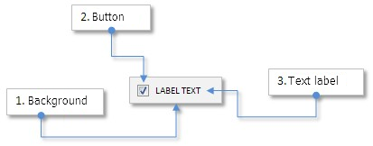
Fig. 1. Compound parts of the checkbox control.
Let us take a closer look at the class of this control.
Developing a Class for Creating the Checkbox Control
In the third part of this series, we spoke about a similar control - an icon button and its class CIconButton (see the article Graphical Interfaces III: Simple and Multi-Functional Buttons (Chapter 1)). The checkbox control is similar to an icon button with the two-state mode. The only difference here is that a button in different states (on/off) has different background color and text color (if they are set), and in case of a checkbox, only the icon and the text color change (if they are set). The checkbox background color will be the same as the background color of the window to which it is attached. The background here will be used as the area for identifying the mouse cursor in relation to the boundaries of this area and also for identifying the left mouse button press on the control. The checkbox control is simpler than an icon button as it has less properties the user can set.
Create the CheckBox.mqh file and include it in the file WndContainer.mqh of the library:
//+------------------------------------------------------------------+
//|                                                 WndContainer.mqh |
//|                        Copyright 2015, MetaQuotes Software Corp. |
//|                                              http://www.mql5.com |
//+------------------------------------------------------------------+
#include "CheckBox.mqh"
Create the CCheckBox class with the methods standard for all the elements of the library in the CheckBox.mqh file:
//+------------------------------------------------------------------+
//|                                                     CheckBox.mqh |
//|                        Copyright 2015, MetaQuotes Software Corp. |
//|                                              http://www.mql5.com |
//+------------------------------------------------------------------+
#include "Element.mqh"
#include "Window.mqh"
//+------------------------------------------------------------------+
//| Class for creating a checkbox                                    |
//+------------------------------------------------------------------+
class CCheckBox : public CElement
  {
private:
   //--- Pointer to the form to which the element is attached
   CWindow          *m_wnd;
   //---
public:
                     CCheckBox(void);
                    ~CCheckBox(void);
   //--- Stores the form pointer
   void              WindowPointer(CWindow &object)                 { m_wnd=::GetPointer(object);            }
   //---
public:
   //--- Chart event handler
   virtual void      OnEvent(const int id,const long &lparam,const double &dparam,const string &sparam);
   //--- Timer
   virtual void      OnEventTimer(void);
   //--- Moving the element
   virtual void      Moving(const int x,const int y);
   //--- (1) Show, (2) hide, (3) reset, (4) delete
   virtual void      Show(void);
   virtual void      Hide(void);
   virtual void      Reset(void);
   virtual void      Delete(void);
   //--- (1) Setting, (2) resetting of priorities of the left mouse button
   virtual void      SetZorders(void);
   virtual void      ResetZorders(void);
   //--- Reset color
   virtual void      ResetColors(void);
  };
Before the control is created, the user will be able to use methods for installing properties listed below:
- Control background
- Icons for the checkbox in the active and blocked states
- Margins for a text label
- Colors of the text label in different states
There will be four icons for the checkbox button - two icons for the active state and two for the blocked state. Icons for all states are available at the end of the article but you can use your own.
class CCheckBox : public CElement
  {
private:
   //--- Color of the checkbox background
   color             m_area_color;
   //--- Checkbox icons in the active and blocked states
   string            m_check_bmp_file_on;
   string            m_check_bmp_file_off;
   string            m_check_bmp_file_on_locked;
   string            m_check_bmp_file_off_locked;
   //--- Text of checkbox
   string            m_label_text;
   //--- Text label margins
   int               m_label_x_gap;
   int               m_label_y_gap;
   //--- Colors of the text label in different states
   color             m_label_color;
   color             m_label_color_off;
   color             m_label_color_hover;
   color             m_label_color_locked;
   color             m_label_color_array[];
   //--- Priorities of the left mouse button press
   int               m_zorder;
   int               m_area_zorder;
   //---
public:
   //--- Setting labels for the button in the active and blocked states
   void              CheckFileOn(const string file_path)            { m_check_bmp_file_on=file_path;         }
   void              CheckFileOff(const string file_path)           { m_check_bmp_file_off=file_path;        }
   void              CheckFileOnLocked(const string file_path)      { m_check_bmp_file_on_locked=file_path;  }
   void              CheckFileOffLocked(const string file_path)     { m_check_bmp_file_off_locked=file_path; }
   //--- (1) Background color, (2) margins for the text label
   void              AreaColor(const color clr)                     { m_area_color=clr;                      }
   void              LabelXGap(const int x_gap)                     { m_label_x_gap=x_gap;                   }
   void              LabelYGap(const int y_gap)                     { m_label_y_gap=y_gap;                   }
   //--- Color of the text in different states
   void              LabelColor(const color clr)                    { m_label_color=clr;                     }
   void              LabelColorOff(const color clr)                 { m_label_color_off=clr;                 }
   void              LabelColorHover(const color clr)               { m_label_color_hover=clr;               }
   void              LabelColorLocked(const color clr)              { m_label_color_locked=clr;              }
   //--- Checkbox description
   string            LabelText(void)                          const { return(m_label.Description());         }
  };
To create the checkbox control, we will need three private methods and one public:
class CCheckBox : public CElement
  {
private:
   //--- Objects for creating a checkbox
   CRectLabel        m_area;
   CBmpLabel         m_check;
   CLabel            m_label;
   //---
public:
   //--- Methods for creating a checkbox
   bool              CreateCheckBox(const long chart_id,const int subwin,const string text,const int x,const int y);
   //---
private:
   bool              CreateArea(void);
   bool              CreateCheck(void);
   bool              CreateLabel(void);
  };
Let us create the CCheckBox::CheckButtonState() and CCheckBox::CheckBoxState() methods for managing the state of the checkbox:
class CCheckBox : public CElement
  {
private:
   //--- State of the checkbox button
   bool              m_check_button_state;
   //--- Checkbox state (available/blocked)
   bool              m_checkbox_state;
   //---
public:
   //--- Return/set the checkbox state
   bool              CheckBoxState(void)                      const { return(m_checkbox_state);              }
   void              CheckBoxState(const bool state);
   //--- Return/set the state of the checkbox button
   bool              CheckButtonState(void)                   const { return(m_check.State());               }
   void              CheckButtonState(const bool state);
  };
To block/unblock the control, use the CCheckBox::CheckBoxState() method:
//+------------------------------------------------------------------+
//| Setting the state of the control                                 |
//+------------------------------------------------------------------+
void CCheckBox::CheckBoxState(const bool state)
  {
//--- Control state
   m_checkbox_state=state;
//--- Icon
   m_check.BmpFileOn((state)? "::"+m_check_bmp_file_on : "::"+m_check_bmp_file_on_locked);
   m_check.BmpFileOff((state)? "::"+m_check_bmp_file_off : "::"+m_check_bmp_file_off_locked);
//--- Color of the text label
   m_label.Color((state)? m_label_color : m_label_color_locked);
  }
To set the state of the checkbox button, use the CCheckBox::CheckButtonState() method:
//+------------------------------------------------------------------+
//| Setting the state of the checkbox button                         |
//+------------------------------------------------------------------+
void CCheckBox::CheckButtonState(const bool state)
  {
//--- Leave, if the control is blocked
   if(!m_checkbox_state)
      return;
//--- Set the button state
   m_check.State(state);
   m_check_button_state=state;
//--- Change colors according to the current state
   m_label.Color((state)? m_label_color : m_label_color_off);
   CElement::InitColorArray((state)? m_label_color : m_label_color_off,m_label_color_hover,m_label_color_array);
  }
We only have to create a method for handling the press on the checkbox control. This method will be called in the main handler of the control CCheckBox::OnEvent() by the event with the CHARTEVENT_OBJECT_CLICK identifier. Let us call it CCheckBox::OnClickLabel(). At the beginning of this method, there is a check if the press was over the area of the control (its background). To avoid confusion over what object of the control exactly the press took place, the background has the priority value of the left mouse button click of 1 and other objects have the value of 0. Therefore, even if the press was when the cursor was over a checkbox button or a text label, it will be treated as a click on the control background, that is the object with the highest priority in this area. Then, we will use the CCheckBox::CheckButtonState() method to set the state opposite the checkbox button. At the end of the method, a custom event with (1) the ON_CLICK_LABEL event identifier, (2) the element identifier and (3) the element description are sent.
class CCheckBox : public CElement
  {
private:
   //--- Handling of the press on the element
   bool              OnClickLabel(const string clicked_object);
  };
//+------------------------------------------------------------------+
//| Event handling                                                   |
//+------------------------------------------------------------------+
void CCheckBox::OnEvent(const int id,const long &lparam,const double &dparam,const string &sparam)
  {
//--- Handling the left mouse button click on the object
   if(id==CHARTEVENT_OBJECT_CLICK)
     {
      //--- Click on the checkbox
      if(OnClickLabel(sparam))
         return;
     }
  }
//+------------------------------------------------------------------+
//| Clicking on the element label                                    |
//+------------------------------------------------------------------+
bool CCheckBox::OnClickLabel(const string clicked_object)
  {
//--- Leave, if the name is different
   if(m_area.Name()!=clicked_object)
      return(false);
//--- Leave, if the control is blocked
   if(!m_checkbox_state)
      return(false);
//--- Switch to the opposite state
   CheckButtonState(!m_check.State());
//--- The mouse cursor is currently over the element
   m_label.Color(m_label_color_hover);
//--- Send a message about it
   ::EventChartCustom(m_chart_id,ON_CLICK_LABEL,CElement::Id(),0,m_label.Description());
   return(true);
  }
Testing the Checkbox Control
All the method of the CCheckBox class are ready so we can test how this control works. The file with the class of this control must be already included in the library. The EA for tests can be copied from the previous article. Delete all controls from it except the main menu and the status bar. Create two checkboxes for the test. Ensure that the second checkbox is blocked by default at the moment of loading the program on to the chart. The first checkbox will be available for the interaction with the user but in the disabled state. Enabling the first checkbox will be a signal for unblocking the second checkbox. The same will work for the opposite situation - disabling of the first checkbox will be a signal for blocking the second checkbox.
In the CProgram custom class create two instances of the CCheckBox class and declare two methods for creating checkboxes and specify margins from the edge of the form to which they are going to be attached:
//+------------------------------------------------------------------+
//| Class for creating the application                               |
//+------------------------------------------------------------------+
class CProgram : public CWndEvents
  {
private:
   //--- Checkboxes
   CCheckBox         m_checkbox1;
   CCheckBox         m_checkbox2;
   //---
private:
   //--- Checkboxes
#define CHECKBOX1_GAP_X       (7)
#define CHECKBOX1_GAP_Y       (50)
   bool              CreateCheckBox1(const string text);
#define CHECKBOX2_GAP_X       (30)
#define CHECKBOX2_GAP_Y       (75)
   bool              CreateCheckBox2(const string text);
  };
The only difference in the method implementation will be that the availability of the second checkbox will depend on the state of the first checkbox:
//+------------------------------------------------------------------+
//| Creates checkbox 2                                               |
//+------------------------------------------------------------------+
bool CProgram::CreateCheckBox2(string text)
  {
//--- Pass the panel object
   m_checkbox2.WindowPointer(m_window1);
//--- Coordinates
   int x=m_window1.X()+CHECKBOX2_GAP_X;
   int y=m_window1.Y()+CHECKBOX2_GAP_Y;
//--- Set properties before creation
   m_checkbox2.XSize(90);
   m_checkbox2.YSize(18);
   m_checkbox2.AreaColor(clrWhiteSmoke);
   m_checkbox2.LabelColor(clrBlack);
   m_checkbox2.LabelColorOff(clrBlack);
   m_checkbox2.LabelColorLocked(clrSilver);
//--- Create control
   if(!m_checkbox2.CreateCheckBox(m_chart_id,m_subwin,text,x,y))
      return(false);
//--- The availability will depend on the current state of the first checkbox
   m_checkbox2.CheckBoxState(m_checkbox1.CheckButtonState());
//--- Add the object to the common array of the object groups
   CWndContainer::AddToElementsArray(0,m_checkbox2);
   return(true);
  }
Put the method calls for creating checkboxes in the main method for creating the graphical interface. A shortened version of this code is presented below:
//+------------------------------------------------------------------+
//| Creates the training panel                                       |
//+------------------------------------------------------------------+
bool CProgram::CreateTradePanel(void)
  {
//--- Creating form 1 for controls
//--- Creating controls:
//    Main menu
//--- Context menus
//--- Creating the status bar

//--- Checkboxes
   if(!CreateCheckBox1("Checkbox 1"))
      return(false);
   if(!CreateCheckBox2("Checkbox 2"))
      return(false);
//--- Redrawing the chart
   m_chart.Redraw();
   return(true);
  }
We will receive and handle a message with the ON_CLICK_LABEL identifier in the event handler of the CProgram class. The availability of the second checkbox will be defined by the state of the first checkbox as shown in the code below:
//+------------------------------------------------------------------+
//| Event handler                                                    |
//+------------------------------------------------------------------+
void CProgram::OnEvent(const int id,const long &lparam,const double &dparam,const string &sparam)
  {
//--- The checkbox press event
   if(id==CHARTEVENT_CUSTOM+ON_CLICK_LABEL)
     {
      ::Print(__FUNCTION__," > id: ",id,"; lparam: ",lparam,"; dparam: ",dparam,"; sparam: ",sparam);
      //--- If the press was on the first checkbox
      if(lparam==m_checkbox1.Id())
        {
         //--- Set the state of the second checkbox
         m_checkbox2.CheckBoxState(m_checkbox1.CheckButtonState());
        }
     }
  }
Now, compile the files and load the EA on the chart. The result should be as in the screenshot below:
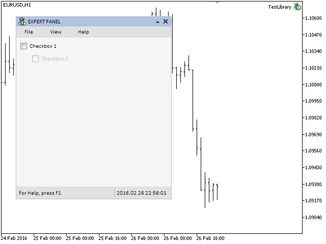
Fig. 2. Testing the checkbox control.
The screenshot shows that the second checkbox is blocked. The indication here is the color of the text and the button icon corresponding to this state (faded colors). Everything works well and we are moving on to developing a class for creating the edit control.
The Edit Control
The edit control is used for setting a numeric value in the text field. The value can be entered manually or with the help of buttons for scrolling. The maximum and minimum values (limits) as well as the step for scrolling can be defined by the user. If the button with the up/down arrow is pressed once, then the value will be increased/decreased by the step specified in settings. If the up-down arrow is pressed and held down, the value in the edit will be changing fast. The scrolling will stop having reached the allowed maximum or minimum.
This control will be composed of five graphical objects. They are:
- Background
- Text label
- Edit
- Two buttons for scrolling values in the edit control

Fig. 3. Compound parts of the edit control.
In the next part of the article, we will write a class for creating this interface element.
Developing a Class for Creating the Edit Control
Similar to the checkbox control, the edit control is simple, not compound. In other words, it is made up of simple objects and does not contain any other controls. This is why no additions are required in the WndContainer.mqh file. We just need to include the file with the class of the edit control.
Now, create the SpinEdit.mqh file and include it in the WndContainer.mqh file:
//+------------------------------------------------------------------+
//|                                                 WndContainer.mqh |
//|                        Copyright 2015, MetaQuotes Software Corp. |
//|                                              http://www.mql5.com |
//+------------------------------------------------------------------+
#include "SpinEdit.mqh"
In the SpinEdit.mqh file, create the CSpinEdit class with the methods standard for all the elements of the library like in the description of the CCheckBox class earlier in this article. That is why we will go straight to the description of the edit control properties.
Below is the list of all properties of the edit control which will be available to the user for setting.
- Background color
- Text of the description of the edit
- Margins of the text label
- Colors of the text in different state
- Size of the edit
- Margin of the edit from the right side of the element
- Colors of the edit in different states
- Colors of the edit text in different states
- Colors of the edit frame in different states
- Labels of the switches in the active and blocked state
- Button margins (from the right side)
- Mode of resetting the value to the minimum
- Minimum and maximum value
- Step for changing the value in the edit using the buttons
- Mode of text alignment
- Number of decimal places
The code below presents the fields and methods of the class for setting the control properties listed above:
//+------------------------------------------------------------------+
//| Class for creating the edit                                      |
//+------------------------------------------------------------------+
class CSpinEdit : public CElement
  {
private:
   //--- Color of the control background
   color             m_area_color;
   //--- Text of the description of the edit
   string            m_label_text;
   //--- Text label margins
   int               m_label_x_gap;
   int               m_label_y_gap;
   //--- Color of the text in different states
   color             m_label_color;
   color             m_label_color_hover;
   color             m_label_color_locked;
   color             m_label_color_array[];
   //--- Size of the edit
   int               m_edit_x_size;
   int               m_edit_y_size;
   //--- Margin of edit from the right side
   int               m_edit_x_gap;
   //--- Colors of the edit and text of the edit in different states
   color             m_edit_color;
   color             m_edit_color_locked;
   color             m_edit_text_color;
   color             m_edit_text_color_locked;
   color             m_edit_text_color_highlight;
   //--- Colors of the edit frame in different states
   color             m_edit_border_color;
   color             m_edit_border_color_hover;
   color             m_edit_border_color_locked;
   color             m_edit_border_color_array[];
   //--- Labels of switches in the active and blocked states
   string            m_inc_bmp_file_on;
   string            m_inc_bmp_file_off;
   string            m_inc_bmp_file_locked;
   string            m_dec_bmp_file_on;
   string            m_dec_bmp_file_off;
   string            m_dec_bmp_file_locked;
   //--- Button margins (from the right side)
   int               m_inc_x_gap;
   int               m_inc_y_gap;
   int               m_dec_x_gap;
   int               m_dec_y_gap;
   //--- The mode of resetting the value to the minimum
   bool              m_reset_mode;
   //--- Minimum/maximum value
   double            m_min_value;
   double            m_max_value;
   //--- Step for changing the value in edit
   double            m_step_value;
   //--- Mode of text alignment
   ENUM_ALIGN_MODE   m_align_mode;
   //--- Number of decimal places
   int               m_digits;
   //---
public:
   //--- (1) Background color, (2) text of edit description, (3) margins of the text label
   void              AreaColor(const color clr)                     { m_area_color=clr;                   }
   string            LabelText(void)                          const { return(m_label.Description());      }
   void              LabelXGap(const int x_gap)                     { m_label_x_gap=x_gap;                }
   void              LabelYGap(const int y_gap)                     { m_label_y_gap=y_gap;                }
   //--- Colors of the text label in different states
   void              LabelColor(const color clr)                    { m_label_color=clr;                  }
   void              LabelColorHover(const color clr)               { m_label_color_hover=clr;            }
   void              LabelColorLocked(const color clr)              { m_label_color_locked=clr;           }
   //--- (1) Edit size, (2) margin for edit from the right side
   void              EditXSize(const int x_size)                    { m_edit_x_size=x_size;               }
   void              EditYSize(const int y_size)                    { m_edit_y_size=y_size;               }
   void              EditXGap(const int x_gap)                      { m_edit_x_gap=x_gap;                 }
   //--- Colors of edit in different states
   void              EditColor(const color clr)                     { m_edit_color=clr;                   }
   void              EditColorLocked(const color clr)               { m_edit_color_locked=clr;            }
   //--- Colors of the edit text in different states
   void              EditTextColor(const color clr)                 { m_edit_text_color=clr;              }
   void              EditTextColorLocked(const color clr)           { m_edit_text_color_locked=clr;       }
   void              EditTextColorHighlight(const color clr)        { m_edit_text_color_highlight=clr;    }
   //--- Colors of the edit frame in different states
   void              EditBorderColor(const color clr)               { m_edit_border_color=clr;            }
   void              EditBorderColorHover(const color clr)          { m_edit_border_color_hover=clr;      }
   void              EditBorderColorLocked(const color clr)         { m_edit_border_color_locked=clr;     }
   //--- Setting labels for the button in the active and blocked states
   void              IncFileOn(const string file_path)              { m_inc_bmp_file_on=file_path;        }
   void              IncFileOff(const string file_path)             { m_inc_bmp_file_off=file_path;       }
   void              IncFileLocked(const string file_path)          { m_inc_bmp_file_locked=file_path;    }
   void              DecFileOn(const string file_path)              { m_dec_bmp_file_on=file_path;        }
   void              DecFileOff(const string file_path)             { m_dec_bmp_file_off=file_path;       }
   void              DecFileLocked(const string file_path)          { m_dec_bmp_file_locked=file_path;    }
   //--- Margins for edit buttons
   void              IncXGap(const int x_gap)                       { m_inc_x_gap=x_gap;                  }
   void              IncYGap(const int y_gap)                       { m_inc_y_gap=y_gap;                  }
   void              DecXGap(const int x_gap)                       { m_dec_x_gap=x_gap;                  }
   void              DecYGap(const int y_gap)                       { m_dec_y_gap=y_gap;                  }
   //--- Reset mode when press on the text label takes place
   bool              ResetMode(void)                                { return(m_reset_mode);               }
   void              ResetMode(const bool mode)                     { m_reset_mode=mode;                  }
   //--- Minimum value
   double            MinValue(void)                           const { return(m_min_value);                }
   void              MinValue(const double value)                   { m_min_value=value;                  }
   //--- Maximum value
   double            MaxValue(void)                           const { return(m_max_value);                }
   void              MaxValue(const double value)                   { m_max_value=value;                  }
   //--- The step of the value
   double            StepValue(void)                          const { return(m_step_value);               }
   void              StepValue(const double value)                  { m_step_value=(value<=0)? 1 : value; }
   //--- (1) Number of decimal places, (2) mode of text alignment
   void              SetDigits(const int digits)                    { m_digits=::fabs(digits);            }
   void              AlignMode(ENUM_ALIGN_MODE mode)                { m_align_mode=mode;                  }
  };
To create the edit control, we will need five private methods for creating graphical primitive objects and one public method, which will be called in the custom class when the graphical interface is created. Icons for scrolling buttons can be downloaded at the end of the article. They are used by default but you can use your own.
class CSpinEdit : public CElement
  {
private:
   //--- Objects for creating the edit
   CRectLabel        m_area;
   CLabel            m_label;
   CEdit             m_edit;
   CBmpLabel         m_spin_inc;
   CBmpLabel         m_spin_dec;
   //---
public:
   //--- Methods for creating the edit
   bool              CreateSpinEdit(const long chart_id,const int subwin,const string label_text,const int x,const int y);
   //---
private:
   bool              CreateArea(void);
   bool              CreateLabel(void);
   bool              CreateEdit(void);
   bool              CreateSpinInc(void);
   bool              CreateSpinDec(void);
  };
Now, we are going to discuss modes and methods for managing the states and properties of the control after its creation. Let us start with the CSpinEdit::SetValue() method for adjusting and storing the value for the edit control and also the CSpinEdit::HighlightLimit() auxiliary method for highlighting (flashing) of the text in edit when the minimum and maximum limits are exceeded.
At the beginning of the CSpinEdit::SetValue() method, there is an adjustment considering the step for changing the value. Then, follow checks for exceeding set limits (maximum/minimum). If the limits are exceeded, then a value corresponding to the check is set and the CSpinEdit::HighlightLimit() method is called for highlighting the text. If after all the checks and adjustments the value changed in relation to what was stored before, the new value overwrites the old one.
The CSpinEdit::HighlightLimit() method is rather simple. There, the color of flashing is set first. It is red by default and can be redefined by the user. After that, there is a pause of 100 milliseconds. This is sufficient for a temporary change of color to be noticed. The initial text color is set at the end.
Below is the code of the described methods:
class CSpinEdit : public CElement
  {
private:
   //--- Current value of the edit
   double            m_edit_value;
   //---
public:
   //--- Returning and setting the edit value
   double            GetValue(void)                           const { return(m_edit_value);               }
   bool              SetValue(const double value);
   //--- Flashing when the limit is reached
   void              HighlightLimit(void);
  };
//+------------------------------------------------------------------+
//| Check of the current value                                       |
//+------------------------------------------------------------------+
bool CSpinEdit::SetValue(double value)
  {
//--- For adjustment
   double corrected_value =0.0;
//--- Adjust considering the step
   corrected_value=::MathRound(value/m_step_value)*m_step_value;
//--- Check for the minimum/maximum
   if(corrected_value<m_min_value)
     {
      //--- Set the minimum value
      corrected_value=m_min_value;
      //--- Set the state to On
      m_spin_dec.State(true);
      //--- Flash to indicate that the limit has been reached
      HighlightLimit();
     }
   if(corrected_value>m_max_value)
     {
      //--- Set the maximum value
      corrected_value=m_max_value;
      //--- Set the state to On
      m_spin_inc.State(true);
      //--- Flash to indicate that the limit has been reached
      HighlightLimit();
     }
//--- If the value has been changed
   if(m_edit_value!=corrected_value)
     {
      m_edit_value=corrected_value;
      m_edit.Color(m_edit_text_color);
      return(true);
     }
//--- Value unchanged
   return(false);
  }
//+------------------------------------------------------------------+
//| Highlighting the limit                                           |
//+------------------------------------------------------------------+
void CSpinEdit::HighlightLimit(void)
  {
//--- Change the text color temporarily
   m_edit.Color(m_edit_text_color_highlight);
//--- Update
   ::ChartRedraw();
//--- Delay before returning to the initial color
   ::Sleep(100);
//--- Change the text color for the initial one
   m_edit.Color(m_edit_text_color);
  }
The CSpinEdit::SetValue() method is designated only for adjusting the value in case the set limit is exceeded. The CSpinEdit:: ChangeValue() method is used for changing the value in the edit:
class CSpinEdit : public CElement
  {
private:
   //--- Changing the value in the edit
   void              ChangeValue(const double value);
  };
//+------------------------------------------------------------------+
//| Changing the value in the edit                                   |
//+------------------------------------------------------------------+
void CSpinEdit::ChangeValue(const double value)
  {
//--- Check, adjust and store the new value
   SetValue(value);
//--- Set the new value in the edit
   m_edit.Description(::DoubleToString(GetValue(),m_digits));
  }
Similar to other elements, we will need a method for managing the availability of the edit control as shown in the code below:
class CSpinEdit : public CElement
  {
private:
   //--- Checkbox state (available/blocked)
   bool              m_spin_edit_state;
   //---
public:
   //--- Returning/ setting the state of availability of the edit
   bool              SpinEditState(void)                      const { return(m_spin_edit_state);          }
   void              SpinEditState(const bool state);
  };
//+------------------------------------------------------------------+
//| Setting the state of the control                                 |
//+------------------------------------------------------------------+
void CSpinEdit::SpinEditState(const bool state)
  {
   m_spin_edit_state=state;
//--- Color of the text label
   m_label.Color((state)? m_label_color : m_label_color_locked);
//--- Color of the edit
   m_edit.Color((state)? m_edit_text_color : m_edit_text_color_locked);
   m_edit.BackColor((state)? m_edit_color : m_edit_color_locked);
   m_edit.BorderColor((state)? m_edit_border_color : m_edit_border_color_locked);
//--- Icons of switches
   m_spin_inc.BmpFileOn((state)? "::"+m_inc_bmp_file_on : "::"+m_inc_bmp_file_locked);
   m_spin_dec.BmpFileOn((state)? "::"+m_dec_bmp_file_on : "::"+m_dec_bmp_file_locked);
//--- Setting in relation of the current state
   if(!m_spin_edit_state)
     {
      //--- Priorities
      m_edit.Z_Order(-1);
      m_spin_inc.Z_Order(-1);
      m_spin_dec.Z_Order(-1);
      //--- Edit in the read only mode
      m_edit.ReadOnly(true);
     }
   else
     {
      //--- Priorities
      m_edit.Z_Order(m_edit_zorder);
      m_spin_inc.Z_Order(m_spin_zorder);
      m_spin_dec.Z_Order(m_spin_zorder);
      //--- The edit control in the edit mode
      m_edit.ReadOnly(false);
     }
  }
Now, we are going to consider methods for handling the edit control events. Pressing on the text label will generate a custom event with (1) the ON_CLICK_LABEL event identifier, (2) the control identifier, (3) the control index and (4) the description of the text label. The mode of resetting the value in edit to the minimum has been mentioned earlier. This mode is disabled by default (false). It can be enabled with the CSpinEdit::ResetMode() method. For that, you just need to set true in its only argument. If the mode for resetting the value is enabled, then pressing on the text label will call the method for setting a minimum value in the edit.
The code of the CSpinEdit::OnClickLabel() method for handling the press on the text label will be as shown below:
class CSpinEdit : public CElement
  {
private:
   //--- Handling the press on the text label
   bool              OnClickLabel(const string clicked_object);
  };
//+------------------------------------------------------------------+
//| Clicking on the element label                                    |
//+------------------------------------------------------------------+
bool CSpinEdit::OnClickLabel(const string clicked_object)
  {
//--- Leave, if the name is different
   if(m_area.Name()!=clicked_object)
      return(false);
//--- If the mode of resetting the value is enabled
   if(m_reset_mode)
     {
      //--- Set the minimum value
      ChangeValue(MinValue());
     }
//--- Send a message about it
   ::EventChartCustom(m_chart_id,ON_CLICK_LABEL,CElement::Id(),CElement::Index(),m_label.Description());
   return(true);
  }
The user can change the value in the edit control by entering the new value either manually or using the buttons of increment and decrement. We will need new identifiers of custom events. Add them in the Defines.mqh file:
//+------------------------------------------------------------------+
//|                                                      Defines.mqh |
//|                        Copyright 2015, MetaQuotes Software Corp. |
//|                                              http://www.mql5.com |
//+------------------------------------------------------------------+
#define ON_END_EDIT               (18) // Final editing of the value in the edit
#define ON_CLICK_INC              (19) // Change the counter up
#define ON_CLICK_DEC              (20) // Change the counter down
To handle the manual entry of the new value, let us write the CSpinEdit::OnEndEdit() method. It will be called in the CSpinEdit::OnEvent() common handler by receiving an event with the CHARTEVENT_OBJECT_ENDEDIT identifier. The new value can be adjusted if the necessity arises. At the end of the method, a custom event will be generated with (1) the ON_END_EDIT event identifier, (2) the element identifier, (3) the element index and (4) the description from the text label as shown in the code below.
class CSpinEdit : public CElement
  {
private:
   //--- Handling the value entering in the edit
   bool              OnEndEdit(const string edited_object);
  };
//+------------------------------------------------------------------+
//| Handling the value entering in the edit                          |
//+------------------------------------------------------------------+
bool CSpinEdit::OnEndEdit(const string edited_object)
  {
//--- Leave, if the name is different
   if(m_edit.Name()!=edited_object)
      return(false);
//--- Get the entered value
   double entered_value=::StringToDouble(m_edit.Description());
//--- Check, adjust and store the new value
   ChangeValue(entered_value);
//--- Send a message about it
   ::EventChartCustom(m_chart_id,ON_END_EDIT,CElement::Id(),CElement::Index(),m_label.Description());
   return(true);
  }
To handle the press on the increment and decrement buttons, we need to create two separate methods CSpinEdit::OnClickSpinInc() and CSpinEdit::OnClickSpinDec(). They are rather simple. After a graphical object has been pressed on, there is a check by its name of if it is a button of our control. Then, we get the current value in the edit and increase/decrease its step set in the properties of the control. At the end of the methods, a custom event is generated with (1) the ON_CLICK_INC/ON_CLICK_DEC event identifier, (2) the element identifier, (3) the element index and (4) the description from the text label as shown in the code below.
class CSpinEdit : public CElement
  {
private:
   //--- Handling the edit button press
   bool              OnClickSpinInc(const string clicked_object);
   bool              OnClickSpinDec(const string clicked_object);
  };
//+------------------------------------------------------------------+
//| Pressing on the increment switch                                 |
//+------------------------------------------------------------------+
bool CSpinEdit::OnClickSpinInc(const string clicked_object)
  {
//--- Leave, if the name is different
   if(m_spin_inc.Name()!=clicked_object)
      return(false);
//--- Get the current value
   double value=GetValue();
//--- Increase by one step and check for exceeding the limit
   ChangeValue(value+m_step_value);
//--- Set the state to On
   m_spin_inc.State(true);
//--- Send a message about it
   ::EventChartCustom(m_chart_id,ON_CLICK_INC,CElement::Id(),CElement::Index(),m_label.Description());
   return(true);
  }
//+------------------------------------------------------------------+
//| Pressing on the decrement switch                                 |
//+------------------------------------------------------------------+
bool CSpinEdit::OnClickSpinDec(const string clicked_object)
  {
//--- Leave, if the name is different
   if(m_spin_dec.Name()!=clicked_object)
      return(false);
//--- Get the current value
   double value=GetValue();
//--- Decrease by one step and check for exceeding the limit
   ChangeValue(value-m_step_value);
//--- Set the state to On
   m_spin_dec.State(true);
//--- Send a message about it
   ::EventChartCustom(m_chart_id,ON_CLICK_DEC,CElement::Id(),CElement::Index(),m_label.Description());
   return(true);
  }
All these handling methods must be called in the main method for event handling as shown in the code below. Access to the body of handling methods is controlled by the current availability of the control.
//+------------------------------------------------------------------+
//| Event handling                                                   |
//+------------------------------------------------------------------+
void CSpinEdit::OnEvent(const int id,const long &lparam,const double &dparam,const string &sparam)
  {
//--- Handling the left mouse button click on the object
   if(id==CHARTEVENT_OBJECT_CLICK)
     {
      //--- Leave, if the control is blocked
      if(!m_spin_edit_state)
         return;
      //--- Handling the press on the text label
      if(OnClickLabel(sparam))
         return;
      //--- Handling the edit button press
      if(OnClickSpinInc(sparam))
         return;
      if(OnClickSpinDec(sparam))
         return;
      //---
      return;
     }
//--- Handling the value change in edit event
   if(id==CHARTEVENT_OBJECT_ENDEDIT)
     {
      //--- Leave, if the control is blocked
      if(!m_spin_edit_state)
         return;
      //--- Handling the value entry
      if(OnEndEdit(sparam))
         return;
     }
  }
For fast scrolling of values when the left mouse button is pressed down over switch buttons of the control, create the CSpinEdit::FastSwitching() method that will be called in the timer of the control. We discussed this method when spoke about the CListView class for creating list views with a scrollbar. Whereas this method was required there for scrolling a list, here it will have a function of increasing or decreasing values in edit. More detailed code of the CSpinEdit::FastSwitching() method is presented below.
class CSpinEdit : public CElement
  {
private:
   //--- Fast scrolling of values in the edit
   void              FastSwitching(void);
  };
//+------------------------------------------------------------------+
//| Timer                                                            |
//+------------------------------------------------------------------+
void CSpinEdit::OnEventTimer(void)
  {
//--- If the element is a drop-down
   if(CElement::IsDropdown())
     {
      ChangeObjectsColor();
      FastSwitching();
     }
   else
     {
      //--- Track the change of color and the fast scrolling of values
      //    if the form is not blocked
      if(!m_wnd.IsLocked())
        {
         ChangeObjectsColor();
         FastSwitching();
        }
     }
  }
//+------------------------------------------------------------------+
//| Fast scrolling of values in the edit                             |
//+------------------------------------------------------------------+
void CSpinEdit::FastSwitching(void)
  {
//--- Leave, if the focus is not on the control
   if(!CElement::MouseFocus())
      return;
//--- Return the counter to the initial value if the mouse button is released
   if(!m_mouse_state)
      m_timer_counter=SPIN_DELAY_MSC;
//--- If the mouse button is pressed down
   else
     {
      //--- Increase the counter by the set step
      m_timer_counter+=TIMER_STEP_MSC;
      //--- Leave, if less than zero
      if(m_timer_counter<0)
         return;
      //--- Get the current value in the edit
      double current_value=::StringToDouble(m_edit.Description());
      //--- If increase
      if(m_spin_inc.State())
         SetValue(current_value+m_step_value);
      //--- If decrease
      else if(m_spin_dec.State())
         SetValue(current_value-m_step_value);
      //--- Change the value if the switching button is still pressed down
      if(m_spin_inc.State() || m_spin_dec.State())
         m_edit.Description(::DoubleToString(GetValue(),m_digits));
     }
  }
Testing the Edit Control
All the methods of the edit control have been implemented. Let us test it in the program that we have prepared earlier. In the CProgram custom class of the application, create one instance of the CSpinEdit class and declare a method for creating the edit control.
//+------------------------------------------------------------------+
//| Class for creating the application                               |
//+------------------------------------------------------------------+
class CProgram : public CWndEvents
  {
private:
   //--- Edits
   CSpinEdit         m_spin_edit1;
   //---
private:
   //--- Edits
#define SPINEDIT1_GAP_X       (150)
#define SPINEDIT1_GAP_Y       (75)
   bool              CreateSpinEdit1(const string text);
  };
Let us make the first checkbox to manage the availability of this control in the same way as it was done in relation to the second checkbox. Therefore, after this control has been created, its availability will depend on the state of the first checkbox as shown in the code below.
//+------------------------------------------------------------------+
//| Creates edit 1                                                   |
//+------------------------------------------------------------------+
bool CProgram::CreateSpinEdit1(string text)
  {
//--- Store the window pointer
   m_spin_edit1.WindowPointer(m_window1);
//--- Coordinates
   int x=m_window1.X()+SPINEDIT1_GAP_X;
   int y=m_window1.Y()+SPINEDIT1_GAP_Y;
//--- Value
   double v=(m_spin_edit1.GetValue()==WRONG_VALUE) ? 4 : m_spin_edit1.GetValue();
//--- Set properties before creation
   m_spin_edit1.XSize(150);
   m_spin_edit1.YSize(18);
   m_spin_edit1.EditXSize(76);
   m_spin_edit1.MaxValue(1000);
   m_spin_edit1.MinValue(-1000);
   m_spin_edit1.StepValue(1);
   m_spin_edit1.SetDigits(0);
   m_spin_edit1.SetValue(v);
   m_spin_edit1.ResetMode(true);
   m_spin_edit1.AreaColor(clrWhiteSmoke);
   m_spin_edit1.LabelColor(clrBlack);
   m_spin_edit1.LabelColorLocked(clrSilver);
   m_spin_edit1.EditColorLocked(clrWhiteSmoke);
   m_spin_edit1.EditTextColor(clrBlack);
   m_spin_edit1.EditTextColorLocked(clrSilver);
   m_spin_edit1.EditBorderColor(clrSilver);
   m_spin_edit1.EditBorderColorLocked(clrSilver);
//--- Create control
   if(!m_spin_edit1.CreateSpinEdit(m_chart_id,m_subwin,text,x,y))
      return(false);
//--- The availability will depend on the current state of the first checkbox
   m_spin_edit1.SpinEditState(m_checkbox1.CheckButtonState());
//--- Add the object to the common array of the object groups
   CWndContainer::AddToElementsArray(0,m_spin_edit1);
   return(true);
  }
Similar to other controls, the CProgram::CreateSpinEdit1() method must be called in the main method for creating the graphical interface of the program. Below is a shortened version of the method:
//+------------------------------------------------------------------+
//| Creates the training panel                                       |
//+------------------------------------------------------------------+
bool CProgram::CreateTradePanel(void)
  {
//--- Creating form 1 for controls
//--- Creating controls:
//    Main menu
//--- Context menus
//--- Creating the status bar
//--- Checkboxes
//--- Edits
   if(!CreateSpinEdit1("Spin Edit 1:"))
      return(false);
//--- Redrawing the chart
   m_chart.Redraw();
   return(true);
  }
In the CProgram::OnEvent() event handler, add code for the test of listening events from the edit controls and also specify that the first edit depends on the state of the first checkbox:
//+------------------------------------------------------------------+
//| Event handler                                                    |
//+------------------------------------------------------------------+
void CProgram::OnEvent(const int id,const long &lparam,const double &dparam,const string &sparam)
  {
//--- The text label press event
   if(id==CHARTEVENT_CUSTOM+ON_CLICK_LABEL)
     {
      ::Print(__FUNCTION__," > id: ",id,"; lparam: ",lparam,"; dparam: ",dparam,"; sparam: ",sparam);
      //--- If the press was on the first checkbox
      if(lparam==m_checkbox1.Id())
        {
         //--- Set the state for the second checkbox and the first edit
         m_checkbox2.CheckBoxState(m_checkbox1.CheckButtonState());
         m_spin_edit1.SpinEditState(m_checkbox1.CheckButtonState());
        }
     }
//--- The end of value entry in edit event
   if(id==CHARTEVENT_CUSTOM+ON_END_EDIT)
     {
      ::Print(__FUNCTION__," > id: ",id,"; lparam: ",lparam,"; dparam: ",dparam,"; sparam: ",sparam);
     }
//--- Switching buttons of the edit press event
   if(id==CHARTEVENT_CUSTOM+ON_CLICK_INC || id==CHARTEVENT_CUSTOM+ON_CLICK_DEC)
     {
      ::Print(__FUNCTION__," > id: ",id,"; lparam: ",lparam,"; dparam: ",dparam,"; sparam: ",sparam);
     }
  }
Compile the program and load it on to the chart. You can see what the graphical interface of the application currently looks like in the screenshot below:
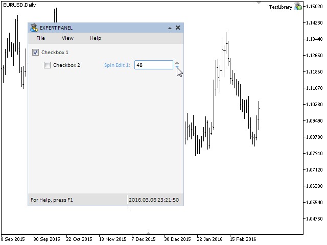
Fig. 4. Testing the edit control.
Other Controls with Checkboxes
It was mentioned at the beginning of the article that besides the checkbox and edit controls we would consider edit with checkbox and check combobox. Edit with checkbox is an extended version of the CSpinEdit class enriched with fields and methods of the CCheckBox class which have been considered in this article.
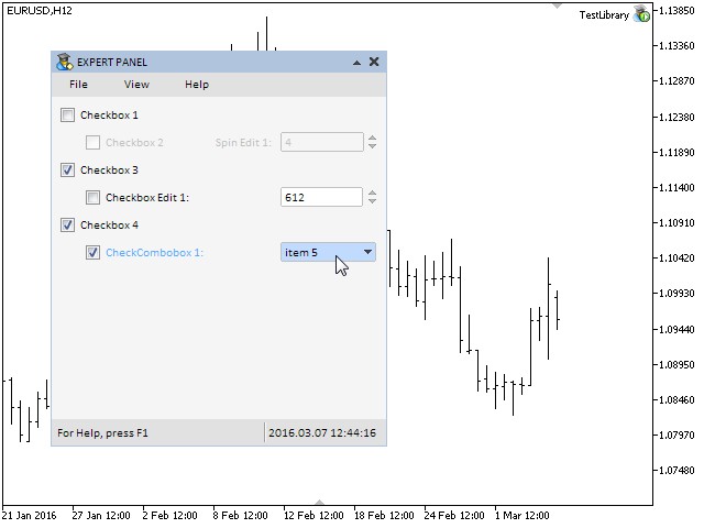
Fig. 5. Compound parts of the edit with checkbox control.
Check combobox is a similar combination of the CComboBox and CCheckBox classes:
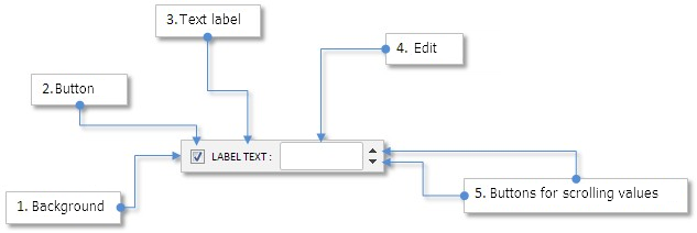
Fig. 6. Compound parts of the check combobox control.
You can find the implementation of the CCheckBoxEdit (edit with checkbox) and CCheckComboBox (check combobox) in the files attached to this article for independent study. As the control of the CCheckComboBox type contains a drop-down list view, relevant additions need to be introduced in the WndContainer.mqh file similar to other elements that have drop-down parts. In this case, the drop-down list view pointer must get into the m_drop_lists[] private array of pointers. A detailed description of the way to do it can be found in the article Graphical Interfaces V: The Combobox Control (Chapter 3).
For the sake of example, we will add the test application with these controls so you can see how it works. Let us add two checkboxes of the CCheckBox type and one of CCheckBoxEdit and CCheckComboBox. The availability of the control of the CCheckBoxEdit type will depend on the state of the third checkbox and the availability of the control of the CCheckComboBox control will be defined by the state of the fourth combobox.
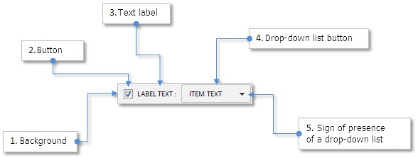
Fig. 7. Testing controls of mixed types.
Conclusion
In this article, we have developed controls widely used in many graphical interfaces in different environments: checkbox, edit, edit with checkbox and check combobox. In the second chapter, we will develop the slider and dual slider controls.
- Graphical Interfaces VI: the Checkbox Control, the Edit Control and their Mixed Types (Chapter 1)
- Graphical Interfaces VI: the Slider and Dual Slider Controls (Chapter 2)
Translated from Russian by MetaQuotes Ltd.
Original article: https://www.mql5.com/ru/articles/2466
Warning: All rights to these materials are reserved by MetaQuotes Ltd. Copying or reprinting of these materials in whole or in part is prohibited.
This article was written by a user of the site and reflects their personal views. MetaQuotes Ltd is not responsible for the accuracy of the information presented, nor for any consequences resulting from the use of the solutions, strategies or recommendations described.
 Self-optimization of EA: Evolutionary and genetic algorithms
 Universal Expert Advisor: Pending Orders and Hedging Support (Part 5)
 Graphical Interfaces VI: the Slider and the Dual Slider Controls (Chapter 2)
 How to create an indicator of non-standard charts for MetaTrader Market
- Free trading apps
- Over 8,000 signals for copying
- Economic news for exploring financial markets
You agree to website policy and terms of use
Even if they did, it's no big deal. You can always fix it.
That's natural, but it takes extra time. That's why I thought of it.
However, I'm glad that everything is moving and everything is good.
Question: Tol, tell me, are you planning to add in the next update the possibility to change the background colour of CCanvasTable cells?
...
Question: Tol, tell me, is it planned to add in the next update the ability to change the background colour of CCanvasTable cells ?
Only what was announced is planned for the next update. Everything else that was discussed will be added in the next updates.
Only what was announced is planned for the next one. Everything else that was discussed is in subsequent updates.
I have this problem - I never follow the keyboard layout :) (Autoswitch is available) Often in SpinEdit I type "," instead of ".".
Added a little bit. I guess it can't hurt...