
Graphical Interfaces VI: the Slider and the Dual Slider Controls (Chapter 2)
 13 410
 18
18

Contents
Introduction
The first article Graphical Interfaces I: Preparation of the Library Structure (Chapter 1) explains in detail what this library is for. You will find a list of articles with links at the end of each chapter. There, you can also download a complete version of the library at the current stage of development. The files must be placed in the same directories as they are located in the archive.
In the previous article we enriched our library with four controls frequently used in graphical interfaces: checkbox, edit, edit with checkbox and check combobox. The second chapter of the sixth part will be dedicated to the slider and the dual slider controls.
The Slider Control
Slider is a type of the edit control which contains a range limited by the minimum and maximum values. Unlike the edit control that we considered in detail in the previous article, a slider does not have buttons for changing the value in the entry field. For that purpose, there is a line along which the slider can be moved. Such an interface element is suitable for the cases when only an approximate value within a certain range is required and the precise value is not necessary. However, there is still a possibility to enter a precise value.
This element will be composed of six graphical objects. They are:
- Background
- Caption (text label)
- Entry field
- Slider line
- Slider runner
- Slider indicator
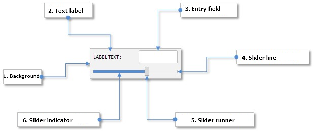
Fig. 1. Compound parts of the slider control.
Let us study the class of this control in detail.
Developing a Class for Creating the Slider Control
Create the Slider.mqh file and include it in the WndContainer.mqh file:
//+------------------------------------------------------------------+
//|                                                 WndContainer.mqh |
//|                        Copyright 2015, MetaQuotes Software Corp. |
//|                                              http://www.mql5.com |
//+------------------------------------------------------------------+
#include "Slider.mqh"
In the Slider.mqh file create the CSlider class with the standard set of methods that must be present in every control of the library under development. Alongside included files Element.mqh and Window.mqh, include the SeparateLine.mqh file with the CSeparateLine class for creating a separation line. The CSeparateLine class was already discussed in the article Graphical Interfaces II: the Separation Line and Context Menu Elements (Chapter 2) and therefore we are not going to consider it again. The only thing I would like to remind you of is that if the set height is greater than two pixels, there is an empty space between two drawn lines. Visually it looks like a hollow which is suitable for creating a slider line (slit or slot) where the slider runner will be moving.
//+------------------------------------------------------------------+
//|                                                       Slider.mqh |
//|                        Copyright 2015, MetaQuotes Software Corp. |
//|                                              http://www.mql5.com |
//+------------------------------------------------------------------+
#include "Element.mqh"
#include "Window.mqh"
#include "SeparateLine.mqh"
//+------------------------------------------------------------------+
//| Class for creating a slider with edit                            |
//+------------------------------------------------------------------+
class CSlider : public CElement
  {
private:
   //--- Pointer to the form to which the element is attached
   CWindow          *m_wnd;
public:
                     CSlider(void);
                    ~CSlider(void);
   //---
public:
   //--- Stores the form pointer
   void              WindowPointer(CWindow &object)                 { m_wnd=::GetPointer(object);         }
   //---
public:
   //--- Chart event handler
   virtual void      OnEvent(const int id,const long &lparam,const double &dparam,const string &sparam);
   //--- Timer
   virtual void      OnEventTimer(void);
   //--- Moving the element
   virtual void      Moving(const int x,const int y);
   //--- (1) Show, (2) hide, (3) reset, (4) delete
   virtual void      Show(void);
   virtual void      Hide(void);
   virtual void      Reset(void);
   virtual void      Delete(void);
   //--- (1) Set, (2) reset priorities of the left mouse button press
   virtual void      SetZorders(void);
   virtual void      ResetZorders(void);
   //--- Reset the color
   virtual void      ResetColors(void);
  };
The library user should have a possibility to set the properties of all the objects the slider control will be composed of. These properties are listed below.
- Color of the element background
- Text for describing the slider
- Colors of the text label in different states
- Current value in the entry field
- Size of the entry field
- Colors of the entry field in different states
- Colors of the text of the entry field in different states
- Colors of the frame of the entry field in different states
- Size of the slit along the Y axis (height)
- Colors of the slit lines
- Colors of the slider indicator in different states
- Size of the slider runner
- Colors of the slider runner
- Priorities of the left mouse button press
Below is the code of fields and methods of the class of the element objects properties listed above:
class CSlider : public CElement
  {
private:
   //--- Color of the element background
   color             m_area_color;
   //--- Text for describing the slider
   string            m_label_text;
   //--- Colors of the text label in different states
   color             m_label_color;
   color             m_label_color_hover;
   color             m_label_color_locked;
   color             m_label_color_array[];
   //--- Size of the entry field
   int               m_edit_x_size;
   int               m_edit_y_size;
   //--- Colors of the entry field in different states
   color             m_edit_color;
   color             m_edit_color_locked;
   //--- Colors of the text of the entry field in different states
   color             m_edit_text_color;
   color             m_edit_text_color_locked;
   //--- Colors of the frame of the entry field in different states
   color             m_edit_border_color;
   color             m_edit_border_color_hover;
   color             m_edit_border_color_locked;
   color             m_edit_border_color_array[];
   //--- Size of the slit
   int               m_slot_y_size;
   //--- Colors of the slit
   color             m_slot_line_dark_color;
   color             m_slot_line_light_color;
   //--- Colors of the indicator in different states
   color             m_slot_indicator_color;
   color             m_slot_indicator_color_locked;
   //--- Size of the slider runner
   int               m_thumb_x_size;
   int               m_thumb_y_size;
   //--- Colors of the slider runner
   color             m_thumb_color;
   color             m_thumb_color_hover;
   color             m_thumb_color_locked;
   color             m_thumb_color_pressed;
   //--- Priorities of the left mouse button press
   int               m_zorder;
   int               m_area_zorder;
   int               m_edit_zorder;
   //---
public:
   //--- (1) Background color, (2) colors of the text label
   void              AreaColor(const color clr)                     { m_area_color=clr;                   }
   void              LabelColor(const color clr)                    { m_label_color=clr;                  }
   void              LabelColorHover(const color clr)               { m_label_color_hover=clr;            }
   void              LabelColorLocked(const color clr)              { m_label_color_locked=clr;           }
   //--- Size of (1) the entry field and (2) the slit
   void              EditXSize(const int x_size)                    { m_edit_x_size=x_size;               }
   void              EditYSize(const int y_size)                    { m_edit_y_size=y_size;               }
   void              SlotYSize(const int y_size)                    { m_slot_y_size=y_size;               }
   //--- Colors of the entry field in different states
   void              EditColor(const color clr)                     { m_edit_color=clr;                   }
   void              EditColorLocked(const color clr)               { m_edit_color_locked=clr;            }
   //--- Colors of the text of the entry field in different states
   void              EditTextColor(const color clr)                 { m_edit_text_color=clr;              }
   void              EditTextColorLocked(const color clr)           { m_edit_text_color_locked=clr;       }
   //--- Colors of the frame of the entry field in different states
   void              EditBorderColor(const color clr)               { m_edit_border_color=clr;            }
   void              EditBorderColorHover(const color clr)          { m_edit_border_color_hover=clr;      }
   void              EditBorderColorLocked(const color clr)         { m_edit_border_color_locked=clr;     }
   //--- (1) Dark and (2) light color of the separation line (slit)
   void              SlotLineDarkColor(const color clr)             { m_slot_line_dark_color=clr;         }
   void              SlotLineLightColor(const color clr)            { m_slot_line_light_color=clr;        }
   //--- Colors of the slider indicator in different states
   void              SlotIndicatorColor(const color clr)            { m_slot_indicator_color=clr;         }
   void              SlotIndicatorColorLocked(const color clr)      { m_slot_indicator_color_locked=clr;  }
   //--- Size of the slider runner
   void              ThumbXSize(const int x_size)                   { m_thumb_x_size=x_size;              }
   void              ThumbYSize(const int y_size)                   { m_thumb_y_size=y_size;              }
   //--- Colors of the slider runner
   void              ThumbColor(const color clr)                    { m_thumb_color=clr;                  }
   void              ThumbColorHover(const color clr)               { m_thumb_color_hover=clr;            }
   void              ThumbColorLocked(const color clr)              { m_thumb_color_locked=clr;           }
   void              ThumbColorPressed(const color clr)             { m_thumb_color_pressed=clr;          }
  };
The properties from the previous list relate mainly to the color and the size of the element objects. Properties to do with the range and the slider entry field will make a separate group. These properties are:
- Minimum value
- Maximum value
- Step of changing values in the entry field
- Mode of text alignment
- Number of decimal places
class CSlider : public CElement
  {
private:
   //--- (1) Minimum and (2) maximum value, (3) step for changing the value
   double            m_min_value;
   double            m_max_value;
   double            m_step_value;
   //--- Number of decimal places
   int               m_digits;
   //--- Mode of text alignment
   ENUM_ALIGN_MODE   m_align_mode;
   //---
public:
   //--- Minimum value
   double            MinValue(void)                           const { return(m_min_value);                }
   void              MinValue(const double value)                   { m_min_value=value;                  }
   //--- Maximum value
   double            MaxValue(void)                           const { return(m_max_value);                }
   void              MaxValue(const double value)                   { m_max_value=value;                  }
   //--- Step of changing the value
   double            StepValue(void)                          const { return(m_step_value);               }
   void              StepValue(const double value)                  { m_step_value=(value<=0)? 1 : value; }
   //--- (1) Number of decimal places, (2) mode of text alignment
   void              SetDigits(const int digits)                    { m_digits=::fabs(digits);            }
   void              AlignMode(ENUM_ALIGN_MODE mode)                { m_align_mode=mode;                  }
  };
To get the current value as well as to adjust and set the new value in the entry field, we will use the CSlider::GetValue(), CSlider::SetValue() and CSlider::ChangeValue() methods:
class CSlider : public CElement
  {
private:
   //--- Current value in the entry field
   double            m_edit_value;
   //---
public:
   //--- Returning and setting the value in the entry field
   double            GetValue(void)                           const { return(m_edit_value);               }
   bool              SetValue(const double value);
   //--- Changing the value in the entry field
   void              ChangeValue(const double value);
  };
//+------------------------------------------------------------------+
//| Setting the current value                                        |
//+------------------------------------------------------------------+
bool CSlider::SetValue(const double value)
  {
//--- For adjustment
   double corrected_value=0.0;
//--- Adjust considering the step
   corrected_value=::MathRound(value/m_step_value)*m_step_value;
//--- Check for the minimum/maximum
   if(corrected_value<=m_min_value)
      corrected_value=m_min_value;
   if(corrected_value>=m_max_value)
      corrected_value=m_max_value;
//--- If the value has been changed
   if(m_edit_value!=corrected_value)
     {
      m_edit_value=corrected_value;
      return(true);
     }
//--- Value unchanged
   return(false);
  }
//+------------------------------------------------------------------+
//| Changing the value in the entry field                            |
//+------------------------------------------------------------------+
void CSlider::ChangeValue(const double value)
  {
//--- Check, adjust and store the new value
   SetValue(value);
//--- Set the new value in the entry field
   m_edit.Description(::DoubleToString(GetValue(),m_digits));
  }
When the slider runner is moving, the value in the entry field must be calculated in relation to the X coordinate. If the value is entered manually, then the X coordinate of the slider runner must be calculated in relation to the new value in the entry field. In other words, the possibility of inverse transformation should be allowed when the element is developed.
For correct calculation, we will need auxiliary fields (variables) of the class that will be used in the calculation. These variables will have to be calculated (initialized) only once, immediately after the element has been created. Below are the description of these variables.
- Number of pixels in the working area (m_pixels_total).
- Number of steps in the value range of the working area (m_value_steps_total).
- Step in relation to the width of the working area (m_position_step).
Let us write a method for calculating these values and call it CSlider::CalculateCoefficients():
class CSlider : public CElement
  {
private:
   //--- Number of pixels in the working area
   int               m_pixels_total;
   //--- Number of steps in the working area
   int               m_value_steps_total;
   //--- Step of transformed width of the working area
   double            m_position_step;
   //---
private:
   //--- Calculation of values (steps and coefficients)
   bool              CalculateCoefficients(void);
  };
//+------------------------------------------------------------------+
//| Calculation of values (steps and coefficients)                   |
//+------------------------------------------------------------------+
bool CSlider::CalculateCoefficients(void)
  {
//--- Leave, if the width of the element is less than the width of the slider runner
   if(CElement::XSize()<m_thumb_x_size)
      return(false);
//--- Number of pixels in the working area
   m_pixels_total=CElement::XSize()-m_thumb_x_size;
//--- Number of steps in the value range of the working area
   m_value_steps_total=int((m_max_value-m_min_value)/m_step_value);
//--- Step in relation to the width of the working area
   m_position_step=m_step_value*(double(m_value_steps_total)/double(m_pixels_total));
   return(true);
  }
Now, the values of the variables listed above can be used for calculating the X coordinate of the slider runner in relation to the value in the entry field and back. For that, let us write two separate methods CSlider::CalculateThumbX() and CSlider::CalculateThumbPos().
At the beginning of the CSlider::CalculateThumbX() method, we will calculate the values of the auxiliary local variable (neg_range) for adjustment in case the value of the minimum limit is negative. Then, we will calculate the X coordinate for the slider runner. After that, in case the line of the slider has been exceeded, the value is adjusted. At the end of the method, a new value of the X coordinate is set for the slider runner and the margin from the edge of the form to which the element is attached is calculated anew.
At the very beginning of the CSlider::CalculateThumbPos() method, we get the position of the slider runner in the range of values. Then, an adjustment is carried out if the value of the minimum limit is negative and the value of the m_current_pos_x variable is correct. Then, if the working area has been exceeded, a corresponding adjustment of value is performed.
class CSlider : public CElement
  {
private:
   //--- Current position of the slider runner: (1) value, (2) the X coordinate
   double            m_current_pos;
   double            m_current_pos_x;
   //---
private:
   //--- Calculation of the X coordinate of the slider runner
   void              CalculateThumbX(void);
   //--- Changes the current position of the slider runner in relation to the current value
   void              CalculateThumbPos(void);
  };
//+------------------------------------------------------------------+
//| Calculating the X coordinate of the slider runner                |
//+------------------------------------------------------------------+
void CSlider::CalculateThumbX(void)
  {
//--- Adjustment considering that the minimum value can be negative
   double neg_range=(m_min_value<0)? ::fabs(m_min_value/m_position_step) : 0;
//--- Calculate the X coordinate for the slider runner
   m_current_pos_x=m_area.X()+(m_edit_value/m_position_step)+neg_range;
//--- If the working area is exceeded on the left
   if(m_current_pos_x<m_area.X())
      m_current_pos_x=m_area.X();
//--- If the working area is exceeded on the right
   if(m_current_pos_x+m_thumb.XSize()>m_area.X2())
      m_current_pos_x=m_area.X2()-m_thumb.XSize();
//--- Store and set the new X coordinate
   m_thumb.X(int(m_current_pos_x));
   m_thumb.X_Distance(int(m_current_pos_x));
   m_thumb.XGap(m_thumb.X()-m_wnd.X());
  }
//+------------------------------------------------------------------+
//| Calculation of the slider runner position in the value range     |
//+------------------------------------------------------------------+
void CSlider::CalculateThumbPos(void)
  {
//--- Get the position number of the slider runner
   m_current_pos=(m_thumb.X()-m_area.X())*m_position_step;
//--- Adjustment considering that the minimum value can be negative
   if(m_min_value<0 && m_current_pos_x!=WRONG_VALUE)
      m_current_pos+=int(m_min_value);
//--- Check for exceeding the working area on the right/left
   if(m_thumb.X2()>=m_area.X2())
      m_current_pos=int(m_max_value);
   if(m_thumb.X()<=m_area.X())
      m_current_pos=int(m_min_value);
  }
When the slider runner is moving, the width of the slider indicator must be calculated and updated. The right side of the slider indicator must be tied to the slider runner. For that, let us write the CSlider::UpdateIndicator() method:
class CSlider : public CElement
  {
private:
   //--- Updating the slider indicator
   void              UpdateIndicator(void);
  };
//+------------------------------------------------------------------+
//| Updating the slider indicator                                    |
//+------------------------------------------------------------------+
void CSlider::UpdateIndicator(void)
  {
//--- Calculate the size
   int x_size=m_thumb.X()-m_indicator.X();
//--- Adjustment in case of impermissible values
   if(x_size<=0)
      x_size=1;
//--- Setting a new size
   m_indicator.X_Size(x_size);
  }
To create the slider control we will need six private and one public methods.
class CSlider : public CElement
  {
public:
   //--- Methods for creating the control
   bool              CreateSlider(const long chart_id,const int subwin,const string text,const int x,const int y);
   //---
private:
   bool              CreateArea(void);
   bool              CreateLabel(void);
   bool              CreateEdit(void);
   bool              CreateSlot(void);
   bool              CreateIndicator(void);
   bool              CreateThumb(void);
  };
We are going to discuss only the code of the CSlider::CreateThumb() method because this is where all methods for calculations considered before will be called. Other methods for creating the control objects do not contain anything that was not spoken about in the previous articles of this series.
//+------------------------------------------------------------------+
//| Creates the slider runner                                        |
//+------------------------------------------------------------------+
bool CSlider::CreateThumb(void)
  {
//--- Forming the object name
   string name=CElement::ProgramName()+"_slider_thumb_"+(string)CElement::Id();
//--- Coordinates
   int x=CElement::X();
   int y=m_slot.Y()-((m_thumb_y_size-m_slot_y_size)/2);
//--- Set the object
   if(!m_thumb.Create(m_chart_id,name,m_subwin,x,y,m_thumb_x_size,m_thumb_y_size))
      return(false);
//--- set properties
   m_thumb.Color(m_thumb_color);
   m_thumb.BackColor(m_thumb_color);
   m_thumb.BorderType(BORDER_FLAT);
   m_thumb.Corner(m_corner);
   m_thumb.Selectable(false);
   m_thumb.Z_Order(m_zorder);
   m_thumb.Tooltip("\n");
//--- Store the size (in the object)
   m_thumb.XSize(m_thumb.X_Size());
   m_thumb.YSize(m_thumb.Y_Size());
//--- Store coordinates
   m_thumb.X(x);
   m_thumb.Y(y);
//--- Margins from the edge
   m_thumb.XGap(x-m_wnd.X());
   m_thumb.YGap(y-m_wnd.Y());
//--- Calculation of the values of auxiliary variables
   CalculateCoefficients();
//--- Calculation of the X coordinates of the slider runner in relation to the current value in the entry field
   CalculateThumbX();
//--- Calculation of the slider runner position in the value range
   CalculateThumbPos();
//--- Update the slider indicator
   UpdateIndicator();
//--- Store the object pointer
   CElement::AddToArray(m_thumb);
   return(true);
  }
Methods of moving the slider runner are identical to the similarly-named methods in the CScroll and CScrollH classes, which were discussed in detail in the article Graphical Interfaces V: The Vertical and Horizontal Scrollbar (Chapter 1). This is why we are not going to consider their code here. We will only declare them in the body of the CSlider class.
class CSlider : public CElement
  {
private:
   //--- State of the mouse button (pressed/released)
   ENUM_THUMB_MOUSE_STATE m_clamping_area_mouse;
   //--- To identify the mode of the slider runner movement
   bool              m_slider_thumb_state;
   //--- Variables connected with the slider runner movement
   int               m_slider_size_fixing;
   int               m_slider_point_fixing;
   //---
private:
   //--- Process of the slider runner movement
   void              OnDragThumb(const int x);
   //--- Updating of the slider runner location
   void              UpdateThumb(const int new_x_point);
   //--- Checks the state of the mouse button
   void              CheckMouseButtonState(void);
   //--- Zeroing variables connected with the slider runner movement
   void              ZeroThumbVariables(void);
  };
To handle entering the values in the entry field, create the CSlider::OnEndEdit() method that will be called in the CSlider::OnEvent() event handler.
At the beginning of the CSlider::OnEndEdit()method, there is a check by the object name for if a value was entered in the field of this slider. Then, we get the current value of the entry field. Then, follow a mandatory check for the impermissible value entry, adjustment, calculation of the X coordinate of the slider runner and position in the value range. After that, the slider indicator is updated. At the end of this method, a message must be sent with (1) the ON_END_EDIT custom event identifier, (2) the element identifier, (3) the element index and (4) the description contained in the text label.
class CSlider : public CElement
  {
private:
   //--- Handling entering the value in the entry field
   bool              OnEndEdit(const string object_name);
  };
//+------------------------------------------------------------------+
//| Handling entering the value in the entry field                   |
//+------------------------------------------------------------------+
bool CSlider::OnEndEdit(const string object_name)
  {
//--- Leave, if the object name is different
   if(object_name!=m_edit.Name())
      return(false);
//--- Get the entered value
   double entered_value=::StringToDouble(m_edit.Description());
//--- Check, adjust and store the new value
   ChangeValue(entered_value);
//--- Calculate the X coordinate of the slider runner
   CalculateThumbX();
//--- Calculate the position in the value range
   CalculateThumbPos();
//--- Update the slider indicator
   UpdateIndicator();
//--- Send a message about it
   ::EventChartCustom(m_chart_id,ON_END_EDIT,CElement::Id(),CElement::Index(),m_label.Description());
   return(true);
  }
Same custom message must be sent after the slider runner stops moving for changing the value in the entry field. The CSlider::ZeroThumbVariables() method serves this purpose best of all. This is called in the CSlider::CheckMouseButtonState() method where the area of the left mouse button press is tracked. Call of the CSlider::ZeroThumbVariables() method already implies that the left mouse button is released. If it is pressed down over the area of the slider runner it means that the movement of the slider runner is finished and a message must be sent that the value in the entry field has been changed.
//+------------------------------------------------------------------+
//| Zeroing variables related to the movement of the scrollbar       |
//+------------------------------------------------------------------+
void CSlider::ZeroThumbVariables(void)
  {
//--- If you are here, it means that the left mouse button is released.
//    If the left mouse button was pressed over the slider runner...
   if(m_clamping_area_mouse==THUMB_PRESSED_INSIDE)
     {
      //--- ... send a message that changing of the value in the entry field with the sider runner is completed
      ::EventChartCustom(m_chart_id,ON_END_EDIT,CElement::Id(),CElement::Index(),m_label.Description());
     }
//---
   m_slider_size_fixing  =0;
   m_clamping_area_mouse =THUMB_NOT_PRESSED;
//--- If the element identifier matches the activating identifier,
//    unblock the form and reset the identifier of the activated element
   if(CElement::Id()==m_wnd.IdActivatedElement())
     {
      m_wnd.IsLocked(false);
      m_wnd.IdActivatedElement(WRONG_VALUE);
     }
  }
Complete code of the CSlider::OnEvent() event handler in this case will look as follows:
//+------------------------------------------------------------------+
//| Chart event handler                                              |
//+------------------------------------------------------------------+
void CSlider::OnEvent(const int id,const long &lparam,const double &dparam,const string &sparam)
  {
//--- Handling of the cursor movement event
   if(id==CHARTEVENT_MOUSE_MOVE)
     {
      //--- Leave, if the element is hidden
      if(!CElement::IsVisible())
         return;
      //--- Coordinates and the state of the left mouse button
      int x=(int)lparam;
      int y=(int)dparam;
      m_mouse_state=(bool)int(sparam);
      //--- Checking the focus over elements
      CElement::MouseFocus(x>X() && x<X2() && y>Y() && y<Y2());
      m_thumb.MouseFocus(x>m_thumb.X() && x<m_thumb.X2() &&
                         y>m_thumb.Y() && y<m_thumb.Y2());
      //--- Leave, if the element is blocked
      if(!m_slider_state)
         return;
      //--- Check and store the state of the mouse button
      CheckMouseButtonState();
      //--- Change the color of the slider runner
      ChangeThumbColor();
      //--- If management was passed to the slider line, identify its location
      if(m_clamping_area_mouse==THUMB_PRESSED_INSIDE)
        {
         //--- Moving the slider runner
         OnDragThumb(x);
         //--- Calculation of the slider runner position in the value range
         CalculateThumbPos();
         //--- Setting a new value in the entry field
         ChangeValue(m_current_pos);
         //--- Update the slider indicator
         UpdateIndicator();
         return;
        }
     }
//--- Handling of the changing the value in the entry field event
   if(id==CHARTEVENT_OBJECT_ENDEDIT)
     {
      //--- Handling of the value entry
      if(OnEndEdit(sparam))
         return;
     }
  }
We have implemented methods for creating and managing the slider element. Let us test it in the MQL application that we worked with in the previous article.
Testing the Slider Control
In the previous article, in the test application we created four checkboxes that managed availability of other elements. We will add the slider element and the fifth checkbox for managing its availability to the graphical interface. For that, in the CProgram custom class, declare instances of the CCheckBox and CSlider classes as well as methods with margins from the edge of the form to which these controls will be attached.
//+------------------------------------------------------------------+
//| Class for creating the application                               |
//+------------------------------------------------------------------+
class CProgram : public CWndEvents
  {
private:
   //--- Checkboxes
   CCheckBox         m_checkbox5;
   //--- Sliders
   CSlider           m_slider1;
   //---
private:
   //--- Checkboxes
#define CHECKBOX5_GAP_X       (7)
#define CHECKBOX5_GAP_Y       (200)
   bool              CreateCheckBox5(const string text);
   //--- Sliders
#define SLIDER1_GAP_X         (32)
#define SLIDER1_GAP_Y         (225)
   bool              CreateSlider1(const string text);
  };
We considered code of the methods for creating checkboxes in the previous article, this is why we are moving on straight to the method for creating the CProgram::CreateSlider1() element. Using the CSlider::MinValue() and CSlider::MaxValue() methods, set a value range from -1 to 1. Set the step up to the 8th decimal place (0.00000001). The availability will depend on the current state of the fifth checkbox.
//+------------------------------------------------------------------+
//| Creates slider 1                                                 |
//+------------------------------------------------------------------+
bool CProgram::CreateSlider1(const string text)
  {
//--- Store the window pointer
   m_slider1.WindowPointer(m_window1);
//--- Coordinates
   int x=m_window1.X()+SLIDER1_GAP_X;
   int y=m_window1.Y()+SLIDER1_GAP_Y;
//--- Value
   double v=(m_slider1.GetValue()==WRONG_VALUE) ? 0.84615385 : m_slider1.GetValue();
//--- Set properties before creation
   m_slider1.XSize(264);
   m_slider1.YSize(40);
   m_slider1.EditXSize(87);
   m_slider1.MaxValue(1);
   m_slider1.StepValue(0.00000001);
   m_slider1.MinValue(-1);
   m_slider1.SetDigits(8);
   m_slider1.SetValue(v);
   m_slider1.AreaColor(clrWhiteSmoke);
   m_slider1.LabelColor(clrBlack);
   m_slider1.LabelColorLocked(clrSilver);
   m_slider1.EditColorLocked(clrWhiteSmoke);
   m_slider1.EditBorderColor(clrSilver);
   m_slider1.EditBorderColorLocked(clrSilver);
   m_slider1.EditTextColorLocked(clrSilver);
   m_slider1.SlotLineDarkColor(clrSilver);
   m_slider1.SlotLineLightColor(clrWhite);
   m_slider1.SlotYSize(4);
   m_slider1.ThumbColorLocked(clrLightGray);
   m_slider1.ThumbColorPressed(clrSilver);
   m_slider1.SlotIndicatorColor(C'85,170,255');
   m_slider1.SlotIndicatorColorLocked(clrLightGray);
//--- Create control
   if(!m_slider1.CreateSlider(m_chart_id,m_subwin,text,x,y))
      return(false);
//--- Availability will depend on the current state of the fifth checkbox
   m_slider1.SliderState(m_checkbox5.CheckButtonState());
//--- Add the object to the common array of object groups
   CWndContainer::AddToElementsArray(0,m_slider1);
   return(true);
  }
New methods for creating elements must be called in the main method for creating the graphical interface. Below is the code of a shortened version of this method:
//+------------------------------------------------------------------+
//| Creates the trading panel                                        |
//+------------------------------------------------------------------+
bool CProgram::CreateTradePanel(void)
  {
//--- Creating form 1 for controls
//--- Creating controls:
//    Main menu
//--- Context menus
//--- Creating the status bar
//--- Checkboxes
   if(!CreateCheckBox5("Checkbox 5"))
      return(false);
//--- Sliders
   if(!CreateSlider1("Slider 1:"))
      return(false);
//--- Redrawing the chart
   m_chart.Redraw();
   return(true);
  }
We will track the change of the state of the fifth checkbox for controlling the availability of the slider in the CProgram::OnEvent() event handler of the application. The event with the ON_END_EDIT custom identifier will indicate when the value in the entry field will change.
//+------------------------------------------------------------------+
//| Event handler                                                    |
//+------------------------------------------------------------------+
void CProgram::OnEvent(const int id,const long &lparam,const double &dparam,const string &sparam)
  {
//--- The text label press event
   if(id==CHARTEVENT_CUSTOM+ON_CLICK_LABEL)
     {
      ::Print(__FUNCTION__," > id: ",id,"; lparam: ",lparam,"; dparam: ",dparam,"; sparam: ",sparam);
      //--- If the fifth checkbox was clicked on
      if(lparam==m_checkbox5.Id())
        {
         //--- Set the state for the first slider
         m_slider1.SliderState(m_checkbox5.CheckButtonState());
        }
     }
//--- The end of entering the value in the entry field event
   if(id==CHARTEVENT_CUSTOM+ON_END_EDIT)
     {
      ::Print(__FUNCTION__," > id: ",id,"; lparam: ",lparam,"; dparam: ",dparam,"; sparam: ",sparam);
     }
  }
Now, the program can be compiled and loaded on to the chart. Try to interact with controls of the graphical interface of the application. If everything was done correctly, you will see the result as in the screenshot below:

Fig. 2. Testing the slider control.
The Dual Slider Control
The difference between a dual slider and a simple slider is that the former allows selection in the value range set by the user. For that reason, there are two slider runners on the slider line. The left slider runner can be moved from the left side of the slider line to the right slider runner. The right slider runner can be moved from the right side of the slider line to the left slider runner. A dual slider also has two entry fields reflecting the value in relation to the position of slider runners in the slider line. Values can be entered in these entry fields manually. This will change the position of the slider runners.
This control will be composed of eight primitive graphical objects. They are:
- Background.
- Caption (text label).
- Left entry field.
- Right entry field.
- Slider line.
- Left slider runner.
- Right slider runner.
- Slider indicator.
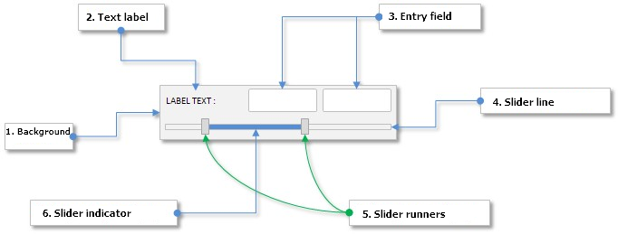
Fig. 3. Compound parts of the dual slider control.
Let us take a look at the class of a dual slider and note its difference from a simple slider.
Developing a Class for Creating the Dual Slider Control
Include the DualSlider.mqh file with the CDualSlider class of control in the WndContainer.mqh file:
//+------------------------------------------------------------------+
//|                                                 WndContainer.mqh |
//|                        Copyright 2015, MetaQuotes Software Corp. |
//|                                              http://www.mql5.com |
//+------------------------------------------------------------------+
#include "DualSlider.mqh"
In terms of the control properties, the CDualSlider class is identical to the CSlider class. The only difference here is that the left and right entry fields and slider runners require separate fields and methods. Differences between these two methods are insignificant and this is why we are not going to discuss their code here. You can find it in the files attached to this article.
class CDualSlider : public CElement
  {
private:
   //--- Current values in the entry fields (left and right)
   double            m_left_edit_value;
   double            m_right_edit_value;
   //--- Current position of the slider runners (left and right)
   double            m_left_current_pos;
   double            m_left_current_pos_x;
   double            m_right_current_pos;
   double            m_right_current_pos_x;
   //--- State of the mouse button (pressed/released) for slider runners (left and right)
   ENUM_THUMB_MOUSE_STATE m_clamping_mouse_left_thumb;
   ENUM_THUMB_MOUSE_STATE m_clamping_mouse_right_thumb;
   //---
public:
   //--- Return and set the value in entry fields (left and right)
   double            GetLeftValue(void)                       const { return(m_left_edit_value);          }
   double            GetRightValue(void)                      const { return(m_right_edit_value);         }
   bool              SetLeftValue(double value);
   bool              SetRightValue(double value);
   //--- Changing values in entry fields (left and right)
   void              ChangeLeftValue(const double value);
   void              ChangeRightValue(const double value);
   //---
private:
   //--- Process of moving slider runners (left and right)
   void              OnDragLeftThumb(const int x);
   void              OnDragRightThumb(const int x);
   //--- Updating position of slider runners (left and right)
   void              UpdateLeftThumb(const int new_x_point);
   void              UpdateRightThumb(const int new_x_point);
   //--- Checks the state of the left mouse button over the slider runner
   void              CheckMouseOnLeftThumb(void);
   void              CheckMouseOnRightThumb(void);
   //--- Calculating the X coordinate of sliders (left and right)
   void              CalculateLeftThumbX(void);
   void              CalculateRightThumbX(void);
   //--- Changes position of the left slider runner in relation to the value (left and right)
   void              CalculateLeftThumbPos(void);
   void              CalculateRightThumbPos(void);
  };
Here, we will present only code of the methods where two entry fields and slider runners are considered. Below is the structure of the CDualSlider::OnEndEdit() method:
class CDualSlider : public CElement
  {
private:
   //--- Handling entering the value in the entry field
   bool              OnEndEdit(const string object_name);
  };
//+------------------------------------------------------------------+
//| End of entering the value                                        |
//+------------------------------------------------------------------+
bool CDualSlider::OnEndEdit(const string object_name)
  {
//--- If the value is entered in the left entry field
   if(object_name==m_left_edit.Name())
     {
      //--- Get the entered value
      double entered_value=::StringToDouble(m_left_edit.Description());
      //--- Check, adjust and store the new value
      ChangeLeftValue(entered_value);
      //--- Calculate the X coordinate of the slider runner
      CalculateLeftThumbX();
      //--- Updating of the slider runner location
      UpdateLeftThumb(m_left_thumb.X());
      //--- Calculate the position in the value range
      CalculateLeftThumbPos();
      //--- Check, adjust and store the new value
      ChangeLeftValue(m_left_current_pos);
      //--- Update the slider indicator
      UpdateIndicator();
      //--- Send a message about it
      ::EventChartCustom(m_chart_id,ON_END_EDIT,CElement::Id(),CElement::Index(),m_label.Description());
      return(true);
     }
//--- If the value is entered in the right entry field
   if(object_name==m_right_edit.Name())
     {
      //--- Get the entered value
      double entered_value=::StringToDouble(m_right_edit.Description());
      //--- Check, adjust and store the new value
      ChangeRightValue(entered_value);
      //--- Calculate the X coordinate of the slider runner
      CalculateRightThumbX();
      //--- Updating of the slider runner location
      UpdateRightThumb(m_right_thumb.X());
      //--- Calculate the position in the value range
      CalculateRightThumbPos();
      //--- Check, adjust and store the new value
      ChangeRightValue(m_right_current_pos);
      //--- Update the slider indicator
      UpdateIndicator();
      //--- Send a message about it
      ::EventChartCustom(m_chart_id,ON_END_EDIT,CElement::Id(),CElement::Index(),m_label.Description());
      return(true);
     }
//---
   return(false);
  }
The same applies to moving the left and right slider runners. The CDualSlider::OnEvent() event handler contains separate checks and blocks of code for each of them:
//+------------------------------------------------------------------+
//| Chart event handler                                              |
//+------------------------------------------------------------------+
void CDualSlider::OnEvent(const int id,const long &lparam,const double &dparam,const string &sparam)
  {
//--- Handling of the cursor movement event
   if(id==CHARTEVENT_MOUSE_MOVE)
     {
      //--- Leave, if the element is hidden
      if(!CElement::IsVisible())
         return;
      //--- Coordinates and the state of the left mouse button
      int x=(int)lparam;
      int y=(int)dparam;
      m_mouse_state=(bool)int(sparam);
      //--- Checking the focus over elements
      CElement::MouseFocus(x>X() && x<X2() && y>Y() && y<Y2());
      m_left_thumb.MouseFocus(x>m_left_thumb.X() && x<m_left_thumb.X2() &&
                              y>m_left_thumb.Y() && y<m_left_thumb.Y2());
      m_right_thumb.MouseFocus(x>m_right_thumb.X() && x<m_right_thumb.X2() &&
                               y>m_right_thumb.Y() && y<m_right_thumb.Y2());
      //--- Leave, if the element is blocked
      if(!m_slider_state)
         return;
      //--- Check and store the state of the mouse button
      CheckMouseOnLeftThumb();
      CheckMouseOnRightThumb();
      //--- Change the color of the slider runner
      ChangeThumbColor();
      //--- If the management is passed to the slider line (left slider runner)
      if(m_clamping_mouse_left_thumb==THUMB_PRESSED_INSIDE)
        {
         //--- Moving the slider runner
         OnDragLeftThumb(x);
         //--- Calculation of the slider runner position in the value range
         CalculateLeftThumbPos();
         //--- Setting a new value in the entry field
         ChangeLeftValue(m_left_current_pos);
         //--- Update the slider indicator
         UpdateIndicator();
         return;
        }
      //--- If the management is passed to the scrollbar (right slider runner)
      if(m_clamping_mouse_right_thumb==THUMB_PRESSED_INSIDE)
        {
         //--- Moving the slider runner
         OnDragRightThumb(x);
         //--- Calculation of the slider runner position in the value range
         CalculateRightThumbPos();
         //--- Setting a new value in the entry field
         ChangeRightValue(m_right_current_pos);
         //--- Update the slider indicator
         UpdateIndicator();
         return;
        }
     }
  }
You can download the files attached to this article and study the code of the CDualSlider class in detail.
Testing the Dual Slider Control
Add the dual slider control to the graphical interface of the test application. Declare an instance of the CDualSlider class and a method with margins from the edge of the form in the CProgram custom class of the application:
//+------------------------------------------------------------------+
//| Class for creating the application                               |
//+------------------------------------------------------------------+
class CProgram : public CWndEvents
  {
private:
   //--- Sliders
   CDualSlider       m_dual_slider1;
   //---
private:
   //--- Sliders
#define DUALSLIDER1_GAP_X     (32)
#define DUALSLIDER1_GAP_Y     (275)
   bool              CreateDualSlider1(const string text);
  };
The code below shows the code of the CProgram::CreateDualSlider1() method. Set the value range from -2000 to 1000. The availability of this control will depend on the current state of the fifth checkbox similar to the simple slider that was created earlier in this article.
//+------------------------------------------------------------------+
//| Creates dual slider 1                                            |
//+------------------------------------------------------------------+
bool CProgram::CreateDualSlider1(const string text)
  {
//--- Store the window pointer
   m_dual_slider1.WindowPointer(m_window1);
//--- Coordinates
   int x=m_window1.X()+DUALSLIDER1_GAP_X;
   int y=m_window1.Y()+DUALSLIDER1_GAP_Y;
//--- Values
   double v1=(m_dual_slider1.GetLeftValue()==WRONG_VALUE) ? 0 : m_dual_slider1.GetLeftValue();
   double v2=(m_dual_slider1.GetRightValue()==WRONG_VALUE) ? 500 : m_dual_slider1.GetRightValue();
//--- Set properties before creation
   m_dual_slider1.XSize(264);
   m_dual_slider1.YSize(40);
   m_dual_slider1.EditXSize(87);
   m_dual_slider1.MaxValue(1000);
   m_dual_slider1.StepValue(1);
   m_dual_slider1.MinValue(-2000);
   m_dual_slider1.SetDigits(0);
   m_dual_slider1.SetLeftValue(v1);
   m_dual_slider1.SetRightValue(v2);
   m_dual_slider1.AreaColor(clrWhiteSmoke);
   m_dual_slider1.LabelColor(clrBlack);
   m_dual_slider1.LabelColorLocked(clrSilver);
   m_dual_slider1.EditColorLocked(clrWhiteSmoke);
   m_dual_slider1.EditBorderColor(clrSilver);
   m_dual_slider1.EditBorderColorLocked(clrSilver);
   m_dual_slider1.EditTextColorLocked(clrSilver);
   m_dual_slider1.SlotLineDarkColor(clrSilver);
   m_dual_slider1.SlotLineLightColor(clrWhite);
   m_dual_slider1.SlotYSize(4);
   m_dual_slider1.ThumbColorLocked(clrLightGray);
   m_dual_slider1.ThumbColorPressed(clrSilver);
   m_dual_slider1.SlotIndicatorColor(C'85,170,255');
   m_dual_slider1.SlotIndicatorColorLocked(clrLightGray);
//--- Create control
   if(!m_dual_slider1.CreateSlider(m_chart_id,m_subwin,text,x,y))
      return(false);
//--- Availability will depend on the current state of the fifth checkbox
   m_dual_slider1.SliderState(m_checkbox5.CheckButtonState());
//--- Add the object to the common array of object groups
   CWndContainer::AddToElementsArray(0,m_dual_slider1);
   return(true);
  }
Do not forget to place the call of the method of the new control in the main method for creating the graphical interface as it is demonstrated in the shortened version of the code below.
//+------------------------------------------------------------------+
//| Creates the trading panel                                        |
//+------------------------------------------------------------------+
bool CProgram::CreateTradePanel(void)
  {
//--- Creating form 1 for controls
//--- Creating controls:
//    Main menu
//--- Context menus
//--- Creating the status bar
//--- Checkboxes
//--- Sliders
   if(!CreateDualSlider1("Dual Slider 1:"))
      return(false);
//--- Redrawing the chart
   m_chart.Redraw();
   return(true);
  }
Now, current state of the fifth checkbox will define two controls - the simple slider and the dual slider.
//+------------------------------------------------------------------+
//| Event handler                                                    |
//+------------------------------------------------------------------+
void CProgram::OnEvent(const int id,const long &lparam,const double &dparam,const string &sparam)
  {
//--- The text label press event
   if(id==CHARTEVENT_CUSTOM+ON_CLICK_LABEL)
     {
      ::Print(__FUNCTION__," > id: ",id,"; lparam: ",lparam,"; dparam: ",dparam,"; sparam: ",sparam);
      //--- If the fifth checkbox was clicked on
      if(lparam==m_checkbox5.Id())
        {
         //--- Set state for sliders
         m_slider1.SliderState(m_checkbox5.CheckButtonState());
         m_dual_slider1.SliderState(m_checkbox5.CheckButtonState());
        }
     }
//--- The end of entering the value in the entry field event
   if(id==CHARTEVENT_CUSTOM+ON_END_EDIT)
     {
      ::Print(__FUNCTION__," > id: ",id,"; lparam: ",lparam,"; dparam: ",dparam,"; sparam: ",sparam);
     }
  }
Now, compile the program and load it on to the chart. The screenshot below illustrates the result:

Fig. 4. The dual slider control.
Conclusion
In the sixth part of the series we considered six controls:
- Checkbox.
- The edit control.
- Edit with checkbox.
- Check combobox.
- Slider.
- Dual slider.
Currently, the schematic of the library for creating graphical interfaces looks as shown below:

Fig. 5. Structure of the library at the current stage of development.
In the next part of the series we will enrich our library with tables and tabs.
You can download the material of Part VI and test how it works. If you have questions on using material from those files, you can refer to the detailed description of the library development in one of the articles from the list below or ask your question in the comments of this article.
List of articles (chapters) of the sixth part:
- Graphical Interfaces VI: the Checkbox Control, the Edit Control and their Mixed Types (Chapter 1)
- Graphical Interfaces VI: the Slider and the Dual Slider Controls (Chapter 2)
Translated from Russian by MetaQuotes Ltd.
Original article: https://www.mql5.com/ru/articles/2468
Warning: All rights to these materials are reserved by MetaQuotes Ltd. Copying or reprinting of these materials in whole or in part is prohibited.
This article was written by a user of the site and reflects their personal views. MetaQuotes Ltd is not responsible for the accuracy of the information presented, nor for any consequences resulting from the use of the solutions, strategies or recommendations described.

 Universal Expert Advisor: A Custom Trailing Stop (Part 6)
 Self-optimization of EA: Evolutionary and genetic algorithms
 Creating an assistant in manual trading
 Graphical Interfaces VI: the Checkbox Control, the Edit Control and their Mixed Types (Chapter 1)
- Free trading apps
- Over 8,000 signals for copying
- Economic news for exploring financial markets
You agree to website policy and terms of use
Anatol, question: will there be a "standard" possibility to override the mutual location of objects in composite elements, as well as changing their sizes?
For example, in order to compactly pack sliders into small panel sizes, I had to change/add slider methods.
But that's not very practical in terms of compatibility with future updates.
I've already answered this question for you.
Forum on trading, automated trading systems and testing trading strategies
Discussion of the article "Graphical Interfaces III: Simple and Multifunctional Buttons (Chapter 1)"
Anatoli Kazharski, 2016.09.29 18:07
I will make it so that you can change any property of elements already after creation.//---
But not everything at once. All the most important things first. Subtle settings last (lowest priority).
I've already answered that question for you.
//---
But not all at once. The most important things first. Fine tuning last (lowest priority).
Perhaps I missed something, or on the contrary I haven't got there yet )))
But my slider is constantly glitching, when creating the slider runs away to the rightmost value even if it was set as the average between the upper and lower. However, the value shows what was set when defining it. And after that, when trying to rotate it in any way, the value changes either to the extreme minimum or to the extreme maximum.
Can you suggest something?
Try the latest version of the library:
EasyAndFastGUI - library for creating graphical interfaces
Dear Anatoli Kazharski
Thanks for your sharing, it is very advanced.
I am tring to compile in MT4 MetaEditor,the following errors occured. I don't know what is wrong for me, i am a beginner.
Looking forwards to your answer.