
Graphical Interfaces XI: Refactoring the Library code (build 14.1)
Contents
- Introduction
- Common properties of controls
- Class for working with image data
- Methods for working with images
- Merging controls as part of the library code optimization
- Hierarchy of controls
- Array of nested controls
- Base code of the virtual methods
- Automatic determination of priorities of the left mouse click
- Application for testing the control
- Conclusion
Introduction
The first article Graphical Interfaces I: Preparation of the Library Structure (Chapter 1) considers in detail what this library is for. A list of chapters with links is provided at the end of articles in each part. You can also download the latest full version of the library from there. Files must be placed under the same directories as they are located in the archive.
The latest update of the library is aimed at optimizing the code, reducing its size and making its implementation even more object-oriented. All this will make the code easier to learn. A detailed description of the changes made will allow the readers to independently modify the library for their own tasks, spending as little time as possible.
Due to the large volume of the publication, the description of the latest library update has been split into two articles. The first part is presented here.
Common properties of controls
First of all, the changes involved the common properties of the library controls. Previously, the class fields and methods for certain properties (color of background, border, text, etc.) were stored in derived classes of each individual control. In terms of object-oriented programming, this is overloading. Now that all the necessary graphical interface controls have been implemented, it is easy to determine the frequently repeated fields and methods responsible for setting the general properties and to move them to the base class.
Let us define the full list of properties, which are inherent to all controls of the library and can be placed in the base class.
- Image (icon) read from a file or rendered programmatically.
- Indents for the image along the X and Y axes.
- Background color.
- Border color.
- Text color.
- Description text.
- Indents of the description text.
Now it is necessary to decide which class will contain the fields and methods for setting and getting these properties.
There are two classes in the class hierarchy of each control: CElementBase and CElement. Fields and methods for the following properties will be placed in the CElementBase base class: coordinates, sizes, identifiers, indexes, as well as the modes peculiar to each control from the list. The fields and methods for managing the properties related to the appearance of controls will be placed in the derived class CElement.
In addition, methods for creating the name of the graphical object of the controls are added to the CElementBase class. Previously, the name was generated in the methods for creating the controls. Now that each control is drawn on one separate object, it is possible to make universal methods which can be located in the base class.
The CElementBase::NamePart() methods are designed for getting and setting the part of the name that indicates the type of the control.
//+------------------------------------------------------------------+
//| Base control class                                               |
//+------------------------------------------------------------------+
class CElementBase
  {
protected:
   //--- Part of the name (type of the control)
   string            m_name_part;
   //---
public:
   //--- (1) Stores and (2) returns the part of the control name
   void              NamePart(const string name_part)                { m_name_part=name_part;                }
   string            NamePart(void)                            const { return(m_name_part);                  }
  };
The CElementBase::ElementName() method is used for generating the full name of the graphical object. This method must be passed the part of the name that indicates the type of the control. If it turns out that the part of the name has been set earlier, the passed value will not be used. Due to the recent changes in the library (see below), this approach is used in cases when one control is derived from another, and the part of the name needs to be redefined.
class CElementBase
  {
protected:
   //--- name of the control
   string            m_element_name;
   //---
public:
   //--- Forming the object name
   string            ElementName(const string name_part="");
  };
//+------------------------------------------------------------------+
//| Returns the generated control name                               |
//+------------------------------------------------------------------+
string CElementBase::ElementName(const string name_part="")
  {
   m_name_part=(m_name_part!="")? m_name_part : name_part;
//--- Forming the object name
   string name="";
   if(m_index==WRONG_VALUE)
      name=m_program_name+"_"+m_name_part+"_"+(string)CElementBase::Id();
   else
      name=m_program_name+"_"+m_name_part+"_"+(string)CElementBase::Index()+"__"+(string)CElementBase::Id();
//---
   return(name);
  }
When handling mouse clicks on a certain control, it is necessary to check the name of the clicked graphical object. This check was often repeated for many controls, therefore, a special CElementBase::CheckElementName() method has been placed in the base class:
class CElementBase
  {
public:
   //--- Checking if the line contains a significant part of the control name
   bool              CheckElementName(const string object_name);
  };
//+------------------------------------------------------------------+
//| Returns the generated control name                               |
//+------------------------------------------------------------------+
bool CElementBase::CheckElementName(const string object_name)
  {
//--- If the pressing was on this control
   if(::StringFind(object_name,m_program_name+"_"+m_name_part+"_")<0)
      return(false);
//---
   return(true);
  }
As for the other properties, it makes sense to dwell only on the description of methods for working with images.
Class for working with image data
To work with the images, the CImage class has been implemented, where the image data can be stored:
- array of image pixels;
- image dimensions (width and height);
- path to the file.
To get the value of these properties, the appropriate methods will be required:
//+------------------------------------------------------------------+
//| Class for storing the image data                                 |
//+------------------------------------------------------------------+
class CImage
  {
protected:
   uint              m_image_data[]; // Array of the image pixels
   uint              m_image_width;  // Image width
   uint              m_image_height; // Image height
   string            m_bmp_path;     // Path to the image file
   //---
public:
                     CImage(void);
                    ~CImage(void);
   //--- (1) Size of the data array, (2) set/return the data (pixel color)
   uint              DataTotal(void)                             { return(::ArraySize(m_image_data)); }
   uint              Data(const uint data_index)                 { return(m_image_data[data_index]);  }
   void              Data(const uint data_index,const uint data) { m_image_data[data_index]=data;     }
   //--- Set/return the image width
   void              Width(const uint width)                     { m_image_width=width;               }
   uint              Width(void)                                 { return(m_image_width);             }
   //--- Set/return the image height
   void              Height(const uint height)                   { m_image_height=height;             }
   uint              Height(void)                                { return(m_image_height);            }
   //--- Set/return the path to the image
   void              BmpPath(const string bmp_file_path)         { m_bmp_path=bmp_file_path;          }
   string            BmpPath(void)                               { return(m_bmp_path);                }
  };
The CImage::ReadImageData() method is used for reading the image and storing its data. This method should be passed the path to the image file:
class CImage
  {
public:
   //--- Read and store the data of the passed image
   bool              ReadImageData(const string bmp_file_path);
  };
//+------------------------------------------------------------------+
//| Store the passed image to an array                               |
//+------------------------------------------------------------------+
bool CImage::ReadImageData(const string bmp_file_path)
  {
//--- Leave, if an empty string
   if(bmp_file_path=="")
      return(false);
//--- Store the path to the image
   m_bmp_path=bmp_file_path;
//--- Reset the last error
   ::ResetLastError();
//--- Read and store the image data
   if(!::ResourceReadImage("::"+m_bmp_path,m_image_data,m_image_width,m_image_height))
     {
      ::Print(__FUNCTION__," > Error when reading the image ("+m_bmp_path+"): ",::GetLastError());
      return(false);
     }
//---
   return(true);
  }
Sometimes it is necessary to copy the data of the passed image. This is done by the CImage::CopyImageData() method. An object of the CImage type is passed by reference to this method in order to copy the array data of this object. Here, the size of the source array is obtained first, and the same size is set to the receiver array. Then the CImage::Data() method is used in a cycle to retrieve the data of the passed array and store them in the receiver array.
class CImage
  {
public:
   //--- Copies the data of the passed image
   void              CopyImageData(CImage &array_source);
  };
//+------------------------------------------------------------------+
//| Copies the data of the passed image                              |
//+------------------------------------------------------------------+
void CImage::CopyImageData(CImage &array_source)
  {
//--- Get the size of the source array
   uint source_data_total =array_source.DataTotal();
//--- Resize the receiver array
   ::ArrayResize(m_image_data,source_data_total);
//--- Copy the data
   for(uint i=0; i<source_data_total; i++)
      m_image_data[i]=array_source.Data(i);
  }
The CImage::DeleteImageData() method is used for deleting the image data:
class CImage
  {
public:
   //--- Deletes image data
   void              DeleteImageData(void);
  };
//+------------------------------------------------------------------+
//| Deletes the image data                                           |
//+------------------------------------------------------------------+
void CImage::DeleteImageData(void)
  {
   ::ArrayFree(m_image_data);
   m_image_width  =0;
   m_image_height =0;
   m_bmp_path     ="";
  }
The CImage class is contained in the Objects.mqh file. Now all controls will be rendered, so classes for creating graphic primitives are no longer needed. They have been removed from the Objects.mqh file. An exception is made only for the subchart, which allows creating charts similar to the main chart of the symbol. All types of MQL applications are located in its window and, accordingly, a graphical interface is created.
//+------------------------------------------------------------------+
//|                                                      Objects.mqh |
//|                        Copyright 2015, MetaQuotes Software Corp. |
//|                                             https://www.mql5.com |
//+------------------------------------------------------------------+
#include "Enums.mqh"
#include "Defines.mqh"
#include "Fonts.mqh"
#include "Canvas\Charts\LineChart.mqh"
#include <ChartObjects\ChartObjectSubChart.mqh>
//--- List of classes in file for quick navigation (Alt+G)
class CImage;
class CRectCanvas;
class CLineChartObject;
class CSubChart;
...
Methods for working with images
Several methods have been implemented for working with images. All of them are placed in the CElement class. It is now possible to set the required number of groups (arrays) of images for a certain control. This allows making the appearance of the controls more informative. The number of the icons displayed in the control is defined by the developer of the MQL application.
For this purpose, the EImagesGroup structure has been created and a dynamic array of its instances has been declared in the CElement file. It will contain the properties of the image groups (indents and the image selected for display), as well as the images themselves, which are stored in a dynamic array of the CImage type.
//+------------------------------------------------------------------+
//| Derived class of control                                         |
//+------------------------------------------------------------------+
class CElement : public CElementBase
  {
protected:
   //--- Groups of images
   struct EImagesGroup
     {
      //--- Array of images
      CImage            m_image[];
      //--- Icon margins
      int               m_x_gap;
      int               m_y_gap;
      //--- Image from the group selected for display
      int               m_selected_image;
     };
   EImagesGroup      m_images_group[];
  };
In order to add an image to a control, a group must be added first. This can be done with the help of the CElement::AddImagesGroup() method. It must be passed the indents of the images in this group from the top left point of the control as arguments. By default, the first image in the group will be selected for display.
class CElement : public CElementBase
  {
public:
   //--- Adding a group of images
   void              AddImagesGroup(const int x_gap,const int y_gap);
  };
//+------------------------------------------------------------------+
//| Adding a group of images                                         |
//+------------------------------------------------------------------+
void CElement::AddImagesGroup(const int x_gap,const int y_gap)
  {
//--- Get the size of the image groups array
   uint images_group_total=::ArraySize(m_images_group);
//--- Add one group
   ::ArrayResize(m_images_group,images_group_total+1);
//--- Set indents for the images
   m_images_group[images_group_total].m_x_gap=x_gap;
   m_images_group[images_group_total].m_y_gap=y_gap;
//--- The default image
   m_images_group[images_group_total].m_selected_image=0;
  }
The CElement::AddImage() method is designed for adding an image to a group. The index of the group and the path to the image file must be specified as its arguments. The image will not be added if there are no groups. An adjustment to prevent exceeding the array range is also present here. In case the range is exceeded, the image will be added to the last group.
class CElement : public CElementBase
  {
public:
   //--- Adding the image to the specified group
   void              AddImage(const uint group_index,const string file_path);
  };
//+------------------------------------------------------------------+
//| Adding the image to the specified group                          |
//+------------------------------------------------------------------+
void CElement::AddImage(const uint group_index,const string file_path)
  {
//--- Get the size of the image groups array
   uint images_group_total=::ArraySize(m_images_group);
//--- Leave, if there are no groups
   if(images_group_total<1)
     {
      Print(__FUNCTION__,
      " > A group of images can be added using the CElement::AddImagesGroup() methods");
      return;
     }
//--- Prevention of exceeding the range
   uint check_group_index=(group_index<images_group_total)? group_index : images_group_total-1;
//--- Get the size of the images array
   uint images_total=::ArraySize(m_images_group[check_group_index].m_image);
//--- Increase the array size by one element
   ::ArrayResize(m_images_group[check_group_index].m_image,images_total+1);
//--- Add an image
   m_images_group[check_group_index].m_image[images_total].ReadImageData(file_path);
  }
It is possible to add a group with an array of images right away using the second version of the CElement::AddImagesGroup() method. Here, in addition to the indents, it is necessary to pass an array with the file paths as arguments. After increasing the size of the images group array by one element, the program adds the entire array of the passed images in a cycle using the CElement::AddImage() method (see above).
class CElement : public CElementBase
  {
public:
   //--- Adding a group of images with an array of images
   void              AddImagesGroup(const int x_gap,const int y_gap,const string &file_pathways[]);
  };
//+------------------------------------------------------------------+
//| Adding a group of images with an array of images                 |
//+------------------------------------------------------------------+
void CElement::AddImagesGroup(const int x_gap,const int y_gap,const string &file_pathways[])
  {
//--- Get the size of the image groups array
   uint images_group_total=::ArraySize(m_images_group);
//--- Add one group
   ::ArrayResize(m_images_group,images_group_total+1);
//--- Set indents for the images
   m_images_group[images_group_total].m_x_gap =x_gap;
   m_images_group[images_group_total].m_y_gap =y_gap;
//--- The default image
   m_images_group[images_group_total].m_selected_image=0;
//--- Get the size of the array of the added images
   uint images_total=::ArraySize(file_pathways);
//--- Add images to a new group, if a non-empty array was passed
   for(uint i=0; i<images_total; i++)
      AddImage(images_group_total,file_pathways[i]);
  }
An image in a certain group can be set or replaced at the program runtime. To do this, use the CElement::SetImage() method, pass the (1) index of the group, (2) index of the image and (3) path to the file as arguments.
class CElement : public CElementBase
  {
public:
   //--- Setting/replacing image
   void              SetImage(const uint group_index,const uint image_index,const string file_path);
  };
//+------------------------------------------------------------------+
//| Setting/replacing image                                          |
//+------------------------------------------------------------------+
void CElement::SetImage(const uint group_index,const uint image_index,const string file_path)
  {
//--- Checking for exceeding the array range
   if(!CheckOutOfRange(group_index,image_index))
      return;
//--- Delete the image
   m_images_group[group_index].m_image[image_index].DeleteImageData();
//--- Add an image
   m_images_group[group_index].m_image[image_index].ReadImageData(file_path);
  }
If, however, all the necessary images are set initially when creating the control, it is better to simply switch them using the CElement :: ChangeImage() method:
class CElement : public CElementBase
  {
public:
   //--- Switching the image
   void              ChangeImage(const uint group_index,const uint image_index);
  };
//+------------------------------------------------------------------+
//| Switching the image                                              |
//+------------------------------------------------------------------+
void CElement::ChangeImage(const uint group_index,const uint image_index)
  {
//--- Checking for exceeding the array range
   if(!CheckOutOfRange(group_index,image_index))
      return;
//--- Store the index of the image to display
   m_images_group[group_index].m_selected_image=(int)image_index;
  }
To find out the currently selected image in a particular group, use the CElement::SelectedImage() method. If there are no groups or there are no images in the specified group, the method returns a negative value.
class CElement : public CElementBase
  {
public:
   //--- Returns the image selected for display in the specified group
   int               SelectedImage(const uint group_index=0);
  };
//+------------------------------------------------------------------+
//| Returns the image selected for display in the specified group    |
//+------------------------------------------------------------------+
int CElement::SelectedImage(const uint group_index=0)
  {
//--- Leave, if there are no groups
   uint images_group_total=::ArraySize(m_images_group);
   if(images_group_total<1 || group_index>=images_group_total)
      return(WRONG_VALUE);
//--- Leave, if there are no images in the specified group
   uint images_total=::ArraySize(m_images_group[group_index].m_image);
   if(images_total<1)
      return(WRONG_VALUE);
//--- Return the image selected for display
   return(m_images_group[group_index].m_selected_image);
  }
Previously, all classes of the controls, where users might need to display an icon, had methods for setting the images. For example, buttons could be assigned icons for the released and pressed states, as well as the locked state. This feature will remain, as it is a clear and comprehensible option. As before, the icon indents can be set using the CElement::IconXGap() and CElement::IconYGap() methods.
class CElement : public CElementBase
  {
protected:
   //--- Icon margins
   int               m_icon_x_gap;
   int               m_icon_y_gap;
   //---
public:
   //--- Icon margins
   void              IconXGap(const int x_gap)                       { m_icon_x_gap=x_gap;              }
   int               IconXGap(void)                            const { return(m_icon_x_gap);            }
   void              IconYGap(const int y_gap)                       { m_icon_y_gap=y_gap;              }
   int               IconYGap(void)                            const { return(m_icon_y_gap);            }
   //--- Setting icons for the active and locked states
   void              IconFile(const string file_path);
   string            IconFile(void);
   void              IconFileLocked(const string file_path);
   string            IconFileLocked(void);
   //--- Setting icons for the control in the pressed state (available/locked)
   void              IconFilePressed(const string file_path);
   string            IconFilePressed(void);
   void              IconFilePressedLocked(const string file_path);
   string            IconFilePressedLocked(void);
  };
The code of the CElement::IconFile() method will be provided as an example. Here, if the control does not have any image groups yet, a group is added first. If no indents were specified before calling the method, zero values are set for them. After adding the group, the image passed in the argument is added, and also space is reserved for an image in the locked state of the control.
//+------------------------------------------------------------------+
//| Setting an icon for the active state                             |
//+------------------------------------------------------------------+
void CElement::IconFile(const string file_path)
  {
//--- If there are no image groups yet
   if(ImagesGroupTotal()<1)
     {
      m_icon_x_gap =(m_icon_x_gap!=WRONG_VALUE)? m_icon_x_gap : 0;
      m_icon_y_gap =(m_icon_y_gap!=WRONG_VALUE)? m_icon_y_gap : 0;
      //--- Add a group and an image
      AddImagesGroup(m_icon_x_gap,m_icon_y_gap);
      AddImage(0,file_path);
      AddImage(1,"");
      //--- The default image
      m_images_group[0].m_selected_image=0;
      return;
     }
//--- Set the image to the first group as the first element
   SetImage(0,0,file_path);
  }
In order to find out the number of image groups or the number of images in a particular group, it is necessary to use the corresponding methods (see the code listing below):
class CElement : public CElementBase
  {
public:
   //--- Returns the number of image groups
   uint              ImagesGroupTotal(void) const { return(::ArraySize(m_images_group)); }
   //--- Returns the number of images in the specified group
   int               ImagesTotal(const uint group_index);
  };
//+------------------------------------------------------------------+
//| Returns the number of images in the specified group              |
//+------------------------------------------------------------------+
int CElement::ImagesTotal(const uint group_index)
  {
//--- Checking the group index
   uint images_group_total=::ArraySize(m_images_group);
   if(images_group_total<1 || group_index>=images_group_total)
      return(WRONG_VALUE);
//--- The number of images
   return(::ArraySize(m_images_group[group_index].m_image));
  }
Merging controls as part of the library code optimization
Until now, many controls have been virtually repeated, with only a few methods being unique. This greatly inflated the code. Therefore, changes have been made to the library, which reduced the code and simplified understanding.
1. Earlier, two classes have been developed for creating buttons.
- CSimpleButton — simple button.
- CIconButton — icon button.
But now, icons can be created in any control using the basic tools. Therefore, to create buttons with different properties, there is no need for two classes anymore. Only one modified class is left - CButton. To center the text in the button, simply enable the corresponding mode with the CElement::IsCenterText() method, which can be applied to any control.
class CElement : public CElementBase
  {
protected:
   //--- Mode of text alignment
   bool              m_is_center_text;
   //---
public:

   //--- Align text to center
   void              IsCenterText(const bool state)                  { m_is_center_text=state;          }
   bool              IsCenterText(void)                        const { return(m_is_center_text);        }
  };
2. The same applies to creating button groups. In previous versions of the library, three classes were created to create groups of buttons with different properties:
- CButtonsGroup — group of simple buttons.
- CRadioButtons — group of radio buttons.
- CIconButtonsGroup — group of icon buttons.
In all these classes, buttons were created from the standard graphic primitives. Only the CButtonsGroup class remains now. It creates buttons as ready-made controls of the CButton type.
The radio button mode (when one button in the group is always selected) can be enabled using the CButtonsGroup::RadioButtonsMode() method. Appearance similar to radio buttons can be enabled using the CButtonsGroup::RadioButtonsStyle() method.
class CButtonsGroup : public CElement
  {
protected:
   //    The radio button mode
   bool              m_radio_buttons_mode;
   //--- Radio button display style
   bool              m_radio_buttons_style;
   //---
public:
   //--- (1) Setting the mode and (2) display style of radio buttons
   void              RadioButtonsMode(const bool flag)              { m_radio_buttons_mode=flag;       }
   void              RadioButtonsStyle(const bool flag)             { m_radio_buttons_style=flag;      }
  };
3. Consider the following three classes for creating controls with edit boxes:
- CSpinEdit — spin edit box.
- CCheckBoxEdit — spin edit box with a checkbox.
- CTextEdit — text edit box.
All properties of the above classes can be compactly placed in a single one, let it be the CTextEdit class. If it is necessary to create a spin edit box with increment and decrement switches, enable the corresponding mode using the CTextEdit::SpinEditMode() method. If it is necessary for the control to have a checkbox, enable that mode with the CTextEdit::CheckBoxMode() method.
class CTextEdit : public CElement
  {
protected:
   //--- Mode of control with a checkbox
   bool              m_checkbox_mode;
   //--- Mode of spin edit box with buttons
   bool              m_spin_edit_mode;
   //---
public:
   //--- (1) Checkbox and (2) spin edit box modes
   void              CheckBoxMode(const bool state)          { m_checkbox_mode=state;              }
   void              SpinEditMode(const bool state)          { m_spin_edit_mode=state;             }
  };
4. The same applies to the elements for creating comboboxes. Previously there were two classes:
- CComboBox — button with a drop-down list.
- CCheckComboBox — button with a drop-down list and a checkbox.
Keeping two almost identical classes is redundant, therefore, only one is left — CComboBox. Mode of the control with a checkbox can be enabled using the CComboBox::CheckBoxMode() method.
class CComboBox : public CElement
  {
protected:
   //--- Mode of control with a checkbox
   bool              m_checkbox_mode;
   //---
public:
   //--- Setting the mode of control with a checkbox
   void              CheckBoxMode(const bool state)         { m_checkbox_mode=state;                  }
  };
5. Two classes were previously intended for creating sliders:
- CSlider — simple numerical slider.
- CDualSlider — dual slider for specifying a numerical range.
Only one of them is left — the CSlider class. The dual slider mode is enabled using the CSlider::DualSliderMode() method.
class CSlider : public CElement
  {
protected:
   //--- Dual slider mode
   bool              m_dual_slider_mode;
   //---
public:
   //--- Dual slider mode
   void              DualSliderMode(const bool state)           { m_dual_slider_mode=state;           }
   bool              DualSliderMode(void)                 const { return(m_dual_slider_mode);         }
  };
6. Earlier, the library contained two classes for creating list views with a scrollbar, one of which allows creating a list view with checkboxes.
- CListView — simple list view with the ability to select one item.
- CCheckBoxList — list view with checkboxes.
Out of these, only CListView remains. To create a list with checkboxes, simply enable the corresponding mode using the CListView::CheckBoxMode() method.
class CListView : public CElement
  {
protected:
   //--- Mode of list view with checkboxes
   bool              m_checkbox_mode;
   //---
public:
   //--- Setting the mode of control with a checkbox
   void              CheckBoxMode(const bool state)         { m_checkbox_mode=state;                  }
  };
7. The previous version of the library contained as many as three classes of tables:
- CTable — edit box table.
- CLabelsTable — text label table.
- CCanvasTable — rendered table.
During the course of the library improvement, the CCanvasTable class turned out to be the most advanced. Therefore, the other classes have been removed, and the CCanvasTable class has been renamed to CTable.
8. There were two classes for creating tabs:
- CTabs — simple tabs.
- CIconTabs — icon tabs.
There is no need to keep these two classes in the library either. The array of icon tabs was previously created from graphical primitive objects. The buttons of the CButton type are now used for this purpose, where the icons can be defined using the basic methods described above. As a result, we leave only the CTabs class.
Hierarchy of controls
The hierarchy of the controls of the graphical interface has changed as well. So far, all controls were attached to a form (CWindow). The controls were aligned on the form relative to its upper left point. It is necessary to specify the coordinates for each control when creating a graphical interface. And if the position of the element is modified during the finalization, then it was necessary to manually redefine all the coordinates relative to a certain area inside it for all controls located in that area. For example, groups of other controls are located inside the area of the Tabs control. And if we needed to move the Tabs control to any other part of the form, then all controls on each individual tab would remain in their previous positions. This is very inconvenient, but now the problem is solved.
Earlier, before creating a certain control in a custom MQL application class, it was necessary to pass it the form object to store the pointer to the form using the CElement::WindowPointer() method. The CElement::MainPointer() method is used now. As an argument, it passes the object of the control, where the created control is to be attached.
class CElement : public CElementBase
  {
protected:
   //--- Pointer to the main control
   CElement         *m_main;
   //---
public:
   //--- Stores and returns pointer to the main control
   CElement         *MainPointer(void)                               { return(::GetPointer(m_main));    }
   void              MainPointer(CElement &object)                   { m_main=::GetPointer(object);     }
  };
As before, you cannot create a control unless it is attached to the main control. The main method for creating controls (in all classes) has a check for presence of the pointer to the main control. The method for such a check has been renamed and is now called CElement::CheckMainPointer(). Here the form pointer and pointer to the mouse cursor object are stored. It also determines and stores the identifier of the control, stores the chart identifier and the subwindow number, where the MQL application and its graphical interface are attached. Previously, this code was repeated from class to class.
class CElement : public CElementBase
  {
protected:
   //--- Checking the presence of pointer to the main control
   bool              CheckMainPointer(void);
  };
//+------------------------------------------------------------------+
//| Checking the presence of pointer to the main control             |
//+------------------------------------------------------------------+
bool CElement::CheckMainPointer(void)
  {
//--- If there is no pointer
   if(::CheckPointer(m_main)==POINTER_INVALID)
     {
      //--- Output the message to the terminal journal
      ::Print(__FUNCTION__,
              " > Before creating a control... \n...it is necessary to pass a pointer to the main control: "+
              ClassName()+"::MainPointer(CElementBase &object)");
      //--- Terminate building the graphical interface of the application
      return(false);
     }
//--- Store the form pointer
   m_wnd=m_main.WindowPointer();
//--- Store the mouse cursor pointer
   m_mouse=m_main.MousePointer();
//--- Store the properties
   m_id       =m_wnd.LastId()+1;
   m_chart_id =m_wnd.ChartId();
   m_subwin   =m_wnd.SubwindowNumber();
//--- Send the flag of pointer presence
   return(true);
  }
This approach of attaching controls to the main control is distributed across all classes. Complex compound controls are assembled from several others, and all of them are attached to each other in a certain sequence. Exception is made only for three classes:
- CTable — class for creating a table.
- CListView — class for creating a list view.
- CTextBox — class for creating a multiline text box.
They are assembled from multiple graphical objects of the OBJ_BITMAP_LABEL type, the contents of which, however, are also rendered. Testing various approaches has shown that using multiple objects is the optimal way for this stage of the library's development.
The CButton class has become some sort of universal "brick", which is used virtually in all other controls of the library. In addition, the control of the CButton (button) type is now the base for certain other classes of controls, such as:
- CMenuItem — menu item.
- CTreeItem — tree view item.
As a result, the general scheme of class relationships in the "base-derived" ("parent-child") format now looks like this:
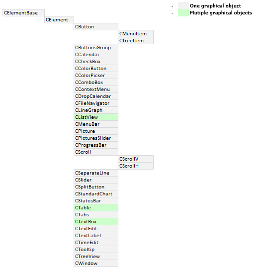
Fig. 1. The scheme of class relationships, as base—derived (parent—child).
As of now, 33 (thirty-three) different controls have been implemented in the library. Below is a series of schemes that show all the controls of the library in alphabetical order. Root controls are marked in green and numbered. Next come the nested controls for the entire depth of nesting. Each column is the next layer of nested controls for a particular control. The ‘[]’ symbol marks the controls, multiple instances of which are present. Such a view will help readers to faster and better understand the OOP scheme of the library.
The schemes of the following controls are shown in illustrations below:
1. CButton — button.
2. CButtonsGroup — group of buttons.
3. CCalendar — calendar.
4. CCheckBox — checkbox.
5. CColorButton — button to call the color picker.
6. CColorPicker — color picker.
7. CComboBox — button to call the drop-down list (combobox).
8. CContextMenu — context menu.
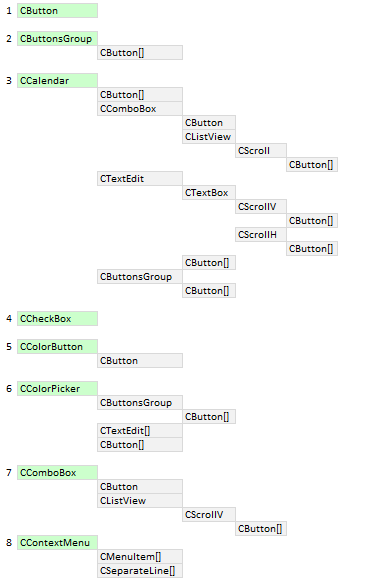
Fig. 2. Schematic representation of the controls (part 1).
9. CDropCalendar — button to call the drop-down calendar.
10. CFileNavigator — file navigator.
11. CLineGraph — line chart.
12. CListView — list view.
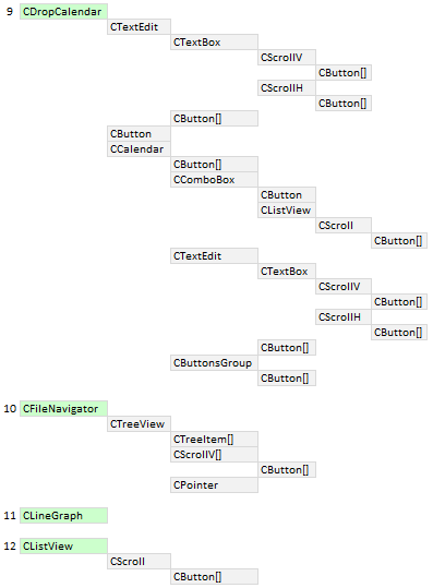
Fig. 3. Schematic representation of the controls (part 2).
13. CMenuBar — main menu.
14. CMenuItem — menu item.
15. CPicture — picture.
16. CPicturesSlider — picture slider.
17. CProgressBar — progress bar.
18. CScroll — scrollbar.
19. CSeparateLine — separation line.
20. CSlider — numerical slider.
21. CSplitButton — split button.
22. CStandartChart — standard chart.
23. CStatusBar — status bar.
24. CTable — table.
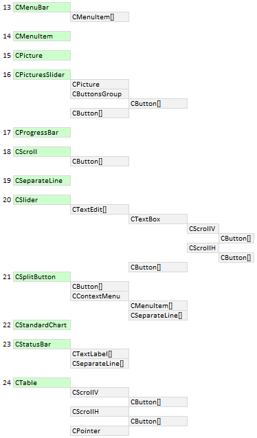
Fig. 4. Schematic representation of the controls (part 3).
25. CTabs — tabs.
26. CTextBox — text edit box with the option to enable the multiline mode.
27. CTextEdit — edit box.
28. CTextLabel — text label.
29. CTimeEdit — control for entering time.
30. CTooltip — tooltip.
31. CTreeItem — tree view item.
32. CTreeView — tree view.
33. CWindow — form (window) for the controls.
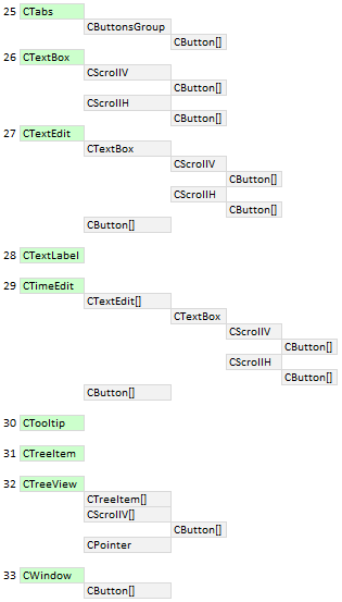
Fig. 5. Schematic representation of the controls (part 4).
Array of nested controls
When creating controls in the previous version of the library, their base classes stored the pointers to the objects of graphic primitives. Now, they will store the pointers to the controls that are the components of a certain control of the graphical interface.
Pointers to controls are added to a dynamic array of type CElement using the protected CElement::AddToArray() method. This method is designed for internal use and will be used only in the classes of controls.
class CElement : public CElementBase
  {
protected:
   //--- Pointers to nested controls
   CElement         *m_elements[];
   //---
protected:
   //--- Method for adding pointers to nested controls
   void              AddToArray(CElement &object);
  };
//+------------------------------------------------------------------+
//| Method for adding pointers to nested controls                    |
//+------------------------------------------------------------------+
void CElement::AddToArray(CElement &object)
  {
   int size=ElementsTotal();
   ::ArrayResize(m_elements,size+1);
   m_elements[size]=::GetPointer(object);
  }
It is possible to retrieve a pointer of a control from the array at the specified index. This is done using the public CElement::Element() method. In addition, methods for retrieving the number of nested controls and freeing the array are available.
class CElement : public CElementBase
  {
public:
   //--- (1) Getting the number of nested controls, (2) free the array of nested controls
   int               ElementsTotal(void)                       const { return(::ArraySize(m_elements)); }
   void              FreeElementsArray(void)                         { ::ArrayFree(m_elements);         }
   //--- Returns the pointer of the nested control at the specified index
   CElement         *Element(const uint index);
  };
//+------------------------------------------------------------------+
//| Returns the pointer of the nested control                        |
//+------------------------------------------------------------------+
CElement *CElement::Element(const uint index)
  {
   uint array_size=::ArraySize(m_elements);
//--- Verifying the size of the object array
   if(array_size<1)
     {
      ::Print(__FUNCTION__," > This control ("+m_class_name+") has no nested controls!");
      return(NULL);
     }
//--- Adjustment in case the range has been exceeded
   uint i=(index>=array_size)? array_size-1 : index;
//--- Return the object pointer
   return(::GetPointer(m_elements[i]));
  }
Base code of the virtual methods
The base code of the virtual methods intended for managing the controls has been defined. These methods include:
- Moving() — moving.
- Show() — showing.
- Hide() — hiding.
- Delete() — deleting.
- SetZorders() — setting priorities.
- ResetZorders() — resetting priorities.
Each control is drawn on a separate graphical object now. Therefore, the aforementioned methods can be made universal, thus eliminating the repetitions in all classes of controls. There are cases when some of these methods will be overridden in the classes of certain controls. This is the reason these methods have been declared as virtual. For example, such controls include CListView, CTable and CTextBox. It has been mentioned earlier that these are the only controls assembled from multiple rendered graphical objects in the current version of the library.
Consider the CElement::Moving() method as an example. It now has no arguments. Previously, it was passed coordinates and the operation mode. But now there is no need for that — everything has become much simpler. This is due to substantial modifications in the core of the library (the CWndEvents class), but it will be discussed in more detail in one of the following sections of the article.
A control is moved relative to the current position of the main control it is attached to. Once the graphical object is moved, its nested controls (if any) are then moved in a cycle. The same copy of the CElement::Moving() method is called in almost every control. And so on at all levels of nesting. That is, if it is necessary to move a certain control, then it is sufficient to call the method once and the similar methods of other controls will be called automatically (sequentially in the order of their creation).
The listing below shows the code of the CElement::Moving() virtual method:
class CElement : public CElementBase
  {
public:
   //--- Moving the control
   virtual void      Moving(void);
  };
//+------------------------------------------------------------------+
//| Moving the control                                               |
//+------------------------------------------------------------------+
void CElement::Moving(void)
  {
//--- Leave, if the control is hidden
   if(!CElementBase::IsVisible())
      return;
//--- If the anchored to the right
   if(m_anchor_right_window_side)
     {
      //--- Storing coordinates in the control fields
      CElementBase::X(m_main.X2()-XGap());
      //--- Storing coordinates in the fields of the objects
      m_canvas.X(m_main.X2()-m_canvas.XGap());
     }
   else
     {
      CElementBase::X(m_main.X()+XGap());
      m_canvas.X(m_main.X()+m_canvas.XGap());
     }
//--- If the anchored to the bottom
   if(m_anchor_bottom_window_side)
     {
      CElementBase::Y(m_main.Y2()-YGap());
      m_canvas.Y(m_main.Y2()-m_canvas.YGap());
     }
   else
     {
      CElementBase::Y(m_main.Y()+YGap());
      m_canvas.Y(m_main.Y()+m_canvas.YGap());
     }
//--- Updating coordinates of graphical objects
   m_canvas.X_Distance(m_canvas.X());
   m_canvas.Y_Distance(m_canvas.Y());
//--- Moving the nested controls
   int elements_total=ElementsTotal();
   for(int i=0; i<elements_total; i++)
      m_elements[i].Moving();
  }
Automatic determination of priorities of the left mouse click
In the previous version of the library, the priorities for the left mouse click were hardcoded in classes of each library control. Now that each control is a single graphical object, it is possible to implement the automatic mode of determination of priorities. Every graphical object that is on top of any other object receives a higher priority:
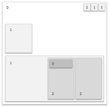
Fig. 6. A visual representation of the determination of priorities of the left mouse click.
But there are controls that do not have graphical objects at all. As mentioned before, there are controls that are assembled from multiple rendered objects. In both cases the priority is adjusted in the class of each particular control. First, determine the control where such adjustment is required.
Controls without graphical objects:
- CButtonsGroup — group of buttons.
- CDropCalendar — button to call the drop-down calendar.
- CSplitButton — split button.
- CStandardChart — standard chart.
Controls with multiple graphical objects:
- CListView — list view.
- CTable — table.
- CTextBox — text edit box.
The following methods have been added to the CElement class for setting and getting the priority:
class CElement : public CElementBase
  {
protected:
   //--- Priority of the left mouse button click
   long              m_zorder;
   //---
public:
   //--- Priority of left mouse click
   long              Z_Order(void)                             const { return(m_zorder);                }
   void              Z_Order(const long z_order);
  };
//+------------------------------------------------------------------+
//| Priority of left mouse click                                     |
//+------------------------------------------------------------------+
void CElement::Z_Order(const long z_order)
  {
   m_zorder=z_order;
   SetZorders();
  }
Controls that have no graphical objects are a kind of control modules where other controls are nested. There is nothing to set priorities to in such a control. But the priority of the nested controls is calculated relative to the priority of the main control. Therefore, it is necessary to set the values manually for everything to work correctly.
Priority for controls without objects is set to the same as that of their main control:
...
//--- Priority as in the main control, since the control does not have its own area for clicking
   CElement::Z_Order(m_main.Z_Order());
...
For all other controls, priority is set after creating the canvas object. Forms have this value equal to zero, it increases by 1 relative to the main control for every subsequently created control:
...
//--- All controls, except the form, have a higher priority than the main control
   Z_Order((dynamic_cast<CWindow*>(&this)!=NULL)? 0 : m_main.Z_Order()+1);
...
As an example, consider one more scheme. Imagine a graphical interface composed of the following controls (listed in order of creation):
- Form for the controls (CWindow). Form can have buttons (CButton) for (1) closing the program, (2) minimizing/maximizing the form and (3) tooltips, etc. Other buttons may be added in the future updates of the library, extending the capabilities of this control.
- Tabs (CTabs). In addition to the working area, where the groups of controls are located, this control contains a group of buttons (CButton), which represent the tabs.
- A list view (CListView) with a scrollbar (CScrollV), which has increment and decrement buttons (CButton), will be placed in one of the tabs.
- Another tab will contain a multiline text box (CTextBox) with horizontal (CScrollH) and vertical (CScrollV) scrollbars.
No action is required to set priorities for the graphical interface objects. Everything will be set automatically according to the scheme:
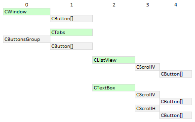
Fig. 7. Example of defining the priorities of the left mouse click.
The form receives the lowest priority with the value of 0 (zero). Buttons on the form have a priority with the value of 1.
Each component button of the control with the CTabs type (tabs) receives a priority of 1, the working area of the tabs — also a priority of 1. But the CButtonsGroup control will have a value of 0, as it does not have its own graphical object, it is merely a control module for buttons of the CButton type. In the custom class of the MQL application, use the CElement::MainPointer() method to specify the main control (see code below). Here, the form (CWindow) will be the main control, to which the CTabs control is attached. The pointer should be stored before calling the method for creating controls.
...
//--- Store the pointer to the main control
   m_tabs1.MainPointer(m_window);
...
The list view receives a priority of 2, as its main control here is CTabs. This must be specified before the control is created:
...
//--- Store the pointer to the main control
   m_listview1.MainPointer(m_tabs1);
...
There is no need to specify the main control for the scrollbar, as this is already implemented within the list view class (CListView). The same applies to all controls of the library that are components of other controls. If the scrollbar's main control is the list view (CListView) with a priority of 2, the value is increased by one (3). And for the buttons of the scrollbar, which is the main control for them, the value will be 4.
Everything that works in the list view (CListView) also works in the CTextBox control.
Application for testing the controls
An MQL application has been implemented for testing purposes. Its graphical interface contains all the controls of the library to allow you to see how all of that works. This is how it looks like:
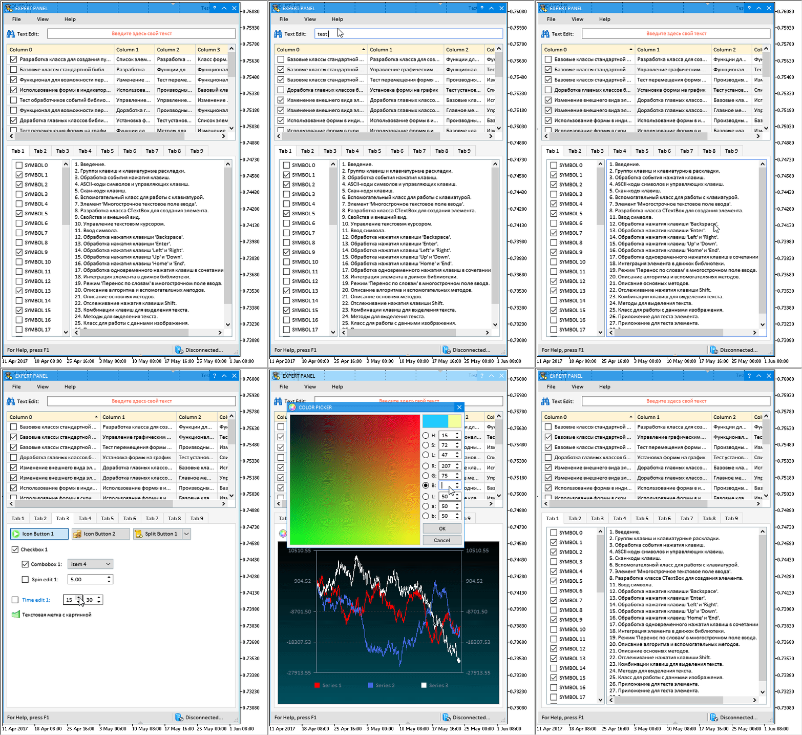
Fig. 12. Graphical interface of the test MQL application.
This test application is attached at the end of the article for a more detailed study.
Conclusion
This version of the library has significant differences from the one presented in the article Graphical Interfaces X: Text selection in the Multiline Text box (build 13). A lot of work was done, which affected almost all files of the library. Now all controls of the library are drawn on separate objects. Code readability has improved, its volume has decreased by approximately 30%, and its features have improved. A number of errors and flaws reported by users have been fixed.
If you have already started creating your MQL applications using the previous version of the library, it is recommended that you first download the new version to a separately installed copy of the MetaTrader 5 terminal in order to study and thoroughly test the library.
The library for creating graphical interfaces at the current stage of development looks like in the schematic below. This is not the final version; the library will evolve and improve in the future.
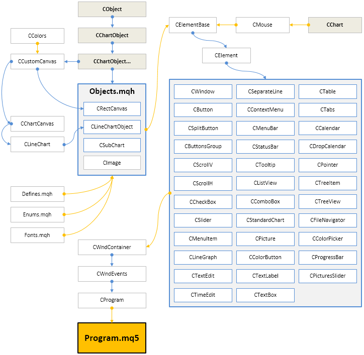
Fig. 13. Library structure at the current stage of development
If you have questions on using the material presented in those files, you can refer to the detailed description of the library development in one of the articles of this series or ask your question in the comments of this article.
Translated from Russian by MetaQuotes Ltd.
Original article: https://www.mql5.com/ru/articles/3365
Warning: All rights to these materials are reserved by MetaQuotes Ltd. Copying or reprinting of these materials in whole or in part is prohibited.
This article was written by a user of the site and reflects their personal views. MetaQuotes Ltd is not responsible for the accuracy of the information presented, nor for any consequences resulting from the use of the solutions, strategies or recommendations described.
 Patterns available when trading currency baskets. Part III
 Creating Documentation Based on MQL5 Source Code
- Free trading apps
- Over 8,000 signals for copying
- Economic news for exploring financial markets
You agree to website policy and terms of use
Well, well, well.
Anyway, I'll wait for you to make up your mind. If you don't, it's okay. It happens.
Good luck.
I challenged you to a "battle" six months ago in private. I am always ready to compare the efficiency of the technology. As soon as you have the time and desire - feel free to contact me and I will not shirk. It would be great to do it publicly. It will be very revealing and entertaining).
Maybe you should be banned for a week for trying to organise discussion (advertising) of your paid products? In such a strange way you are trying to draw attention to your person. Not only do you show your favourite self in every possible way in a thread that is not your own, but also interfere with a person's work. This will be both revealing and entertaining.
Maybe you should be banned for a week for trying to organise discussion (advertising) of your paid products? In such a strange way you are trying to draw attention to your person. Not only do you show your favourite self in every possible way in a thread that is not your own, but also interfere with a person's work. That would be both revealing and entertaining.
Moderators good, these features are implemented, even if the use of the include file is after all the source code visible. Can you let the source code in the library, including the file call library, the main programme call including the file. This is better than directly including the file to see the code is not to write!