
What is a trend and is the market structure based on trend or flat?

Introduction
According to one of the Merriam-Webster definitions, a trend is the general movement over time of a statistically detectable change and also a statistical curve reflecting such a change. In math, trends can be described using various equations — linear, logarithmic, polynomial, etc. The actual trend type is established based on the selection of its functional model by statistical methods or by smoothing the initial time series.
In economics, a trend is the overall direction of economic indicators. It is usually considered within the framework of technical analysis implying the direction of price movement or index values. According to Charles Dow, an uptrend (bullish trend) is characterized by each subsequent peak on a chart being higher than the previous ones, while a downtrend (bearish trend) means each subsequent bottom should be lower than the previous ones (see the Dow Theory). If the chart goes sideways, this means a flat movement. In case of a bullish trend, a trend line connects two or more price bottoms (the line is located below the chart as if supporting and pushing it up visually). In case of a bearish trend, a trend line connects two or more price peaks (the line is located above the chart as if resisting and pushing it down visually). Trend lines serve as support (for an uptrend) and resistance lines (for a downtrend).
However, it is not the terms we are interested in but the ability to profit from them. The terms above do not reveal how they can be formalized mathematically. All well-known definitions sound rather vague and can be interpreted in more than one way. In its turn, science likes accuracy. A definition should be clear, understandable and have only one interpretation, so that anyone who uses the method is able to reproduce the results of another person who used that same method before.
Profitable trading strategy basics
In order to move on to the concepts of a trend and flat, we first need to understand the basics, namely what needs to be done in order to make money. Any trading strategy needs to have the expected payoff above 0. Those familiar with math need no further explanations, but I will still provide them. In simple words, expected payoff (mathematical expectation of profit) is the average profit. Naturally, the average profit should exceed 0. If it is equal to 0, we get no profit. If it is below 0, then we lose money.
The expected payoff consists of the probability of a profitable deal, average profit and average loss. The equation is simple: the profit probability is multiplied by the average profit. The loss probability multiplied by the average loss is substracted from the obtained result.
m=(P(tp)*tp)-(P(sl)*sl),
where
- m — expected payoff,
- P(tp) — profitable deal probability,
- P(sl) — losing deal probability,
- tp — average profitable deal,
- sl — average losing deal.
This means that if the probability of a profitable deal is 50%, and the average size of a profitable deal is equal to the size of a losing deal, then the expected value is 0 meaning we do not earn anything. For example, the average sizes of winning and losing deals is $10, then m=(50*10)-(50*10)=0. The expected payoff for the normally distributed random variable is 0 (this is a mathematical fact). In my previous article Price series discretization, random component and "noises", I considered that the distribution of increments in real markets is very similar to normal and is suspiciously similar to random walk.
In order to make profit, we should either increase the probability of a profitable deal or increase the average size of a profitable deal and reduce the average size of a losing deal. Suppose that we increase the probability of a profitable deal up to 60%, while the average profitable deal is equal to the average losing deal = $10. Then after completing 100 deals, we will earn m=(60*10)-(40*10)=$200. If the profitable deal probability remains the same, then we will get steady profit. Similarly, if we increase the average profitable deal size, reduce the average losing deal size and leave the probability at 50%, we will also get steady profit.
This is where many traders, especially newcomers, often start experiencing a cognitive bias. They think: "Ok, I will simply make the average size of a profitable deal two times larger than the average size of a losing deal and will open positions ...say, at intersections of Moving Averages" (the entry algorithm is not important here). They subconsciously want to achieve the result: m=(50*20)-(50*10)=$500, but in reality they only get the expected payoff m=(33,3*20)-(66,6*10)=0 or, most probably, a loss due to spread and commission. I will not consider spread and commissions in this article since they are not important here. Some other traders may fall into the opposite trap: they may decide to make a profit two times less than a loss as, according to their observations, profitable deals should be triggered more often in this case. As a result, they also get a loss due to commissions and spread, since it turns out that the real expected payoff of such a system is m=(66,6*10)-(33,3*20)=0. This way, we can greatly increase a stop loss and reduce a profit bringing the probability of making a profit to 90-99% and higher, but all that profit is eventually offset by losses. This also includes all martingale systems which do not change the expected payoff as it remains 0, while getting a loss may only be greatly delayed in time.
This happens because no profitable patterns have actually been found. Instead, a trader performs deals based on a random walk. The expected payoff of a random walk is 0. If the expected payoff is 0, the probability of a profitable deal remains 50%. The only things that change are ratios (from now on, I will refer to this as "50% equilibrium"). So we either increase the probability of a profitable deal while reducing its size, or reduce the size of a profitable one the probability of a profitable deal while increasing its size. We need to somehow break this "50% equilibrium" and go beyond the zero expected payoff. It is worth noting that developing a losing system is equally difficult. Traders suffer losses due to commissions and finite deposit.
From candles to blocks
Since we trade price changes happening in points (minimum possible price change) and the profit depends on how many points the price has passed, we need to move away from the standard way of representing prices in the form of candles/bars since they greatly distort the picture and make it difficult to understand the process. Let's move on to the display method considering only the price movement in points. In this article, I will use my indicator which builds blocks after the price moves a certain number of points. The indicator is attached below. However, you are free to use any other method. Figure 1 shows how blocks are built. Blocks can be of any size, from one point to infinity in one-point increments. If the block size is 10 points, the block is closed after the price has moved 10 points vertically, and any block is formed. This block is able to close with an increment of 10 points up or down. The block features open, high, low and close prices that are similar in functions to their candle counterparts. Consider that one block is one step. This will be important later.

Figure 1
To move on to the concept of trend, we need to have some sort of a sample. In the random walk, each subsequent step does not depend on the previous one, the process has no memory and the probability of the next step changing its direction is 50%. But is the random walk based on trend or flat? Let's have a look at the random walk chart in Figure 2.

Figure 2
If we want, we can find trend and flat areas in Figure 2, but in reality this is a random walk chart sampled by H1 candles. The probability of each next step moving up or down here is 50% and does not depend on the previous step direction. When developing the concept of a trend, I will use the random walk as a basis since, as I wrote earlier, the expected payoff in this case is 0. This follows from the fact that the probability of each next step changing or maintaining its direction here is 50%. The average loss always remains equal to the average profit regardless of a number of steps a position remains open. The probability of guessing the direction is also 50%. Therefore, I will assume that the random walk chart is based neither on trend, nor on flat. It is random.
Now we have a sample we can compare a price series with, while deciding whether this price series is based on trend or flat.
Reference model development
Figure 2 shows the random walk chart sampled by H1 candles. Such a representation is not too intuitive and distorts the process perception. Let's consider its source code shown on Figure 3. I have attached the series in the CSV format below. You can download it in the terminal.

Figure 3
Figure 3 shows the random walk chart with the step of 1 point and the same chart in the form of blocks with the size of 1 point. The blocks make the steps more visible. In all other respects, the charts are identical. Since we assume that the random walk is a reference for defining the trend nature of a price series, let's build the random walk increment probability density distribution graph to compare the actual price series with the reference. This problem can be solved analytically, using the Gaussian function. However, the solution is not so visual. Even those familiar with math may not fully understand the meaning of every obtained distribution form. In order to construct the reference probability density, I will use combinatorial rules and build a table. Its fragment is displayed in Figure 4. The full Excel table is attached below.

Figure 4
The table lets us evaluate how much the random walk may go vertically in 40 steps. The qs ratio (in the table equation) allows setting the number of samples the table is build for. In the example, the table has been built for 100,000 samples. The "vertical steps" column features the number of steps the function goes vertically, while the "probability of event %" column displays the frequency of these vertical steps. For example, the process makes 40 steps in total and is able to go 40 steps up or down, we have 100,000 samples (measurements). On average, the process moves 40 vertical steps 0.00000009 times out of 100,000. 38 steps are made 0.0000036 times, while 36 steps are made 0.00007 times out of 100,000. Thus, by setting the value array in the "probability of event %" column, we can build the increment probability density distribution graph displayed in Figure 5.

Figure 5
The table allows us to obtain the reference increment probability density distribution in 40 steps for the process having the direction change and continuation probabilities of each subsequent step being equal to 50%. To make sure that all is correct, we can measure the probability density distribution for the random walk and compare it with the reference. The measurements are made for the random walk whose fragments are displayed in Figures 2 and 3. I will measure how many vertical steps the function has made within 40 steps and 100,000 samples (measurements). The results are shown in Figure 6. The Х axis shows the amplitudes of -40...0...40 vertical steps, while Y axis specifies the number of events for each number of vertical steps.

Figure 6
The reference distribution for 100,000 samples 40 steps each (calculated according to the table) is displayed in red, while the white histogram shows the actually measured 100,000 samples of the generated random walk. As we can see, the reference distribution and the histogram are almost identical. The deviations are insignificant. The more samples we use, the more accurately the actually measured values will correspond to the reference ones. Now we are able to define how much a series distribution differs from the reference one. Considering the increment probability distribution I can currently assume that the analyzed series matches the random walk as accurately as possible. I will explain why this is necessary later.
Increment distribution in the real market
To perform the measurements, let's use the actual GBPUSD chart and transform it into a block chart with the block size of 0.00022. As in the above example, calculate how much the price moved vertically in 40 steps using 100,000 samples and compare it with the reference in Figure 7.

Figure 7
As before, the reference distribution is shown in red, while the measured one is shown in white. Now I will need the simplification I have introduced before (combinatorics instead of the Gaussian function). We can see that the distribution of GBPUSD increments is symmetric relative to zero. The symmetry relative to zero indicates the absence of the distinct inclination towards up or downtrends. This means the probability of each up block being followed by the down block is equal to the probability of each down block being followed by the up block. In other words, there is no visible inclination towards upward or downward price movement.
GBPUSD distribution chart being lower and wider than the reference is much more interesting. This indicates that, within 40 steps, the price passes zero much less often than it should for the random walk and often passes vertically much more blocks. This means that the probability of each next step changing its direction is slightly less than 50%. The graph suggests that the probability of an up block being followed by another up block exceeds 50%, as is the probability of a down block being followed by another down block.
How can this be of use to us? Let's recall the expected payoff equation allowing us to evaluate profit. The entire issue of getting profit is that if the probability of a "correct" entry were more than 50%, then we would remain in profit, provided that the average loss is equal to the average profit. To make profit, we need to break the "50% equilibrium". Currently, I have not evaluated the exact reversal probability. It can be calculated using the graph, but if we assume that the continuation probability on this graph is 55%, while the reversal probability is 45%, and the average profit matches the average loss and is equal to 10 steps (step size 0.00022*10=0.0022), then the expected payoff m=(55*0.0022)-(45*0.0022)=0.121-0.099=0.022. In turn, this means that after completing 100 deals, we will remain with the profit of 0.022. If we trade 0.1 lot on GBPUSD, this means $220 of profit.
Knowing that the trend continuation probability exceeds 50%, we can use a trend continuation strategy, i.e. buy after an up block. In other words, if the trend continuation probability exceeds 50%, we use a trend-following strategy and get profit. Conversely, if we know that the probability of a reversal is greater than 50% (up blocks are more often followed by down ones), we will open a Sell position every time an up block is closed and get profit using a flat (counter-trend) strategy.
Definition of trend/flat
Trend/flat definition directly depends on a strategy we use to make profit in a particular market. If in case of the random walk, the trend continuation probability is 50% and the random walk is based neither on trend, nor on flat, then:
In case of a trend movement, the probability of a trend continuation exceeds the trend reversal probability. If the price moves 10 points, then it will move yet another 10 points in the same direction with the probability exceeding 50%.
In case of a flat movement, the probability of a trend reversal exceeds the trend continuation probability. If the price moves 10 points, then it will reverse and move another 10 points in the opposite direction with the probability exceeding 50%.
If the price is shown as blocks (as I described above) 10 points each, then the trend movement suggests opening Buy after each subsequent upward block is closed and opening Sell after each subsequent downward block. Conversely, the flat movement suggests opening Sell after each upward block and Buy after each downward one.
In other words, if the market is in trend, simply trade in its direction. If the market is flat, trade reversals. If the market is neither in trend, nor in flat, do not enter it.
Here I am not saying that it is impossible to make money on the random walk. This is a topic for a separate and thorough study.
Checking the statement
Seemingly logical statements sometimes turn out to be false. So let's check the conclusions using a simple model. To do this, create 2 processes having the reversal probabilities of 80% (Figure 8) and 20% (Figure 9).

Figure 8

Figure 9
Figure 8 shows that the measured probability density distribution is much narrower than the reference. The process returns to zero much more often. Figure 9 shows that the measured probability density distribution is much wider than the reference. The process returns to zero much less often. Hence, we can conclude that the previously performed operations are correct, as is the logic. If the probability of a reversal is less than 50%, then the distribution turns out to be wider than the reference one, and then this logic can be used to analyze the degree of trendiness of a certain instrument. Here I will introduce the concept of "trendiness", which quantitatively reflects the process inclination to continue the trend.
Estimating instrument trendiness degree
Having a reference value, we can estimate the degree of trendiness of both different timeframes of one instrument and of different instruments in absolute values. But first we need to develop a method for comparing absolute values. I suggest two methods:
- By density deviation. Select a range of amplitudes and count how many events fell into this range for the reference. Then do the same for the measured values. Divide the reference value by the measured one to get absolute units. If the value exceeds 1, then the series is of trend nature, if it is less than 1, the series is flat. For example, the entire amplitude range is -40...0...40. There is no point in counting how many values fell into -40...40, because 100% of the values fall there, so let's take another value. According to the probability theory "about 68% of values from the normal distribution are located at a distance of no more than one σ standard deviation from the average; about 95% of values are located within two standard deviations, while 99,7% can be found at no more than three standard deviations". I.e. it is considered normal to define how many events fall within a particular range and compare this to the normal distribution. However, I did not measure the standard deviation in my work as it is not necessary. Therefore, I will use absolute numbers. I prefer the following method:
- In the reference, set the sample percentage we are interested in. For example, we are interested in 80% of samples. This means we should define the range these 80% of samples fall into. Our example features 100,000 samples, which means 80% is 80,000 samples. Let's calculate the amplitude range these 80 000 samples fall into. 84.6% of samples fall into the range of -8...8, while 73.18% of samples fall into the range of -6...6. 84.6% is closer to 80%, so define how many samples fall into the range of -8...8 — these are 84,614 samples.
- Now let's define how many samples fall into the range of -8...8 on the distribution built for the series with the 80% reversal probability. In our case, the range features 100,000 samples. 84,614/100,000=0.8416. Thus, the trendiness degree is 0.8416 for the chart in Figure 8.
- Check the chart trendiness degree in Figure 9. The range of -8...8 features 52,034 samples, so we obtain the series trendiness degree with the 20% reversal probability 84,614/52,325=1.617.
- By the average amplitude. From the central limit theorem, we can conclude that the average vertical amplitude of the random walk is proportional to the power of 0.5 of the number of steps. Previously, I have made the table for constructing the reference distribution partially displayed in Figure 4. Apart from other things, it features the "average block vertically" cell calculating the average number of vertical steps passed by the reference random walk. This number was found as the sum of the "amplitude frequency" column for the range of 0...40 vertical steps divided into the number of samples (here it is 100,000). In the table, this is the value of 5.0148. This means that the average walk passes -5.0148...5.0148 vertical steps for 40 steps on the average. This is proportional to the power of 0.437 of the number of steps. The deviation from the 0.5 power arises from the fact that we take only 40 steps, and the drunken sailor theorem says that the random walk should approximately be proportional to the 0.5 power of the number of steps. Using the table, we have obtained the accurate value for the given number of steps.
- If we measure the average number of vertical steps passed by the process with the reversal probability of 50% displayed in Figures 2 and 3, we will receive 5.0363. Let's define the trendiness degree of the series with the 50% reversal probability. To do this, divide the reference value by the measured one 5.0148/5.0363=0.9957. As we can see, the trendiness degree is almost 1 suggesting that the series is as close to the random walk as possible, and our logic is correct.
- Calculate the trendiness degree for the process with the 80% reversal probability. To do this, measure its average amplitude. It is equal to 1.6495. Next, divide the measured value by the reference one 1.6495/5.0148=0.3289. The value is much lower than 1 meaning the analyzed series has low trendiness.
- Calculate the trendiness degree for the process with the 20% reversal probability. To do this, measure its average amplitude. It is equal to 9.95. Next, divide the measured value by the reference one 9.95/5.0148=1.98. The value is almost 2 times higher than 1 suggesting that the analyzed series has a high degree of trendiness.
Having such a tool, we can directly compare trendiness degrees on different scales (timeframes) of one instrument and visually evaluate its statistical parameters. As an example, let's use the same 2 processes with 20% and 80% reversal probabilities, and visually evaluate their statistical parameters at different scales. Previously, I used the block size equal to 1 point. Now I will create blocks of the greater size by multiplying each subsequent block size by the ratio of 1.1. Thus, I will get several scales with the block sizes of 1; 1.1; 1.21; 1.33 ..... 6.12. Figure 10 shows how trendiness changes with increasing scale for the process with the 80% reversal probability. Figure 11 shows the same for the process with the 20% reversal probability.

Figure 10

Figure 11
In Figures 10 and 11, the smallest scale (1 point) is located to the left, while the largest one is located to the right on the X axis. The Y axis features the instrument trendiness degree calculated using the "average amplitude" degree. In Figure 10, where the 80% reversal probability process is initially flat, the first histogram column has low trendiness, but as the scale increases, the trendiness tends to 1 (the reference random walk value). This suggests that, despite the reversal probability on the smallest scale is high, the same is not true for larger scales where the process loses "memory" and turns into the random walk. Figure 11 shows a similar picture. If initially the process has a high degree of trendiness of 2.053, it is reduced and tends to the random walk reference value on larger scales.
Figures 10 and 11 demonstrate that the process has "memory" only at the smallest scale and becomes more and more like the random walk as the scale increases. This conclusion is supported by the series creation. When generating these two processes, only the previous step direction was considered. The remaining steps were not taken into account therefore the "memory" effect quickly dissipates with the increasing scale.
Constructing the dependence of the trendiness degree on the number of steps
Real markets are different from synthetically generated series. Detecting patterns requires more analysis tools. Therefore, it would be useful not only to analyze the trendiness degree on a fixed number of steps but also evaluate how the market trendiness changes with an increase in the number of passed steps. Since reference tables can be built for a different number of steps, we can simultaneously view not only how the tool behaves with increasing step size, but also how it behaves when the number of steps increases. Figure 12 shows the dynamics of the GBPUSD trendiness degree for 10,000 samples with the block size of 0.00314, for the number of steps from 10 to 100. The leftmost histogram column has been built for 10 steps, while the rightmost one has been constructed for 100 steps. At each histogram column, the number of steps is increased by 2.

Figure 12
According to Figure 12, on the current scale, GBPUSD trendiness exceeds 1 and fluctuates in the range of 1.133-1.166 depending on the number of steps the analysis is performed for. Figure 13 shows how the trendiness degree changes with increasing scale. The graph has been built for 10,000 samples 40 steps each, for step sizes from 0.00021 to 0.00495. The leftmost histogram column has been built for the block size of 0.00021, while each subsequent histogram column exceeds the previous one 1.1 times.

Figure 13
Figure 13 shows how the trendiness degree goes down with increasing scale. While it is equal to 1.425 for the smallest scale, it already tends to 1 and is equal to 1.062 in the largest one. While the scale increases, GBPUSD behavior bears more resemblance to the behavior of a synthetic series with the 20% probability.
This approach allows us to dynamically evaluate the change speed of the trading instrument trendiness degree. The animation below shows the dynamics of the increment probability density distribution for AMD shares relative to the reference distribution. M1 timeframe candles are used as a basis. The animation is built for 40 steps, 1000 samples. The block size changes dynamically depending on the current average volatility.

Unlike GBPUSD, the distribution of the AMD shares increment probability density is not symmetric to zero. The upward trend component is clearly present. This means that the trend continuation probability is slightly higher when an upward step is followed by an upward step compared to the case when a downward step is followed by a downward step. This means it is more reasonable to open Buy deals on such an instrument. In this case, it is possible to remain profitable even while entering the market at random points.
Is the market structure based on trend or flat?
Considering all the above, we may ask a question, whether the markets are predominantly trend, flat or random-based. Answering the question will allow us to define which strategy and analysis to apply. I have analyzed more than 30 currency pairs, more than 50 stocks of both Russian and U.S. markets, as well as cryptocurrency and commodity markets. Commodity markets included metals, energy and food. Based on my research, I can conclude that:
- Most developed currency pairs have a weak trend that decreases with increasing scale and trading volume. For example, EURUSD is less trendy than GBPUSD. The probability distribution density in Forex is close to the normal distribution.
- The stock market is more trendy than currencies but trendiness is still reduced with increasing scale. Actively developing assets are more trendy than assets of developed companies. The less a company is inclined to development and the less potential it has, the less trendy its stock is. Completely "uninteresting" assets can display a flat movement. The higher the instrument liquidity, the lower the trendiness degree. Analyzing the trendiness distribution in the context of scale enables us to understand the capital flow structure. Suppose that a stock is trendy on a smaller scale and flat on a greater one. This indicates that the company is not developing, while money is invested for a short term only. In other words, the distribution forms show whether an instrument is of investment or purely speculative nature. Thus, the graph allows assessing the credit rating of a company, albeit in indirect way.
- The commodity market features trend and flat instruments depending on the current demand for raw materials and production level. If demand grows while production remains unchanged, the instrument becomes more trendy. Similarly, if demand falls, the trendiness degree also grows provided that the product level remains unchanged. If commodity supply and demand are close to the equilibrium, its movement becomes more flat.
- Cryptocurrencies are more trendy at the stage of growing interest and increasing turnover. They become more flat when public interest diminishes. As a result, the price for their entire history tends to the random walk. But as soon as a new wave starts, the instrument becomes trendy again.
Here we can draw broader conclusions, but this is a topic for another article.
Below are a few graphs describing the features of trading instruments.


- BTCUSD becomes flat when the excitement about the crypto currency subsides. Interestingly, the probability density distribution for bitcoin is symmetrical relative to zero despite the fact that visually it seems the bitcoin features an uptrend.
- AMD and AAPL shares are consistently trending with a few minor dips. The probability density distribution is shifted to the right relative to zero in the direction of upward movements. Besides, it is visually clear that these stocks have a steady upward trend.
- Oil is trending overall, even with increasing scale.
- On EURUSD, trendiness almost disappears on large scales. The instrument becomes flat on some scales. In general, it tends to the random walk probability density distribution more than others.
- The leaders of the Russian market are similar to each other – stable trends on a small scale and virtually no trend on a large scale.
Why is an instrument more trendy on a smaller scale and more flat on a greater one? In the next article, I will try to explain the reasons for such behavior. I will develop the algorithm based on the current research and see if it is profitable.
Conclusion
The concepts of trend and flat can be clearly and fully defined. Besides, it is possible to compare the trendiness degree of different instruments as well as of a single instrument on different scales. Such an analysis allows us to evaluate characteristics and features of instruments and construct trading algorithms considering individual behavior of each instrument.
Knowing statistical characteristics of an instrument and their change over time, we can get rid of optimizing parameters when developing a trading algorithm. Instead, we can perform measurements and deliberately change trading algorithm parameters depending on statistical characteristics of a traded instrument.
Below are the files with the history for 20%, 50% and 80% probability reversal graphs. Besides, there is an Excel file for constructing a reference distribution, as well as an indicator building blocks used for the analysis.
The indicator algorithm has been developed by Maxim Romanov, the indicator code has been created by Konstantin Gruzdev.
Translated from Russian by MetaQuotes Ltd.
Original article: https://www.mql5.com/ru/articles/8184
Warning: All rights to these materials are reserved by MetaQuotes Ltd. Copying or reprinting of these materials in whole or in part is prohibited.
This article was written by a user of the site and reflects their personal views. MetaQuotes Ltd is not responsible for the accuracy of the information presented, nor for any consequences resulting from the use of the solutions, strategies or recommendations described.

 Neural networks made easy (Part 2): Network training and testing
 Websockets for MetaTrader 5
 Custom symbols: Practical basics
 Price series discretization, random component and noise
- Free trading apps
- Over 8,000 signals for copying
- Economic news for exploring financial markets
You agree to website policy and terms of use
How to get it.
At the moment, no way, I am not distributing this indicator now. Perhaps in the future I will make another indicator and I can share it
The histogram bars jump suspiciously much when changing by only 1 bar: supposedly 1 bar out of 1000 should be removed from the end and 1 bar should be added at the beginning. I.e. the change should be in the proportion of 1/500 for all bars of the histogram at once, practically 1 or 2 bars should change.
I thought that maybe the speed is high and I don't notice smoothness...
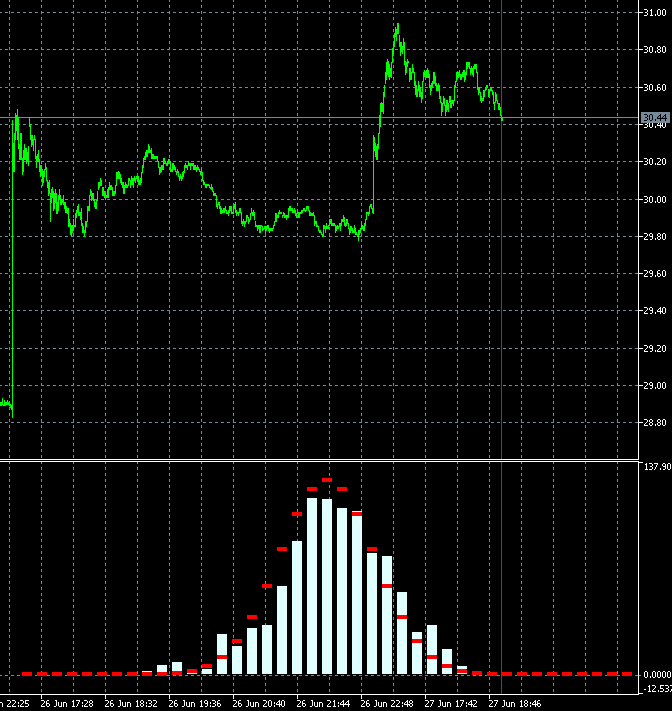
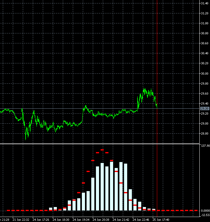
I copied 2 frames 340 and 341 with neighbouring bars and made slower:
The changes are very strong in all bars at once. Maybe there is a mistake somewhere in their calculation? 2 bars out of 1000 can't change the picture like that.
It seems that not 2 bars have changed in the calculation, but all 1000, like the window for 1000 (for a week, month...) has shifted to the past, not for 1 bar.
The histogram bars jump suspiciously much when changing by only 1 bar: supposedly 1 bar out of 1000 should be removed from the end and 1 bar should be added at the beginning. I.e. the change should be in the proportion of 1/500 for all histogram bars at once, practically 1 or 2 bars should change.
I thought that maybe the speed is high and I don't notice smoothness...
I copied 2 frames 340 and 341 with neighbouring bars and made slower:
The changes are very strong in all bars at once. Maybe there is a mistake somewhere in their calculation? 2 bars out of 1000 can't change the picture like that.
It seems that not 2 bars have changed in the calculation, but all 1000, like the window for 1000 (for a week, month...) has shifted to the past, not for 1 bar.
Yes, it may seem suspicious) But there is a peculiarity in the construction of blocks. Blocks are built not in the future, but in the past from the last date. Accordingly, when a candle comes, the price of building blocks shifts and the blocks themselves turn out to be different. A shift of even 10 points can change the configuration of blocks and, consequently, the shape of distribution.
Why I did it this way. There are 2 reasons
1. The method of building blocks is very sensitive to the initial price and I wanted to see how the distribution changes when building from different prices. This approach allowed me to see in dynamics how the distribution changes over time and how the distribution changes from the initial price.
2. I made a block indicator for a large robot and there I used exactly this approach to avoid optimising parameters for history. Since block configurations change a lot from initial conditions, a shift of 1 day forward/backward kills all optimisation of parameters for history. This way we can avoid rough fitting to history and evaluate how stable the detected patterns are. It was important for me to make a robot that works on any trading instrument without optimising parameters
Yes, it may seem suspicious) But there is a peculiarity in the construction of blocks. Blocks are built not in the future, but in the past from the last date. Accordingly, when a candle comes, the price of building blocks shifts and the blocks themselves turn out to be different. A shift of even 10 pips can change the configuration of blocks and, consequently, the shape of distribution.
Why I did it this way. There are 2 reasons
1. The block building method itself is very sensitive to the initial price and I wanted to see how the distribution changes when building from different prices. This approach allowed me to see in dynamics how the distribution changes with time and how the distribution changes with the change of the initial price.
2. I made a block indicator for a large robot and there I used exactly this approach to avoid optimising parameters for history. Since block configurations change a lot from initial conditions, a shift of 1 day forward/backward kills all optimisation of parameters for history. This way we can avoid rough fitting to history and evaluate how stable the detected patterns are. It was important for me to make a robot that works on any trading instrument without optimising parameters
I understood the reason for such jumps, but I still don't like it. Is this histogram indicator posted somewhere? It is interesting to see it live, not on a picture.
I thought about the algorithm of MA calculation: 1 removed, 1 added.
I understood the reason for such jumps, but I still don't like it. Is this histogram indicator posted somewhere? It is interesting to see it live, not on a picture.
No, I have not posted a ready indicator