

A simple Daytrading Strategy
Found a good article about a very interestint Daytrading Strategy especially for different Indizes. Whole Article you found in the Source URL. Check it:
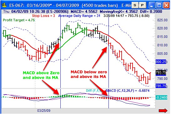
SEE ATTACHED FILES FOR PICTURE DESCRIPTION!
This strategy is a simple trend following strategy that should work in any market, but as a day trader I prefer to trade futures. At Rockwell Trading, we trade this strategy live in our Live Trading Roomson the following markets:
- E-mini S&P
- E-mini Dow
- E-mini S&P MidCap
- FX Euro
- 30-Year T-Bonds
When selecting a timeframe, we prefer tick charts for this strategy. If you’re not familiar with tick charts, a tick bar completes after a specific number of trades, instead of a time frame like a 5 or 15 minute bar. As an example, I use a 4,500 tick chart for the E-mini S&P. This means that a bar or a candle is plotted every 4,500 trades. A bar can take 2 to 5 minutes to complete, but the actual time it takes to complete really doesn’t matter. All that counts is the amount of trades that have been executed in the market.
The advantage of using tick charts is that the number of bars will increase and decrease depending on volatility. When the markets are moving and there are more trades, you will have more bars. If the markets are quiet you will have fewer bars.
As an example, a setting of 4,500 trades for the E-mini S&P will typically produce between 7 and 10 bars during the 17 hour overnight session (16:30 pm EST and 9:30 am EST) since the E-mini S&P is not actively traded during this time. However, in the first two hours of active trading (between 9:30 am and 11:30 am EST), you can expect between 16 and 24 bars, depending on the trading activity of the day.
Tick charts remove the time factor from charts and add volume and volatility to your bars. Give it a try and you’ll probably find that tick charts are an easier way to see intraday movements in the markets you trade.
Note: We update tick settings for the markets we follow 2-3 times per year, since volatility in the markets can change.
The next step is to add the popular MACD Indicator to the chart. Just use the standard settings:
- 26 for the slow moving average
- 12 for the fast moving average and
- 9 for the moving average of the MACD – the “signal line”
I am using the MACD to identify the direction of the market, but I am using it with a little twist:
- The market is in an uptrend if the MACD is above its signal line and above the zero line.
- The market is in a downtrend if the MACD is below its signal line and below the zero line.
My charting software allows me to color the bars based on certain criteria, and therefore I am coloring the bars in an uptrend (according to the definition above) green and the bars in a downtrend red.


