The TREND HARMONY indicator automates deep trend analysis and generates visualizations for you. It helps taking control of your trades by eliminating uncertainty and revolutionize your trading experience with precision and insight through the TREND HARMONY Multi Timeframe indicator – your ultimate trend visualization indicator for both MT4 and MT5 platform.
How TREND HARMONY Multi Timeframe Trend & Phase Visualizer Empowers You
Time-Saving: Streamline your analysis process by viewing trends across multiple timeframes at a glance. The indicator works on any trading instrument and timeframe.
Historical Reference Lines: Highlights prices of past expansive impulsive start points on each timeframe with thick horizontal lines, serving as strong support or resistance levels. Enhance decision-making by leveraging historical reference lines and projecting trend continuations.
Trend Continuation Projection: Anticipate trend continuation by identifying trend reversals at the end of correction phases.
Trend Change Signals: signals potential trend changes when current price surpasses the initiation points of the existing expansion on each timeframe.
Adaptability: Tailor your strategy to the current market phase, ensuring you're always one step ahead.
Key features:
· Multi-Timeframe Analysis:
Analyze your chosen instrument effortlessly across 6 different timeframes simultaneously. Gain a holistic view of market trends, empowering well-informed decision-making and optimizing trading focus.
· Trend Identification:
Our advanced algorithm accurately identifies and illustrates trend waves. Visualize market trends in unprecedented detail, enabling you to ride the waves of success.
· Trend Phase Determination:
Easily determine the trend phases of a specific instrument by analyzing 6 timeframes simultaneously, allowing strategic adaptation. Clearly differentiate between impulsive, corrective and reversing phases enhancing understanding of market dynamics.
· Sideways Signalization:
The indicator signals when the market enters Sideways phase, preventing you from entering trades when it's best to stay on the sidelines.
· Filtering of False breakout and fake trend changes:
You can set flexible threshold for filtering out false breakouts and fake trend changes, By cleaning out such "noises" you can see and trust well established trends better.
· Signals if TrendHarmony is formed or ended:
The indicator displays arrows and sends notifications when all timeframes are in the same direction and in expansive or trend continuation phase.
· Indication of retarcement levels while waves forming:
You can efforlessly identify retracement (support/resistance) levels in corrective waves, in trend reversal phases and in case of trend changes.
How It Guides Your Trading Journey
The TREND HARMONY indicator assists in prioritise financial instruments to choose for trade on a specific trading day by identifying periods with a higher probability of significant winnings.
- Trend identification:
You essentially identify and decipher a trend by connecting a series of highs or lows. This will give you an idea of whether it is an uptrend or sideways trend or a downtrend.
Let us look at an uptrend first. If you can connect a series of chart low-points sloping upward, you have an uptrend.
Established uptrend is signalized by the indicator to each timeframe with a ![]() icon on the Dashboard in the corner.
icon on the Dashboard in the corner.
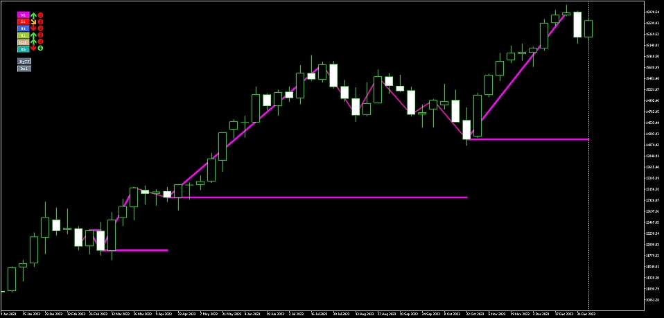
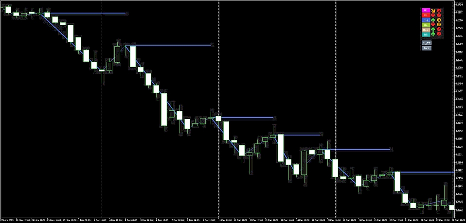
If you can connect a series of chart high points sloping downward, you have a downtrend. A downtrend is always characterized by lower tops and lower bottoms.
Established downtrend is signalized by the indicator to each timeframe with a ![]() icon on the Dashboard in the corner.
icon on the Dashboard in the corner.
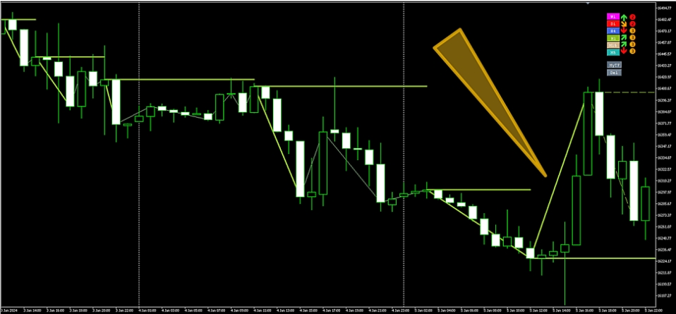
if the starting point of the last trend impulse falls, i.e. the price significantly breaks through, then we are talking about a changing trend.
Changing trend is signalized by the indicator to each timeframe with a ![]() or a
or a ![]() icon on the dashboard depending on the direction of the change.
icon on the dashboard depending on the direction of the change.
In the next chart a downtrend changes to a forming uptrend, as you can see on the Dashboard at H1 Timeframe it shows a ![]() icon on the right upper corner:
icon on the right upper corner:
As a general rule well-established trend on longer timeframes are stronger against short-term trends. The indicator helps to focus on trade opportunities in the direction of greater forces and aids in exiting the market when impulsive movements end.
- Trend Phase identification:
As the trending markets consists of consecutive trend-directional impulses and corrections, the indicator breaks them down into several phases:
Phase 1. Expansive implulse: ![]()
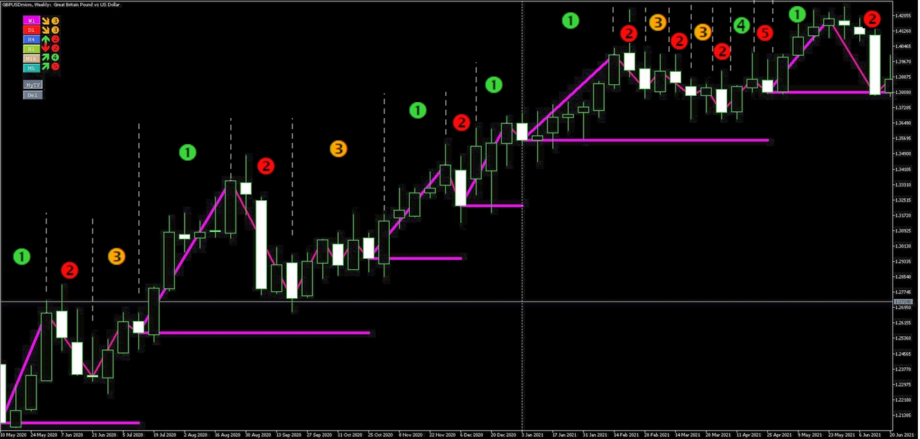
If the price reaches a new high in an uptrend or a new low in a downtrend, the impulse is expansive. This phase typically offers the greatest potential. In each timeframe the expansive impulse is marked as green phase1 icon ( ![]() ) on the dashboard and marked with a thicker trend line on the price chart.
) on the dashboard and marked with a thicker trend line on the price chart.
Additionally, the indicator marks the past initiation prices of the trending impulse with thick horizontal lines, functioning as strong support or resistance. These horizontal lines generally function as strong support in uptrends or resistance in downtrends. A break in this line signals a potential trend reversal. The longer the timeframe the more significant the likelihood of a trend reversal.
The following chart shows the recurring repetition of market phases:
Phase 2. Corrective impulse: ![]()
The indicator divides the correction into two main phases: Corrective Impulse and Correction of corrective impulse.
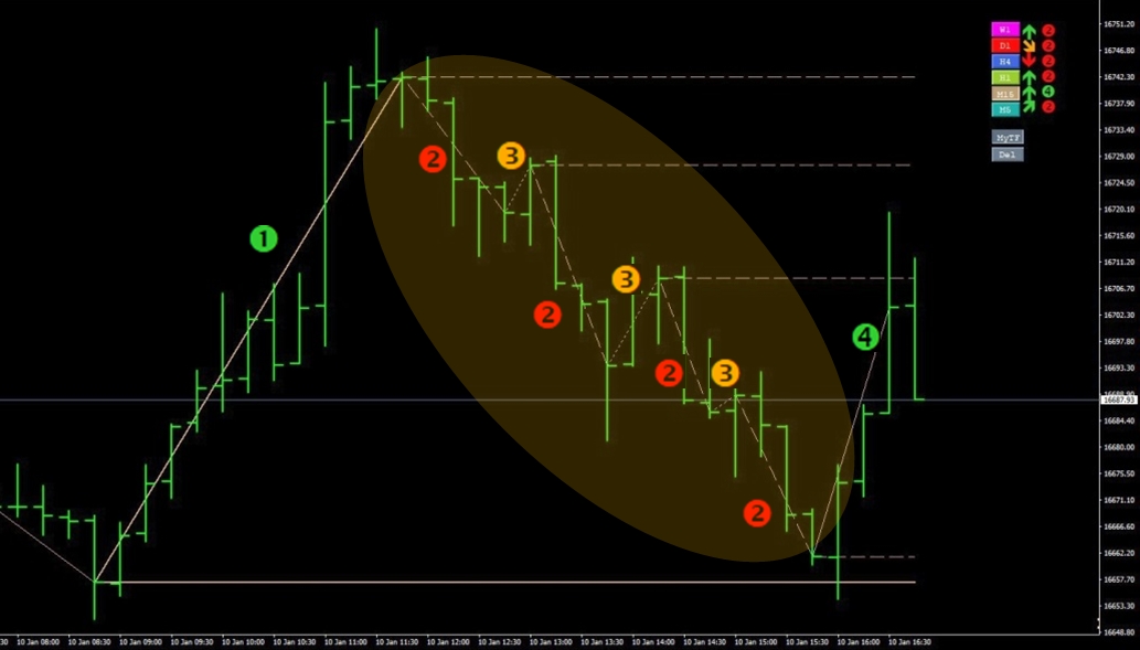
A corrective impulse is when the price accelerates into the direction opposite to the trend with an impulsive movement. In each timeframe, the indicator marks the corrective impulse as Phase 2 (using the ![]() icon on the dashboard) and with a dashed trend line in the price chart. Additionally, the indicator marks the starting point of each corrective impulse with a dashed horizontal line, because these are usually resistance/support levels when the trend continues. (Until this price - price of the last corrective impulse - is broken, the new expansive impulse cannot start. Once that happens, we move into Phase 4. - see details below)
icon on the dashboard) and with a dashed trend line in the price chart. Additionally, the indicator marks the starting point of each corrective impulse with a dashed horizontal line, because these are usually resistance/support levels when the trend continues. (Until this price - price of the last corrective impulse - is broken, the new expansive impulse cannot start. Once that happens, we move into Phase 4. - see details below)
Phase 3. Correction of corrective impulse: ![]()
The next phase of the market trend cycle is the correction of the corrective impulses. Although these moves are actually to the direction of the original trend, they usually involves low-speed and uncertain movements, because the corrective impulse has already been exhausted, but the market's commitment to the direction of the main trend has still not arrived. Again, unless the starting price of the last corrective impulse). In each timeframe, the indicator marks the correction of the corrective impulse as Phase 3 (using the ![]() icon on the dashboard) with a dotted trend line suggesting that this is the least profitable stage of the trends.
icon on the dashboard) with a dotted trend line suggesting that this is the least profitable stage of the trends.
How to corrective phases usually follow each other (until a break into the main trend direction):
Phase 4. Impulsive move in trend direction, potential start of another expansion: ![]()
When the price breaks the starting point of the (last) corrective impulse, it turns in the trend direction again, marking the possible beginning of the next expansion. The indicator forecasts main trend continuation when the corrective trend turns into trend-oriented waves.
If there were several corrective impulses during the correction phase, the price may still get stuck at the starting points of the earlier corrective impulses. They act as support or resistance, so the indicator marks these levels with a dashed line (as mentioned at phase 2.)
If there is no corrective wave on a higher timeframe, only one corrective move, it is important to observe the trend reversal of the corrective waves on lower timeframes.
Phase 5. Correction of Trending impulse: ![]()
When the trending impulse stops at such resistance or support, it usually enters a shorter correction phase (usually on shorter timeframes) until starting a new trending impulse. In each timeframe, the indicator marks this phase as Phase 5 with a dotted trend line.
When the trend does not develop further to the direction of the main trend it might run into another corrective cycle; in this case the starting point(s) of Phase 4 impulse(s) is indicated with a dotted trend line since these prices usually behave aas support/resistance prices.
How correction turns back to main trend direction:
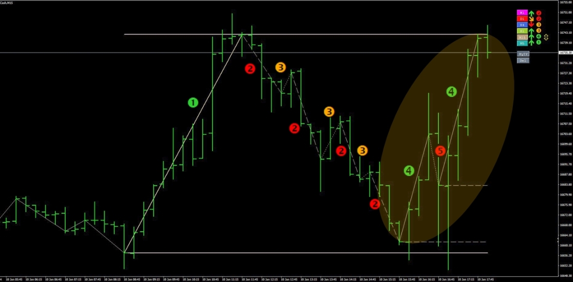
Starting price of the corrective impulses can stop trending impulses. If the last one stops it, it can cause the following market situation: Sideways.
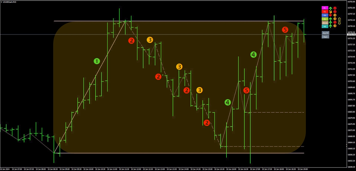
Sideways indicated:
When the last support/resistance is broken, the market enters the expansion phase ![]() again and the trend steps into the next expansive impulse.
again and the trend steps into the next expansive impulse.
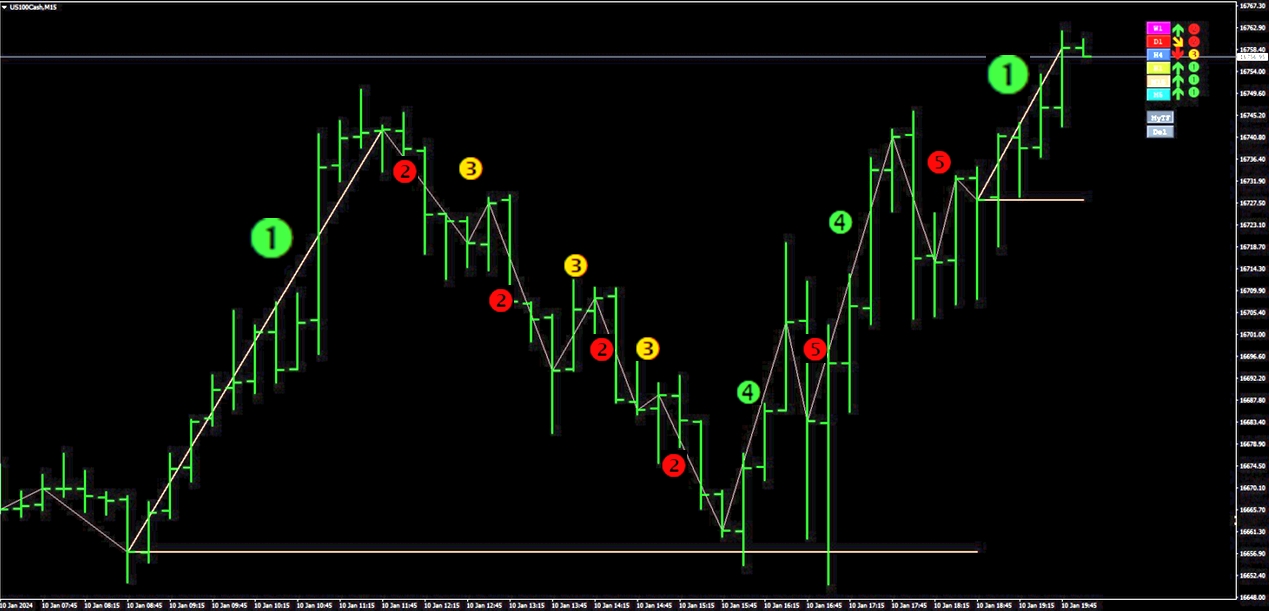
The market can be in different directions and phases on different timeframes, but all of them go through the above phases. The only differences are: dynamics and the specific course - involving some noise which is usually more significant on shorter periods. The longer the timeframe naturally the slower it changes; and so, longer timeframes represent greater market forces.
Overall, it might be stated that the greatest trading potential in a well-established trend arises when all the timeframes are in trend-impulsive phases - in Phase 1 or in phase 4.
That's when the trend comes into harmony! The TREND HARMONY indicator marks these phases highlighted, the ‘Chartinfo’ panel turns into green or red - depending on the trend direction - and an affirmative extra arrow appears at the dashboard.
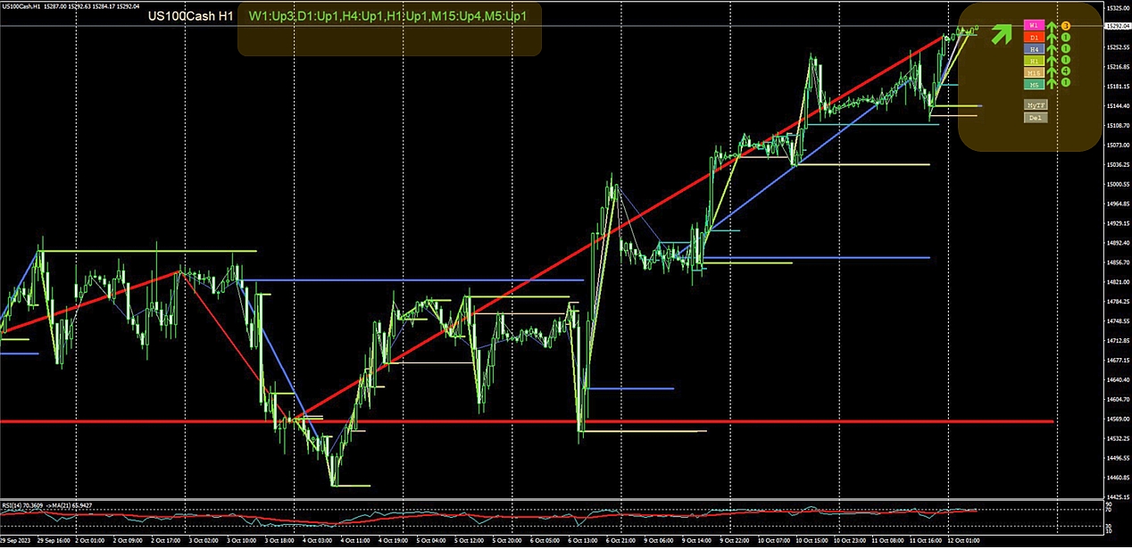
As already presented above, the indicator also identifies if a timeframe is in a sideways drift. When the price oscillates within a fairly stable range without forming any distinct trends over some period of time, an upper and a lower sideways line appears on the chart with the color of the given timeframe as a price support and resistance. Sideways drift is marked as a ![]() icon on the dashboard and marked with parallel trend lines on the price chart above and below the formed sideways. Additionally, if the 'Chartinfo' panel is ON an extra (s!) appears near the relevant timeframe. Trading a sideways market can be tricky, although certain options strategies may maximize payoff in such situations.
icon on the dashboard and marked with parallel trend lines on the price chart above and below the formed sideways. Additionally, if the 'Chartinfo' panel is ON an extra (s!) appears near the relevant timeframe. Trading a sideways market can be tricky, although certain options strategies may maximize payoff in such situations.
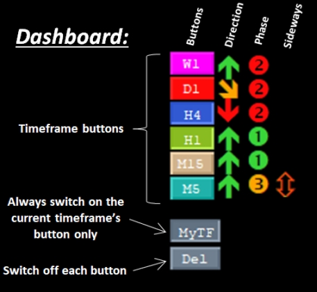
Using a given timeframe you can see other timeframes' trendlines and above mentioned support/resistance prices as well by swithing ON or OFF the TF Button of the related timeframe at the Dashboeard. Every timeframe have their own colors you can customize at the input settings of the indicator.
These colors can alse come back at the dashboard. The following figure presents the setup of the dashboard:
Legend of Line styles:
· Solid thick trend line: Phase 1 – Expansive impulse;
· Solid thick horizontal line: Starting price of Expansive impulse;
· Upper and Lower Solid thick horizontal lines: sideways market upper and lower lines;
· Dashed trend line: Phase 2 – Corrective impulse;
· Dashed horizontal line: Starting price of the Corrective impulse OR the impulsive move in the trend direction;
· Dotted trend line: Phase 3 or Phase 5 – Correction of corrective impulse OR Correction of trending impulse;
· Solid thin trend line: Phase 4 – Impulsive move in trend direction (not expansive impulse yet);
Details of Chartinfo panel:
![]()
· Name of instrument + current Timeframe;
· Timeframes from 0 to 5:
o Trend direction: Up – 2U (Turning Up) – Dn (Down) – 2D (Turning Down)
o Trend phase: 1-5 (See description of trend phases above)
o Sideways signal (optional): (s!) only if exists
Input parameters and default values:
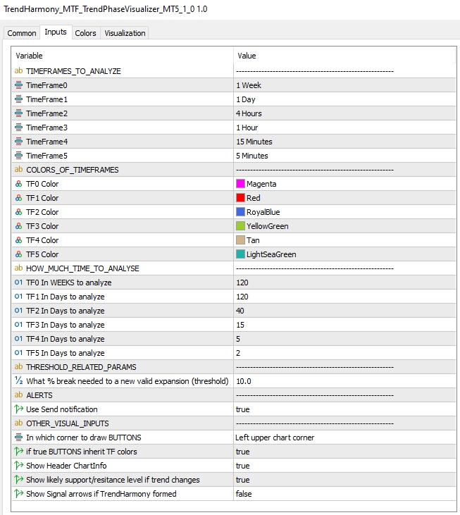
TIMEFRAMES_TO_ANALYZE group enables the custumization of the 6 timeframes.
COLORS_OF_TIMEFRAMES group enables the custumization of the colors of the 6 timeframes.
HOW_MUCH_TIME_TO_ANALYSE GROUP enables to customize analysis periods to each timeframes. Please be aware that the first Timeframe is defined in Weeks, not in Days as the other timeframes.
In THRESHOLD_RELATED_PARAM section the 'What % break needed to a new valid expansion (threshold)' parameter defines what level of breakout is not yet considered as validated breakout. Once the price goes over this threshold the breakout becomes valid and the indicator draws the related trendline as a new expansive move. 10% means that the price must go over or below the start or end price of the last expansive impulse by 10% based on the width of the impulse.
In OTHER_VISUAL_INPUTS group:
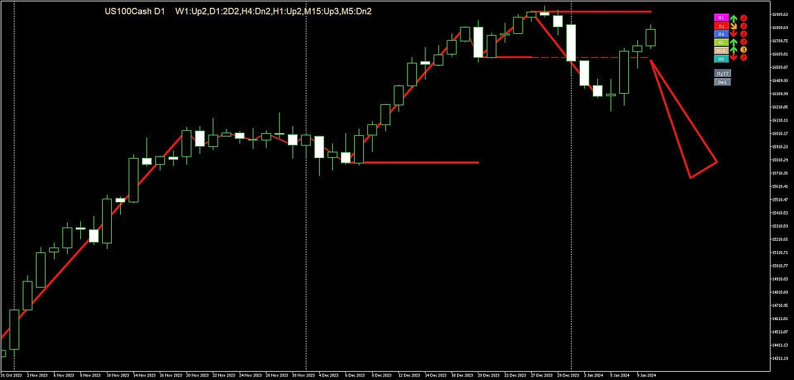
If the "Show likely support/resitance level if trend changes" parameter is set true, the indicator signalizes the broken price with a dashed horizontal line until a new expansive impulse is formed.
An example of such event (in this case the price broke this resistance level):
If the "Show Signal arrows if TrendHarmony formed" parameter is set true the indicator draw "BUY" or "SELL" signal arrows on the price line if the TREND HARMONY is formed and draws "CLOSE" arrows if the harmony disappears. In the background the indicator calculates the potential gain could have been earned with the current settings.
**For proper operation please make sure historical data is downloaded for every timeframe or reduce analyzed period (at HOW_MUCH_TIME_TO_ANALYSE inputs)!**
NOTE: TREND HARMONY - MTF Trend & Phase Visualizer is compatible with MetaTrader 4 and MetaTrader 5 and is designed to enhance, not replace, your trading strategy. Trade responsibly!
For MT4 Version: Click here.
For MT5 Version: Click here.
Feel free to post your questions or comments below, thank you!

