Fan sayfamıza katılın

Acceleration&Speed Indicator - MetaTrader 4 için gösterge
- Görüntülemeler:
- 31881
- Derecelendirme:
- Yayınlandı:
- Güncellendi:
-
 Alım-satım fırsatlarını kaçırıyorsunuz:
- Ücretsiz alım-satım uygulamaları
- İşlem kopyalama için 8.000'den fazla sinyal
- Finansal piyasaları keşfetmek için ekonomik haberler
Kayıt Giriş yapWeb sitesi politikasını ve kullanım şartlarını kabul edersiniz
Hesabınız yoksa, lütfen kaydolun -
 Bu koda dayalı bir robota veya göstergeye mi ihtiyacınız var? Freelance üzerinden sipariş edin
Freelance'e git
Bu koda dayalı bir robota veya göstergeye mi ihtiyacınız var? Freelance üzerinden sipariş edin
Freelance'e git
The idea of the indicator is very simple and obvious. Strange that similar indicators haven't appeared yet.
Prices constantly change - go up or down. If we take N bars for a period of time, the difference of prices, for example closing prices at the ends of the period, is equal to the speed of closing price change on this period of time.
If the speed is found, the acceleration can also be found.
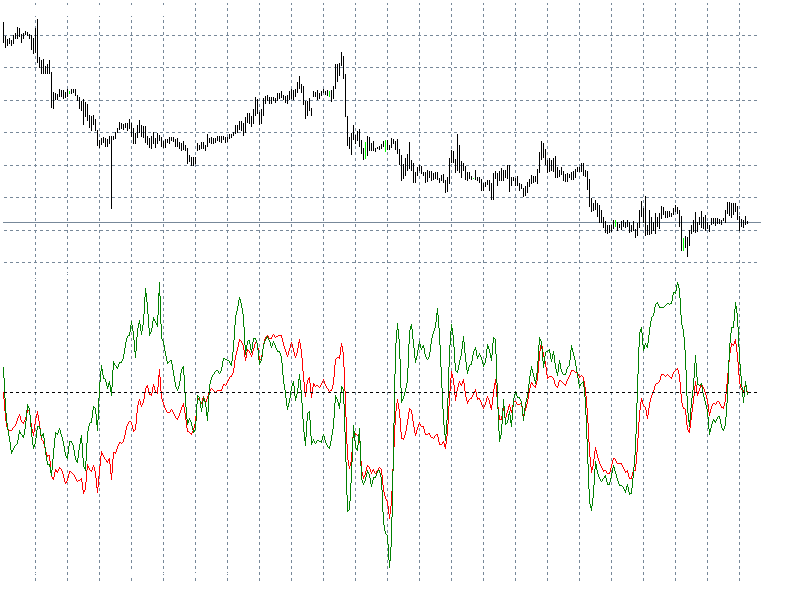
The red line is speed, the green one is acceleration. They are calculated in points.
So, what is obvious at the picture?
1. The speed has boundary values.
2. The cyclic nature.
3. The speed and the acceleration do not always have the same direction.
I have also made some changes: added speed charts (yellow) and acceleration (blue) with a shift into history; added a switcher of charts visibility.
MetaQuotes Ltd tarafından Rusçadan çevrilmiştir.
Orijinal kod: https://www.mql5.com/ru/code/7743
Awesome_Signal - Extended Awesome
The standard Awesome with some amendments: signal line, setup of quick, slow, signal line, shifting of the signal line.
ind_FullSymbol_v1
Shows the full symbol name on a chart.
 Z-Score Calculation
The library helps to organize calculations of Max, Min, universal mean, standard deviation, skew, kurtosis, and Z-score, on the data array.
TREND_alexcud
A multi-timeframe indicator. It shows the trend direction of several time charts in a separate window.