POC, VAH and VAL: how to read a volume profile in MetaTrader 5

A candle chart tells you where price went. It does not tell you where the trading actually happened. Those are different questions, and the second one is often the more useful of the two.
A volume profile answers the second question. Instead of plotting volume along the bottom of the chart against time, it plots volume sideways against price, so you can see how much trade took place at each level. Three readings come out of it: the POC, the VAH and the VAL. This guide explains what each one is, how it is calculated, how traders read it, and how to get a profile onto an MT5 chart.
What the profile is showing
Take one session. Instead of asking "what was the price at 10:15", ask "how much volume changed hands between 1.1640 and 1.1642". Do that for every price band in the session and you get a horizontal histogram: long bars where a lot of business was done, short bars where price passed through quickly.
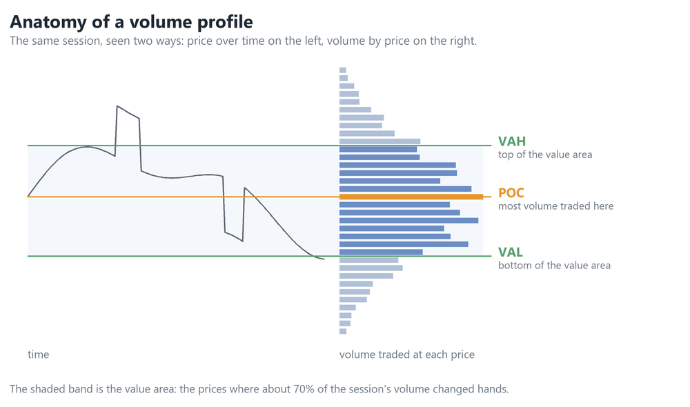
The left panel is the price path you already know. The right panel is the same session's volume, stacked by price.
How the volume gets into the rows
This step is skipped in almost every explanation, and it determines what the numbers actually mean.
A bar of MT5 history gives you an open, high, low, close and one volume total. It does not record how that total was distributed across the prices inside the bar. So a profile built from bar data has to apply an allocation rule, and the rule is a modelling choice rather than a measurement.
The common rule, and the one BrioQuant Range Volume Profile uses, is to spread each bar's volume evenly across every price row its high-to-low range touches. A bar covering ten rows contributes a tenth of its volume to each of them. Rows are then summed across every bar in the range.
Two consequences follow directly, and they are worth holding on to:
- A bar that travels a long way spreads its volume thinly. A bar that stays in a tight range concentrates all of it into a few rows. This is what makes a quiet, rotational period build a fat profile and a fast directional move leave a thin one.
- The profile is a model of the session, not a tape of it. A tick-by-tick profile built from every quote would place volume differently inside each bar. The overall shape is usually similar; the exact POC row can move.
If you want a profile built from ticks rather than bars, that is a different and heavier calculation, and it is worth knowing which one a given tool performs before comparing its levels to someone else's.
POC - the point of control
The POC is the single price row holding the most volume once the allocation above has been applied. Mechanically that is all it is: the tallest bar in the histogram, usually quoted at the centre price of that row.
How traders use it is a separate matter, and these are interpretations rather than properties of the calculation:
- As a reference the market returns to. Price that leaves the POC frequently trades back through it. The reasoning offered is that this is where the most participants have positions to manage.
- As a reference for bias. Trading persistently above the previous session's POC is a different situation from trading persistently below it.
The row's height depends on the shape of the distribution it came from. A POC taken from a session that rotated for hours sits on a broad, well-populated shelf. A POC taken from a session that trended sits on a shallow one, and a small change in the row count can move it. The number looks identical in both cases, which is why the shape matters as much as the level.
The value area, VAH and VAL
The value area is the band of prices containing a chosen share of the session's volume, conventionally 70%, built outward from the POC. Its top edge is the VAH (value area high) and its bottom edge is the VAL (value area low).
The walk itself is worth stating explicitly, because platforms do it differently and the same profile can produce different edges. Some expand a row at a time, some take rows in pairs, some rank all rows by volume and take them in order until the target is met.
BrioQuant Range Volume Profile expands one row at a time: start at the POC, compare the row immediately above the current band with the row immediately below it, add whichever holds more volume, and repeat until the accumulated volume reaches the target. That is why a value area is usually lopsided rather than centred on the POC.
The 70% figure is a convention inherited from market profile work, not a property of markets. Some platforms default to 68%, some to 70%, and the input is adjustable. It is sometimes described as "about one standard deviation", but that equivalence only holds for a normal distribution, and a value area expanded outward from a POC can be skewed or have two peaks. Treat 70% as the definition it is: the share of volume you have chosen to call value.
What the edges give you is a defined boundary for that session. Most of the trading happened inside it. Comparatively little happened outside it.
Reading it: acceptance and rejection
Most of the practical use is in watching what happens when price reaches an edge. The two cases traders separate are these:
- Rejection. Price moves above the VAH, little volume accumulates up there, and it falls back inside. On the profile this leaves a thin spike. This is the failed-breakout case, and the value area edge is commonly used as a fade level.
- Acceptance. Price moves above the VAH and keeps trading there, building new volume. The profile begins thickening at the new level. This is the case where fading the edge goes badly.
The distinction is not the move itself but whether volume follows it. That is exactly what a profile shows you and a candle chart does not, and it is the most useful habit to build from this tool. It is also a reading of the chart rather than a signal: the profile tells you volume is or is not accumulating, and what you do about that is a separate decision.
Three shapes worth recognising
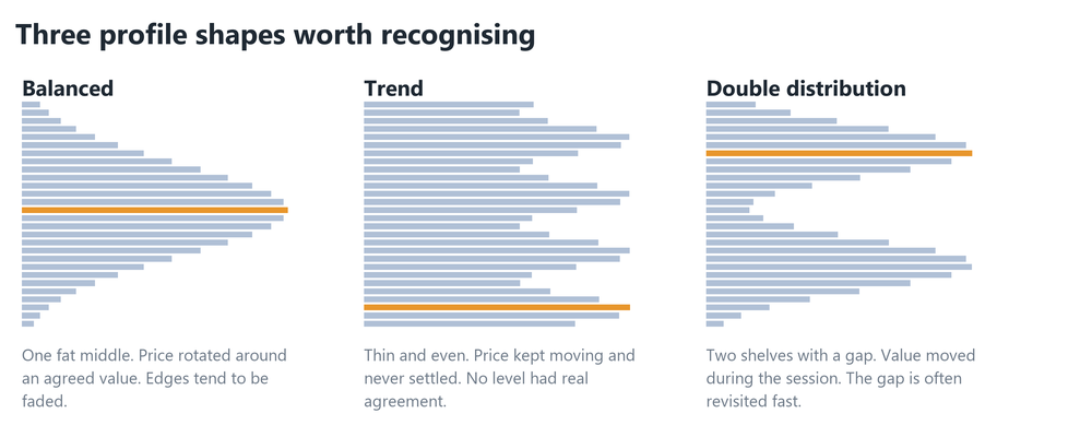
A balanced profile means the session rotated around one area for most of its length. A trend profile means price kept moving and no single row accumulated much, so any level taken from it rests on very little volume. A double distribution means the session traded around one area, moved, and then traded around another; the thin gap between the shelves was crossed quickly, and traders watch it because it is often crossed quickly again.
The caveat that matters on forex
This one changes how much weight the numbers deserve.
Volume profiles come from the futures pits, where volume means contracts traded through a central exchange. Forex has no central exchange. What your MT5 terminal reports for a currency pair is almost always tick volume - the number of price changes in a bar, not the quantity traded.
Tick volume is used as a proxy on the reasoning that more activity produces more price updates. It is a proxy, not a measurement, and two things follow:
- Your profile is broker-specific. A different feed updates at a different rate and produces a different POC. Two traders comparing exact levels across two brokers are comparing two different datasets.
- On indices, metals and futures CFDs, check where a non-zero real-volume field is actually coming from. A populated field does not by itself mean centrally cleared exchange volume; on a CFD it can be the broker's own internal dealt volume, which is a sample of one venue's flow. If the feed genuinely carries exchange data for that instrument, it is the better input. Ask the broker rather than assuming.
None of this makes the tool useless. It does mean treating the POC as a zone rather than an exact price, and being sceptical of anyone quoting a tick-volume POC to five decimal places as though it were exchange data.
Putting one on an MT5 chart
MetaTrader 5 does not include a volume profile as standard. The chart's built-in volume indicator plots volume against time along the bottom, which is a different thing entirely.
You need an indicator that bins volume by price. BrioQuant Range Volume Profile is a free one that does this over a range you choose, and it is the one used for the steps below.
- Install it from the Market tab in MetaTrader, then drag it onto a chart from the Navigator.
- Pick the range the profile is built over. A fixed range with two draggable handles is the most useful starting point - put them around yesterday's session and look at what you get.
- Set Applied volume to Tick on forex. Switch it to Real only if you have established that your broker supplies genuine volume for that symbol.
- Leave the value area at 70% until you have a reason to change it, and remember it is your choice rather than a fixed property.
- Set the row count by looking at the result. Too few rows and neighbouring prices merge into one meaningless block; too many and every row holds a fragment and the POC jumps around. The right number depends on the range's height and the symbol's tick size, so change it and watch the profile settle. On a single forex session, somewhere around 50 to 80 rows is a reasonable place to begin looking.
If you want the profile to reset per trading session rather than over a range you drag, BrioQuant Session Volume Profile builds a separate profile for the Asia, London and New York sessions and tracks untested POCs across days.
Common mistakes
- Treating the POC as a signal. It is a reference level, not an entry. It tells you where the volume was, not what to do next.
- Building the profile over an arbitrary window. A profile over "the last 500 bars" spans several sessions with different participants and merges them. Pick a range that means something - a session, a day, a swing.
- Comparing levels across tools without checking the method. Two indicators can disagree on the same chart simply because one expands the value area a row at a time and the other ranks rows by volume, or because one allocates bar volume evenly and the other uses ticks.
- Ignoring the shape. A POC from a trend profile rests on far less volume than a POC from a balanced one, but they look identical when quoted as a number.
- Forgetting the clock. Session profiles depend entirely on your broker's server time. If your sessions look an hour out, that is a timezone offset rather than a fault in the tool.
In short
The POC is the price row holding the most volume once each bar's volume has been spread across the rows it covers. The value area is the band expanded outward from the POC until it holds about 70% of the total, edged by the VAH and VAL. The useful skill is watching whether price that leaves the value area attracts volume or does not - and remembering that on forex you are reading a tick-volume model, not exchange data.