Imperial Dominator
You can verify everything described in this article in the Strategy Tester using the EA's Market demo version.
Want to know which top-ranked MQL5 Market EA uses the techniques described in this article? Send me a private message.
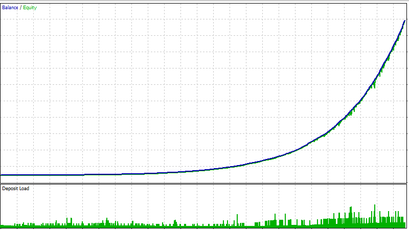
This chart comes from the same Expert Advisor this article is about.
Drawdowns are minimal. The curve rises evenly.
That is exactly the kind of chart shown when someone wants to sell something.
The test did not produce it. A person did.
And in this article I will show how that is done.
The Expert Advisor is available, and you can repeat everything yourself.
EA Input Parameters Explained
First — what is this EA anyway?
Imperial Dominator is a simple Expert Advisor.
Once a day at 11:00 (08:00 GMT) it builds a price range from the high and low of the last eight hours and places Buy Stop and Sell Stop orders at the edges of that range.
Each signal is split into seven equal orders with a fixed Stop Loss and Take Profit.
Open positions have a trailing Stop Loss, and new profit is used to force-close older losing positions.
That is all.
Code like this can be ordered in the MQL5 Freelance section for a few dozen dollars.
In the Market storefront, marketing — not the code — drives up the EA price from a few dozen to several hundred.
But why show an EA like this at all?
Because in this article we will not look only at the final result.
We will take one and the same Expert Advisor and look, step by step, at how this beautiful result is built.
You will be able to run the EA in the MetaTrader 5 Strategy Tester, inspect individual trades, change the settings, and check my conclusions.
You do not have to take my word for it.
Verify everything yourself.
Layer one: the ratio
First look at the settings.
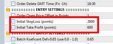
Take Profit is 600 p, but Stop Loss is 2600 p.
p = price points.
So the ratio shown in the settings is about 1 to 4.3.
In another Expert Advisor the numbers will be different, with a similar proportion, and they will look just as acceptable.
But this is only the storefront.
The system does not close most trades at the 600-point Take Profit.
The real ratio is visible in the trades.
Look at one trade
Run visual testing and watch one trade from start to finish.
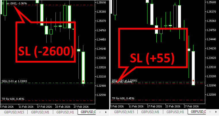
The position opens.
Take Profit is 600 p — exactly as written in the settings.
Price moves forward.
The trailing stop moves the Stop Loss and locks in about 55 points of profit.
Price comes back.
The position closes with about 55 points of profit.
The 600 p Take Profit was not reached.
And in most trades it is not reached.
So in the settings we see:
600 p vs 2600 p.
But in the actual trade we see:
about 55 p vs 2600 p.
That is roughly 1 to 47.
To offset one 2600-point loss with 55-point winning trades, you need about 47 such wins.
This is exactly where the high win rate comes from.
Many small wins.
Rare large losses.
And that is why the equity curve can look very smooth.
The system did not become better because it wins often.
It simply loses rarely — and when it loses, the loss is large.
You do not see this ratio in the settings window.
You cannot understand it by simply looking at the Take Profit and Stop Loss values.
It becomes visible when you look at individual trades.
I would call a system like this a Loss-Delayed EA.
It is not an EA that prevents the loss. It is an EA that postpones the loss as far as possible.
Check it yourself: trades
Run the Expert Advisor in visual mode and watch ten trades in a row.
Watch where the Stop Loss is after a few minutes, and at what result the position actually closes.
Do not look only at what is written in the settings.
Look at what actually happens to the trade.
An EA does not have to be stable for years in order to sell well.
It needs a period in which it looks extremely good.
A Loss-Delayed EA can produce that period by its own design — most trades are small pluses, while the large loss is postponed.
So a long winning streak is not only a good result.
It can become a marketing window.
Small accounts with small lot sizes are run continuously specifically for MQL5 signals. As soon as losses appear, that account is written off and a new one takes its place.
But the moment one of them shows a longer no-loss streak — active marketing starts.
In such periods the signal is kept alive for as long as possible, so that as much as possible can be sold. And when the losses become too large, the signal is simply deleted to make room for the next one already waiting for its moment in the spotlight.
Layer two: split entry
Now look at the same entry in the history.
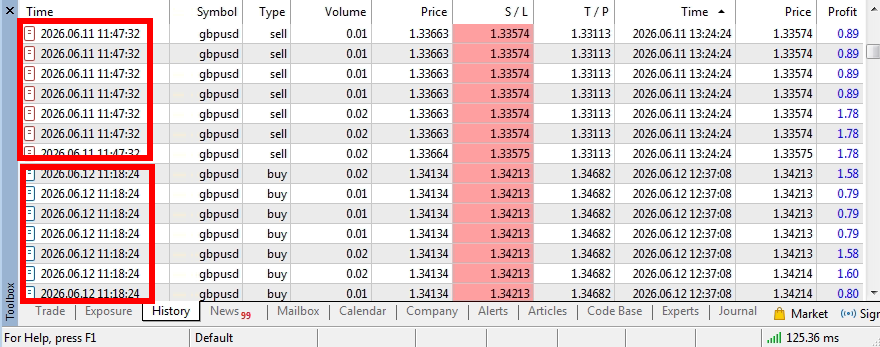
Remember that each entry is split into seven parts?
In the history it looks like this — seven rows with one time and one price.
It is like buying one pie and cutting it into seven slices.
You do not have seven pies.
You still have only one pie.
But in the trade history it looks like seven separate trades.
Check it yourself: split entry
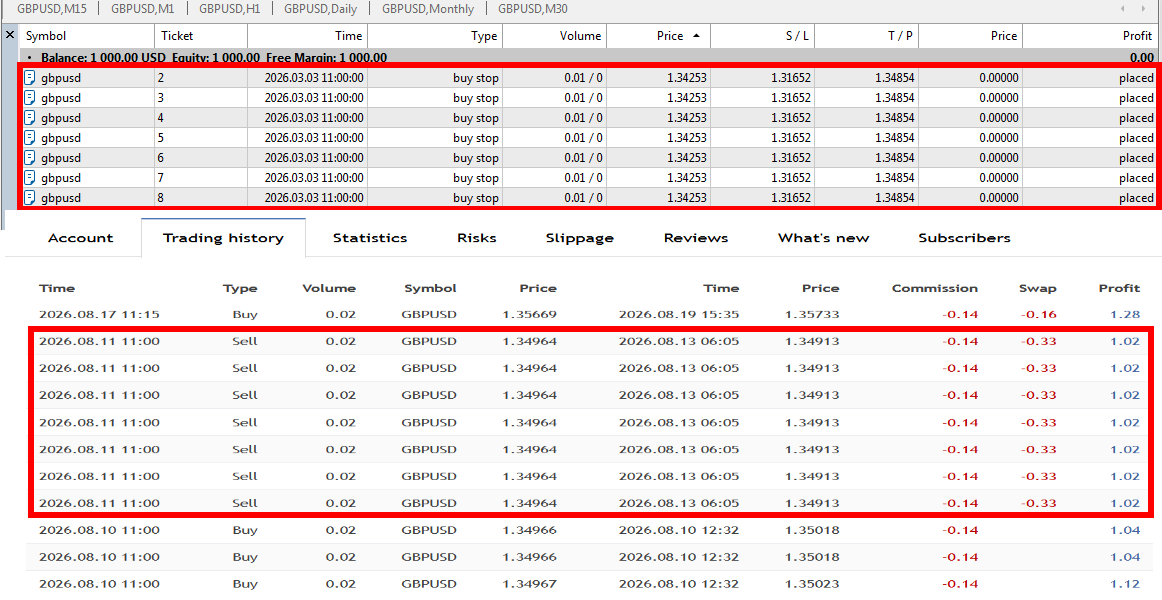
In the Strategy Tester open Results and look at the opening time and price.
If several rows match, they may be one entry split across several positions.
You can check the same thing on an MQL5 signal page in the Trading History section.
Why this matters
Because winning streaks like this look very good in marketing.
If one entry produces seven profitable positions, the history shows seven wins.
That creates a much more impressive picture than one entry with the combined profit.
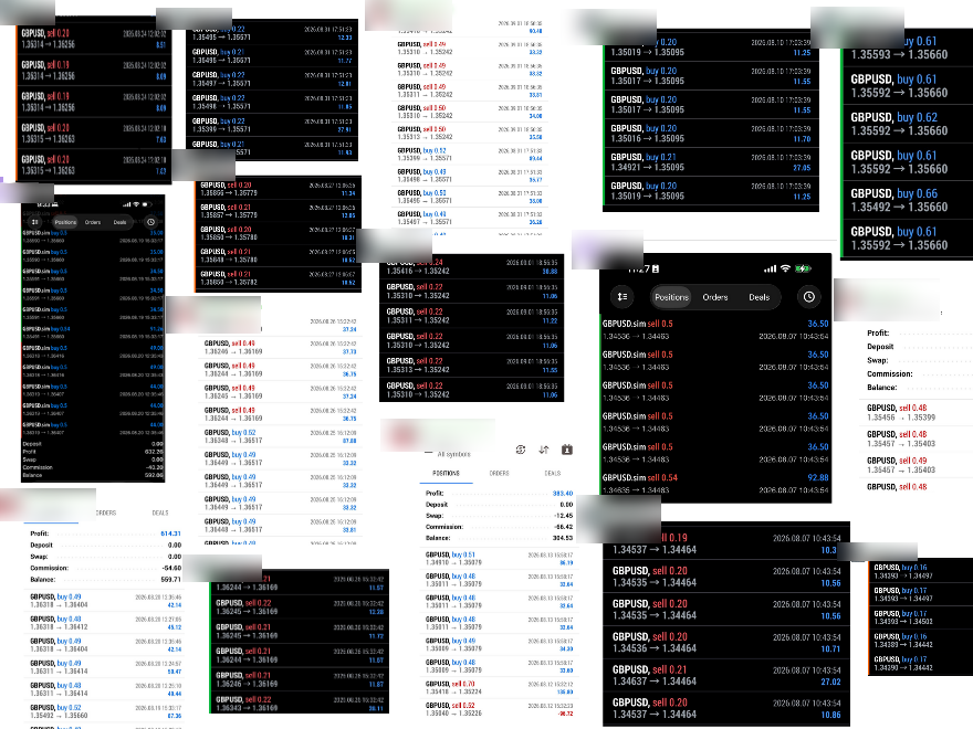
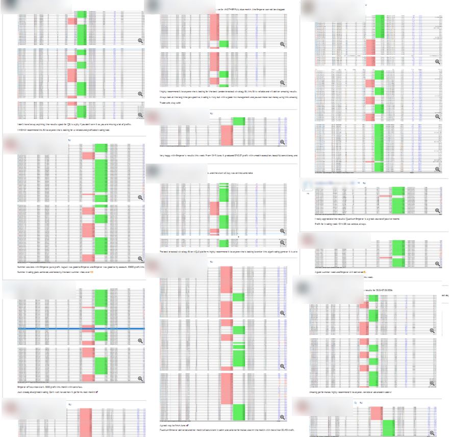
You have seen screenshots like these.
Row after row, everything in profit, posted by the same users. But how do you call their bluff?
Ask for proof of the large lot sizes — for example, a real account history on the Market signals service or other trusted signal services. If there is no verifiable proof, do not believe it.
The more of these questions stay unanswered, the less information you actually have about how the EA really trades.
A pretty screenshot is proof that someone made a pretty screenshot. It is not yet proof of long-term EA performance.
But before you judge a system by a streak like this, pay attention:
How many separate entries were there actually?
Seven positions in one entry are not seven independent wins.
For example, there may be no loss at all for forty days.
That sounds impressive.
But it still does not say much about the system.
It may be only a small snippet from a much larger trading history.
Why is the entry split?
This splitting also has a practical purpose.
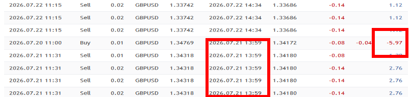
The Expert Advisor uses profit from a newer trade to close older losing positions before their Stop Loss.
I could call this mechanism:
"sophisticated unique Neural AI technique"
It sounds impressive.
In reality the principle is simple.
If the new position makes a profit, that profit can be used to reduce the loss on an older losing position.
Depending on the period, it both lifts and damages the result. So as part of the strategy it has no value.
In the tester, in optimization mode, the mechanism can be turned off by entering a coefficient of 0 (Batch Coefficient).

Compare both results.

The practical difference is small.
But to a beginner's eye a few visible losses remain — and the EA looks more credible than a curve with no drawdowns at all.
And one more important point about this experiment.
On the Imperial Dominator signal I also use my Recovery Booster.
It is not needed only for this type of EA — it is a separate recovery tool that can also be used with other strategies.
In the Imperial Dominator case I used it deliberately, to keep this system alive longer and to test how long such a system can be kept alive with a history-analyzing recovery mechanism.
It does not change the nature of the system and does not make the risk disappear. Worse, such a mechanism can seriously affect drawdown (DD) if there are several losses in a row (very clearly visible on my signal).
Layer three: the period
The first two layers explain why the curve can look smooth.
But not why it can contain no large drop at all.
Here is how the same test looks when we also show one losing period.
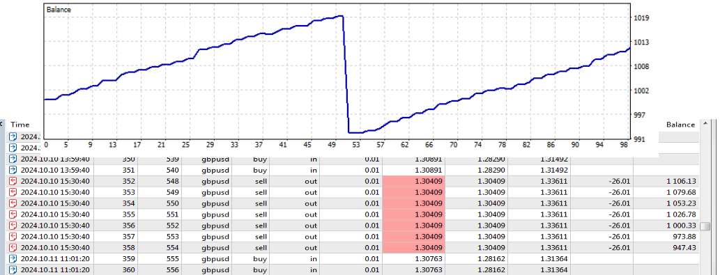
This is only one losing period.
Now let's see what happens if the Expert Advisor does not trade on that date.
Imperial Dominator has a Skip Days parameter.
It stops the Expert Advisor from opening new orders on the specified dates.
Set it to Skip Days = 241002.

Enter the date on which the Expert Advisor will not trade.
Run the test again.
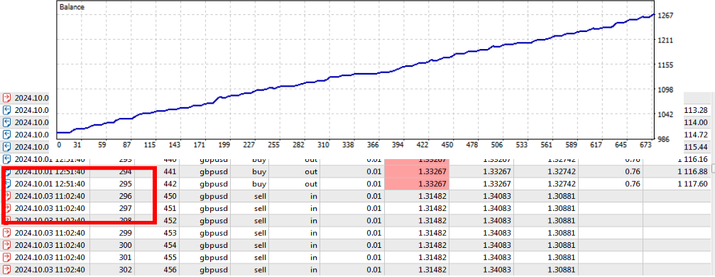
The drop is gone. On 2024.10.02 there are no longer any open positions.
The win rate has increased.
Maximum drawdown has decreased, profit has grown, the curve looks perfect.
And the test summary gives no hint that this day was skipped.
And now see how far this can be taken
So far we removed only one losing period.
Now we will do the same with every losing period.
We will use a 16-year test period and a dynamic lot size.
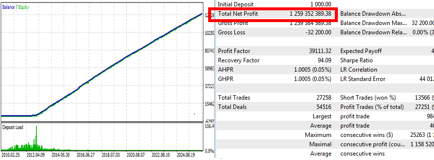
The result looks downright absurd.
Hundreds of millions in profit.
And that is not because we found a fantastic trading strategy.
We simply let the system trade with a dynamic lot on those historical days where we like the result, and removed the days where we do not.
This is a story about how much can be built from historical data if you yourself choose the days on which the system was allowed to lose.
Build it yourself and look!
In this EA the bad days are not hidden in the code — they sit in the Skip Days field.
But the same principle can also be used in the code, where the buyer cannot see it.
Then, after a large loss, a new version can appear on the Market page, and in the What’s new section of the update it says, for example:
"Improved performance"
or
"Fixed minor issues".
The text there can say anything. The fix is the update itself, not the words written next to it. After that, this EA's backtest looks perfect again.
If the loss date is hard-coded inside the Expert Advisor, you cannot see it in the settings and you cannot turn it off.
How easy it is to build a backtest like this technically is shown in more detail in my previous article:
STOP! Backtests Lie. How to Make Any EA Look "Perfect" in 5 Seconds
https://www.mql5.com/en/blogs/post/769134
That is why the backtest you are shown is not always the full history of the system.
It may be only the history of the days on which the system was allowed to trade.
Check it yourself: the skipped day
Find a losing day in your EA backtest.
Run the test over the full period.
Then exclude that date and run the test again.
Compare the results.
A single day can substantially change how the entire backtest looks.
But can't this be done honestly?
An honest process — filters, tests, checks — takes time.
But for this system it will not help.
If losses are very few, you cannot tell from a handful of cases what they had in common.
A filter built on a few isolated cases may lock onto chance, not a pattern.
If a system had only three losses in a year and we cut those three days out, we have not improved the robot.
We have simply removed from the statistics the part we did not like.
The next loss may fall on a completely different day and for a different reason.
That is called Rare-Event Overfitting — fitting to rare events.
The more precisely the filter cleans past losses, the more fragile it can become.
The chance of getting zero losses in the future simply by filtering out the previous ones is practically zero.
More on backtest over-optimization and its effect on results outside the test period:
Bailey, D., Borwein, J., Lopez de Prado, M., & Zhu, Q. (2014). Pseudo-Mathematics and Financial Charlatanism: The Effects of Backtest Overfitting on Out-of-Sample Performance. Notices of the American Mathematical Society, 61(5), 458–471.
SSRN — full text of the paper
Another way to extend a live signal's life and postpone the inevitable
You can simply reduce the number of days the Expert Advisor is allowed to trade.
For example, restrict trading to a certain day of the week.
Add a news filter.
Do not allow trading at certain hours.
Each of these filters can look perfectly reasonable on its own.
And they can also be useful.
But they should also be viewed through a marketing lens.
The fewer days the Expert Advisor trades, the fewer chances there are to lose.
And the fewer losses remain in the test, the easier it is to get a long period with no losses.
This matters especially for a Loss-Delayed EA: the longer the large loss can be postponed, the more impressive the previous winning streak looks.
Do the filters have a logical justification, or do they simply cut the number of trading days so that marketing can talk for longer about how good the system is?
For example, if the system does not trade on Fridays, it trades only four out of five working days.
That means the same winning streak, counted in trading days, stretches across the calendar by about 25%.
The streak did not get better. It simply happens more slowly.
But why do real signal-page curves so often look perfectly smooth?
So far we looked at what can be done with the Expert Advisor itself and its backtest.
But on MQL5 signals you already see statistics from a real trading account.
So a logical question appears:
If this is a real account, why can its equity curve also look almost perfect?
Here the manipulation happens at another level — not in the EA code, but in how the account statistics are displayed.
Let's look at one and the same account in two views (Growth and Balance).
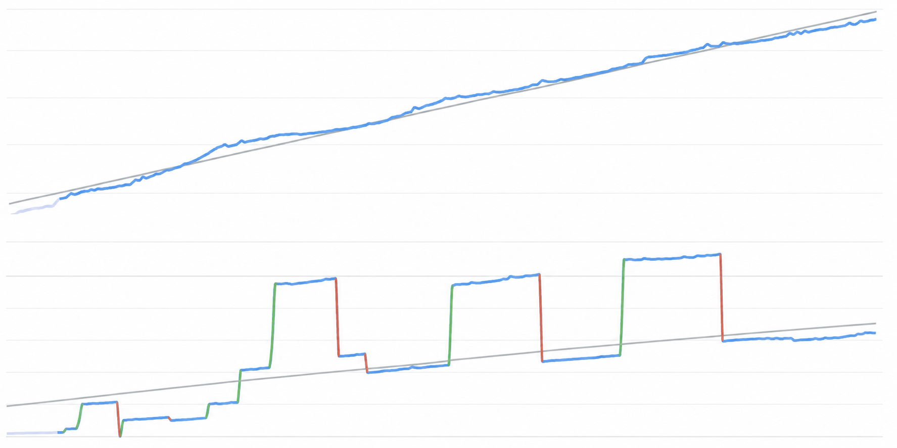
Do you see the difference?
The trading result has not changed.
In the Growth view the curve looks smoothly rising, even though the account had drawdowns in the same period.
In the Balance view we see several deposits and withdrawals.
And that is already a completely different level of manipulation.
How deposits and withdrawals can be used to build a much prettier statistical picture on MQL5 signals is what we will talk about in the next POM Education Series article.
But you already know that a pretty curve is not enough on its own.
You have to look at what exactly built that curve.
What you know now
You now know:
- how small profits and a large loss can create a very high win rate;
- how one entry split across several positions can look like a long winning streak;
- how excluding bad periods makes a backtest prettier;
- how fewer trading days can stretch a winning streak across the calendar;
- and why a pretty curve by itself proves nothing.
Next time you see a perfect EA result, do not look only at the curve.
Ask yourself: is this a Loss-Delayed EA?
Look at what sits behind it.
This is only the beginning
This is the first POM Education Series training article.
I plan to continue the series and look at other methods that can create a misleading impression of EA quality.
If you do not want to miss the next articles, follow the Pulse of Market channel on MQL5.
If you found this article useful, share it with others as well. Otherwise this kind of information always stays only with those who have already found it.
Pulse of Market channel: https://www.mql5.com/en/channels/01a02c54cf2bdd01