Volume delta analysis powered by custom symbols representing Point&Figure and Kagi charts
In my previous blog post I described an interesting approach of Volume delta analysis powered by custom renko symbols. In short, MetaTrader 5 environment allows you to use RenkoFromRealTicks utility to build a renko comprising volume delta, and then to apply CustomVolumeDelta indicator to visualize and analyze the delta.
However, the renko is not the only special chart type which tries to eliminate time effects from actual price action. Two other well-known types of such charts are Point-And-Figure (PnF) and Kagi. Either one can be considered as a kind of a renko with "packed" (or "stacked") boxes.
These time-invariant charts are now also available for MetaTrader 5: new PointFigureKagiCharts utility builts them from the tick history and online ticks. And guess what - it also supports volume delta embedding. You may try the free version of PointFigureKagiCharts DEMO.
As far as the charts are implemented on the basis of custom symbols (UI, API), internally they are stored in the standard quotes records, and rendered in the terminal as familiar bar charts.
As a result, they do not conform to the classical presentation of PnF and Kagi. You'll not see PnF's X/O columns or rectangular waves of Kagi. Instead they consists of bars, calculated from and denoting stable unidirectional price moves (as multiples of the box size), which is equivalent to XO columns or polygonal lines.
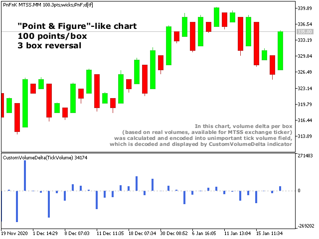
Here is how a PnF chart looks like:
And here is how a Kagi chart looks like:
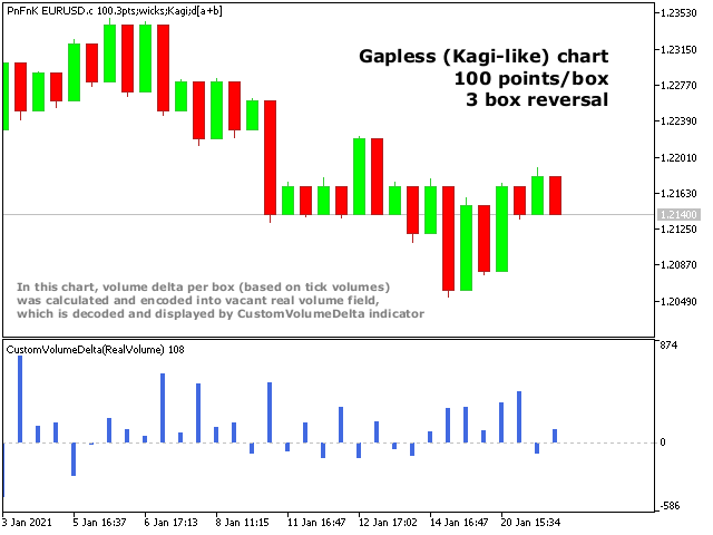
Both demonstrate volume delta visualization using CustomVolumeDelta.
There are some important nuances of PointFigureKagiCharts operation and setup.
First, this EA builds PnF or Kagi from ticks. Classical approach does usually use close or high/low price types. Using ticks means higher accuracy and eliminates ambiguities.
Second, this EA is different in the way how the reversal size is defined, which especially affects PnF. Lets recall how PnF reversal size is explained by popular trading sites:
The reversal distance is the box size multiplied by the reversal amount. An X-Column extends as long as price does not move down more than the reversal distance. Similarly, a stock in a downtrend will cause a descending O-Column to appear. Only when the stock changes direction by more than the reversal distance will a new X-column be added to the chart.
https://school.stockcharts.com/doku.php?id=chart_analysis:pnf_charts:pnf_basics
Or:
In order for the price to reverse, resulting in the formation of a new column of X's following O's or a new column of O's following X's, the price must reverse by the reversal amount. A reversal occurs when the price is no longer moving enough to put another X or O in the current X or O column, and then the price moves at least three box sizes (if this is the chosen reversal amount) in the opposite direction.
https://www.investopedia.com/terms/p/pointandfigurechart.asp
Now lets take a look at the regular PnF chart, in this case with 3 box reversal distance.
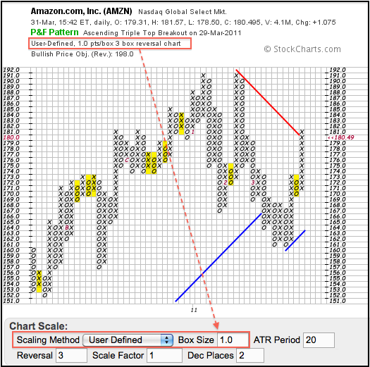
The main feature of PnF is obviously visible on the chart, but is not so clear from the wordings above: each pair of adjacent columns has a gap between them - after the closing of upward X column, there is 1 box "jump" down to the opening of the next O column; and after the closing of downward O column, there is 1 box "jump" up to the opening of the next X column.
According to the quoted definitions, the single box reversal size means that every first box in opposite direction should appear right after the price retraces for 1 box from previous top/bottom, but this corresponds to the empty box (gap). Hence, it seems it's impossible to build PnF with a reversal equal to single box (because it always maps to the gap). But here is a trick.
Lets look again at the graph built for 3 box reversal. All the places, where the minimal reversal occured are highlighted in yellow. These places illustrate, what the classical PnF implies with the reversal distance of 3 boxes. Remember, these rows are formed as a whole, right after the moment the price goes the distance along every one of them.
When the price changes direction, it does actually move from the level where the previous column was closed. So the highlighted reversal columns contain actually 4 boxes as you see. Probably the canonical explanations are not correct enough, or the columns should be painted side by side without a gap, but then we would end up with Kagi-like structure (we'll address this in a moment). The other option could be to adjust the naming convention and consider the chart shown above as 4 box reversal. Using this logic we can deduce that "the classical 1 box reversal" covers actually 2 box distance, which is why it's physically possible.
The approach with new naming convention is utilized in PointFigureKagiCharts. Its parameter ReversalFactor strictly conforms to the definition of the reversal: price must retrace by the reversal amount. Hence, if the box size is 100 points and ReversalFactor = 2, new column will appear when price goes in opposite direction 2 boxes (200 points) or more. Along this 2 box range, the 1-st box is "invisible" as it's shown as 1 box gap, and initial column state consists of 1 visible box.
In other words, ReversalFactor = 2 means that minimal tangible column size is a single box (because the gap always takes 1 additional "invisible" box).
If you expect to reproduce reversal setup used by some other software you should adjust it by adding 1 for ReversalFactor in PointFigureKagiCharts.
For PnF, only ReversalFactor larger than 1 makes sense. If ReversalFactor = 1, it'll switch to Kagi. As you know, Kagi also represents a time-independent chart, which changes its direction only when a specific reversal amount is reached, and in this case the classical Kagi has been always implemented in full accordance to the definition.
PointFigureKagiCharts supports Kagi-like charts as well. In Kagi there is no gap between adjacent vertical lines - close price of the previous bar is always equal to open price of the next bar. This is why it's important to have fair ReversalFactor = 1 (which is really equal to 1 box, not 2 boxes as classical PnF loosely implies).
One of the features of classical Kagi is the variable thickness of lines. Lines become thick after breakout of previous extremums.
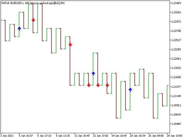
Since the charts built by PointFigureKagiCharts are regular MT5 charts they can not afford the variable thickness. Instead one may use variuos indicators. For example, PFKBreakOut draws arrows in points where upward and downward breakouts occur.
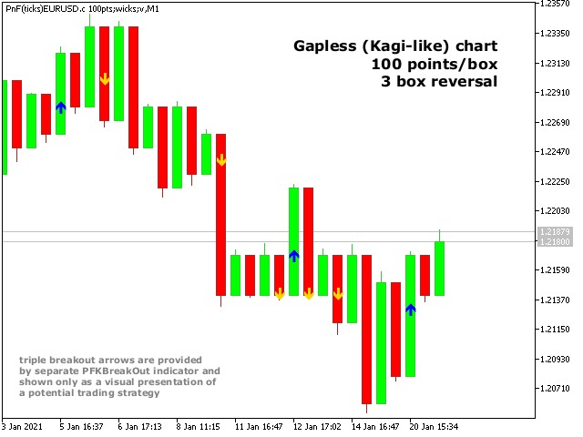
Or if you prefer even more Kagi-like presentation of "bars" (as opposed to "candles"), then you may change the chart's mode accordingly and disable wicks during custom symbol generation:
In combination with volume delta analysis, this tool extends the showcase of trading systems based on time-invariant custom charts.


