Indicators: Equity Chart
Unfortunately when I apply this indicator to a graph it shows me the error "Trading history is not fully loaded".
I tried to download the history from History center but nothing changes.
How can I solve this issue?
Thanks in advance.
Unfortunately when I apply this indicator to a graph it shows me the error "Trading history is not fully loaded".
I tried to download the history from History center but nothing changes.
How can I solve this issue?
Thanks in advance.
Unfortunately when I apply this indicator to a graph it shows me the error "Trading history is not fully loaded".
I tried to download the history from History center but nothing changes.
How can I solve this issue?
Thanks in advance.
Hello, Peppe, it's not history quotes, it's history of trading operations,
open your account history tab, right click, select "all history", you may see it on the screen:
(it's important for initial balance to be loaded)

Hi transcendreamer,
Just started using your indicator and it works as described.
Question:
There is a red line and blue line displayed on the chart. I understand that blue line is equity.
What does the red line represent? I know it is not balance. It would be useful to see the % drawdown on the equity line whenever there is a dip.
May I ask for additional functions that might be useful to you as well?
I would like to suggest the following:
1) Display current time drawdown by showing current time equity to balance ratio in %.
2) Display current Highest drawdown by showing current time equity to highest balance ratio in %.
3) Display Pegged drawdown by showing current time equity to time pegged balance ratio in %. This is useful to compare the balance in say last month 2016 07 01 0000 hours compared to today's equity.
Please let me know your thoughts.
Hi Tadada,
blue line is equity
red line is balance
max DD is shown in the corner
lesser DD cavities could be easily checked with "crosshair" tool
regarding your suggestions: I will think about them
current DD may be useful for trading
Hi transcendreamer,
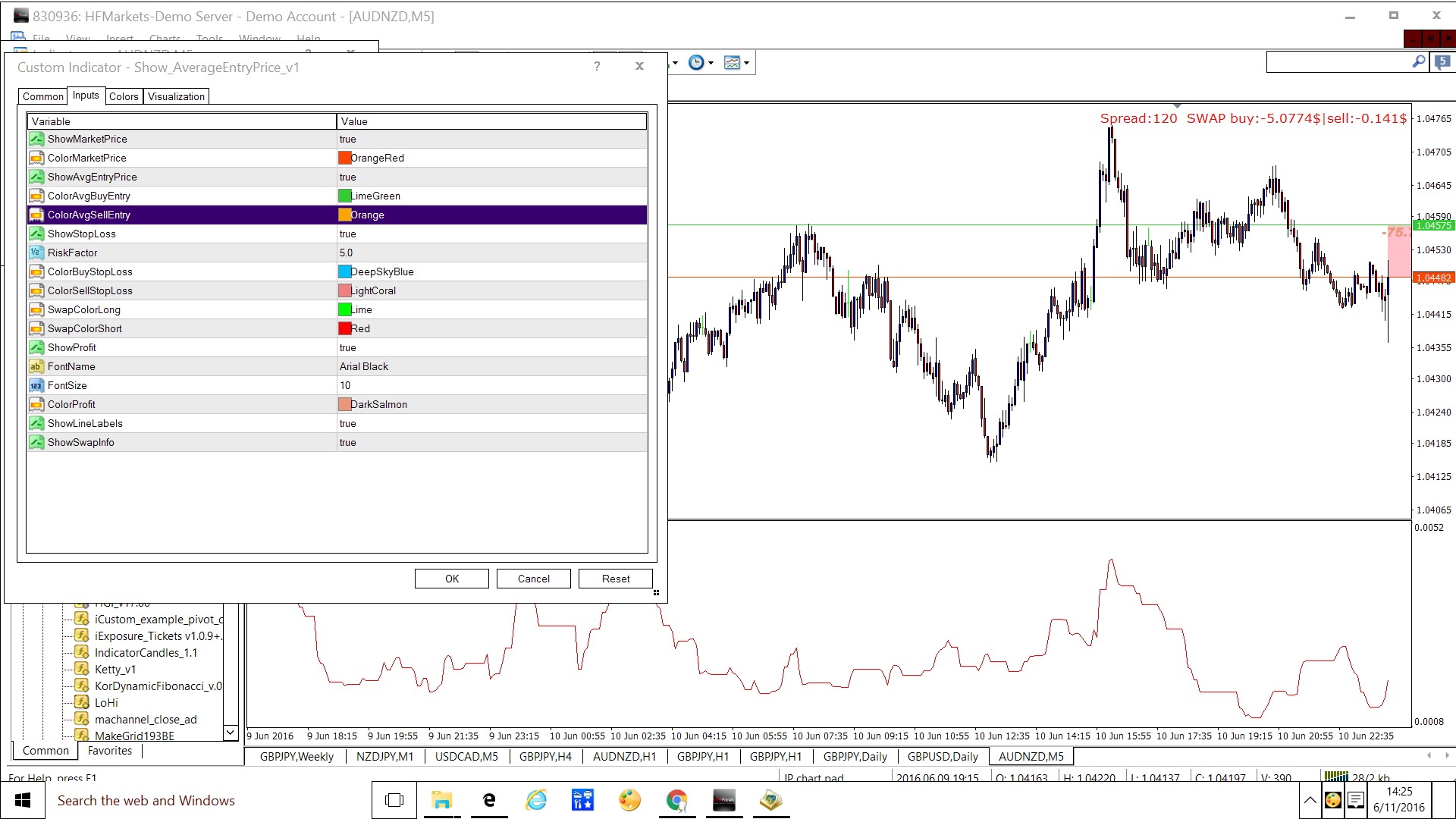
Thank you for sharing such a useful indicator covering multiple pairs. Excellent quality. My suggestion is to make quite simple visual tool like the picture I am attaching. The indicator is also attached for your reference.
I am using a simple averaging indicator which shows four lines: market price, dynamic profit/drawdown shadow , Averaging Entry and Stoploss position. This works only for the pair on the chart.
Can you please print on each horizontal line based on market price-
1. Equity Line showing lots traded, pips/$ , percentage
2. Drawdown/Profit Line or Shadow showing lots , pips/$, percentage,
3. Breakeven or Recovery Line showing how many lots, pips/$, percentage needed to break even (Inputs will decide lot size - constant or varying/proportionate ) based on recovery factor
4. Stoploss Equity Line showing pips/$, percentage based on risk factor
Sorry revise No 2 to read as
Drawdown/Profit Line (or Shadow is deleted) showing lots , pips/$, percentage,
Equity line should print market prices of each pair.
If horizontal lines can't be used to accommodate paris then a table of text should be printed to show market prices of pairs traded.
I have come across a mql file which has some coding done on Breakeven Line but it can't compile.
Hi transcendreamer,
Thank you for sharing such a useful indicator covering multiple pairs. Excellent quality. My suggestion is to make quite simple visual tool like the picture I am attaching. The indicator is also attached for your reference.
I am using a simple averaging indicator which shows four lines: market price, dynamic profit/drawdown shadow , Averaging Entry and Stoploss position. This works only for the pair on the chart.
Can you please print on each horizontal line based on market price-
1. Equity Line showing lots traded, pips/$ , percentage
2. Drawdown/Profit Line or Shadow showing lots , pips/$, percentage,
3. Breakeven or Recovery Line showing how many lots, pips/$, percentage needed to break even (Inputs will decide lot size - constant or varying/proportionate ) based on recovery factor
4. Stoploss Equity Line showing pips/$, percentage based on risk factor
Hi Peejay,
if you mean separate tool for position planning then please have a look at Smart Calculator
https://www.mql5.com/ru/code/12839/
while implementing average entry and stop loss in Equity Monitor would be slightly out of the conception for now
pips/dollars would be very different for different currency pair
lots traded statistics may be included in future versions

- votes: 16
- 2015.04.17
- //www.mql5.com/ru/users/transcendreamer">
- www.mql5.com
- Free trading apps
- Over 8,000 signals for copying
- Economic news for exploring financial markets
You agree to website policy and terms of use
Equity Chart:
The indicator displays the equity and balance charts.
Author: transcendreamer