 MetaTrader 5
 Experts
 Indicators
 Scripts
 Libraries
 Storage
Join our fan page

Rainbow Ranga - AKM - indicator for MetaTrader 5

- Views:
- 2318
- Rating:
- Published:
- Updated:
-
 You are missing trading opportunities:
- Free trading apps
- Over 8,000 signals for copying
- Economic news for exploring financial markets
Registration Log inYou agree to website policy and terms of use
If you do not have an account, please register -
 Need a robot or indicator based on this code? Order it on Freelance
Go to Freelance
Need a robot or indicator based on this code? Order it on Freelance
Go to Freelance
layman’s breakdown of how this tool works, what we built into it, and how you can use it for classical trading.
Understanding the Core Concepts
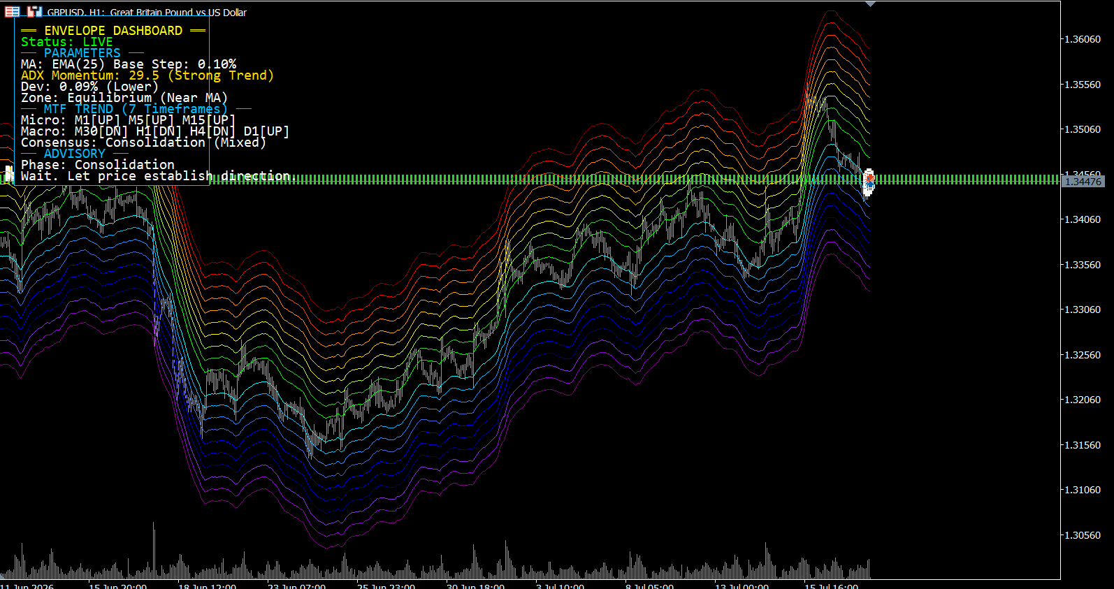
1. The Rainbow (The Rubber Band Effect) Think of the hidden center line (the 25 EMA) as the market's "home base" or fair value. The colored bands (envelopes) act like a rubber band.
-
When price is near the middle, there is no tension.
-
When price pushes up into the Red / Orange zones, the rubber band is stretched tightly upward. The asset is considered "expensive" or overbought.
-
When price drops into the Blue / Violet zones, the rubber band is stretched tightly downward. The asset is "cheap" or oversold.
-
Classical Rule: Rubber bands always want to snap back to their resting state.
2. The 7-Timeframe Analysis (The Weather Forecast) Looking at a 5-minute chart is like looking out the window to see a gust of wind, but looking at a Daily chart tells you the actual season. Our dashboard looks at 7 timeframes at once (from 1 Minute to Daily).
-
If the higher timeframes (Macro) are Bullish, the overall "season" is upward.
-
If the lower timeframes (Micro) suddenly drop, it's just a temporary breeze against the main trend.
3. The ADX (The Train's Speedometer) The ADX measures momentum. If the ADX is weak, the market is just drifting sideways. If the ADX is strong, a massive train is moving. You never want to stand in front of a speeding train by betting on a reversal just because price hit a red or violet line.
How to Trade with It (Classical Strategies)
Using the dashboard's advice, here are the three classical ways you would trade this setup:
Strategy 1: The "Buy the Dip" (Trend Continuation)
This is the safest and most reliable classical strategy. You are looking to align the short-term pullback with the long-term trend.
-
What to look for: The dashboard says the MTF Consensus is STRONGLY BULLISH.
-
The Trigger: You wait patiently for the price to drop into the lower bands (Blue/Violet).
-
The Action: Because the macro trend is UP, this drop isn't a crash; it's a discount. The dashboard will flag this as a "Corrective Pullback (Buy Zone)". You buy the asset, expecting it to bounce off the violet bands and resume its upward journey.
Strategy 2: The "Rubber Band Snap" (Mean Reversion)
You use this when the market is trapped in a sideways range and there is no clear long-term trend.
-
What to look for: The dashboard says the MTF Consensus is Mixed / Consolidation and the ADX is Weak.
-
The Trigger: Price spikes violently into the EXTREME RED or EXTREME VIOLET zones (0.8%+ deviation).
-
The Action: Because there is no strong trend to keep pushing the price further, the rubber band is maxed out. You trade against the spike (sell the red, buy the violet), expecting the price to snap back to the middle Moving Average.
Strategy 3: Profit Taking (Impulse Exhaustion)
Sometimes the best trade is doing nothing, or simply taking your money off the table.
-
What to look for: You are already in a Buy trade. The MTF trend is Strongly Bullish, and price rallies hard into the Extreme Red zone.
-
The Action: The dashboard will read "Impulse Exhaustion (Wait/Scale Out)". It knows the trend is up, so it tells you not to short/sell. However, it also knows the rubber band is stretched to the max, meaning a temporary drop is imminent. This is your signal to close your existing buy trade and take your profits.
Summary of the Features We Implemented
-
Dynamic Visual Heatmap: 20 beautifully color-coded support and resistance bands that breathe with the market's volatility, spaced at precise 0.1% increments.
-
7-Timeframe Sentiment Engine: A silent scanner that checks the 1M, 5M, 15M, 30M, 1H, 4H, and Daily charts simultaneously to determine if the true market momentum is Bullish or Bearish.
-
Smart Phase Detection: Logic that distinguishes between a dangerous market crash and a safe "buy-the-dip" opportunity based on trend alignment.
-
Live Advisory UI: A sleek, fully customizable, floating dashboard that constantly translates the complex math into simple English instructions (e.g., "ACTION: High Prob Buy").
 MACD TradingView Style for MT5
MACD indicator replicating TradingView’s visual style for MT5. 4-colour histogram, SMA-based signal line — values match TradingView bar-for-bar.
AIS Smoothed Linear Trend
This indicator displays the smoothed value of the linear trend
 Trading Performance journal
An institutional-grade trading journal and behavioral analytics suite designed to run entirely inside MetaTrader 5. The application is built as a single-file, zero-dependency dashboard that replaces standard terminal objects with a high-performance, double-buffered vector graphics pipeline (CCanvas). It provides real-time quantitative analysis, behavioral risk auditing, a vertical scrollable monthly calendar, and interactive log cards with inline note editing directly on the chart.
Pivot SuperTrend / BhanuCodeLab
Pivot SuperTrend BhanuCodeLab is a trend-following indicator that combines confirmed pivot points with an ATR-based trailing trend line to identify market direction, trend reversals, and potential BUY or SELL signals.