Bid × Ask Explained: How to See Buyers and Sellers Inside Every Candle

A Complete MT5 Guide to Bid Ask Footprint, Order Flow, Delta and Trading Imbalances
https://www.mql5.com/en/market/product/190942?source=Site+Market+My+Products+Page
Most traders look at a candlestick and see four values:
Open. High. Low. Close.
These values tell us what price did during a particular period.
But there is another question:
What happened inside that candle?
A bullish candle tells us that price closed above its opening price. But it does not show us, by itself, how buying and selling activity was distributed at each price level.
This is where Bid × Ask Footprint Charts and Order Flow analysis become interesting.
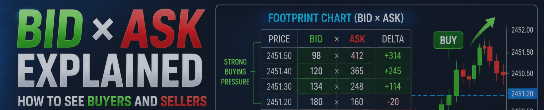
Instead of looking only at the final shape of a candle, a Footprint Chart breaks the candle into price levels and displays buying and selling activity inside it.
For example, instead of seeing only one green candle, a trader may see:
| Price | Bid × Ask |
|---|---|
| 2451.50 | 98 × 412 |
| 2451.40 | 120 × 365 |
| 2451.30 | 134 × 248 |
| 2451.20 | 180 × 160 |
| 2451.10 | 210 × 128 |
| 2451.00 | 256 × 95 |
All numerical examples in this article are illustrative.
This provides an entirely different view of the candle.
In this guide, we will explore how Bid × Ask Footprint Charts work in MetaTrader 5 (MT5), what Bid and Ask numbers mean, how Delta is calculated, how imbalances are detected, and how traders can use this information to understand buying and selling pressure.
1. What Does Bid × Ask Mean in a Footprint Chart?
A Footprint Chart divides a candle into multiple price levels.
At each level, two numbers are displayed:
Bid × Ask
For example:
120 × 365
The value on the left represents the Bid-side activity.
The value on the right represents the Ask-side activity.
The objective is to give the trader a more detailed representation of market activity than a conventional OHLC candle.
Instead of asking only:
Did price move up or down?
we can begin asking:
Where was buying activity concentrated?
Where was selling activity concentrated?
Did one side become unusually aggressive?
Did that aggression actually move price?
Those questions form the foundation of Order Flow trading.
2. Understanding the Bid
The Bid is generally the price at which buyers are currently willing to buy.
When a participant aggressively sells into available liquidity, that transaction is associated with the Bid side.
In a simplified Footprint interpretation, larger Bid-side values therefore represent greater sell-side activity at that price.
Consider:
480 × 110
The left side is considerably larger than the right.
This tells us there was much greater activity associated with the Bid side at this level.
A trader may describe this as stronger aggressive selling activity.
But this does NOT automatically mean:
SELL!
The reaction of price is equally important.
3. Understanding the Ask
The Ask is generally the price at which sellers are currently willing to sell.
When a participant aggressively buys available liquidity, that activity is associated with the Ask side.
Consider:
100 × 420
Here, the Ask-side value is substantially larger.
This can indicate stronger aggressive buying activity at that level.
Again, this should not automatically be interpreted as a Buy signal.
The better question is:
What happened to price after that aggressive buying occurred?
That distinction is extremely important.
4. Buyers and Sellers Exist in Every Transaction
A common beginner misunderstanding is:
"If there are 500 buyers and 100 sellers, price should rise."
Markets do not work quite that simply.
Every completed transaction requires counterparties.
The useful distinction in Order Flow analysis is therefore often aggressiveness.
Who is crossing the spread?
Who is accepting the currently available price?
Who appears more aggressive at a particular level?
This is why Bid × Ask analysis can provide information that a normal candlestick does not show directly.
5. Passive vs Aggressive Participants
Understanding this distinction makes Footprint Charts much easier to read.
Imagine a buyer waiting with a limit order.
That buyer is willing to transact at a specified price.
Now imagine a seller wants to execute immediately and sells into that liquidity.
The seller is acting aggressively.
The same idea works in reverse.
An aggressive buyer accepts available Ask liquidity to transact immediately.
Therefore, Order Flow traders are often interested in identifying where aggressive activity is appearing and, even more importantly, how price responds to it.
6. Reading a Bid × Ask Footprint Candle
Suppose an XAUUSD Footprint candle contains:
| Price | Bid | Ask |
|---|---|---|
| 2451.50 | 98 | 412 |
| 2451.40 | 120 | 365 |
| 2451.30 | 134 | 248 |
| 2451.20 | 180 | 160 |
| 2451.10 | 210 | 128 |
| 2451.00 | 256 | 95 |
Look carefully at the distribution.
Near the upper prices:
Ask activity dominates.
Near the lower prices:
Bid activity dominates.
A normal candle cannot display this internal distribution.
A Footprint Chart can.
This is one of the primary reasons traders use Bid Ask Footprint analysis.
7. What Is Delta in Order Flow?
Once Bid and Ask activity is available, we can calculate another useful measurement:
Delta
A simplified formula is:
Delta = Buy-side activity − Sell-side activity
For example:
Ask-side activity = 7,500
Bid-side activity = 5,000
Then:
Delta = +2,500
Positive Delta means measured buying activity exceeded measured selling activity.
Now suppose:
Ask-side activity = 4,000
Bid-side activity = 6,800
Then:
Delta = -2,800
Negative Delta means measured selling activity exceeded buying activity.
Your MT5 implementation uses the same core idea internally: total Buy activity minus total Sell activity produces the cluster Delta.
8. Positive Delta
Consider:
Bid: 3,200
Ask: 5,900
Therefore:
Delta = +2,700
The positive Delta tells us that Ask-side/aggressive buying activity was greater during that measurement period.
Beginners sometimes interpret this as:
Positive Delta = BUY
That is too simplistic.
Instead ask:
Did the buying activity actually push price higher?
This question can reveal much more.
9. Negative Delta
Now consider:
Bid: 7,100
Ask: 4,600
Delta becomes:
4,600 − 7,100 = -2,500
This indicates stronger measured sell-side activity.
Again:
Negative Delta ≠ automatic Sell signal.
Suppose extremely negative Delta appears at support but price refuses to continue lower.
That may be far more interesting than the negative Delta itself.
10. Price + Delta Is More Powerful Than Delta Alone
Consider four simplified situations.
Situation A
Price ↑ + Delta ↑
Price and buying aggression broadly agree.
Situation B
Price ↓ + Delta ↓
Price and selling aggression broadly agree.
Situation C
Price ↑ but Delta weakens
The upward price movement may deserve closer examination.
Situation D
Price ↓ but selling aggression fails to produce further downside
Potential absorption or changing pressure may deserve attention.
This is why professional Order Flow analysis is not simply:
Green = Buy
Red = Sell
Context changes everything.
11. What Is an Order Flow Imbalance?
Now we reach one of the most popular Footprint concepts:
Imbalance
An imbalance occurs when one side's activity becomes substantially larger than the relevant opposite-side comparison.
For a simple illustration:
100 × 400
The Ask-side value is four times the Bid-side value.
This demonstrates substantial Ask-side dominance.
Conversely:
450 × 120
shows much greater Bid-side activity.
An Order Flow indicator can highlight these unusual relationships so the trader does not have to manually compare every number.
Your implementation includes configurable imbalance detection, including an imbalance ratio and a minimum-size filter.
12. Why Imbalance Ratio Matters
Suppose the Footprint contains:
100 × 110
The difference is small.
Now compare:
100 × 350
That is much more significant.
An imbalance ratio helps separate relatively ordinary differences from unusually large differences.
For example, with a theoretical 3:1 threshold, one side needs to be approximately three times the comparison before being highlighted.
This helps traders focus on the more extreme areas of activity.
13. Buy Imbalance
A Buy Imbalance indicates unusually strong Ask-side activity according to the indicator's comparison rules.
Example:
100 × 380
If the required threshold is satisfied, the row can be highlighted as a Buy Imbalance.
Potential interpretation:
Aggressive buyers were particularly active around this level.
However, location still matters.
A Buy Imbalance appearing:
- At support
- During a breakout
- Above VWAP
- Near POC
- After absorption
can have a very different meaning from one appearing randomly in the middle of a range.
14. Sell Imbalance
A Sell Imbalance represents the opposite situation.
Example:
420 × 100
The Bid-side activity is substantially greater.
Potential interpretation:
Aggressive sellers were particularly active around this price.
But again:
Sell Imbalance ≠ guaranteed Sell signal.
Order Flow provides evidence.
It does not provide certainty.
15. What Is a Stacked Imbalance?
One imbalance can occur randomly.
Several consecutive imbalances can be more interesting.
Consider:
| Price | Bid × Ask |
|---|---|
| 2452.30 | 80 × 340 |
| 2452.20 | 95 × 390 |
| 2452.10 | 110 × 420 |
If all three satisfy the selected imbalance conditions, we have a cluster of buy-side imbalances.
This is commonly referred to as a:
Stacked Buy Imbalance
The opposite:
| Price | Bid × Ask |
|---|---|
| 2449.80 | 390 × 100 |
| 2449.70 | 430 × 105 |
| 2449.60 | 410 × 90 |
could represent a:
Stacked Sell Imbalance
Your indicator can require multiple imbalance rows before defining a stacked zone and can extend those zones to the right side of the chart.
16. Why Stacked Imbalances Matter
Imagine three or four adjacent price levels all show unusually strong buying activity.
That tells us something different from one isolated number.
It indicates that the aggressive activity occurred across an area, rather than at just one price.
Traders can therefore monitor these zones when price returns.
Possible questions include:
Does the zone hold?
Does price immediately trade through it?
Does opposite-side aggression appear?
Does Delta support the original direction?
This converts a colored Footprint cell into a structured analytical process.
17. What Is Absorption?
Absorption is one of the most valuable concepts for understanding the relationship between aggression and price response.
Imagine sellers become extremely aggressive.
The Footprint shows:
- Large Bid-side activity
- Negative Delta
- Heavy volume
You would normally expect price to move lower.
But it doesn't.
Price remains near the same level or starts rising.
The question becomes:
Who is absorbing all that aggressive selling?
This can suggest that significant opposite-side liquidity is preventing further movement.
18. Bullish Absorption Example
Suppose XAUUSD reaches a previous low.
You observe:
Heavy selling
Negative Delta
Large Bid-side activity
but:
Price refuses to break lower.
Then buy-side activity starts increasing.
This can indicate potential bullish absorption.
The important signal is not simply the large selling number.
The interesting relationship is:
Strong selling + weak downside response.
19. Bearish Absorption Example
Now reverse the situation.
XAUUSD reaches an important high.
You observe:
Strong Ask-side activity
Positive Delta
Aggressive buying
but:
Price cannot continue higher.
Then sell-side activity begins increasing.
This can indicate possible bearish absorption.
Again:
Strong buying + weak upside response
is the relationship worth studying.
Your Footprint implementation includes configurable absorption analysis as part of its setup engine.
20. Point of Control — POC
Another useful Footprint concept is:
POC — Point of Control
The POC represents the price row with the greatest measured total activity in the relevant cluster/profile.
Suppose:
| Price | Total |
|---|---|
| 2451.40 | 400 |
| 2451.30 | 650 |
| 2451.20 | 1,250 |
| 2451.10 | 720 |
| 2451.00 | 480 |
The POC is:
2451.20
This tells us where the largest concentration of activity occurred in this example.
21. Developing POC
POC becomes even more interesting when its movement is tracked.
A Developing POC can show how the highest-activity area migrates as the market develops.
If the POC gradually moves higher, concentration is shifting upward.
If it moves lower, concentration is shifting downward.
Your indicator includes a Developing POC path specifically for this type of contextual analysis.
22. Combining Bid × Ask With VWAP
VWAP means:
Volume Weighted Average Price
Instead of using Bid × Ask information alone, traders can compare Order Flow behavior with VWAP.
For example:
Scenario
Price is above VWAP.
A pullback reaches VWAP.
Strong sell-side activity appears.
But price cannot continue below VWAP.
Then Buy Imbalances begin appearing.
That combination may be more informative than either VWAP or the Footprint numbers individually.
Your implementation can display session VWAP alongside the Footprint clusters.
23. Bid × Ask + Volume Profile
Volume Profile answers a different question:
At which prices has activity concentrated?
Bid × Ask helps us inspect activity inside individual clusters.
Volume Profile provides broader price-level context.
Combining them allows traders to study:
WHERE activity occurred
and
HOW buying and selling behaved there.
Your code can display a right-side Volume Profile, Delta Profile, profile POC/VAH/VAL and HVN/LVN nodes.
24. HVN and LVN
Volume Profile introduces two additional concepts.
HVN — High Volume Node
An area of relatively high activity.
LVN — Low Volume Node
An area of relatively low activity.
Now imagine a strong Buy Imbalance appears at an important profile area.
That provides more context than the same imbalance appearing at an arbitrary price.
This brings us back to one of the central lessons of this article:
LOCATION MATTERS.25. Cumulative Delta
Individual candle Delta gives us one piece of information.
Cumulative Delta (CVD) accumulates Delta over multiple periods.
For example:
Candle 1: +300
Candle 2: +450
Candle 3: -200
Candle 4: +600
Candle 5: -100
Cumulative Delta:
+1,050
Instead of focusing on one candle, CVD allows us to examine how buying/selling aggression is developing across a sequence of candles.
Your implementation includes a Delta histogram together with Cumulative Delta functionality.
26. Cumulative Delta Divergence
Now consider:
Price → Higher High
but:
CVD → Lower High
Price and aggressive flow are no longer moving together in the same way.
This is called a form of:
Cumulative Delta Divergence
Likewise:
Price → Lower Low
while
CVD → Higher Low
can indicate a different type of divergence.
Divergence is not a guaranteed reversal.
It is a reason to investigate the current move more closely.
Your code specifically contains an option for CVD divergence detection.
27. A Simple Way to Read Every Footprint Candle
Instead of staring at hundreds of numbers, ask five questions.
Question 1 — Where is price?
Support?
Resistance?
Previous high/low?
VWAP?
POC?
Profile node?
Question 2 — Who appears aggressive?
Buyers?
Sellers?
Neither?
Question 3 — Where is the imbalance?
One isolated row?
Several stacked rows?
Question 4 — Did aggression move price?
This is crucial.
Question 5 — What happened next?
Continuation?
Rejection?
Absorption?
Opposite imbalance?
Delta divergence?
This five-question process makes Footprint analysis much easier.
28. Example of a Potential Bullish Order Flow Sequence
Imagine XAUUSD falls toward an important support area.
Stage 1
Selling becomes aggressive.
Bid-side values increase.
Stage 2
Delta becomes strongly negative.
Stage 3
Despite the selling pressure, price stops making meaningful new lows.
Stage 4
Potential absorption appears.
Stage 5
Ask-side activity begins increasing.
Stage 6
Several Buy Imbalances appear.
Stage 7
Price moves above the local POC.
Stage 8
Cumulative Delta begins improving.
This provides a sequence of evidence.
The analysis is not:
Green number → BUY.
It is:
Aggressive sellers failed → buyers appeared → Order Flow shifted → price responded.
29. Example of a Potential Bearish Sequence
Now imagine XAUUSD rallies into resistance.
Stage 1
Buyers become aggressive.
Stage 2
Positive Delta increases.
Stage 3
Price struggles to make further progress.
Stage 4
Potential absorption appears near the high.
Stage 5
Bid-side activity increases.
Stage 6
Sell Imbalances begin stacking.
Stage 7
Price moves below a local high-volume area.
Stage 8
Cumulative Delta weakens.
The reasoning becomes:
Aggressive buyers failed → sellers appeared → Order Flow changed → price responded.
That is much more meaningful than simply selling because a Footprint number turned red.
30. Footprint Charts vs Normal Candlesticks
A candlestick can show:
Open
High
Low
Close
A Footprint can additionally help visualize:
Bid
Ask
Delta
Imbalance
Stacked Imbalance
POC
Volume distribution
and related Order Flow information.
Combined with other analytics, an MT5 Footprint workspace can also include:
VWAP
Volume Profile
Cumulative Delta
Absorption
Delta Divergence
HVN/LVN
This does not make candlesticks useless.
Footprint Charts simply provide a deeper layer of information.
31. Important MT5 Data Limitation
This deserves special attention.
Forex and many CFD markets are decentralized.
The data available in MetaTrader 5 depends on the broker, symbol and available tick history.
Therefore, a Footprint displayed on one broker's XAUUSD symbol should not automatically be assumed to represent the entire global Gold market.
Your MT5 terminal may be working with broker-provided ticks and, depending on the instrument, real volume may not be available.
Historical tick availability can also be limited.
Your indicator explicitly accounts for this issue: it reads available tick history and can estimate older clusters when real tick history is unavailable; those estimated clusters are treated as estimates rather than real tape.
Understanding the underlying data is essential when interpreting any Footprint Chart.
32. How This Works in My MT5 Footprint Project
The Order Flow Footprint project used for the examples behind this article is designed to transform available MT5 tick information into an easier-to-read Footprint environment.
The current version includes:
Bid × Ask clusters
Candle aggregation
Delta
Imbalance detection
Stacked imbalance zones
Developing POC
VWAP
Value Area
Volume Profile
Delta Profile
HVN/LVN
Cumulative Delta
Absorption and divergence analysis
Analytical entry, stop and target levels
Setup quality scoring
Risk-based lot calculation
Alerts
The software is intended for analysis rather than automatic trading. That distinction is explicitly part of the indicator's design.
33. Common Bid × Ask Mistakes
The biggest beginner mistake is believing:
More buyers = price must rise.
Or:
More sellers = price must fall.
Order Flow is more subtle.
Heavy buying that fails to move price higher can itself be valuable information.
Heavy selling that fails to move price lower can also be valuable.
Another mistake is trading every imbalance.
An imbalance should be evaluated in context.
Another is ignoring the underlying data source.
And finally, traders often overload the chart with too many concepts before understanding Bid × Ask itself.
34. The Four-Step Framework
If you remember nothing else from this article, remember:
LOCATION → AGGRESSION → RESPONSE → CONFIRMATION1. LOCATION
Where is the activity happening?
2. AGGRESSION
Which side appears more aggressive?
3. RESPONSE
Did price respond as expected?
4. CONFIRMATION
Does subsequent Order Flow support the idea?
This is a much stronger approach than:
Green = Buy
Red = Sell
Conclusion
A normal candlestick shows the final result of price movement.
A Bid × Ask Footprint Chart gives traders a way to inspect activity occurring at different price levels inside that candle.
Understanding Bid × Ask is therefore one of the foundations of Order Flow Trading in MetaTrader 5.
From Bid × Ask, traders can progress toward understanding:
Delta
Buy/Sell Imbalances
Stacked Imbalances
Absorption
POC
VWAP
Volume Profile
Cumulative Delta