
The chart that warns you not to buy, signals it may be high time to sell - Analysis

The long-term “bearish divergence” in the S&P 500’s chart signals it is still much too soon to try to pick a bottom. Let us have a look at four charts...
Reporter for MarketWatch Tomi Kilgore has brought to light several extremely interesting charts with a way more interesting conclusion:
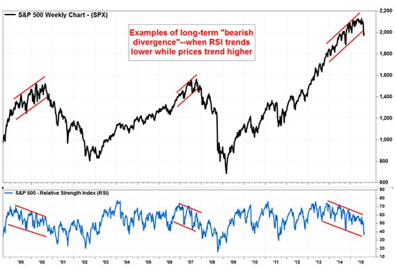
Class A bearish divergence
According to him, it was two years ago when the bearish divergence began to signal a yellow light for stocks, but it didn’t turn red until a couple of weeks ago, when the S&P 500 broke below support at the January trough.
Bearish divergences do not strongly suggest investors should sell, but they do caution that when a breakdown in price does happen, they should not fight it. The pattern now shows the gauge could decline a lot further before the opposite “bullish divergence” appears.
Chart observers use the Relative Strength Index (RSI) technical indicator, which compares the magnitude of recent gains with the magnitude of recent losses, to estimate the momentum of a market trend.
One way chart watchers use the RSI is to trace when the RSI trend moves in the opposite direction of the price trend it tracks. When a bullish trend in price goes together with a bearish trend in the RSI - a “bearish divergence” - it implies the uptrend has lost momentum, and could reverse course at any time.
The above chart demonstrates the bearish divergences which the Market Technicians Association portrays as the most-bearish type - “Class A bearish divergence” - as prices rose to record highs while RSI hit distinct lower highs and lower lows.
At the same time, a bullish
divergence can be a strong buy signal, as the two big bear-market
bottoms of the last 15 years indicate.
The less pleasant thing is that it could take months and a much deeper drop before the bullish divergence emerges.
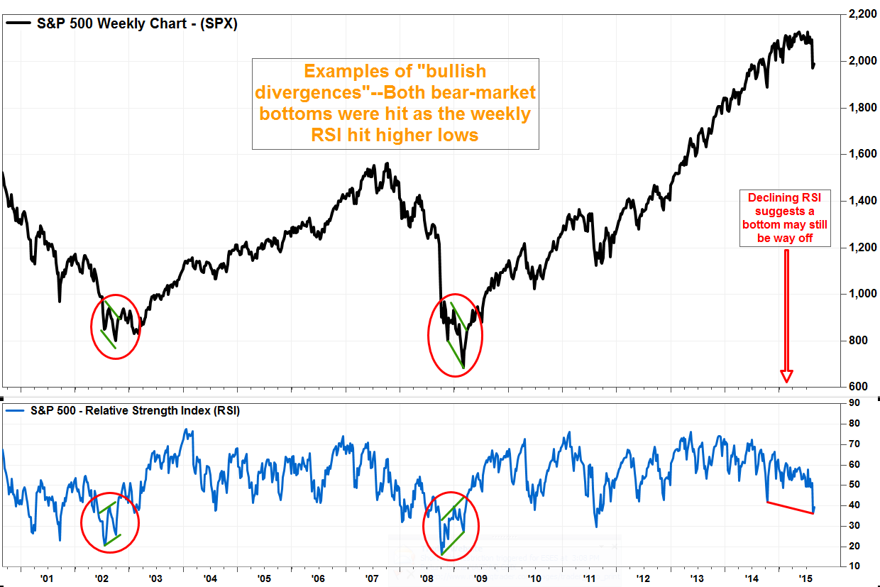
According
to research and analytics firm Divergence Analysis, the focus remains on downside risk until there is a clear, developed divergence bottom.
On Friday, the S&P 500 gave up 1.2% in morning trade, after data showed August jobs growth in the U.S. was less than expected.
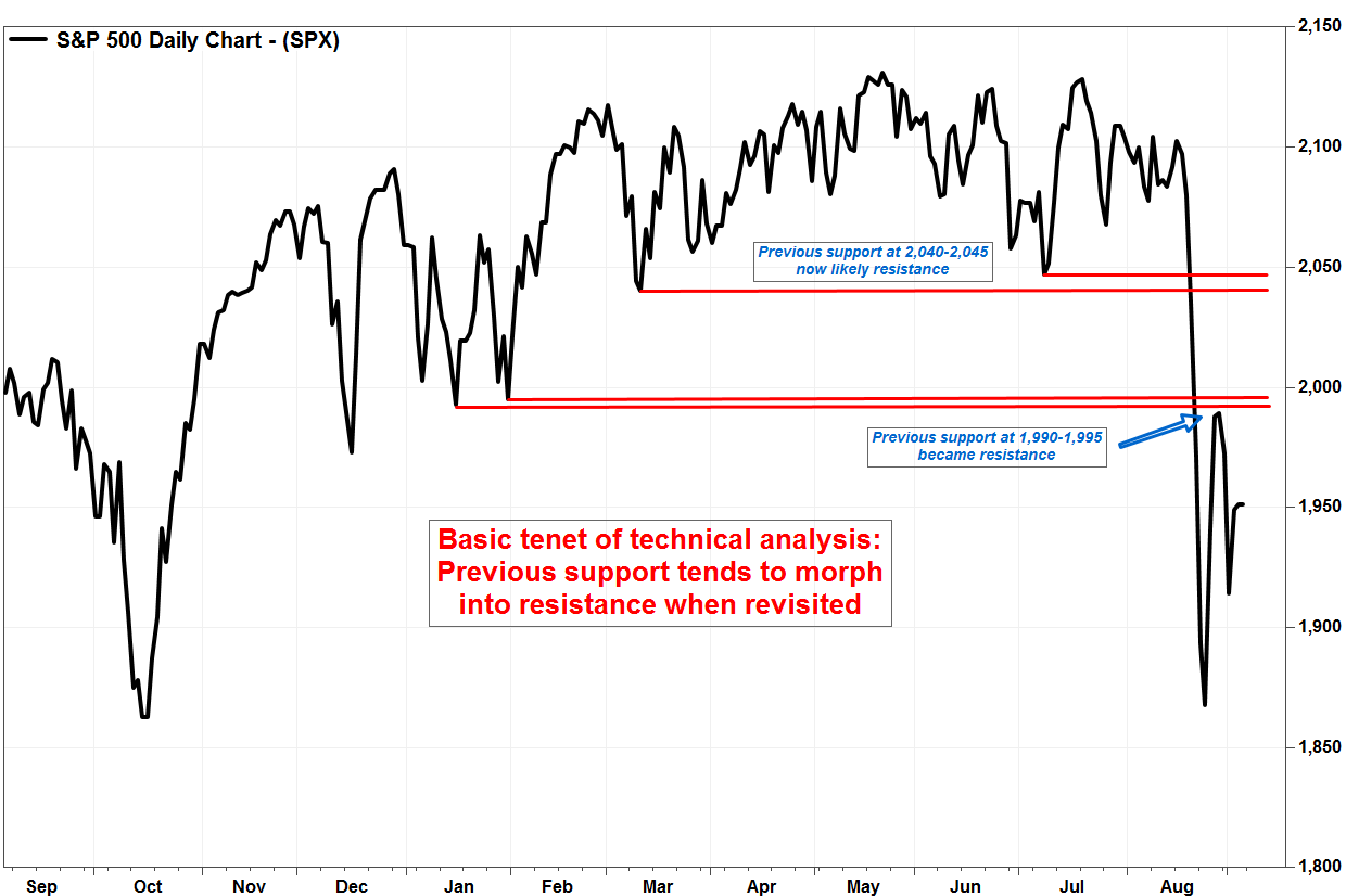
That said, one of the basic rules of technical analysis is that previous support tends to turn into resistance when revisited. The stronger the support, the stronger the resulting resistance.
During last week's bounce, the first area of potential resistance at the January lows was tested, and it held firm. Above that, the March and July troughs around the 2,040 to 2,045 level should prove hard to surpass.
On the downside, the 1,815 level could be weighty for the long-term outlook. That’s where an uptrend line drawn off the March 2009 low currently extends.
Below that, the 1565-1575 area sticks out on the charts for two reasons:

Kilgore sees two things:
1) The first key retracement level based on the Fibonacci, or “divine ratio,” is around 1575, which represents a 38.2% retracement of the rally off the March 9, 2009 closing trough of 676.53 to the May 21 high of 2,130.82.
2) The S&P 500’s October 9, 2007 closing peak was 1,565, just before the Great Recession hit. That should have turned into strong support.


![[XAUUSD]: Weekly Liquidity Activation Points (timings), June 29 - July 3, 2026](https://c.mql5.com/6/1014/splash-preview-772062.png "[XAUUSD]: Weekly Liquidity Activation Points (timings), June 29 - July 3, 2026")
