Argus Indicator
- インディケータ
-
Yevhen Hladchenko
 I am a discretionary trader turned systems developer.
After several years of trading the markets by hand - learning price action, risk management, and the psychology of execution the hard way - I reached one clear conclusion: consistency comes from process, not emotion. - バージョン: 2.0
- アクティベーション: 5
The package consists of two MetaTrader 5 indicator files that are normally placed together on the chart:
Part 1 — Top Indicator: TudasInstantAnalysis.mq5
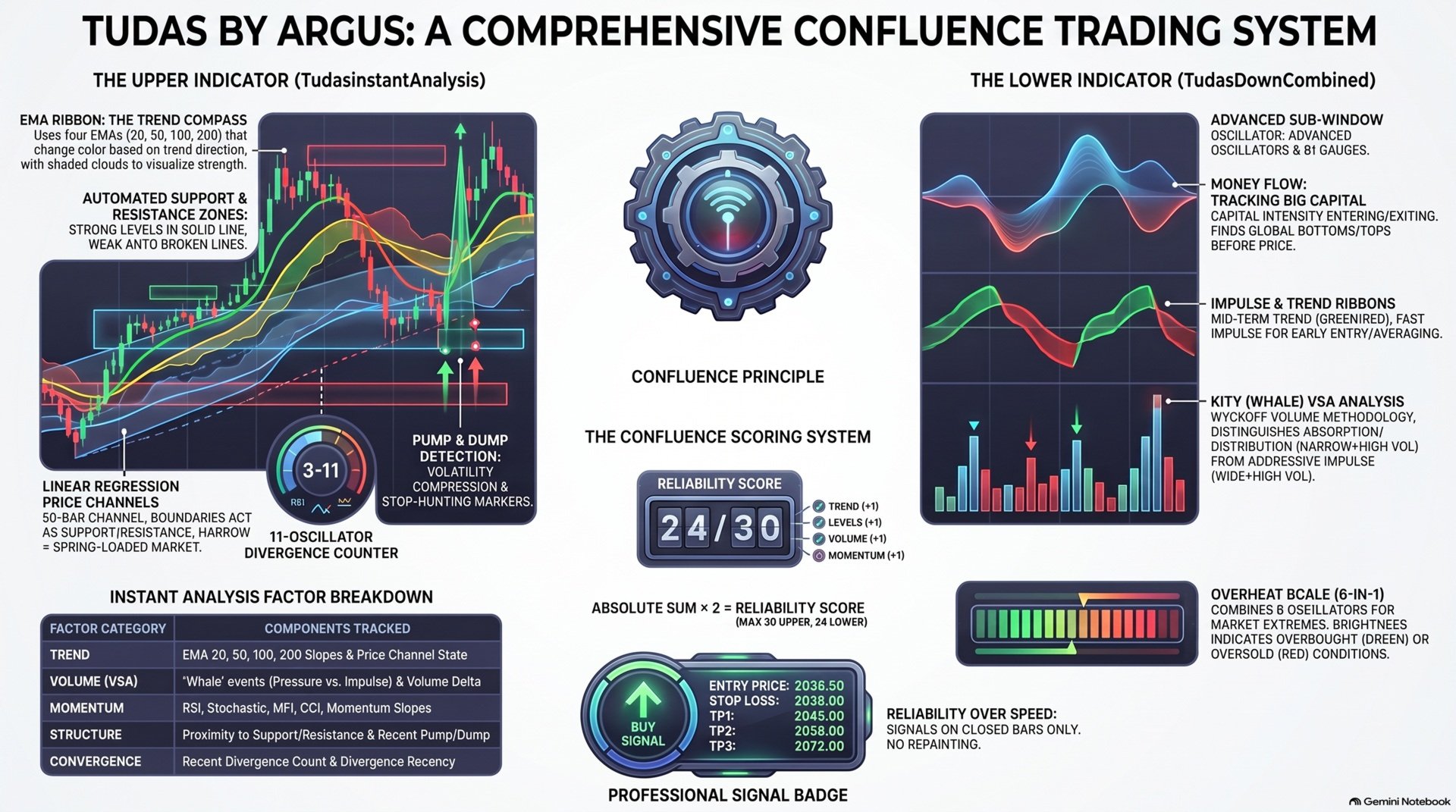
How to read trend strength: the 4 lines fan out to the same side and the clouds share the same color — a strong, stable trend. The lines weave together and flip color often — the market is sideways, better to skip signals.
How to read it: the channel edges act as support/resistance; after a breakout, the middle line usually switches roles. The channel's direction filters out false signals against the trend.
Divergence counter — one of the strongest phenomena in technical analysis: price marks a new extreme, but the oscillator doesn't — the move is losing strength underneath. Calculated across 11 oscillators at once (RSI, MACD, Stochastic, AO, CCI, Momentum, OBV, ADX, MFI, ROC, WPR):
Part 2 — Bottom Indicator: TudasDownCombined.mq5
Three uses:
Being the fastest layer, it's not enough on its own — by default it's used as an early warning, with reliability confirmed by Money Flow/the Ribbon/the analysis panel. Works best with an already established trend.
The module analyzes bar volume and range (honest disclaimer: forex/CFD brokers don't provide data on individual trade sizes — this is volume analysis under the Wyckoff methodology, not a literal "whale detector")
- TudasInstantAnalysis.mq5 — the "top" indicator, drawn over price on the main chart.
- TudasDownCombined.mq5 — the "bottom" indicator, an independent subwindow below the chart.
Part 1 — Top Indicator: TudasInstantAnalysis.mq5
1.1 EMA Ribbon — moving-average ribbon
Trend "by eye" on candles is easy to confuse with a pullback: you end up trading against the move right when a local correction looks like a reversal.The ribbon removes that subjectivity: four EMAs (20, 50, 100, 200) are colored automatically based on their direction.
- Green — the line is rising (slope faster than InpFlatATR ×ATR per bar).
- Red — falling.
- Yellow — sideways, slope within the threshold.
- Line thickness increases with the period: EMA20 is the thinnest, EMA200 the thickest.
- Semi-transparent clouds fill the space between neighboring lines: green when the upper EMA sits above the lower one, red when it's the other way around
How to read trend strength: the 4 lines fan out to the same side and the clouds share the same color — a strong, stable trend. The lines weave together and flip color often — the market is sideways, better to skip signals.
Simple idea: price pulls back to a green EMA — wait for a buy signal from another module in the package (mirror for red). Works best with the trend or in a flat market; against the trend, take short targets only or skip the signal.
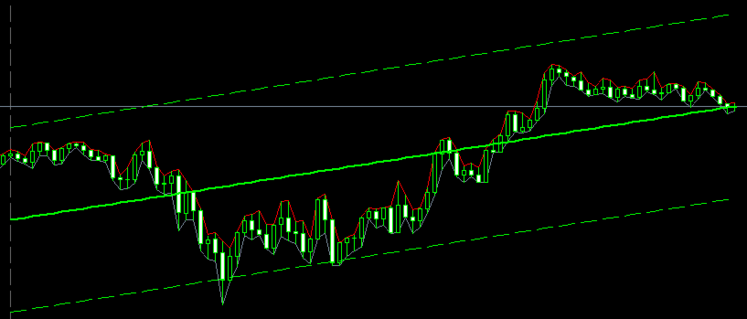
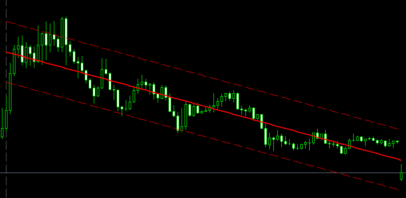
1.2 Price Channel(PriceChannel)An entry "out of thin air", with no relation to structure — it's unclear exactly where you went wrong if the trade didn't work out.The linear-regression channel over the last InpLength bars (50 by default) gives an entry from the edge, not from nowhere: three lines — mean (solid) + upper/lower (dashed), width = ± InpMult ×standard deviation.
- Green (BULL) / Red (BEAR) / Yellow (FLAT) — based on the regression slope, normalized and compared against the InpThreshold threshold.
- Label in the chart corner: PriceChannel: BULL/BEAR/FLAT slope X.XX .
- Wide channel = high volatility/strong trend. Narrow channel = calm before an impulse — the market "coiling like a spring".
How to read it: the channel edges act as support/resistance; after a breakout, the middle line usually switches roles. The channel's direction filters out false signals against the trend.
Simple idea: price at the green lower edge — wait for Buy; at the red upper edge — wait for Sell. Against the channel's direction, signals are weaker.
How to read it: price moves from level to level. Open a position from a strong level, and place the target before reaching the next strong level, not right on it. Bounce or breakout: Bounce — in a sideways/weak trend: find the nearest strongest level, wait for the bounce to start, trade in its direction. Breakout — in a strong trend: wait for the level to break + a retest of the same level from the other side, trade in the breakout's direction.1.3 Support/Resistance Zones
Hand-drawn levels — different ones today, different ones tomorrow, and stops pile up right where you drew yesterday's line.The indicator finds levels on its own, from confirmed swing pivots over the last SRZ_InpLookback bars (5000 by default), and updates them without trader intervention.
- Green — support, red — resistance.
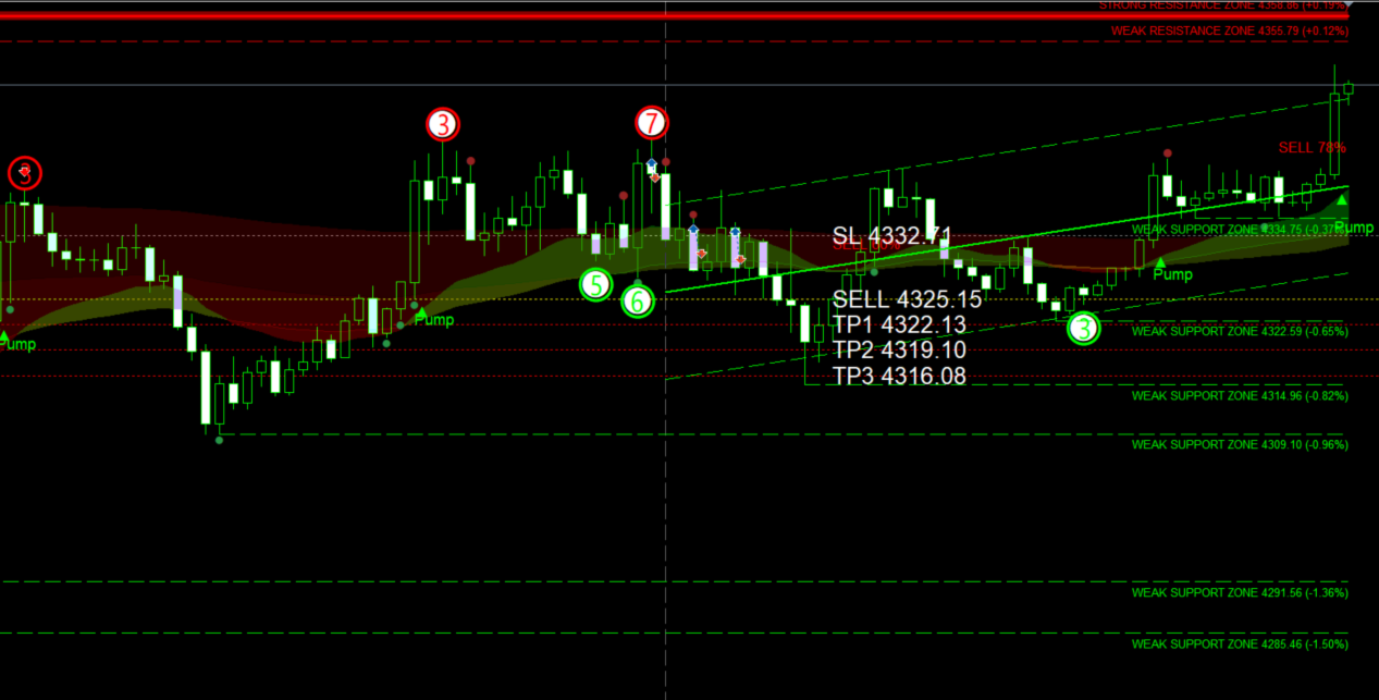
- Weak zone — thin dashed line (1 touch). Strong zone — thick solid line + rectangular fill ( InpStrongTouches =2+ touches) — the key levels to watch first. Label next to the line: STRONG/WEAK RESISTANCE/SUPPORT ZONE price (±% of current) .
- Broken zones aren't deleted — they remain as a dotted line with the historical memory of the level, not just "the level disappeared".
- Nearby price touches (radius broken price label — a InpTouchPts ) merge into a single zone instead of duplicating — the touch counter grows, the zone stays one.
Advanced idea: you don't need to wait for every module to agree at once — 2–3 factors (level + channel edge + EMA turn) already give a noticeably more reliable entry point than a level alone.
1.4 Pressure Dots + Pump/Dump + Divergences (TudasCandleSignals)
Candles say a lot, but it's hard to track every tick — you miss half the clues, and the ones you do notice get interpreted a little differently each time.Big-player pressure — colored dots next to the candle's wick:
- Dot at the low, green — buying pressure.
- Dot at the high, red — selling pressure.
- Dot size = pressure strength (close offset from the bar's center, reinforced by anomalous volume). Weak signals (below Pressure_MinStrength ) aren't drawn.
- Pump (green label with an up arrow) — volatility compression + volume increase on the breakout bar + a close above the compression range. A zone where big players were quietly building a position — an impulse is brewing.
- Dump (red label with a down arrow) — a recent high pierced followed by a weak close — a classic retail stop-hunt, a strong sell signal.
Divergence counter — one of the strongest phenomena in technical analysis: price marks a new extreme, but the oscillator doesn't — the move is losing strength underneath. Calculated across 11 oscillators at once (RSI, MACD, Stochastic, AO, CCI, Momentum, OBV, ADX, MFI, ROC, WPR):
- Red arrow up — bearish divergence, green down — bullish.
- Number in the circle — how many oscillators confirmed the divergence (minimum InpMinCount =3, maximum 11).
- Filled circle — also confirmed by money flow (OBV/MFI diverged too) — a reinforced signal.
- False divergences, after which no real move followed ( InpProveBars bars), remove themselves retroactively.
Simple idea: bullish divergence at the bottom — wait for Buy; bearish at the top — wait for Sell. The higher the number in the circle, the stronger the signal.
1.5 "Instant Technical Analysis" Panel
Everything described above is manual work: looking at 5 different layers and weighing what they say together yourself. The panel does this automatically.
15 factors, reliability scale 0–30
№ | Factor | Source |
|---|---|---|
| 1–4 | EMA20/50/100/200 trend | slope of the EMA Ribbon lines |
| 5 | Price channel | PriceChannel state |
| 6 | "Whale" event (VSA) | narrow bar+anomalous volume+close at the edge = pressure; wide bar+anomalous volume = impulse |
| 7 | Volume delta | volume on bullish bars minus bearish bars |
| 8-12 | RSI/Stochastic/MFI/CCI/Momentum | rising/falling over recent bars |
| 13 | Latest divergence | if more recent than AN_DivRecencyBars bars |
| 14 | Position next to an S/R zone | closer to support or resistance |
| 15 | Latest Pump/Dump | if more recent than AN_PumpDumpRecencyBars bars |
- Each factor contributes +1 (buy side), −1 (sell side), or 0. The sum determines direction, reliability = |sum|×2, max 30 — but the more factors that ACTUALLY line up at the same time, the higher and more reliable that number is, and vice versa: 2–3 points means almost nothing lined up, the signal isn't worth attention. The signal fires when reliability ≥ AN_MinScoreToFire (a threshold calibrated against the real score distribution — the theoretical max of 30 is nearly unreachable), no more than once every AN_CooldownBars bars, and only on an already-closed bar — reliability matters more than how fast it appears. What appears on the chart when it fires:
- BUY/SELL XX% badge next to the entry.
- Analysis panel: sections "1) Trend / 2) Levels / 3) Entry Confirmation" — each factor with a colored dot (green = favors buy, red = favors sell, yellow = neutral), then Reliability: N/30 points , entry/SL/TP, risk/reward ratio, and a live line below that updates every bar: the current floating result while the position is "open", and after closing, the final outcome by stop or by take.
- Entry level and SL — in large white text, so they don't get lost on the chart.
- TP1/TP2/TP3 — from the nearest S/R zones in the trade's direction, but never closer than the stop (minimum 1R/2R/3R) — the risk/reward ratio is protected at the calculation level, not just visually.
- Touch counter at the bottom left — how many times TP1/TP2/TP3/SL were actually reached across every signal fired during the session
Part 2 — Bottom Indicator: TudasDownCombined.mq5
2.1 Money Flow
Price is rising, but money is actually leaving the asset — you can't see this in the candles, and the move dies right after you enter, because there's no real buyer behind it. Money Flow shows the intensity of capital entering and leaving the asset, before this shows up in price, not after. The line is smoothed through a cascade of EMAs to strip out small-player noise and show the direction the big players are setting.
- Flow rising — money coming in — bullish signal.
- Flow falling — money leaving — bearish signal.
- Green zone (near 100%) — market top. Red zone (near 0%) — market bottom.
- Single label in the corner: Flow: NN% .
2.1 Money Flow
Price is rising, but money is actually leaving the asset — you can't see this in the candles, and the move dies right after you enter, because there's no real buyer behind it. Money Flow shows the intensity of capital entering and leaving the asset, before this shows up in price, not after. The line is smoothed through a cascade of EMAs to strip out small-player noise and show the direction the big players are setting.
- Flow rising — money coming in — bullish signal.
- Flow falling — money leaving — bearish signal.
- Green zone (near 100%) — market top. Red zone (near 0%) — market bottom.
- Single label in the corner: Flow: NN% .
Simple idea: price leaves the red zone (bottom) and flow starts rising — wait for Buy. Leaving the green zone (top) with flow falling — wait for Sell. Works best with the flow's direction — shorting against a rising flow of big players is risky, that kind of counter-signal is best filtered out.
2.2 Trend Ribbon
2.2 Trend Ribbon
The wave just started, or is it already ending — by eye these two states are almost indistinguishable.
The ribbon is colored by direction: green — rising wave, red — falling wave. A color change at the wave's turn is a possible reversal signal. Advanced idea (three-wave combo): determine the overall trend with Money Flow → confirm with an Impulse turn → enter on the ribbon/analysis-panel signal → results tend to be more precise on higher timeframes.
2.3 Impulse
There's movement on the chart, but no force behind it — the trade reverses right after you enter, because there was no real volume behind the impulse.
Impulse is the fastest, least smoothed layer in the package: the wave changes color by direction (green = bullish mood, red = bearish), wave size = current strength of buyers/sellers, dots at peaks/troughs = turning points. Three uses:
- Entry — in an uptrend, the best entries are green dots on a green wave.
- Averaging in — the same colored dot again, in the same direction — you can add to the position with the trend.
- Taking profit — an opposite-colored dot appears — signal to close the position.
Being the fastest layer, it's not enough on its own — by default it's used as an early warning, with reliability confirmed by Money Flow/the Ribbon/the analysis panel. Works best with an already established trend.
2.4 Whales (VSA)
A big player is quietly building a position while retail jumps in right at the peak.
- Pressure (narrow bar + anomalous volume + close at the edge) = absorption/distribution — a phase where a big player is accumulating or unloading a position.
- Impulse trades (wide bar + anomalous volume) = an aggressive trade already opened by a big player.
- The wave doesn't cut off instantly — it holds and decays smoothly, forming a shaped mountain, not an isolated flash.
- Text labels right on the chart: "R↑/R↓" (reversal — absorption at the bottom/distribution at the top) and "I↑/I↓" (impulse — trend continuation) — green for buy, red for sell.
- A readiness dot on the main chart — appears when several consecutive events cluster in the same direction ( Kity_ReadinessPersistEvents , 3 by default) — a signal that the accumulation/distribution phase is about to end.
Simple idea: knowing where a big player opens and closes positions means trading alongside the strongest market participants, not against them.
Advanced idea: identify the market phase from the pressure → confirm the big player's strength with impulse trades and the readiness dot → enter with the trend on the signal.The scale combines 6 oscillators at once (RSI, StochRSI, Stochastic, MFI, CCI, Momentum) into a single compact strip — one unified "sensor" for market overheating, instead of watching six charts at once.
2.5 Overheat Scale
Two typical mistakes: entering after the move already happened, and entering right as the impulse starts fading.
- Green — overbought (buy-side strength). Red — oversold (sell-side strength). Grey — neutral.
- Segment brightness = degree of overheating (how far the move has gone).
- Runs with hysteresis (doesn't switch off instantly at the smallest pullback — there's a separate zone-exit level, so it doesn't flicker every bar).
- Labels on the right update every tick: RSI (62%), etc
"Buy the green" — enter on green overheating, exit as it fades. "Sell the red" — mirror for red. The more of the 6 oscillators that overheat at the same time, the more reliable the signal.
Part 3 — General Principles
- Reliability matters more than speed. Every marker and both panels are calculated only on already-closed bars — a signal may appear a bar later, but it never "changes its mind" afterward.
- The more factors that line up at the same time, the stronger the signal — this principle holds at every level of the package: from a single divergence, to all six Overheat Scale oscillators, to the final analysis panel.
- Best used with the trend or in a flat market, on higher timeframes. Against the trend, signals are weaker — short targets only, or skip them.
- Thresholds and weights are calibration hypotheses, obtained through testing on real data, not dogma — they're tuned to the specific instrument/timeframe via debug mode ( ..._Debug=true ), which prints the real signal distribution to the journal.
- Simple strategy — wait for the corresponding layer's Buy/Sell signal and enter. Advanced strategy — don't wait for every module to agree at once; 2–3 matching factors already give a noticeably more reliable entry point than any one alone