Phantom Trade Analytics
- Utilità
- Versione: 1.0
- Attivazioni: 5

Phantom Trade Analytics
Professional Performance Dashboard for MetaTrader 5
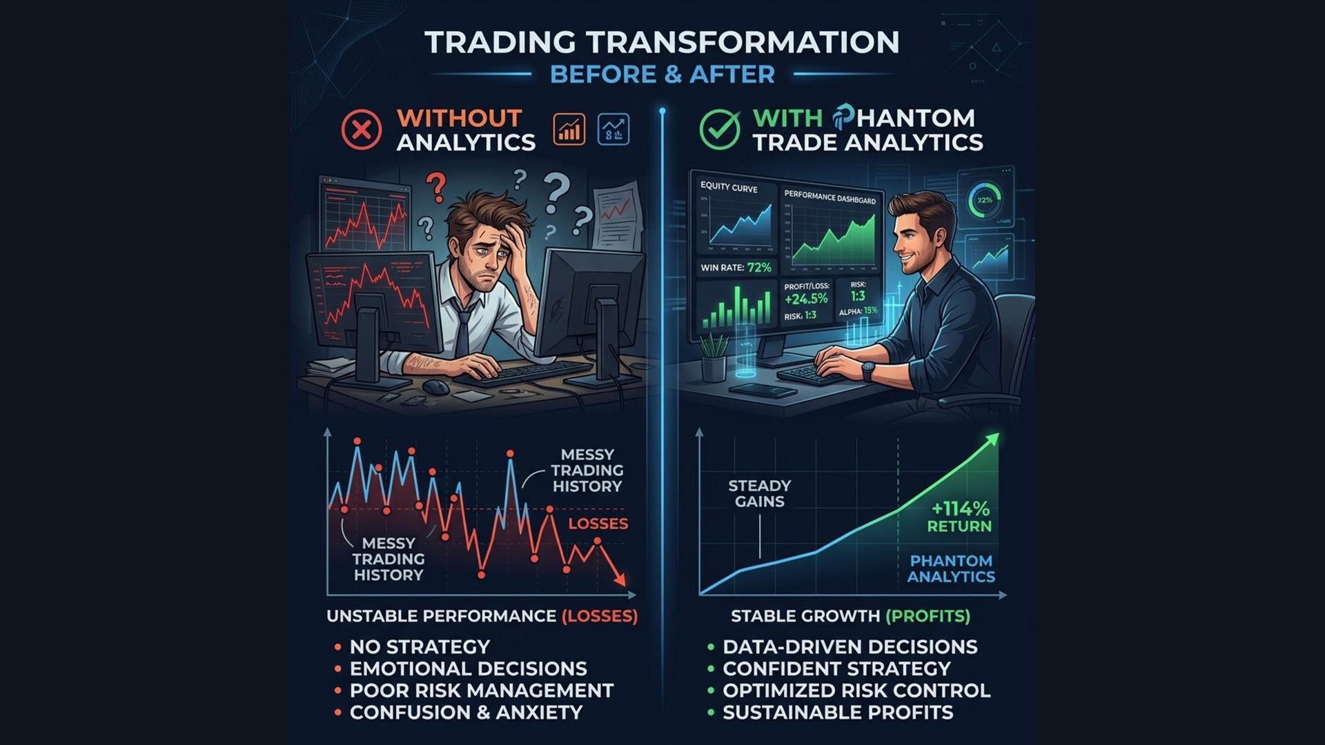
How good is your trading? Do you actually know your Sharpe Ratio? Your Expectancy? Your real Win Rate including commissions and swaps?
Most traders look at their balance and "feel" like they're doing okay. But without proper institutional-grade metrics, you're flying blind. **Phantom Trade Analytics** puts a professional performance dashboard directly on your chart, analyzing your real trade history in real-time.
---
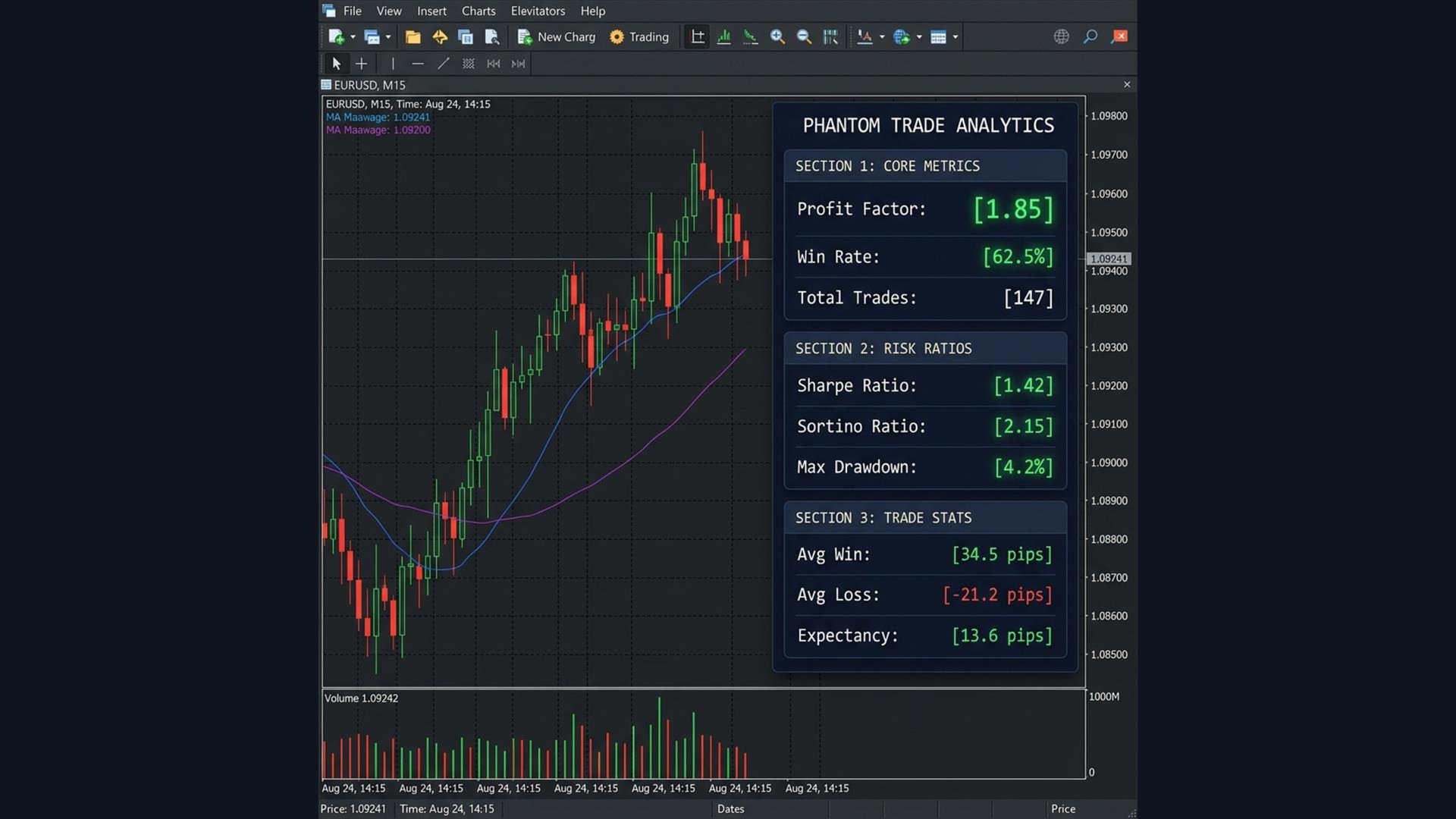
What It Measures
The dashboard is divided into three sections, each color-coded for instant reading:
Core Metrics
| Metric | What It Tells You |
| **Profit Factor** | Total wins / Total losses. Above 1.5 = Green. Below 1.0 = Red (you're losing money) |
| **Win Rate** | Percentage of winning trades. Above 60% = Green |
| **Total Trades** | How many trades were analyzed |
| **Net Profit** | Your actual P&L including commissions and swaps |
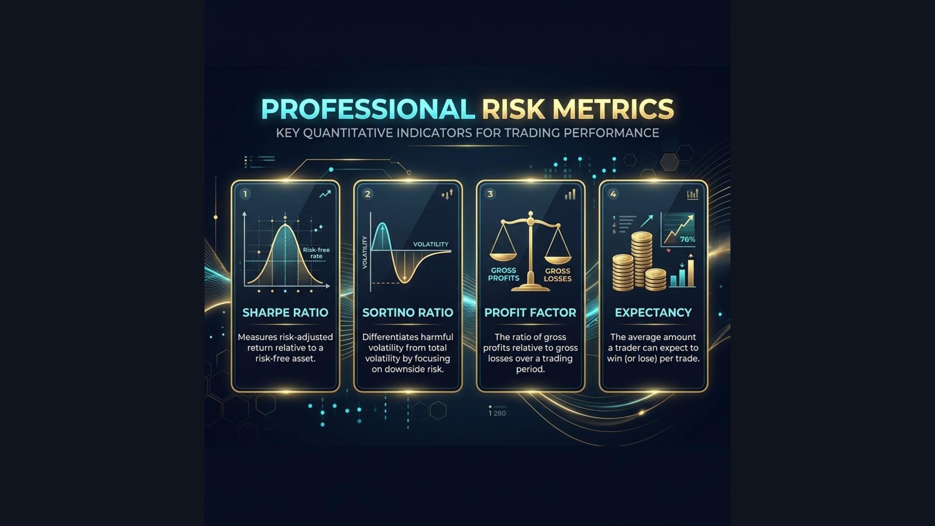
Risk Ratios (Institutional Grade)
| Metric | What It Tells You |
| **Sharpe Ratio** | Risk-adjusted return. Above 1.0 = Good. Above 2.0 = Excellent |
| **Sortino Ratio** | Like Sharpe, but only penalizes downside volatility. More accurate for trading |
| **Max Drawdown %** | The deepest your equity curve fell. Below 5% = Green |
Trade Statistics
| Metric | What It Tells You |
| **Avg Win** | Average profit per winning trade |
| **Avg Loss** | Average loss per losing trade |
| **Expectancy** | How much you can expect to make per trade on average |
| **Best Trade** | Your single biggest winning trade |
| **Worst Trade** | Your single biggest losing trade |
---
Key Features
1. Color-Coded Health Check
Every metric is automatically color-coded:
- 🟢 **Green**: Healthy — your trading is performing well
- 🟡 **Yellow**: Caution — room for improvement
- 🔴 **Red**: Danger — you need to fix something
2. Includes Commissions & Swaps
Unlike basic MT5 reports, this dashboard calculates net profit including broker commissions and overnight swap fees. What you see is the real number.
3. Adjustable History Window
Set the analysis period from 7 days to 365 days. Track short-term performance or long-term consistency.
4. Non-Intrusive Design
A compact, professional dark panel that doesn't block your chart. Place it in any corner.
---
Parameters
| Parameter | Default | Description |
| History Days | 30 | Number of days to analyze |
| Refresh Rate | 5 | Seconds between dashboard updates |
| Dashboard Corner | RIGHT UPPER | Panel placement on chart |
| X Offset | 250 | Distance from horizontal edge |
| Y Offset | 20 | Distance from vertical edge |
| Panel BG Color | Dark Navy | Background color of the panel |
| Tester Self-Trade | true | Enable demo trades for MQL5 Validator |
Professional Performance Dashboard for MetaTrader 5
How good is your trading? Do you actually know your Sharpe Ratio? Your Expectancy? Your real Win Rate including commissions and swaps?
Most traders look at their balance and "feel" like they're doing okay. But without proper institutional-grade metrics, you're flying blind. **Phantom Trade Analytics** puts a professional performance dashboard directly on your chart, analyzing your real trade history in real-time.
---
What It Measures
The dashboard is divided into three sections, each color-coded for instant reading:
Core Metrics
| Metric | What It Tells You |
| **Profit Factor** | Total wins / Total losses. Above 1.5 = Green. Below 1.0 = Red (you're losing money) |
| **Win Rate** | Percentage of winning trades. Above 60% = Green |
| **Total Trades** | How many trades were analyzed |
| **Net Profit** | Your actual P&L including commissions and swaps |
Risk Ratios (Institutional Grade)
| Metric | What It Tells You |
| **Sharpe Ratio** | Risk-adjusted return. Above 1.0 = Good. Above 2.0 = Excellent |
| **Sortino Ratio** | Like Sharpe, but only penalizes downside volatility. More accurate for trading |
| **Max Drawdown %** | The deepest your equity curve fell. Below 5% = Green |
Trade Statistics
| Metric | What It Tells You |
| **Avg Win** | Average profit per winning trade |
| **Avg Loss** | Average loss per losing trade |
| **Expectancy** | How much you can expect to make per trade on average |
| **Best Trade** | Your single biggest winning trade |
| **Worst Trade** | Your single biggest losing trade |
---
Key Features
1. Color-Coded Health Check
Every metric is automatically color-coded:
- 🟢 **Green**: Healthy — your trading is performing well
- 🟡 **Yellow**: Caution — room for improvement
- 🔴 **Red**: Danger — you need to fix something
2. Includes Commissions & Swaps
Unlike basic MT5 reports, this dashboard calculates net profit including broker commissions and overnight swap fees. What you see is the real number.
3. Adjustable History Window
Set the analysis period from 7 days to 365 days. Track short-term performance or long-term consistency.
4. Non-Intrusive Design
A compact, professional dark panel that doesn't block your chart. Place it in any corner.
---
Parameters
| Parameter | Default | Description |
| History Days | 30 | Number of days to analyze |
| Refresh Rate | 5 | Seconds between dashboard updates |
| Dashboard Corner | RIGHT UPPER | Panel placement on chart |
| X Offset | 250 | Distance from horizontal edge |
| Y Offset | 20 | Distance from vertical edge |
| Panel BG Color | Dark Navy | Background color of the panel |
| Tester Self-Trade | true | Enable demo trades for MQL5 Validator |