Building a Footprint Chart in MQL5: Reading Order Flow from Raw Tick Data

https://www.mql5.com/en/market/product/190942?source=Site+Market+My+Products+Page
A candle tells you where price went. It does not tell you who moved it. This
Why a candle hides the important part
A candlestick is a summary of four numbers out of thousands. Open, high, low, close, and everything that actually happened in between is thrown away.
Consider two candles with identical bodies, both closing five points up on the same total volume. In the first, buyers lifted the offer steadily all the way up. In the second, price was pushed up early and then two thousand contracts were quietly sold into every tick of the rally, and it closed up only because the last print happened to be an uptick. These are opposite situations. The candle draws them the same.
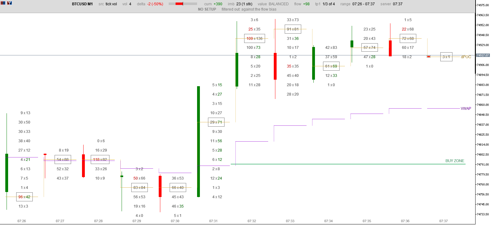
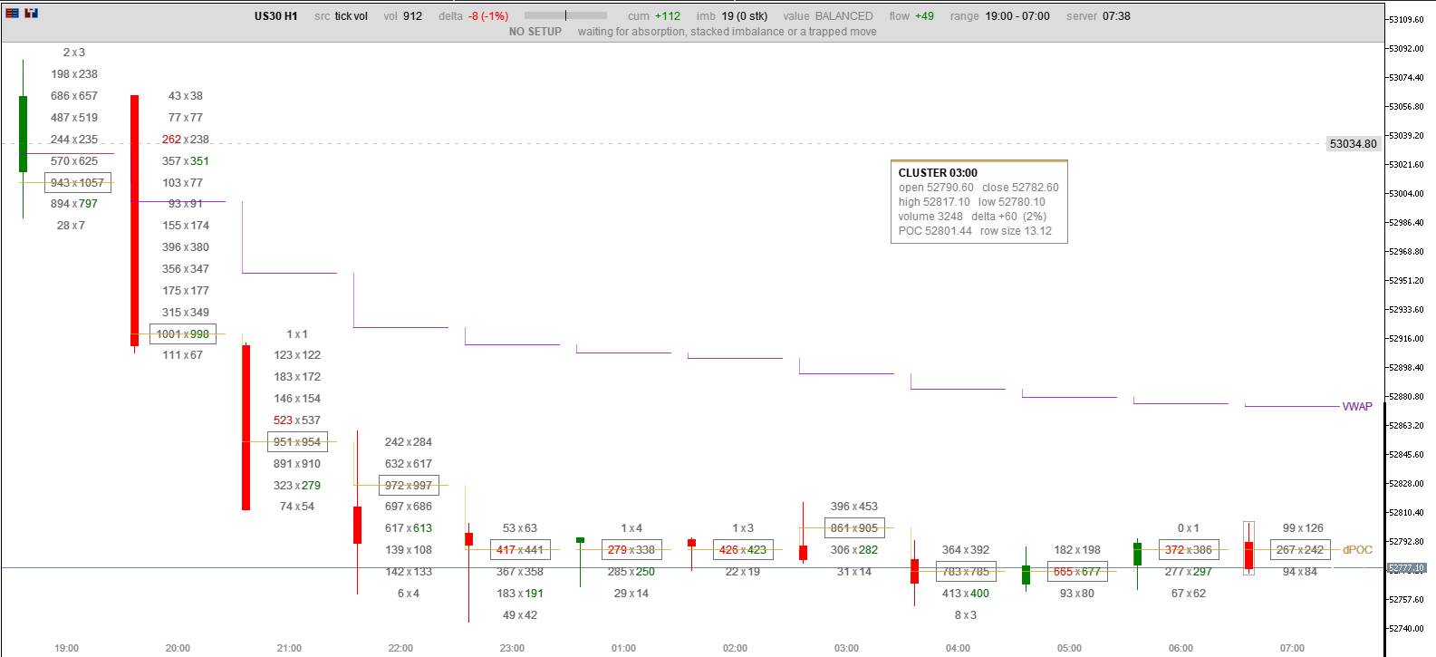
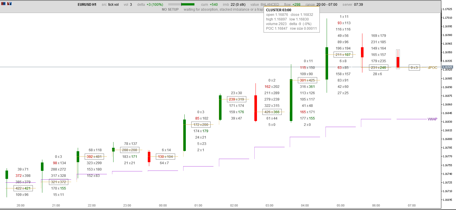
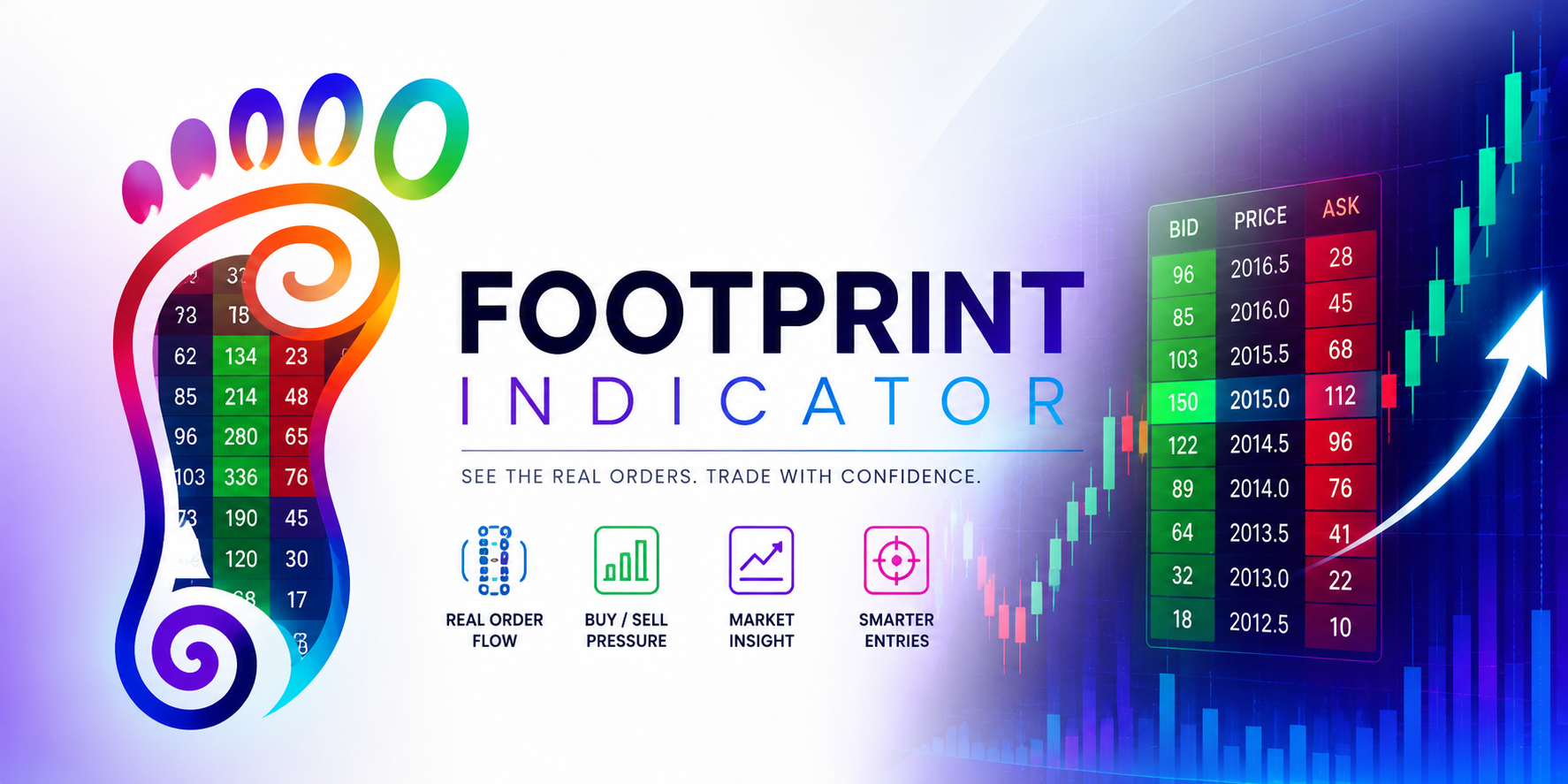
A footprint chart, also called a cluster chart, keeps what the candle discards. Instead of one body it shows every price the candle traded at, and at each price it shows two numbers: volume that was sold into the bid, and volume that was bought from the ask. Reading down a column, you see where the effort went and which side was spending it.
This article builds one. The attached FootprintDemo.mq5 is a complete, single file, no includes, and compiles as it stands. It is deliberately small so the whole thing fits in your head.
What MetaTrader actually gives us
Everything starts with CopyTicksRange .
Note the flag. It must be COPY_TICKS_ALL .
This is the first thing that catches people out, and it costs hours. It is tempting to use COPY_TICKS_TRADE , since trades are what we want. On an exchange instrument that works. On a retail forex or CFD account it returns nothing at all, every time, on every symbol. There is no error, no warning, just an empty result and a blank chart.
The reason is structural. A retail broker for spot forex, gold or an index CFD is not an exchange. It publishes a stream of bid and ask quotes. There is no central tape of executed trades to publish, so there are no trade ticks and the TICK_FLAG_BUY and TICK_FLAG_SELL flags are never set. Ask for trade ticks and you are asking for something that does not exist in that feed.
COPY_TICKS_ALL returns the quote stream, which is what we have to work with.
Attributing a tick to a buyer or a seller
Now the real problem. We have ticks. Which side was the aggressor?
The answer depends on how much the feed is willing to tell us, so the code tries three sources in falling order of trust.
Level one is the broker stating it directly. If a tick carries TICK_FLAG_BUY , someone lifted the offer and we are done. This is real exchange data and nothing beats it. You will see it on futures and on exchange traded stocks, and never on spot forex.
Level two applies when there is a last traded price and a live spread. A print at or above the ask means a buyer crossed the spread to get filled. At or below the bid means a seller did. This is the classical rule and it is close to exact.
Level three is the fallback that makes footprints possible on retail feeds at all. It is the tick rule, sometimes called Lee-Ready after the paper that formalised it: if the price ticked up, treat the volume as buyer initiated; if it ticked down, seller initiated; if unchanged, inherit the previous direction.
Be honest about level three, both in your own head and to anyone reading your chart. It is an inference from price movement, not observed order flow. Academic work on the tick rule generally puts it in the region of eighty to ninety percent agreement with true trade direction on liquid instruments. That is high enough to be genuinely useful and low enough that you should never present it as exchange data. Every MetaTrader footprint indicator on a forex feed is doing this, whatever its marketing says.
One more subtlety. On a quote-only feed there is no traded volume either, so tick_volume is a count of quote updates rather than contracts. It correlates well with real activity, but a "volume" of 900 means nine hundred price updates, not nine hundred lots.
Clustering ticks into price rows
With direction resolved, each tick is dropped into a price bucket.
The interesting decision is rowSize . The obvious choice is the symbol's tick size, so every distinct price gets its own row. Do not do this. It will work beautifully on EURUSD and then destroy you on Bitcoin.
Consider the arithmetic. A BTCUSD tick size is 0.01. A quiet M1 candle covering forty dollars is four thousand rows. An H4 candle covering two thousand dollars is two hundred thousand rows, per candle, and you are holding a dozen candles. Either you allocate hundreds of megabytes or your array bounds silently clip and you display wrong numbers.
Scale the row to the candles instead:
Using the widest candle on screen rather than the average guarantees that no candle ever exceeds the target row count. A quiet candle simply gets fewer rows, which is correct: it had less to say.
Why you must not draw this with chart objects
The instinct is OBJ_TEXT per number and OBJ_RECTANGLE per cell. Work it out before you write it. Twelve candles times fifteen rows times two numbers plus a frame is well over five hundred objects, recreated whenever anything changes. MetaTrader will crawl.
Draw into a single bitmap instead. MQL5 has everything needed built in, no include required:
g_px is a plain uint array of ARGB pixels, one per screen pixel. You write into it with ordinary array arithmetic, hand it to ResourceCreate , and point a single OBJ_BITMAP_LABEL at it with the :: prefix. One object for the entire display.
Text goes in with TextOut , which writes glyphs straight into your pixel array:
Two details that are easy to get wrong.
Set OBJPROP_BMPFILE once, not on every frame. Re-pointing the object at the resource each time forces the terminal to reload the bitmap instead of repainting it, and the visible symptom is a chart that flickers, badly, as soon as a second indicator is present.
Pass the font size to TextSetFont as a negative number. Negative means tenths of a point and is independent of screen DPI. Positive values are device dependent and your careful layout will be wrong on somebody else's monitor.
Mapping price to pixels
CHART_PRICE_MIN and CHART_PRICE_MAX give the visible price range and CHART_HEIGHT_IN_PIXELS the height. OBJ_BITMAP_LABEL at corner CORNER_LEFT_UPPER shares that coordinate origin, so the mapping is a straight linear interpolation.
Reading what you have drawn
The point of control is the row with the most total volume. Mark it. It is the price the market spent the most effort agreeing on, and it acts as a magnet on a retest.
Delta is total ask volume minus total bid volume for the candle. Positive means buyers were the aggressors overall. The useful signal is when delta and the candle disagree: a candle that closes up on strongly negative delta means buyers pushed price while sellers did the real business, and those buyers are often about to be proved wrong.
Diagonal imbalance is the one that takes explaining. You do not compare the bid and ask on the same row, because that comparison is nearly meaningless: a resting order and the order that hit it are the same trade counted from two sides. Compare diagonally instead. Ask volume at a price against bid volume one row below, since those two compete for the same participants. When the ask side beats the bid diagonal by a multiple, typically three, buyers were paying up aggressively at that level.
Three or more of those stacked consecutively is worth marking as a level. It says buyers ran through several prices without hesitating, and the bottom of that run often holds on a retest.
The problems the documentation does not warn you about
These cost real time to find. They are the reason this article exists.
Tick history arrives asynchronously. The first CopyTicksRange for a range will usually fail or return zero, because the terminal has only just started downloading the tick files for those days. It is very tempting to try a few times and then fall back to something approximate. Do not cap the attempts. The download can take tens of seconds on a symbol you have never opened, and if you mark those candles finished you will never go back for the real data. Retry indefinitely, and treat any approximation as provisional until real ticks land.
But retrying naively will freeze the terminal. CopyTicksRange blocks, and all indicators for one symbol share a single thread. Retrying twelve candles on every render pass is roughly eighty blocking calls a second on the thread that draws your chart. Space the attempts out: immediate, then a few hundred milliseconds, backing off to a few seconds, then a slow poll. The difference between a frozen terminal and a smooth one is entirely in that backoff.
Chart change events echo. If you redraw on CHARTEVENT_CHART_CHANGE , and your redraw calls ChartRedraw , and another indicator on the chart does the same, you have built a feedback loop. Compare the actual geometry — width, height, first visible bar, visible bar count — and return immediately when nothing has moved.
WebRequest cannot be called from an indicator. It is synchronous and indicators share a thread, so MetaTrader blocks it and returns error 4014. If your tool needs to reach an external service, it has to be an Expert Advisor.
Push notifications are rate limited. SendNotification allows two calls per second and ten per minute, and abusing it can get the function disabled for the user. Queue messages and release them slowly rather than firing inline.
Choosing an instrument and timeframe
A footprint needs tape to read. On EURUSD M1 during the quiet part of the Asian session you may get forty quote updates in a whole minute, spread across five price rows. Those numbers are real and completely meaningless.
Use liquid instruments and let the candle collect something. Gold, indices and the major pairs from M5 upward will give you hundreds to thousands of updates per candle, which is where the imbalances start to mean something. If you have access to exchange instruments, use them: real volume and real aggressor flags make everything above exact rather than inferred.
Where to take it next
The demo is a foundation, not a finished tool. Natural extensions, roughly in order of value:
Aggregate several chart candles into one cluster so you can view hourly footprints while working on a fifteen minute chart. Build a volume profile across everything on screen and mark the value area, the high volume nodes that attract price and the low volume nodes it moves through quickly. Track a developing point of control across candles to see where value is migrating. Detect absorption, which is heavy aggression at an extreme that fails and closes back inside, the single most reliable read a footprint offers.
All of it starts with the same thing: a tick, attributed correctly, dropped in the right bucket.
Conclusion
A footprint chart is not complicated once the data problem is solved. The hard parts are not the drawing or the mathematics. They are knowing that COPY_TICKS_ALL is the only flag that works on a retail feed, that the aggressor has to be inferred through a fallback chain, that row size must scale to the instrument, and that tick history arrives when it feels like it.
Compile the attached file, put it on gold or an index at M15, and give it a minute to load. Then watch what happens at a high that fails: the ask volume piles up at the top rows and price closes back down through them. That is absorption, and it is invisible on a candlestick chart.