
How to read an AntiOverfit PRO report without getting lost in the numbers

How to read an AntiOverfit PRO report without getting lost in the numbers
When someone opens an AntiOverfit PRO report for the first time, it is normal to feel like there is too much information. Numbers, metrics, labels, distributions, percentiles... and the sense that you need to be an expert to get anything useful out of it.
The good news is that you do not.
In fact, one of the best things about AntiOverfit PRO is exactly that: you do not need to be a statistician or a quantitative analyst to reach a clear conclusion.
Yes, the report allows you to dig deep. Yes, it has multiple layers of detail. But for a first reading, it is usually enough to look at three things: the score, the label, and the final summary.
And in practice, that alone can already tell you whether the system inspires confidence or whether it should be approached more cautiously.
What was done in this example
In this case, 100 synthetic worlds were created and validated. Put simply, we are talking about 100 alternative histories that preserve the statistical properties of XAUUSD, without repeating the exact same real historical sequence.
Then, an Expert Advisor was tested across all of those scenarios, and the result was analyzed with AntiOverfit PRO.
The report indicates that the analysis was run on XAUUSD, with 100 synthetic worlds and 100 valid worlds used.
What does that mean in practical terms?
It means we did not rely on just one historical test on the real market. Instead of blindly trusting a single price path, the system was tested on other possible paths that would also be credible.
And that is exactly what makes AntiOverfit PRO valuable.
Because a historical test can look spectacular not necessarily because the system is very robust, but because the market, during that period, happened to follow an especially favorable path. And if you only look at the original history, that often goes unnoticed.

The quick read: the main idea is already here
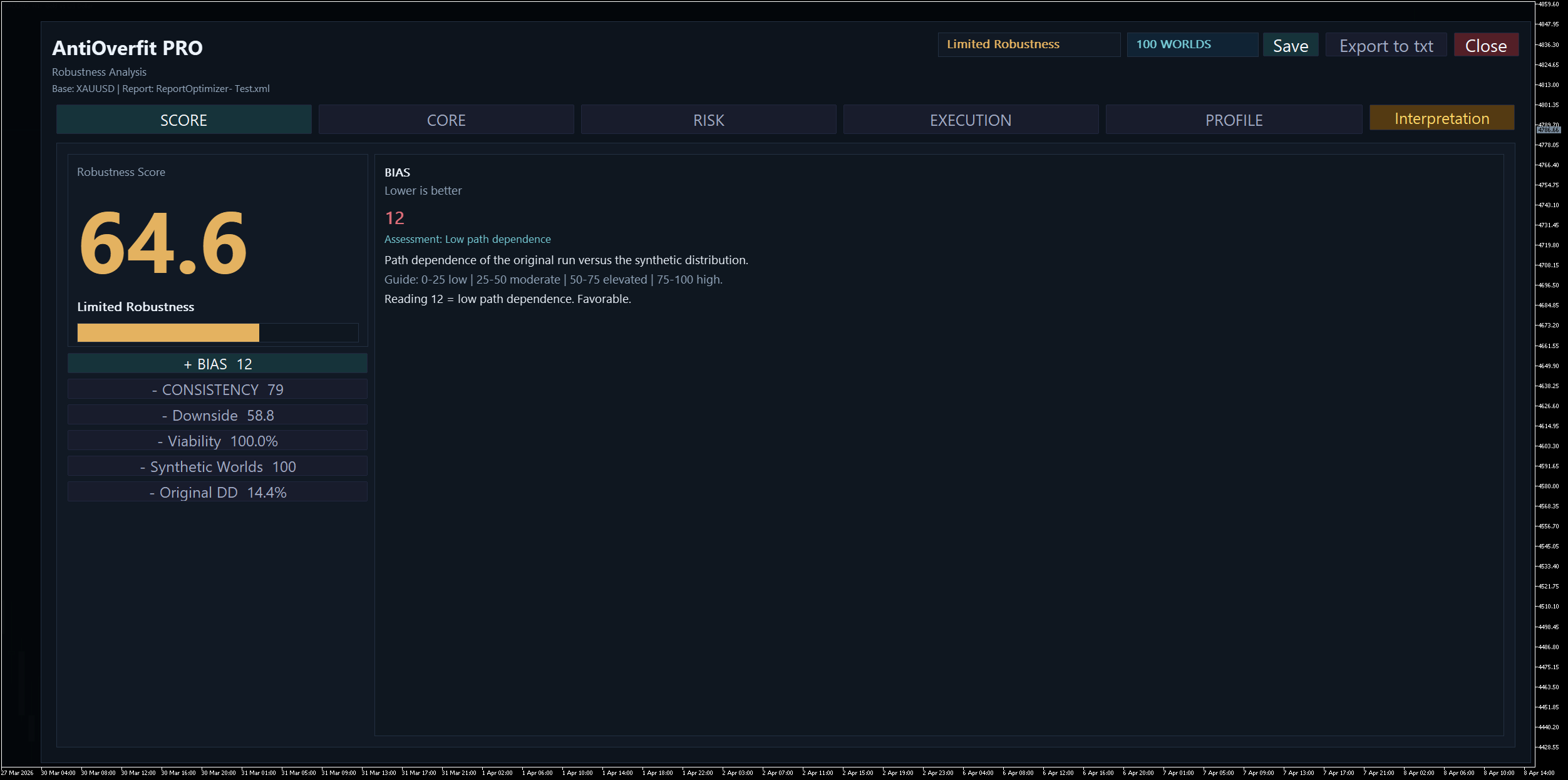
In this example, AntiOverfit PRO returns a score of 64.6 out of 100 and a label of Limited Robustness.
On top of that, the report summary makes the core message clear in a single idea: the original historical test looks clearly better than the synthetic distribution.
From that alone, we can already draw a very useful conclusion:
the original result probably looks better than it really should.
Put even more simply: the historical test shows a more optimistic version of the system than what we would probably see across other plausible scenarios.
And this matters, because for a first practical decision, you do not need much more than that.
You do not need to review twenty metrics or get lost in charts to understand the central message. The score is already telling you that this is not a strong confirmation, but rather a warning sign.
So what is the rest of the report for?
Very simple.
The score gives you the main conclusion.
The individual metrics explain why that conclusion was reached.
In other words, the score is for a quick read. The rest of the report helps you understand the diagnosis.
Once you decide to go deeper, you are no longer just asking “what came out,” but something much more interesting: “why did it come out that way?”
What this case is saying in plain language
In this example, several important metrics are marked as Optimistic Path: Profit Factor, Expected Payoff, Recovery Factor, and even the number of trades.
What does that mean?
It means that, in those metrics, the original result landed in an especially favorable zone when compared with what the synthetic worlds show.
Translated into much more direct language:
the real historical path treated this system especially well.
That does not mean it should be discarded right away. What it does suggest is something much more useful: if the market had followed other plausible paths, the system most likely would not have looked as impressive as it did in the original historical test.
And that is exactly the kind of bias AntiOverfit PRO is designed to bring to light.

Also, remember that you can always click the Interpretation button in the top-right corner to get a more natural reading:

The key point: the system remains viable, but the backtest calls for caution
This is where the reading needs to be precise.
The report is not saying that the Expert Advisor has no value. In fact, some signals hold up reasonably well. Consistency is 79 out of 100, viability is 100%, and operational continuity is maintained, with a collapse rate of 0.0%.
That means the system remains operational when exposed to synthetic variation. It does not disappear, it does not stop trading, and it does not collapse immediately.
So where is the sensitive point?
It is that the quality of the original result looks clearly better than the typical quality shown by the synthetic worlds.
And that changes quite a lot about the right way to interpret the historical test.
The most important example: how to understand stress drawdown
This is a key point, because it is very easy to read it the wrong way.
In the original history, the drawdown was 14.4%. But AntiOverfit PRO also shows a stress drawdown of 31.4%.
On top of that, the report indicates that the synthetic median drawdown is 21.3%, and that 31.4% corresponds to the 90th percentile of the synthetic distribution.
And here is the most important part:
that 31.4% does not mean it will be the worst possible result in the future.
It also does not mean that the system will experience exactly that drawdown in live trading.
Reading it that way would be a mistake.
What the report is saying is something else:
if we change the market path for other plausible ones, a drawdown close to 31% falls within an adverse but credible zone for this system.
It is a stress reference. It is not a prophecy. It is not an exact prediction. It is not the absolute worst case.
Put even more clearly:
- in the original historical test, the risk looked like 14.4%;
- but when the market follows other plausible paths, the analysis shows that the risk can feel significantly harsher;
- and a drawdown close to 31% falls within the kind of adverse scenarios this system could go through without stepping outside what the model considers credible.
For a user, it can be summed up like this:
It is not enough to think that this system has a 14% drawdown. What AntiOverfit PRO is showing is that, under alternative but plausible scenarios, the risk can be much more demanding than it looked when viewed only through the original history.
And that difference matters a lot.
Because it changes expectations. It changes capital management. And it changes how honestly the system is being evaluated.

The overall profile also sends a clear signal
At the end, the report adds another interesting warning: a profile mismatch.
And it points out that the largest deviation appears in the Recovery Factor, where the original value was 11.81, compared with a typical synthetic value of 3.84.
That brings us back to the same central idea:
the profile of the original historical test does not fully match the typical profile that appears when the system is tested across synthetic worlds.
In other words, the original history does not seem to fully represent the system’s more normal behavior when it is exposed to plausible market variation.

So what should a user conclude?
The practical conclusion in this case would be this:
the system may still work, but the original historical test is probably showing an overly optimistic version of its behavior.
And that is where the real value of AntiOverfit PRO lies.
Not in staying with the classic question:
“Does this historical test make money?”
But in moving to a much more useful one:
“Does it still look like a good idea when the market stops following exactly the same path?”
The final idea worth remembering
If you do not want to analyze the report metric by metric, keep this in mind:
- score: 64.6 out of 100
- label: Limited Robustness
- summary: the original historical test looks clearly better than the synthetic distribution
With that alone, we already have the essence: there are clear signs that the original result was more favorable than normal.
Then, if you want to go deeper, the individual metrics will help you see where that fragility shows up: in the quality of the result, in the overall profile, in the risk under stress, or in the gap between real history and alternative paths.
But the main idea was already there from the start.
And that is exactly what makes AntiOverfit PRO useful: it lets you reach the important conclusion quickly and then go deeper only if you really need to.


")
