Something Interesting in Financial Video May 2016
Forum on trading, automated trading systems and testing trading strategies
Something Interesting in Financial Video January 2014
Sergey Golubev, 2014.01.16 10:12
The Hidden Secret of Technical Analysis
Discover a whole 'other world' of technical analysis, where novice traders fear to go.
- Technical Analysis: How Do We Analyze?
- Technical Analysis vs Fundamentals: How Reliable are Technicals ?
- Technical Analysis for Idiots - My Market Theory.
- Technical Analysis Course - Module 1: Technical Analysis and the Dow Theory
- Technical Analysis Course - Module 2: Charting Basics
- Technical Analysis Course - Module 3: Trend Concepts
- Technical Analysis Course - Module 4: Reversal and Continuation Patterns
- Technical Analysis Course - Module 5: Volume and Open Interest
- Technical Analysis Course - Module 6: Moving Averages
- Technical Analysis Course - Module 7: Oscillators and Sentiment Indicators
- Technical Analysis Course - Module 8: Further Charting
- Technical Analysis Course - Module 9: Elliott Waves and Cycles of Time
- Technical Analysis Course - Module 10: Cloud Charts: the Ichimoku Technique
- Technical Analysis Course - Module 11: Money Management and Computers
- Technical Analysis Course - Module 12: How to Build a Trading Systems
- Technical Analysis Course - Module 13: The Stock Market
- Technical Analysis Course - Module 14: Futures
- Technical Analysis Course - Module 15: Options
- Technical Analysis Course - Module 16: Forex Trading
- Technical Analysis Course - Module 17: Strategies and Trading Principle
Forum on trading, automated trading systems and testing trading strategies
Market Condition Evaluation based on standard indicators in Metatrader 5
Sergey Golubev, 2013.06.06 15:54
This is one of setup to be used with technical analysis - this post. But I uploaded on this thread Stochastic the other setup which we can use in technical analysis too (to create the threads and to make simple analysis of the market condition). This second one is related to Stochastic and it is here with one exception: period for slow MA should be 200 instead of 100 for example.
Forum on trading, automated trading systems and testing trading strategies
Sergey Golubev, 2013.06.06 15:06
This is very simple setup related to technical analysis:
- Moving Averages indicator with period 55, method - simple, apply to close.
- Moving Averages indicator with period 100, method - simple, apply to close.
- Stochastic indicator with the settings 100/8/8
This kind of setup is used for technical analysis. But why the traders are not trading their technical analysis setups? we watched tv ... we are reading some threads about support resistance levels and so on. Why they are not connecting their setups/EAs to the Signals? because this Stochastic condition (overbought/oversold) are not coming on the same bar with the main signals to open buy/sell trade. Let me explain more.
Hang Seng Index
The Hang Seng Index is a freefloat-adjusted market
capitalization-weighted stock market index in Hong Kong. It is used to
record and monitor daily changes of the largest companies of the Hong
Kong stock market and is the main indicator of the overall market
performance in Hong Kong. These 50 constituent companies represent about
58% of the capitalisation of the Hong Kong Stock Exchange.
HSI was started on November 24, 1969, and is currently compiled and maintained by Hang Seng Indexes Company Limited, which is a wholly owned subsidiary of Hang Seng Bank, one of the largest banks registered and listed in Hong Kong in terms of market capitalisation. It is responsible for compiling, publishing and managing the Hang Seng Index and a range of other stock indexes, such as Hang Seng China Enterprises Index, Hang Seng China AH Index Series, Hang Seng China H-Financials Index, Hang Seng Composite Index Series, Hang Seng China A Industry Top Index, Hang Seng Corporate Sustainability Index Series and Hang Seng Total Return Index Series. Hang Seng in turn, despite being a public company, is held in majority by British financial firm HSBC.
What is The Hang Seng Index?
The Hang Seng is the most widely quoted barometer for the Hong Kong
economy. Because of Hong Kong's status as a special administrative
region of China, there are close ties between the two economies and many
Chinese companies listed on the Hong Kong Exchange.
The Hang Seng
Index is maintained by a subsidiary of Hang Seng Bank, and has been
published since 1969. The index aims to capture the leadership of the
Hong Kong exchange, and covers approximately 65% of its total market
capitalization. The Hang Seng members are also classified into one of
four sub-indexes based on the main lines of business including commerce
and industry, finance, utilities and properties.
Economic Calendar Of The Week - May 2-6, 2016
With a new month there is hopes for better economic results. Last week central banks and earning were the main focus. All three banks, the US Fed, the Bank of Japan and the Bank of New Zealand all held rates and policy. Facebook and Amazon surprised the markets to the upside as a dismal earning season winds down this week.
Economic data sees PMI numbers from the UK, plus Chinese PMI figures and US non-farm payrolls at the end of the week. Markets were rocked by the Bank of Japan’s decision to hold fire at its most recent meeting, and with Japanese data relatively thin on the ground we may see a recovery in the Nikkei. Elsewhere, the focus will be on crude oil, which has made new 2016 highs this week.
Purchasing managers´ indices for the manufacturing and services sector scheduled for release on Tuesday and Thursday will provide further real-time readings on the current state of affairs in the British economy. Nevertheless, and as the Monetary Policy Committee pointed out at its last meeting, the uncertainty relating to the 23 June referendum can be expected to continue clouding the data.
Acting as a backdrop, and as occurs on the first week of each month, the most important release by far will be Friday´s US non-farm payrolls number for April, especially given the steady stream of warnings from central bank officials stateside regarding the possibility the debt markets might be too complacent when it comes to pricing-in further rate hikes this year.
Starting off the week ECB President Mario Draghi will speak in Frankfurt. He may refer to the recent criticism from Germany that the ECB’s low rates were squeezing savers. Draghi defended this policy of printing money and keeping borrowing costs at rock bottom saying this strategy proves to be affective. Draghi also called on euro zone governments to help get the region’s sluggish economy on a more solid footing through economic reforms. Market volatility is expected.
Tuesday’s
Asian session will be busy with Australian rate decision. The Reserve
Bank of Australia maintained the official cash rate at a record low 2%
for a 10th straight meeting. RBA governor Glenn Stevens stated that low
inflation may prompt another rate cut to boost economic activity.
Next we will have New Zealand’s jobs data. The labor market recovered in the last quarter of 2015 as unemployment plunged to a six-year low of 5.3% from 6% in the third quarter. However, the sharp decline in unemployment was also facilitated by a 0.2% fall in labor market participation. New Zealand work force increased by 0.9% to 2.369 million during the quarter. Analysts expected unemployment to rise to 6.1% and job growth to rise 0.8%.
Wednesday bring up leading indicating data from ADP. U.S. private sector added 200,000 jobs in March, beating forecasts of 195,000. Private payroll figures in February were revised down to 205,000 from an originally reported 214,000 increase. The ADP reports comes ahead of the major employment release from the U.S. Labor Department, which includes both public and private-sector employment. US private sector is expected to add 205,000 new jobs in April.
The
global focus will shift to the US Nonfarm payroll report due Friday
morning. US monthly employment release showed solid expansion in March
with a rise in wages, indicating the economy remains resilient signaling
the Fed to proceed with its gradual rate raise plan. Nonfarm payrolls
increased 215,000 in March following a 242,000 addition in the previous
month. The Fed has downgraded its economic outlook amid cheap oil prices
and the strong dollar, saying it is appropriate for policymakers to
“proceed cautiously in adjusting policy.” However, the positive figures
in March show a positive trend in the US economy. US monthly Job growth
is expected to reach 206,000 as the unemployment rate should remain at
5%.
What Are Negative Interest Rates?
A negative interest rate means the central bank and perhaps private banks will charge negative interest: instead of receiving money on deposits, depositors must pay regularly to keep their money with the bank. This is intended to incentivize banks to lend money more freely and businesses and individuals to invest, lend, and spend money rather than pay a fee to keep it safe.
Think about what interest is. The
lender gets paid interest for allowing someone else to use their money.
But when the rate goes below zero the relationship is turned on its
head. The lender is now paying the borrower. Why would anyone do that?
Of
course, this situation only applies to a limited number of financial
relationships. No-one will pay you to spend on your credit card. But
this unusual state of affairs does exist.
These negative rates are the policy decisions taken by a handful of central banks. But the phenomenon has also affected the bond market, where investors buy and sell the bonds or debts of governments and large companies.
The cost
of borrowing is set when the bonds are issued. It depends on how much
the financial firms who buy the bonds pay for them - what they are
buying is a promise to make a series of payments in the future. If the
price is high enough, the borrowing cost, in effect the interest rate,
can be zero or even negative.
Forum on trading, automated trading systems and testing trading strategies
Something Interesting in Financial Video November 2014
Sergey Golubev, 2014.11.27 10:23
Suri Duddella, Webinar: The Success and Failure of Chart Patterns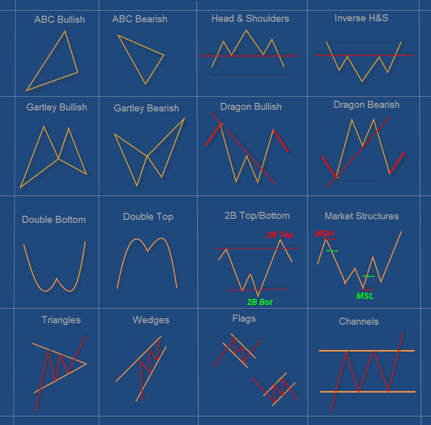
Suri Duddella, 19+ years full-time Futures/Equities/Options Trader.
Patterns based Algorithmic Trading. Author -- "Trade Chart Patterns
Like The Pros" book.
- Chart Pattern Modeling
- Essential pattern structure components and analysis
- Practical statistics of patterns success and failures
- Examples of many patterns
======
A chart pattern is a distinct formation on a stock chart that
creates a trading signal, or a sign of future price movements. Chartists
use these patterns to identify current trends and trend reversals and
to trigger buy and sell signals. 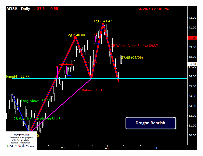
Identifying chart
patterns is simply a system for predicting stock
market trends and turns! Well, a trend is merely an indicator
of an imbalance in the supply and demand. These
changes can usually be seen by market action through
changes in price. These price changes often form
meaningful chart patterns that can act as signals
in trying to determine possible future trend developments.
Research has proven that some patterns have high
forecasting probabilities. These patterns include:
The Cup & Handle, Flat Base, Ascending and
Descending Triangles, Parabolic Curves, Symmetrical
Triangles, Wedges, Flags and Pennants, Channels and
the Head and Shoulders Patterns.
What is a Japanese Candlestick in Forex Trading
Candlestick charts are the most common chart types used by retail traders and investors. There are other types of charts such as line charts, bar charts etc., but they don't tell the story of past price action like candlesticks do. When trading is based on technical analysis, the decisions for future price action are made based on how the price has reacted in the past. I find candlesticks to be very useful and they are one of my favorite indicators. They work almost perfectly in volatile times, but even in less volatile times they work pretty well if used in combination with one or two other indicators.
Candlesticks are the price movement/action for a certain period of time,
from as little as 1 minute to a week or a month. The body of the
candlestick is the price difference between the opening and the closing
time. The two lines on each side, which are called shadows or wicks,
display the highest and the lowest point of the price for that period of
time. The green candlestick in the picture below is a bullish
candlestick in which the closing point is higher than the opening and
the red one is a bearish candlestick, indicating that the price at
closing was lower than at opening. The colors of the body is irrelevant,
you can set them to your preference.
Traders carry out technical analysis to build ideas and strategies for possible future trades. Candlestick formations are a very useful tool for indicating possibilities for entries and exits. I use candlesticks as one of my two or three indicators on most of the trades that I make. Their shapes show you what's going on with the price very clearly. Let's see some of the most popular and easy to trade candlesticks and how they can be interpreted.
Forum on trading, automated trading systems and testing trading strategies
Something Interesting in Financial Video January 2014
Sergey Golubev, 2014.01.16 10:12
The Hidden Secret of Technical Analysis
Discover a whole 'other world' of technical analysis, where novice traders fear to go.
- Technical Analysis: How Do We Analyze?
- Technical Analysis vs Fundamentals: How Reliable are Technicals ?
- Technical Analysis for Idiots - My Market Theory.
- Technical Analysis Course - Module 1: Technical Analysis and the Dow Theory
- Technical Analysis Course - Module 2: Charting Basics
- Technical Analysis Course - Module 3: Trend Concepts
- Technical Analysis Course - Module 4: Reversal and Continuation Patterns
- Technical Analysis Course - Module 5: Volume and Open Interest
- Technical Analysis Course - Module 6: Moving Averages
- Technical Analysis Course - Module 7: Oscillators and Sentiment Indicators
- Technical Analysis Course - Module 8: Further Charting
- Technical Analysis Course - Module 9: Elliott Waves and Cycles of Time
- Technical Analysis Course - Module 10: Cloud Charts: the Ichimoku Technique
- Technical Analysis Course - Module 11: Money Management and Computers
- Technical Analysis Course - Module 12: How to Build a Trading Systems
- Technical Analysis Course - Module 13: The Stock Market
- Technical Analysis Course - Module 14: Futures
- Technical Analysis Course - Module 15: Options
- Technical Analysis Course - Module 16: Forex Trading
- Technical Analysis Course - Module 17: Strategies and Trading Principle
Forum on trading, automated trading systems and testing trading strategies
Libraries: MQL5 Wizard - Candlestick Patterns Class
Sergey Golubev, 2013.09.14 19:53
The Evening Star Pattern is a bearish reversal pattern, usually occuring at the top of an uptrend. The pattern consists of three candlesticks:
- Large Bullish Candle (Day 1)
- Small Bullish or Bearish Candle (Day 2)
- Large Bearish Candle (Day 3)
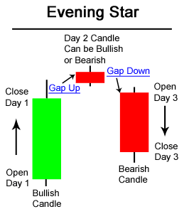
The first part of an Evening Star reversal pattern is a large bullish green candle. On the first day, bulls are definitely in charge, usually new highs were made.
The second day begins with a bullish gap up. It is clear from the opening of Day 2 that bulls are in control. However, bulls do not push prices much higher. The candlestick on Day 2 is quite small and can be bullish, bearish, or neutral.
Generally speaking, a bearish candle on Day 2 is a stronger sign of an impending reversal. But it is Day 3 that is the most significant candlestick.
Day 3 begins with a gap down, (a bearish signal) and bears are able to press prices even further downward, often eliminating the gains seen on Day 1.
Evening Star Candlestick Chart ExampleThe chart below of Exxon-Mobil (XOM) stock shows an example a Evening Star bearish reversal pattern that occured at the end of an uptrend:
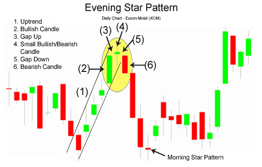
Day 1 of the Evening Star pattern for Exxon-Mobil (XOM) stock above was a strong bullish candle, in fact it was so strong that the close was the same as the high (very bullish sign). Day 2 continued Day 1's bullish sentiment by gapping up. However, Day 2 was a Doji, which is a candlestick signifying indecision. Bulls were unable to continue the large rally of the previous day; they were only able to close slightly higher than the open.
Day 3 began with a bearish gap down. In fact, bears took hold of Exxon-Mobil stock the entire day, the open was the same as the high and the close was the same as the low (a sign of very bearish sentiment). Also, Day 3 powerfully broke below the upward trendline that had served as support for XOM for the past week. Both the trendline break and the classic Evening Star pattern gave traders a signal to sell short Exxon-Mobil stock.
The Evening Star pattern is a very powerful three candlestick bearish reversal pattern. The bullish equivalent of the Evening Star is the Morning Star patternForum on trading, automated trading systems and testing trading strategies
Something Interesting in Financial Video December 2013
Sergey Golubev, 2013.12.06 07:08
Candlestick Charting - Vol 15 - Evening Star
Forum on trading, automated trading systems and testing trading strategies
Something Interesting in Financial Video December 2013
Sergey Golubev, 2013.12.03 13:52
Candlestick Charting - Vol 14 - Bullish Engulfing Pattern
Forum on trading, automated trading systems and testing trading strategies
Libraries: MQL5 Wizard - Candlestick Patterns Class
Sergey Golubev, 2013.09.11 16:10
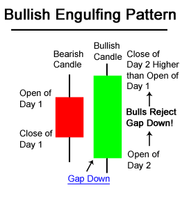
The Bullish Engulfing Candlestick Pattern is a bullish reversal pattern, usually occuring at the bottom of a downtrend. The pattern consists of two Candlesticks:
- Smaller Bearish Candle (Day 1)
- Larger Bullish Candle (Day 2)
The bearish candle real body of Day 1 is usually contained within the real body of the bullish candle of Day 2.
On Day 2, the market gaps down; however, the bears do not get very far before bulls take over and push prices higher, filling in the gap down from the morning's open and pushing prices past the previous day's open.
The power of the Bullish Engulfing Pattern comes from the incredible change of sentiment from a bearish gap down in the morning, to a large bullish real body candle that closes at the highs of the day. Bears have overstayed their welcome and bulls have taken control of the market.
The chart below of the S&P 500 Depository Receipts Exchange Traded Fund (SPY) shows an example of a Bullish Engulfing Pattern occuring at the end of a downtrend:
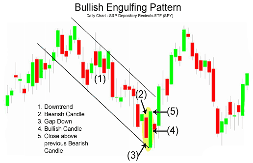
There are three main times to buy using the Bullish Engulfing Pattern; the buy signals that are presented below are ordered from the most aggressive to most conservative:
- Buy at the close of Day 2 when prices rallied upwards from the gap down in the morning. A strong indication that the rally on Day 2 was significant and truly a reversal of market sentiment, is if there was a substantial increase in volume that accompanied the large move upward in price.
- Buy on the day after the Bullish Engulfing Pattern occurs; by waiting until the next day to buy, a trader is making sure that the bullish reversal and enthusiasm of the prior day is continuing and was not just a one day occurance like a short covering rally. In the chart above of the SPY's, a trader would likely not enter the market long on the day after the Bullish Engulfing Pattern because the market gapped down significantly and even made new lows. A trader using methodology #2, would likely wait for a more concrete buy signals such as the one presented in method #3 next.
- After a trader sees the Bullish Engulfing Pattern, the trader would wait for another signal, mainly a price break above the downward resistance line, before entering a buy order.
An example of what usually occurs intra-day during a Bullish Engulfing Pattern is presented next.
Intra-day Bullish Engulfing PatternThe following 15-minute chart of the S&P 500 exchange traded fund (SPY) is of the 2-day period comprising the Bullish Engulfing Pattern example on the prior page:
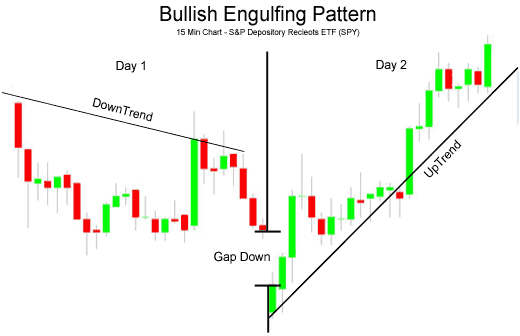
- Day 1: As is seen in the chart above, Day 1 was a down day, even closing the day at the low (bearish sentiment).
- Day 2: The open was a gap down, very bearish sign; but the bulls appeared to have had enough because the price of the SPY's went up the rest of the day, closing near the day's highs (bullish sentiment) and higher than Day 1's high.
- Free trading apps
- Over 8,000 signals for copying
- Economic news for exploring financial markets
You agree to website policy and terms of use
Please upload forex video you consider as interesting one. No direct advertising and no offtopic please.
The comments without video will be deleted.