

This is the first edition guide to the MetriX panel and Chart Tools of the CGE Trading Suite for MetaTrader 5. Each section below shows one screen or tool, with a short explanation of what you see and how to read it.
Overview
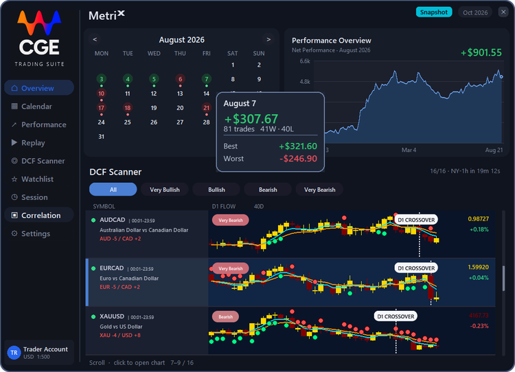
The month you just traded, the account behind that month, and which currency is being bought.
Calendar
Each day is the result of the trades closed that day. Green made money. Red lost money. A day with no color had no trade closed. On 7 August the account made $307.67 from 81 trades, 41 wins and 40 losses. The best trade was +$321.60 and the worst was -$246.90.
Performance Overview
This card answers two different questions. The number, +$901.55, is how August finished. It is the same month as the calendar beside it. The graph is the all-time result, from the first trade in December to the latest close in August. A rise in the graph is a run of winning closes. A dip is money given back. If you open a month with no closed trades, the number switches to that all-time total.
DCF Scanner
Daily Capital Flow measures which currencies are strong and which are weak, so you can see where the money is moving and trade with it, not against it. On weekdays the score is saved three times: one hour before London, one hour before New York, and at the daily close. You read the bias before each open, then again from the finished day. EUR -5 / CAD +2 means the euro is weak against the Canadian dollar, so EURCAD is a sell. Align your technical analysis using the Chart Tools to find the entry.
Economic Calendar
The announcements that can move a currency you are holding, over the next seven days.
The week
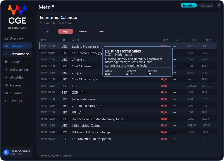
This is the MT5 calendar for the next seven days. All, High, Medium and Low filter it by impact. Here High is selected, so only the releases that usually move a currency are shown. Each row gives the time, the currency, the event and its impact, then ACT, FCST and PREV: the actual number, the forecast and the previous print. A dash means the number is not out yet. Hover an event for details. Existing Home Sales, USD, prints on 13 October at 17:00. The card says what it measures, housing activity and demand, and shows Actual n/a, Forecast 4.02 and Previous 3.98, so you can see what the market is waiting on.
Before London and New York
Read this before London, and again before New York. Use it to expect the volatility, stay out of the window, or be positioned before the announcement. If a high-impact release is due on a currency you are holding, decide before it prints. The forecast is not the number.
Performance
The full record of closed profit, and the pace set for the days still left this month.
Performance Overview
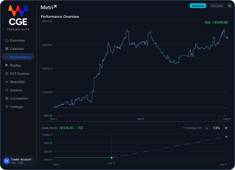
This is the same all-time result as the graph on Overview, shown on its own. It ends at +$5,340.66. That is closed profit, not the account balance. It runs from the first trade in December to the latest close in August. A rise is a run of winning closes. A dip is money given back.
Goal path
This is the plan for the rest of the month, not a promise. Today's goal is to grow the account by 1.5%. Minus and plus change that percent. The plan adds +$1,336.40 over 15 days. It runs from 11 October to 31 October, and the green dot is today. Under the graph means the month is behind the pace you set.
Replay
A closed trade, drawn back on the chart so you can see the entry and the exit.
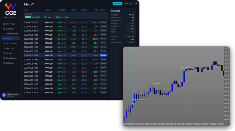
The book
Replay puts a closed trade back on its chart, so you can see where you entered and where you exited. Each row is one trade. Press Replay and the path is drawn. Press it again to clear it. Use it to check whether the idea was right, and whether you got out too late.
Statistics
This is the record of those closes. 47.7% made money. A profit factor of 1.28 means the wins were larger than the losses. The average trade made $2.67. The average win was $25.33 and the average loss was -$18.06. The best close was $742.04 and the worst was -$459.70. Net closed profit is $5,340.66, after -$565.70 in commission. A trade that closed flat is counted, but it is not a win and not a loss.
DCF Scanner
The full currency book. Same saved score as the short list on Overview.
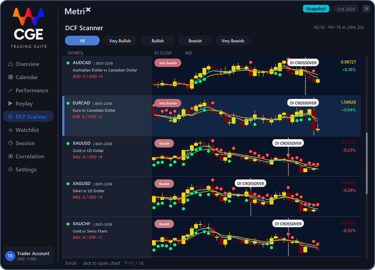
The score
Daily Capital Flow measures which currencies are strong and which are weak, so you can see where the money is moving and trade with it, not against it. On weekdays the score is saved three times: one hour before London, one hour before New York, and at the daily close. You read the bias before each open, then again from the finished day. EUR -5 / CAD +2 means the euro is weak against the Canadian dollar, so EURCAD is a sell. NY-1h is the time left until the next save.
The row
Very Bearish on EURCAD is the current score for that pair. The chart beside it is the last 40 days, with the daily 5 and 10 EMA. A green dot is a day the flow was bullish. A red dot is a day it was bearish. D1 CROSSOVER is the index crossover of capital flow, not a cross of the EMAs. Open a row to put that symbol on the chart. Align your technical analysis using the Chart Tools to find the entry.
Watchlist
The markets you choose to keep in front of you.
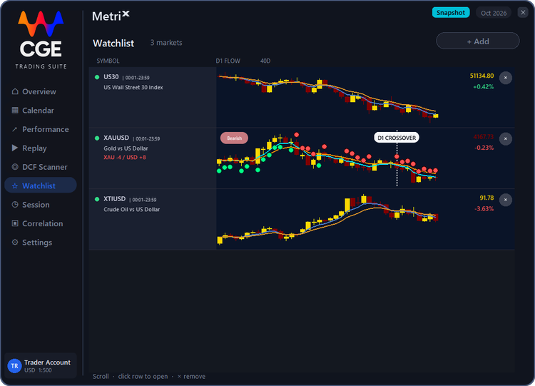
This is the list of markets you want in front of you. +Add pins one. Click a row to open its chart. Gold is in the currency basket, so XAU -4 / USD +8 is a sell. Wall Street and crude are not, so they show the daily candles and the 5 and 10 EMA, with no score.
Trading Sessions
Which market is open now, and whether its pairs agree with the daily flow.
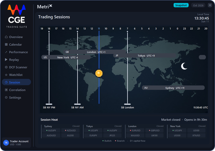
Trading Sessions
This is the day, split into Sydney, Tokyo, London, and New York, so you can see which market is open and when the next one starts. Each bar shows its offset from UTC: London UTC+1, New York UTC-4, Tokyo UTC+9, and Sydney UTC+11. At 13:30 local time, Sunday 11 October (11:30 UTC), nothing is open: it is the weekend, so no session is highlighted. The sun sits on the current UTC hour, and the moon marks night time, on the opposite side of the world. The Silver Bullet marks are three one-hour windows in New York time: 03:00 (SB London), 10:00 (SB NY AM), and 14:00 (SB NY PM). Each is an hour when the session often sweeps liquidity and leaves a fair-value gap. That is the window to look for the entry, in the direction of the daily flow.
Session Heat
These are the markets that belong to each session, so you know what to trade while that session is open. Sydney is the Australian and New Zealand dollar pairs and AU200. Tokyo is the yen pairs and JP225. London is GBPUSD, EURUSD, gold, and UK100. New York is the US indices, crude, and USDJPY. The green and red dots on a chip are the D1 capital flow of that pair. Green is bullish flow. Red is bearish flow. In this example, all four sessions show Closed, and the label at the top right reads Market closed · Opens in 9h 30m, counting down to the weekly open. EURUSD, GBPUSD, and NZDUSD are bearish; USDJPY and AUDJPY are bullish. When a session is live, its column lights up with a LIVE tag; trade the live column, in the direction of that flow.
Daily Correlation
How closely two markets have moved together over the last 100 days.
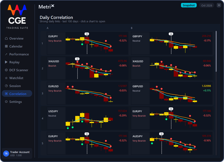
Correlation is how closely two markets move together. A high number means they rise and fall on the same days. Here a pair is shown only if that match is 0.70 or stronger over the last 100 days, and the strongest matches are listed first. The chart is the last 10 days, with the daily 5 and 10 EMA.
Settings
A change here applies on the chart immediately.
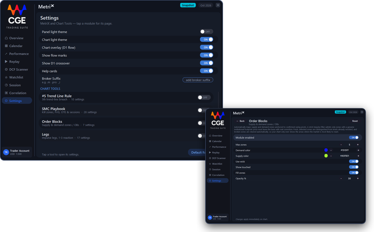
Panel and chart
The panel and the chart have their own theme. Here the panel is dark and the chart is light. Chart overlay draws the daily 5 and 10 EMA. On a chart below daily, those lines run out to the current price. Flow marks are the capital-flow dots. D1 crossover is the index crossover of capital flow.
Broker suffix
Some brokers add an ending to a symbol, such as .m, .pro, or _i. Set that ending so the scanner, the watchlist, and the session chips find the right name. Leave it empty if your names have no ending.
Chart Tools
Each chart tool has its own settings here. Open a module, change it, and the chart updates at once. Default Reset puts them back.
Module settings
Open a module to get its own settings page. Here it is Order Blocks. Module enabled turns it on or off. Max zones sets how many zones are shown. Demand color and Supply color set the zone colors. Use wick, Show touched and Fill zones switch those options, and Opacity % sets how strong the fill is. Reset puts the module back to its defaults and Back returns to the list. Changes apply immediately on the chart.
Trader Account
The account the panel is reading. It opens from Trader Account at the bottom of the sidebar.
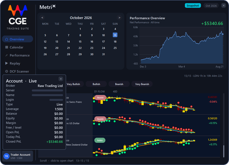
This is the live account behind MetriX. In this example it is Raw Trading Ltd, leverage 1:500. The server, name, and login are hidden here. Balance, equity, and margin are the account right now. Open PnL is the floating result. Today PnL is the result since the day opened. Closed PnL is +$5,340.66, the same closed profit as Performance.
Chart Tools
The tools on the chart. Open a module to turn it on and set it. A change applies immediately.
This is the list of tools on the chart: Price Label, Smart Grid, Trap Play, Knee-Jerk, Exhaustion 9/13, the two channels, MIDAS, the 5th trend-line break, the SMC playbook, order blocks, legs, market structure, volume profile, bifurcation, arrays, ECM & Pi cycles, and economic events. Open a module for its own settings.
Price Label
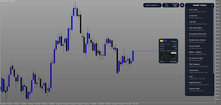
The card on the chart is Price Label. XAUEUR is 3744.63, +1.57%. The market is closed, so the daily bar countdown shows 0s. The spread is 114 pips. D1 flow is XAU +6 / EUR -7. Trend is Very Bullish. The small chart is the daily flow, and the dashed mark is the index crossover.
Smart Grid
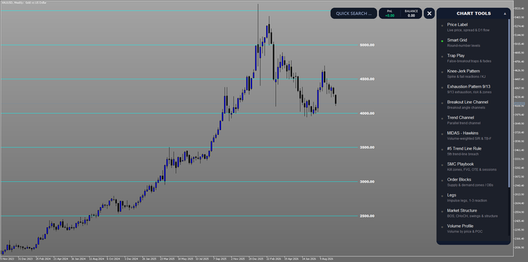
Automatically plots the psychological round numbers where price repeatedly reacts, putting key levels on your chart before the market reaches them. On this XAUUSD weekly chart the lines are 2500, 3000, 3500, 4000, 4500, and 5000.
Trap Play
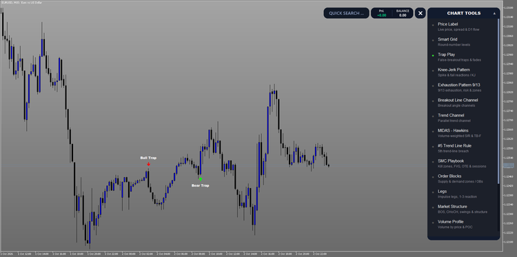
Flags false breakouts in real time: moments where price appears to break out only to reverse sharply. Sidestep the deceptive entry and position around the liquidity-driven reversal instead. On this EURUSD M15 chart a Bull Trap and a Bear Trap are marked.
Knee-Jerk Pattern
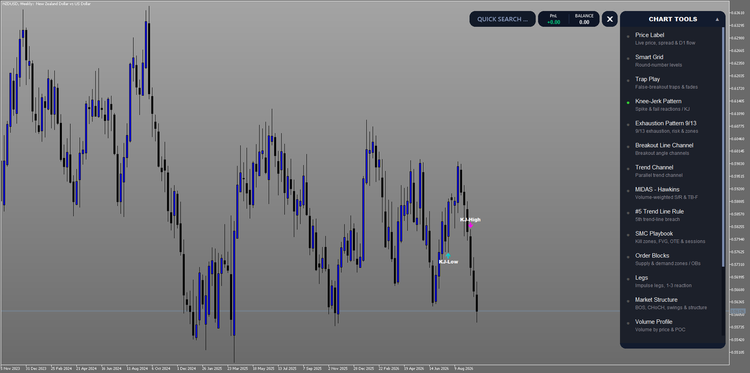
A single-bar trap: price spikes beyond the prior bar's high or low, closes back inside, and the next bar confirms the failure. It is not a trend change, just a choppy-market head-fake. Do not chase the spike; wait for the true move that follows. On this NZDUSD weekly chart a KJ-High and a KJ-Low are marked.
Exhaustion Pattern 9/13
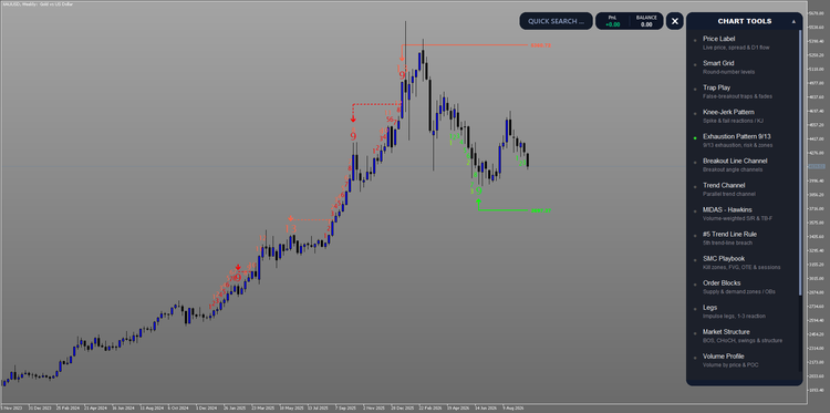
Tracks momentum exhaustion with a dual-cycle sequential count. A 9-bar impulse marks where trend momentum begins to fade; if pressure persists, a 13-bar cascade confirms full exhaustion, the structural point where buying or selling pressure is spent. Each completed count projects a risk level onto the chart, marking the price that must hold for the signal to remain valid; a break through it invalidates the setup. Use it to find high-probability reversal zones and to avoid entering trends already running on empty. On this XAUUSD weekly chart the completed counts project 5360.72 and 3697.37.
Breakout Line Channel
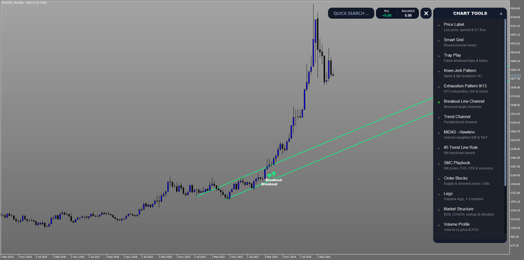
A cyclical, momentum-based tool that reads the angle of price movement to reveal direction and pressure. Steeper angles signal stronger momentum, letting you spot potential breakouts and breakdowns early. On this XAUUSD monthly chart the channel marks the breakout and the angle of the move that followed.
Trend Channel
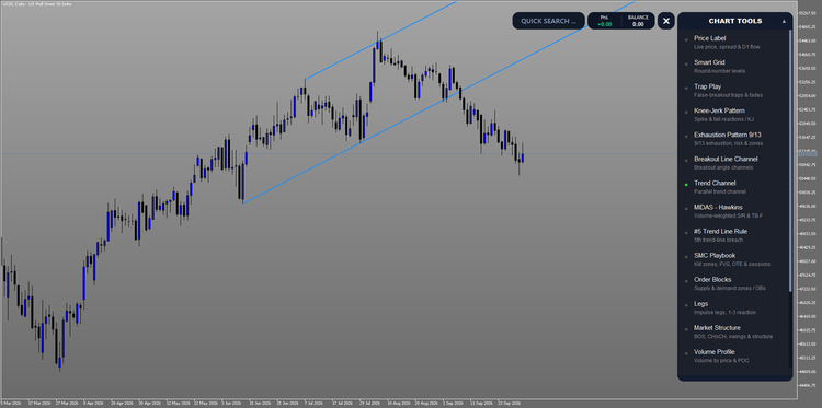
Draws the pair of parallel trend lines that frame the dominant uptrend or downtrend. It scans back through price history for two major swing highs and two major swing lows, then builds a primary trend line and its matching parallel so the active trading channel is unmistakable. On this US30 daily chart the two lines frame the move.
MIDAS - Hawkins
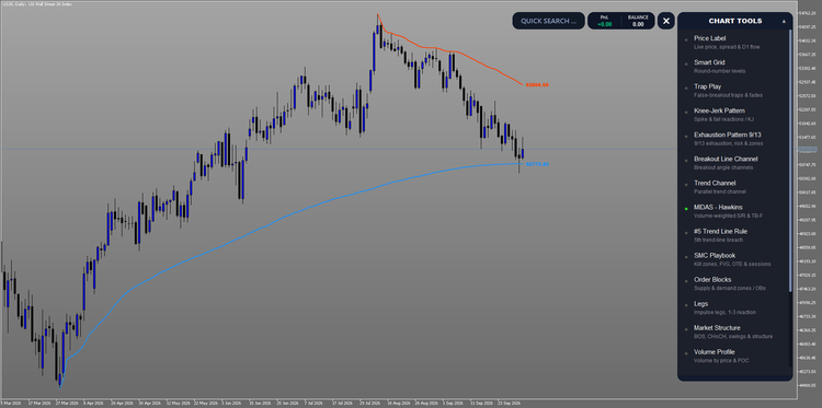
A VWAP-based tool that plots dynamic support and resistance by anchoring volume-weighted price curves to significant market turning points. The Hawkins method anchors directly to highs and lows for precise, actionable levels. On this US30 daily chart the curves sit at 52866.69 and 50772.80.
MIDAS Top-Bottom Finder
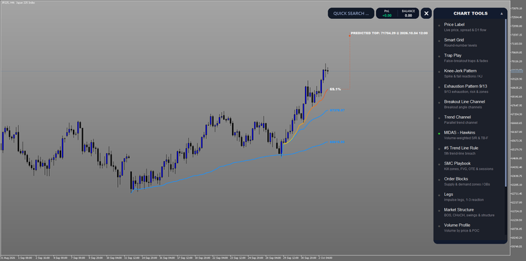
The Top/Bottom Finder weighs cumulative volume against price movement to tell you whether a trend has the fuel to continue, or whether exhaustion and a reversal are approaching. On this JP225 H4 chart it projects a top at 71704.29 on 4 October 2026, with the move 69.1% of the way there.
#5 Trend Line Rule
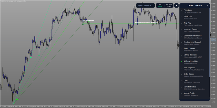
Finds the breakout that actually counts. Markets rarely reverse cleanly: price typically prints five false breakouts before the sixth follows through with real conviction. The suite tracks every trend-line breach automatically, so you always know where you stand in the sequence and avoid being shaken out before the move that matters. On this AUDCAD H1 chart the fifth breach is marked, and the breakdown level is broken.
SMC Playbook
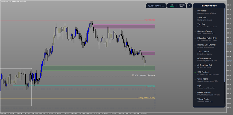
Maps the institutional trading day directly onto your chart. The Asian range, London Open, New York AM, and London Close kill zones are shaded as the windows where smart-money activity concentrates, with the Asian range projected forward as live liquidity reference lines and the Silver Bullet windows (03:00, 10:00, and 14:00 New York) marked for high-probability setups. A corner session clock tracks live New York time, highlights the active kill zone, and counts down to the next session, and to the reopen whenever the market is closed. Timezone and US daylight-saving shifts are handled automatically, so every session aligns precisely with New York regardless of your broker. On this NZDUSD M1 chart the buy-side and sell-side liquidity are marked, with the 50% equilibrium and the OTE buy zone at 61.8-79%.
Order Blocks
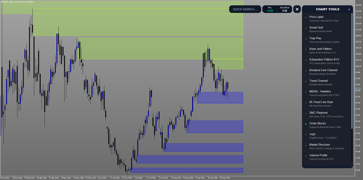
Automatically maps supply and demand zones anchored to confirmed swing pivots. A strict impulse filter admits only zones with a genuine institutional footprint: price must leave the base with real conviction. Fresh, untested zones are distinguished from levels already revisited, and broken zones are cleared automatically, so your chart only ever shows the areas where the market is most likely to react. On this XTIUSD daily chart the supply zones sit above price and the demand zones sit below.
Legs (BETA)
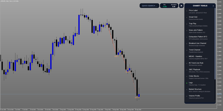
Maps the impulse and correction legs that make up the trend, so you see how far a move has already traveled and where the next swing is likely to form. Each leg is drawn from tip to origin on a Wick or Close basis you choose in Settings, with an optional V-shape filter that keeps only clean, tradable swings and drops the noise. Breaks of structure along the path are marked when enabled, and everything confirms on closed bars, so the picture you act on does not repaint. Use it beside Market Structure and Order Blocks when you need the path of the move, not only the pivots. On this EURUSD daily chart the decline is marked Leg 1, Leg 2, and Leg 3.
Bifurcation
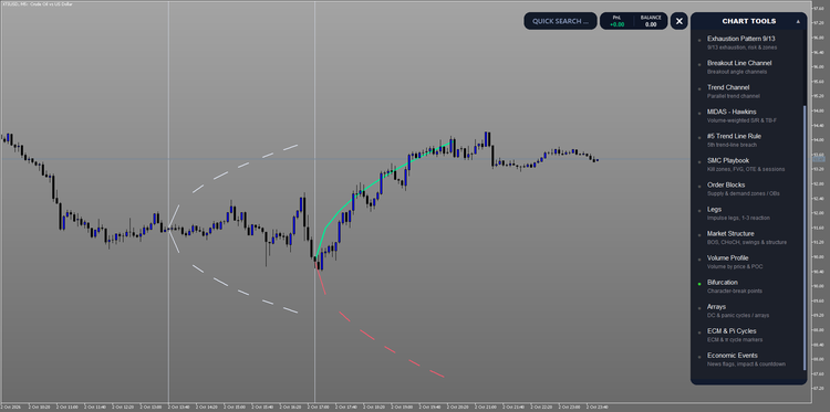
Marks the bar where a market stops behaving the way it has been. Character rarely changes gradually: price holds its state, becomes less able to absorb disturbance, then resolves quickly one way or the other. Bifurcation marks that moment and draws both paths, because the loss of stability does not decide which one is taken. A close through the upper curve resolves it upward, the lower one downward, and a mark reaching neither simply came to nothing. Infrequent by design and confirmed on closed bars only, so nothing repaints. On this XTIUSD M5 chart the upper path was taken.
Volume Profile
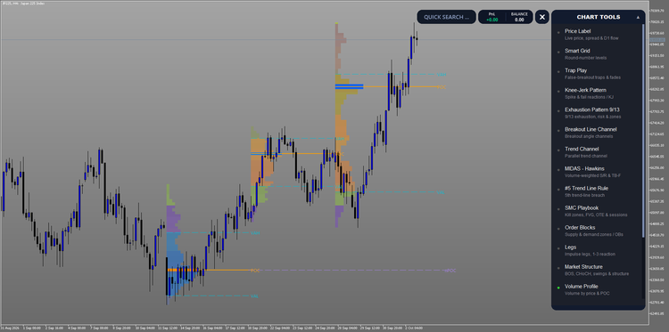
Reveals where the market actually did business. Every other volume tool measures activity against time. Volume Profile measures it against price, distributing traded volume across each level to show where value was accepted and where it was rejected. The Point of Control marks the price with the heaviest participation, and the value area bounds the 70% of volume around it, separating the prices the market agreed on from the ones it merely visited. Naked POCs, prior sessions' control prices that have never been traded back through, are tracked automatically and cleared the moment price returns, marking the unfinished auctions that so often act as a draw on liquidity. The profile period scales with your chart automatically, from daily sessions on intraday timeframes through weekly, monthly and yearly profiles above, and samples from its own source timeframe so resolution stays high whether you are on M1 or MN1. Volume source is detected automatically, using real exchange volume where the broker reports it and tick volume elsewhere, with the active source shown on the hover card. On this JP225 H4 chart each session shows VAH, POC and VAL, and a naked POC still open.
Arrays
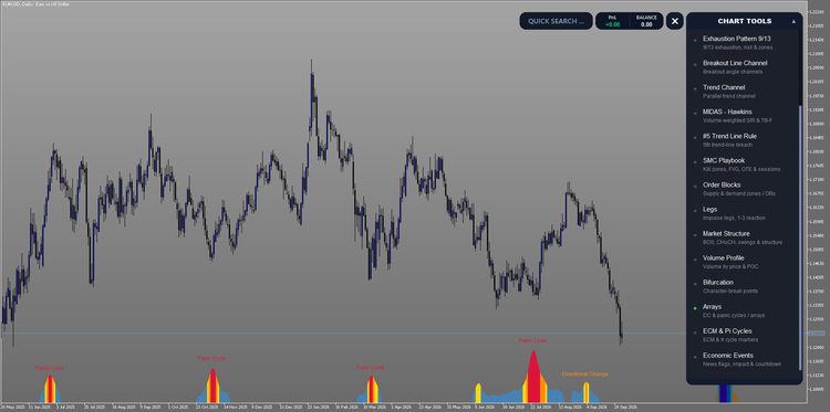
A timing tool rooted in Pi-cycle theory that pinpoints high-energy turning-point windows in time. Blue bars signal low energy and normal conditions; gold bars indicate converging cycles and expanding volatility; orange bars, the core signal, mark windows where a trend change is probable; crimson bars flag extreme convergence, where the sharpest reversals, capitulation lows, and blow-off tops tend to cluster. Read them as a sequence: a clean build from blue to crimson and back is the highest-quality signal the system produces. On this EURUSD daily chart the crimson peaks are marked Panic Cycle, and the smaller window is a Directional Change.
ECM & Pi Cycles
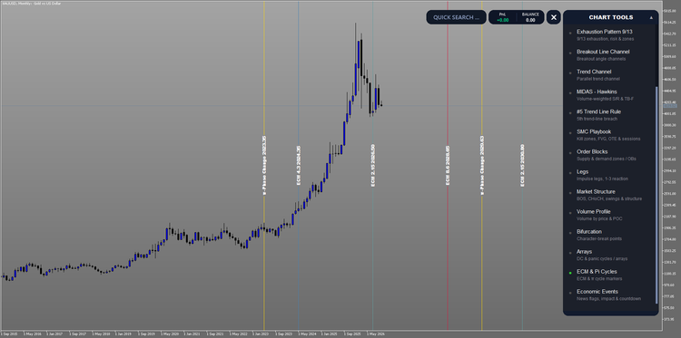
Plots long-term ECM and pi-based timing cycles directly on the chart as vertical markers. These cycles have historically coincided with major market turning points, giving you a macro timing backdrop to confirm whether your short-term signals align with a larger cyclical move. On this XAUUSD monthly chart the markers are the pi-phase changes and the ECM dates through 2030.
Economic Events
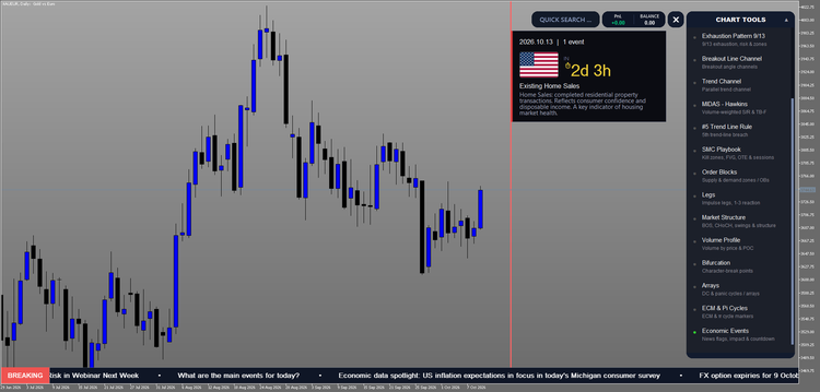
A full economic calendar built directly into your charts. High-impact releases are plotted as vertical markers; hover any marker for the event name and live countdown, without leaving your workflow. Anticipate volatility, stay out during risky windows, or position ahead of the announcements that move markets. On this XAUEUR daily chart the red event line marks 2026.10.13, with one US release: Existing Home Sales, in 2d 3h. Its card explains the release: completed residential property transactions, which reflect consumer confidence and disposable income, a key indicator of housing market health.
Live News Ticker
A scrolling breaking-news strip pinned along the bottom of your chart, streaming market-moving headlines in real time so you never miss a release while you stay focused on price. Headlines refresh continuously, newest first, and clicking any headline opens the full story for instant context, with no second screen and no switching tabs. Where the Economic Events calendar covers the scheduled releases, the ticker captures the unscheduled flow: central-bank remarks, geopolitical headlines, and surprise data. The ticker is powered by the free companion CGE News Bridge, which streams live InvestingLive headlines into the suite.
CGE Trading Suite on the MQL5 Market: https://www.mql5.com/en/market/product/153914
Free companion, CGE Trade Desk: https://www.mql5.com/en/market/product/173129
Full guide (PDF): CGE Trading Suite Guide


![[XAUUSD]: Weekly Liquidity Activation Points (LAP), October 12-16, 2026](https://c.mql5.com/6/1035/splash-preview-777299.png "[XAUUSD]: Weekly Liquidity Activation Points (LAP), October 12-16, 2026")
![[BRENT]: Weekly Liquidity Activation Points (LAP), October 12-16, 2026](https://c.mql5.com/6/1035/splash-preview-777303.png "[BRENT]: Weekly Liquidity Activation Points (LAP), October 12-16, 2026")
