KD MTF Dashboard
- 지표
-
Dien Du Khanh Duong
 KD Trading System: Trade with context. Read structure. Confirm across timeframes. Plan the risk.
==================================================================================== - 버전: 1.0
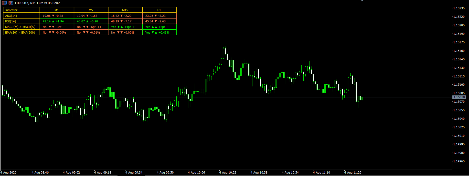
KD MTF Dashboard displays ADX, RSI, MACD and EMA trend readings for the current chart's symbol across any combination of timeframes from M1 to D1 (up to 6 at once, M1/M5/M15/H1 by default), in a single table. It is designed to show whether a symbol's timeframes agree with each other, without needing to switch between charts.
Key Features
- Multi-Timeframe Indicator Table: Displays ADX(14), RSI(14), MACD Main/Signal comparison, and EMA(20)/EMA(200) comparison for the current symbol, one column per selected timeframe.
- Timeframe Selection: Choose any combination of timeframes from M1 to D1, up to 6 at once.
- Adjustable Indicator Settings: Change the ADX, RSI, EMA and MACD periods to match your preferred settings.
- Custom Thresholds: Set the ADX trending level and RSI overbought/oversold levels used for highlighting.
- Current or Closed Bar Reading: Choose whether the dashboard reads live in-progress values or only fully closed-bar values.
- Flexible Positioning and Display: Place the panel in any of the 6 chart corners, and adjust column width, row height, font and font size.
Synergy with the KD Trading System
KD MTF Dashboard is the 7th pillar — a multi-timeframe confirmation layer that can be added on top of the other tools:
- KD Ultimate SMC: Its structure and liquidity zones can be reviewed alongside this dashboard's trend reading before acting on a signal.
- KD SMC Mini Charts: Can be used to review the timeframes shown in this dashboard in more visual detail.
- KD Auto SLTP: Can be used to size and place a trade once this dashboard's timeframe read supports a setup.
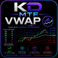
- KD MTF VWAP: This dashboard can confirm whether a VWAP band touch is occurring in a trending or ranging market — a check that tool's own guide recommends before treating a band touch as a reversal zone.
- KD MTF Candle Timer: Indicates when this dashboard's next update, and next confirmation, will occur.
- KD HTF Candles: This dashboard can confirm whether the trend behind an observed higher-timeframe candle is strong before that level is given weight.
- KD MTF Dashboard (This Tool): Provides a multi-timeframe indicator reading for the current symbol.
Practical Use Cases
Use Case 1: Top-Down Confirmation Before Entry
- Setup: A trader wants to check whether a lower-timeframe signal is supported by the higher-timeframe trend.
- In practice: Review H1 (or H4/D1, if enabled) first for ADX trend strength and EMA(20)/EMA(200) alignment, then check whether RSI and MACD on M5/M15 point in the same direction rather than against it.
- Purpose: Provides a reference for whether timeframes agree, to consider alongside an entry method such as structure or price action.
Use Case 2: Reading the Arrows, Not Just the Snapshot
- Setup: A value on the dashboard (for example, MACD[M] > MACD[S]) has just changed from "No" to "Yes."
- In practice: The trader treats a recent change with more weight than a reading that has held steady for a while, since the direction of change can be as informative as the current value.
- Purpose: Highlights that the dashboard's arrows and change values, not only the current snapshot, are part of what the table is designed to show.
User Settings & Customization
- Select any combination of timeframes from M1 to D1, up to 6 at once.
- Adjust the ADX, RSI, EMA and MACD calculation periods.
- Set custom ADX trending and RSI overbought/oversold thresholds.
- Choose between current (in-progress) bar values and closed-bar-only values.
- Position the panel in any chart corner and adjust column width, row height, font and font size.