Something Interesting in Financial Video February 2014
Every trader needs one.
Do you know what it is.
Many times it's the difference between success and failure in the market.
Watch the fifth episode of the "Traders Whiteboard" series and learn from master trader Adam Hewison on how to incorporate this key element into your own trading.
===============
How to Build a Four-Point Trading Plan
The ‘What’
The most important aspect of a trading plan is the definition of the type of trader that you are. And if you’re a new trader and aren’t quite sure of what type of trader you want to be, it’s ok to modify this as you see more results and get a better idea of which direction you want to move towards.
The benefit behind this is that it helps to keep you grounded. Let’s say that you’re a technical swing trader, but with an upcoming NFP report you see an especially attractive setup that you decide is worth of a quick scalp position.
Well, if that scalp doesn’t work out and a loss is taken – the ‘what’ of a trading plan serves as a reminder that you were trading outside of your comfort zone.
The ‘How’
A trading plan is worthless without a definition of ‘how’ a trader wants to enter and manage positions. This can be as simple as ‘I’m going to scalp trends,’ to as complex as ‘I’m going to take scalps with 8 period EMA crossovers on the 5 minute chart when price is below the 34 period hourly EMA.’
It really just depends on how in-depth you want to be. The benefit of having a more well-defined strategy in this portion of the plan allows you to come back later to troubleshoot if results aren’t meeting your expectations. A more loosely-defined strategy in this section of the plan may lead to a lack of discipline when you’re actually placing trades as the trader hasn’t made the commitment to the strategy by integrating it as part of their trading plan.
An important note here – the strategy should be yours, customized for your unique risk tolerance and personality. This should also mesh with the ‘what’ of the trading plan, as this is an extension of the type of trader you are.
The ‘When’
This part of the plan is often missed by traders; as many markets somewhat define when you’re actually able to trade. If you’re a stock trader, well you have to adhere to open market hours. Even then, many traders choose to focus on the first or last hour of the day, as this is where the majority of volatility will often take place.
But in the Forex market, there is quite a bit more flexibility available to the trader – and this isn’t always a positive thing. The FX Market moves 24 hours a day, and will often display differing characteristics based on the time-of-the-day and the area of the world that is providing liquidity.
The importance of defining the ‘when’ of a trading plan is that it allows traders to learn and improve upon their strategies and approach with as few moving variables as possible. If a trader normally implements their strategy during the Asian session, but for some reason couldn’t get to sleep and finds themselves trading during the London open with the same strategy; they are introducing an entirely new and unfamiliar risk into their approach.
The ‘Why’
The last part of the plan is, in my opinion, the most important. This is where you write down your goals and reasons for becoming a trader. This can be as ambitious as ‘I want to be a billionaire,’ to as reasonable as ‘I want to replace my income so that I can spend more time with my family.’ I strongly encourage you to set realistic, honest goals otherwise they’re nearly impossible to adhere to. I speak from experience.
Trading isn’t easy. It can be difficult, and tough, and costly, and frustrating all at the same time. Especially when we have fundamental environments that, as we say in Texas, ‘is about as clear as mud.’
The ‘why’ of a trading plan serves as the reminder for why you’re willing to go through the pain; and when times get difficult or a major drawdown is seen on the account, this can help to provide perspective of ‘the bigger picture.’ This allows the trader to take a step back in order to realize that the reasons they want to become a successful trader are worth any trials or tribulations that they may go through.
If the goal doesn’t seem worth the frustration any longer, then at the least you know its time to take a step back and either re-evaluate your options, or quit.
===============
Ichimoku - Kumo Cloud Studies I
- Ichimoku - about this indicator in general, what every line of this indicator means.
- Ichimoku cloud, how to use it with trading
- Ichimoku Trading - Ichimoku Training - Support and Resistance with the Ichimoku Cloud Trading
- Kumo Breakout Trading with the Ichimoku System.
- Ichimoku vs Moving Average Trade Analysis.
- Ichimoku vs Moving Average Trade Analysis
- Technical Analysis Course - Module 10: Cloud Charts: the Ichimoku Technique
- Ichimoku - Drawbacks Of Ichimoku Kinko Hyo
Forum on trading, automated trading systems and testing trading strategies
USDJPY Technical Analysis 23.06 - 30.06 : Rally Finishing to Ranging
newdigital, 2013.06.27 12:07
Well ... what I am explaining here by text and charts - it is understandable for traders. But there are traders and coders on the forum. And I think we all know that they are using different "forex english" in some cases. So, I am just translating some terms/words I am using for technical Ichimoku analysis onto "coding english" language :) :
- Tenkan Sen - moving average of the highest high and lowest low over the last 9 trading days. (Highest high + Lowest low) / 2 over the last 9 trading days
- Kijun Sen - moving average of the highest high and lowest low over the last 26 trading days. (Highest high + Lowest low) / 2 over the last 26 trading days.
- Senkou Span A - the average of the Tenkan Sen and Kijun Sen, plotted 26 days ahead. (Tenkan Sen + Kijun Sen) / 2 plotted 26 days ahead
- Senkou Span B - the average of the highest high and lowest low over the last 52 days, plotted 26 days ahead. (Highest high + Lowest low) / 2 over the last 52 trading days plotted 26 days ahead.
- Chikou Span - the closing price plotted 26 days behind.
Forum on trading, automated trading systems and testing trading strategies
Something Interesting in Financial Video October 2013
newdigital, 2013.10.27 15:37
Ichimoku trading tenkan-sen kijun-sen cross Part 2Second part of the TK Cross video explaining about the Kumo future as a filter on your cross.
==================
Tenkan Sen / Kijun Sen Cross
The Tenkan Sen / Kijun Sen Cross signal occurs when the Tenkan Sen (Turning line) crosses the Kijun Sen (Standard line).
A bullish signal occurs when the Tenkan Sen crosses from below to above the Kijun Sen
- A weak bullish signal occurs when the cross is below the Kumo.
- A neutral bullish signal occurs when the cross is inside the Kumo.
- A strong bullish signal occurs when the cross is above the Kumo.
- A weak bearish signal occurs when the cross is above the Kumo.
- A neutral bearish signal occurs when the cross is inside the Kumo.
- A strong bearish signal occurs when the cross is below the Kumo.
Kijun Sen Cross
The Kijun Sen Cross signal occurs when the price crosses the Kijun Sen (Standard line).
A bullish signal occurs when the price crosses from below to above the Kijun Sen
- A weak bullish signal occurs when the cross is below the Kumo.
- A neutral bullish signal occurs when the cross is inside the Kumo.
- A strong bullish signal occurs when the cross is above the Kumo.
- A weak bearish signal occurs when the cross is above the Kumo.
- A neutral bearish signal occurs when the cross is inside the Kumo.
- A strong bearish signal occurs when the cross is below the Kumo.
Forum on trading, automated trading systems and testing trading strategies
newdigital, 2014.01.07 07:56
Watch Price In Relation To Ichimoku Cloud (adapted from dailyfx article)
- Price & Cloud Relationships
- Price Bouncing Off Cloud Shows You A Well-Supported Trend
- An Example Ichimoku Trade with USDJPY
Ichimoku is a trend following indicator that almost anyone can learn to use with ease. When trading with Ichimoku, you’re often advised to start with the cloud to get a feel for whether or not price is trending up or down to past points on the chart. However, to get a better feel for the strength of the trend, it is better to see how price is reacting to the cloud rather than only looking where price is in relation to the cloud at any point in time.
Price & Cloud Interactions
USDJPY Has Demonstrated a Strong Trend Due To Multiple Cloud Bounces:
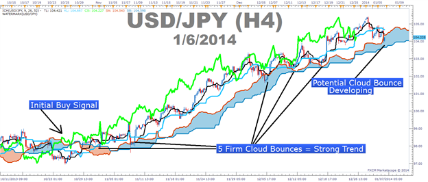
The cloud is a dynamic indicator that takes into consideration two aspects of a currency pair. In an uptrend, the top line of the cloud, traditionally known as Senkou Span A is composed of the mid-point between the 9 & 26 moving average based on mid-prices, or Tenkan-Sen & Kijun-Sen, and pushed forward 26-periods in order to give you a reference for the strength of a move. If current price is above the cloud, then current price is stronger than the mid-point of the 9 & 26 moving average from 26-periods ago, identifying the strength of the current trend.
The cloud’s bottom line in an uptrend, traditionally known as Senkou Span B, is composed of the mid-point over the last 52-periods on the chart and is also pushed forward 26-periods just like the top line. Therefore, if the current candle is above the cloud, which was created from 26-periods ago, then you can see that price is above both the mid-point of the 9 & 26 moving average as well as the mid-point over the last 52-sessions.
Price Bouncing Off Cloud Shows You a Well-Supported Trend
The key point of this article is that it’s not enough to simply know where price is in relation to the cloud to have a strong trend based trade. What you need to do is see if price is consistently on one side of the cloud or if price flips on either side of the cloud showing a very weak or non-existent trend. If there is no consistency with price and is consistently bouncing higher off the cloud proving the cloud as support and that the uptrend is strong, then it is best to take Ichimoku off your charts as Ichimoku doesn’t work well in ranges and will likely only clog up the charts if there is no clear trend.
A Cloud & Price Example Trade with USDJPY
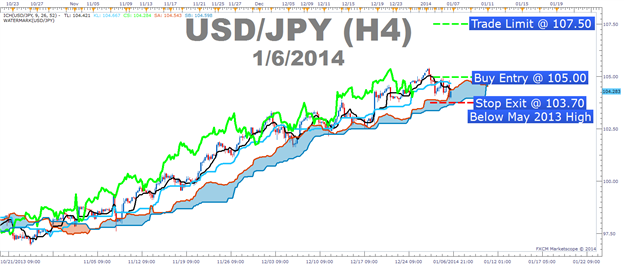
Entry to Buy: 105.00 (Breakout through resistance)
Stop: 103.70 (recent price action low and below May 2013 High – Pivotal Support)
Limit: 107.50 (Monthly R2 Pivot)
If this is your first reading of the Ichimoku report, here is a definitive guide on the versatile indicator:
- Full Candle Bodies above the Kumo Cloud
- The trigger line (black) is above the base line (light blue) or is crossing below
- Lagging line is above price action from 26 periods ago (Bright green line)
- Kumo ahead of price is bullish and rising (blue cloud = bullish Kumo)
How to Invest using Bollinger Bands
This video show you how to use technical analysis using Bollinger Bands to invest in stocks
=============
Videos :
- The Right Way to Trade Bollinger Bands (As the inventor of Bollinger bands, analyst John Bollinger discusses some of the misconceptions about trading the bands and how using them on multiple time frames can be advantageous).
- Reversals with Bollinger Bands
- How to trade Extreme Bollinger Band Reversal in Forex
- How to Trade Bollinger Bands - Stocks, Futures, Forex
- How to trade Bollinger Bands in Forex
- Bollinger Bands and Forex
- Bollinger bands - How To Master Bollinger Bands
=============
Book :
Forum on trading, automated trading systems and testing trading strategies
Something Interesting to Read January 2014
newdigital, 2014.01.16 10:26
Bollinger on Bollinger Bands Hardcover by John A. Bollinger
Over the past two decades, thousands of veteran traders have come to view Bollinger Bands as the most representative**and reliable**tool for assessing expected price action. Now, in the long-anticipated Bollinger on Bollinger Bands, John Bollinger himself explains how to use this extraordinary technique to effectively compare price and indicator movements.
Traders can look to this techniques-oriented book for hundreds of valuable insights, including:
- Analysis of the primary indicators derived from Bollinger Bands %b and BandWidth
- How traders can use Bollinger Bands to work with instead of against commonly encountered trading patterns
- Strategic use of Bollinger Bands in short-, mid-, and long-term trading program
- Three trading systems based on Bollinger Bands
By understanding how to incorporate Bollinger's techniques into their own investment strategy, investors will greatly increase their ability to ignore often-costly emotions and arrive at rational decisions supported by both the facts and the underlying market environment.
Forum on trading, automated trading systems and testing trading strategies
newdigital, 2013.08.06 13:49
Bollinger Bands Forex Trading Indicator
Developed by John Bollinger.
The Bollinger Bands indicator acts as a measure of volatility. This indicator is a price overlay indicator. The indicator consists of three lines; the middle line (moving average), an upper line and a lower line. These three bands will enclose the price and the price will move within these three bands.
This indicator forms upper and lower bands around a moving average. The default moving average is the 20-SMA. This indicator use the concept of standard deviations to form their upper and lower Bands.
The example is shown below.
Bollinger Bands Indicator
Because standard deviation is a measure of volatility and volatility of the market is dynamic, the bands keep adjust their width. higher volatility means higher standard deviation and the bands widen. Low volatility means the standard deviation is lower and the bands contract.
Bollinger Bands use price action to give a large amount of information. The information given by the this indicator includes:
- Periods of low volatility- consolidation phase of the forex market.
- Periods of high volatility- extended trends, trending forex markets.
- Support and resistance levels.
- Buy and Sell points.
This is part 2 of the video series that shows how to use technical analysis using Bollinger Bands to invest in stocks.
Forum on trading, automated trading systems and testing trading strategies
newdigital, 2013.08.06 13:51
How Bollinger Bands Indicator Works
Bollinger Bands calculations uses standard deviation to plot the bands, the default value used is 2.
Calculation
- The middle line is a simple moving average
- The upper line is: Middle line + Standard Deviation
- The lower line is: Middle line - Standard Deviation
Bollinger considered the best default for his indicator to be 20 periods moving average and the the bands are then overlaid on the price action.
Standard Deviation is a statistics concept. It originates from the notion of normal distribution. One standard deviation away from the mean either plus or minus, will enclose 67.5 % of all price action movement. Two standard deviations away from the mean either plus or minus, will enclose 95 % of all price action movement.
This is why the Bollinger Bands indicator uses the standard deviation of 2 which will enclose 95 % of all price action. Only 5 % of price action will be outside the bands, this is why traders open or close trades when price hits one of the outer Bands.
The Bollinger Bands indicator main function is to measure volatility. What the Bollinger Bands upper and lower limits try to do is to confine price action of up to 95 percent of the possible closing prices
This indicator compares the current closing price with the moving average of the closing price. The difference between them is the volatility of the current price compared to the moving average. The volatility will increase or decrease the standard deviation.
Forum on trading, automated trading systems and testing trading strategies
newdigital, 2013.08.06 13:57
Bollinger Bands Indicator Bulge and Squeeze Technical Analysis
The Bollinger Bands are self adjusting which means the bands widen and narrow depending on volatility.
Standard Deviation is the statistical measure of the volatility used to calculate the widening or narrowing of the bands. Standard deviation will be higher when prices are changing significantly and lower when markets are calmer.
- When volatility is high the Bands widen.
- When volatility is low the Bands narrows.
The Bollinger Squeeze
Narrowing of Bands is a sign of consolidation and is known as the Bollinger band squeeze.
When the Bollinger Bands display narrow standard deviation it is usually a time of consolidation, and it is a signal that there will be a price breakout and it shows people are adjusting their positions for a new move. Also, the longer the prices stay within the narrow bands the greater the chance of a breakou
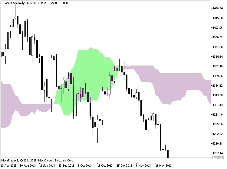
The Bollinger Bulge
The widening of Bands is a sign of a breakout and is known as the Bulge.
Bollinger Bands that are far apart can serve as a signal that a trend reversal is approaching. In the example below, the bands get very wide as a result of high volatility on the down swing. The trend reverses as prices reach an extreme level according to statistics and the theory of normal distribution. The "bulge" predicts the change to downtrend.
Ichimoku - Multiple Confirmations
- Ichimoku - about this indicator in general, what every line of this indicator means.
- Ichimoku cloud, how to use it with trading
- Ichimoku Trading - Ichimoku Training - Support and Resistance with the Ichimoku Cloud Trading
- Kumo Breakout Trading with the Ichimoku System.
- Ichimoku vs Moving Average Trade Analysis.
- Ichimoku vs Moving Average Trade Analysis
- Technical Analysis Course - Module 10: Cloud Charts: the Ichimoku Technique
- Ichimoku - Drawbacks Of Ichimoku Kinko Hyo
- Ichimoku - Ideal Ichimoku Scenarios
Forum on trading, automated trading systems and testing trading strategies
newdigital, 2013.11.25 12:23
Ichimoku Cloud (based on The Definitive Guide to Trading Trends with Ichimoku Cloud article)
Many traders are asked what indicator they would wish to never do without. The answer has never wavered as there is one indicator that clearly illustrates the current trend, helps you time entries, displays support and resistance, clarifies momentum, and shows you when a trend has likely reversed. That indicator is Ichimoku Kinko Hyo or more casually known as Ichimoku.
Ichimoku is a technical or chart indicator that is also a trend trading system in and of itself. The creator of the indicator, Goichi Hosada, introduced Ichimoku as a “one glance” indicator so that in a few seconds you are able to determine whether a tradable trend is present or if you should wait for a better set-up on a specific pair.
Before we break down the components of the indicator in a clear and relatable manner, there are a few helpful things to understand. Ichimoku can be used in both rising and falling markets and can be used in all time frames for any liquid trading instrument. The only time to not use Ichimoku is when no clear trend is present.
Always Start With the Cloud
The cloud is composed of two dynamic lines that are meant to serve multiple functions. However, the primary purpose of the cloud is to help you identify the trend of current price in relation to past price action. Given that protecting your capital is the main battle every trader must face, the cloud helps you to place stops and recognize when you should be bullish or bearish. Many traders will focus on candlesticks or price action analysis around the cloud to see if a decisive reversal or continuation pattern is taking shape.
In the simplest terms, traders who utilize Ichimoku should look for buying entries when price is above the cloud. When price is below the cloud, traders should be looking for temporary corrections higher to enter a sell order in the direction of the trend. The cloud is the cornerstone of all Ichimoku analysis and as such it is the most vital aspect to the indicator.
Time Entries with the Trigger & Base Line
Once you have built a bias of whether to look for buy or sell signals with the cloud, you can then turn to the two unique moving averages provided by Ichimoku. The fast moving average is a 9 period moving average and the slow moving average is a 26 period moving average by default. What is unique about these moving averages is that unlike their western counterparts, the calculation is built on mid-prices as opposed to closing prices. I often refer to the fast moving average as the trigger line and the slow moving average as the base line.
The Ichimoku components are introduced in a specific order because that is how you should analyze or trade the market. Once you’ve confirmed the trend by recognizing price as being below or above the cloud, you can move to the moving averages. If price is above the cloud and the trigger crosses above the base line you have the makings of a buy signal. If price is below the cloud and the trigger crosses below the base line you have the makings of a sell signal.
Confirm Entries with the Mysterious Lagging Line
In addition to the mystery of the cloud, the lagging line often confuses traders. This shouldn’t be the case as it’s a very simple line that is the close of the current candle pushed back 26 periods. When studying Ichimoku, I found that this line was considered by most traditional Japanese traders who utilize mainly Ichimoku as one of the most important components of the indicator.
Once price has broken above or below the cloud and the trigger line is crossing the base line with the trend, you can look to the lagging line as confirmation. The lagging line can best confirm the trade by breaking either above the cloud in a new uptrend or below the cloud in a developing downtrend. Looking above, you can see that the trend often gathers steam nicely after the lagging line breaks through the cloud. Another benefit of using the lagging line as a confirmation indicator is that the lagging line can build patience and discipline in your trading because you won’t be chasing the initial thrust but rather waiting for the correction to play out before entering in the direction of the overall trend.
Trading With Ichimoku Checklist
Now that you know the components of Ichimoku here is a checklist that you can print off or use to keep the main components of this dynamic trend following system:
Ichimoku Checklist:
1.Where is Price in Relation to the Cloud?
- Above the cloud -filtered for buy only signals
- In the Cloud - be cautious but ready to jump in on the prior trend or finesse a current position. what the candle stick formations heavily
- Below the cloud - filtered for short only trades
2. Is price consistently on one side of the cloud or is price whipping around on both sides consistently?
- Ichimoku is best used with clear trends and should be set aside during ranging markets.
3. Which level of the Ichimoku would like to use to place your stop?
- If you use Ichimoku to place stops as well, you can either use the cloud or the base line.
This is today's video about January Barometer :
Stock Market TimingForum on trading, automated trading systems and testing trading strategies
newdigital, 2014.02.03 17:24
I never know about this fundamental indicator ... so -
January barometer - (from wikipedia) : "The January barometer is the hypothesis that stock market performance in January (particularly in the U.S.) predicts its performance for the rest of the year. So if the stock market rises in January, it is likely to continue to rise by the end of December. The January barometer was first mentioned by Yale Hirsch in 1972"
This is the page #16 of 2008 edition of this book (Stock Trader's Almanac 2008) :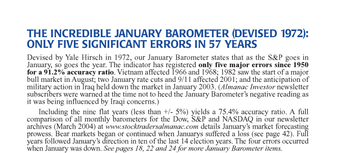
This is January so ...
This is the 5th video in a series on economic reports created for all markets, or for those who simply have an interest in economics. In this lesson we cover the ISM Manufacturing report.
============
Previous parts:
- 01: NON FARM PAYROLL (Part 1) - ECONOMIC REPORTS FOR ALL MARKETS
- 02: NON FARM PAYROLL (Part 2)- ECONOMIC REPORTS FOR ALL MARKETS
- 03: TWO MORE UNEMPLOYMENT REPORTS
- 04: PRODUCER PRICE INDEX
============
Description #1 :
ISM Index (Institute of Supply Management's index, former NAPM — National Association of Purchasing Managers) is the index of business activity.
ISM figures above 50 are usually considered as an indicator of expansion, while values below 50 indicate contraction. Typically, when ISM approaches 60 investors begin to worry about possible economic overheating, inflation increase and the corresponding measures (raising rates) by the Federal Reserve Bank. Figures below 40 entail talks about recession.
ISM is released just before unemployment data are announced, and is often used to refine data by Bureau of Labor Statistics.
- Release Frequency: monthly.
- Release Schedule: 10:00 EST, the first business day of the month.
- Source: Institute for Supply Management.
============
Description #2 :
- Source : Institute for Supply Management
- Measures : Level of a diffusion index based on surveyed purchasing managers in the manufacturing industry
- Usual Effect : actual > forecast = good for currency
- Frequency : Released monthly, on the first business day after the month ends
- Why Traders Care : It's a leading indicator of economic health - businesses react quickly to market conditions, and their purchasing managers hold perhaps the most current and relevant insight into the company's view of the economy
- Also Called : Manufacturing ISM Report On Business
============
Forum on trading, automated trading systems and testing trading strategies
newdigital, 2014.01.17 15:52
How Forex News Traders Use ISM Numbers (adapted from dailyfx article)
- The Institute for Supply Management (ISM) was founded in 1915 and is the first supply management institute in the world.
- Servicing 40,000 business professionals in more than 90 countries, ISM focuses on supply chain management.
- Forex traders rely heavily on ISM’s release their Purchasing Managers Index (PMI) on the first business day of each month to gauge economic growth.
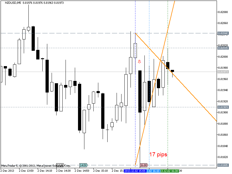
NZDUSD M5 : 17 pips prrice movement by USD ISM Manufacturing PMI :
What is ISM?
A country’s economy is as strong as its supply chain. The Institute for Supply Management (ISM) measures the economic activity from both the manufacturing side as well as the service side. Formed in 1915, ISM is the first management institute in the world with over 40,000 members in 90 countries. Since it can draw from information gathered from the surveying its large membership of purchasing managers, the ISM economic news releases are carefully watched by Forex traders around the world as a reliable guide to economic activity.

ISM Surveys
ISM publishes three surveys; manufacturing, construction, and services. Published on the first business day of the month, the ISM Purchasing Managers Index (PMI) is compiled from surveys of 400 manufacturing purchasing managers. These purchasing managers from different sectors represent five different fields; inventories and employment, speed of supplier deliveries, production level, and new orders from customers.
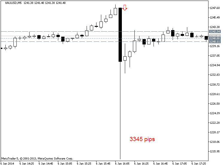
XAUUSD M5 : 3345 pips price movement by USD - ISM Non-Manufacturing PMI news event :
In addition, ISM construction PMI is released on the second business day of the month, followed by services on the third business day. Forex traders will look to these releases to determine the risks at any given time in the market.
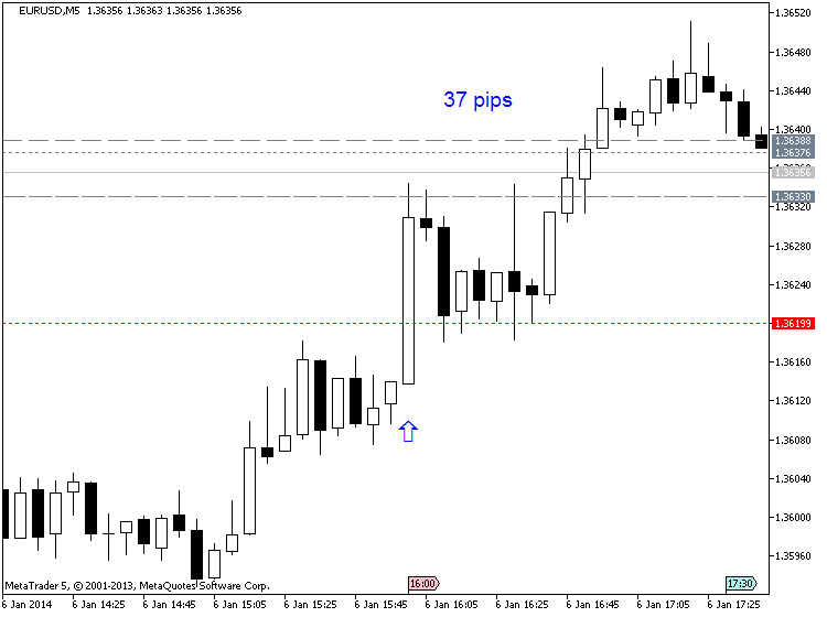
EURUSD M5 : 37 pips price movement by USD - ISM Non-Manufacturing PMI news event :
Forex Market Impact
The Manufacturing and Non-manufacturing PMI’s are big market movers. When these reports come out at 10:30 AM ET, currencies can become very volatile. Since these economic releases are based on the previous month’s historical data gathered directly from industry professionals, Forex traders can determine if the US economy is expanding or contracting.
Forex traders will compare the previous month’s number with the forecasted number that economists have published. If the released PMI number is better than the previous number and higher than the forecasted number, the US dollar tends to rally. This is where fundamental and technical analysis comes together to create a trade setup.
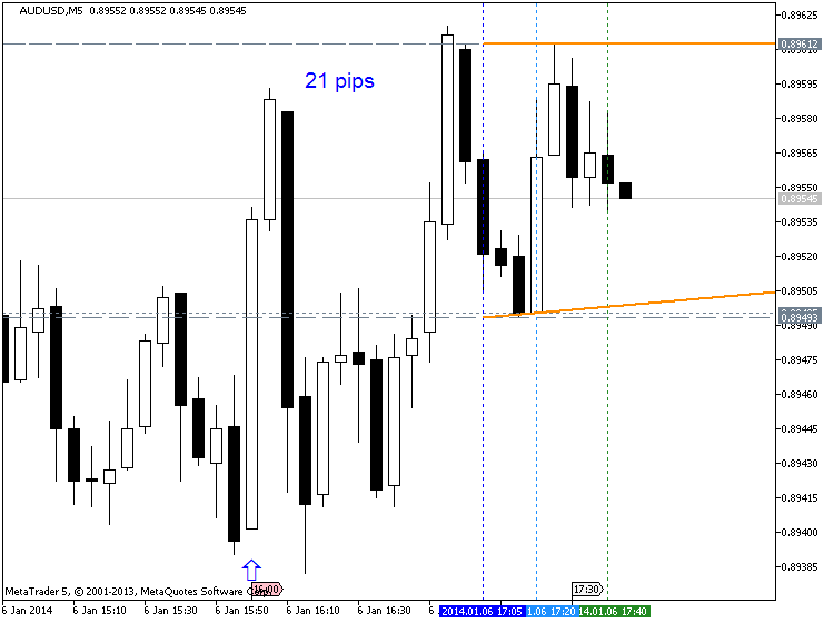
AUDUSD M5 : 21 pips price movement by USD - ISM Non-Manufacturing PMI news event :
In the example above, notice how the better than expected PMI number triggered a US dollar rally against the Euro. As seen in the chart above of the EURUSD, the ISM Non-Manufacturing was not only above 50 but at 55.4, beat the forecasts calling for a drop from 54.4 to 54.0.
When an economic release beats expectations, like in the example above, sharp fast moves can result. In this case, EURUSD dropped 22 pips in 15 minutes. Traders often choose the Euro as the “anti-dollar” to take advantage of capital flows between two of the largest economies.
The Euro zone has a large liquid capital markets which can absorb the huge waves of capital seeking refuge from the U.S. So a weak US ISM Non-Manufacturing number usually leads to a dollar sell-off and a rise in the Euro. Another scenario is when the number released is in line with forecasts and/or unchanged from the previous month, then the US dollar may not react at all to the number.
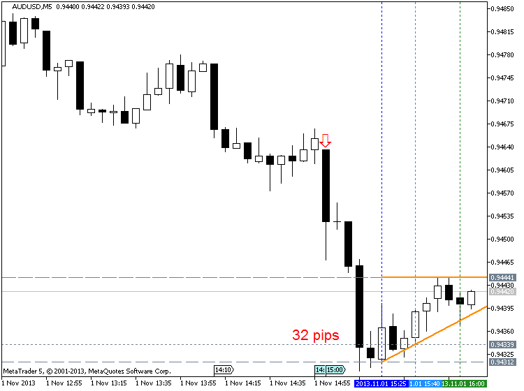
AUDUSD M5 : 32 pips price movement by USD - ISM Manufacturing PMI :
Overall, an ISM PMI number above 50 indicates that the economy is expanding and is healthy. However, a number below 50 indicates that the economy is weak and contracting. This number is so important that if the PMI is below 50 for two consecutive months, an economy is considered in recession.
PMI’s are also compiled for Euro zone countries by the Markit Group while US regional and national PMIs are compiled by ISM. As you can see, traders have good reason to pay special attention to the important releases from the Institute of Supply Management.
================
A short video introducing traders to the subject of currency correlations.
Forum on trading, automated trading systems and testing trading strategies
Indicators: MFCS Currency Correlation Chart
newdigital, 2013.10.26 09:29
Currency Pairs Correlation in Forex Market: Cross Currency Pairs
As a forex trader, if you check several different currency pairs to find the trade setups, you should be aware of the currency pairs correlation, because of two main reasons:
1- You avoid taking the same position with several correlated currency pairs at the same time and so you do not multiply your risk. Additionally, you avoid taking the positions with the currency pairs that move against each other, at the same time. 2- If you know the currency pairs correlations, it may help you to predict the direction and movement of a currency pair, through the signals that you see on the other correlated currency pairs.
Now I explain how currency pairs correlation helps. Lets start with the 4 major currency pairs: EURUSD ; GBPUSD ; USDJPY and USDCHF.
In both of the first two currency pairs (EURUSD and GBPUSD), USD works as the money. As you know, the first currency in currency pairs is known as the commodity and the second one is the money. So when you buy EURUSD, it means you pay USD to buy Euro. In EURUSD and GBPUSD, the currency that works as the money is the same (USD). The commodity of these pairs are both related to two big European economies. These two currencies are highly connected and related to each other and in 99% of the cases they move on the same direction and form the same buy/sell signals. Just recently, because of the economy crisis, they moved a little differently but their main bias is still the same.
What does it mean? It means if EURUSD shows a buy signal, GBPUSD should also show a buy signal with minor differences in the strength and shape of the signal. If you analyze the market and you come to this conclusion that you should go short with EURUSD and at the same time you decided to go long with GBPUSD, it means something is wrong with your analysis and one of your analysis is wrong. So you should not take any position until you see the same signal in both of these pairs. Of course, when these pairs really show two different direction (which rarely happens), it will be a signal to trade EUR-GBP. I will tell you how.
Accordingly, USD-CHF and USDJPY behave so similar but not as similar as EURUSD and GBPUSD, because in USD-CHF and USDJPY, money is different. Swiss Franc and Japanese Yen have some similarities because both of them belong to oil consumer countries but the volume of industrial trades in Japan, makes JPY different.
Generally, when you analyze the four major currency pairs, if you see buy signals in EURUSD and GBPUSD, you should see sell signals in USDJPY. If you also see a sell signal in USD-CHF, then your analysis is more reliable. Otherwise, you have to revise and redo your analysis.
EURUSD, GBPUSD, AUDUSD, NZDUSD, GBPJPY, EURJPY, AUDJPY and NZDJPY usually have the same direction. Just their movement pattern sometimes becomes more similar to each other and sometimes less.
What do I prefer?
If I find a sell signal with EURUSD and GBPUSD and a buy signal with USDJPY, I prefer to take the short position with one of the EURUSD or GBPUSD because downward movements are usually stronger. I will not take the short position with EURUSD or GBPUSD and the long position with USDJPY at the same time, because if any of these positions goes against me, the other one will do the same. So I don’t double my risk by taking two opposite positions with two currency pairs that move against each other.
How to use the currency pairs correlation to predict the direction of the market?
When I have a signal with a pair, but I need confirmation to take the position, I refer to the correlated currency pairs or cross currency pairs and look for the confirmation. For example I see a MACD Divergence in USDCAD four hours chart but there is no close support breakout in USDCAD four hours or one hour chart. I want to take a short position but I just need a confirmation. If I wait for the confirmation, it can become too late and I may miss the chance. I check a correlated currency pair like USDSGD and if I see a support breakout in it, I take the short position with USDCAD. Now the question is why I don’t take the short position with USDSGD and I use its support breakout to go short with USDCAD? I do it because USDCAD movements are stronger and more profitable. I use USDSGD just as an indicator to trade USCAD.
It happens that you take a position with a currency pair, but it doesn’t work properly and you don’t know if it was a good decision or not. On the other hand, you don’t see any sharp signal on that currency pair to help you decide if you want to keep the position or close it. In such cases, you can check a correlated currency pair and look for a continuation or reversal signal. It helps you to decide about the position you have.
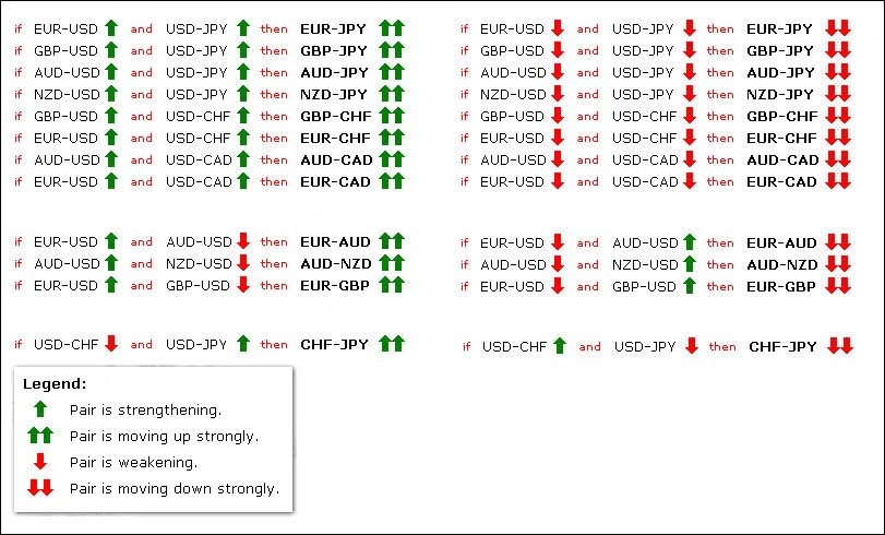
Sometimes, some correlated currency pairs don’t move in the way that they are supposed to move. For example EURUSD and USDJPY go up at the same time, whereas they usually move against each other. It can happen when Euro value goes up and USD value doesn’t have a significant change, but at the same time JPY value goes down, because of some reason. In these cases, you can use the below table to find and trade the currency pair that its movement is intensified by an unusual movement in two other currency pairs. In this example, if EURUSD and USDJPY go up at the same time, EURJPY will go up much stronger (see the below chart).
Or if EURUSD goes up and AUDUSD goes down at the same time, EUR-AUD goes up strongly.
Another important example: If EURUSD goes up and GBPUSD goes down at the same time, EURGBP goes up strongly. Maybe this is the most important case that we can trade based on this rule. It happens many times that EURUSD and GBPUSD move against each other and that is the best time to trade EURGBP. Now you know why EURGBP doesn’t move strongly most of the time. It is because EURUSD and GBPUSD move in the same direction most of the time. For example they go up at the same time and so EURGBP doesn’t show any significant movement because when both of the currencies of a currency pair go up or down at the same time, that currency pair doesn’t show any strong movement and direction (I hope you know why a currency pair goes up or down. It goes up when the first currency value goes up OR the second currency value goes down. For example EURUSD goes up, if Euro value goes up or USD value goes down. If this happens at the same time, then EURUSD goes up much stronger).
The below chart includes almost all of these unusual movements and their results on the third currency pair.
if EURUSD and USDJPY then EURJPY means if EURUSD and USDJPY go up at the same time, then EURJPY goes up much stronger.
Currency Correlations, Part II
The second video in a two-part series on currency correlations.
Forum on trading, automated trading systems and testing trading strategies
Indicators: MFCS Currency Correlation Chart
newdigital, 2014.02.04 08:27
Trade Gold Using Currency Correlations (based on dailyfx article)
Talking Points:
- Correlations are useful to find direction for a variety of markets.
- Gold and the AUDUSD have a positive correlation.
- Once direction is found, plan your trading strategy for another asset.
Let’s get started!
Golds Correlation
When someone mentions Gold, the AUDUSD should immediately come to mind as a correlating asset. These assets are positively correlated, meaning they can be seen generally moving in the same direction. First this correlation works because both assets are priced in US Dollars. The AUD/USD pair represents Aussie Dollars priced in US Dollars. While gold is XAU/USD or gold priced in US Dollars per oz. When the US dollar gains strength, both assets tend to depreciate in value.
Secondly, the AUD has a high correlation to gold due to Australia’s extensive gold mining operations. As gold prices fluctuate, this increases or decreases the amount of funds transferred into AUD to make purchases of the metal. These transfers essentially change demand for the currency and can directly cause changes in the AUDUSD currency pair as well.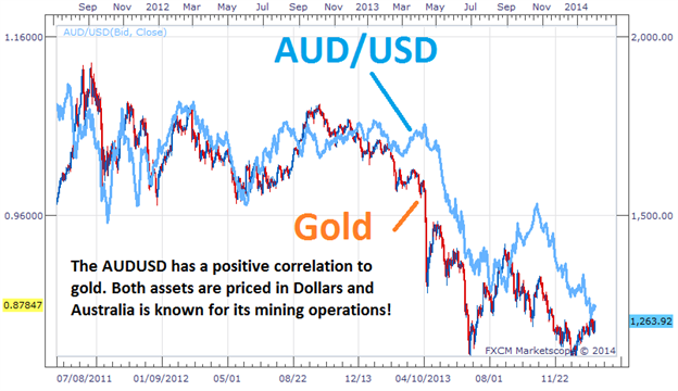
Trading the Correlation
The key to trading positively correlated assets, is finding a direction from one of the underlying assets before making a trading decision. If traders are seeing the AUDUSD push to lower lows, this could easily be the catalyst for a bearish bias on Gold. Conversely if gold is trending upwards, this can also be a signal of a new uptrend on the AUDUSD.

As you can see, this information is very useful to traders that have a general fundamental view of the market. If you have an opinion on Gold or the US Dollar this can be relayed into a trade idea. Often traders that are bullish on Gold choose to trade the AUDUSD instead of the metal itself. The Aussie Dollar carries a 2.50% banking rate, meaning traders can earn additional interest while executing a buy order on a positively correlated opinion of Gold. If a trader is bearish on the AUDUSD currency pair, traders can in turn sell gold to avoid accumulating interest on their trading balance.
Forum on trading, automated trading systems and testing trading strategies
Indicators: MFCS Currency Correlation Chart
newdigital, 2014.02.04 09:27
Australian Dollar Strongly Correlated to Gold, Silver, Steel Prices (based on this article)
View forex correlations to the SPDR Gold ETF Trust (GLD), United States Oil Fund ETF (USO), SPDR Dow Jones Industrial Average ETF Trust (DIA), UK FTSE 100 Index, and IShares Silver Trust ETF (SLV) prices: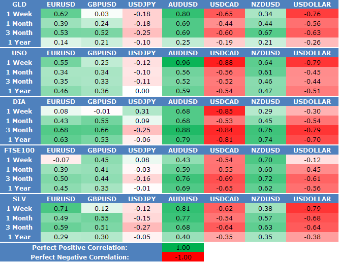
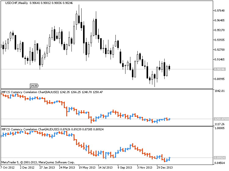
XAUUSD/AUDUSD :
XAGUSD/EURUSD :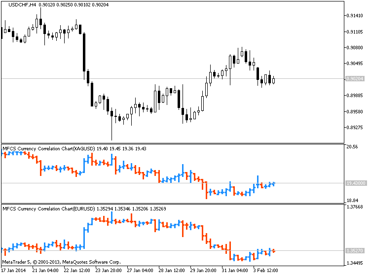
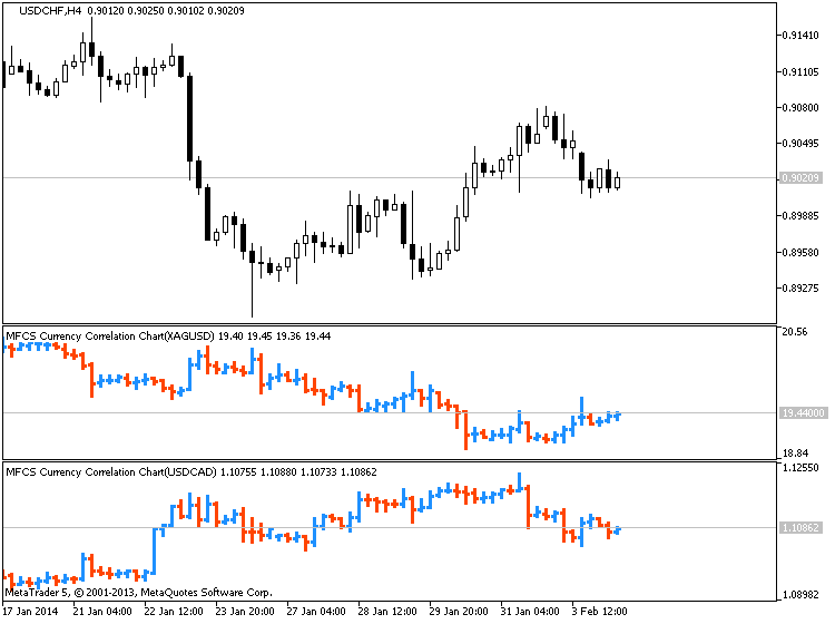
XAGUSD/USDCAD :
The importance of having a demo account is usually skimmed past by a lot of new traders. A demo trading account is the key to your success, especially if you are new to trading. Watch the video above to find out why.
============
===========
- Free trading apps
- Over 8,000 signals for copying
- Economic news for exploring financial markets
You agree to website policy and terms of use
Trading and training video (from youtube for example) about forex and financial market in general.
Please upload forex video you consider as interesting one. No direct advertising and no offtopic please.
Any the comments without video will be deleted.