Something Interesting in Financial Video October 2013 - page 6
You are missing trading opportunities:
- Free trading apps
- Over 8,000 signals for copying
- Economic news for exploring financial markets
Registration
Log in
You agree to website policy and terms of use
If you do not have an account, please register
The next lesson in free video stock trading course which covers how to buy and short sell stocks on margin.
Indicators - Accumulative Swing Index (ASI)
Forum
Indicators: Accumulation Swing Index (ASI)
newdigital, 2013.09.04 15:09
Accumulative Swing IndexDeveloped by Welles Wilder in his popular technical analysis book New Concepts in Technical Trading Systems, the Accumulative Swing Index (ASI) is mainly used as a divergence and confirmation tool, but can be used for buy and sell signals as well. It was designed to be used for futures trading, but can be used for stock trading and currency trading too. Basically, the Accumulative Swing Index is a running total of the Swing Index (see: Swing Index).
The chart below of gold futures shows the Accumulative Swing Index:
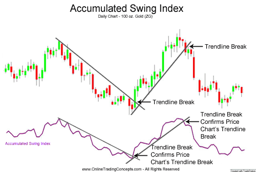
Accumulative Swing Index as a Confirmation ToolIn the chart shown below, the Accumulative Swing Index confirmed Gold's downtrend. Subsequently, when Gold broke the downward trendline, the Accumulative Swing Index confirmed the trendline break as well.
Similarly, the upward move in the Gold futures contract was confirmed by the Accumulative Swing Index and the upward trendline break was confirmed too.
Buy Signal - Accumulative Swing IndexBuy when Accumulative Swing Index breaks above a downward trendline or, in a price consolidation period, above resistance.
Sell Signal - Accumulative Swing IndexSell when the Accumulative Swing Index breaks below an upward trendline or, in a price consolidation period, below support.
Bollinger bands - How To Master Bollinger Bands
Techniques for mastering Bollinger bands for maximum profit. 5 Bollinger bands set-ups and their variations that you must know if you want to use Bollinger bands effectively.
Bollinger bands are about the best indicator you will ever use to help identify high probability trades.
Bollinger bands measure a standard deviation from the mean or middle. Usually the "mean" or middle is a 21 day moving average of closing price.
So you would lay down a 21 day moving average and then a 2.0 standard deviation set of Bollinger bands and when price closed outside of either band it is said to have closed outside a 2 standard deviation band.
==========
Forum
Indicators: Bollinger Bands ®
newdigital, 2013.08.06 13:49
Bollinger Bands Forex Trading Indicator
Developed by John Bollinger.
The Bollinger Bands indicator acts as a measure of volatility. This indicator is a price overlay indicator. The indicator consists of three lines; the middle line (moving average), an upper line and a lower line. These three bands will enclose the price and the price will move within these three bands.
This indicator forms upper and lower bands around a moving average. The default moving average is the 20-SMA. This indicator use the concept of standard deviations to form their upper and lower Bands.
The example is shown below.
Bollinger Bands Indicator
Because standard deviation is a measure of volatility and volatility of the market is dynamic, the bands keep adjust their width. higher volatility means higher standard deviation and the bands widen. Low volatility means the standard deviation is lower and the bands contract.
Bollinger Bands use price action to give a large amount of information. The information given by the this indicator includes:
Forum
Indicators: Bollinger Bands ®
newdigital, 2013.08.06 13:51
How Bollinger Bands Indicator Works
Bollinger Bands calculations uses standard deviation to plot the bands, the default value used is 2.
Calculation
Bollinger considered the best default for his indicator to be 20 periods moving average and the the bands are then overlaid on the price action.
Standard Deviation is a statistics concept. It originates from the notion of normal distribution. One standard deviation away from the mean either plus or minus, will enclose 67.5 % of all price action movement. Two standard deviations away from the mean either plus or minus, will enclose 95 % of all price action movement.
This is why the Bollinger Bands indicator uses the standard deviation of 2 which will enclose 95 % of all price action. Only 5 % of price action will be outside the bands, this is why traders open or close trades when price hits one of the outer Bands.
The Bollinger Bands indicator main function is to measure volatility. What the Bollinger Bands upper and lower limits try to do is to confine price action of up to 95 percent of the possible closing prices
This indicator compares the current closing price with the moving average of the closing price. The difference between them is the volatility of the current price compared to the moving average. The volatility will increase or decrease the standard deviation.
Bollinger Bands and Forex
In this video I'll show you a set-up using Bollinger bands that you can use to make virtually unlimited profits with Bollinger bands.
All you have to do here is pay careful attention to swing structure and price actions failure to print a new swing high. In this case when the new high failed to print on the chart we ended up with nearly a double-top, which is equally as powerful but because the high was actually lower than the previous it wasn't quite a double top.
In this case it was a LOWER SWING HIGH.
When that happened we ended up with a consolidation, a pinching of the bands and then ultimately a nice Bollinger band expansion followed by a break of the lower support levels and a perfect low risk high profit entry into a move that collapsed down to a quick fast 400 pip profit in a total of 4 days.
================
Forum
Indicators: Bollinger Bands ®
newdigital, 2013.08.06 13:54
Bollinger Bands and Volatility
When volatility is high; prices close far away from the moving average, the Bands width increases to accommodate more possible price action movement that can fall within 95% of the mean.
Bollinger bands will widen as volatility widens. This will show as bulges around the price. When bollinger bands widen like this it is a continuation pattern and price will continue moving in this direction. This is normally a continuation signal.
The example below illustrates the Bollinger bulge.
High Volatility and Low Volatility
When volatility is low; prices close closer towards the moving average, the width decreases to reduce the possible price action movement that can fall within 95% of the mean.
When volatility is low price will start to consolidate waiting for price to breakout. When the bollinger bands is moving sideways it is best to stay on the sidelines and not to place any trades.
The example is shown below when the bands narrowed.
Forum
Indicators: Bollinger Bands ®
newdigital, 2013.08.06 13:57
Bollinger Bands Indicator Bulge and Squeeze Technical Analysis
The Bollinger Bands are self adjusting which means the bands widen and narrow depending on volatility.
Standard Deviation is the statistical measure of the volatility used to calculate the widening or narrowing of the bands. Standard deviation will be higher when prices are changing significantly and lower when markets are calmer.
The Bollinger Squeeze
Narrowing of Bands is a sign of consolidation and is known as the Bollinger band squeeze.
When the Bollinger Bands display narrow standard deviation it is usually a time of consolidation, and it is a signal that there will be a price breakout and it shows people are adjusting their positions for a new move. Also, the longer the prices stay within the narrow bands the greater the chance of a breakou
The Bollinger Bulge
The widening of Bands is a sign of a breakout and is known as the Bulge.
Bollinger Bands that are far apart can serve as a signal that a trend reversal is approaching. In the example below, the bands get very wide as a result of high volatility on the down swing. The trend reverses as prices reach an extreme level according to statistics and the theory of normal distribution. The "bulge" predicts the change to downtrend.
How to Trade Bollinger Bands - Stocks, Futures, Forex
Full text of this video :
Bollinger Bands are comprised of three bands which are referred to as the upper band, the lower band, and the center band. The middle band is a simple moving average which is normally set at 20 periods, and the upper band and lower band represent chart points that are two standard deviations away from that moving average.
Example of Bollinger Bands ...
Bollinger bands are designed to give traders a feel for what the volatility is in the market and how high or low prices are relative to the recent past. The basic premise of Bollinger bands is that price should normally fall within two standard deviations (represented by the upper and lower band) of the mean which is the center line moving average. If you are unfamiliar with what a standard deviation is you can read about it here As this is the case trend reversals often occur near the upper and lower bands. As the center line is a moving average which represents the trend in the market, it will also frequently act as support or resistance. The first way that traders use the indicator is to identify potential overbought and oversold places in the market. Although some traders will take a close outside the upper or lower bands as buy and sell signals, John Bollinger who developed the indicator recommends that this method should only be traded with the confirmation of other indicators. Outside of the fact that most traders would recommend confirming signals with more than one method, with Bollinger bands prices which stay outside or remain close to the upper or lower band can indicate a strong trend, a situation that you do not want to be trading reversals in. For this reason selling at the upper band and buying at the lower is a technique that is best served in range bound markets.
Example of Buying and Selling at the Upper and Lower Band ...
Large breakouts often occur after periods of low volatility when the bands contract. As this is the case traders will often position for a trend trade on a break of the upper or lower Bollinger band after a period of contraction or low volatility. Be careful when using this strategy as the first move is often a fake out.
============
Forum
Indicators: Bollinger Bands ®
newdigital, 2013.08.06 14:00
Bollinger Bands Price Action in Trending Forex Markets
Bollinger Bands indicator is used to identify and analyze trending markets. In a trending market this indicator clearly shows up or down direction.
This indicator can be used to determine the direction of the forex trend. In an uptrend this indicator will clearly show the direction of the trend, it will be heading upwards and price will be above middle bollinger.
In a downtrend the price will be below the middle band and the bands will be heading downwards.
By observing the patterns formed by bollinger bands a trader can determine the direction in which the price is likely to move.
Patterns and Continuation Signals
Forex Uptrend
Price hugs the upper band in a forex upward.
Forex DowntrendForum
Indicators: Bollinger Bands ®
newdigital, 2013.08.06 14:02
Bollinger Bands Price Action in Ranging Forex Markets
Bollinger Bands Indicator is also used to identify periods when a currency price is overextended. The guidelines below are considered when applying this indicator to a sideways trend.
It is very important because it is used to give indications that a break out may be upcoming. During a trending market these techniques do not hold, this only holds as long as Bollinger Bands are pointing sideways.
One of the uses of Bollinger Bands is to use the above overbought and oversold guidelines to establish price targets during a ranging market.
In the above ranging market the instances when the price level hits the upper or lower bands can be used as profit targets for long/short positions.
Trades can be opened when price hits the upper resistance level or lower support level. A stop loss should be placed a few pips above or below depending on the trade opened, just in case price action breaks out of the range.
Forum
Indicators: Bollinger Bands ®
newdigital, 2013.08.06 14:04
Bollinger Bands Trend Reversals- Double Tops and Double Bottoms
A Forex trader should wait for the price to turn in the opposite direction after touching one of the bands before considering that a reversal is happening.
Even better one should see the price cross over the moving average.
Double Bottoms Trend Reversals
A double bottom is a buy setup/signal. It occurs when price action penetrates the lower bollinger band then rebounds forming the first low. then after a while another low is formed, and this time it is above the lower band.
The second low must not be lower than the first one and it important is that the second low does not touch or penetrate the lower band. This bullish Forex trading setup is confirmed when the price action moves and closes above the middle band (simple moving average).
Double Tops Trend Reversals
A double top is a sell setup/signal. It occurs when price action penetrates the upper bollinger band then rebounds down forming the first high. then after a while another high is formed, and this time it is below the upper band.
The second high must not be higher than the first one and it important is that the second high does not touch or penetrate the upper band. This bearish Forex trading setup is confirmed when the price action moves and closes below the middle band (simple moving average).
Forum
Indicators: Bollinger Bands ®
newdigital, 2013.08.06 14:05
Bollinger Bands Forex Trading Strategy Summary
Bollinger Bands is a popular indicator that can be used in various ways. However, like most indicators it should not be used alone. This indicator work best combined with overbought and oversold indicators and oscillators.
Since Bollinger Bands uses volatility to determine the trend, traders should not use indicators that duplicate this information. Instead these bands should combined with indicators that measure volume or momentum. The table below summarizes trading strategies used with this indicator.
============
The next lesson in my free video stock trading course which covers the implications of the pattern day trader rule and why you need $25,000 to daytrade stocks
Forum
Indicators: Relative Strength Index (RSI)
newdigital, 2013.08.07 12:55
RSI Indicator Forex Trading StrategyRelative Strength Index or RSI is the most popular indicator used in Forex trading. It is an oscillator indicator which oscillates between 0 -100. The RSI is a trend following indicator. It indicates the strength of the trend, values above 50 indicate a bullish trend while values below 50 indicate bearish Forex trend.
The RSI measures momentum of a currency.
The centerline for the RSI is 50,crossover of the centerline indicate shifts from bullish to bearish and vice versa.
Above 50, the buyers have greater momentum than the sellers and price of a currency will keep going up as long as RSI stays above 50.
Below 50, the sellers have greater momentum than the buyers and price of a currency will keep going downwards as long as RSI stays below 50.
In the example above, when the RSI is below 50, the price kept moving in a downward trend. The price continues to move down as long as RSI was below 50. When the RSI moved above 50 it showed that the momentum had changed from sell to buy and that the downtrend had ended.
When the RSI moved to above 50 the price started to move upwards and the trend changed from bearish to bullish. The price continued to move upwards and the RSI remained above 50 afterwards.
From the example above, when the trend was bullish sometimes the RSI would turn downwards but it would not go below 50, this shows that these temporary moves are just retracements because during all these time the price trend was generally upwards. As long as RSI does not move to below 50 the trend remains intact. This is the reason the 50 mark is used to demarcate the signal between bullish and bearish.
The RSI uses 14 day period as the default RSI period, this is the period recommended by J Welles Wilders when he introduced the RSI. Other common periods used by forex trader is the 9 and 25 day moving average.
The RSI period used depends on the time frame you are using, if you are using day time frame the RSI 14 will represent 14 days, while if you use 1 hour the RSI 14 will represent 14 hours. For our example we shall use 14 day moving average, but for your trading you can substitute the day period with the time frame you are trading.
To Calculate RSI:- The number of days that a currency is up is compared to the number of days that the currency is down in a given time period.
- The numerator in the basic formula is an average of all the sessions that finished with an upward price change.
- The denominator is an average of all the down closes for that period.
- The average for the down days are calculated as absolute numbers.
- The Initial RS is then turned into an oscillator.
Sometimes very large up or down movement in price in a single price period may skew the calculation of the average and produce a false signal in the form of a spike.Center-line: The center-line for RSI is 50. A value above 50 implies that a currency is in a bullish phase as average gains are greater than average losses. Values below 50 indicate a bearish phase.
Overbought and Oversold Levels:Wilder set the levels at which currencies are overextended at 70 and 30
Forum
Something Interesting in Financial Video July 2013
newdigital, 2013.07.09 10:26
22. How to Trade the Relative Strength Index (RSI) Like a Pro
A lesson on how to trade the RSI for traders and investors using technical analysis in the stock market, futures market and forex market.
In our last lesson we looked at 3 different ways that the MACD indicator can be traded. In today's lesson we are going to look at a class of indicators which are known as Oscillators with a look at how to trade one of the more popular Oscillators the Relative Strength Index (RSI).
An oscillator is a leading technical indicator which fluctuates above and below a center line and normally has upper and lower bands which indicate overbought and oversold conditions in the market (an exception to this would be the MACD which is an Oscillator as well). One of the most popular Oscillators outside of the MACD which we have already gone over is the Relative Strength Index (RSI) which is where we will start our discussion.
The RSI is best described as an indicator which represents the momentum in a particular financial instrument as well as when it is reaching extreme levels to the upside (referred to as overbought) or downside (referred to as oversold) and is therefore due for a reversal. The indicator accomplishes this through a formula which compares the size of recent gains for a particular financial instrument to the size of recent losses, the results of which are plotted as a line which fluctuates between 0 and 100. Bands are then placed at 70 which is considered an extreme level to the upside, and 30 which is considered an extreme level to the downside.
Example of the RSI :
The first and most popular way that traders use the RSI is to identify and potentially trade overbought and oversold areas in the market. Because of the way the RSI is constructed a reading of 100 would indicate zero losses in the dataset that you are analyzing, and a reading of zero would indicate zero gains, both of which would be a very rare occurrence. As such James Wilder who developed the indicator chose the levels of 70 to identify overbought conditions and 30 to identify oversold conditions. When the RSI line trades above the 70 line this is seen by traders as a sign the market is becoming overextended to the upside. Conversely when the market trades below the 30 line this is seen by traders as a sign that the market is becoming over extended to the downside. As such traders will look for opportunities to go long when the RSI is below 30 and opportunities to go short when it is above 70. As with all indicators however this is best done when other parts of a trader's analysis line up with the indicator.
Example of RSI Showing Overbought and Oversold :
A second way that traders look to use the RSI is to look for divergences between the RSI and the financial instrument that they are analyzing, particularly when these divergences occur after overbought or oversold conditions in the market. These divergences can act as a sign that a move is loosing momentum and often occur before reversals in the market. As such traders will watch for divergences as a potential opportunity to trade a reversal in the stock, futures or forex markets or to enter in the direction of a trend on a pullback.
Example of RSI Divergence :
The third way that traders look to use the RSI is to identify bullish and bearish changes in the market by watching the RSI line for when it crosses above or below the center line. Although traders will not normally look to trade the crossover it can be used as confirmation for trades based on other methods.
Forex Trading - How to Use the RSI Indicator ... ok? :)
Forum
Indicators: Relative Strength Index (RSI)
newdigital, 2013.08.07 13:03
RSI Indicator Overbought and Oversold LevelsRSI values of above 70 are considered to be overbought; traders consider points above the 70 level as market tops and good points for taking profits.
RSI values of below 30 are considered to be oversold; traders consider points below the 30 level as market bottoms and good points for taking profits.
These levels should be confirmed by center line crossovers. If these regions give a market top or bottom, this signal should be confirmed with a center line crossover. This is because these levels are prone to giving whipsaws in the market.
In the example below, when the RSI hit 70, it showed that the currency was overbought, and this could be considered a signal that the currency could reverse.
The currency then reversed after a short while and started to move downwards, until it got to the oversold levels. This was considered a market bottom after which the currency started to move upwards again.
Over extended RSI overbought and oversoldWhen the market is trending strongly upwards or downwards the RSI will stay at these levels for a long time. When this happens these regions cannot be used market tops and bottoms because the RSI will stay at these levels for an extended period of time. This is the reason why we say that RSI overbought and oversold regions are prone to whipsaws and it is best to confirm the signals using center-line crossovers.
How to Use Moving Averages in Stock Trading
Forum
Indicators: Custom Moving Average
newdigital, 2013.07.31 07:53
Short-term Forex Trading with Moving AveragesShort term trading will use short period moving averages such as the 10 and 20 moving average.
In the example below we use 10 and 20 moving averages to generate Forex signals; the signals generated are able to identify the trend as early as possible.
Scalper Trading Using Moving Averages
One of the most widely used method of technical analysis used to trade price fluctuations in scalp trading is the use of moving averages. moving averages is an indicator that provides a profitable chart structure for scalp trader.
The idea behind moving averages is to simply enhance analysis before taking a signal to enter the market. Planning and setting goals in the short-term according to moving averages helps a trader to identify interests in the market and thus trade accordingly.
Most of the targets can be established using a specific period on MA. The moving averages determines whether the trader will scalp in a short-term long-term. In addition, the price action above or below the price determines the state of the market for the trading day.
If a large part of the price action is considered to be below the MA, then bias trade/forex trend for the day is short. Most traders the use the MA as support or resistance to determine where to enter a trade, if price touches the MA in the direction of the forex trend a trade is then opened.
The moving averages are plotted and the intersection point with the price action can be used to determine the appropriate entry and exit times in the market. Since there is always oscillation in the forex trends and activities of the price action on the market, the price will repeat this process of oscillating and bouncing off the MA and this can be used to generate forex trading signals.
Scalp trader use moving averages define the price floor in an upward Forex trend and price ceiling in a downward Forex trend.
Simple moving averages are calculated and their approach is based on the observation of price within a particular period of time using sufficient data to calculate the moving averages is what moving average are all about? The interpretation of the moving averages has provided many scalp traders with lots of tips on how and when to trade a currency.
Medium-term Trading with Moving Average
Medium term trading will use the 50 period MA.
The 50 period MA acts as support or resistance level for the price.
In an uptrend the 50 period MA will act as a support, price should always bounce back up after touching the MA. If price closes below the MA then it is an exit signal.
50 period MA Support
In a downtrend the 50 period MA will act as a resistance, price should always go down after touching the moving average. If price closes above the moving average then it is an exit signal.
50 Day Moving Average Analysis in the Forex Market
As your currency pair moves up in price, there is a key line you want to watch. This is the 50 day moving average. If your currency pair stays above it, that is a very good sign. If your currency pair drops below the line in heavy volume, watch out, there could be reversal ahead.
A 50 day MA line takes 10 weeks of closing price data, and then plots the average. The line is recalculated everyday. This will show a currency pair's price trend. It can be up, down, or sideways.
You normally should only buy currency pairs that are above their 50 day MA. This tells you the currency pair is trending upward in price. You always want to trade with the trend, and not against it. Many of the world's greatest traders, past and present, only trade or traded in the direction of the trend.
When a successful currency pair corrects in price, which is normal, it may drop down to its 50 day MA.
Winning currency pairs normally will find support over and over again at that line. Big trading institutions such as mutual funds, pension funds, and hedge funds watch top currency pairs very closely. When these big volume trading entities spot a great currency pair moving down to its 50 day line, they see it as an opportunity, to add to, or start a position at a reasonable price.
What does it mean if your currency pair price slices downward through its 50 day line. If it happens on heavy volume, it is a strong signal to sell the currency pair. This means big institutions are selling their shares, and that can cause a dramatic drop in price, even if fundamentals still look solid. Now, if your currency pair drops slightly below the 50 day line on light volume, watch how the currency pair acts in the following days, and take appropriate action if necessary
Long-term Trading with Moving Average
Long term trading will use long period moving averages such as the 100 and 200 moving average.
These moving averages act as long term support and resistance levels. Since many traders use the 100 and 200 moving averages price will often react to these support and resistance levels.
Learn about the 200 day MA
In Forex Trading, investors can use both fundamental analysis and technical analysis to help determine whether a currency pair is a good buy or sell.
In technical analysis technique traders looking to gauge supply and demand for a currency use the 200 day moving average to examine data in different ways.
Traders are most familiar with the basic analysis of MA. The 200 day moving average is used to plot the long term support or resistance level. If price is above 200 day MA then price is bullish, and if it is below then it is bearish.
One of the ways to measure supply and demand is to calculate the average closing price over the last 200 trading sessions. this accounts for each day going back in time and shows how this 200 day average has moved hence the term 200 day MA.
The reason why the average 200 day MA in particular is so popular in technical analysis is because historically has been used with profitable results for trading in the forex market. A popular timing strategy is used to buy when price action is above its moving average of 200 days and sell when it goes below it.
With individual currency pairs, investors can benefit from being notified when a currency pair rises above, or falls below its 200 day Moving Average and then use fundamental analysis to help determine if the signal is an opportunity to go long or short.
This video is on how to use multiple moving averages to give structure to the market.
Forum
How to Start with Metatrader 5
newdigital, 2013.07.15 21:19
Just good indicator found in Metatrader 5 CodeBase : GUPPY MULTIPLE MOVING AVERAGES :
These are two groups of exponential moving averages. The short term group is a 3, 5, 8, 10, 12 and 15 day moving averages. This is a proxy for the behaviour of short term traders and speculators in the market.
The long term group is made up of 30, 35, 40, 45, 50 and 60 day moving averages. This is a proxy for the long term investors in the market.
The relationship within each of these groups tells us when there is agreement on value - when they are close together - and when there is disagreement on value - when they are well spaced apart.
The relationship between the two groups tells the trader about the strength of the market action. A change in price direction that is well supported by both short and long term investors signals a strong trading opportunity. The crossover of the two groups of moving averages is not as important as the relationship between them.
When both groups compress at the same time it alerts the trader to increased price volatility and the potential for good trading opportunities.
==========
The Guppy Multiple Moving Average (GMMA) is an indicator that tracks the inferred activity of the two major groups in the market. These are investors and traders. Traders are always probing for a change in the trend. In a downtrend they will take a trade in anticipation of a new up trend developing. If it does not develop, then they get out of the trade quickly. If the trend does change, then they stay with the trade, but continue to use a short term management approach. No matter how long the up trend remains in place, the trader is always alert for a potential trend change. Often they use a volatility based indicator like the count back line, or a short term 10 day moving average, to help identify the exit conditions. The traders focus is on not losing money. This means he avoids losing trading capital when the trade first starts, and later he avoids losing too much of open profits as the trade moves into success.
We track their inferred activity by using a group of short term moving averages. These are 3, 5, 8, 10, 12 and 15 day exponentially calculated moving averages. We select this combination because three days is about half a trading week. Five days is one trading week. Eight days is about a week and a half.
The traders always lead the change in trend. Their buying pushes prices up in anticipation of a trend change. The only way the trend can survive is if other buyers also come into the market. Strong trends are supported by long term investors. These are the true gamblers in the market because they tend to have a great deal of faith in their analysis. They just know they are right, and it takes a lot to convince them otherwise. When they buy a stock they invest money, their emotions, their reputation and their ego. They simply do not like to admit to a mistake. This may sound overstated, but think for a moment about your investment in AMP or TLS. If purchased several years ago these are both losing investments yet they remain in many portfolios and perhaps in yours.
The investor takes more time to recognize the change in a trend. He follows the lead set by traders. We track the investors inferred activity by using a 30, 35, 40, 45, 50 and 60 day exponentially calculated moving average. Each average is increased by one week. We jump two weeks from 50 to 60 days in the final series because we originally used the 60 day average as a check point.
This reflects the original development of this indicator where our focus was on the way a moving average crossover delivered information about agreement on value and price over multiple time frames. Over the years we have moved beyond this interpretation and application of the indicator. In the notes over the coming weeks we will show how this has developed.
Our starting point was the lag that existed between the time of a genuine trend break and the time that a moving average cross over entry signal was generated. Our focus was on the change from a downtrend to an up trend. Our preferred early warning tool was the straight edge trend line which is simple to use and quite accurate. The problem with using a single straight edge trend line was that some breakouts were false. The straight edge trend line provided no way to separate the false from the genuine.
On the other hand, the moving average crossover based on a 10 and 30 day calculation, provided a higher level of certainty that the trend break was genuine. However the disadvantage was that the crossover signal might come many days after the initial trend break signal. This time lag was further extended because the signal was based on end of day prices. We see the exact cross over today, and if we were courageous, we could enter tomorrow. Generally traders waited for another day to verify that the crossover had actually taken place which delayed the entry until 2 days after the actual crossover. This time lag meant that price had often moved up considerably by the time the trade was opened.
The standard solution called for a combination of short term moving averages to move the crossover point further back in time so that it was closer to the breakout signaled by a close above the straight edge trend line. The drawback was that the shorter the moving average, the less reliable it became. In plotting multiple moving averages on a single chart display four significant features emerged.
They were:
These broad relationships, and the more advanced relationships used with the GMMA are summarized in the chart. Over the following series of articles we will examine the identification and application of each of these relationships.
This is the most straightforward application of the GMMA and it worked well with “V’ shaped trend changes. It was not about taking the lag out of the moving average calculation. It is about validating a prior trend break signal by examining the relationship between price and value. Once the initial trend break signal is validated by the GMMA the trader is able to enter a breakout trade with a higher level of confidence.
The CBA chart shows the classic application of the GMMA. We start with the breakout above the straight edge trend line. The vertical line shows the decision point on the day of the breakout. We need to be sure that this breakout is for real and likely to continue upwards. After several months in a downtrend the initial breakout sometimes fails and develops as shown by the thick black line. This signals a change in the nature of the trend line from a resistance function prior to the breakout to a support function after the breakout.
The GMMA is used to assess the probability that the trend break shown by the straight edge trend line is genuine. We start by observing the activity of the short term group. This tells us how traders are thinking. In area A we see a compression of the averages. This suggests that traders have reached an agreement on price and value. The price of CBA has been driven so low that many traders now believe it is worth more than the current traded price. The only way they can take advantage of this ‘cheap’ price is to buy stock. Unfortunately many other short term traders have reached the same conclusion. They also want to buy at this price. A bidding war erupts. Traders who believe they are missing out on the opportunity outbid their competitors to ensure they get a position in the stock at favorable prices.
The compression of these averages shows agreement about price and value. The expansion of the group shows that traders are excited about the future prospects of increased value even though prices are still rising. These traders buy in anticipation of a trend change. They are probing for a trend change.
We use the straight edge trend line to signal an increased probability of a trend change. When this signal is generated we observe this change in direction and separation in the short term group of averages. We know traders believe this stock has a future. We want confirmation that the long term investors are also buying this confidence.
The long term group of averages, at the decision point, is showing signs of compression and the beginning of a change in direction. Notice how quickly the compression starts and the decisive change in direction. This is despite the longest average of 60 days which we would normally expect to lag well behind any trend change. This compression in the long term group is evidence of the synchronicity relationship that makes the GMMA so useful.
This compression and change in direction tells us that there is an increased probability that the change in trend direction is for real – it is sustainable. This encourages us to buy the stock soon after the decision point shown.
The GMMA picks up a seismic shift in the markets sentiment as it happens, even though we are using a 60 day moving average.. Later we will look at how this indicator is used to develop reliable advance signals of this change. This compression and eventual crossover within the long term group takes place in area B. The trend change is confirmed. The agreement amongst investors about price and value cannot last. Where there is agreement some people see opportunity. There are many investors who will have missed out on joining the trend change prior to area B. Now the change is confirmed they want to get part of the action. Generally investors move larger funds than traders. Their activity in the market has a larger impact.
The latecomers can only buy stock if they outbid their competitors. The stronger the initial trend, the more pressure there is to get an early position. This increased bidding supports the trend. This is shown by the way the long term group continue to move up, and by the way the long term group of averages separates. The wider the spread the more powerful the underlying trend.
Even the traders retain faith in this tend change. The sell off that takes place in area C is not very strong. The group of short term averages dips towards the long term group and then bounces away quickly. The long term group of averages show that investors take this opportunity to buy stock at temporarily wakened prices. Although the long term group falters out at this point, the degree of separation remains relatively constant and this confirms the strength of the emerging trend.
The temporary collapse of the short term group comes after a 12% appreciation in price. Short term traders exit the trade taking short term profits at this level of return and this is reflected by the compression and collapse of the short term group of averages. As long term investors step into the market and buy CBA at these weakened prices, traders sense that the trend is well supported. Their activity takes off, and the short term group of averages rebounds, separates, and then run parallel to the long term group as the trend continues.
The GMMA identifies a significant change in the markets opinion about CBA. The compression of the short term and long term groups validates the trend break signal generated by a close above the straight edge trend line. Using this basic application of the GMMA, the trader has the confidence necessary to buy CBA at, or just after the decision points shown on the chart extract.
Using this straightforward application of the GMMA also kept traders out of false breakouts. The straight edge trend line provides the first indication that a downtrend may be turning to an up trend. The CSL chart shows two examples of a false break from a straight edge trend line. We start with decision point A. The steep downtrend is clearly broken by a close above the trend line. If this is a genuine trend break then we have the opportunity to get in early well before any moving average crossover signal.
This trend break collapses quickly. If we had first observed this chart near decision point B then we may have chosen to plot the second trend line as shown. This plot takes advantage of the information on the chart. We know the first break was false, and by taking this into account we set the second trend line plot. Can this trend break be relied upon? If we are right we get to ride a new up trend. If we are wrong we stand to lose money if we stay with a continuation of the downtrend. The straight edge trend line by itself does not provide enough information to make a good decision.
When we apply the GMMA we get a getter idea of the probability of the trend line break actually being the start of a new up trend. The key relationship is the level of separation in the long term group of averages, and trend direction they are traveling. At both decision point A and decision point B the long term group is well separated. Investors do not like this stock. Every time there is a rise in prices they take advantage of this to sell. Their selling overwhelms the market and drives prices down so the downtrend continues.
The degree of separation between the two groups of moving averages also makes it more difficult for either of the rallies to successfully change the direction of the trend. The most likely outcome is a weak rally followed by a collapse and continuation of the down trend. This observation keeps the trader, and the investor, out of CSL.
Looking forward we do see a convergence between the short term group of averages and the long term group of averages. Additionally the long term group begins to narrow down, suggesting a developing level of agreement about price and value amongst investors in April and May. In late March the 10 day moving average closes above the 30 day moving average, generating a classic moving average buy signal.
we can use GMMA indicator for Multiple MA : GMMA indicator from MT5 CodeBase is here :