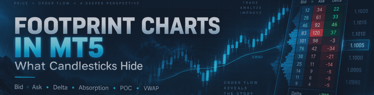
What Candlesticks Hide: Footprint Charts & Order Flow Trading Explained for Forex, MT4 and MT5

What Candlesticks Hide: Footprint Charts & Order Flow Trading Explained for Forex, MT4 and MT5
See Buyers, Sellers, Delta, CVD, Imbalances, Absorption, Exhaustion, POC, VWAP and Volume Profile — Inside the Candle
Order Flow Footprint Pro MT5 on MQL5 Market
A normal candlestick shows us where price went.
But it does not clearly show us what happened while price was moving.
That is the idea behind Order Flow and Footprint Charts.
Imagine two bullish candles that look almost identical.
Both opened near the low.
Both closed near the high.
But inside the first candle, buyers were consistently aggressive.
Inside the second, sellers were heavily active near the low, their selling was absorbed, and only then did price reverse upward.
On a normal candlestick chart, both candles may look similar.
A Footprint Chart can tell a very different story.
That is why traders interested in Forex Order Flow, Footprint Charts, Delta, Cumulative Delta, Volume Profile, POC and VWAP look beyond the candle body.
This guide explains those concepts without complicated terminology.
Whether you use MetaTrader 4, MetaTrader 5 or other trading platforms, the underlying Order Flow concepts are the same. The example tool shown later in this article is for MT5.
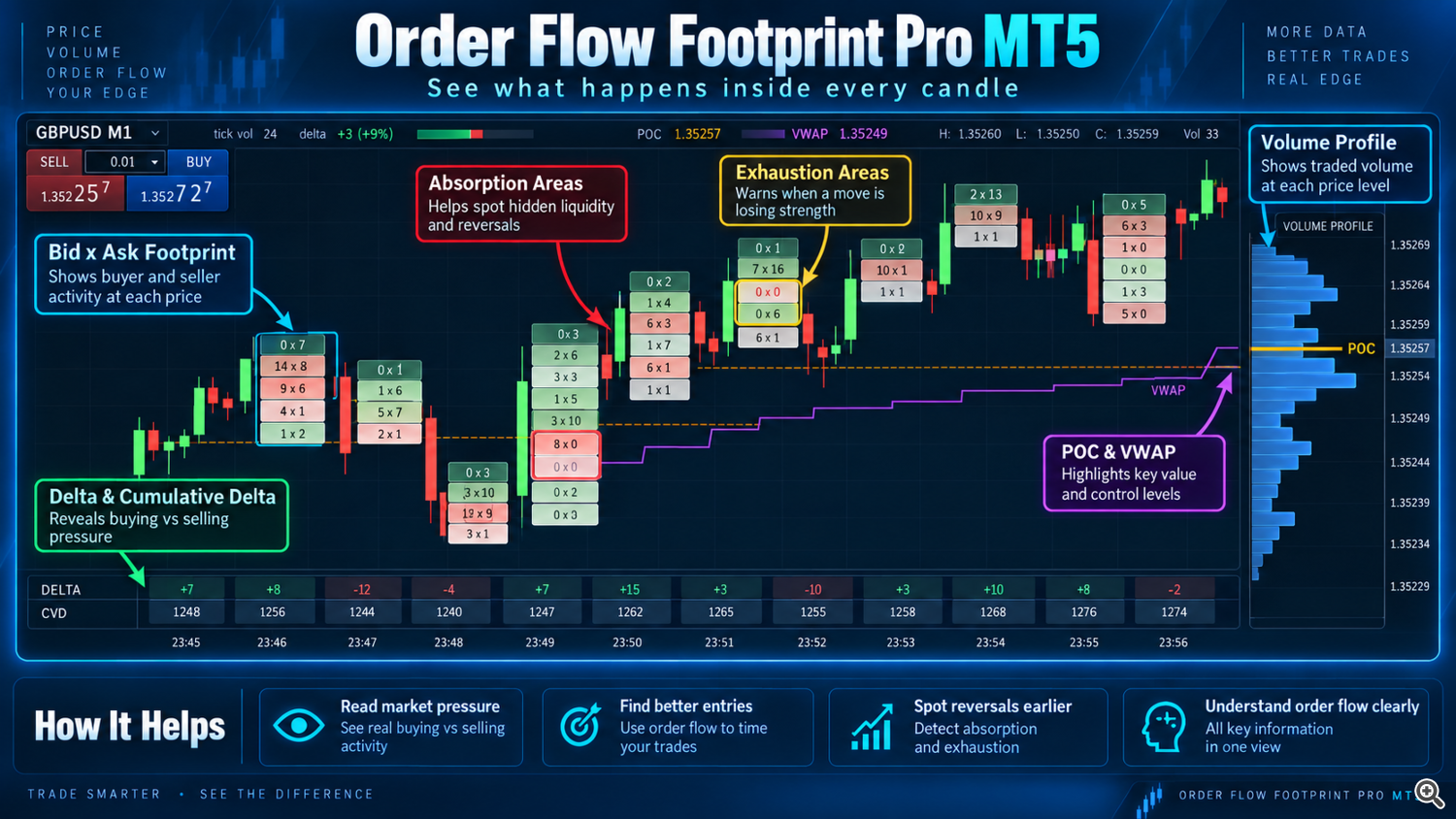
Order Flow Footprint Pro MT5 on MQL5 Market
A normal candlestick shows us where price went.
But it does not clearly show us what happened while price was moving.
That is the idea behind Order Flow and Footprint Charts.
Imagine two bullish candles that look almost identical.
Both opened near the low.
Both closed near the high.
But inside the first candle, buyers were consistently aggressive.
Inside the second, sellers were heavily active near the low, their selling was absorbed, and only then did price reverse upward.
On a normal candlestick chart, both candles may look similar.
A Footprint Chart can tell a very different story.
That is why traders interested in Forex Order Flow, Footprint Charts, Delta, Cumulative Delta, Volume Profile, POC and VWAP look beyond the candle body.
This guide explains those concepts without complicated terminology.
Whether you use MetaTrader 4, MetaTrader 5 or other trading platforms, the underlying Order Flow concepts are the same. The example tool shown later in this article is for MT5.
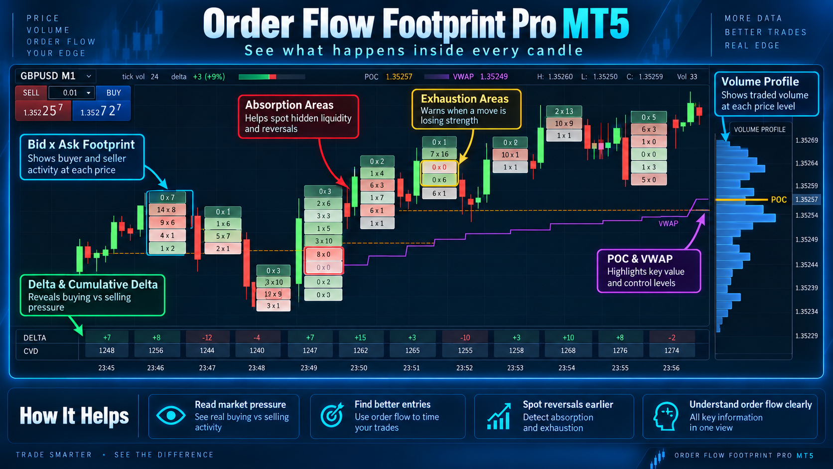
1. A Candlestick Shows the Result — A Footprint Shows the Activity
Every trader knows a candlestick.
It contains:
Open, High, Low and Close.
That is useful because it tells us the final result of the battle between buyers and sellers.
But imagine watching a football match and seeing only the final score.
You know who won.
You do not know how the match developed.
A Footprint Chart is similar to watching what happened during the match.
Instead of one candle, we see activity at several price levels inside it.
For example:
Price Bid × Ask 1.35260 18 × 52 1.35258 27 × 86 1.35256 46 × 128 1.35254 95 × 71 1.35252 142 × 39
Now we can begin asking better questions.
Where were buyers aggressive?
Where were sellers aggressive?
Did heavy selling actually push price lower?
Did strong buying really move price higher?
Where did activity suddenly disappear?
Those questions are the beginning of Order Flow analysis.
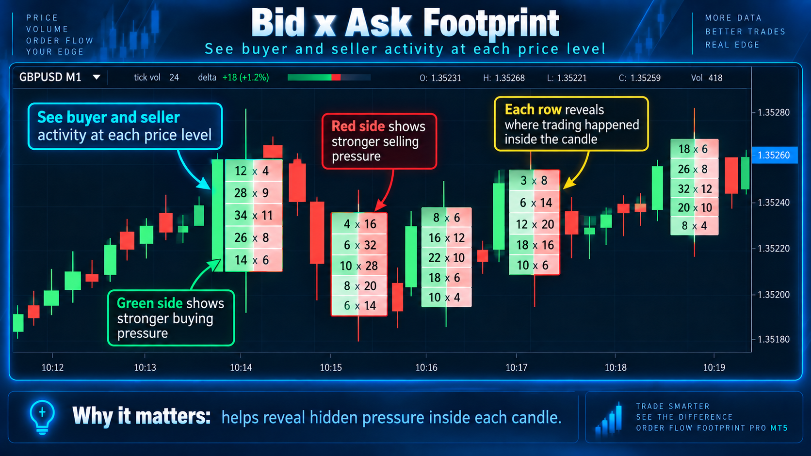
What Does Bid × Ask Mean?
Bid × Ask is one of the most common Footprint displays.
You may see a row such as:
34 × 120
The two values represent activity assigned to opposite sides of the market.
In a simplified interpretation, activity associated with aggressive selling appears on the Bid side, while activity associated with aggressive buying appears on the Ask side.
So if one level contains much stronger Ask activity, buyers were more aggressive there.
If Bid activity dominates, sellers were more aggressive.
But this is the first major lesson:
Large buying numbers do not automatically mean BUY.
And:
Large selling numbers do not automatically mean SELL.
Why?
Because the most important question is not just:
Who was aggressive?
It is:
What happened to price after they became aggressive?
That difference leads directly to Delta, absorption and exhaustion.
Delta — Who Is Applying More Pressure?
Delta compares buying-side activity with selling-side activity.
The basic idea is:
Delta = Buying activity − Selling activity
Suppose a candle has:
Buying activity = 8,000
Selling activity = 5,000
Delta = +3,000
Buying pressure was greater.
Now consider:
Buying activity = 4,000
Selling activity = 7,500
Delta = −3,500
Selling pressure was greater.
Simple.
But Delta becomes valuable only when we compare it with price.
Positive Delta + Rising Price
Buyers are aggressive and price is responding upward.
That is normal bullish behaviour.
Negative Delta + Falling Price
Sellers are aggressive and price is responding downward.
That is normal bearish behaviour.
But now consider this:
Very Negative Delta + Price Refuses to Fall
Sellers are extremely aggressive...
yet price is not moving lower.
Something unusual is happening.
That can be a clue that selling is being absorbed.

Cumulative Delta — Is Pressure Building Over Time?
One Delta candle tells us what happened during that individual period.
Cumulative Delta, commonly called CVD, connects multiple Delta readings.
Imagine:
Candle 1 +120 Candle 2 +240 Candle 3 -80 Candle 4 +310 Candle 5 -90
CVD allows us to see the broader pressure developing across all five candles.
The interesting part occurs when price and CVD disagree.
Imagine price makes:
Higher High → Higher High → Higher High
But CVD makes:
Higher High → Flat → Lower High
Price continues upward, but measured buying pressure is no longer expanding.
This is not automatically a sell signal.
It is a warning:
Price is doing one thing while Order Flow pressure is doing something different.
That disagreement deserves attention, especially near an important high, resistance area, POC or Volume Profile level.
Imbalance — When One Side Becomes Unusually Aggressive
Suppose one Footprint row shows:
8 × 96
The buying side is dramatically larger than the selling side.
Depending on the selected imbalance method and ratio, that price may be highlighted as a buy imbalance.
Another row might show:
112 × 9
Now selling activity dominates.
That may become a sell imbalance.
An imbalance tells us:
One side became unusually aggressive at this price.
But do not stop there.
Always ask:
Where did the imbalance appear?
Did it form at support?
At resistance?
After a breakout?
At VWAP?
At POC?
Near an absorption zone?
Did price continue afterward?
A single imbalance gives information.
Context gives meaning.
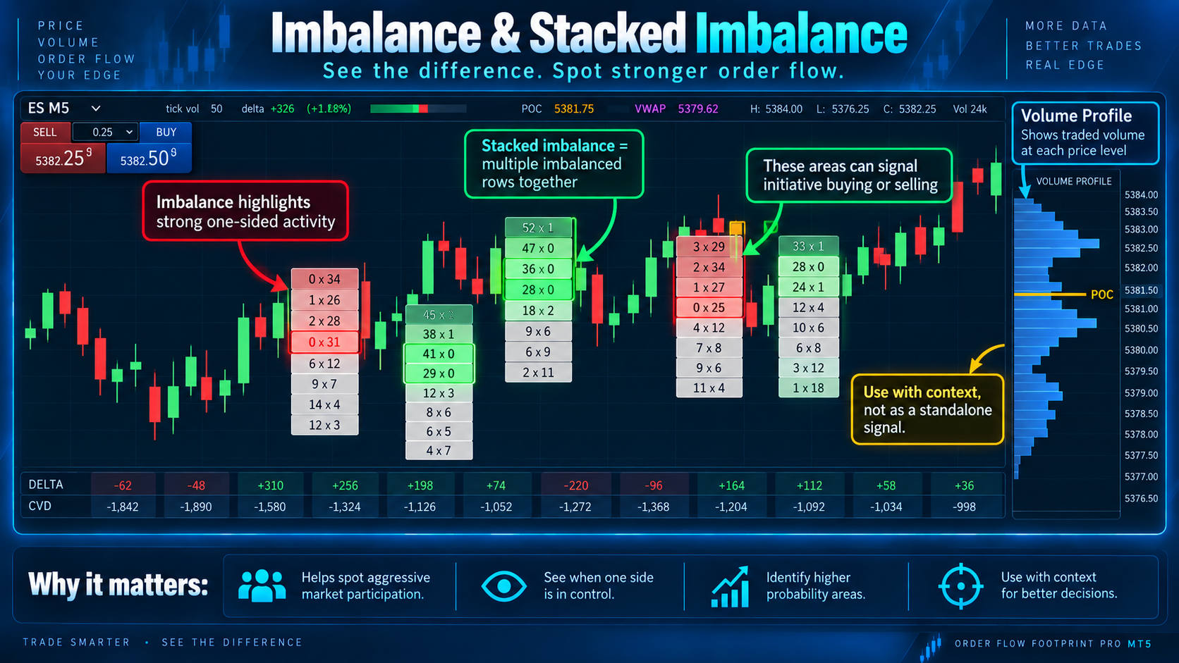
Stacked Imbalance — Aggression Across Several Prices
One imbalance can occur randomly.
But what if aggressive buying appears across several consecutive price levels?
For example:
12 × 84 10 × 97 8 × 121 11 × 105
Now we have concentrated buying pressure over several prices.
This is commonly called a Stacked Imbalance.
The same can happen with selling.
Stacked Imbalances can help traders identify areas of strong directional participation.
However:
Stacked Imbalance ≠ guaranteed continuation.
If a strong buy imbalance forms directly into major resistance and price refuses to continue upward, that aggression may actually become useful information for a reversal trader.
The market's response is always important.
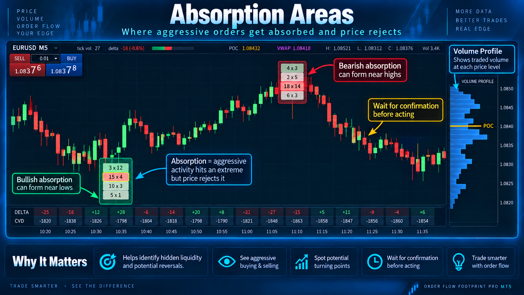
Absorption — One of the Most Important Footprint Concepts
Now we reach a concept many traders misunderstand.
Imagine XAUUSD is falling.
Sellers become aggressive.
Delta becomes strongly negative.
Large selling values appear at the bottom of the Footprint.
You expect price to continue downward.
But it doesn't.
More selling appears.
Price still refuses to fall.
Eventually price rejects the low.
What happened?
There may be large passive buying liquidity absorbing the aggressive sellers.
This is absorption.
A very simple way to remember it:
Huge effort — small result.
For bullish absorption:
Sellers are aggressive.
But price cannot continue downward.
For bearish absorption:
Buyers are aggressive.
But price cannot continue upward.
Absorption is especially interesting when it appears near an important market level.
But absorption does not mean:
BUY NOW.
The next step is confirmation.
Exhaustion — The Move Is Running Out of Participation
Absorption and exhaustion sound similar.
They are not.
This is the easiest way to remember them:
Absorption = strong activity is being blocked.
Exhaustion = activity is disappearing.
Imagine price keeps moving upward.
At first buying activity is strong.
But near the highest price levels, the numbers become smaller.
Buyers are no longer participating with the same intensity.
The upward move may be losing energy.
That is possible buying exhaustion.
The reverse can happen after a strong decline.
Selling activity becomes weaker and weaker near the low.
That may suggest selling exhaustion.
Again:
Exhaustion does not guarantee reversal.
It simply tells us:
The side driving the move may be losing participation.

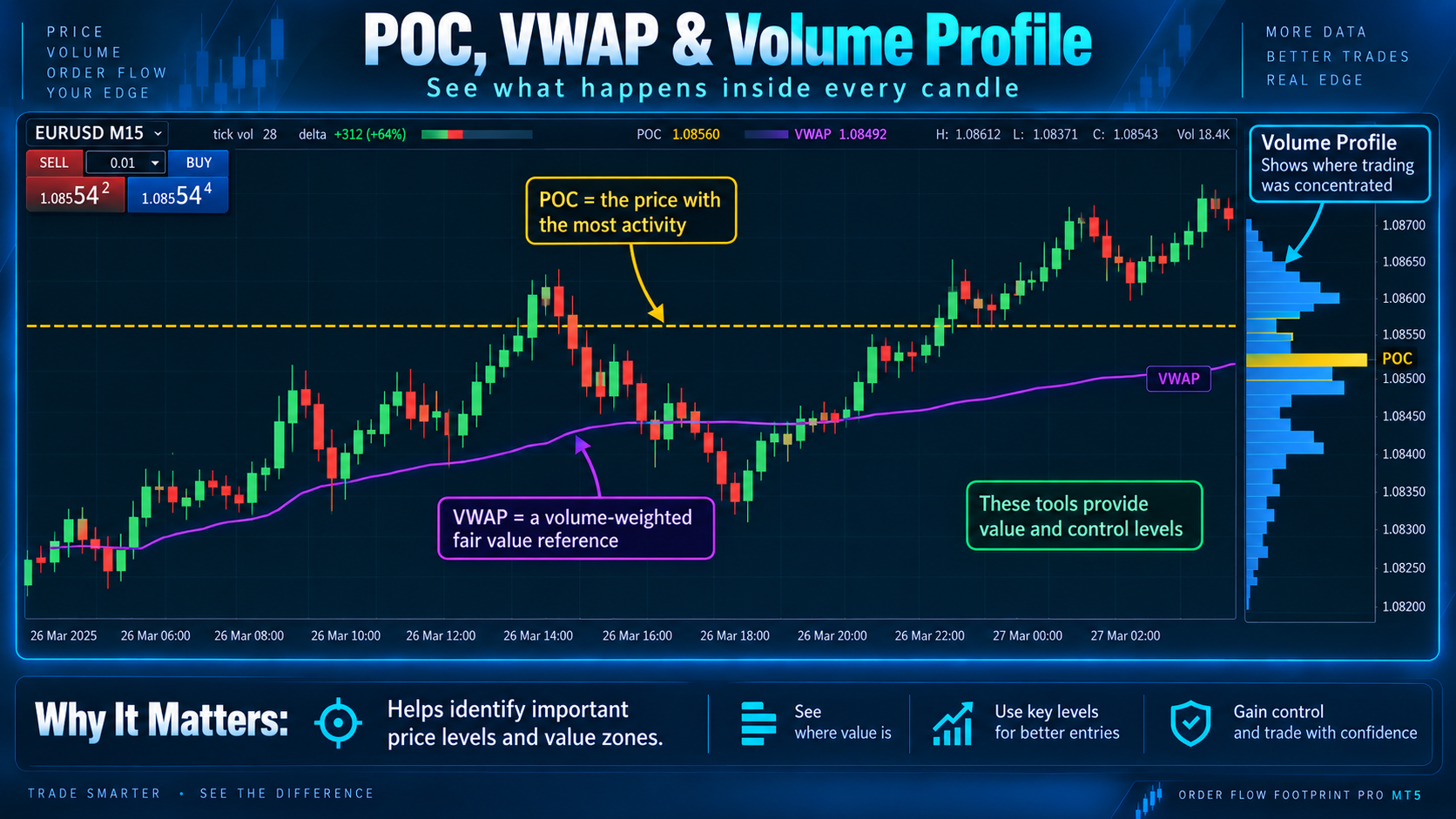
POC — Where Did the Most Activity Occur?
POC means Point of Control.
It represents the price level containing the highest measured activity within the analyzed area.
Think of it as:
The price where the market did the most business.
POC can help answer:
Where was activity concentrated?
Is value moving higher?
Is value moving lower?
Is price moving away from POC?
Is price repeatedly returning to POC?
A developing POC can also show how the most active price shifts as the market develops.
If price rises and POC also migrates higher, activity is following price.
If price climbs significantly while POC remains far below, the trader may ask whether higher prices are truly being accepted.
VWAP — Where Is the Volume-Weighted Average?
VWAP means:
Volume Weighted Average Price.
Instead of treating VWAP as an automatic support or resistance line, combine it with Order Flow.
For example:
Price approaches VWAP.
Strong selling appears.
But price refuses to fall below VWAP.
Bullish absorption appears.
Delta begins recovering.
Price reclaims VWAP.
That is far more informative than simply saying:
“Price touched VWAP, so I bought.”
Order Flow adds context to the level.
Volume Profile — Where Has the Market Spent Its Activity?
Footprint analyzes activity inside individual candles.
Volume Profile looks across a much larger price range.
You will commonly see:
POC — Point of Control
VAH — Value Area High
VAL — Value Area Low
HVN — High Volume Node
LVN — Low Volume Node
The Profile helps answer:
Where has the market accepted price?
Where did most activity occur?
Where did price travel quickly?
This gives a powerful workflow:
Use Volume Profile to find the location.
Then:
Use Footprint and Order Flow to understand what happens when price reaches it.
The Simplest Way to Use Order Flow
You do not need to read 50 different signals.
Remember only four words:
LOCATION → PRESSURE → RESPONSE → CONFIRMATIONLOCATION
Where is price?
Support?
Resistance?
Previous high?
Previous low?
POC?
VWAP?
VAH?
VAL?
PRESSURE
Who is aggressive?
Buyers?
Sellers?
Look at Bid × Ask, Delta, CVD and Imbalances.
RESPONSE
Did that pressure actually move price?
Strong selling + falling price = normal.
Strong selling + price refusing to fall = possible absorption.
Weakening activity at the extreme = possible exhaustion.
CONFIRMATION
What happened next?
Did structure break?
Did price reclaim VWAP?
Did Delta change?
Did opposite-side imbalance appear?
Did the absorption area hold?
That is the complete Order Flow workflow.
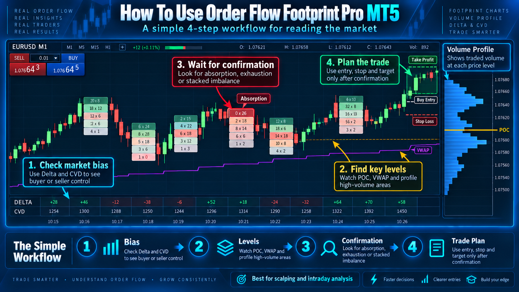
A Bullish Trade Example — Read the Story, Not the Colour
Imagine EURUSD is falling into support.
First:
Price is falling.
Delta is negative.
Sellers are aggressive.
Nothing unusual yet.
Then price reaches support.
Selling increases.
Delta remains negative.
But price stops making meaningful new lows.
Possible bullish absorption.
Next:
CVD stabilizes.
Buy activity increases.
Price holds above the absorption area.
Finally:
Price reclaims VWAP or nearby structure.
Now we have:
Location = support.
Pressure = aggressive sellers.
Response = sellers failed.
Confirmation = buyers reclaimed structure.
That is a logical bullish Order Flow idea.
Not because a box turned green.
But because the story changed.

A Bearish Trade Example
Now reverse the situation.
Price rallies into major resistance.
Buyers become increasingly aggressive.
Positive Delta expands.
Large Ask activity appears at the top.
But price stops moving upward.
Heavy buying continues.
Still no higher price.
That can suggest bearish absorption.
Or perhaps buying activity begins becoming smaller as price tests the high repeatedly.
That can suggest exhaustion.
Then:
Delta turns negative.
Price loses VWAP or POC.
Local support breaks.
Now the bearish interpretation has confirmation.
Again:
Footprint did not predict the future.
It helped reveal how the market was behaving at the important location.
Why Many Footprint Traders Lose Clarity
The biggest problem is not the Footprint Chart.
It is trying to trade every number.
Seeing:
Green → BUY
Red → SELL
Positive Delta → BUY
Negative Delta → SELL
Imbalance → ENTER
is not Order Flow analysis.
The stronger approach is:
Where did it happen?
Who became aggressive?
Did their aggression work?
What happened next?
That single framework can simplify an extremely complicated-looking Footprint Chart.
Important Truth for Forex Traders Using MT4 and MT5
This section is extremely important.
Forex is decentralized.
There is no single Forex exchange that sends every broker exactly the same transaction feed.
That means Footprint information on Forex and many CFDs depends on the broker's available data.
Some instruments provide real exchange volume.
Many Forex symbols provide tick-based information instead.
Different brokers can therefore produce different numbers.
This is normal.
A recent MQL5 article explains that true exchange Footprint data requires trade price, size and aggressor information; most retail Forex/CFD feeds instead provide broker-local quote/tick data, so traders should understand whether their tool is using real trade data or a proxy.
This is also why an honest Footprint tool should never pretend that broker-local Forex tick activity is identical to centralized futures Order Flow.
Understanding the data makes the tool more useful—not less useful.
Can MT4 Traders Use This Knowledge?
Yes.
The concepts in this article—Delta, CVD, Bid × Ask, imbalance, absorption, exhaustion, POC, VWAP and Volume Profile—are platform-independent concepts.
MT4 and MT5 traders can learn the same Order Flow principles.
However, the exact implementation depends on what tick and volume information the platform, broker and indicator can access.
The tool used in my examples is designed for MetaTrader 5.
The Five Questions I Would Ask Before Every Order Flow Trade
Before entering, ask yourself:
Where is price?
Who is aggressive?
Is that aggression actually working?
Is the market showing absorption, exhaustion or continuation?
What confirms the idea, and where is the idea invalidated?
If you cannot answer those questions clearly, you probably do not yet have enough information.
Waiting is also a trading decision.
Final LessonA candlestick tells you:
WHAT price did.
Order Flow tries to help explain:
HOW the move developed.
Footprint tells us what happened at individual price levels.
Delta compares buyer and seller aggression.
CVD tracks that pressure through time.
Imbalance highlights unusually one-sided activity.
Stacked Imbalance shows concentrated aggression across several prices.
Absorption shows strong aggression failing to create expected progress.
Exhaustion shows participation fading.
POC tells us where activity concentrated.
VWAP gives us a volume-weighted reference.
Volume Profile helps us understand where the market accepted and rejected price.
Put everything together and the chart becomes much easier:
LOCATION → PRESSURE → RESPONSE → CONFIRMATIONThat is the principle worth remembering.
Tool Used for the MT5 Examples
The MetaTrader 5 examples in this guide are based on the same concepts available in Order Flow Footprint Pro MT5.
For readers who want to see the MT5 tool used for these concepts: