From theory to practice - page 1169
You are missing trading opportunities:
- Free trading apps
- Over 8,000 signals for copying
- Economic news for exploring financial markets
Registration
Log in
You agree to website policy and terms of use
If you do not have an account, please register
come on.
is there an example?
Let's take an average with a period of 50.

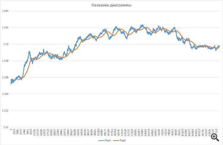
One minute averages 69 ticks. So for the tick chart, let's take an indicator with a period of 3450.
the minutes
ticks
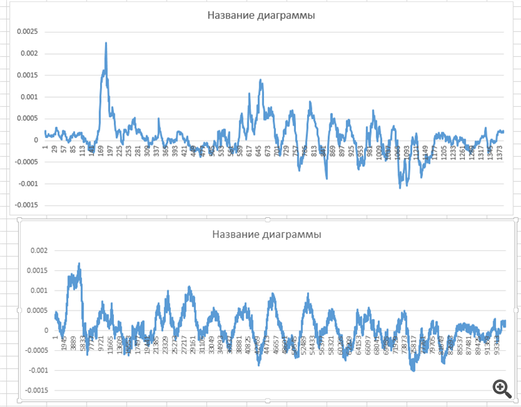
charts of price difference and average:
minutes and ticks
Well done, mate. You'll soon come to the same conclusions and formulas as I did.
Only you don't have to average it out - you have to be precise. And be able to accurately determine the dependence of the number of ticks on time, and it is periodic.
You have to work with ticks, but as if with time :)))
let's take an average with a period of 50.
One minute averages 69 ticks. Thus, for the tick chart, let's take an indicator with the period of 3450.
it doesn't look like the charts have an average built with such a period
if it was, then the orange one would start with the 50th report on the minute one, and the tick one with 3450.
plus, the period of the average on the tick should not be 3450, but at the same intervals*number (e.g. 50), exactly the same on the tick.
So it is still impossible to believe in such a statement.
This is an error in the plotting.
it doesn't look like the charts have an average built with such a period
if it was, then the orange one would start from the 50th report on the minute one, and the tick one from 3450.
plus, the period of the average on the tick should not be 3450, but at the same intervals*number (let's say 50), exactly the same on the tick.
so you can't believe in such a statement yet.
Plus, the period of the average on the tick should not be 3450, but at the same time intervals*number (e.g. 50), also on the tick.
I attached the file there.
I looked, it's a comparison file.
but you have to get the graphs right first and then summarise the results.
A lot of strategies are born out of faulty constructions and hypotheses.I looked, it's a comparison file.
but you have to get the graphs right first, and then you can summarise the results.
a lot of strategies are born from faulty constructions and hypotheses.
build
I don't use Excel and I build it programmatically.
so I can see mistakes straight away.
let's say I have a euro tick database of about 240 million ticks, and what's your pseudo-experience toy?I don't use Excel and I build it programmatically.
so I can see mistakes straight away.
i'm fed up with you today ))))
let's say I have a database with about 240 million ticks on euros.
build it programmatically and see your mistakes right away.
I'm sick of you today ))))
I can only wish you luck.
;)
I can only wish you good luck
;)