Swing point levels

Swings · Milana Trades

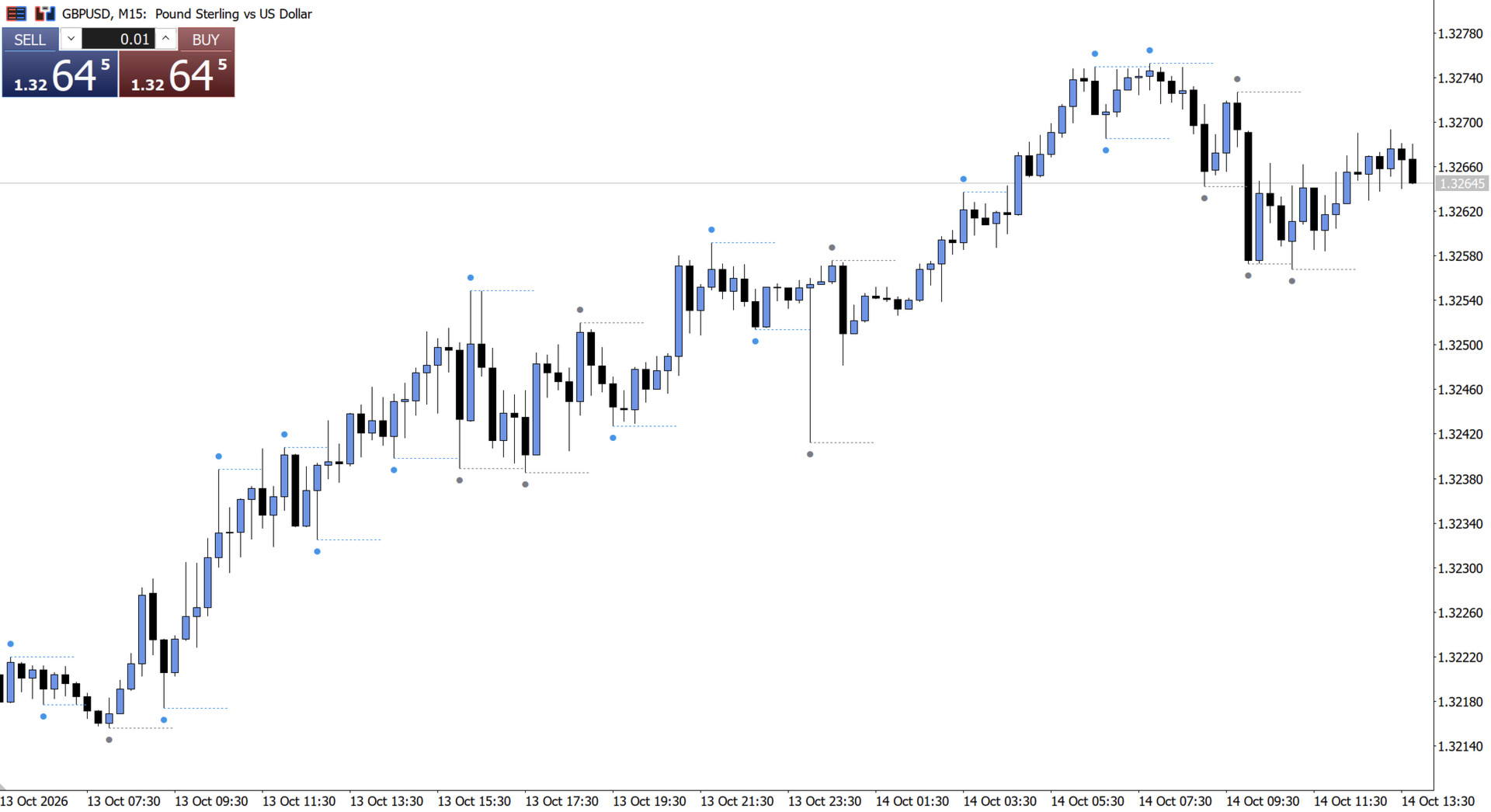
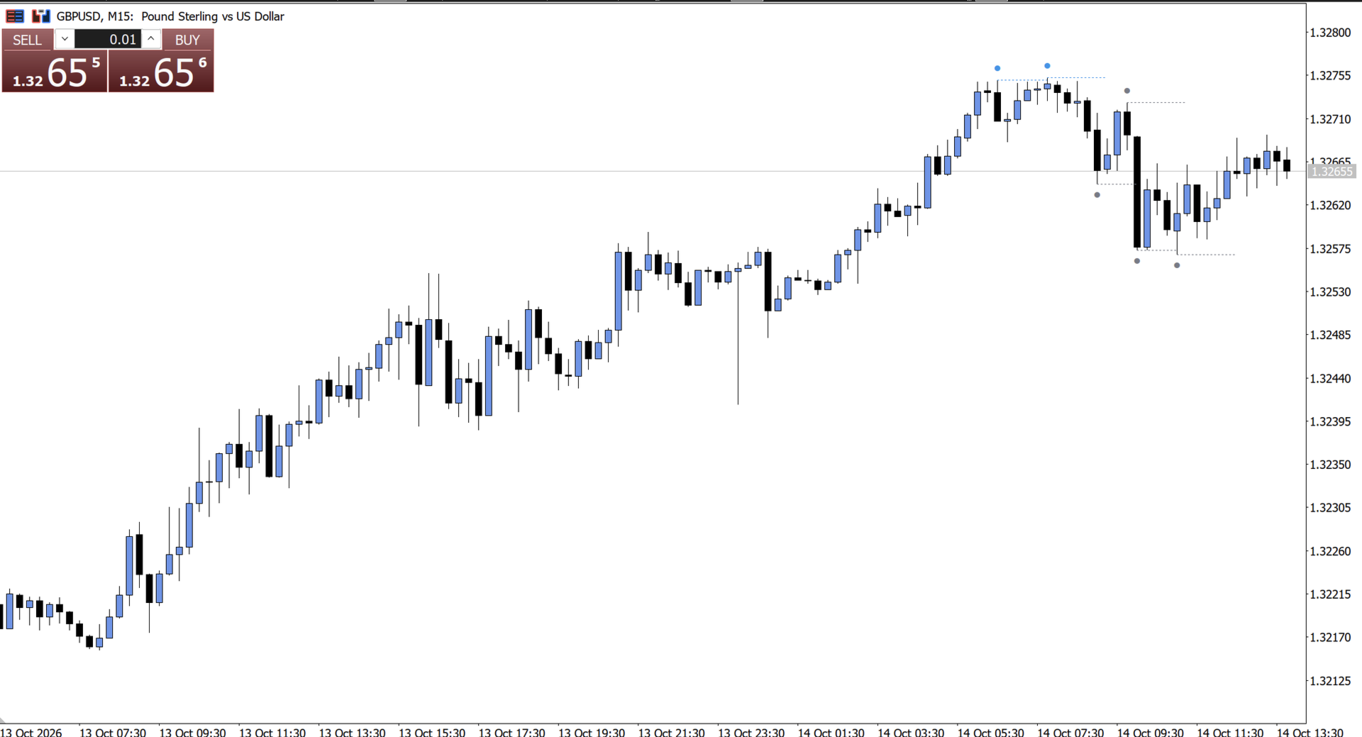
Swings shows the most recent swing highs and swing lows on your chart without clutter. Each swing gets a small dot at the extreme and a short dotted line to the right, so you can see key levels and the structure of the move at a glance.

How to read it

  • Blue dot and line: the swing is higher than the previous swing of its kind. A higher high or a higher low is a rising structure.
  • Grey dot and line: the swing is lower than the previous swing of its kind. A lower high or a lower low is a falling structure.
  • The dotted line is cut off at the candle where price took out the swing (optional). The line ends where the level stops being relevant.

How swings are detected

A swing high is a candle whose high is above the highs of N candles on its left and not exceeded by the N candles on its right. A swing low works the same way in reverse. You set the number of candles on each side. A swing is confirmed only after the right-hand candles have closed, so it appears with that delay.

Features

  • Shows only the last N pairs of swings (default 3), so the chart stays clean
  • Adjustable line length in candles
  • Optional cut-off when price takes the level
  • Dots can be switched on or off, and their size is adjustable (1–5)
  • Fully customizable colours
  • Works on any symbol and timeframe
  • Light on resources: it redraws only when something changes

Inputs

  • Candles on the left: how many candles to the left must be lower (for highs) or higher (for lows). Default 3.
  • Candles on the right: how many candles to the right confirm the swing. Default 3.
  • Last pairs: how many swing highs and lows to show. Default 3.
  • Line length (candles): how far the dotted line extends. Default 6.
  • Cut when taken: end the line when price takes the swing. Default on.
  • Dots: show dots at the swing points. Default on.
  • Dot size: 1 to 5. Default 1.
  • Colour for higher swings: default blue.
  • Colour for lower swings: default grey.


Reading the context

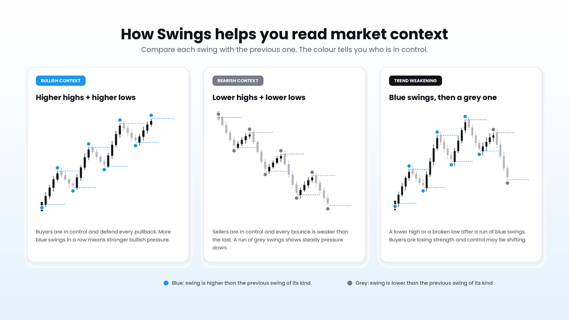
Each new swing is compared with the previous swing of the same kind, and the colour tells you the result.

  • Bullish context. Swing highs keep getting higher and swing lows are lifted above the previous ones, so most dots and lines are blue. Buyers are pushing price up and defending each pullback. The more consecutive blue swings you see, the stronger the bullish pressure.
  • Bearish context. Swing highs and lows keep getting lower, so most dots and lines are grey. Sellers are in control, and each bounce is weaker than the last.
  • Weakening trend. In an uptrend, a grey high appears (a lower high) or a low breaks below the previous one. Buyers are losing strength and a pullback or reversal may be forming. The same applies in reverse in a downtrend.
  • Range or transition. Blue and grey swings alternate and no side is dominant. The market is consolidating or deciding.
作者のその他のプロダクト
CRT Pro is a complete Candle Range Theory toolkit for MetaTrader 5. It finds the CRT model on up to three timeframes and adds the tools needed to read it: higher-timeframe candles, structure shifts, fair value gaps, liquidity sweeps, a bias table and SSMT divergence. Every module can be switched on or off. 1. CRT Model A CRT model is built from two candles of the chosen CRT timeframe. C1 is the range candle. C2 is the sweep candle: it takes the high or the low of C1 and closes back inside the
CRT + Daily Bias – Milana Trades A clean tool for Candle Range Theory (CRT). It marks the CRT range on your chart and shows the daily and weekly bias in one small table. WHAT IS CRT One candle sets a range: its high and its low. The next candle takes out one side of that range and closes back inside. This is the sweep. After the sweep, the opposite side of the range becomes the target. WHAT THE INDICATOR DRAWS - CRT H and CRT L – the high and low of the range candle. - 0.5 – the middle of th
FREE
Key Liquidity Levels and Confirmation shows where liquidity is resting on the chart and marks the moment it is taken. It combines three steps of one trading idea in a single tool: the key level, the sweep of that level, and the confirmation that follows. KEY LEVELS - Asia, London and New York session highs and lows - Previous day high and low (PDH / PDL) - Previous week high and low (PWH / PWL) - Previous month high and low - All-time high and all-time low Levels that share the same price are
FREE
CRT MTF is a multi-timeframe Candle Range Theory indicator for MetaTrader 5. It finds the CRT model on up to two higher timeframes, draws its range on the chart you trade and shows the higher-timeframe candles next to the price. 1. CRT Model A CRT model is built from two candles of the chosen timeframe. The first is the range candle. The second is the trap candle: it takes one side of the range candle and closes back inside the range. - Bearish CRT: the trap candle trades above the high of t
FREE
Average Range Projection (ADR / AWR / AMR) – Milana Trades This indicator shows how far price can still move today, this week or this month, based on its average range. THE IDEA Every market has a normal size of a day. If the market usually moves 100 points a day and the low of the day is already in, the high of the day is likely to be about 100 points above that low. The indicator draws this for you. WHAT MAKES IT DIFFERENT Most ADR tools draw fixed levels from the open. This indicator uses
FREE
MSNR is a Malaysian SNR indicator for MetaTrader 5. It finds support and resistance levels from candle bodies on D1, H4 and H1, shows which of them are fresh, and adds a dashboard with the current session and the storyline. 1. A and V Levels Levels are taken from candle bodies, the same points that form peaks and valleys on a line chart. - A shape (resistance): a bullish candle followed by a bearish one. The level is the higher of the first close and the second open. - V shape (support): a b
FREE
MSS Levels HTF - Milana Trades Higher-timeframe Market Structure Shift levels that turn into Support / Resistance and Mirror levels as price interacts with them. THE IDEA When price breaks a swing high or swing low on a higher timeframe, that swing becomes an important reference level. The indicator marks it, then follows how price reacts to it: first touch, retest, and finally a flip to the other side. Everything is drawn on your current chart, so you can work on a lower timeframe, while the
FREE
SMT + PSP/PCP MTF compares your chart with correlated instruments and highlights where their behavior diverges What it shows SMT divergence. The indicator draws lines between swing highs or lows where one asset takes liquidity and the correlated asset does not. Bullish and bearish lines have separate colors, styles and widths. PSP / PCP signals. The indicator marks candles where the correlated assets diverge at swing points. You can use text labels, candle coloring (aqua for bullish, orange for
FREE
フィルタ:
レビューなし
レビューに返信