The Vegas Short Term Algorithm
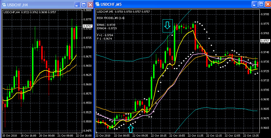
For those of you that trade USD/CHF, today offered a great scalp trade from the algorithm. The 4 Hour chart is bullish, signaling being long. The "Aqua" arrow is the entry into being long, and the boxed "Aqua" arrow is when price hit the exhaustion point, signaling time to exit long position.
After a trade like this to start the day, why trade anymore for the day?
HI Vegas,
Does the goldenrod colored ema on the 5 min chart have any significance? I see you entered long just under that ema.
thx,
todd
HI Vegas,Does the goldenrod colored ema on the 5 min chart have any significance? I see you entered long just under that ema.thx,todd
piptaker,
Double click on "therealvegas" in the header and get the URL for my homepage in my Public Profile. When you get there download from the link "The Vegas Short Term Algorithm". In this PDF are the explanations for all the lines and the "White Dots", and their respective significance and purpose.
In the time it would take to explain here what you want to know, you can download the document and read a detailed explanation of not just the goldenrod line, but everything else as well.
After you do this if you need further explanation just let me know. 
-vegas
Hi Vegas,
I am looking at example 2, out with white dot count.
I am confusing as when to start with white dot count, according to algorithm,
once the price goes back to the white dot, start the count.
from the picture, the third red candle, price is below the white dot, shouldn't
we start the count there, instead of the red up arrow?
thanks,
-tony
Hi Vegas, I am looking at example 2, out with white dot count.I am confusing as when to start with white dot count, according to algorithm,once the price goes back to the white dot, start the count.from the picture, the third red candle, price is below the white dot, shouldn'twe start the count there, instead of the red up arrow?thanks,-tony
Tony,
When you are in any position [long or short], we are only interested in the consecutive white dot count. Remember, the "White Dots" don't mean anything unless 2 conditions are met: 1) 20 in a row or more [from any time in the position] and then price takes out the white dot, in which case we exit the position, or 2) 10 in a row or more [from any time in the position] and the white dots are above the plum line if long [or below the plum line if short] and then price takes out the white dot, in which case we exit the position.
In example 2, if you look carefully and count the white dots, there is a double confirmation that the move is ending. The first red arrow is the start of the consecutive count, and the second red arrow is the end of the 21rst consecutive white dot. On the 22nd white dot, price took it out.
But we also have a white dot count that is above the Plum line also. Starting with the first white dot above the plum line, the second arrow is also where the consecutive 17th white dot is above the Plum line. This is also a signal to exit the long position.
So, the boxed Aqua arrow in example 2 is where we get out - which is exactly where the white dot counts ended. With a double confirmation, you have to close the long position no matter what you feel.
Hope I answered your question.
-vegas
got it. thnx
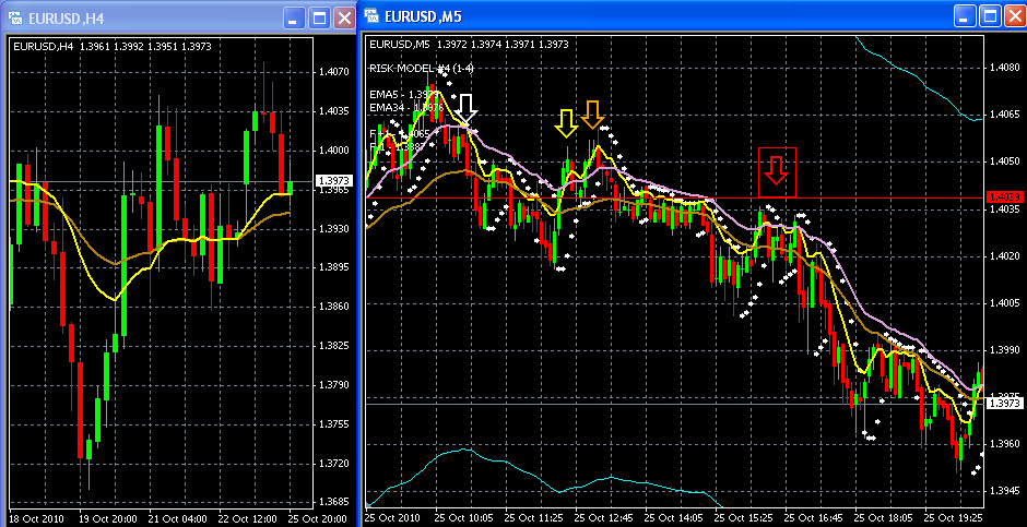
I want to use today's action in the EUR/USD to focus on why it is so important to obey the algorithm.
The Asian session started the week [after the weekend G-20 meeting] with sharply higher prices. For 10 - 12 hours it seemed like the Euro would never have another downtick. Prices just kept plodding higher [maybe big money read my latest blog  ]. Around the European open EUR/USD hit the high of the day at 1.4079. From the attached chart, 35 minutes later [white arrow] the market rolled over and gave us the "get out of long positions" signal when the yellow line went below the plum line.
I am positive many people got long up near the highs today. And why not? Momentum is good, the market is above earlier resistance at 1.4030 - 1.3045, and it "just felt good to be long".
But after yellow went below plum, only one more time did it briefly go back over. I want to focus on the yellow and orange arrows on the attached chart. I came very close to getting long in this area myself, but didn't because I didn't like the green 5M candlestick "tails" under these arrows. It suggested to me aggressive selling.
Later, under the boxed red arrow, the market tried to go higher but couldn't, and the yellow line never could really get above the plum line. Point here is that even if it did, I would want to see if prices could penetrate the resistance at the red line.
2 points here I want to emphasize: 1) use some common technicals to fine tune your entry points [your discretion], and 2) no matter how bullish or bearish you feel about the market - do not fade the algorithm or you risk losing.
There are infinite opportunities and signals to come. Missing a signal or missing a move [here the down move] is only an opportunity cost. Getting long or short when you aren't supposed too and losing money costs you real money. Nobody has unlimited capital to waste.
-vegas
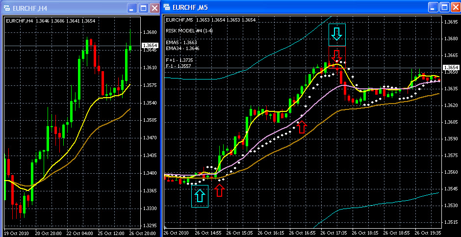
Today's example is from EUR/CHF. As you can see from the 4 Hour chart, market is clearly in uptrend, therefore we want to trade this market from the long side. The upward boxed aqua arrow is the buy signal; the first upward red arrow is the start of the consecutive white dot count; the second upward red arrow is the concurrent start of the white dot count above the plum line.
At the top, the regular consecutive white dot count ends at white dot = 31; the white dot count above the plum line ends at white dot count = 10; we therefore have a double confirmation top, and exit the position which is where the downward boxed aqua arrow is.
If you trade EUR/CHF, this was a great trade.
As I have said before, "The Vegas Short Term Algorithm" works very well in all currency pairs.
-vegas
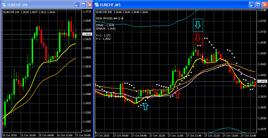
My example today is from EUR/CHF again. 4 Hour is bullish, telling us to trade from the long side. From the attached chart, the aqua upward arrow is when the buy signal is given; the first upward red arrow is the start of the consecutive white dot count above the plum line.
The boxed downward arrow is when price has taken out the consecutive 10th white dot, therefore signaling the liquidation of the position. The boxed aqua arrow is getting out of the position very near the top.
-vegas
Great work! Looking forward to trying this system out! Keep up the good work!
- Free trading apps
- Over 8,000 signals for copying
- Economic news for exploring financial markets
You agree to website policy and terms of use
I'm starting this thread with an example [teachable moment] from today's trading in EUR/USD. Below is a screen shot of my computer screen from today. Note that the 4 Hour chart is neutral, but since it is coming from "sell", I use "Vegas STA4 Short" on the 5M EUR/USD candlestick. The "Aqua" arrow is the area that gives the sell signal, and the "White" arrows are when price hits "the exhaustion zone" [meaning, get out of short position].
My teachable point here is that just because price hits aqua line doesn't mean it is time to get long. It means that the market has hit a point where it is "exhausting", and has a very high probability of now going higher. But we don't know for how long or how far - it only means that from a scalping point of view it's time to cover.