Website Redesigns
I like #1 and #5 the best. But #1 is my priority. Both look nice and professional, but I didn`t like tha waves in the #5 
#1 is by far my favorite
Number 2 and 6 have a login page required and I can't see #5
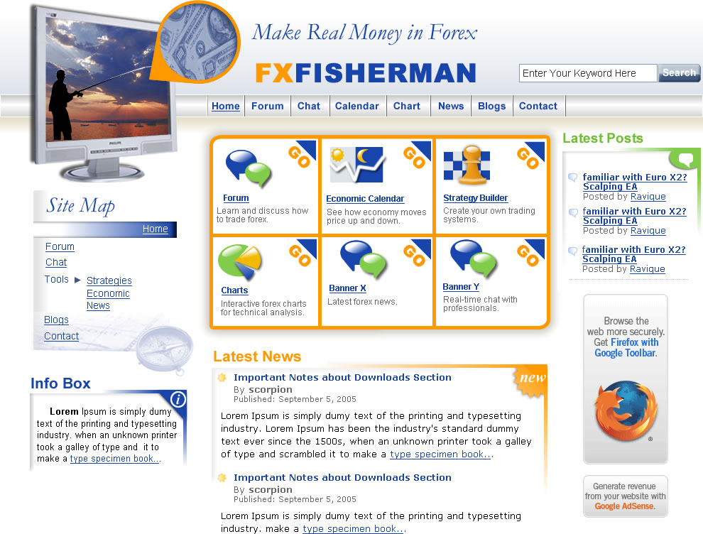
I just wanted to say, I thought in #1 that was a man at the end of the hook, maybe we can change it to either the USD or the EURO (and maybe even change the color if possible?) as they are the biggest currencies right now and third is either the GBP or JPY..
Thats the only thing I would say to change otherwiee number one is by far my favorite (there seems to be an alignment problem in my window though..)
Scorpion, will you able (allowed to mostly) change the website a bit? for example if you wanted to add a tab on the top or remove one...
My favorite is #1 too. I told him to replace the bait and change background to a realistic one with sunny weather, not some foggy thunderstorm.
Gaz, i'll be able to add/remove the tabs. But adding more tabs might be too long and might has problem with 800x600 resolution.
Ok, guys. Pls critic these updates:
#1 https://www.mql5.com/go?link=http://dylan.umetnost.org/finalforex.jpg
#2 /go?link=https://www.sitepoint.com/community/?attachmentid=43536
#3 https://www.mql5.com/go?link=http://i77.imagethrust.com/i/379136/fxfisherman.jpg
#6 /go?link=https://www.sitepoint.com/community/?attachmentid=43417
All others are cancelled by designers.
the #2 and #6 still ask for a password so I cant see them..
#1 i like the best again, #3 seems like one of those "page not found, heres some advertising" kind of website that I've seen before. If I wouldve fallen on that website by mistake I would immediately leave because of the previous uses of this design.
My vote is still on 1
Ok, i've attached #2 and #6.
#2 is the first attachment (show forex master ad)
#6 is the one that show firefox ad.
#2 is nice also but could be improved, I'd say no to #6
The thing about #2 is its logo, that is way too many curves. That F is just way out there and doesnt really fit the design too much. I like the scheme and simplicity of it, everything is nicely spaced and theres no dead space.
But if it was #1 vs #2 id choose #1 still
- Free trading apps
- Over 8,000 signals for copying
- Economic news for exploring financial markets
You agree to website policy and terms of use
Hey guys
Which one of these designs do you like the most? I'm going to change the site's look and feel. You can also criticise, then i'll tell the designers to change if needed.
#1
Home page: https://www.mql5.com/go?link=http://www.designcanada.net/mockups/forex/revision/
Sub page: https://www.mql5.com/go?link=http://www.designcanada.net/mockups/forex/forexblogr.html
Pending changes: Bigger text, wider layout and a nice logo.
#2
Home page: https://www.mql5.com/go?link=https://www.sitepoint.com/community/?attachmentid=42851
Sub page: https://www.mql5.com/go?link=https://www.sitepoint.com/community/?attachmentid=42852
#3
Home page: https://www.mql5.com/go?link=http://i77.imagethrust.com/i/358749/fxfisherman1.jpg
Sub page: Not completed.
Pending changes: Many things.
#4
Home page: https://www.mql5.com/go?link=http://img176.imageshack.us/img176/3655/contestcopyta8.jpg
Sub page: Not completed
Pending changes: Many things.
#5
Home page: https://www.mql5.com/go?link=http://elsite.net/design/misc/fxfish1.gif
Sub page: Not completed
#6
Home page: https://www.mql5.com/go?link=https://www.sitepoint.com/community/?attachmentid=42935
Sub page: Not completed
Cheers