Brooky Indicators
Thank you for sharing
Good work. Thanks for sharing.
Thank you!!
Thanks indeed...that's the spirit!
Minute Overlay for Sub Window Indicator
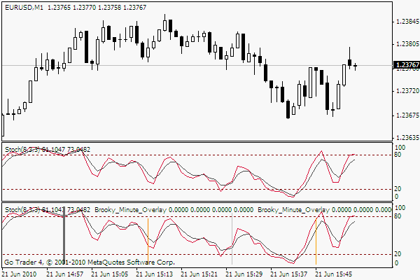
Brooky Minute Overlay Indicator
This indicator can be dragged over the top of any other sub window indicator. It should not upset their working in any way.
The indicator will draw vertical lines every hour or any minute that you desire
within the hour as long as a candle closes on that minute. That is you can see a 27 minute line in a minute chart but not on an M5. You will see a 10minute candle in an M5 chart and a M1 chart. Got the idea?. Most useful for people dealing with M1 and M5 charts.
Stuff tends to happen just after candle closes whether they are 5, 15 or hour candles.
I like to keep an eye on the hour lines because we all share the same hour candle but not the 4 hour candle and it is good to see where a stoch, macd or such might be at without looking at anything but the indicator.
There are a few strategies that look at the 9 minute candle and such like. This could make it easier to identify them as well as visually back test them.
Example chart shows a M1 chart with Hour, 10 minute, 30 minute and 45 minute lines.
It is simple but more useful than it looks. You can change colours, heights, minutes, thickness etc.
There are 4 lines that can be selected. If you only want for eg: The hour ends and the 30 minute mark, just make the hour selection as minute 0 and the other 3 to 30, or if you want every 3 minutes on an M1 chart ??? Overlay a couple of the indicators onto your MACD or whatever indi you have in your sub window and start setting the minutes 3,6,9,12,15,18 rada rada---.
Scroll your mouse over the line to see which minute line you are looking at.
Enjoy. 
Brooky Trend Strength Indicator
As you see so often. The trend is your friend until the end. This indicator could help you stay out of those nasty ranging battles or show you when there is an end coming up. Hope it helps.
The indicator shows the power of the trend that is in place and whether a pair is trending or ranging.
It is based on the variance between ATR and StdDev over the same period with a smoothing array applied.
Strength is always from below 0 heading up. This is not a linear directional indicator. The colours give direction, the slope shows strength. 0 is ranging, going up off 0 is trending.
Direction of trend is Red for down Blue for up
Resistance to trend is
a) Pink for light downward pressure.
b) Light blue for upward pressure.
Settings are similar to MACD with Slow, Fast and signal settings.
Resistance pressure can be entered to your taste and are different
for each pair. 1 for EURUSD and up to 100 for USDJPY. Just plot
against historical to see the pale colour levels as you would like them.
If you place a MACD with the same settings on the chart you can see
what is going on within the trend of the macd. I have found working
with both acts well as complimentary confirmations.
Places to pay attention.
1) At extreme power tops you will often see a reverse colour ie: if
it has been a strong red downtrend a light blue will show up. If you
get only a few bars of light blue the trend will likely continue even
if it is not in itself gaining strength as there is light resistance.
2) A trend has come to an end when the power line increases with more of
the opposite colours showing in the reversal.
3) Generally the trend will degrade into a messy ranging power struggle
which you can see by the power line going below 0 and lots of colour bars
alternating as the struggle rages. Best to wait for a clean clearance.
4) The ranging finishes when a gentle slope with more developed colour
patterns starts to head up to 0 and breaks free. Sharp near vertical
breaks out of 0 are generally short lived. As usual be careful
following on the back of monster breakout candles.
Longer period settings such as 48 on a 1Hour chart are very insightful
and I recommend playing with the settings as they can also be tuned
to a good scalp confirmation when placed on a chart with support
and resistance levels marked.
Enjoy.Would you mind sharing the ADX color indicator if you have it ofcourse...
got a piece of advice , that took me a week to recognise [ as a conclusion -- the indicator that I've got : REPAINT badly ]
I DID NOT download the above indicator -- so I am not implying the above indicator is the same deal
but I got one template that got similar looking @@@@@STO indicator
in live trading, the whole small island landscape seem to rise and fall with the tide, i.e. when we think it reach bottom , then more of the island could appear i.e. the whole island RISE -- above the horizon
i.e. after you download the above indicator, you could try to observe this phenomenon -- If it is not the same after your observation, use it wisely
to be successful , learn forex like maths in high school, by precision and routine practice; rather than Just learn forex like your next colleague maths homework - by approximation during primary education
if public library got a forex section, probably it will look like this site
- Free trading apps
- Over 8,000 signals for copying
- Economic news for exploring financial markets
You agree to website policy and terms of use
Brooky Trend Strength Indicator
As you see so often. The trend is your friend until the end. This indicator could help you stay out of those nasty ranging battles or show you when there is an end coming up. Hope it helps.
The indicator shows the power of the trend that is in place and whether a pair is trending or ranging.
It is based on the variance between ATR and StdDev over the same period with a smoothing array applied.
Strength is always from below 0 heading up. This is not a linear directional indicator. The colours give direction, the slope shows strength. 0 is ranging, going up off 0 is trending.
Direction of trend is Red for down Blue for up
Resistance to trend is
a) Pink for light downward pressure.
b) Light blue for upward pressure.
Settings are similar to MACD with Slow, Fast and signal settings.
Resistance pressure can be entered to your taste and are different
for each pair. 1 for EURUSD and up to 100 for USDJPY. Just plot
against historical to see the pale colour levels as you would like them.
If you place a MACD with the same settings on the chart you can see
what is going on within the trend of the macd. I have found working
with both acts well as complimentary confirmations.
Places to pay attention.
1) At extreme power tops you will often see a reverse colour ie: if
it has been a strong red downtrend a light blue will show up. If you
get only a few bars of light blue the trend will likely continue even
if it is not in itself gaining strength as there is light resistance.
2) A trend has come to an end when the power line increases with more of
the opposite colours showing in the reversal.
3) Generally the trend will degrade into a messy ranging power struggle
which you can see by the power line going below 0 and lots of colour bars
alternating as the struggle rages. Best to wait for a clean clearance.
4) The ranging finishes when a gentle slope with more developed colour
patterns starts to head up to 0 and breaks free. Sharp near vertical
breaks out of 0 are generally short lived. As usual be careful
following on the back of monster breakout candles.
Longer period settings such as 48 on a 1Hour chart are very insightful
and I recommend playing with the settings as they can also be tuned
to a good scalp confirmation when placed on a chart with support
and resistance levels marked.
Enjoy.