Discussion of article "Visualize a Strategy in the MetaTrader 5 Tester"
So the MQ guys are hinting that graphical objects can be displayed in the tester?
Much cooler - look at the proposed scripts.
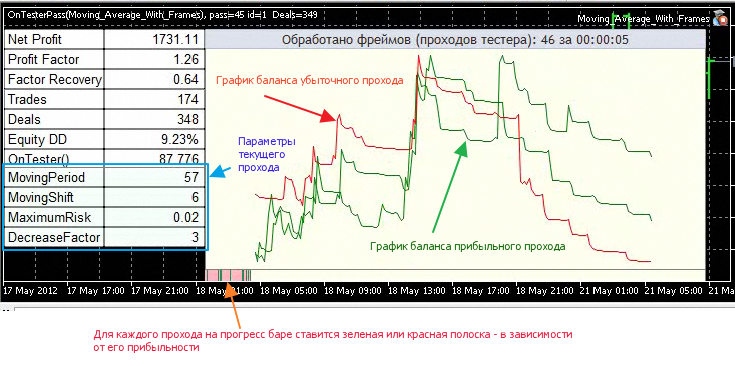
It has long been possible to transmit tons of calculated information from remote agents via data frames and at the same time visualise them directly on the terminal side during optimisation.
That is, an Expert Advisor with the OnTesterPass function runs directly on the terminal as well as on all available agents. The terminal expert waits for data packets transmitted via FrameAdd from hundreds or thousands of remote agents and can use any functions of the terminal. For example, it can visualise the optimization progress, show intermediate results, etc.
The OnTesterPass() function is a handler of the TesterPass event, which is automatically generated when a frame is received during the Expert Advisor's optimisation in the strategy tester. The function must be defined with void type, it has no parameters:
void OnTesterPass();
The Expert Advisor with the OnTesterPass() handler is automatically loaded on a separate terminal chart with the symbol/period specified for testing and is received during the TesterPass event optimisation when a frame is received. The function is intended for dynamic processing of optimisation results right "on the fly", without waiting for its completion. Frames are added by FrameAdd() function, which can be called at the end of a single pass in the OnTester()handler .
The video shows that the window of information output is homemade.
In the future, we would like the codes based on the standard CAppDialog window class to work in the visualisation mode.
Unfortunately, now the standard examples of ChartPanel and SimplePanel indicators are not tested!
Service Desk said - "maybe sometime in the future...".
So, hopefully, this feature will be added in the future.

- 2010.10.26
- Dmitriy Skub
- www.mql5.com
Much cooler - check out the suggested scripts.
Checked. ChartGetInteger(CHART_WIDTH_IN_PIXELS) didn't work...
a shame.
It works fine in normal mode. But in the tester, as described in the documentation, chart operations do not work.
There was a demonstration of a completely different level above - take a closer look. Not everyone understands the point and thinks it's just a video like many others.
Explanations in the videos are very much lacking.
And by the way, if the resolution of the screen is not very large, the quality of the video just unrealistically deteriorates.
YouTube rules.
Much cooler - check out the suggested scripts.
...Cool! Especially liked it with the graphs when optimising. Thanks.
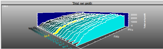
I have a suggestion. Maybe as a standard feature to collect all data (Equity) during optimisation and build a 3D graph of all curves. Before building the graph, of course, sort from profitable to unprofitable, so that the transitions are uniform. This would also make a very clear picture. This can be realised now by exporting data to Excel. But I would like it to be a standard feature. Your graph is three-dimensional better. :)
This wish is understandable. But the article shows how you can get these features independently and process only the data you need. You can send balance charts, test results, Expert Advisor parameters and so on from testing agents. All the received data are recorded by the terminal and after the end of optimisation you can process and reproduce them again.
But the most interesting thing is that you can get an idea of a trading Expert Advisor even without looking at the optimization results - the balance charts that you will see right during the optimization best characterise the trading system.
This wish is understandable. But the article shows how you can get these features independently and process only the data you need. You can send balance charts, test results, Expert Advisor parameters and so on from testing agents. All the received data are recorded by the terminal and after the end of optimisation you can process and reproduce them again.
But the most interesting thing is that you can get an idea about a trading Expert Advisor even without looking at the optimization results - the balance charts that you will see right during the optimization will best describe the trading system.
Thank you. On my own, I already got all this almost as soon as these functions became available. :) Only in a slightly different way and in Excel.
Here is how it could be depicted as a standard function on a three-dimensional chart of the terminal:
//---
This is a low-priority wish. It would be better to cope with what we already have. )))
P.S. By the way, I pulled it from a programme that costs 30 000 euros. :)
- Free trading apps
- Over 8,000 signals for copying
- Economic news for exploring financial markets
You agree to website policy and terms of use
New article Visualize a Strategy in the MetaTrader 5 Tester is published:
Author: MetaQuotes