The usual representation of quotes is the quotes rolled up on certain timeframes (timeframes) with the main indicators OHLC (Open, High, Low, Close). And it is no secret that at each timeframe the chart representation will be different or even strikingly different.
So, is it worth analyzing the candlesticks/bar chart? Or maybe we should consider a chart like this:
That is, this is a completely clean chart. Only the price. There are no graphical constructions, no bars and no candlesticks.
You don't have to worry about it... it's easy... buy with minimal lot in any direction and close position with profit>X and start averaging when it's down > Y and quit after 0 or Z... you can even do it without any chart :) just following the timer and alerts...
Apparently you are a theorist, in practice, your method will fail, averaging will lead to the loss of the deposit, sooner or later, not to mention the pitfalls that your "broker" creates !!!
The usual representation of quotes is the quotes rolled up on certain timeframes (timeframes) with the main indicators OHLC (Open, High, Low, Close). And it is no secret that at each timeframe the chart representation will be different or even strikingly different.
So, is it worth analyzing the candlesticks/bar chart? Or maybe we should consider a chart like this:
That is, this is a completely clean chart. Only the price. There are no graphical constructions, no bars and no candlesticks.
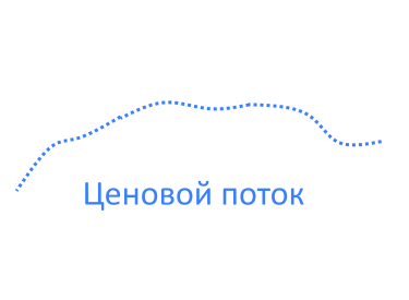
What I meant to say was that prices come in a price stream. This flow could be something like this (it's essentially a clipping from a tick chart):

But when this stream is rolled up into timeframes - you get completely different views/figures (it all depends on your imagination) on different timeframes. But collapsing data into timeframes kills something in the data. Something very important.
What I meant to say was that prices come in a price stream. This stream can be something like this (it's essentially a clipping from a tick chart):
But when this stream is rolled up into timeframes - you get completely different views/figures (it all depends on your imagination) on different timeframes. But collapsing data into timeframes kills something in the data. Something very important.
Vladimir !
You in SUBJ said - "And maybe we should look at this chart" showing a blank sheet, except with the current Bid/Ask... And what you meant by that is known only to your hand cockroaches :-)
So we will discuss a clean sheet...with no trace of insectopoids
What I meant to say was that prices come in a price stream. This stream can be something like this (it's essentially a clipping from a tick chart):
But when this stream is rolled up into timeframes - you get completely different views/figures (it all depends on your imagination) on different timeframes. But collapsing data into timeframes kills something in the data. Something very important.
Yes with candlesticks it's very simple. From the DSP point of view, it is sampling the signal without suppressing the RF component which leads to absurd results. For example, for a candlestick chart on M1 the sampling rate will be 1/60 Hz. Therefore, the signal we are going to use for candlestick charting should not contain HF components with frequencies higher than a half of the sample rate, i.e. 1/60/2 Hz.
No filtering is done, of course, so OHLC is a figment of the word.
Yes, it's very simple with candles. From the DSP point of view it is sampling the signal without suppressing the HF component, which leads to absurd results. For example, for a candlestick chart on M1 the sampling rate will be 1/60 Hz. Therefore, the signal we are going to use for candlestick charting should not contain HF components with frequencies higher than a half of the sample rate, i.e. 1/60/2 Hz.
No filtering is done, of course, so OHLC is a figment of the word.
- Free trading apps
- Over 8,000 signals for copying
- Economic news for exploring financial markets
You agree to website policy and terms of use
The usual representation of quotes is the quotes rolled up on certain timeframes (timeframes) with the main indicators OHLC (Open, High, Low, Close). And it is no secret that at each timeframe the chart representation will be different or even strikingly different.
So, is it worth analyzing the candlesticks/bar chart? Maybe, we should consider a chart similar to this one:
Forum on trading, automated trading systems and strategy testing
Templates for MT5
Karputov Vladimir, 2016.04.21 11:33
Template"Bid Ask Last and Trade.tpl" which displays only Bid, Ask, Last prices and trading levels. The background is white. Bars and candlesticks are not displayed.
Used indicators: -
Chart view:
Customise the colours in the template:
So it's a completely blank chart. Just the price. No charting - no bars or candlesticks.