Discussion of article "Color optimization of trading strategies"
Is this presentation of optimisation data an idea of the author or is it possible to see examples somewhere else?
I'm asking because I couldn't get into it and evaluate the convenience of viewing the attached html examples.
Most likely, I just don't get it. So I would like to see examples of useful application.
Is this presentation of optimisation data an idea of the author or can I see examples somewhere else?
I am asking because I could not get into it and evaluate the convenience of viewing the attached html examples.
Most likely, I just don't get it. So I would like to see examples of useful applications.
Rashid's idea, he suggested the topic for the article. At the beginning of the article he warns that it is an experiment and it is not known whether it will be useful and convenient.
Criterion (as an option): the value of the profitability/loss ratio (the larger the value, the brighter the selected colour).
This is a way to colour separate indicators (in one column). But in the article there is a triple indicator, its interpretation is more complicated, if the colour is bright, it has only one component in plus (or two). And when all of them are in plus, the stronger, the closer to white colour.
As a visualisation experiment is very interesting, I immediately thought that the dependencies of the 3 values on their range are linear, what if we use non-linear, which is more correct. I.e. to calibrate the scale for each so that obviously unsuitable indicators do not take the colour away from black. and the second thought - there are also 4-parametric colour designations.
What is the 4-parametric one?
I don't think that colouring the elements of the table is what Rashid had in mind.
Dmitry, you paid very little attention to the problem statement and started colouring everything at once.
Let's consider an analogy - building a route to bypass an air defence system.
On the terrain map (of course, two-dimensional), three-dimensional marking of air defence effectiveness indicators at each point is performed, taking into account the terrain and other stuff. Then the map is coloured according to the values of these indicators. It is possible to do without one-dimensional markup, then shades of grey are sufficient.
The experience of using this approach has shown that the operator almost instantly builds a route, the probability of losing an aircraft on which is minimal. It is enough just to look at the coloured map.
Now - about application in optimisation. Beautiful, but inefficient. Unless you have a supercomputer. You can try to use it for dynamic optimisation (adaptation) of parameters, but the computing power is very high, and you can hardly optimise more than two parameters. But, seeing the coloured graphs, you will be able to direct the set of values of optimised parameters to the required area in real time. By hand.
Everything is on the rights of imho.
I don't think colouring the elements of the table is what Rashid had in mind.
Dmitry, you paid very little attention to the problem statement and started colouring everything at once.
Let's consider an analogy - building a route to bypass an air defence system.
On the terrain map (of course, two-dimensional), three-dimensional marking of air defence effectiveness indicators at each point is performed, taking into account the terrain and other stuff. Then the map is coloured according to the values of these indicators. It is possible to do without one-dimensional markup, then shades of grey will suffice.
The experience of using this approach has shown that the operator almost instantly builds a route, the probability of losing an aircraft on which is minimal. It is enough just to look at the coloured map.
Now - about application in optimisation. Beautiful, but inefficient. Unless you have a supercomputer. You can try to use it for dynamic optimisation (adaptation) of parameters, but you need very high computing power, and you can hardly optimise more than two parameters. But, seeing the coloured graphs, you will be able to direct the set of values of optimised parameters to the required area in real time. By hand.
All on my own authority.
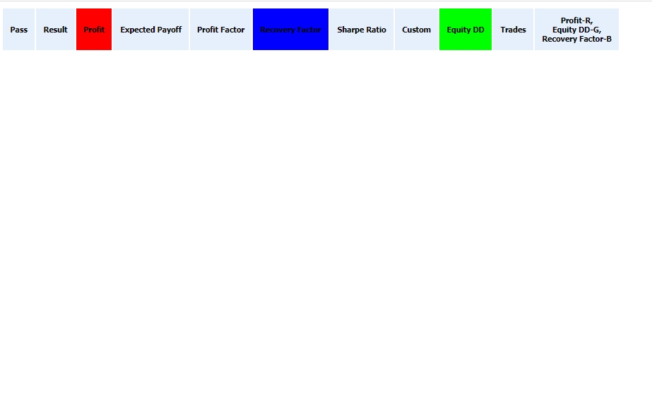
Yes, Rashid was referring to the coloured plane, not the table elements. But before you say "B", you should say "A", that's why a new column was added to the usual table of optimisation results before placing the optimisation results on the plane.
In the second half of the article the plane is drawn, only the pixels are large, rectangular and two-colour gradient)))
Why you need a super computer is not clear. If you optimise two parameters, you need one pass in the loop to find the maximum and minimum values of the three parameters. If there are more than two parameters being optimised, then for each cell you will still need a loop to find the maximum/minimum specifically for that cell. This is a moment. Besides, this report is created once for the whole optimisation, even if it takes three minutes to create - no problem (compared to hours spent on optimisation).
Another thing is to somehow arrange all the results of optimisation on a flat surface, not just by one pair of parameters. But this is an unrealistic fantasy.
- Free trading apps
- Over 8,000 signals for copying
- Economic news for exploring financial markets
You agree to website policy and terms of use
New article Color optimization of trading strategies has been published:
In this article we will perform an experiment: we will represent optimization results as different colors. The final color is determined by three parameters: the levels of red, green and blue (RGB). There are other color coding methods, which also use three parameters. Thus, three testing parameters can be converted into one color, which visually represents the values. Read this article to find out if such a representation can be useful.
The best options in RGB are close to white and in CMY they are close to black. For a proper interpretation of other colors, we need to understand how individual components within the color model are combined and how the resulting color is formed.
Let us view the RGB model in more detail. When the values of all components are equal to 0, we get the black color. When all components are equal to the maximum value, the color is white. All other combinations provide different colors. If one of the components has the highest value, and the other two are equal to 0, we get the clear color of the appropriate component: red, green or blue. If two components have maximum values and the third one is zero, the resulting color is also clear. Red and green result in yellow, green and blue provide cyan, red and blue are shown as magenta. Figure 6 shows several combinations of RGB components.
Fig. 7. Basic combinations of RGB components
Based on the color, we can understand which parameter contributes more positively to the testing result. If red, it is the first parameter; if the color is yellow, then the first and second ones; green means the third parameter, etc.
Author: Dmitry Fedoseev