Something Interesting in Financial Video January 2014
Ichimoku - Advanced Ichimoku Strategies Additional Criteria
The Key Reversal - Part 7 of a video series discussing short term price bar reversals such as the bearish rejection, the bullish rejection, the open close reversal, the closing price reversal, the hook reversal, the key reversal, the island reversal and the pivot point reversal.
31. How to trade support/resistance bounce in Forex
Forum on trading, automated trading systems and testing trading strategies
Indicators: Support and Resistance
newdigital, 2013.09.23 10:15
Support and Resistance Technical Indicator
Support and Resistance is one of the widely used concepts in Forex trading. Most traders plot horizontal lines to show support levels and resistance levels.
There is also an indicator used to plot Support levels automatically and indicate the resistance and support levels.
When it comes to these levels price can either bounce off these levels or break these levels.
If a resistance level is broken price will move higher and the resistance level will turn to a support.
If a support level is broken price will move lower and the support level will turn to a resistance.
Price where the majority of investors believe that prices will move higher, while resistance levels indicate the price at which a majority of investors feel prices will move lower.
Once price has broken through a support level or a resistance level then it is likely that the price will continue moving in that particular direction until it gets to the next support or resistance level.
The more often a support or resistance level is tested or is touched by the price and bounces, the more major that particular support level or resistance level becomes.
Technical Analysis of Resistance and Support Technical IndicatorThese levels are calculated a trend lines method.
Upward Trend
In an upward trend the resistance and support will generally head upwards
In a downward trend the resistance and support will generally head downwards
Key points made in the video:
1. It took Gary about 6 years of diligent study before he became consistently profitable
2. Understanding the Wyckoff method -- interpreting supply and demand in the market based on price action and volume -- via a mentor was the key for him
3. Gary is an active day trader of the E-mini S&P
4. He has a win rate of about 75-80%
5. As a trained clinical psychologist, Gary understands the immense importance of maintaining the proper mindset when trading. He advocates Eastern practices like meditation and yoga, as well as the simple concept of mindfulness -- i.e. being in the moment.
======
MT5 CodeBase - NonLagDot - Nonlagdot is the supply and demand indicator that calculates a possible trend considering market forces domination.
======
Lesson 1 -- Fibonacci Number Sequence
The Fibonacci Sequence is most likely the most influential series of numbers in the world. It is also likely that you encounter the numerical pattern everyday. This mathematical series was discovered by Leonardo Fibonacci of Pisa in the early thirteenth century and was outlined in his book, Book of Calculations. 1, 1, 2, 5, 8, 13, 21, 34, 55, etc. are the "golden" numbers that are found in geometry, art, anatomy, music, biology, botany, conchology, and even trading. After the two starting values, each following number is the sum of the two proceeding numbers. Fn=Fn-1 + Fn-2
How does this relate to trading? The ratio of any number to the next larger number of the sequence is 62% (or specifically 61.8%), the "Golden" ratio. The inverse of that Fibonacci ratio is 38% (or specifically 38.2%). Mathematical psychologist, Vladimir Lefebvre suggested that traders exhibit positive and negative evaluations of the opinions they hold about the market. These negative and positive evaluations have direct correlation with the retracement percentage seen in market analysis.
If you are interested the Fibonacci Sequence you may also want to obtain more information on Elliot Wave and W. D. Gann.
Forum on trading, automated trading systems and testing trading strategies
Indicators: Fibonacci retracement
newdigital, 2013.11.21 12:06
Fibonacci Retracements (based on stockcharts article)
Introduction
Fibonacci Retracements are ratios used to identify potential reversal levels. These ratios are found in the Fibonacci sequence. The most popular Fibonacci Retracements are 61.8% and 38.2%. Note that 38.2% is often rounded to 38% and 61.8 is rounded to 62%. After an advance, chartists apply Fibonacci ratios to define retracement levels and forecast the extent of a correction or pullback. Fibonacci Retracements can also be applied after a decline to forecast the length of a counter trend bounce. These retracements can be combined with other indicators and price patterns to create an overall strategy.
The Sequence and Ratios
This article is not designed to delve too deep into the mathematical properties behind the Fibonacci sequence and Golden Ratio. There are plenty of other sources for this detail. A few basics, however, will provide the necessary background for the most popular numbers. Leonardo Pisano Bogollo (1170-1250), an Italian mathematician from Pisa, is credited with introducing the Fibonacci sequence to the West. It is as follows:
0, 1, 1, 2, 3, 5, 8, 13, 21, 34, 55, 89, 144, 233, 377, 610……
The sequence extends to infinity and contains many unique mathematical properties.
- After 0 and 1, each number is the sum of the two prior numbers (1+2=3, 2+3=5, 5+8=13 8+13=21 etc…).
- A number divided by the previous number approximates 1.618 (21/13=1.6153, 34/21=1.6190, 55/34=1.6176, 89/55=1.6181). The approximation nears 1.6180 as the numbers increase.
- A number divided by the next highest number approximates .6180 (13/21=.6190, 21/34=.6176, 34/55=.6181, 55/89=.6179 etc….). The approximation nears .6180 as the numbers increase. This is the basis for the 61.8% retracement.
- A number divided by another two places higher approximates .3820 (13/34=.382, 21/55=.3818, 34/89=.3820, 55/=144=3819 etc….). The approximation nears .3820 as the numbers increase. This is the basis for the 38.2% retracement. Also, note that 1 - .618 = .382
- A number divided by another three places higher approximates .2360 (13/55=.2363, 21/89=.2359, 34/144=.2361, 55/233=.2361 etc….). The approximation nears .2360 as the numbers increase. This is the basis for the 23.6% retracement.
1.618 refers to the Golden Ratio or Golden Mean, also called Phi. The inverse of 1.618 is .618. These ratios can be found throughout nature, architecture, art and biology. In his book, Elliott Wave Principle, Robert Prechter quotes William Hoffer from the December 1975 issue of Smithsonian Magazine:
….the proportion of .618034 to 1 is the mathematical basis for the shape of playing cards and the Parthenon, sunflowers and snail shells, Greek vases and the spiral galaxies of outer space. The Greeks based much of their art and architecture upon this proportion. They called it the golden mean.
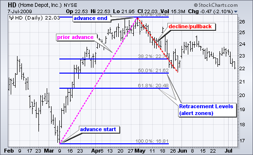
Alert Zones Retracement levels alert traders or investors of a potential trend reversal, resistance area or support area. Retracements are based on the prior move. A bounce is expected to retrace a portion of the prior decline, while a correction is expected to retrace a portion of the prior advance. Once a pullback starts, chartists can identify specific Fibonacci retracement levels for monitoring. As the correction approaches these retracements, chartists should become more alert for a potential bullish reversal. Chart 1 shows Home Depot retracing around 50% of its prior advance.
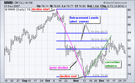
The inverse applies to a bounce or corrective advance after a decline. Once a bounce begins, chartists can identify specific Fibonacci retracement levels for monitoring. As the correction approaches these retracements, chartists should become more alert for a potential bearish reversal. Chart 2 shows 3M (MMM) retracing around 50% of its prior decline.
Keep in mind that these retracement levels are not hard reversal points. Instead, they serve as alert zones for a potential reversal. It is at this point that traders should employ other aspects of technical analysis to identify or confirm a reversal. These may include candlesticks, price patterns, momentum oscillators or moving averages.
Common RetracementsThe Fibonacci Retracements Tool at StockCharts shows four common retracements: 23.6%, 38.2%, 50% and 61.8%. From the Fibonacci section above, it is clear that 23.6%, 38.2% and 61.8% stem from ratios found within the Fibonacci sequence. The 50% retracement is not based on a Fibonacci number. Instead, this number stems from Dow Theory's assertion that the Averages often retrace half their prior move.
Based on depth, we can consider a 23.6% retracement to be relatively shallow. Such retracements would be appropriate for flags or short pullbacks. Retracements in the 38.2%-50% range would be considered moderate. Even though deeper, the 61.8% retracement can be referred to as the golden retracement. It is, after all, based on the Golden Ratio.
Shallow retracements occur, but catching these requires a closer watch and quicker trigger finger. The examples below use daily charts covering 3-9 months. Focus will be on moderate retracements (38.2-50%) and golden retracements (61.8%). In addition, these examples will show how to combine retracements with other indicators to confirm a reversal.
Moderate Retracements Chart 3 shows Target (TGT) with a correction that retraced 38% of the prior advance. This decline also formed a falling wedge, which is typical for corrective moves. The combination raised the reversal alert. Chaikin Money Flow turned positive as the stock surged in late June, but this first reversal attempt failed. Yes, there will be failures. The second reversal in mid July was successful. Notice that TGT gapped up, broke the wedge trend line and Chaikin Money Flow turned positive (green line).
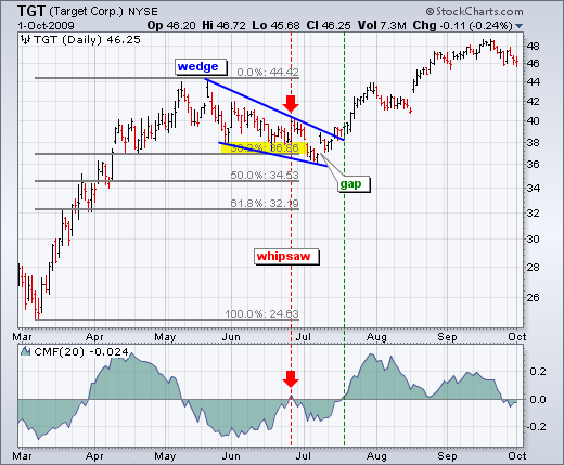
Chart 4 shows Petsmart (PETM) with a moderate 38% retracement and other signals coming together. After declining in September-October, the stock bounced back to around 28 in November. In addition to the 38% retracement, notice that broken support turned into resistance in this area. The combination served as an alert for a potential reversal. William %R was trading above -20% and overbought as well. Subsequent signals affirmed the reversal. First, Williams %R moved back below -20%. Second, PETM formed a rising flag and broke flag support with a sharp decline the second week of December.
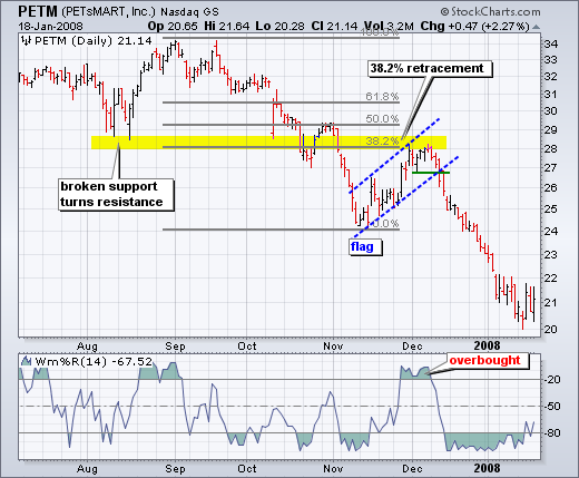
Chart 4 shows Pfizer (PFE) bottoming near the 62% retracement level. Prior to this successful bounce, there was a failed bounce near the 50% retracement. The successful reversal occurred with a hammer on high volume and follow through with a breakout a few days later.
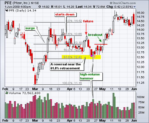
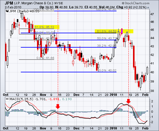
Chart 5 shows JP Morgan (JPM) topping near the 62% retracement level. The surge to the 62% retracement was quite strong, but resistance suddenly appeared with a reversal confirmation coming from MACD (5,35,5). The red candlestick and gap down affirmed resistance near the 62% retracement. There was a two day bounce back above 44.5, but this bounce quickly failed as MACD moved below its signal line (red dotted line).
Fibonacci retracements are often used to identify the end of a correction or a counter-trend bounce. Corrections and counter-trend bounces often retrace a portion of the prior move. While short 23.6% retracements do occur, the 38.2-61.8% covers the more possibilities (with 50% in the middle). This zone may seem big, but it is just a reversal alert zone. Other technical signals are needed to confirm a reversal. Reversals can be confirmed with candlesticks, momentum indicators, volume or chart patterns. In fact, the more confirming factors the more robust the signal.
A look at inflation and deflation, the key issues in any economic crisis, and how understanding how those issues are playing out will help individuals develop a strategy for preserving and growing their wealth in the US economic crisis.
Ichimoku - Advanced Ichimoku Strategies Breakout Qualifiers
The Island Reversal - Part 8 of a video series discussing short term price bar reversals such as the bearish rejection, the bullish rejection, the open close reversal, the closing price reversal, the hook reversal, the key reversal, the island reversal and the pivot point reversal.
32. How to trade Stochastics divergence in Forex
Forum on trading, automated trading systems and testing trading strategies
newdigital, 2013.07.18 16:54
This is some information about how to use/trade Stochastics indicatorTrading with Stochastics :
Stochastics gives its strongest sell signal when the two moving averages that comprise it have first been above 80 and then close below the 80 level. The strongest buying signal is given when the two moving averages have first been below 20 and then close above 20.
Ideally, we should use Stochastics, and any other indicator for that matter, only to take trades in the direction of the Daliy trend. So if a trader determines that a pair is in an uptrend, they would then consult Stochastics to time their entry after Stochastics has been below 20 and then closed above the 20 level. In a downtrend, such as we have on the Daily chart of the USDCHF below, they would look for Stochastics to have been above 80 and then close below it for the signal to sell the pair.
See the chart below for an example of this :
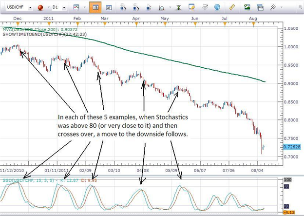
For Stochastics to close below 80 in a downtrend or above 20 in an uptrend is a much stronger signal than if Stochastics simply goes above or below those levels during the course of the time that the candle is open.
For example, let's say that a trader is using a 1 hour chart. When that 1 hour candle closes at the end of the hour, the trader can check Stochastics to see if the two moving averages were above 20 or below 80 after the close occurred. That will confirm that the indicator did indeed close above or below the requisite level.
Forum on trading, automated trading systems and testing trading strategies
newdigital, 2013.07.19 09:16
Slow Stochastics versus Fast Stochastics :Developed by George C. Lane in the late 1950s, the Stochastic Oscillator is a momentum indicator that shows the location of the current close relative to the high/low range over a certain number of periods.
New traders typically want to know the difference between Fast Stochastics and Slow Stochastics. They also want to know whether the typical default settings of 5,5 (Fast Stochastics) or 5,5,5 (Slow Stochastics) as seen in most charting packages developed for FX are better or worse than the typical default settings of 14,3 (Fast Stochastics) or 14,3,3 (Slow Stochastics) seen in stock and futures charting packages.
First of all, the difference between Fast Stochastics and Slow Stochastics is just a moving average.
When calculating Fast Stochastics using the values of 5 and 5, the first “5” is the raw value for Stochastics, while the second “5” is a 5-period moving average of the first “5”. When using Slow Stochastics, the first two 5’s are the same as with the Fast Stochastics, with the third “5” being a moving average of the second “5”. Yes, that’s right, a moving average of the moving average. This slows the movement of the indicator down even further, hence the name of Slow Stochastics.
By slowing the movement of the indicator down, we will see fewer signals to buy or sell on the chart, but they should be more reliable signals. By using a larger value in calculating the raw value of Stochastics, we slow the indicator down even more. This is why I recommend to traders using FX charts to use the Slow Stochastics with values of 15,5,5. This combination offers fairly reliable signals that can offer solid entries into trading opportunities. The chart below shows the difference between Fast Stochastics with values of 5,5 compared to Slow Stochastics with values of 15,5,5.
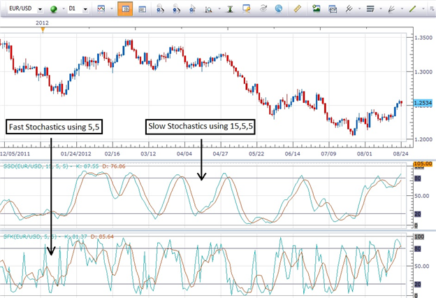
You can see how much easier it is to identify the signals using the Slow Stochastics. Being able to use the technical tool effectively is most of the battle. By keeping things simple and consistent, we should start to see consistent results in our trading.
As with all indicators, entering a trade only when the indicator generates an entry that is in the direction of the trend can result in a higher probability of success.
Forum on trading, automated trading systems and testing trading strategies
Market Condition Evaluation based on standard indicators in Metatrader 5
newdigital, 2013.02.12 16:44
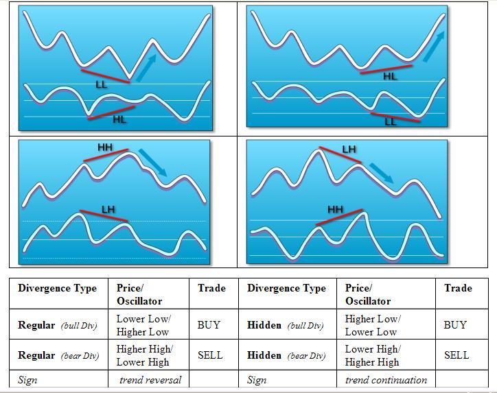
I promissed here to describe something about divergence. yes, it is related to this thread Market Condition Evaluation based on standard indicators in Metatrader 5
We can write about divergence from the following sources:
Forum on trading, automated trading systems and testing trading strategies
Market Condition Evaluation based on standard indicators in Metatrader 5
newdigital, 2013.02.12 16:45
Or ... to make it shorter - we can see the rules from the image:
Renko Bar |Day Trading | What are Renko Bars | How do Renko Bars Work | Part 1
Renko Bars can be viewed as merely a different way to reflect price on a chart; in my opinion, I feel they paint the clearest picture of price available.
Here are my top 6 reasons of why I choose Renko Bars and charts:
- They REALLY help filter the noise
- They help smooth Indicators
- They can provide better entries
- They may help to provide smaller stops
- In my opinion they are just “cleaner”
- They help to filter noise and may help, keep us out of the chop.
Forum on trading, automated trading systems and testing trading strategies
newdigital, 2013.09.03 11:03
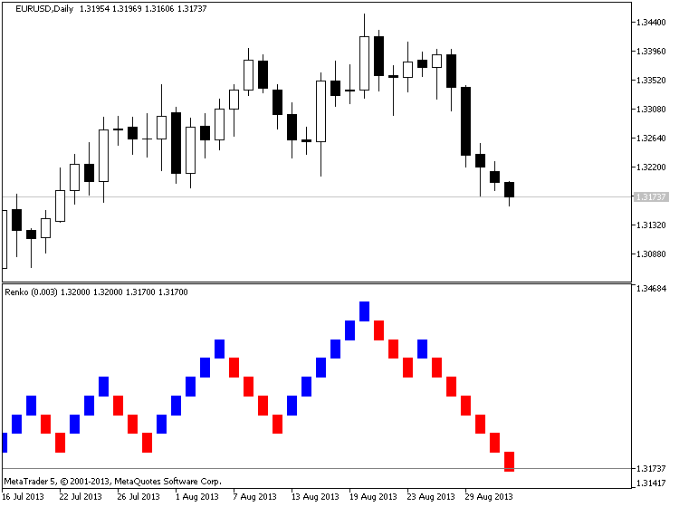
Renko (extraction from Achelis - Technical Analysis from A to Z)
============
Overview
The Renko charting method is thought to have acquired its name from "renga" which is the Japanese word for bricks. Renko charts are similar to Three Line Break charts except that in a Renko chart, a line (or "brick" as they're called) is drawn in the direction of the prior move only if prices move by a minimum amount (i.e., the box size). The bricks are always equal in size. For example, in a 5-unit Renko chart, a 20-point rally is displayed as four, 5-unit tall Renko bricks.
Kagi charts were first brought to the United States by Steven Nison when he published the book, Beyond Candlesticks.
Interpretation
Basic trend reversals are signaled with the emergence of a new white or black brick. A new white brick indicates the beginning of a new up-trend. A new black brick indicates the beginning of a new down-trend. Since the Renko chart is a trend following technique, there are times when Renko charts produce whipsaws, giving signals near the end of short-lived trends. However, the expectation with a trend following technique is that it allows you to ride the major portion of significant trends.
Since a Renko chart isolates the underlying price trend by filtering out the minor price changes, Renko charts can also be very helpful when determining support and resistance levels.
Calculation
Renko charts are always based on closing prices. You specify a "box size" which determines the minimum price change to display.
To draw Renko bricks, today's close is compared with the high and low of the previous brick (white or black):
-
If the closing price rises above the top of the previous brick by at least the box size, one or more white bricks are drawn in new columns. The height of the bricks is always equal to the box size.
-
If the closing price falls below the bottom of the previous brick by at least the box size, one or more black bricks are drawn in new columns. Again, the height of the bricks is always equal to the box size.
If prices move more than the box size, but not enough to create two bricks, only one brick is drawn. For example, in a two-unit Renko chart, if the prices move from 100 to 103, only one white brick is drawn from 100 to 102. The rest of the move, from 102 to 103, is not shown on the Renko chart.
Forum on trading, automated trading systems and testing trading strategies
newdigital, 2013.10.16 08:04
How to Use Renko Bricks and Moving Averages to Find Trades
Talking Points
- Renko bars help filter the noise
- Renko bars reveal clearer entries and exits
- Moving Averages can be used with Renko bars with some minor setting changes to pinpoint entries
Seeing the trend without Forex market noise is the goal of every trader. Too many times, traders get head-faked by the twists and turns of price action.
In addition moving averages can be used to signal entries and exits as well. A couple of settings have to be changed in order to get the moving averages which are usually tied to time, to work with a chart system that is based on price.
To add a 13-period exponential moving average to the Renko chart, choose EMA from the Add Indicator menu then change “Number of periods” to 13.
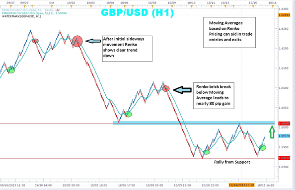
Notice the chart above which displays both Renko bars and a 13-period exponential moving average. A simple system can be built around the Renko bars and the moving average. When Renko price bars cross below the moving average and turns red, traders can enter short and stay with the trend until the Renko bars cross back above the moving average.
An initial stop could be placed just above the last blue Renko brick. Keep in mind that in the above example, each brick is equal to five pips. In the above example, the red circles mark where the Renko bars crossed below the moving average. A trader can see that a number of pips could have been gathered as the bars stayed below the moving average.
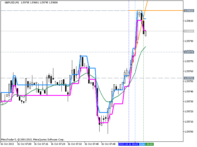
On the other hand, when the Renko bars change color and cross above the moving average, traders can enter long placing stop just below the last red Renko brick. The above chart shows in the green circles, points were the Renko price bars moved above the moving average generating a clear buy signal.
Renko charts, without the dimension of time, may take a little getting a little used to. But once you get the hang of them, you may find it difficult to go back to the candles. Adding a moving average gives excellent signals for entry and exit. Marrying them up with other indicators can magnify the benefits of trading without noise and scary wicks!
- Free trading apps
- Over 8,000 signals for copying
- Economic news for exploring financial markets
You agree to website policy and terms of use
Trading and training video (from youtube for example) about forex and financial market in general.
Please upload forex video you consider as interesting one. No direct advertising and no offtopic please.
Any the comments without video will be deleted.